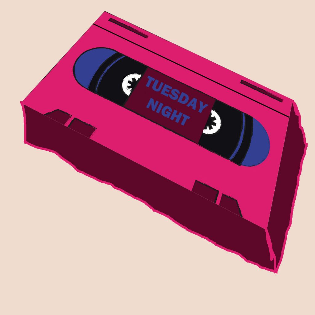
After gathering ideas for some album artwork (see PDF file), I felt like trying some of my own designs. I decided to go with a retro almost theme, inspired by the CASTLEBEAT album cover on the PDF. I found a cartoon-like VHS tape online and put it into photoshop to change the perspective of it, so I can turn it into a 3D object. This is the initial idea I had which I made very quickly just to get a concept of what it would look like. We also decided that ‘Tuesday Night’ would be a great name for the track as it is one of the most prominent lyrics in the song and it has a lot of meaning, even though it sounds fairly simple.

Obviously, the lines I made to make it 3D are unprofessional, but if I work on it more alongside the graphic design team, I think this works really well for the artwork. The font could also be more interesting; I just chose one quickly that I knew would work for now. The background is also a very pale pink, I think this sticks with the theme and colour scheme of the cover and it keeps it interesting compared to if it was on a plain white background. Something else could also be added to the background to make it unique and a little bit busier, but this isn’t a vital addition.
This is a much better mockup of the idea, the perspective has changed and the lines are much neater. I didn’t put any text on it because I still wasn’t sure on the font to use. The colours are still the same as they portray this retro feel that comes with the prop on the cover. If we did go with this cover, we would have to get help with recreating this to make it look much more professional, and the VHS front bit I used was a royalty free one I found off the internet. Compared to the first mock, I think this looks significantly more like a real VHS tape and the perspective looks more realistic.

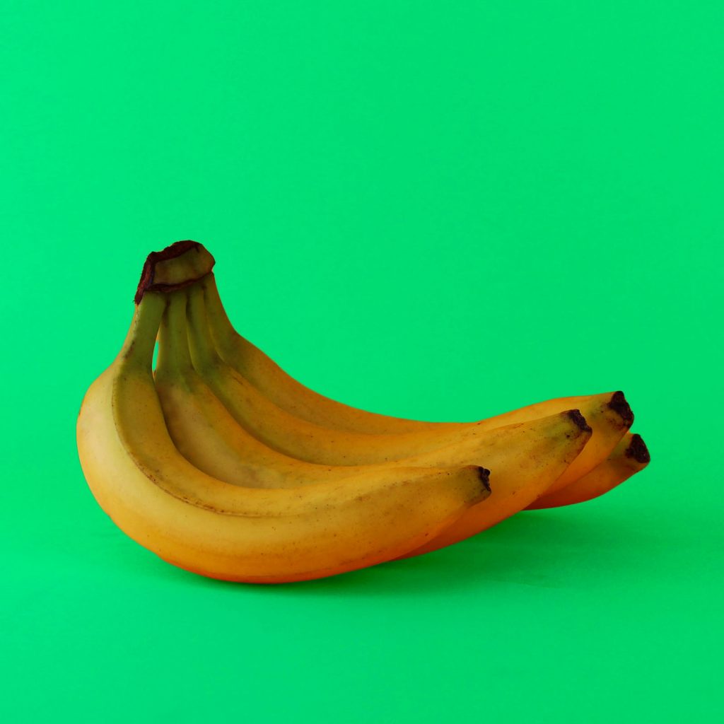
As well as the VHS idea, I decided to stay with the colourful theme but introduce a whole new concept. I took this photo amongst a photoshoot I did last year and for some reason, I thought it would look perfect for an album cover, so I tried it. The original background was yellow, but I changed it to a minty green to make the bananas stand out more. I also made the bananas brighter and more vibrant and got rid of some of the brown parts on the skin. The image itself is 1600*1600 pixels; perfect for a song cover.
