During the holidays, I became a lot more interested in graphic design, so making the poster for the event is extremely important for me and I want to be able to put my own ideas and spin onto the concert’s brand. I became very interested in many different classes of graphics such as acid graphics, oscillation artwork from the likes of Ben F. Laposky and Herbert W. Franke, but more importantly, the minimalistic, brutalist and Bauhaus movements from the past century, as they use insignificant graphics and typography to get a point across in an effective way. I would love to make the poster in the style of these movements so my research on posters will be based on these periods of design.
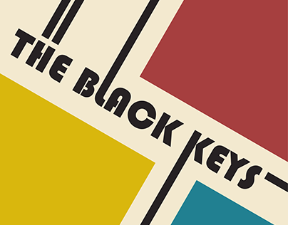
-Simple yet interesting typography with a retro-looking font and lines following off of the words.
-Uses simplistic shapes like squares to make it seem minimalistic and brutalist.
-Uses the three primary colours, giving the poster a Bauhaus Movement look and keeps the colour scheme very mild.
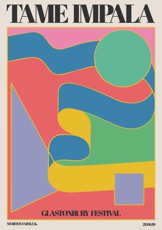
-More complex shaping but still shows a clear Bauhaus style.
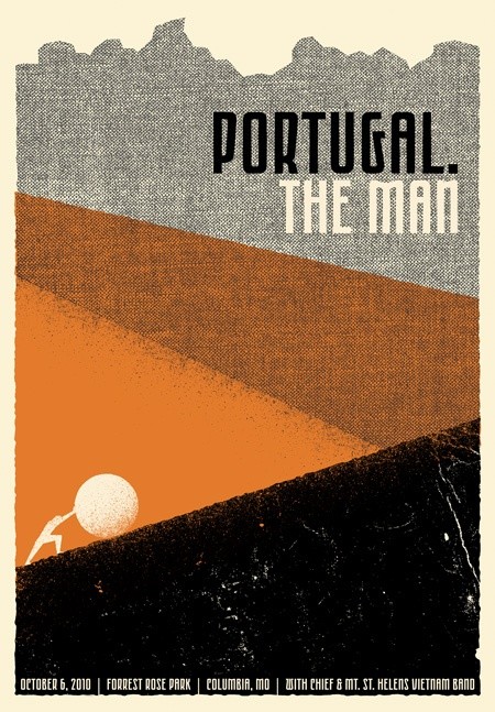
-Very bold and straightforward typography, standard for minimalist works, this gets the point across of who is playing and where very quickly.
-Pastel colour scheme and using lots of colour and shade combinations to make an interesting piece of artwork on the poster.
-Interesting work with layers and imagery, insights a meaning into the poster
-Different colour scheme, doesn’t use much negative space or a border around the main image.
-Poster looks vintage as it used stippling to create the mountain and slopes, and creases to make it look worn and historical.
-Very clear Bauhaus and retro design from the colour scheme and typography. The texture adds some grit and adds to the vintage feel.
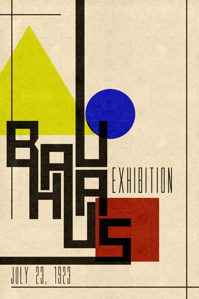
-Very interesting typography for the detail text. Long and thin but stands out from the cream and grainy background.
-Extremely simple shapes and very sparse and spread out but strategically placed as they slightly overlap and are covered by the main title type.