This Week’s Progress
Band Name And Logo
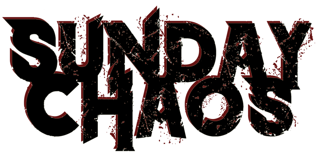
This week, the band and I decided on a name. Lucy suggested the name ‘Sun-Daze’, which we all liked, but we thought it needed more. We wanted something a bit more edgy, something that would represent the songs we are planning to cover in the concert; indie and classic/heavy rock. We decided to keep the Sunday implication, but adding something else to it, so we came up with ‘Sunday Chaos’. As soon as we came up with that I had an idea in my head as to what the logo would look like and worked on it when I got home. I came up with this:

I made this on Photoshop, after downloading the ‘The Dark’ font online. I typed out the name and played with the text arrangement, making the two lines of text merge into each other slightly and the S and C somewhat larger. After this, I made a copy of the logo, changed the text colour to a dark red and put the layer behind and slightly off centre to the black text, creating a drop shadow effect that was more chaotic and rough than the black in front of it. To make the name’s initials stand out more, I went into the S and C with a black brush, covering up holes and scratches, generally making it look more visible and easier to see. After sending this to the band’s group chat and making sure everyone liked it, I thought about what we would use for social media as that logo would be too big to fit in a profile picture. So, I kept the initials of the band name and removed the other characters, creating this:

I think these represent the look and brand that the band wants to create. However, the overall quality of the logos isn’t the best. Next week, I want to recreate the same logo but with a higher resolution so they will look better on posters and social media.
Progress Of A Potential Poster Design
This week too, we decided as a group on a name for the concert next month. After finding some inspiration online thanks to a lucky image saying ‘Live Wire’ on my Pinterest feed, I suggested this to the group and the graphic design tutor and everyone seemed to love it! Straight away I got onto Canva to make some mock-up poster designs in some styles I find very interesting as of now; Bauhaus and minimalism. We also suggested that the ‘Live Wire’ text should look like actual wires with split/cut off ends to represent the name of the concert. Using straight lines and simple shapes, combined with a contrasting colour scheme and an array of aesthetically pleasing font choices, I came up with a first design. These three images show the progress of this one poster, the last one also featuring the band’s logo and a guitar to imply straight away what the concert will be showing. The @ at the bottom of the page is simply a placeholder until we decide on an official social media tag.

Draft 1 
Draft 2 
Draft 3
Next week, I want to have made at least another poster design that I find interesting, so we can perhaps take ideas from both of these and other students’ ideas, to find something we all like and can work on.
Next Week’s Targets
-Recreate the band’s logo but in a higher resolution.
-Create another idea for the poster style.
-Finalise and create a finished poster design ready for use. This means we can start promoting by next week too.