10th March
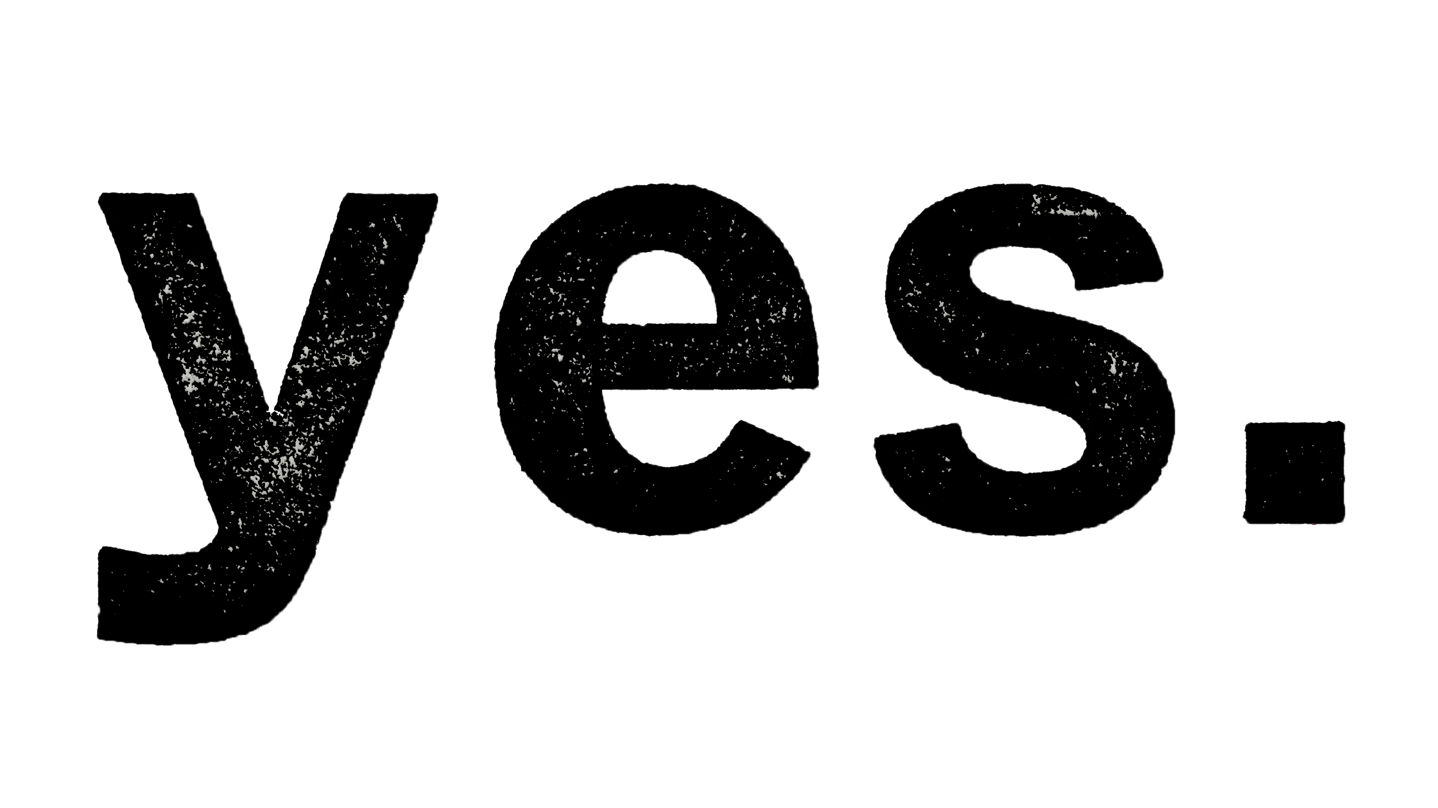
Today, I started to work on the prints I made last week using the metal type printing press in college. I scanned the images in and saved them as high-resolution PNG’s so they would not lack in quality.
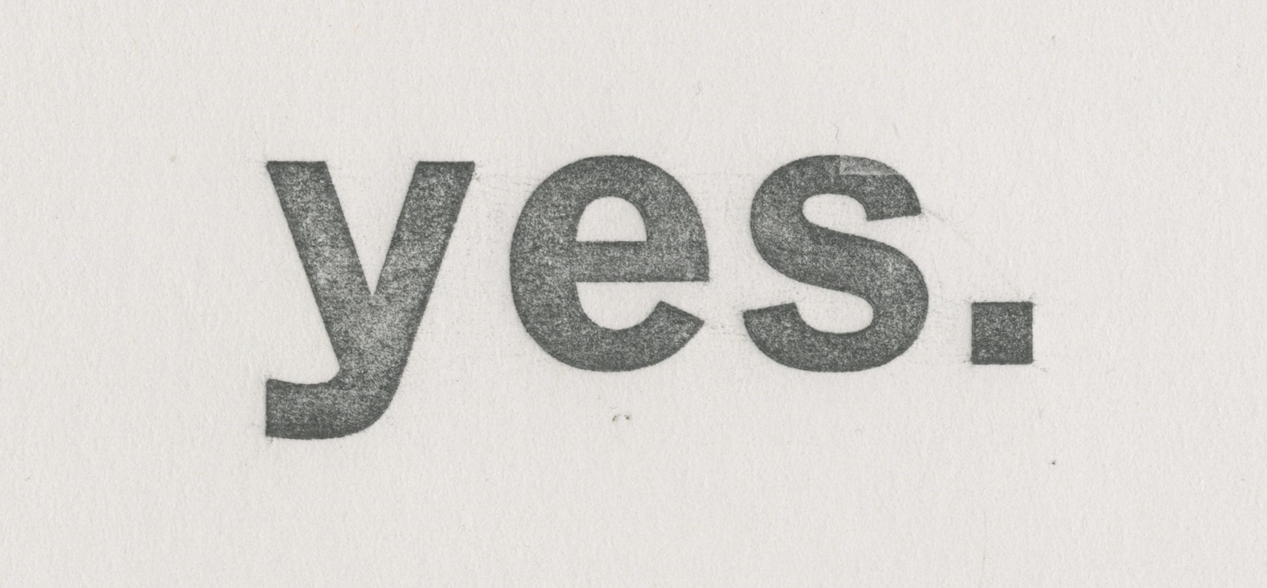
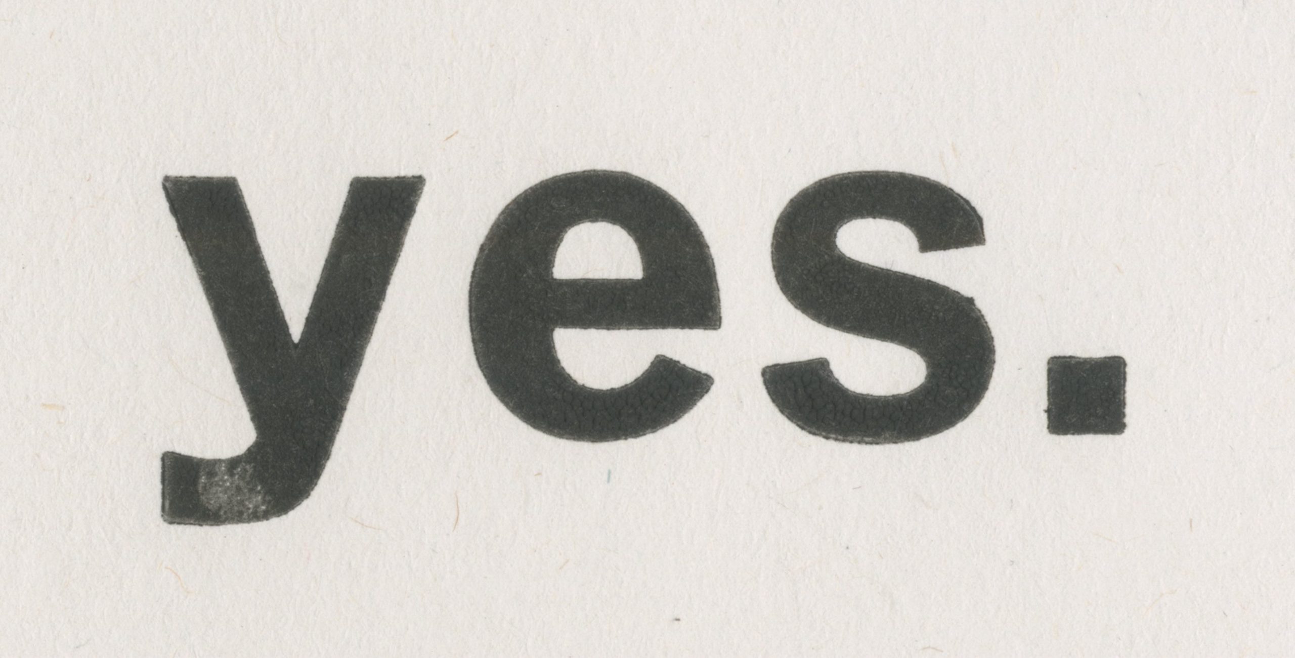
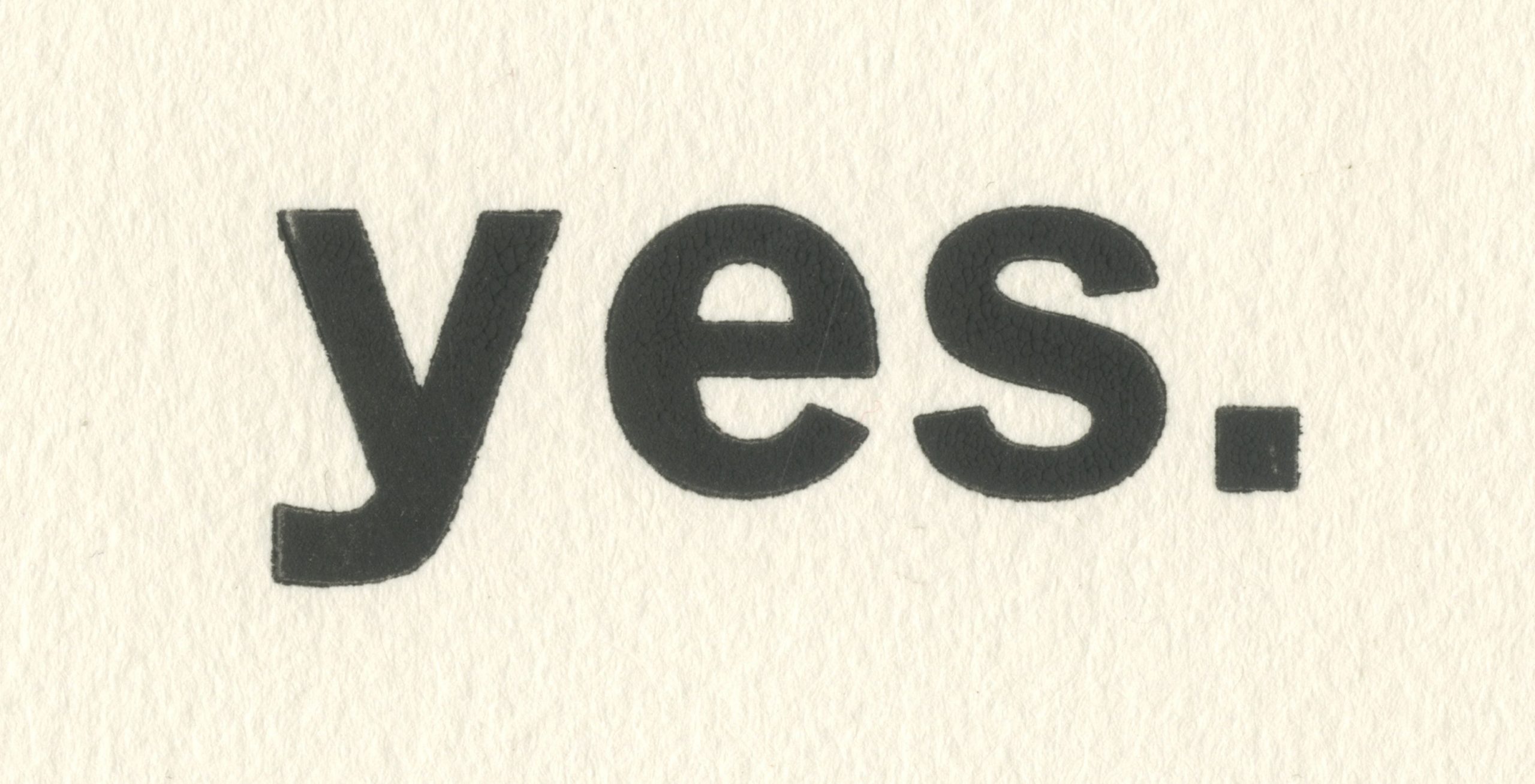
I then ran the three different prints through photoshop to begin editing them. I liked the first one in the images above as it had a lot of markings and grain still left on the paper. I used levels to make the grey turn darker and give it a noticeable contrast and then ran it through the threshold effect to alter the blackness/whiteness of the logo and make the grain sharper. The image below was the outcome; it might not be the final logo design but it’s getting there!
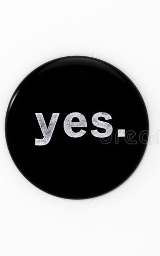
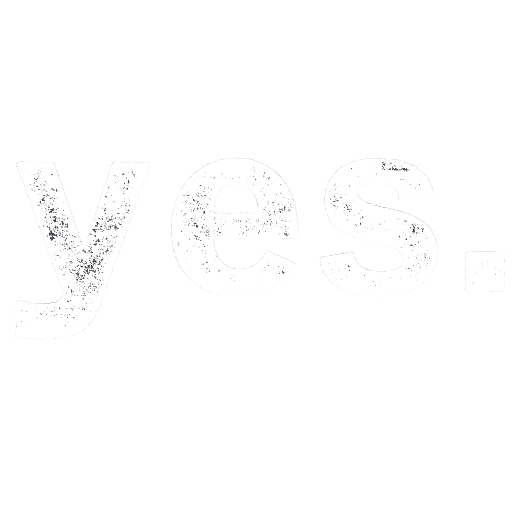
A tutor helped to create some merchandise examples with his interpretation of the logo just as an experiment and to see the logo’s effectiveness. I really like the idea of inverting the logo to make it white with black grain; this is something I will look at when making the final logo. Here are some of the examples we created:


18th March
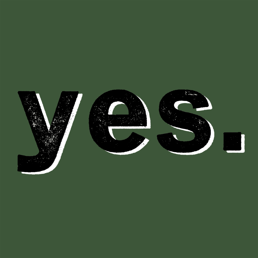
This week, I carried working on the initial logo idea as we both liked the idea. So, I cleaned up the white border and experimented with things like drop shadow and inner glow, and inverting the image to make the logo white. I started to look at branding and background colour schemes we could be interested in too.
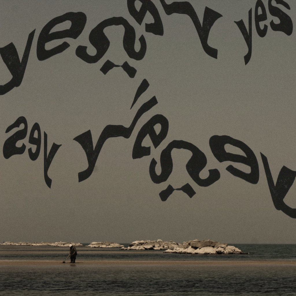
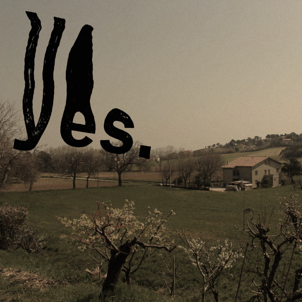
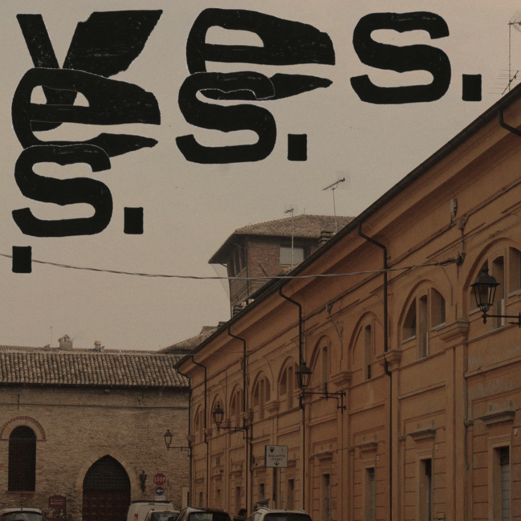
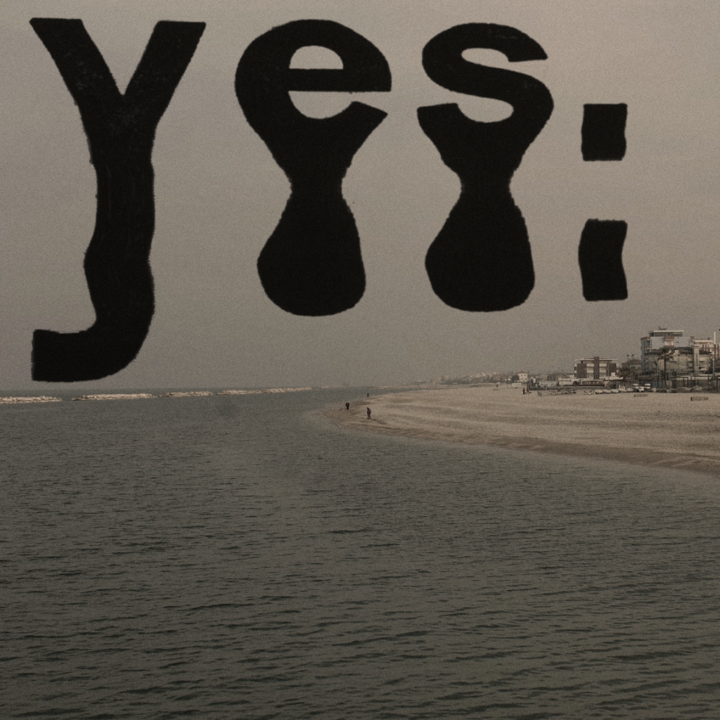
After researching some experimental artwork designs for fonts, I stumbled across a video on TikTok where they photocopy words and blur/warp them by dragging them along the photocopier as the machine is scanning them. I tried it for myself and came out with some really interesting results that I plan to experiment with on photoshop next week after I have scanned them in as high-resolution PNGs. These could look really interesting when combined and put with a background image, perhaps for an album cover.
12th April
Made a design for our first Instagram post, taking the initial design I had made in the pre-production stage and replacing the old logo idea with the official logo. This will be ready to post today.
5th May
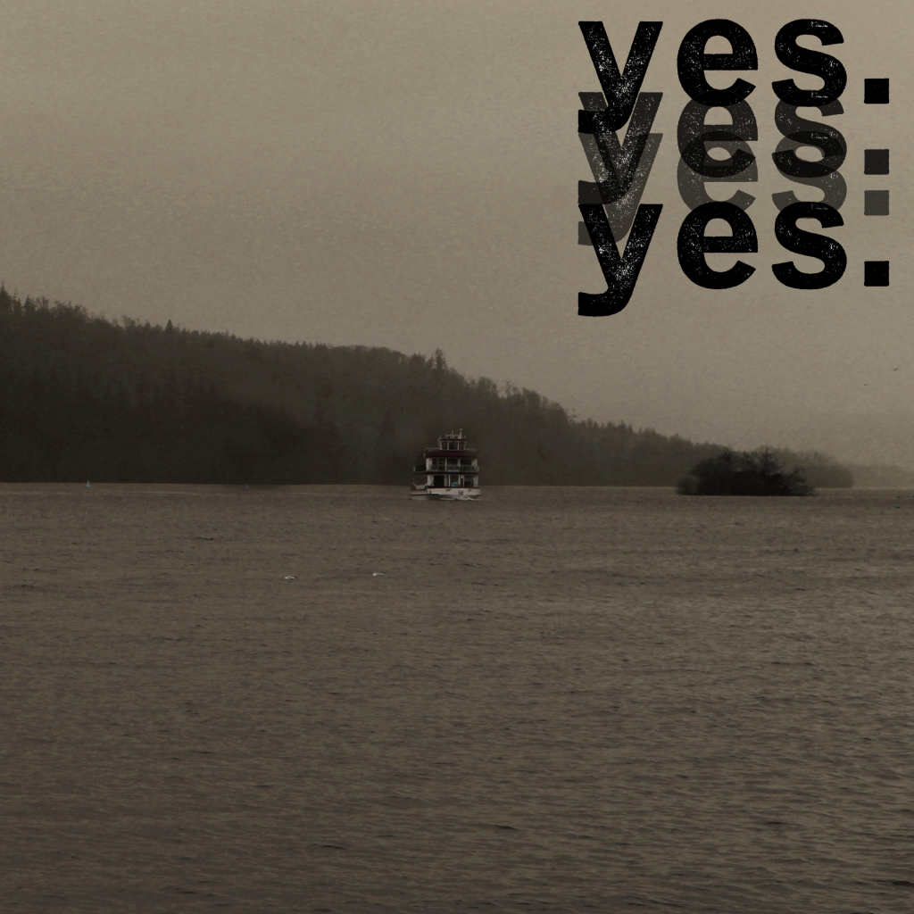
Today, I have spent a while making progress with the promotion because we definitely haven’t been making enough content for our Instagram page. I finally got the chance to scan in the warped images of the logo so I could work on them. Since getting a new laptop, I had to find an alternative to photoshop that still worked well and did what I needed. I found a website called Photopea which worked perfectly and acts just like photoshop. This is what I used to create these images below. As you can see I have kept the same colour scheme and aesthetic throughout.