Branding is one of the most important aspects of being a successful musician in the modern, online world. People are attracted to trends, what’s popular, but equally, things that are unique and different to the ‘norm’. Keeping up a good brand is so important in this day where people want to see consistency and what aesthetic the band or artist relates to. Being consistent allows fans to instantly recognise you and gives newcomers something interesting to find you by, increasing the chances of them sticking around.
Album artwork is directly paired with branding; good album artwork is bound to draw in listeners; maybe it reminds them of another artist they listen to, think it’s totally unique, or it could be a style or aesthetic they are interested in and resonate with. I personally am drawn to album artwork; browsing in record shops and picking up records that look visually captivating, no matter the artist or genre. A recent piece of artwork that drew my attention was the contemporary jazz compilation album “Blue Note Re:imagined”, which I saw on a shelf in HMV and was instantly attracted to. Artwork that looks different to the ‘norm’ stands out on a shelf with a hundred other albums, or on a streaming service with millions of other albums just a click away.
Analysis Of My Favourite Cover Art
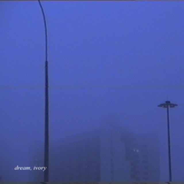
- Very simple colour scheme (shades of light blue and grey)
- No real focal point as the image looks foggy and blurred
- Grainy and purposefully low-quality image (retro, vintage, film camera like)
- Some text, just of the album title, italic serif font. No capital letters
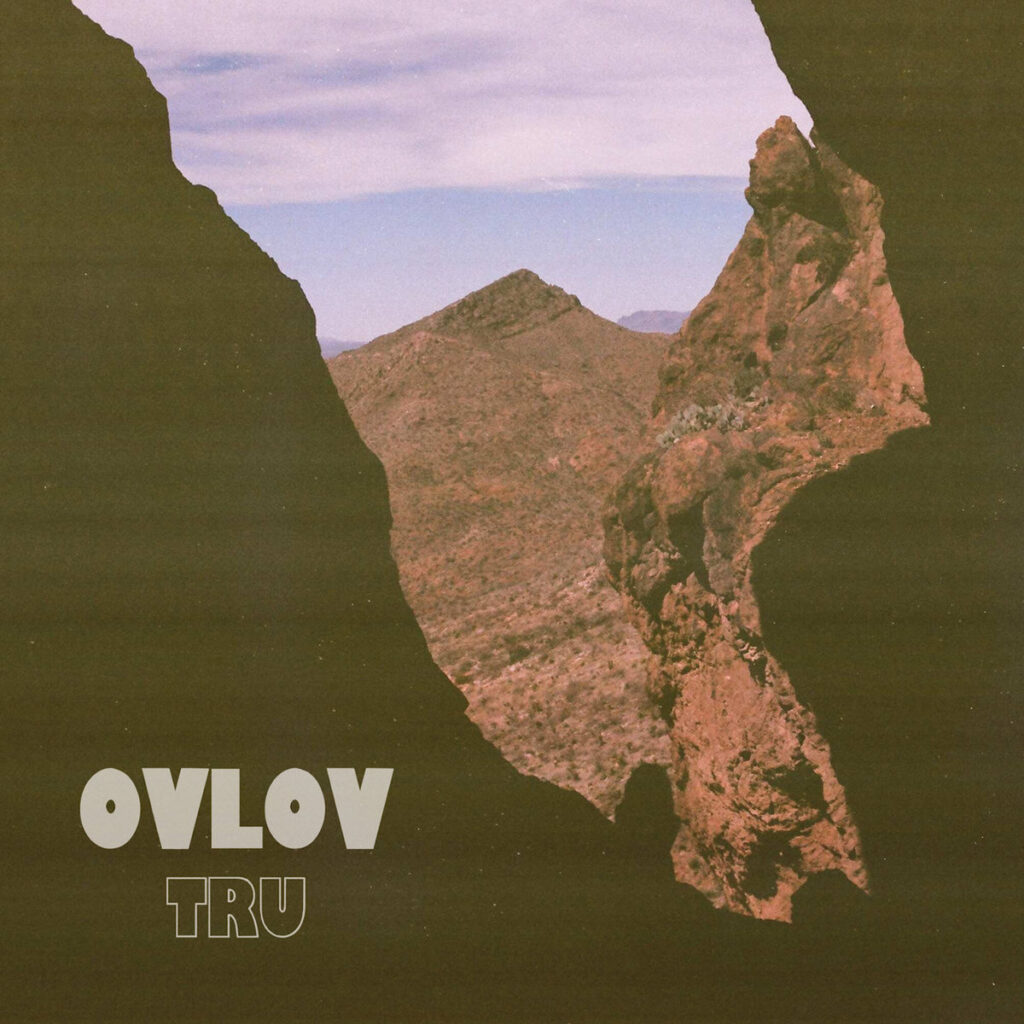
- Colour scheme of neutral colours (browns, muted blues, purples and oranges)
- Image of horizon, has a main focal point (the mountain peak in the background)
- Has lines across cover as though it has been scanned or taken on an old camera (retro, vintage again)
- Minimal text, interesting and bold fonts used to contrast with the image

- Black and white (cream) colour scheme, as simple as you can get
- Lots of negative space, makes you focus on the other parts of the image and keeps things simple and minimalist.
- Makes the simple cover interesting with strange, cryptic illustrations. Looks to be hand-drawn but could have been made to look like this digitally
- Text looks pressed, could be a Letraset or ink press. Not digital but scanned in to edit and warp
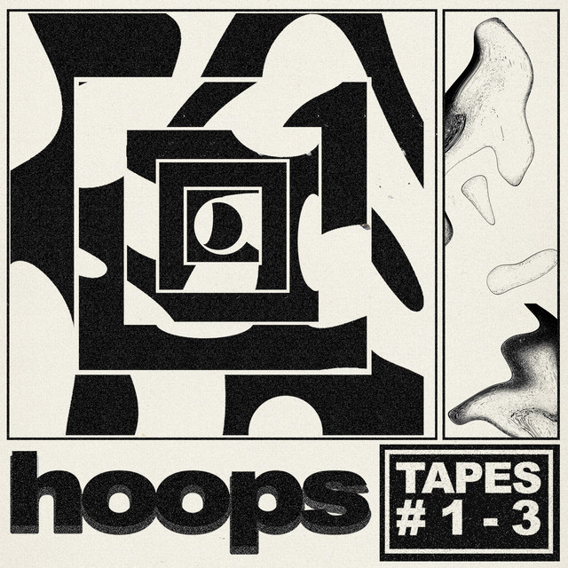
- Black and white (cream) colour scheme again, but more shades of grey have been used for 3D effects and shading
- Not as much negative space, lots of darker parts are there, still keeps the minimalist style
- More cryptic illustrations, again look hand-drawn and scanned, especially with the drawings in the right rectangle
- Text is bold and heavy, very close together. Reads well and has a 3D effect with the grainy grey shading behind ‘hoops’. Inverted colours for the “TAPES #1-3”, section, creates a contrast

- Very interesting but again simple colour scheme of black and a slate, pale blue, creates a very good contrast with the black negative space
- Interesting illustrations of a seemingly unknown person, the threshold effect on the image almost covers their identity
- Lots of interesting, clashing fonts. Tall serif font as the header, but the album name is a thin, minimal font, the paragraph is very cramped, almost making it hard to read. The paragraph explains the album name, giving some context behind the songs
Common Features Of Most Artworks
- Grain, VHS/film camera-like image
- Muted colour scheme
- Some forms of text
- Illustrations
- Negative Space
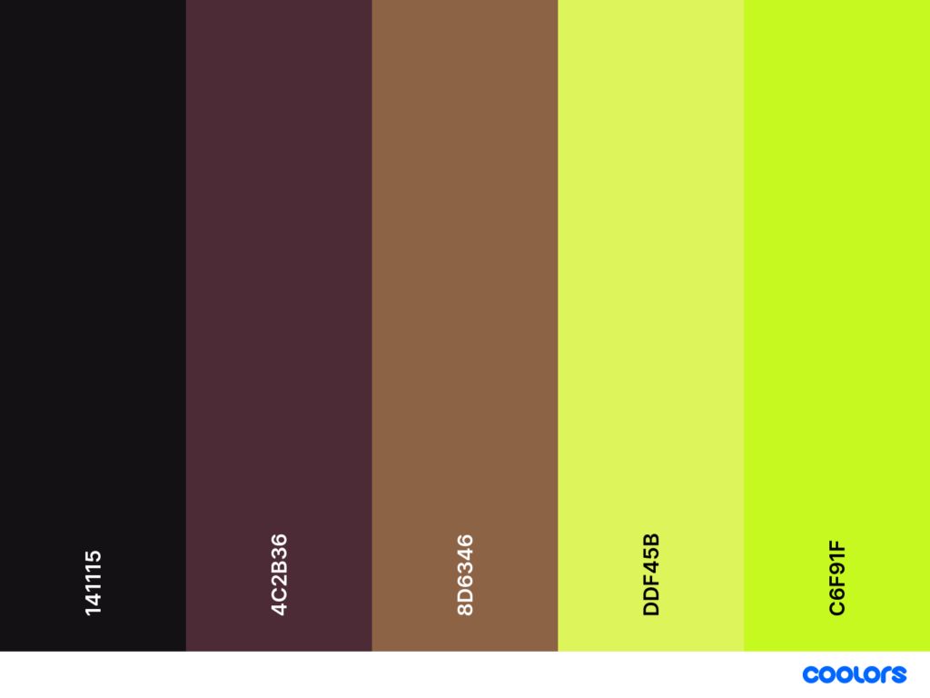
Colour Schemes
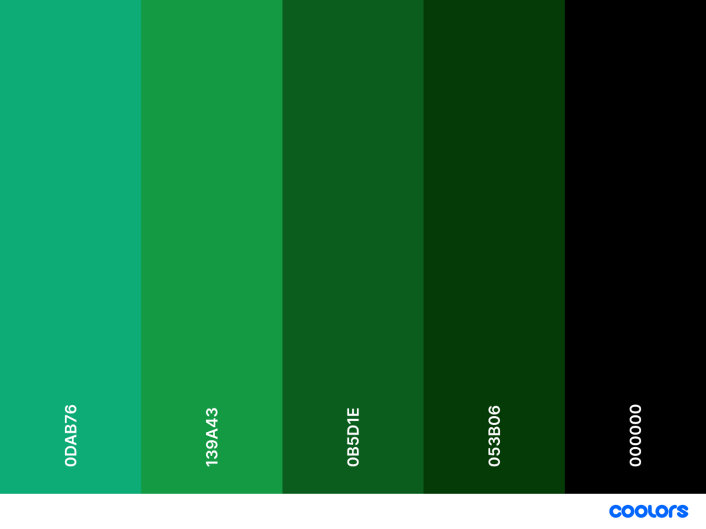
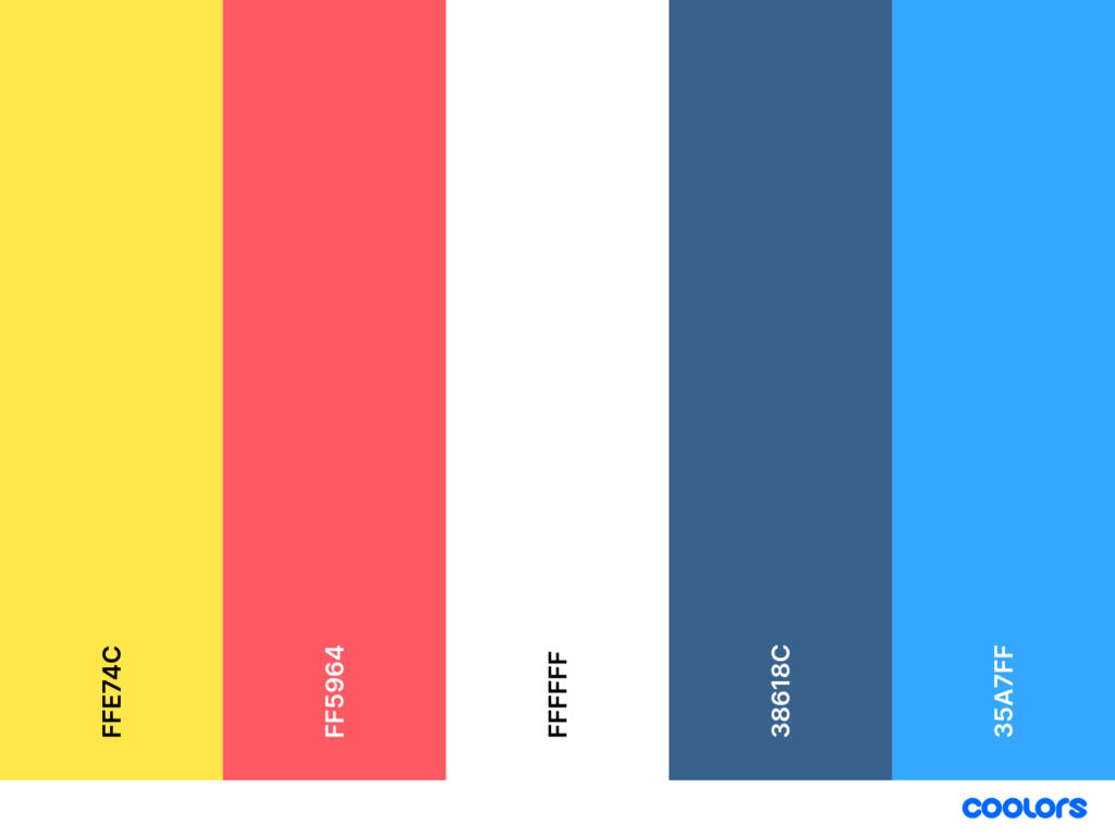
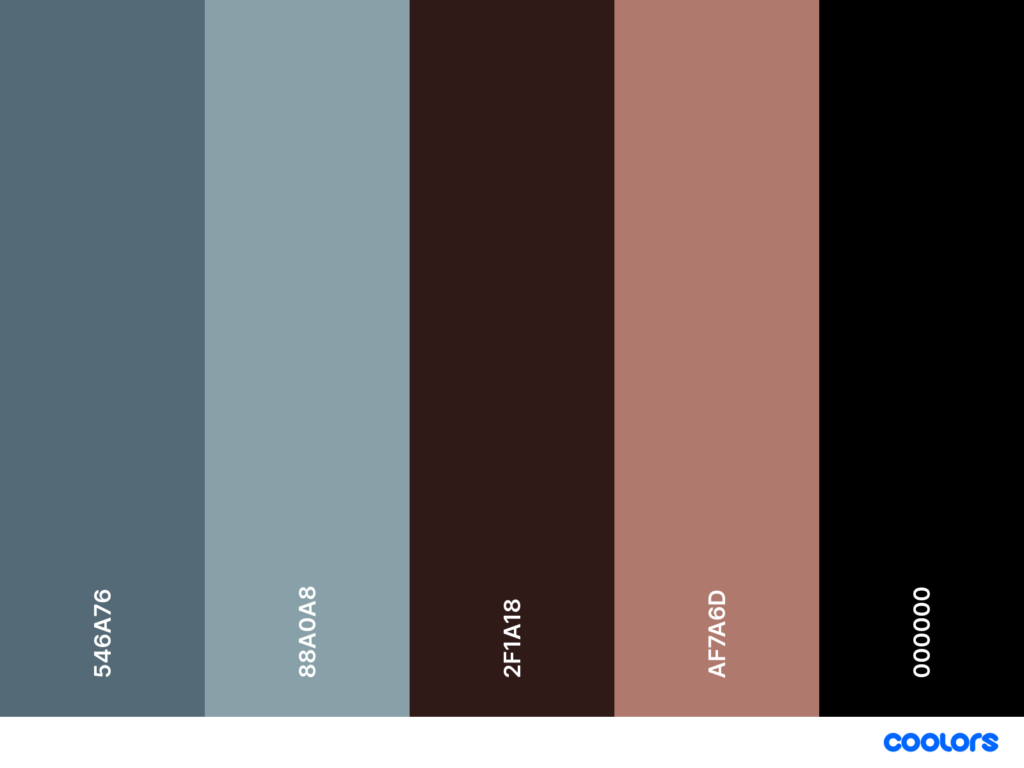
Colour schemes are an extremely important factor in creating a successful brand. It is one of the first details of a brand that people see and can reflect a lot about the branding and what the product is that they’re trying to communicate. The colours you use can further reflect the brand’s aesthetic and can make your company or product unique to others on the market. for example, if you used a bright and bold colour scheme, the product or company could be seen as fun, playful and creative. however, if your colour scheme is dark and minimal, it can be seen as serious, deep or stringent. If your brand or product is meant to appeal to people that are interested in grunge music, for example, a bright and colourful colour scheme may not go down as well as having a dark and mysterious one as the grunge scene goes hand in hand with these adjectives. Here are some colour schemes I have screenshotted using (Coolors – The super fast color palettes generator!, n.d.). All of these could work in different musical brands.

Type And Fonts
Picking a font that represents your brand is both hard and important. There are so many fonts to choose from, and many fonts look so similar that it’s very hard to tell them apart. However, these subtleties can really affect your brand and make a positive difference. The main two types of fonts are serif and sans serif. Serif is a font that uses extra lines to finish off a letter. They generally look sophisticated and traditional. Sans means ‘without’, so a sans serif font does not have any extra lines or strokes. This makes the font fairly minimal and easy to read. You can find more interesting fonts that are experimental and each one will work in a different circumstance. Below are some examples of fonts and when you could use them.

As well as different fonts, choosing different aspects of the font is important too. These can consist of bold, italic, underline, strikethrough, size, letter/line spacing, letter case and more. Having a bold font makes the text striking and eye-catching. Italic fonts can create a sense of professionalism and makes the text look decorative. Underlining certain words works well when creating headers and can make certain words stand out amongst others. The size of the text can help to create a hierarchy of information, for example; the heading would be the largest font, then the subheading, then the main body of text being the smallest font. The letter case can really make your branding unconventional and unique depending on its usage. All upper case lettering is modern, gives a striking look and a sense of urgency and importance, however, all lowercase lettering can create a sense of calmness and is generally more legible.
However, instead of using the standard fonts you can find online, you can even create experimental pieces or create your own fonts. There are apps and websites available that let you make fonts out of your own or other people’s actual handwriting, which could be great to give the reader a further connection to your work and gives your own branding a personal touch. One thing I stumbled across on TikTok was the video below. I loved this experimental idea and wanted to research more about this design tip. It is totally unique and I love the idea that every scan can have a different outcome. As well as being used in posters and promotional material, many musicians have used this too to create album artwork. Musician ‘Ghostpoet’ has used this design idea, as shown in his album art for ‘Dark Days + Canapés’, as well as the album ‘Burnt Sugar’ by ‘Gouge Away’ I used the website below to figure out how to create this glitched font effect.