Thumbnail Development
Below this text is a three stage development of a piece of artwork I had developed for my final project. I had this artwork made to act as a YouTube thumbnail for my project once I release the music online, I am planning on releasing the music on YouTube one day after the showcase. As this will prevent people who are attending the showcase to lose interest in my project prior to the event taking place. However when this video does get released this artwork below will be the thumbnail for the video. This artwork design below was inspired by the artwork pieces I researched earlier in the project, however I decided by artwork did not have to be as detailed or intricate as the other pieces of artwork as viewers will only see the art for one second before clicking on the video. I wanted the artwork to capture the theme of the video game level and represent its context within the game. As I do not know how to edit or develop artwork I has the help of Paul Holmes, a digital designer working at Bradford College to help me develop my thumbnail.
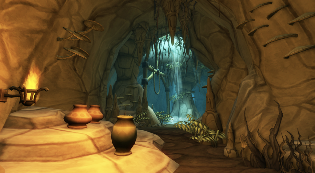
This is the original image that I used for my artwork that I received through google images, I liked this image due to it’s interesting stylised art style. I also think the artworks poly-graphic art-style also matched the style of the game I am composing for, which is one major factor that drew my attention to this artwork. A couple of things I did not like about this artwork was the friendly and vibrant colours present in the cave, as this does not match the theme of the music I am composing for. As the music I made for the game has a very dark and ancient tone, therefore the image looked too bright to match the theme of the game and music I composed. One final thing I did not like about the original image was the pots on the left of the image as these looked very low definition, therefore I did not want them in my final artwork as I did not like their low quality appearance.
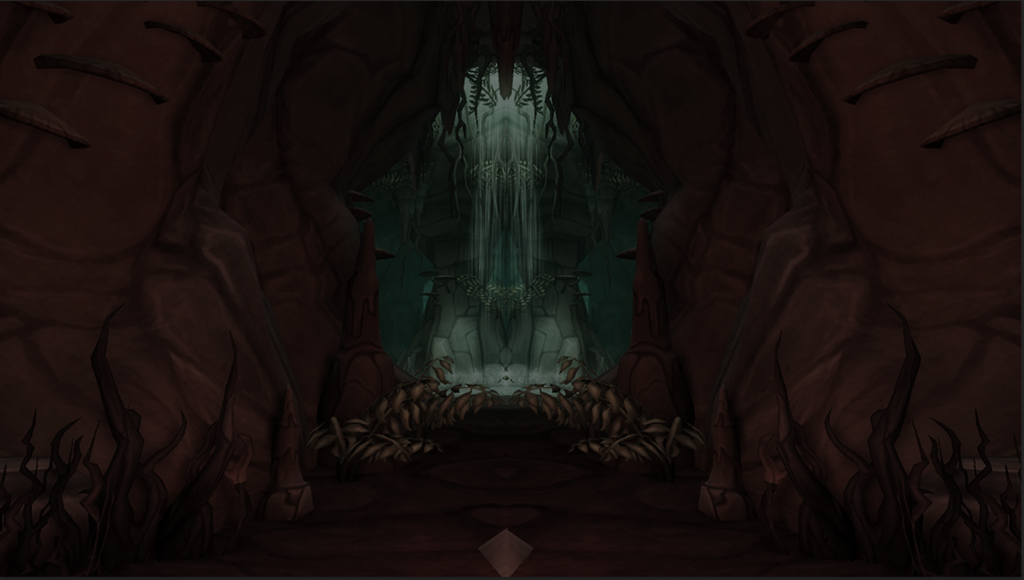
This the 1st edit I came up with, with the help of my digital designer Paul Holmes. To get this edit I showed Paul the artwork I researched on a previous page on my digital space, through this I told him I wanted my picture have a dark tone and sinister appearance much like the images I had researched. After giving him this information he turned down the vibrance of the image and altered the hue and saturation of the artwork, this gave the image a dark and sinister tone due to the darkened colour palette of the image. This greatly reflected upon the theme and style of the music I had composed for my project and the level design of the game in general, therefore I was happy with this change to the image. However the colour scheme was now too dark and made it too difficult to make out details within the image. Therefore I asked him if he could make it a little bit brighter so that the details within the image are easier to make out, however I would still like the image to maintain a sinister atmosphere. This lead to my second edit where Paul turned up the saturation of the image a slight amount to just make the image clearer to see, giving the artwork more clarity furthermore making it look more professional and aesthetically pleasing.
From the original image I also told Paul that I did not like the pots on the left of the image as they looked very low quality and untextured. After receiving this information Paul mirrored the right side of the image and layered it on top of where the pots where. This was very successful as it did not only remove this pots from the image but also made the cave look more scary by giving it a more narrow and claustrophobic look.
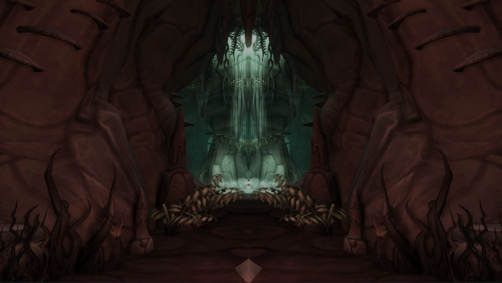
This is the final thumbnail edit for my YouTube video release, I am happy with this artwork as it accurately captures the mood and feel of the video game level and music I have been composing over the course of this project. It also has a simple polygraphic art style which resembles that of the Wwise Adventure Game, furthermore I believe this artwork perfectly blends with the aesthetic of the ‘Wwise Adventure Game’. Initially I planned on having a character holding a torch and peering into the cave in my artwork, I was inspired to do this by the Elden Ring artwork I researched on a previous page. However later in developing this image I decided it would take too long photoshop a character into this image too a high quality, this time could be better spent improving my composition and writing up my written work. Therefore I decided not to include this character within the final design, as viewers would only be looking at the thumbnail for a couple of seconds. Therefore I did not believe it needed to be very intricate, in conclusion I am very happy with my design. However to improve my artwork I would have began developing my design 1 to 2 weeks earlier as this would help me include more details within my artwork such as the character holding a torch. This upload has been semi-successful in terms of promotion, this is because I have reached 20 views which is hard on YouTube as you fit into the algorithm of people’s pages online. One reason this was less successful is because the video has a like to view ratio of 1:20, this means that 19 people that have watched it did not like the video. This means they might not have likes the music due to their different musical interest, therefore in future I will use more specific and relevant hashtags to attract a more accurate audience on YouTube.
Syncing to Video
Making a Credits Screen

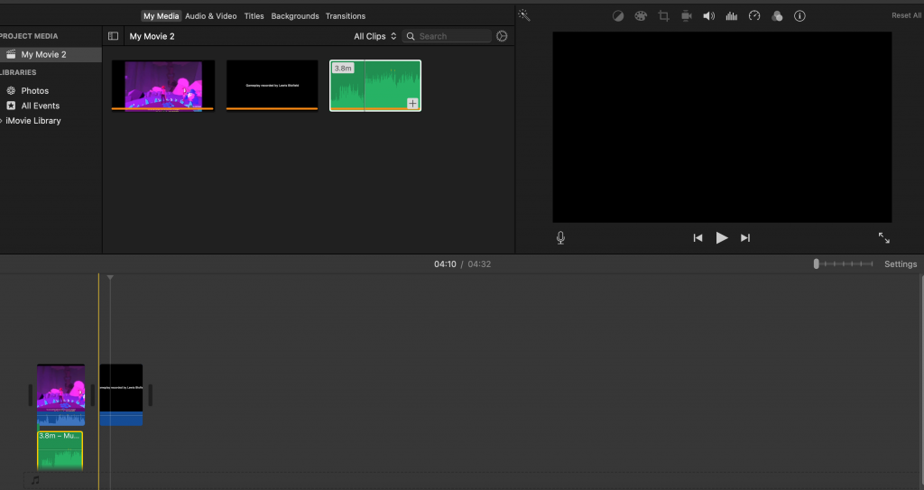
For this project I wanted to have a credits screen at the end of the showcase in order to credit my collaborators and promote my social media accounts. I do not know how to design a credits screen, therefore I got some help from Paul Holmes, a digital artist working at Bradford College. Prior to asking Paul to design the credits screen I put together a cue list on word for allowing him to clearly understand how I wanted the credits list to be arranged. This shows great forward thinking skills and professional standards, as I already knew what I wanted and had prepared a list for him to follow before he commenced work on it. In this credit screen I also decided it was a great opportunity to promote my three main social media accounts, as everyone in the room will be watching the screen. Furthermore this credits screen works very well as it both clearly mentions who was involved and also promotes all my social media platforms. One thing that could be improved in this credits screen was that it says ‘Gameplay recorded by Lewis’ on two separate occasions, this makes the production of the video look very sloppy and unprofessional. Therefore to fix this issue it must either be remade or edited in iMovie cut out the second mention.
Update: Unfortunately after the showcase I gained no new followers on my social media page, meaning this marketing strategy was unsuccessful. However it did appear very organised and professional therefore it was not a waste of time. However if I was to do the showcase again I would also mention my social media account ,as some people in the audience may have not been able to see my social media link behind me due to me standing in front of the projection.
Presenting My Work
YouTube
This is the final form of my composition and its online presentation, as planned I have published this on YouTube for the public to see. I am very happy with how my presentation has turned out as it looks very professional and organised from the eye of the public. One way I believe my project looks well organised is the thumbnail, as the thumbnail summarises the main theme and atmosphere of the level by using a dark colour pallet which reflects on the dark theme of the dungeon. The cave aesthetic of the thumbnail is also made to ressemble the level design in the game, therefore the thumbnail shows great thought and organisation has gone into the project. Another way the presentation looks professional is the successful implementation of the credits screen, crediting everyone involved in the project does not only show professionalism but also great respect to your collaborators. One thing I would do differently if I could get the credits screen developed would be to credit Paul Holmes for helping develop art work for me, as he was a huge help and not crediting him is disrespectful. I also misspelled Lewis’s second name which was revealed to me near the showcase, leaving me to no time to change it. Therefore another thing I would change would be to make sure I know how to spell his name correctly before developing the credits by asking him. The final thing I think went well about this project was the quality of the footage presented, as the footage runs at 30fps in 1080p quality. This provides for a very smooth visual experience for the viewers of this project, furthermore giving the project a professional and organised production quality.

In the description of this project I have described what I have been working on for the last couple of months and also some context about what is going on within the game. I have also showed some gratefulness towards my audience by thanking them for listening and wishing they enjoy the music, this is very polite and can attract people to your music through you likeable persona.

This is some tags I added to my final product on YouTube to make it more likely to reach a larger audience on YouTube, as you can see I have linked it to subjects relevant to my project such as; video game music, music and composer. At the moment of writing this I have not yet reached a large audience, however I am going to push the promotion of this project via social media platforms such as instagram and facebook which may attract more people to this project.
Instagram Reels (Week 8)
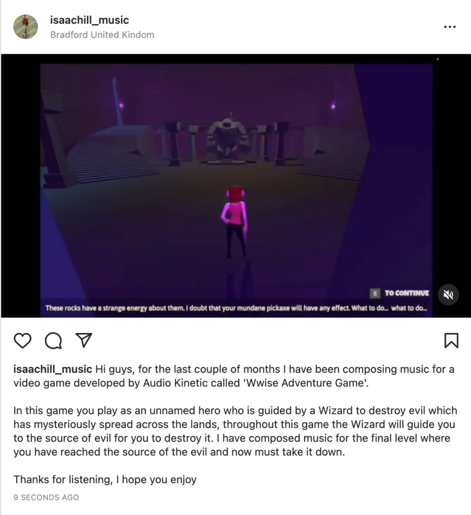
I also have posted my project on my official instagram account making it more accessible for people that do not typically watch YouTube, it also instantly alerts my followers to the post. Therefore making it even more likely to reach a larger audience, another good part about uploading to instagram is that most users operate on a mobile system furthermore allowing to watch my video while on the move.
Update May 27th: This post has had not much interaction after being posted, compared to last years final project this promotion has been less successful. This because at this point in last years project my music has over 90 views, furthermore having only 27 views on my project is today is disappointing. However this was caused by my last second promotion strategies, which have negatively effected my final upload of the project. Therefore if I was to do this again I would promote my project more on instagram with more consistent uploads and direct people from my main account to my music account. This would help me gain more followers on my music account, furthermore giving my music more views and being more successful.
Final Showcase
The final way I presented by work was in the Bradford College Showcase, I have talked more about this presentation on my ‘Week 8’ evaluation page. My performance beings at 00:08:15 in the video below.