As we approach the end of the college year some students may be preparing to go into long term employment within the music industry, therefore we must begin preparing professional forms of promotion and advertisement for ourselves such as CV’s, websites and business cards. Having various amounts of professional material to share with employers and fans looks very organised and shows signs of commitment to your career area. Business cards are very useful as they are very easy to pass around to potential employers and people of interest in person, if someone has hold of one of your business cards it will give them the opportunity to contact you and look around your website or social media, if your social media has all the right information on it of course. Therefore business cards tell people where they can contact you and can also direct them to your website if the link is present on the card. Before I begin designing my own card I will research different styles of other music business cards and take inspiration from them.
Research
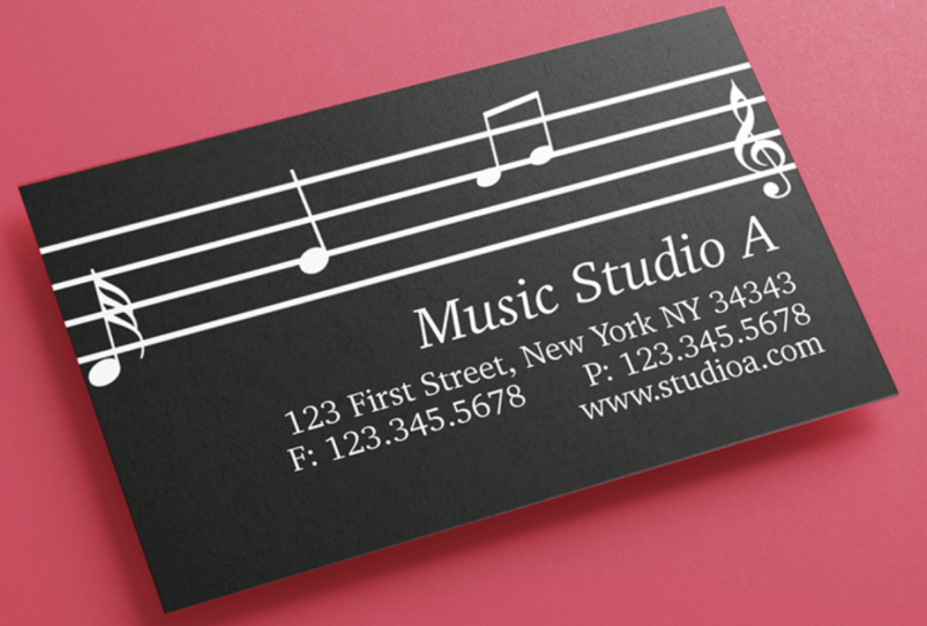
This is one my favourite business cards out of the other designs I have picked out, this is because it’s simple design is easy to look at and aesthetically pleasing. If I was to design a business card inspired by this design I would copy the musical notation from a piece of music I like and put it on the card. This would mean the card would be a reflection of my musical taste and personality, which is all what branding is about. I like the inverted colour scheme of the music on this design as it makes the writing and stave lines stand out from the background. It also looks a lot more casual, as white backgrounds are often used on formal business cards.

This business card has a formal design style, meaning it could be used in a more professional musician. This business card has information such as; their name, career, phone number, web address and location. Giving people this information on your business card makes it easy for people to get in contact with the card distributer, it also allows people to view your portfolio through the web address of the business card. In terms of design I do not like this card as it’s colour scheme looks very dull and has a lot of negative space on the picture.

I like this business card due to it’s design contrast of fire and water which looks very cool, this design is however informal meaning in more serious music gigs this card may have a negative impact on your chances of being selected to perform. However the informal design looks fun, which should be a reflection of your personality and music therefore it will attract people who might want a less formal musician.
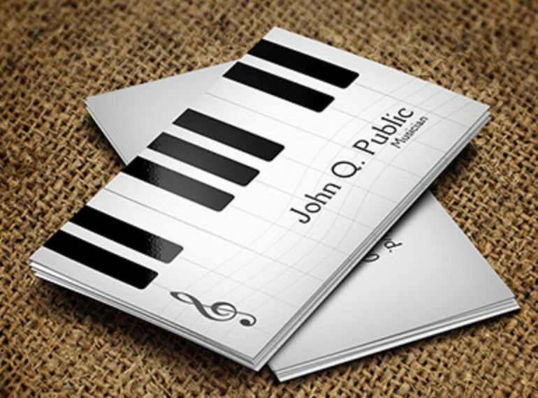
This business card shows an octave on a piano, I think using a business card with a similar design would be useful to me as I am a piano player. Using a design with a piano shows people that you are a piano player, therefore this business card could be used as a reflection of your career or instrumental choice. This card has a simple black and white colour scheme, highlighting the writing on the card making it easier to read.

This card has an informal yet fun and artistic design, this design shows that you are a creative and fun person. Business card designs should be a reflection of your personality and music, this is to let people know what type of musicians you are before listening to your music. A pattern that I have noticed throughout all the business cards I have looked at is that they use to main colours throughout the colour scheme of the cards, these two colours are most often black and white. The background is usually in black whereas the text is in white, this allows the text to stand out very well and is very easy on the eyes for people that are looking at the card.
Designing My Business Cards
85mm- 55mm
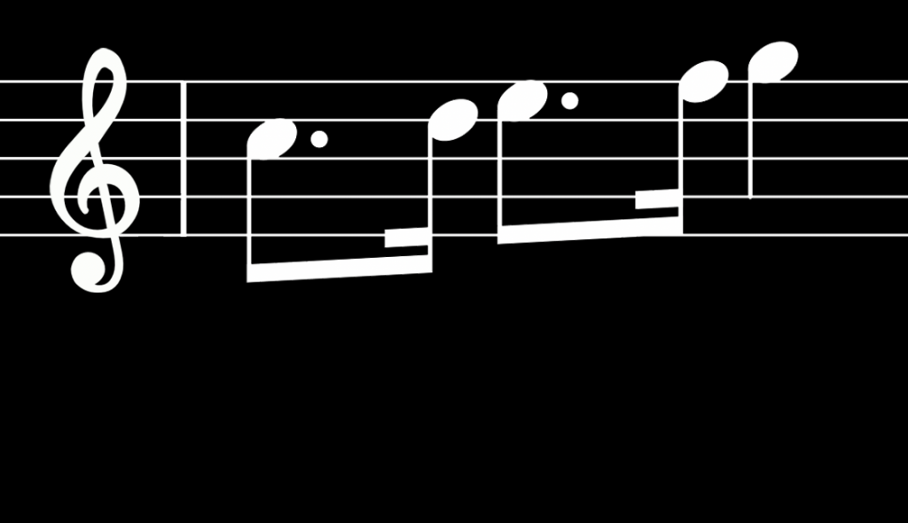
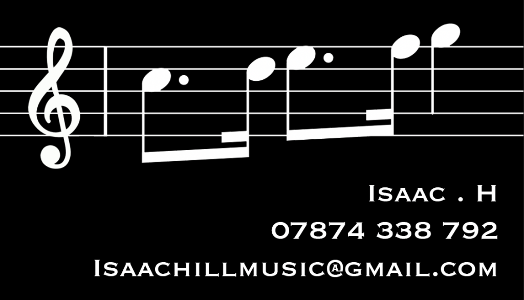
The card above was the main inspiration for my business card design, which I put together on adobe photoshop. To add my interpretation to this business card design I took the second bar of the treble clef within Chopins Nocturne No. 21 in C minor, which is my favourite musical piece on piano. It is important that professional material as a musician greatly reflects who you are as a musician and what music you love to play, this is why I chose to add this piece of music to my business card. To import this bar into photoshop we saved the image from google images and copied it into photoshop, we then deleted all bars in the music except for the treble clef in the second bar of the music. When the second bar was the only piece of music left we enlarged it to fit the scale of the photoshop template, to leave space for the writing we made the staves only take up the space within the upper half of the template. To delete all the space within the stave lines I used the magic wand tool to delete all the white present in the image, after deleting this colour the only thing present on the photoshop project was the black stave lines and sheet music. The next step I took in this design was to create a second layer on photoshop which contained a white background for the sheet music layer to rest on top of, we then inverted the colours within the template to turn all the white to black, and black to white. This created a colour scheme which matched the inspiration design as it inverted the background to black and the sheet music to white
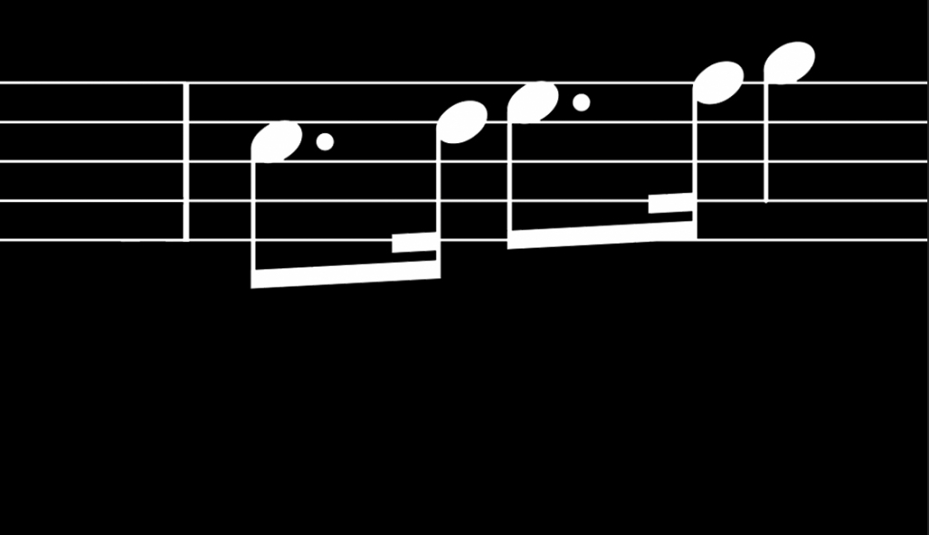
At this point in the design the business card was beginning to look very professional and neat, however there was still some details that needed altering. For example there was still musical notation such as slurs left on top of the bar, this made the design look messy and took up too much space on the card, to delete the slur mark I used the eraser tool on the photoshop tool dropdown menu. Because the sheet music I imported into photoshop was in the second bar meant it was missing the treble clef sign, this is because these symbols always come at the very beginning of the music and not the second bar. I wanted this symbol in my business card as the left side of design had a lot of negative space that needed to be filled as it looked blank, the icon for the treble clef also looks very fancy and nice which was another to why I wanted it in my business card design. When I imported the treble clef into photoshop I had to put in on the top layer so that it was in front of both the stave lines as well as the black background.
After the treble clef was in the design I decided I was happy with the main design element of the business card at that I was ready to move onto adding the contact and personal information on to the business card. Before I began writing down my information I looked back at the design that inspired by business card for a reference of what information was important to put on, after looking at the card I decided I would include all information such as my name, phone number and email however I would leave out my home address as it is not important for the public to know. The card which inspired by own may have used their address of their business office so that clients could meet them in person to deal with important business, as I am only one person and not a record label or company it is not important to tell people my address at the moment. Therefore I only wrote down my name, phone number and email in a basic draft font on the lower half of my business card. I wrote the writing in a big white font that stands out from the background in order to make it easy to read for people who have hold of the card. In future I plan to also add a website address to my own music website on the card to direct people their to check out my past work and online CV, however at the moment I do not have a finished website therefore I can not add it yet. However when I am done with my website I will add the address onto the card and print the business cards off so that I can hand them out to the people that are interested in my music.

Choosing A Font
After finalising my design and adding my contact information onto they card I decided it was time to choose a font for my text in order to make it more professional and give the text more character. Fonts are very important as they showcase what kind of person you are, for example fancy fonts such as Hasley give off a fun look for people looking at your card which can leave various impressions and reactions upon different people. Therefore font choice is very important for a business card, to help me find a font I was happy with I looked around a website called 1001 fonts. This is a website which contains 1001 free fonts which you can safely download and import into photoshop, I looked around this website for a while to try and find at least 3 fonts I was happy with. Below this text you will be able to see the 3 different fonts I picked out and why.

I picked out the typewriter font from the other fonts as it was clear and easy to read, many fonts I had seen where very crazy meaning they had a lot of flicks and fancy curves which made some letter hard to recognise. This font however was very simple and had a formal appearance to it, I believed it was important my business card to have a font in this style so that it looks professional and serious to make people know that I am committed to what I do. I also think it is important that the writing on the card is easy to read so that no one is straining their eyes to try and read a telephone number or a couple of words in a gmail.

The Hasley font stood out to me because of its fancy and fun joint writing style, the design looks informal and fun which may attract people who are looking for a fun new music artist to listen to. It also shows people that I am not too serious though I am committed to the art. One negative to this font style is that it can harder to read than fonts such as typewriter as all the characters are connected via flicks and twirls, this may put some people off of looking at the business card due their dislike of the font.

I liked the Freshmen font because of it’s bold letters and leant over italic style, I personally love the style of italic writing which is one of the main reasons why I picked this font. It is also written in close and bold characters making it easy to read for everyone, this font also looks very formal meaning it will be appropriate use to give to more serious people you would like to give your business card to for example radio hosts, other musicians, record labels ect. Unfortunately the Freshmen font was only a demo, meaning when I imported it into photoshop keys such as punctuation, numbers and a large percentage of the alphabet were not available inside of the font. This meant we could not us this font on the card as it was non functional, to avoid issues like this in the future I should look at the font details below before downloading to see if it is for full access or only a demo trial.
Font Draft 1- Copperplate
This is the first draft I came up with for my business cards, the font style for this card was Copperplate from the Adobe photoshop stock fonts. I chose not to use this font as it looked very boring thick, which did not look great in terms of design. I also wanted to show my creativity through the font style, this font style did not deliver as it looked very formal and bland. Therefore I moved onto designing my next card design to find a better design.
Font Draft- Halsey
This is the second business card font draft I came up with, the main issue I had with this font was that the curvy joint writing was too hard to read and looked very messy. I did not want this font on my card as I believe it does not look very professional and it may give me a bad first impression when handing them out due to it’s messy and hard to read font.
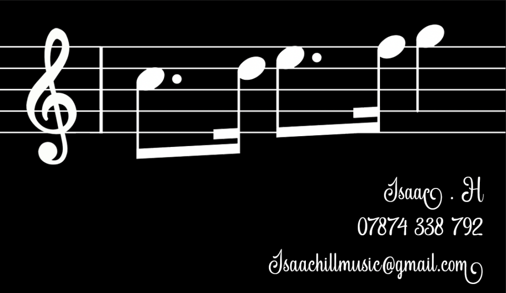
Font Draft and Final Design- American Type Writer

This card design was written in the American Type Writer font off of ‘1000free fonts.com’, this was the final and my favourite business card design. I liked this font due to it’ s neat and organised look along with it’s fancy and fun font style. I preferred this font over Halsey because it is a lot more easy to read than other, in general this font also looked the most professional and organised out of the additional 2 other fonts, therefore this was my final font choice for my design.
Resources
1800businesscards. n.d. Music Business Cards|Business Cards With Musical Themes|1800businesscards. [online] Available at: <https://www.1800businesscards.com/s19/Music/business-cards/designs/> [Accessed 16 December 2021].
1001 Free Fonts. n.d. 1001 Free Fonts | Download 65000 Fonts. [online] Available at: <https://www.1001freefonts.com/> [Accessed 14 December 2021].
BrandBroadwayGifts, n.d. Black Treble Clef. [image] Available at: <https://www.amazon.co.uk/Treble-Glossy-Decoration-Broadway-Gifts/dp/B005M04XUG> [Accessed 14 December 2021].
Gifts for Musicians and Music Lovers. n.d. Music themed business cards. [online] Available at: <https://www.musicgifts4u.com/music-business-cards.html> [Accessed 16 December 2021].
Naldz Graphics. n.d. 20 Fantastic Business Cards For Musicians | Naldz Graphics. [online] Available at: <https://naldzgraphics.net/business-cards-for-musicians/> [Accessed 16 December 2021].
n.d. Nocturne No.21 in C Minor Chopin. [Online] NA: Musescore. Available at: <https://musescore.com/user/29926531/scores/5640231> [Accessed 14 December 2021].
Zazzle. n.d. Music Business Cards. [online] Available at: <https://www.zazzle.co.uk/music_business_cards-240843920221964375> [Accessed 16 December 2021].