Art work has been used in music for many many years, it has been used to illustrate the musical mood and feel of the song or album being published. The art works presentation and content can tell a story or evoke emotion from people that look at it. There are three main styles of music cover art work; Typography, No Typography and Logo art work. Each of these styles can be used differently to convey different messages or draw attention on store shelfs.
Typography
Typography is an art form when the artist arranges the different letters in various ways to make it visual appealing to the eye. A few of the techniques used in typography are; letter spacing, font styles and font sizes. Typography has been used on album covers since the mid 1900’s and is still used hugely today. A few famous examples of typography album covers are; Beatles (number 1), Radio head (In rainbows) and also Daft Punk (Discovery).

I obtained the information on various typography covers from; 30 Typography album covers ideas | album covers, album, music albums (pinterest.co.uk)
No Typography
A no typography album cover is when it features no art forms that resemble typography. Instead the album cover has a image or art work as the cover.NO typography can be used to suggest a message or meaning to those that view it. No typography can be more suggestive than to tell the public what it actually means, this can spark imagination and maybe even draw in listeners. A few forms of No typography album covers are; Metallica (Black), Metallica (Master Of Puppets) and The Beatles (White).

Logo Artwork
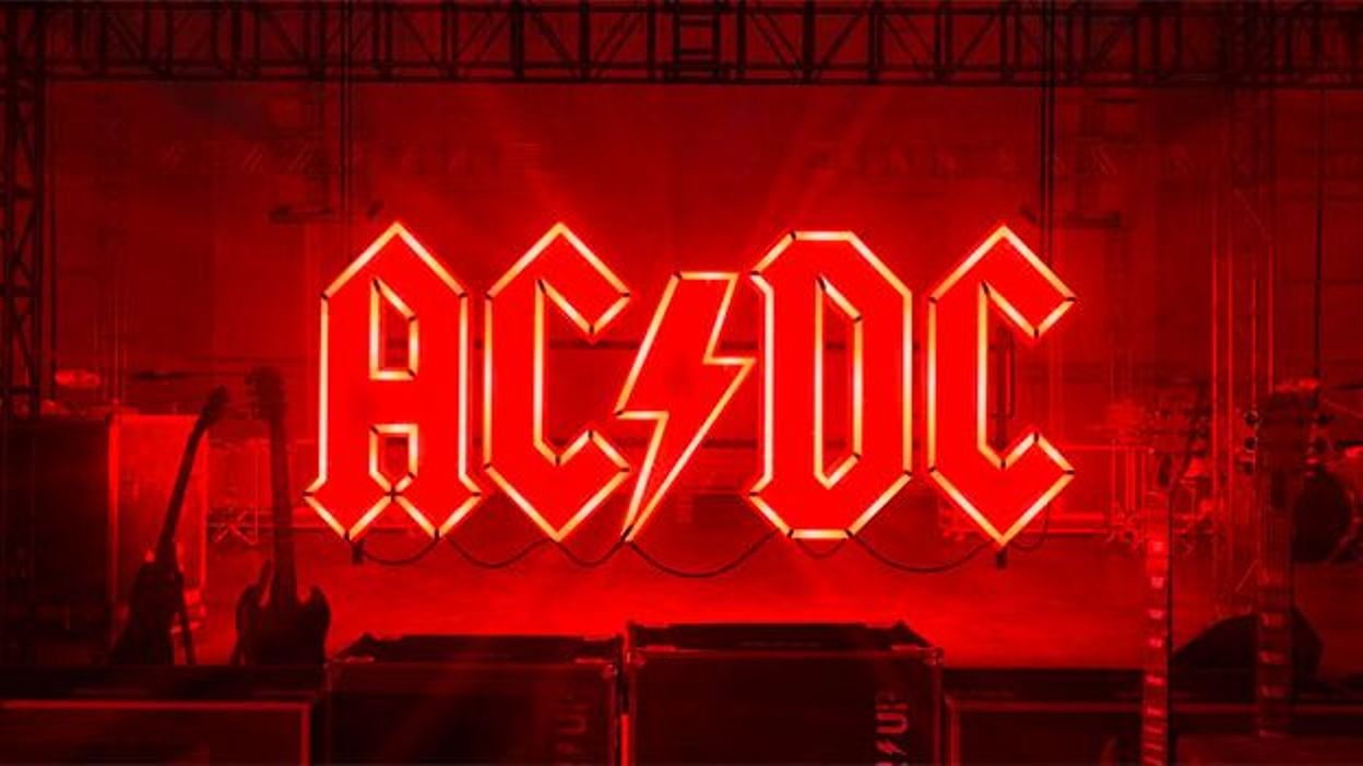
Logo album covers tell less of a story than the other album cover styles I have mentioned. Instead it is used are used a lot to draw in listeners through your reputation or fame. Logo artwork is also used when artists debut, to introduce themselves to the world. This is a really good way to give your self an image through your cover, and tell people what you are like through your logo. A your logo will most likely be a reflection of you or your music, after somebody sees your logo they may be interested in purchasing some of your music. Some examples of logo album covers are; Nirvana (Nirvana) and AC/DC (power up)

More Examples Of Music Artwork
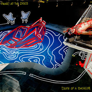
Panic at the disco released the album ‘Death of the Bachelor’ in 2015, the album usually talks about chaotic scenes and events. These include talking about murder, drugs and other things that resemble chaos. The album cover shows a pool area that has been marked out like a crime scene, as there is what is to be assumed a dead body on the floor that has a red chalk outline on the body. The scene on the album cover is also used in the music video for the song ‘ Don’t threaten me with a good time’. The cover references the elements it talks about in the album which is death, drugs and parties.
Whitney Houston’s debut album ‘Whitney Houston’ is named after herself. And the cover is also just a photo of her. So it is safe to assume the album was to let the world know who she is by introducing herself to the world. Another album with a similar link to this is a new album by Juice Wrld ‘Legends never die’ in 2020. The album cover is Juice Wrld standing in front of a nice scenic background of a rising sun. This to pay tribute to Juice Wrld as he sadly passed away previous to the release of this album. The album was made from his unreleased songs that he didn’t publish. Having the album cover as his face will attract buyers as they will know it is one of his albums upon first glance

Logos
AC/DC is a rock band that is are very well known world wide. There name actually stands for alternate current, direct current this is a term used in the science of electricity and energy. The ‘/’ in there band name is replaced with a lightning bolt to symbolise electricity which is a reflection of their name. Metallica is also a metal band that is well known. There logo is written in a shade of grey that resembles steel, this resembles the word ‘metal’ that belongs to the genre. The points on the end of the logos letters are also sharp, which also reflects on the bands sharp sounds they use in their music.
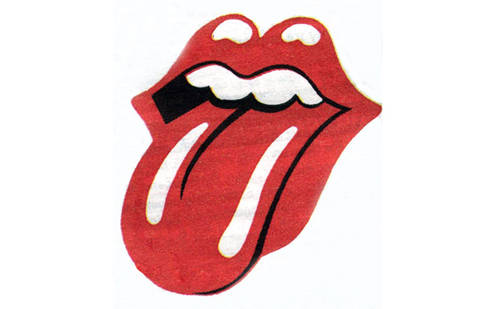
The rolling stones logo is actually very interesting in it’s deeper meaning. Their logo is a mouth with it’s tongue sticking out, this represents the mouth of the Hindu goddess Kali, Kali represents an anti-authoritarian attitude. The rock band ‘guns n’ roses’ logo is designed in the style of a biker jacket fashion design as many bikers have circular designs on their back. The logo also has 2 guns facing away from each other, these represent violence and crime. It also has 2 roses which are often shown as a sign of respect or peace. They are also used a lot to respect those who have passed away.

Posters
:format(jpeg):mode_rgb():quality(40)/discogs-images/R-9569967-1534806839-5507.jpeg.jpg)
This is a poster from George Michael’s Faith Live tour 1988. The image shows A picture of George Michael and the name of the tour and some details such as location and date. This gives buyers an insight into their purchase details so they can see if they want to but it. The poster has writing in multiple language’s along the left hand side, this is because it is a world tour and has to be accessible globally.

This is a BTS poster from one of their recent tours named ‘maps of the soul’. The poster design it self shows the band standing in a shallow stretch of water, which is set to bring peace and links to the soul and meditation. The poster also shows time and location details of the country tour so that people may but tickets to see it. This is a good poster as it gives everyone the essential details of the tour venues.

This is a poster from Kiss’s Houston Summit Concert, the rock band are posing in almost comic action poses and show everyone good energy that will want to get people to see the perform. This is a good poster for advertisement as it had pin point location on where it is. It even displays the entry fee and the time it is held at. They even reference a special guest, which will draw in an even bigger audience.
