the pentagon themes moodboard by Bailey,Jack and Elora
i have used screenshots and websites as part of my research for this word document and have also sent an email to the company behind the product so i can further my current research.
so in this document i show some early ideas for what i wanted to do with my advert and also made a rough script for my advert although the script was not used for the final version as i had completely changed it all
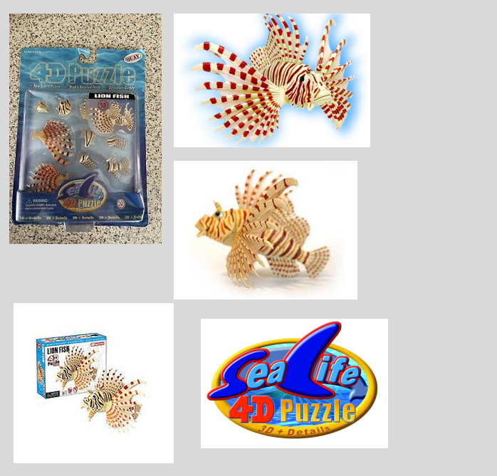
here is a small mindmap of what the product looks like in and out of the box it only has five images and i used figma to create this
decided to have a look at fan made adverts so i can use as inspiration for when it comes for me to film and edit my advert.
here is a small word document describing about what video sizes are and also about the resolution which people use for the highest quality to show their product in the adverts
this document tells you about reception theory in both books and tv even how it is used in film even to this day.
here is the pre production document that I have used to look to document what shots i used for my adverts some have not been documented but a majority of the shots I have documented.
On the mindmap it shows certain ideas but unfortunately you cant really see it but what it does show is the manufacturer , what it can and cant do ,unusual things other things it shows the cost and plenty of other things
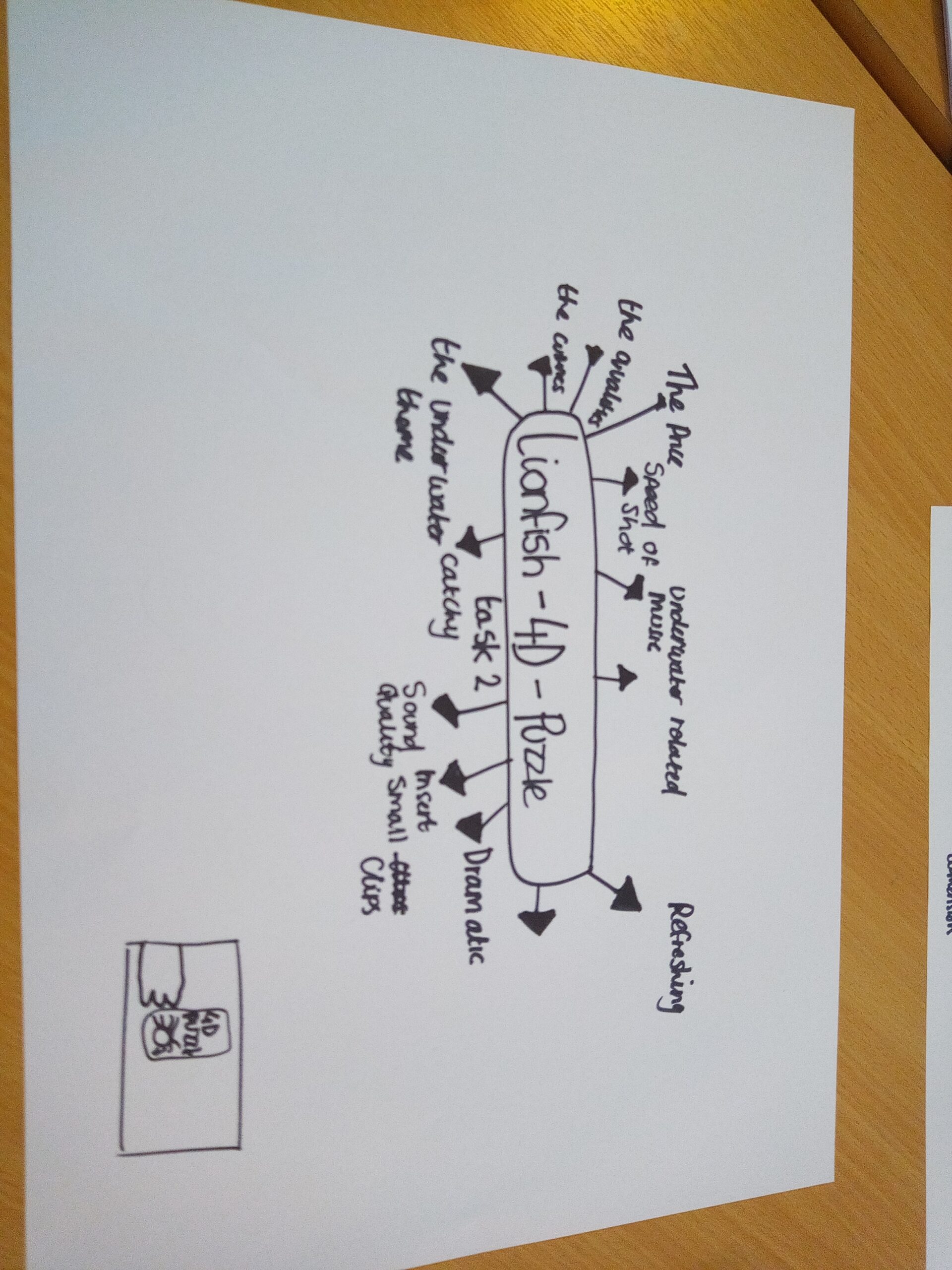
so in task 2 this explains
so the script ive made is going to have me say the words that are already on screen im doing a voiceover for the people who struggle to see and the words are for people who cannot hear
this is the first version of the advert I created for this version the advert had some text errors , the text was too small some of the text was all in capital letters and the video was a bit out of frame I updated the advert with the versions below
this is the second version I made some changes to the text adding a few extra words and removing the capital letters from the advert although the text was still small and there were some rough cuts and i also changed the colour of most of the text with it mostly having a blue text which is visible and i also added an orange drop shadow to make it more stand out. I have made more changes with the advert below.
For this version i made some changes firstly I added a sliding motion in the text so the text would slide across and appear before sliding away to show the next scene and i also added a film dissolve so every time after a scene completes it would dissolve slowly ready to show the next scene. Both of these appear frequently and this version of the adverts makes major improvements compared to the two above it with a variety of changes added to make the advert stand out in a way and I also made the text more readable and easier to understand.
FINAL VERSION – below is the final advert that ive made
Below is my final advert in which I will go into a bit more detail alongside the other versions of the advert in a word document examining and explaining each advert in detail and what changes i made to create the final version seen below.
here is a detailed overview of my advert i went into details into the edits of the final advert and also compared the final version to the first version and how i improved on things compared to the first version that i made.
here is my evaluation for this project i really found it quite fun and would certainly do this project all over again if it was a different product