Since this project gave me the option to choose my own theme I have decided to choose to use the nine tailed fox spirit/kitsune in my work
Research
https://www.mybib.com/b/B9NZxL
project proposal
Artist research
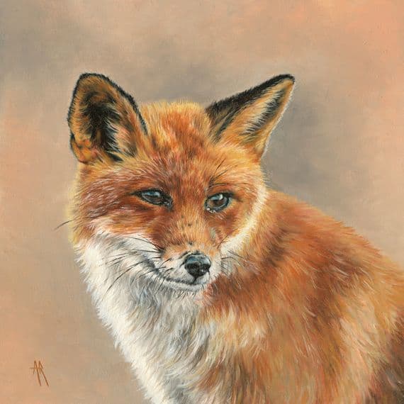
The first artist I’m researching is Anna Reed. Anna reed is an oil painter that talks about how she uses deliberate strokes her painting. what like about this painting is the use of the warm colours and how the fox. is perfectly captured, each brush strokes shows the individual fur strands. the painting honestly is calming to look at. Anna Reed named the painting Felix because it perfectly captures the fox.

This is the artists transcription I made using water colour paint. What I don’t like about it is how unproportional the fox is. While making this, I had a very difficult time. Because I am not used to doing watercolour at all. My specialist practice is graphic designed. So I’m not very good when it comes to using a watercolour paint at all. But I feel like it was a learning experience.
What I could improve on is the colours and the proportions of the fox. I personally think the ears are very small. And the faces very funny. But otherwise so that I think it’s good, but there’s still more room more improvement.
The second artist I’m researching is Ben Heine. Ben Heine is a visual artist that creates drawings of the his photos and adds his own spin to it adding life to it. he is best known for Camera vs Pencil. Ben Heine’s work below is a fictional drawn sketch of the x-ray of a hand.
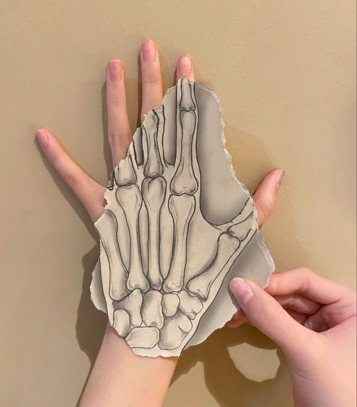
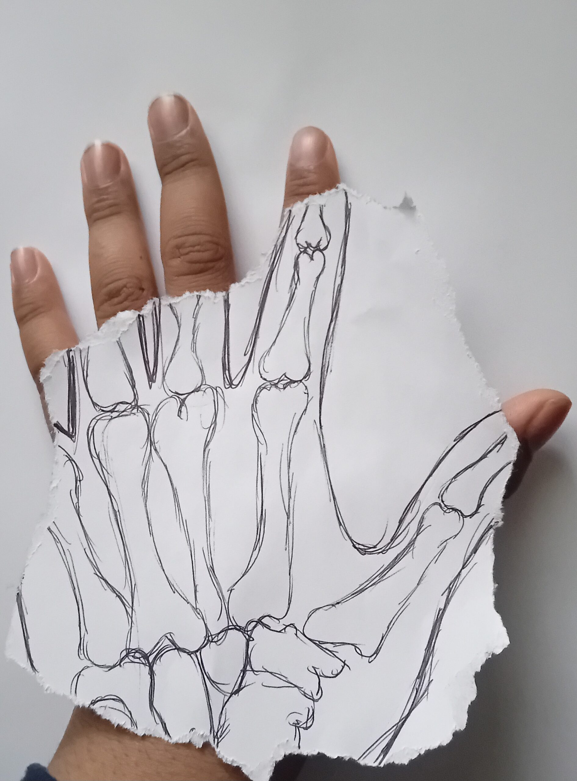
With this one I attempted replecate Ben Heines work But I think I Failed when making this. While making this, I noticed a few things. For an example, the bones want to write the right proportions. I messed up because they didn’t have a pencil to rub it out and I use the pen instead. And a ripped most of the paper off which doesn’t show much detail on what I was trying to do. But otherwise so that I think it came much very good, even with the The idea I had while making this.
mobius strip photoshop work

The above is the first mobius strip I did. Personally, with this one I think it kind of Failed in my opinion. The reason being is because most of the faces have clipped out while making it the dimensions of the actual page for photoshop kind of cut parts of the face off.

With this one, the reason why I like it is because Because I put on different saturation settings hue settings and I Because I put on Different saturation settings. Hue settings and I And I do pluckade the same fox head but put different screens with different colours on. Personally, I have no complaints with this but the one thing I don’t Like about this process. Is that I am very limited with what I have on photoshop.
Spontaneous ink/paint drawing.
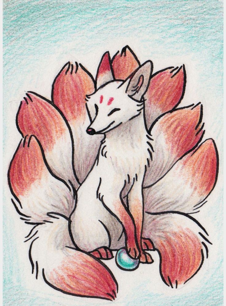
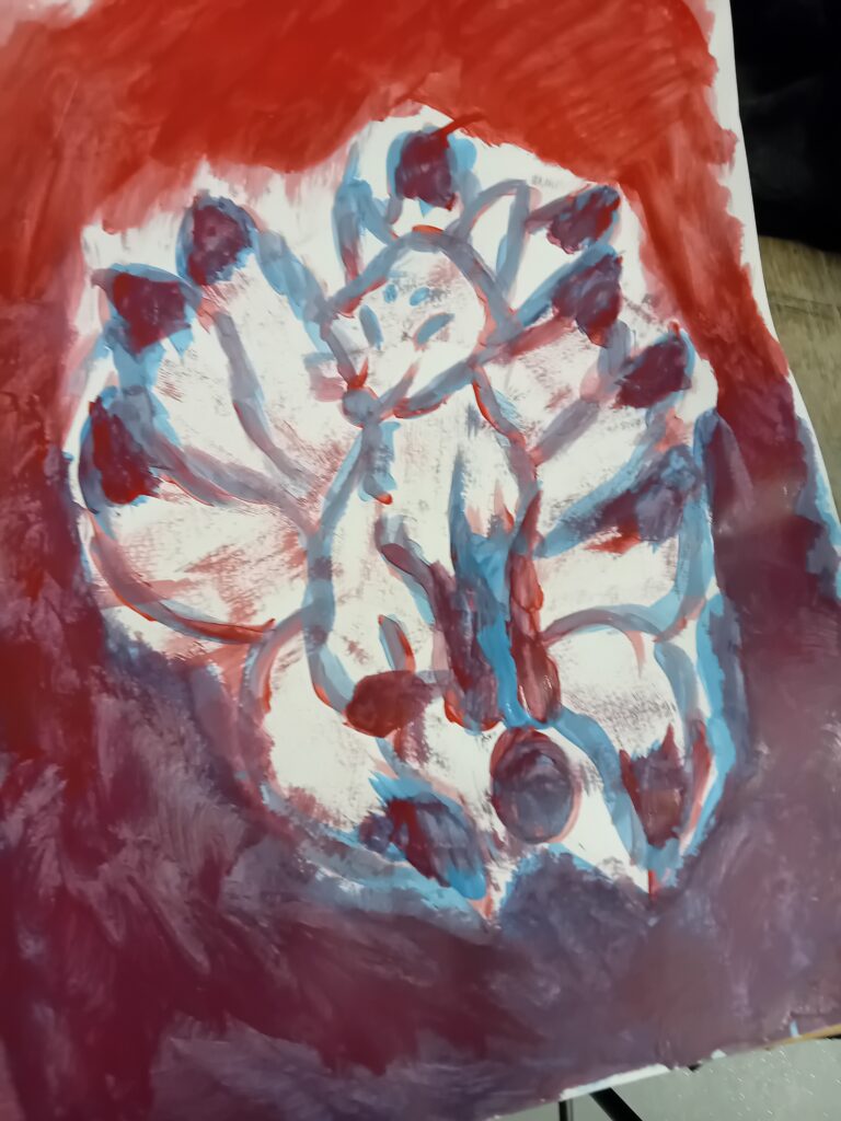
This painting was an inspiration from the image above. I made this during a workshop and the task was to quickly paint the chosen image without trying to make it look perfect. The one thing I could improve was was the front legs it looked very weird to me, it didn’t actually look like legs. Another thing is I should have changed the background colour I don’t really like how it looks I should of done blue instead. But overall for me since I painted it quickly I think it came out pretty well.
I created the painting using acrylic paint and I quickly sketch out the kitsune fox while I was barley holding the brush and I mixed both red and blue for the background.
With this one, This was a Quick sketch i.e. Quick painting session that we did during one of the workshops. What I lacked about this was how quick I had to do it and I think it came out pretty good because I wasn’t thinking about anything at the time And I didn’t want to make it perfect. So that’s why I liked this process a lot.
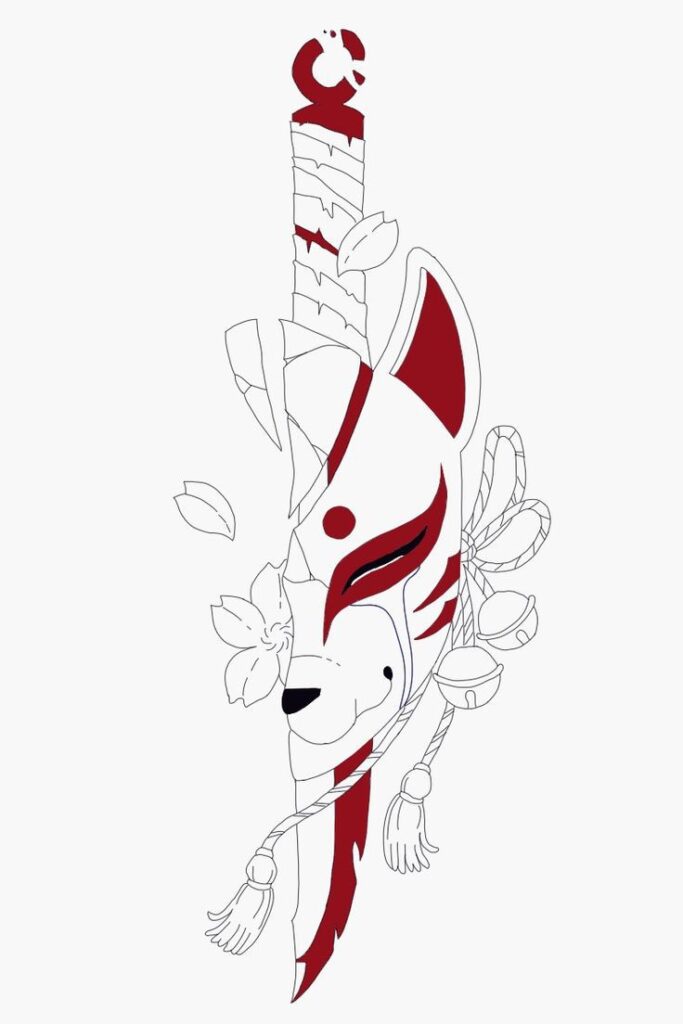
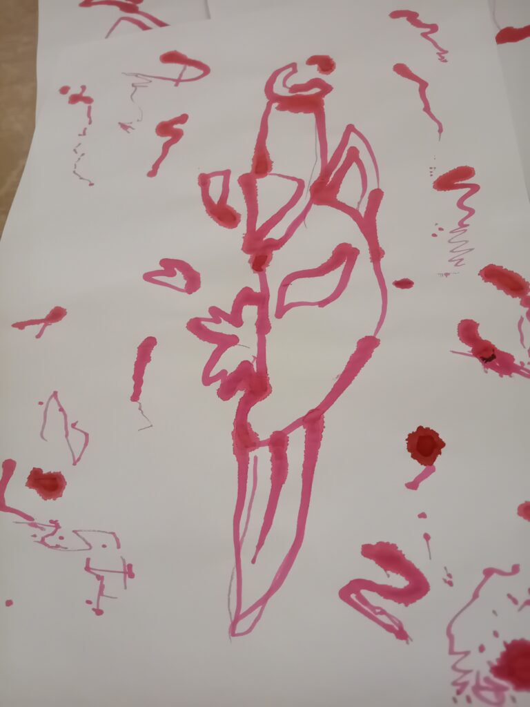
This was also an inspiration from the image above in this I used ink using the back end of a spoon, using my less dominant hand and adding some mark making to the paper. What I enjoyed about this was that I had to also draw the quickly and the result turned out pretty good I honestly have nothing bad to say about this piece. The image below was a quick sketch recreation that I was going to use for screen printing but I didn’t like the outcome so I scrapped it and chose another image instead.
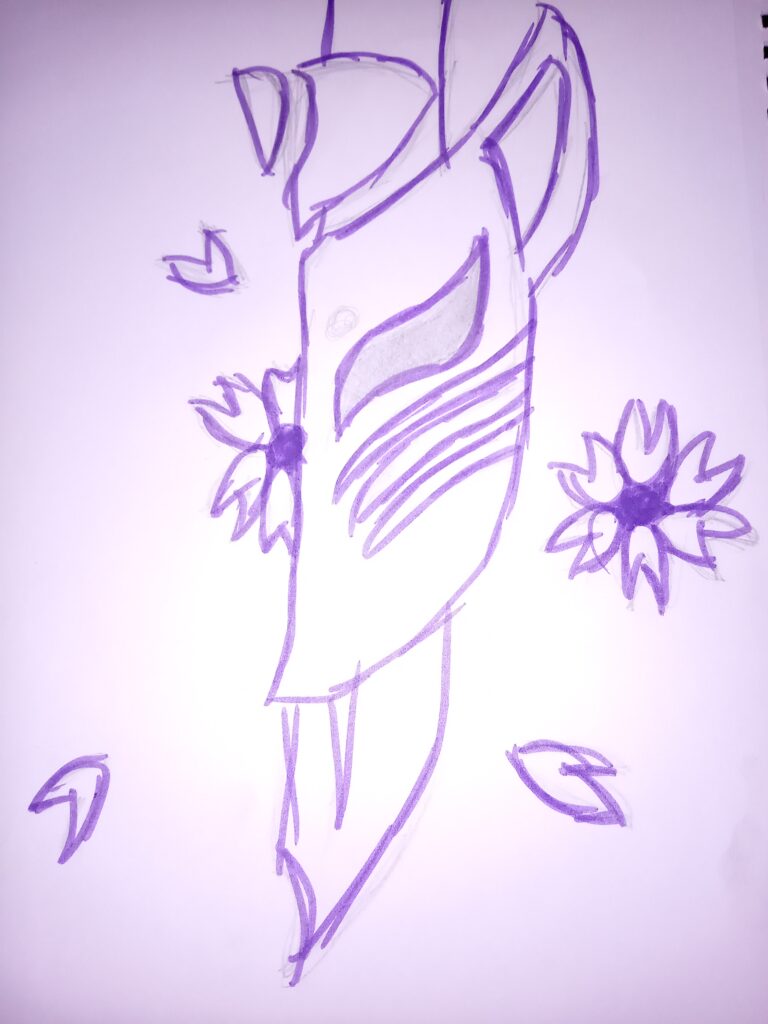
This was recreation of an previous piece of work I did and I decided to add some a bit more features on this than the other one. But ultimately I decided to scrap this when I was going to use it for screen printing because I didn’t really like how it looked so I chose another piece of work instead.
primary research
Primay photos

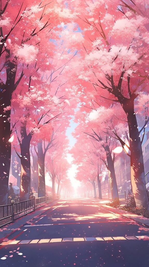
I took this photo while waiting outside of college for the coach. I personally really liked the photo and how the sun was shining on that day.Which made the photo look even better and how though I personally really liked the photo and how the sun was shining on that day. Which made the photo look even better and The cherry blossoms gave us full colour during the The Cherry Blossoms gave us full colour during that time. I personally think that when looking at this photo it relaxes. You keeps you calm and you could enjoy just Looking at the tree and admiring it.
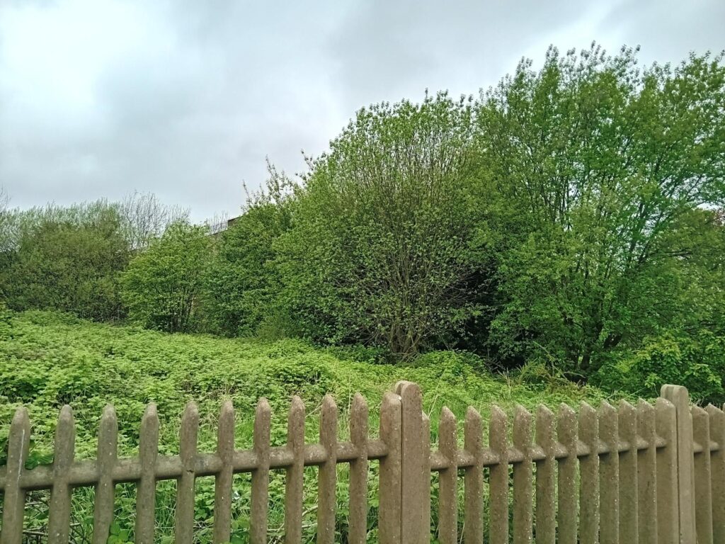
I took this photo on my way back from the shop. And I enjoy the scenery of this photo and how the Bushes and trees go together very well. I know this part of the area very well because it was known to have rubbish and a lot of stuff here. Before the rubbish came about, there was horses there. And the horses were very calm peaceful to look at.
I’m hoping I can use both images above in my final piece because I think it would make my final piece look very good. What I’m hoping to do with these 2 images. Is use them as a silhouette and Use them as a puzzle to put them together to make the fox or the kitsune.
Fox creation ideas
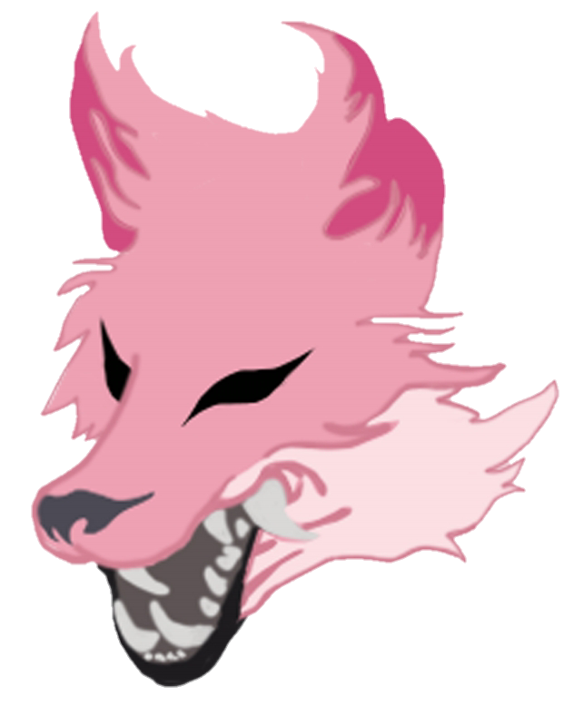
I made the fox design on an editing software called Adobe photoshop.
This animal head is supposed to look like a fox head the reason why it is pink is because I wanted to centre a cherry blossom colour scheme. I I got the idea from looking around on pintrest and I used the image below as a colour palette.
Origianlly the fox head was a design that I was going to use for the Möbius strip task but I really like the design of it and I decided to use it for screen printing
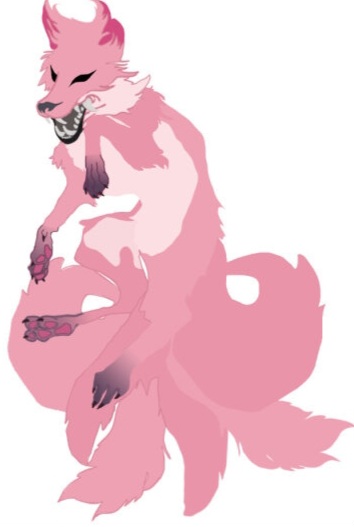
Im this part I made this rest of the body and I really had a really hard time with the paws because I was struggling with the design. And the idea I had for the tails designs were to complicated so I decided to scrap it and I decided to copy, paste and recolour each tail so it doesn’t look like it’s conjoined.
I decided to recolour different body parts so the fox would become more colourful
Things that i’m unhappy with in my work.
●The tails I think need more work colouring and actually making different tail shapes
●The head I think maybe be too big so I should scale it down.
●I definitely think I should change the design of the paws for the fox.
Things I’m happy with my work
●I like how different body parts of the fox came out. I personally think that the proptions are on point.
●I like the how I coloured the different body parts and I’ve wanted to make sure that the fox didn’t look plain.
While making the rest of the body, it was a tedious task because I was learning new things while trying to figure out how to make certain parts of the fox. So I had to go on the internet. And figure out how I would make them. I had a very hard time but at the I managed to figure out how to make it.
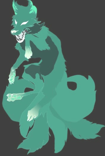
This image is the same the other image but it is inverted.
In my opinion I think the negative version of the pink fox looks way better because this reminds me of a ghost and a goal and I think that this could be further improvements with the math the teeth and other stuff In my opinion, I think the negative version of the pink fox looks way better because this reminds me of a ghost and a goal and I think that this could be further improvements with the mouth and teeth
I personally like this because when looking at it gives me a ghostly/spirt feel and it definitely looks like it could be in a horror movie haunting people. I definitely like this image a lot and I think I could use the colour palette in my final piece.
the one thing I don’t like Is how the mouth, teeth and eyes are coloured.
what I think I could do is re colour the eyes back to black or a different colour entirely. And revert the mouth and nose back to the original colour.
Primary research plans
I planning to use the pictures of a dog I photographed and sketch him out. Then I’m wanted to sketch him as a fox on Photo shop. Once this is done I’m wanting to make different versions of it in different colours and tones.
Collaborative work
The idea of this creatures existence
The creature is a fusion of a pigeon and a kitsune. The “figeon” as it is named is holding bread with eats beak and has a floating orb next to it. It’s body is made up of fox body with feet as well, pigeon wings, pigeon tail, fox ears, huge eyes and nine fox tails. It is quite an odd creature.
This was collaborative piece with another student and they gave me the idea of making this
I really enjoyed doing this collaborative piece because It came out goofy, but I really like how it came out. Personally, I don’t think I would change anything about this at all. I think I would keep it the same way. But at the same time, my kind of fight it very creepy because of the eyes and how big they are. When looking at it, it looks like it’s staring into your soul.
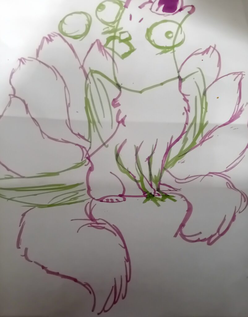
Starting off this piece of work collaborative between I and another student. And I enjoyed making the creature a lot .
When making this, we had to fold the piece of paper many times and enjoy parts of our chosen image onto it. That’s why it’s got different parts of the body there. We messed up on the legs because I was drawing legs and I didn’t like the front legs so I had my friend. To redraw over it. That’s why it has 4 different legs. It was not intentional. I messed up there, but otherwise to that I think it came out pretty well.
The process:
Me and my friend took a piece of paper and folded it. Then we drew different parts of a pigeon and a kitsune fox using green and purple highlighters. While making this we made a few mistakes but overall I’m happy with the results. The purple parts of the drawing are mine We both used retrench images we found to make the drawing.
Things I’m happy with this work
●Firstly I like how the tails came out even though it was a quick sketch. It looks the tail was fluffed up and I also like how there isn’t much detail in it.
These are variants of the collaborative piece but In different filters.
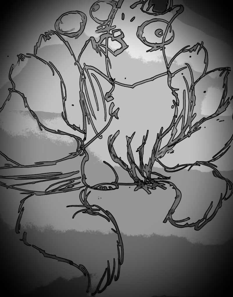
With this variant it looks like an old photo taken of a camera or an old drawing that was found. But with the filter it doesn’t show as much detail as the coloured ones have.
With this variant I personally like this one more than the first image. Even though its inverted the colours are brighter and better looking than the original image. It reminds me of a neon sign that are found on the front of shops.
I like this variant a lot to because. It really brings out the green and the purple of the image And personified them. I think personally, the black background Makes a look better in my opinion.
Screen printing
In this workshop I did screen prints of the fox image I re-drew using markers.
The process
●I got my fox image off photoshop then I printed it off
●Then I re-drew my work my on acetate. Turning it into a repeating pattern
●I found out it was to dark so I had to re-draw over it to make the lines darker. Because it would make the foxes hard to see when on the screen.
●Then tape my acetate on a screen then I placed it into the machine that vacuum seals it and a uv light burns the image on onto the screen.
● I grabbed my screen and some ink and again I taped down my my acitate sheet to the screen to prevent moving.
●Then I made sure there were no holes in the screen by taping them up to prevent and imperfections in the screen print.
●(Make sure to iron your fabric if it has creases because when it’s being printed the creases will show on your print causing it to mess up your work)
●I picked the purple ink because to see if it would show on the paper, the cloth was a dark blue shade.
●I used a squeegee to swipe the ink down the screen to make the screen in the 2nd picture below.
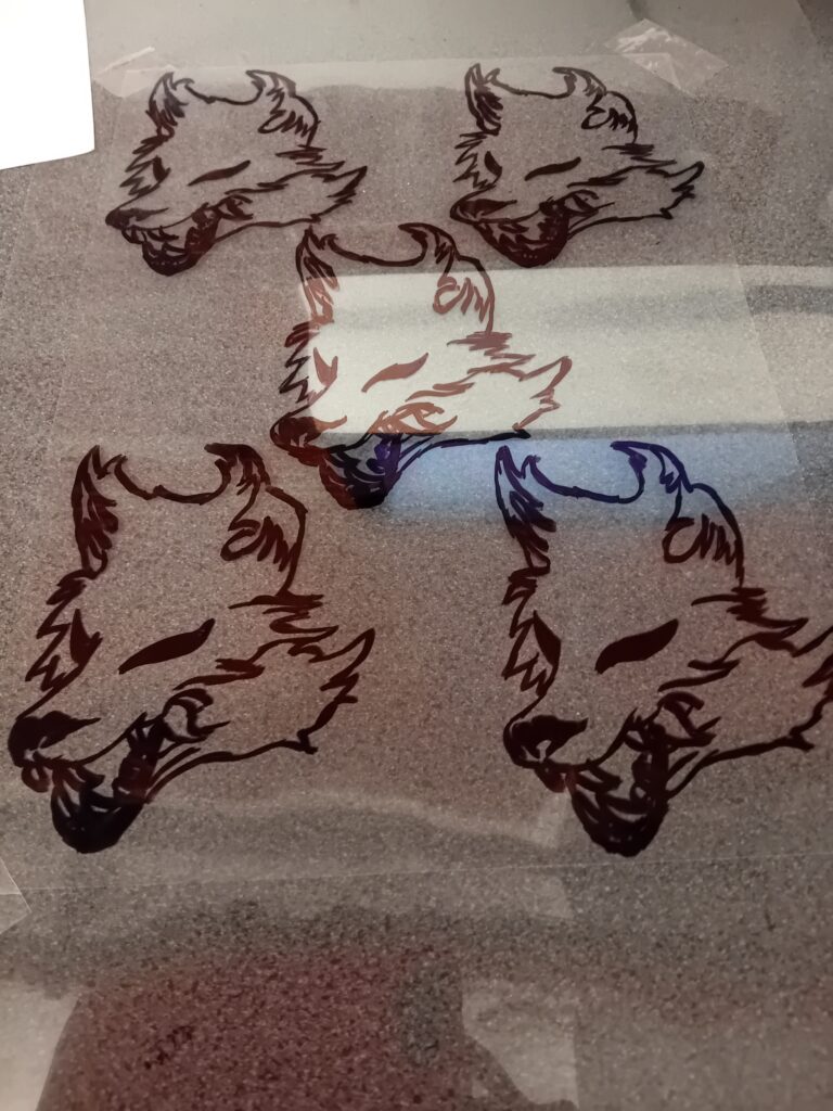

This is the screen print that I made during a workshop. I admit the process was long it was quite enjoyable. The original ink colour is purple when dried it looked like a dark pink. I personally really like how this print came out and it has not imperfections or printing errors
Things I like about my work
●The first thing a like about my print is the scrap fabric I chose. It has a very nice texture when holding it.
The second thing I liked is the print. There were no printing errors or mistakes what so ever and the designs genuinely looked good.
What I disliked about my work
●The only thing I disliked about my work was how the teeth was barley drawn properly because of the marker have a huge tip
●Learning from this I could draw the designs again with a sharpie or a marker with a thinner tip. And add extra detail.
I might do something like this again I really enjoyed this workshop.
Photoshop
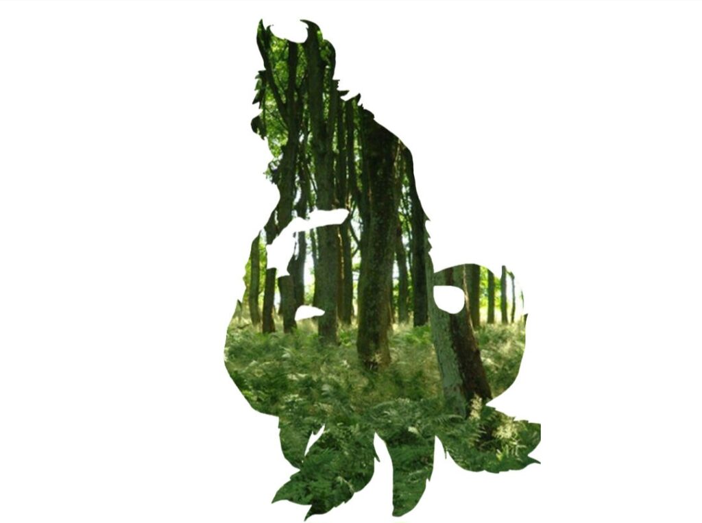
When I made this work it was completely by accident but I liked how it came out. What happened was/outlined the image using the polygonal tool then I used the frame tool and click on highlight the entire image. Then I removed the background showing a silhouette. Then I got my image and then overlapped it with the silhouette creating the image above. The silhouette is the fox that I made a long time ago on photoshop, I was testing out different functions and learning new things about the app
I decided to create another using the silhouette of the a dog a photographed but instead of one picture I used multiple
When making this , I was researching on what animals looked the closest of foxes and I came across the dogs so I decided to do Use the images. I photographed of the dog to make. This was a test but personally I think it came out very good. There is a few flaws, But I think you came out pretty well.
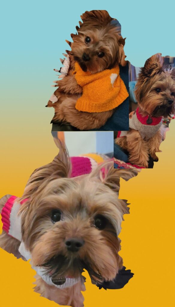
The I used to photograph is called Samson I babysat him with a friend and I wanted to take pictures of samson in different outfits.
Since I was testing things out I was not expecting it to look so good. But at the same time I didn’t like the background gradient I felt like I could have done different colours instead of the yellow and blue.
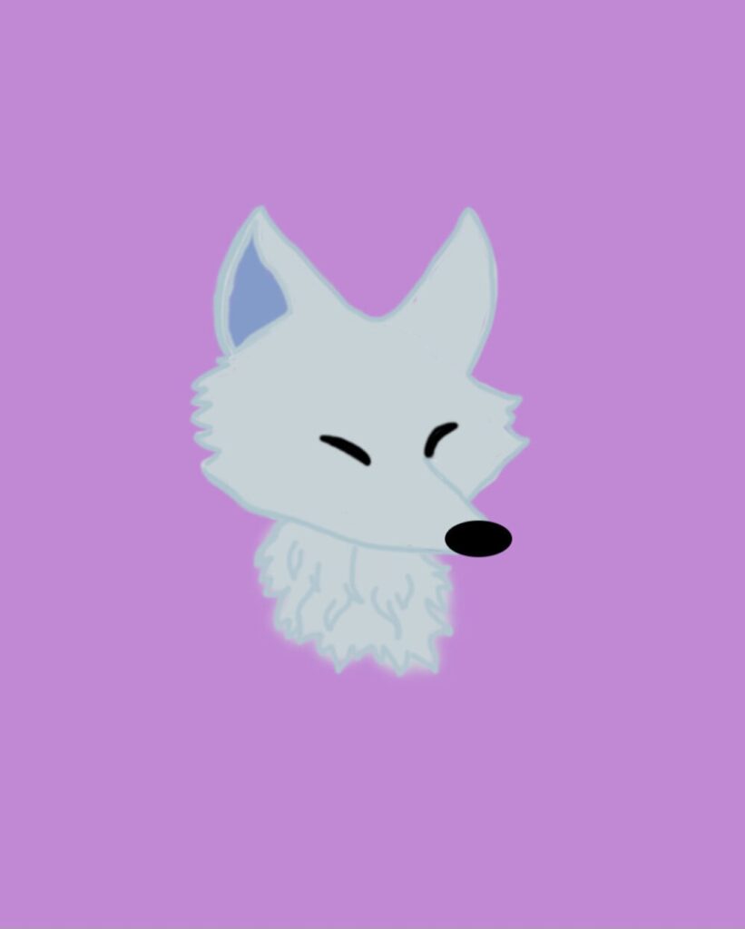
This fox was a re drawn version. I didn’t like the original and so decided scrap it and drew it again. I prefer this one because it doesn’t look like a rough sketch and actually looks good. I think the one problem I have with this is how the lines in this piece and really drawn straight. At the time my hands were shaking a lot and I had a lot of trouble drawing this to avoid this next time I could train myself to learn to draw straighter lines.
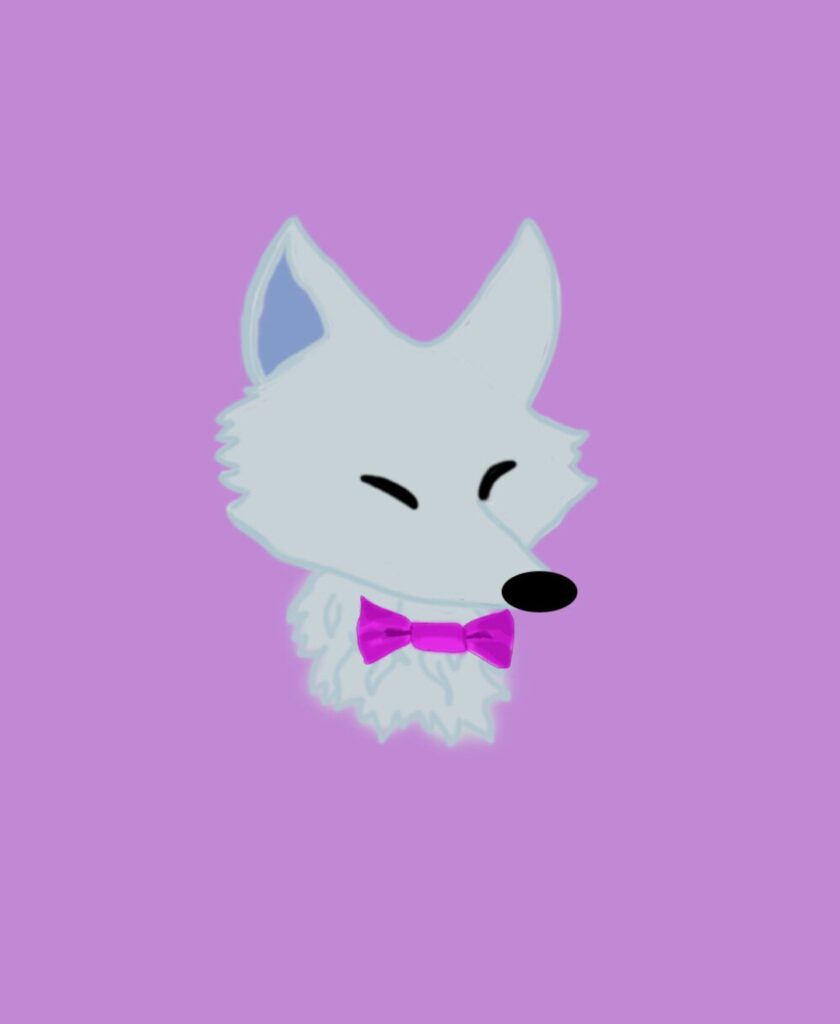
This is the bow tie version. I had no reason to add this whatsoever but I like the idea of it so I decided to create one.
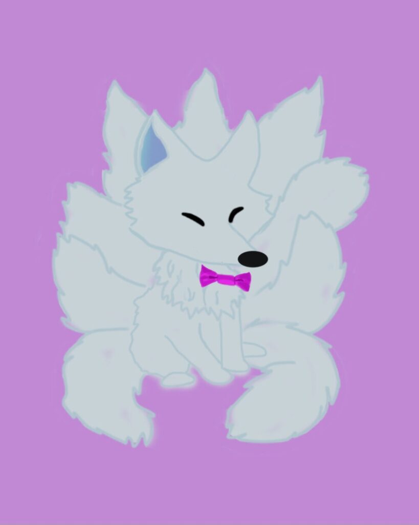
This is the whole body I had the most trouble making the rest of the body I couldn’t figure out how to make it so I found an image that I could use to make the body and the tails . Another thing is the tails being un even and how parts of the tail have patches. For some reason photoshop wasn’t responding and I had a very hard time.
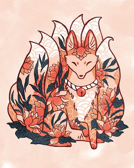
This image was used a reference and an inspiration for my final piece
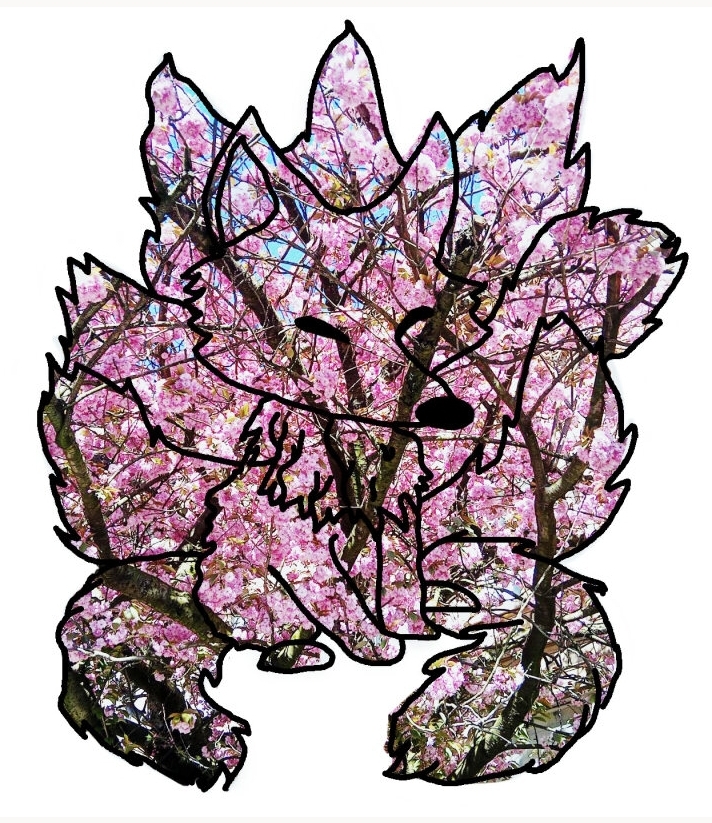
This is the same fox image from above but I put a photograph of a blossom tree I found while waiting for a coach.
I like how simple the outline is and how rich with colour the flowers are
The outline is there to show what the image is supposed to be without it It would be impossible to figure it out.
Development for final piece
this is the developmental stages of my final piece
The first two images are the basic simple kitsune designs. I wanted to learn how plan out how it would go first before I tried anything
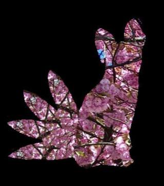
personally I don’t really like this one because to me it doesn’t really look like a fox but I think since this just a rough idea for my final piece I’m going to add anymore to it.
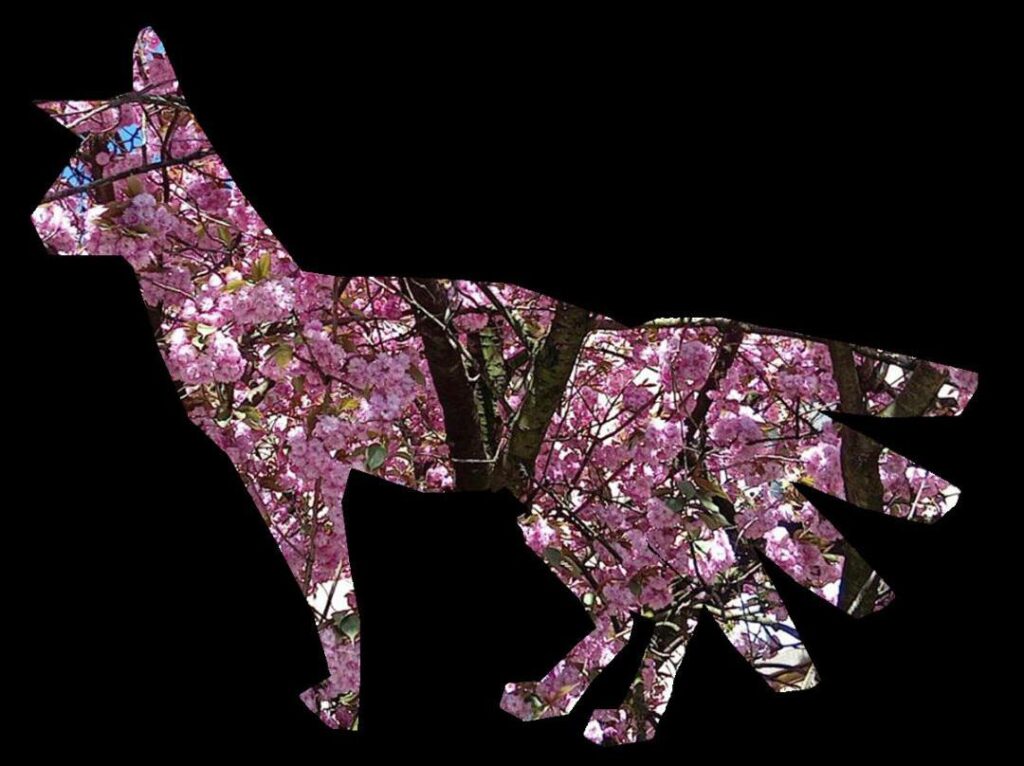
With this one I definitely like this one more than the last one because it has the reassembles a fox a bit. Unlike the other one in my opinion I think it looks better but the one thing that I don’t like about it is the tail shape it reminds me of fingers and that there s one leg missing and it bothers me so I will change it. Another thing I was working on different poses for the foxes and seeing which would be better.
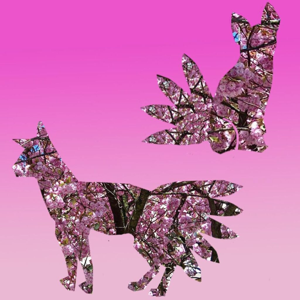
This is a mixture or the previous two pictures and Ive made some changes like for an example added a second leg to the fox .
And changed the shaped of the tails. I like these ones better because even though I made minor changes I think that it looks better in. my opinion.
Reference image
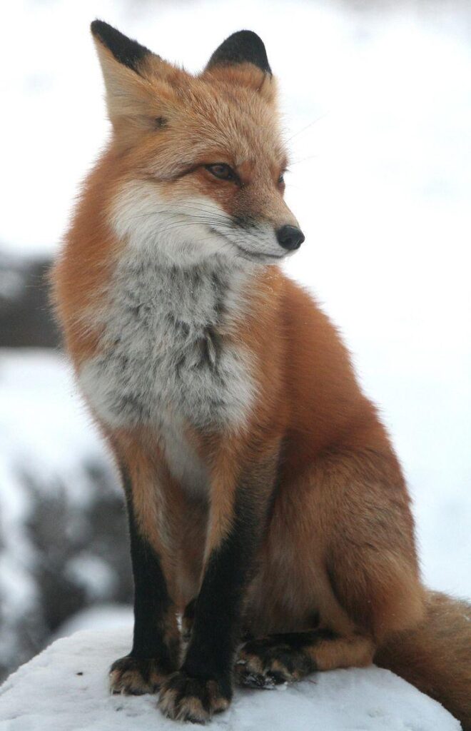
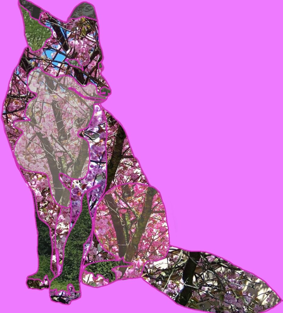
So for this one I like how I have used different saturation and tones of the images colour. And tried to make it look like different body parts but it didn’t go so well.
One thing I don’t like about this piece is the eyes and the outline of the fox. I feel like there should be more room for improvement in this. I personally think that this that the colour in this are very bold and I don’t really like it.
As a whole I don’t think it’s too bad but I know it could be better
Reference image
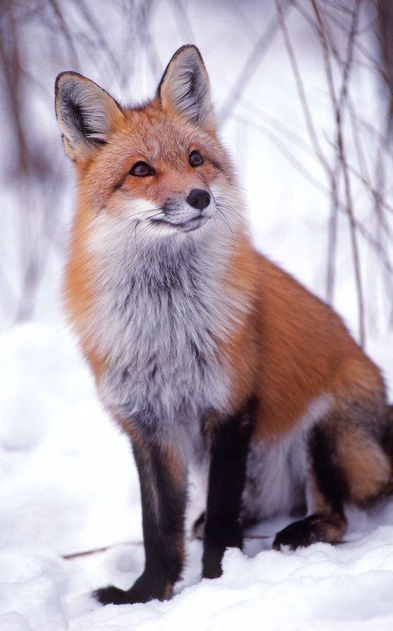
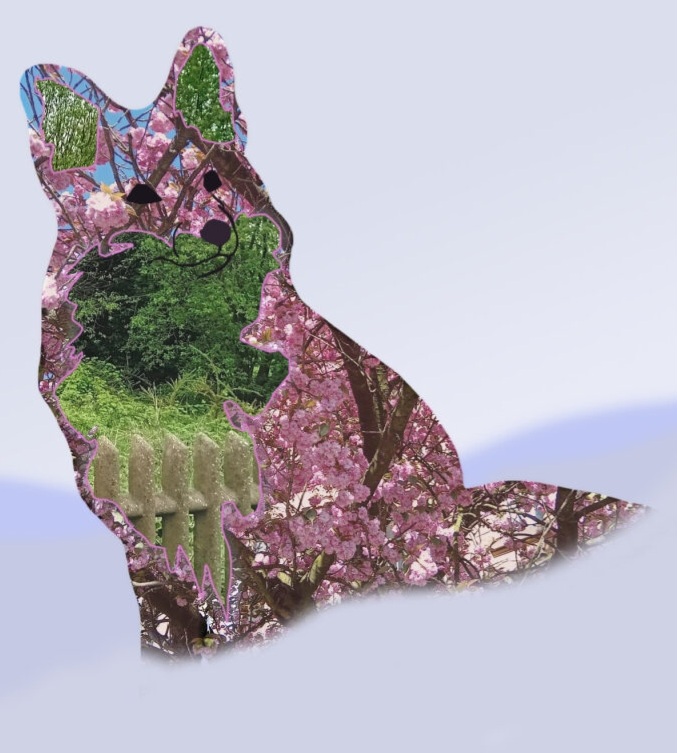
I like this one a lot but at the same time, it looks like a dog instead of a fox. So I decided to scrap the reference image and actually used the previous one because I’d like that one more.
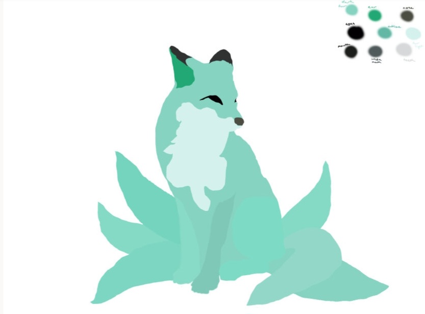
As you can tell, I’ve used the swatches from my previous artwork. To make this fox and needs the colour pallete. I have also used different colours For the tales and legs to show that they’re not the same thing or that it blends in. I decided to make this fox as a map. To figure out where I was gonna put the different images. And how is going to construct everything together.
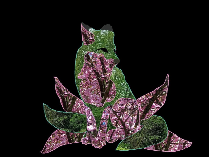
I like this a lot because I did to put the pictures in the right place is below at the same time I feel like the Saturation Looks duller in my opinion. So I wanted to change that in the next piece. I also want to add more outlines to it So show the better my final piece.
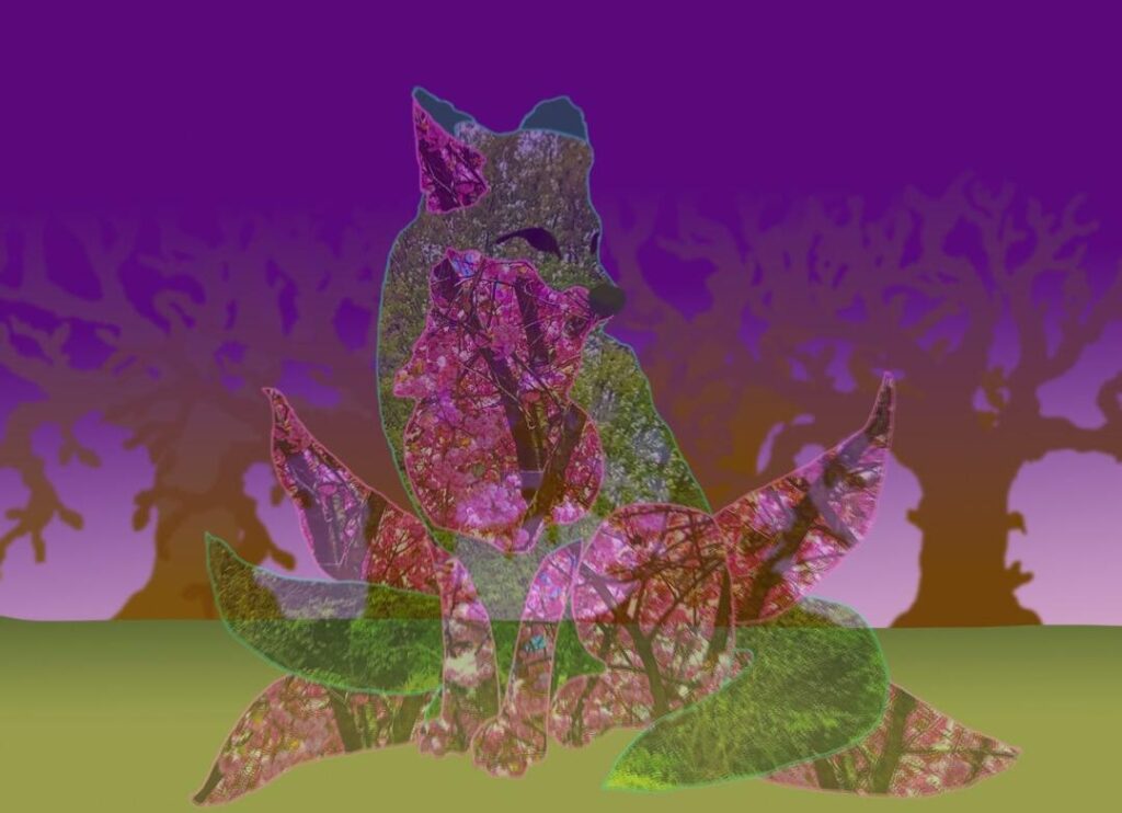
With this I was going to actually make this my original final piece but I decided it doesn’t go well with my proposal. So I decided to change it last minute. While making my final piece I had came across a few complications. I had the hardest time trying to come up with Colours for the background and the grass. I kind of wish I did make the trees look very weird but I change that in the next one. Also, the reason why it’s semi transparent was because I was trying to make it seem ghostly but it didn’t work out.
final piece
reference image

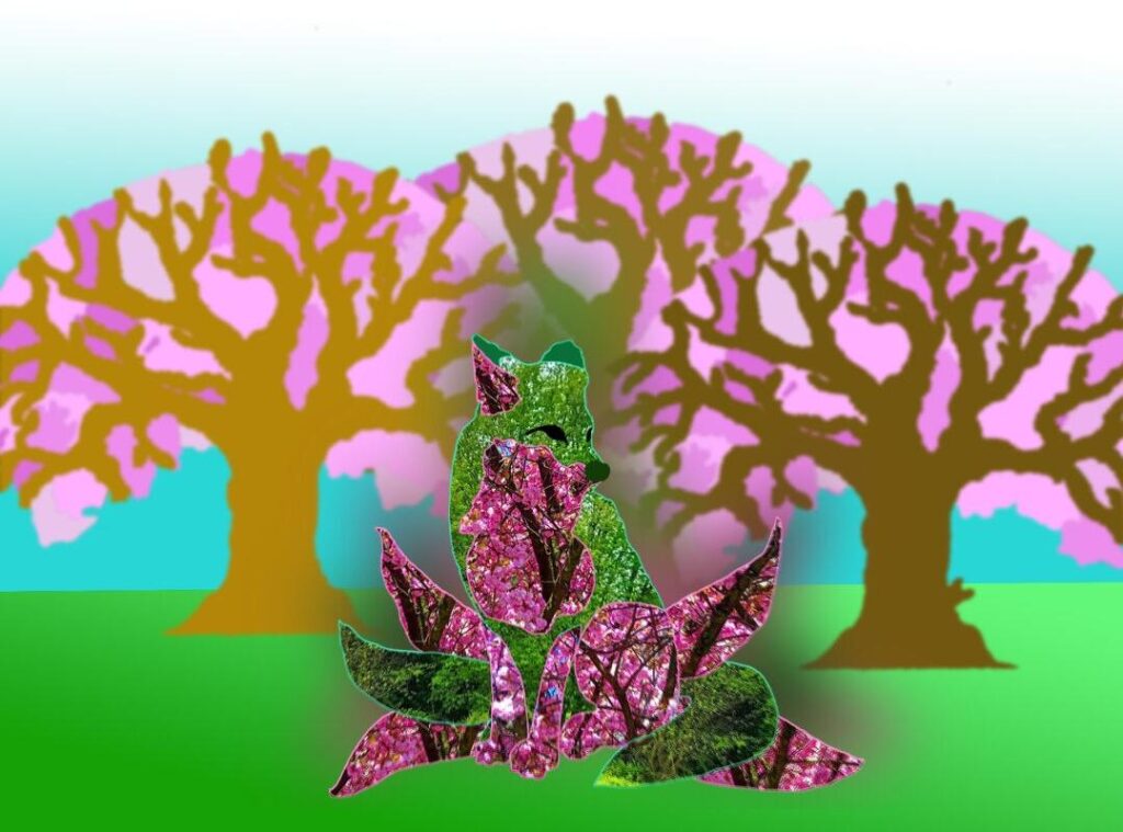
With my final piece I really like how it came out. I like how the trees look. I think the saturation of the fox is a lot better in my opinion. But at the same time I do think it’s a bit too dark so I wish I could change that. I’d also decided to add a little bit of a blurb behind the fox to make it look better. And I also think the simple background You works well with the fox.
