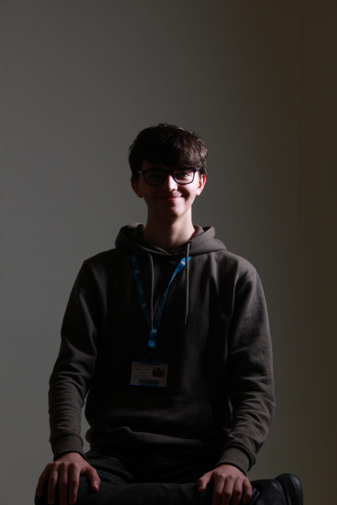
Project Proposal
Throughout my time on this course, I have experimented with various different ideas. Starting with Dreams, I was able to refine my editing and idea generation as well as delving into light painting. In Journey, I recognised how to create a narrative across multiple pieces and developed my semiotic skills while further developing editing and work in the studio. Most recently in Future, I was able to work to a brief to create a truly amazing image that was featured by the company we were working for. I experimented with making my own props and using models for my photography. For this project, I have decided to choose my specialist practice as “Product photography”. With use of the studio, my semiotic analysis and clever use of lighting, colours and editing, I believe that I will be able to make a fitting product that is able to combine product photography with the theme of “Fear”.
My idea for this project is to either take an idea or technique that can be used in later product shoots and practice it with this project or to advertise something that I can link to fear in some way. A technique I could practice that could be useful is “Cloud Tanking”, which is talked about further in my specialist industry practice research. However, I am leaning slightly more towards the idea of advertising something to do with fear. When I think of fear and advertising, a link that I can think of is Halloween Advertising. There is plenty of companies that sell separate autumn or Halloween themed items, so advertising for them around this time of the year would be a good idea. Finding a company to do this style of advertisement would be fairly easy, all that they would need is to be a fairly well known company with a recognisable product based around this time of year. My mind immediately goes to the pumpkin spiced latte from Starbucks. They are a big company that are known for selling these in autumn, so it would be perfect. Analysing Halloween advertisements would also be good to do so I can learn the composition, colour palette and other ideas that companies put in to make their adverts memorable.
To make sure I keep up with how my work is going and make sure I stay on the right track, I will be adding a small conclusion under every section so I can summarise how everything has gone. This will allow me to stay consistent and put my views on every part of this project in a clean and concise way so I can follow it.
Lighting Technique Practice
Lighting Techniques:
- Shooting Through Objects
- Spot Lighting
- Back Lighting
- Up Lighting
- Saturation
- Casting Shadows
- Underexposure
- Harsh Lighting
- Practical Lighting (see the physical light)
Shooting Through Objects
Shooting through objects is a method that involves looking through an object in the foreground to give a creative sense of depth and perspective. It is typically used as a method of framing.
Spot Lighting
A spot light is designed to only cover a certain area. This is typically used in theatre performances and stage shows to put focus on certain subjects. It is usually put on from above the subject as shown below.
Back Lighting
Backlight is light that hits an actor or subject from behind, typically higher than the subject it is exposing. Backlighting an object or actor from the background creates more depth and shape to a subject.

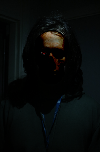
Up Lighting
Up lighting is a technique used to light the subject from beneath. This look is usually associated with telling scary stories around a campfire and makes the subject look more scary when used in conjunction to various facial expressions.
Saturation
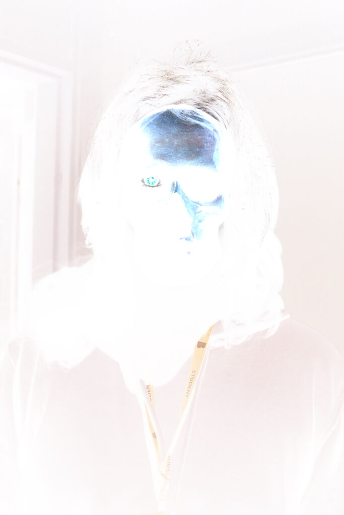
Saturation is normally described as the intensity of colour in an image. It is also often called “chroma.” The more colourful and vibrant an image is, the more saturated it it. See below a less saturated image compared to a more saturated in-camera edit.
Casting Shadows
Casting shadows is the idea of using shadows in your image to better show the placement in your lighting and using them to create something.
Underexposure
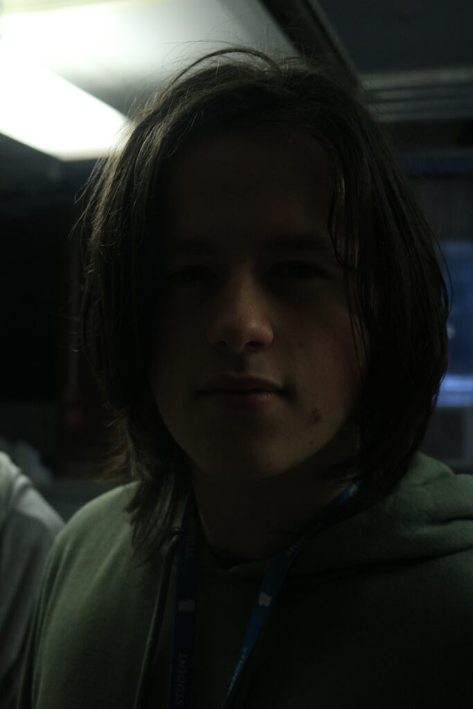
Underexposure is when you do not add enough light onto a subject to sufficiently light it up. This is typically used in horror by putting attention onto a subject by intentionally obscuring it to present mystery and fear.
Harsh Lighting
Harsh lighting is used to create a very sharp contrast between the shadows and highlights of an image. This can be seen in more model based studio shoots.
Practical Lighting
Practical Lighting is the idea of using the lighting for your shot in the picture itself. This is normally in the form of a lamp or something like the sun.

Putting Techniques Into Practice
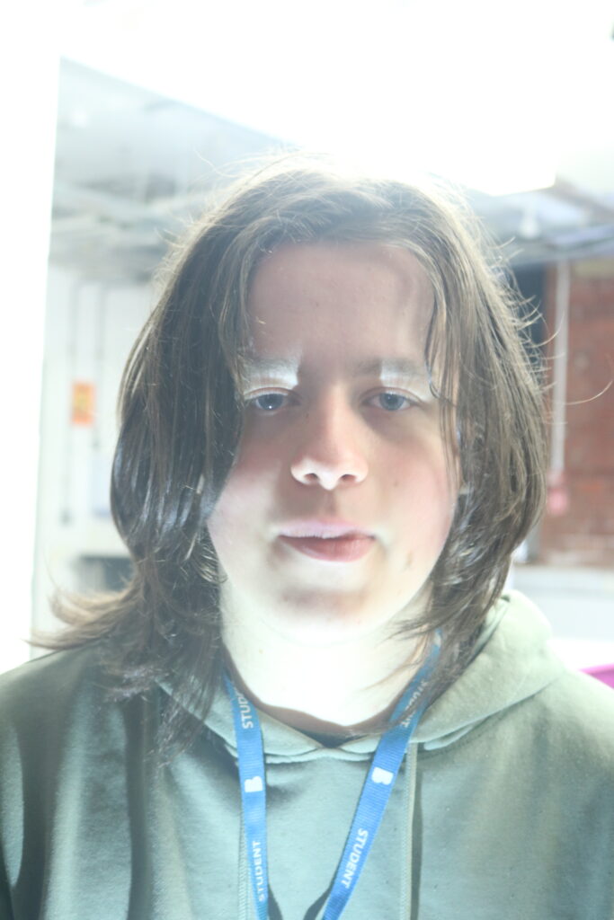
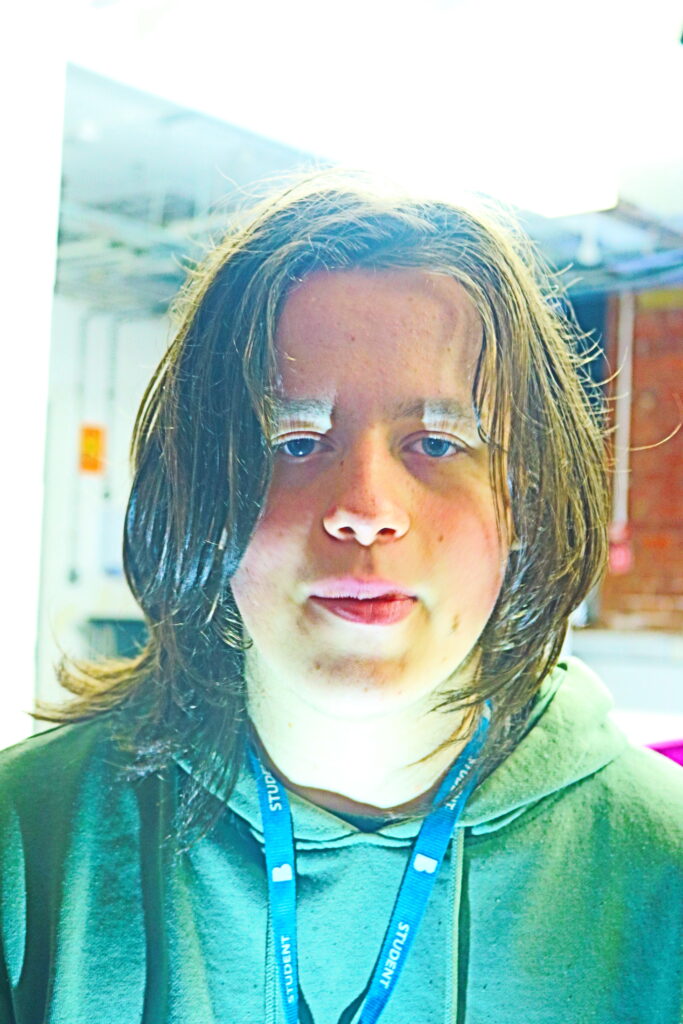
For my first attempt at doing these in a studio, we messed around with some colours for the lighting while keeping a constant of having a light for the background and a light for the model. The lighting we chose to use was up lighting to create some nice shadows.

Our first attempt was with purple and blue to create a more melancholic feel, but it didn’t fit with the theme of fear. It did blend nicely with the background colour, but we were looking to create a stark contrast so that didn’t work.
This is when we came up with the idea of using the Wicked Witch of the West as inspiration. Through some colour theory, we found a good mix of gels to create a nice green and we found 2 coloured translucent boards to create a deep orange. We combined these together along with removing the models fleece to make it look darker and more contrasted to the background and pulling a creepy face and this is what we made.
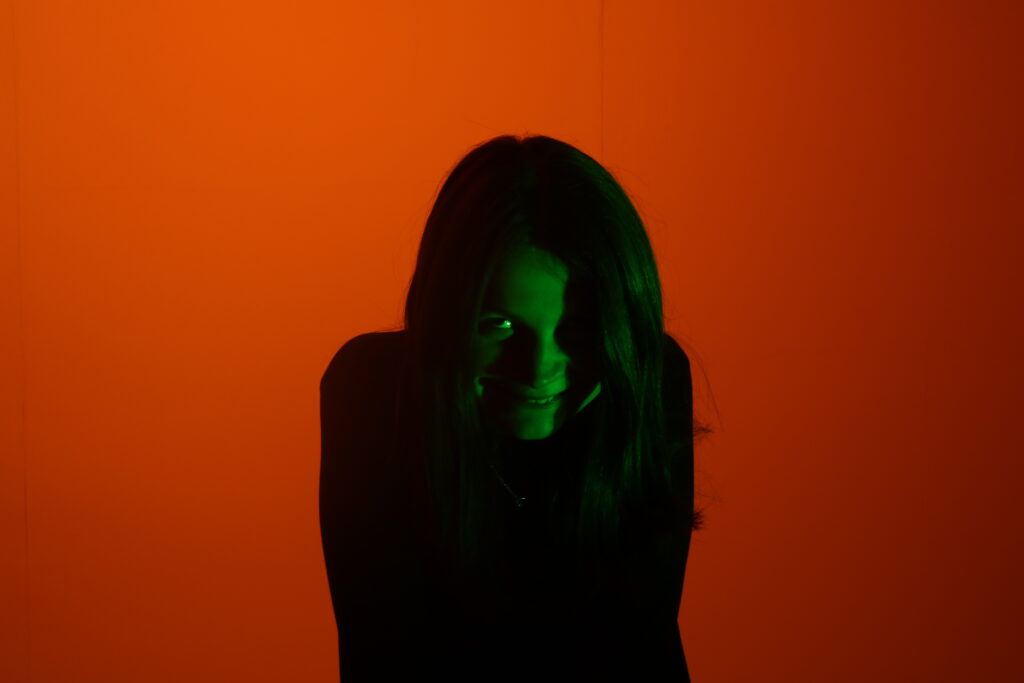
Although not a perfect image, it is a combination of all our efforts and it came out pretty good. The contrast between the orange and green is very nice and the slight vignette created by the light is amazing as well. The shadows on the models face and the shine from the green on her hair help create that contrast to the background even more and the colour scheme fits well with a stereotypical Halloween colour palette.
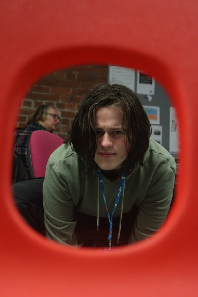
We then tried mixing a few techniques together. I put the camera on a tripod so the shot would remain at the same angle to make the editing for it easier. To cast the shadow, I used the spot lighting and placed the model so it would cast on the wall behind him and look like a looming entity. I then used up lighting for the main model and edited them together to create this.
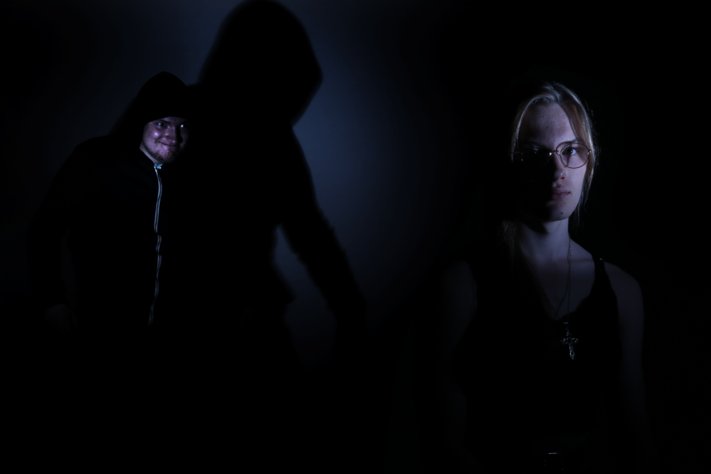
This image combines the techniques of casting shadows, spot lighting and up lighting in a way that makes sense and flows quite well. This proved to me that I wouldn’t have to necessarily stick to one particular lighting technique and I could use multiple of them in one shot effectively.
Conclusion
Practicing these lighting techniques has been very useful and I have managed to make some applications in ways that I think could be very fun to do and fit with my theme, such as using the up lighting and spot lighting.
It was also interesting to experiment with mixing these effects together, such as combining casting shadows, spot lighting and up lighting in one image. I may continue to experiment with mixing the lighting effects in the future to create more interesting imagery.
Editing (Layering)
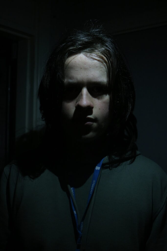
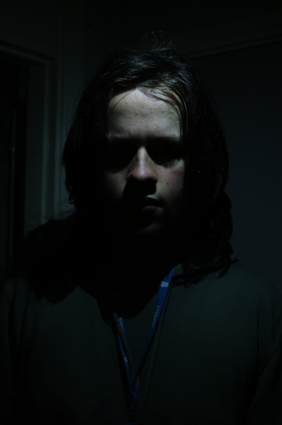
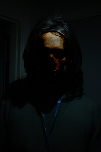
We practiced doing layering with putting animal and human skulls over images since they are usually associated with being creepy and associated with death and fear. I chose a human skull to match with the model because I thought it would be more appropriate than an animal skull.

I first cut out the model burned the shadows of the model to make him have more depth and to make his eyes fully concealed.
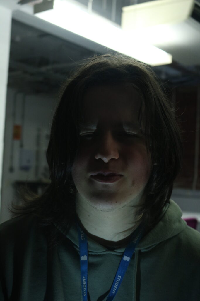
I then found a high definition skull and cut it out. This was then placed on the image with the “Linear Burn” setting on to make it stand out, but still blend into his face with the shadows.
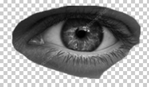
After seeing this, I decided that it could be cool to light up the side of his face mostly concealed with something. Instead of this, I decided to place an eye in the slot where the skull would be. To do this, I cut out the eye from a male model that I desaturated to make it easier to edit. I kept a separate copy that was saturated for later.
I then added this to the image in the location that the eye would be if it was seen.
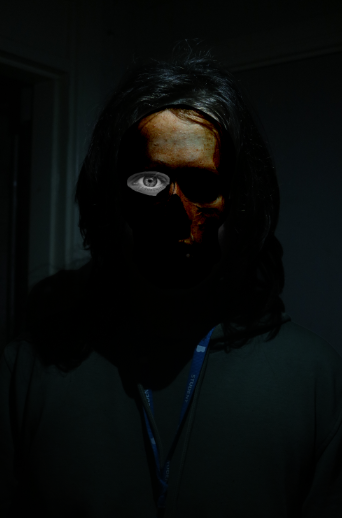
I then checked what blending option would work best and landed on the “Linear Light” option.

After this, I copied the coloured version from before in and cut out the iris and placed it a layer beneath the eye.
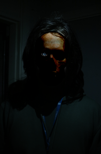
After messing with the saturation and hue, I decided that the colour red would work best. This created this image below.
Conclusion
Overall, this technique has helped me improve my photoshop skills. I tried something I have never done before and it was quite successful. I don’t have any ideas of how to incorporate this at the moment, but I may use it in the future if I come up with any.
Darkroom
For my experimentation in the darkroom, I decided to use the previous picture of the skull and eye of my model shown in the layering process. I inverted them and set them to two different levels with the burn tool; a darker version with more contrast and a lighter version with less contrast.
I did some attempts with solarisation, which is a process where you blast the image with light and put the image in the developing fluid. After it has just started showing up, you take it out of the developer fluid and blast it with more light, then put it back into the fluid and complete the process as usual. This process is typically described as a “tone reversal” by making the white on the images look more grey.
These are the finished products. As you can see, they are a little dark but that is mainly because of the scanner I used. The actual images worked quite well. The distinctions between the dark and light areas of the image were very prominent.
Conclusion
Overall, it was fun to experiment in the darkroom, but for my specialist practice I don’t think there is much application.
Pecha Kucha (Research)
Script
- This is my Pechakutcha, blah blah
- Set ground rules, alex is an idiot, cant believe i actually have to say this
- Please no mentions of skibidi toilet or hawk tuah, it has been done before for some reason and i just want it get it out of the way before we start
- Research into the idea of fear, many different ways to do this, however in kulvinders lesson we used mindmaps.
- Go over some of the things on the mindmap, reason why polish people are on there, you can see the arrows pointing to the top for our artist
- Polish man, talk about colour palette and how it would match with chosen specialisation
- Go over specialisation, product shoots, name mark mawson and mark wonnacott.
- Focus on composition. These pictures show the front on with some text to show what the product is and what it stands for. How can we do advertisements mixed with fear?
- Halloween advertisements. Companies like kipling, heinz and guinness have done similar things.
- Colour palette, audience participation, ask what colours people typically associate with halloween.
- Reveal the colours, comment on how they were taken from adobe colour picker as a triad. Say that they are a bit bland and dull and could use some improvements
- These examples have been taken from ads directly. Comment on how much better they look. More depth and vibrance to catch the eye better
- This is the first draft, using the adobe colour wheel colours with the composition i would be looking for. Doesnt look great, so itll need some changes
- This is the same example but using the more vibrant colours shown in the ads. Already a big improvement from the previous one
- Finishing touches, things typically associated with halloween. Bats, witches etc. any other things could be added in at this point.
- Well Recognisable, seasonable drinks for easier promotion, trendy, all the white girl rage, large audience
- I also chose them because of these other adverts, using warm lighting, known for festive shoots etc.
- Test shoot we did, trying to create the warm lighting with the purple background. Background can be altered in photoshop, but warm lighting worked quite well, sorting out imperfections soon
- Overall, my research and this project should be able to help me further advance not only my abilities to use the studio or work to a brief, but will further allow me to discover more about my specialisation and what I can do to make it work better.
- Ty <3
Conclusion
Through my research, I have identified a way that I can link my specialist practice with the topic of “Fear.” Through research into various artists and advertisement, I have been able to come up with an idea and show off my findings in a concise way that makes sense.
Practice Shoot
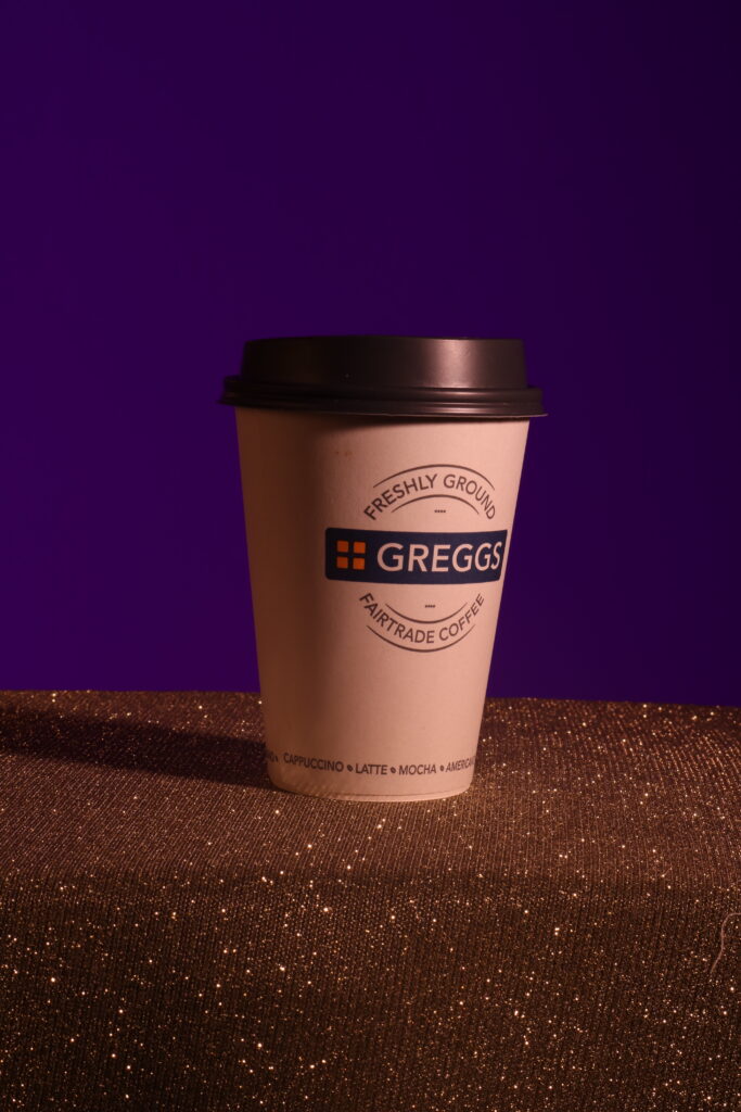
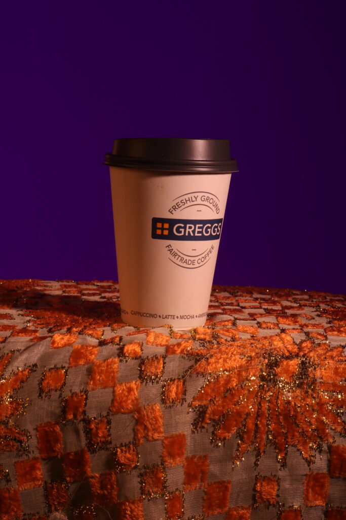
To practice what the shot was going to look like, I first decided to get a cup that I could use. I found a Greggs cup that would work as a substitute to get the lighting right and then I used some gels to create the lighting I was looking for. This setup looked like this:
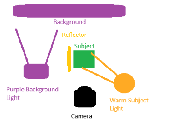
As you can see, this lighting setup separates the lighting for the background and the lighting for the foreground. By using a snoot for both, I am able to create a good strong lighting effect on the subject and I am also able to create a vignette for the background. I am also able to use the reflector just of to the side to keep the lighting fairly consistent on the subject while still having an obvious direction that the light is coming from.
Materials for the Table
I did some experimentation with the colours I could use for the table with different fabrics and cloths to see what could happen.
This silvery cloth had some nice shine, but it wouldn’t fit with the theme we are going for with this project.
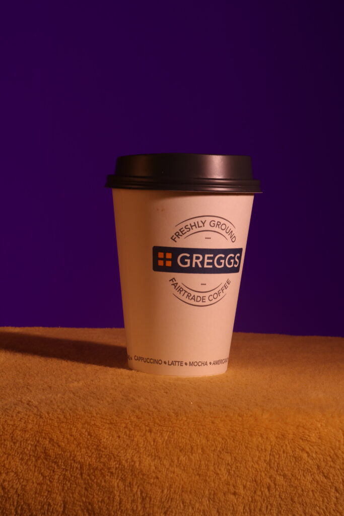
The yellow could work if it was darker, but it would have to be a different material because the furry cloth does not suit the theme.
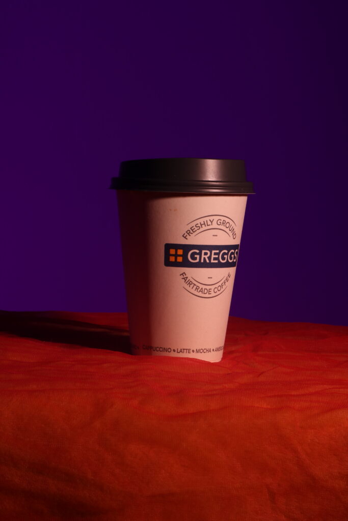
This orange works fairly well to contrast the background, but it is too thick and creates bumps in front of the cup.
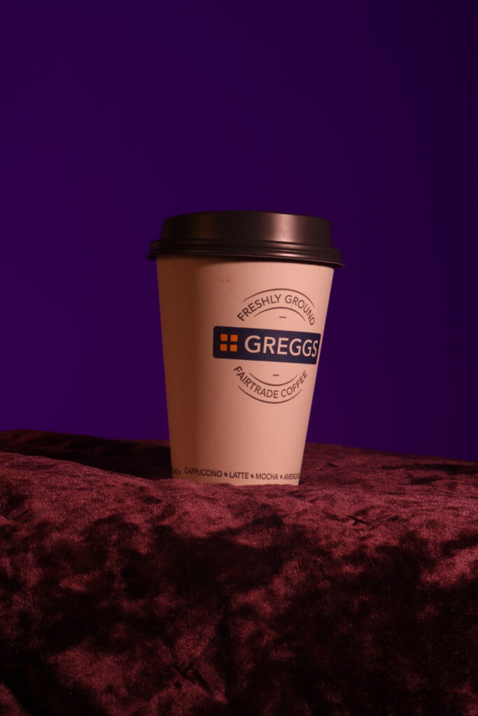
The purple has a similar issue to the orange of creating bumps in front of the cup. It also looks wrong to have two vastly different purples with different textures.
If the flower pattern was not there and it was just a checkered pattern with orange and purple, this could’ve been used for the table. However, that wasn’t available so I wont use this.
Conclusion
After experimenting, I think that using the black cloth for the table will be best. The other colours and materials present various issues and the black will also allow for the image to have some blank space to better fit the image.
Progress Tracker
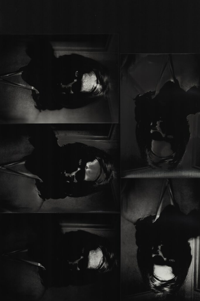
Contact Sheets
Final Edits
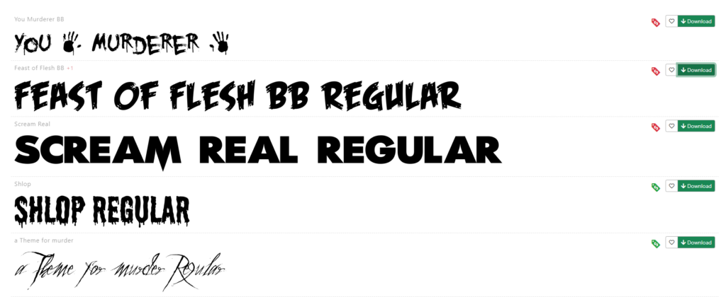
The first thing I did was to go to various websites to look for fonts. I used popular websites like 1001fonts and dafont to search for the correct font.
To find a good slogan, I searched a prompt into the Claude AI. This prompt was:
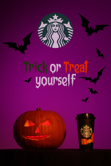
“I am doing a Halloween Advertisement for the company Starbucks. This is for their signature Pumpkin Spiced Latte. It is in a portrait view from a front on perspective of the drink with a pumpkin next to it. There is a purple background. Please generate some ideas for a short slogan that I can put on the advertisement.”
The ideas generated are below.
I decided to use the phrase “Trick or Treat yourself” because I could create emphasis with the capitalisation of the letters as well as creating emphasis with a colour change for those words. I used the “Feast of Flesh BB Regular” so I can get my colours and sizing correct.
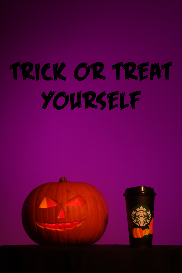
I experimented with using the colours from my Pecha Kucha presentation that were taken from other advertisements. While the orange worked very well, I felt like the purple didn’t blend properly, but I kept it for the moment while I looked for new fonts.
I eventually settled on “Frightmare”, a simplistic font that works well for the advertisement. It has uppercase and lowercase so I can use capitals to emphasize and it is not too big. However, it is a bit thick so I may have to change that soon.
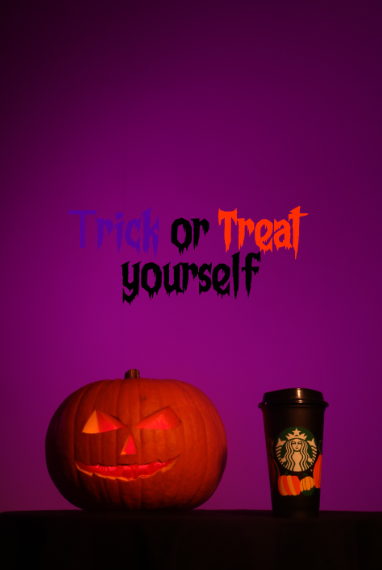
I then changed the colours around to see how it would work. I used a slightly purple white so it wasn’t too blinding while still standing out while using the Starbucks green for the word “Trick” instead of the purple. This worked better, but the colour was just too dark and drab for the advertisement.
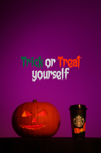
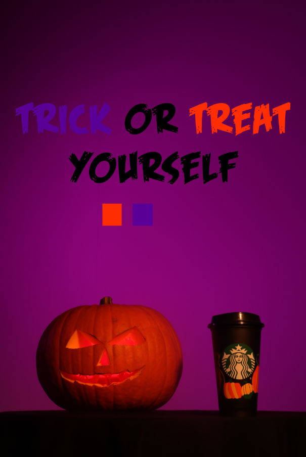
I then changed it to be a very bright green like a witches brew, but it was too neon and contrasting so I decided to try find something more in the middle of the two.
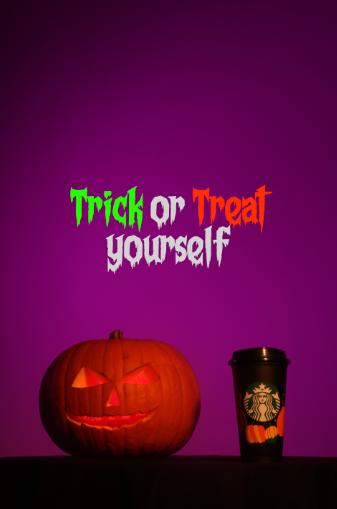
This is when I found this green. It is contrast to the background and the orange without being overpowering and blinding.
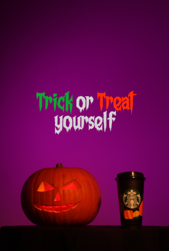
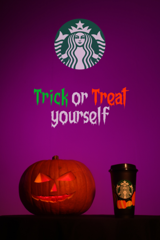
To create more brand recognition, I added the logo and slightly blended it with the opacity tool. This makes the while less overpowering while making it seem like an actual part of the background.
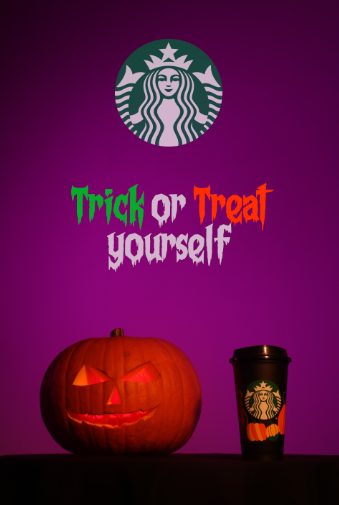
To solve my issue of the letters being too thick, I sampled a purple from the background and created a thin outline around the letters to improve spacing and make them thinner.
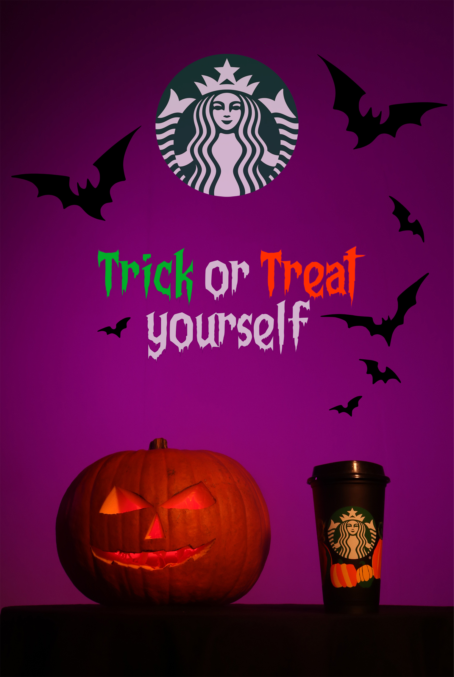
To follow the themes of Halloween, I added some silhouettes of bats and moved them around a bit to create this background.
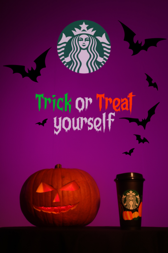
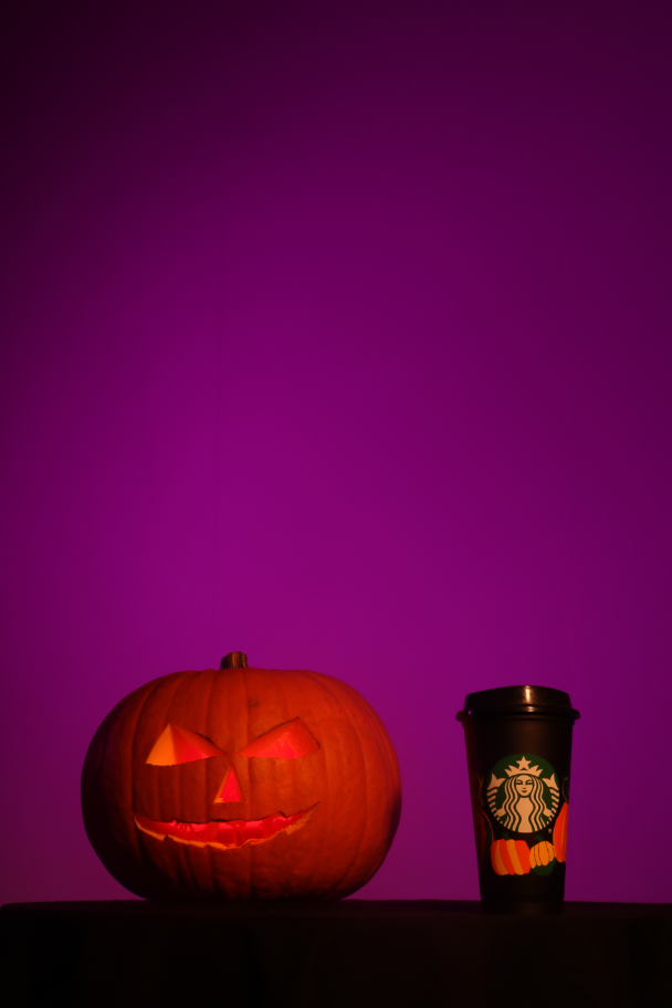
To blend the logo slightly more, I then decided to burn the shadows slightly. This created my final image shown below.
I did one final piece of experimentation by using the orange and green from the Starbucks cup, but it looked awful so I wont be using it.
I then altered the colour and it did look better, however I didn’t like making it look murky because that makes the image look more drab and dirty which is not good when promoting, so I will not use this.
Conclusion
Overall, I believe I have successfully created an image that could be used to advertise effectively. My use of colour theory and being able to dissect other adverts and apply what I learned about them to my own has worked quite well. I planned for the shoot well and everything went as intended. I also got to experiment with making my own props.
Evaluation
Throughout this project I have made use of new ideas, methods and techniques to create my final piece. These have been a further use of editing, a look into colour theory and semiotic analysis and overcoming various challenges throughout.
To start this project, we were looking at various lighting techniques, such as harsh lighting, uplighting and casting shadows. We did some general experimentation with these aswell as some work in the studio trying to figure out how they worked. My experimentation also led me to figure out that I can use multiple lighting techniques at the same time by utilising multiple models. I took one of these pictures into the darkroom to see what I could do with it. After some attempts including solarisation, I decided that darkroom would not work for advertising, so I would not be using it.
As I said in my specialist industry practice research, I was planning on developing a method known as “Cloud Tanking” which utilises a water tank and a coloured liquid that is denser than water to create a cloud. This effect is called cloud tanking because the origins come from the 1977 Alfred Hitchcock classic “Close Encounters of the Third Kind” where the rolling clouds in the background of a scene were created with the use of half salt water and half fresh water in a fish tank. Liquid ink was then injected into the tank to create the rolling clouds.
This type of advertising photography has been virtually perfected by artists such as Mark Mawson, who is likely the most well known aqueous photographer in the world, working with brands such as Gap, Starbucks and Nespresso. His technique for this first came around when he was pouring milk into his morning coffee and he liked the way that the milk spread out in the coffee.
However, I soon found another thing that I could do to link to fear while still being able to develop a more broad set of skills for my specialism. The answer was Halloween advertising, bridging the gap between fear, advertising and seasonal convenience. Because we started this project in September and we are finishing in October, this means that I have very easy access to seasonal items such as pumpkins, Halloween products and various other memorabilia.
I set out researching the different types of Halloween advertisements and something that stuck out to me mainly was the colour palette. This palette consisted of strong oranges, vibrant purples and neon greens. I developed a basic palette using some colours taken from various advertisements and used them on a sketch I made in MSPaint. This worked very well and the colours popped just the way I wanted, so I decided that was the way I was going. I then chose my product, a Starbucks Pumpkin Spiced Latte because it creates some easy links between Halloween and makes sense for the season and setting.
After some test shooting, I decided on the lighting for my final shoot and grabbed some props. I prepared 2 cups, one black with pumpkins on it and one standard Starbucks cup. I then carved a pumpkin out with the typical pumpkin smile and got my lighting prepared. I managed to complete the shoot and everything went well.
After I was done, I took some time to compile various fonts I could use and got some help from an AI called Claude to figure out a tagline for the advertisement. After this, I was finished.
This project was a lot of fun and working out some of the issues I came across were challenging, but enjoyable. I think I produced a good final product and was able to utilise the studio and other resources in an effective manner.