Week 4: Experimenting
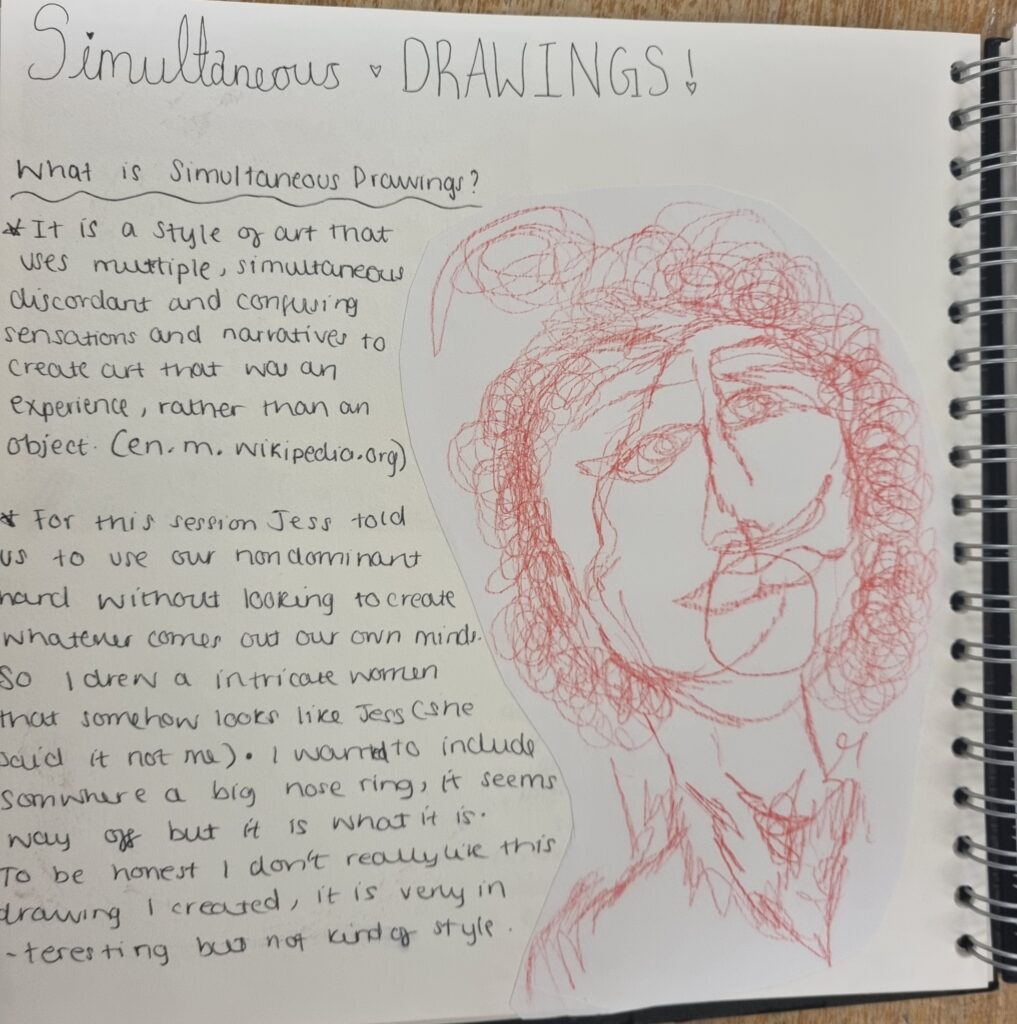
Fashion stick-in
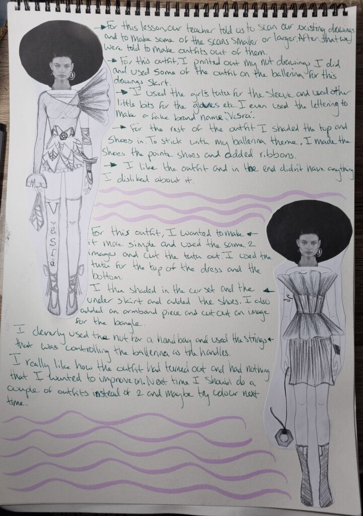
Simultaneous Drawings
Unfortunately, I wasn’t here for this lesson but my friend allowed me to take a picture of her work to at least show some proof.
A time through textiles
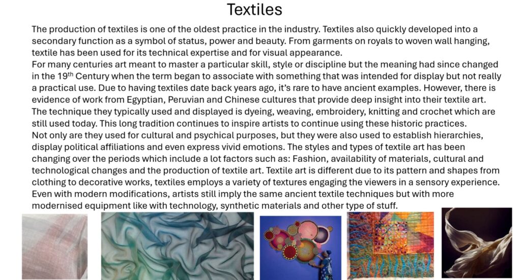
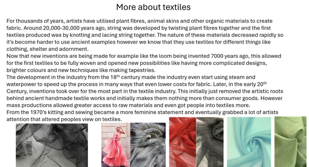
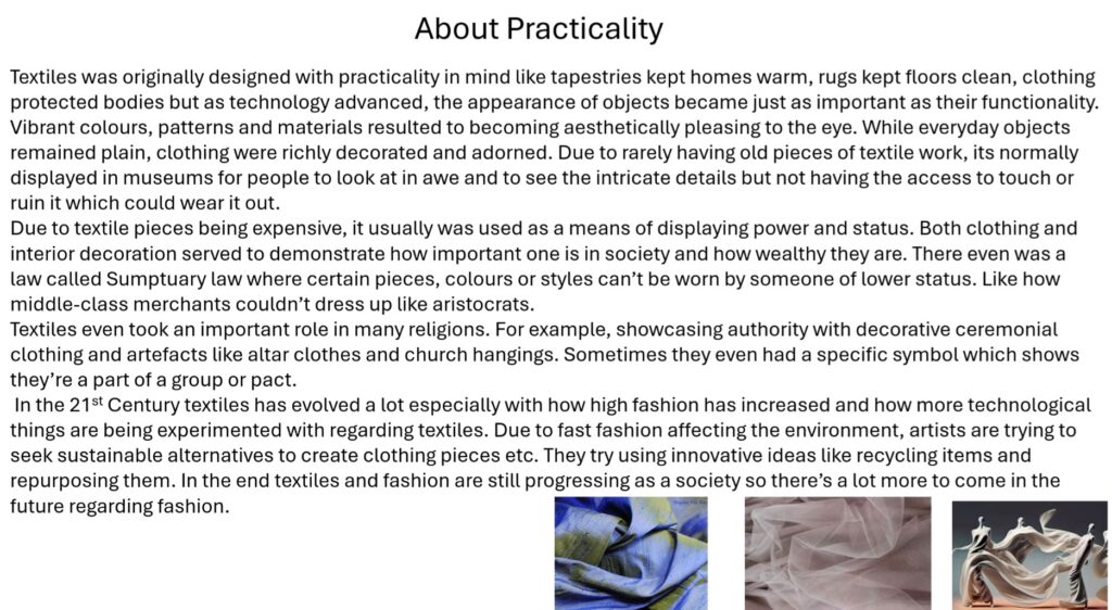
The link I used to gather information from: Textile Art Movement Overview (no date) The Art Story. Available at: https://www.theartstory.org/movement/textile-art/ (Accessed: 24 May 2024).
Week 4 Overview
I didn’t do much this week however I’m experimenting more with workshops. I missed 2 workshops as I was ill but next week I hope to do more different workshops and start on a bit of primary research.
Week 5: Progressing
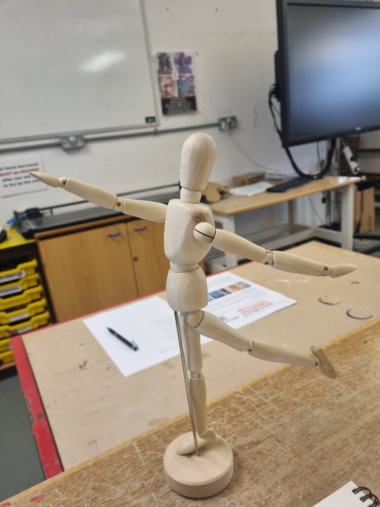
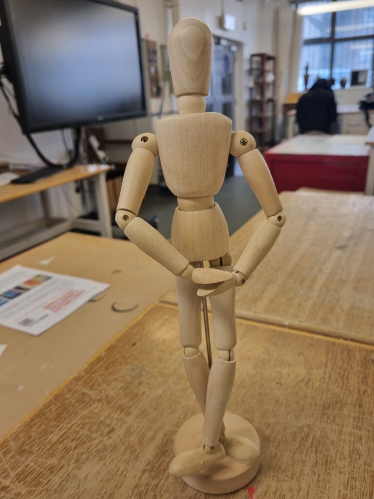
Primary research- Mannequin
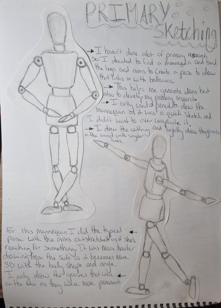
Here is the mannequin I used for reference.
Mood board for Ballet
Here is the link for the mood board I created on Pinterest to gather ideas: https://pin.it/7E3EXdu0b
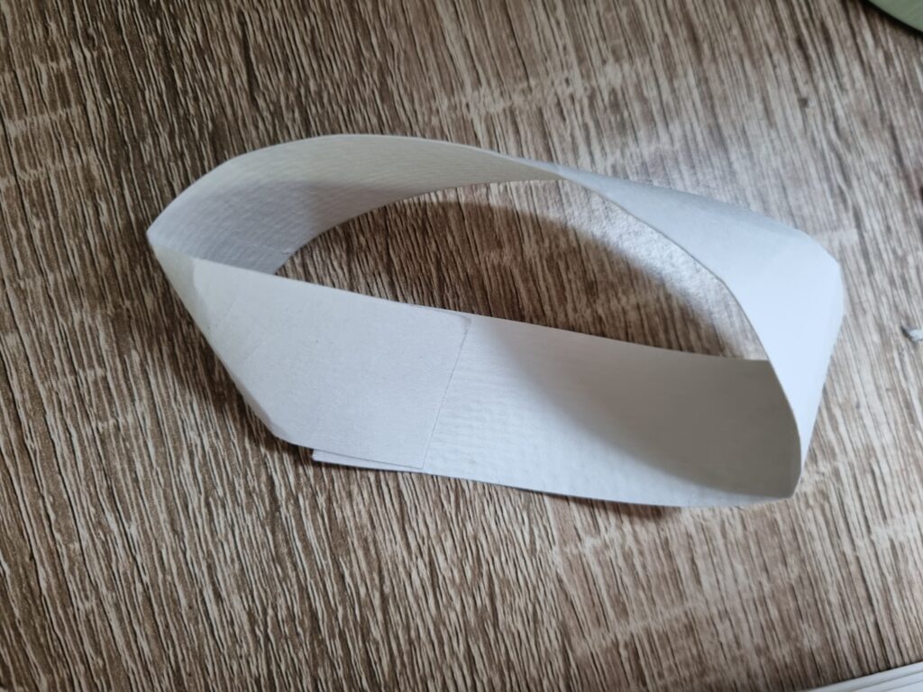
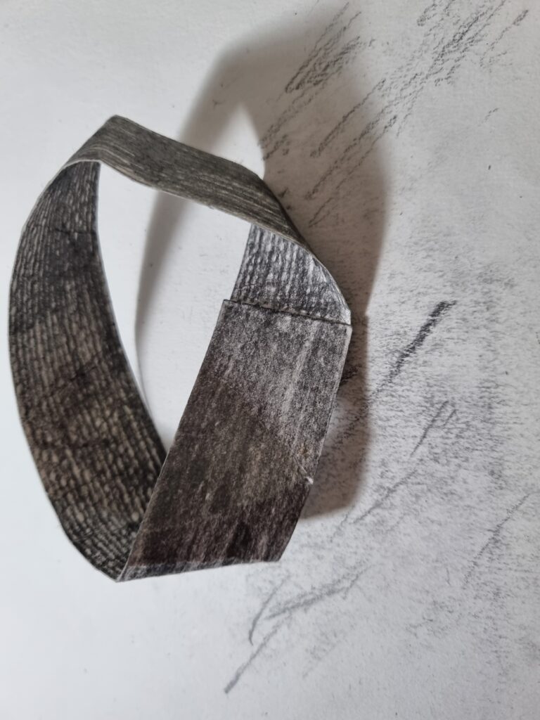
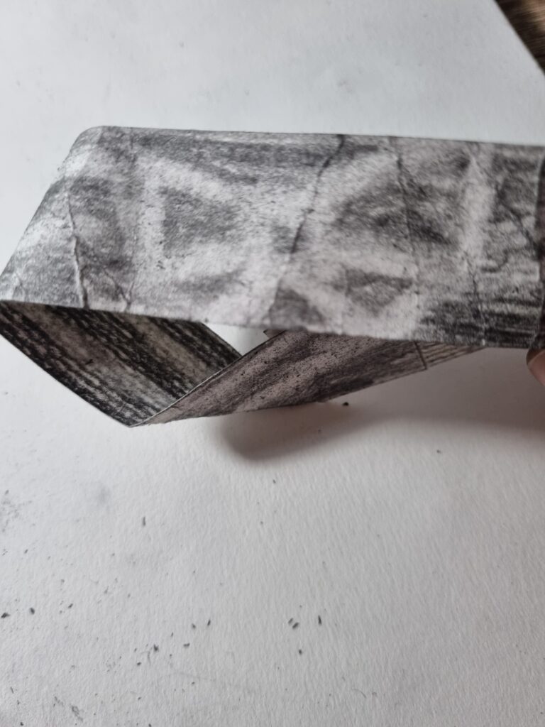
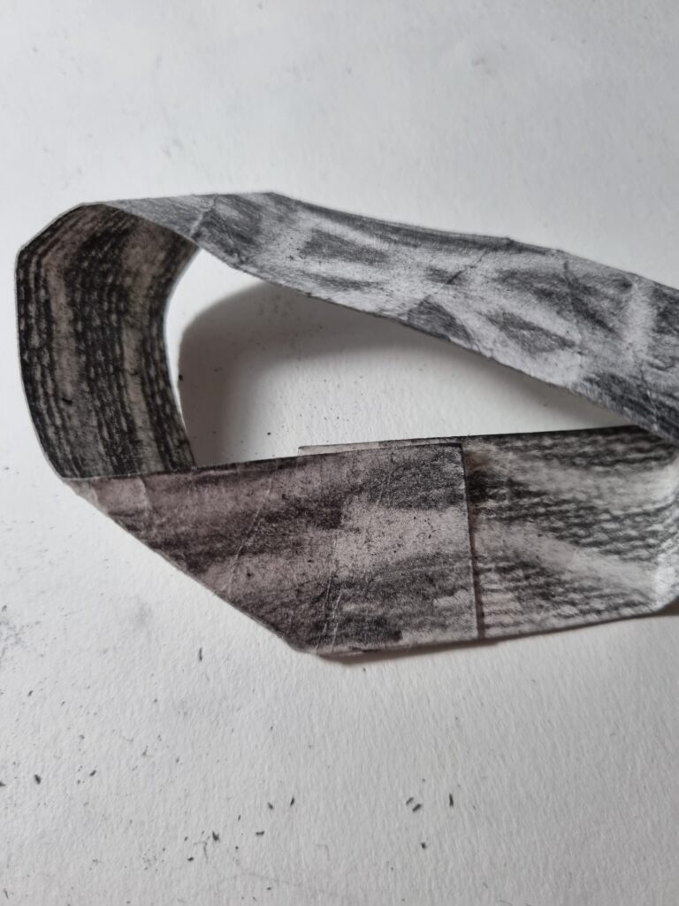
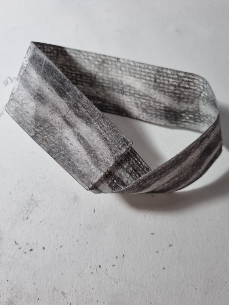
Mobius Strip
A Mobius strip is an infinity strip so no matter what you draw on it, it will come back around. There is no start and no end. For my Mobius strip, I decided to shade it in and then create a bow by rubbing out the drawing. I wanted to create a shadow and experiment more with how you can create sketches just by rubbing out on an existing sketch. I like the idea and thought about it especially as the bow is infinite in this case and how it links into ballerinas however the execution was a bit disappointing. Maybe next time I could use fabric and make a tutu with it or maybe do sketches of ballerinas or their shoes.
Accu Talk
We had Accu come visit us and talk to us about its brand and why they are initially our client.
These 2 links are the PowerPoint they showed us. For the first PowerPoint, Alastair Morris (One of the clients who came to talk to us) talked about himself and how he was a managing director and has been working for 20 years in engineering, manufacturing, sales, and marketing. He then began explaining what Accu initially is and how it’s a brand that sells components for those who are in need of it. They talk about how they first began this business and how Anthony and Martin (the founders of Accu) started this business in their room but it became too big of a company so they started a whole brand gaining a building and workers to run the brand that is today. After that Alastair talks about the website and more about the people and how successful the company is. He talks about how the employees are dedicated and how they work 4 days a week showcasing they care about their workers and how even customer services approve of their hard work. They also talk about how sales skyrocket and how Accu is growing so big that they have to move to a bigger building to maintain bigger orders and satisfy the customers to the best of their abilities. He then brings up the rebranding of Accu and how it subtly got some changes like in pamphlets and the tagline being “Accu building tomorrow”. They wanted a colour that was bold so they went with a darker blue and a mint colour initially using blue for their whole branding. They began also showing us how they plan to make their office space in Accu and how they want us to display our artwork in their office so it’s a more interactive and comfortable space. I learned a lot about who they are, what they do, and what they want from us. I asked what was appropriate for their lounge and they said that they didn’t mind even if we made something big or something that’s not related to what Accu does they wanted anything which gave us students free roam for our project.
The second link focuses on re-branding. Alastair talks about how they came up with the colours and the tagline. He highlighted the words that stuck out and what message came across as powerful and innovative. He then went on about how they wanted some form of shape in their messages and their branding which went onto what style they wanted to go with for the it. They thought about what would attract people’s attention and get them intrigued. He really goes into all the designs they used in their rebranding for their websites, pamphlets, brand names, and a lot more. Next week we will be going to visit their new building site and to learn more about them.
Screen-Printing
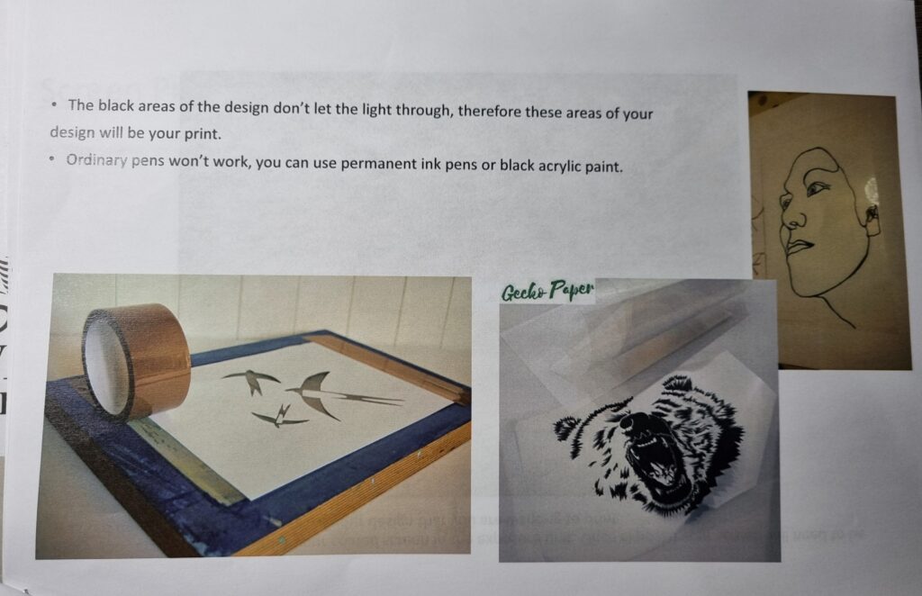
Today we had a lesson on screen printing where we will ink our design onto fabric. Here is some information
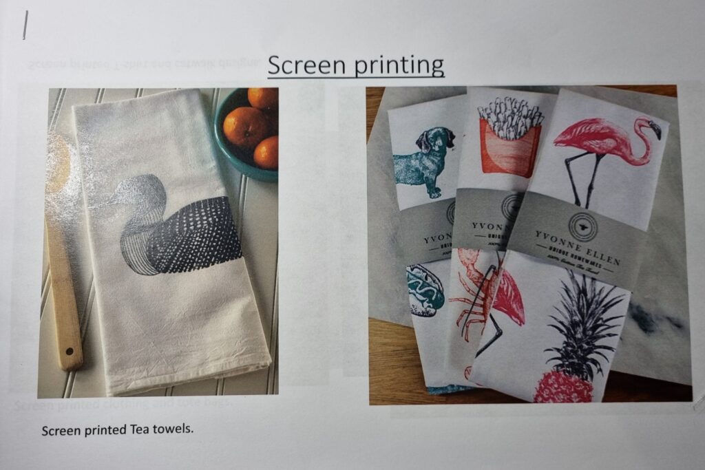
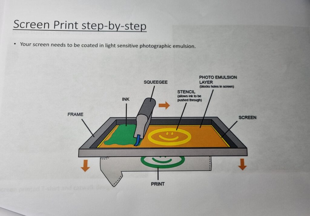
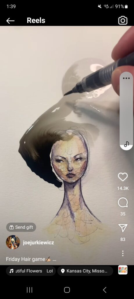
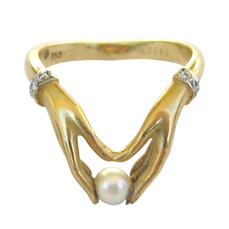
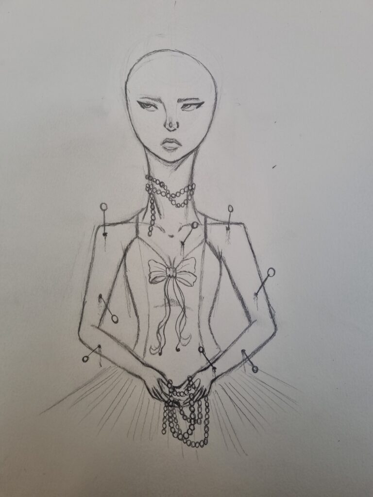
For the first drawing, I used these 2 references. I wanted to try copying Joe Jurkiewicz art style and create a screen print of it, so I tried copying the face and the neck, drawing a leotard for the outfit, and giving her a tutu. The second reference reminds me of pearls so I drew her holding pearls in her hands and she had them adorned on her. I stuck with the pin idea too and added pins coming out of her body. I decided to not give her hair as I wanted to try experimenting with inks on fabric, watercolour, or just fabric paint.
Here are the drawings.
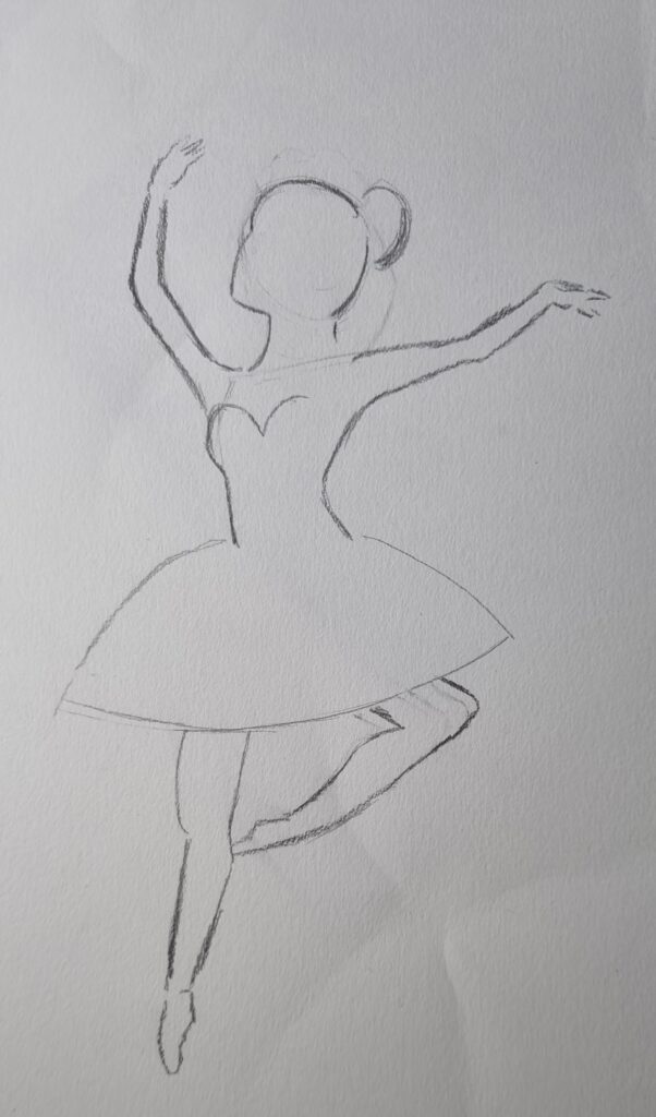
I decided I wanted to do a second drawing so I found an image on Pinterest, this one looked easy so I drew this one as well.
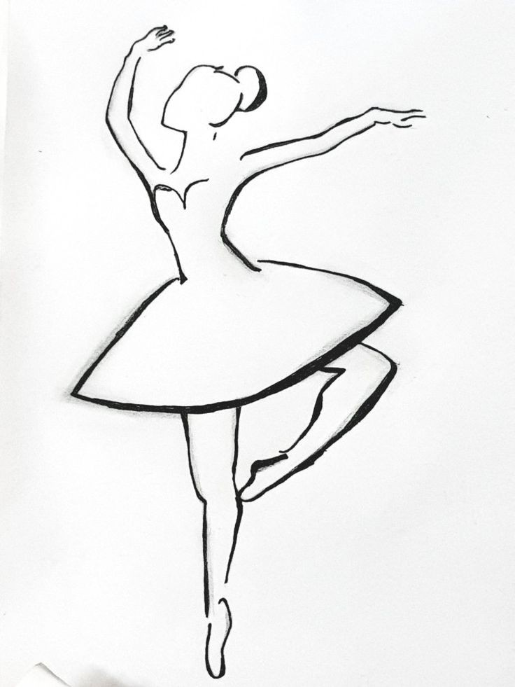
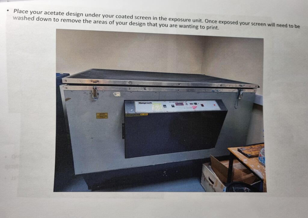
After we had drawn it, we had to trace the design onto this type of cellophane. We had to use a really dark sharpie on it so it would appear on the screen print. I was told mine was too light so I had to join them both together and put it under the machine so it can imprint itself on the screen.
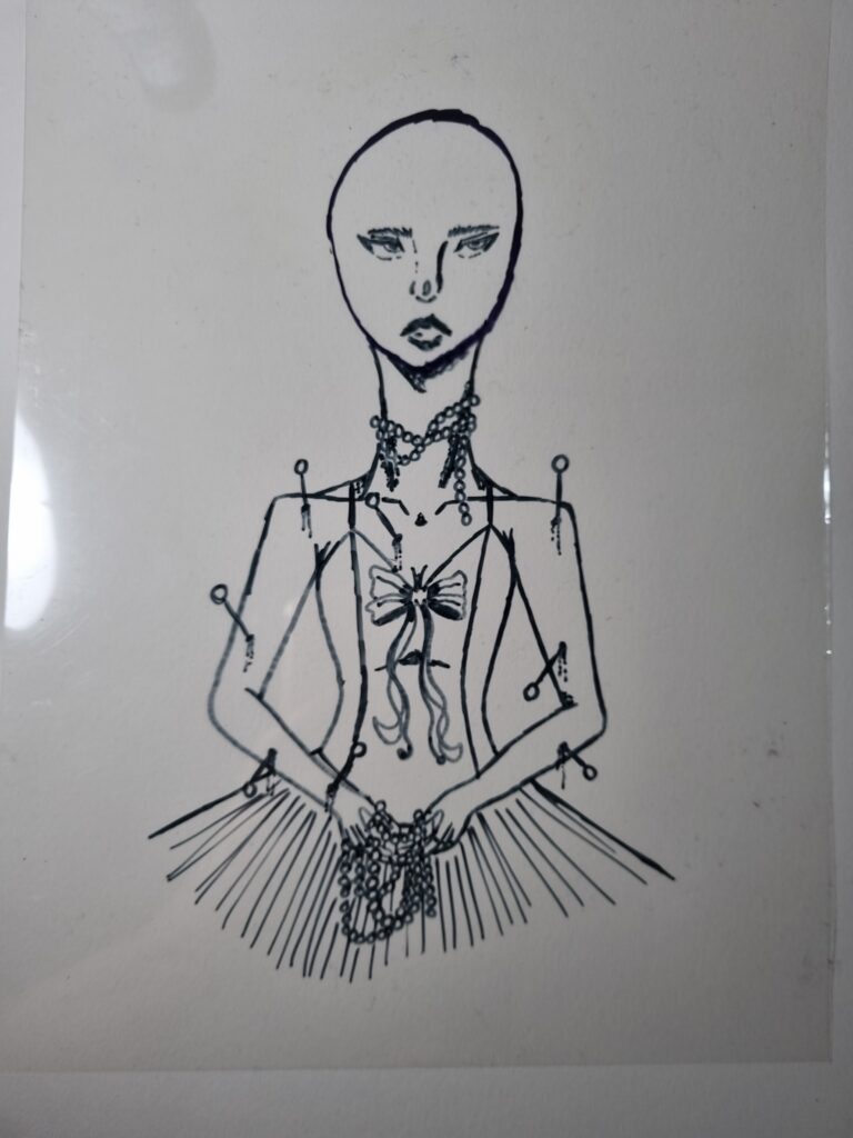
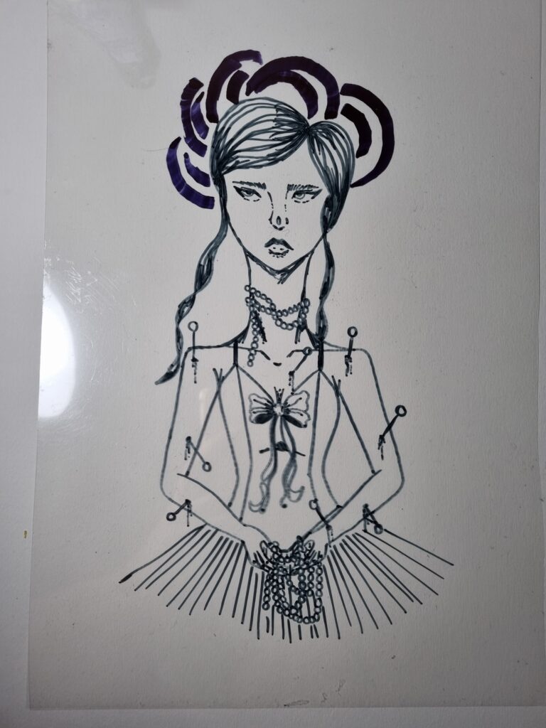
This one turned out well as the sharpie was dark enough.
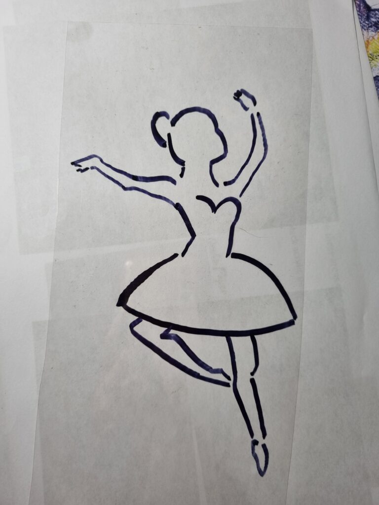
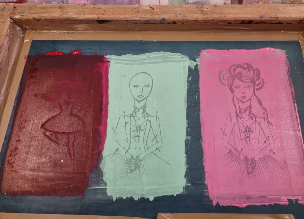
Before I screen printed the design onto the fabric, we put our designs under that machine then we took it out and started washing away at the screen so the design would show up. We let it dry then we came back and began screen printing. I decided I wanted to use these scraps of fabric one being calico and the other a silk type of fabric. For the calico, I used a normal blue paint but for the pink, I wanted to make it florescent so I tested it out and I liked how it came out in the end.
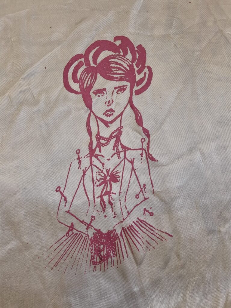
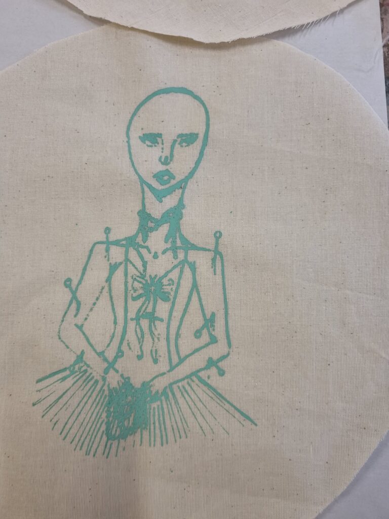
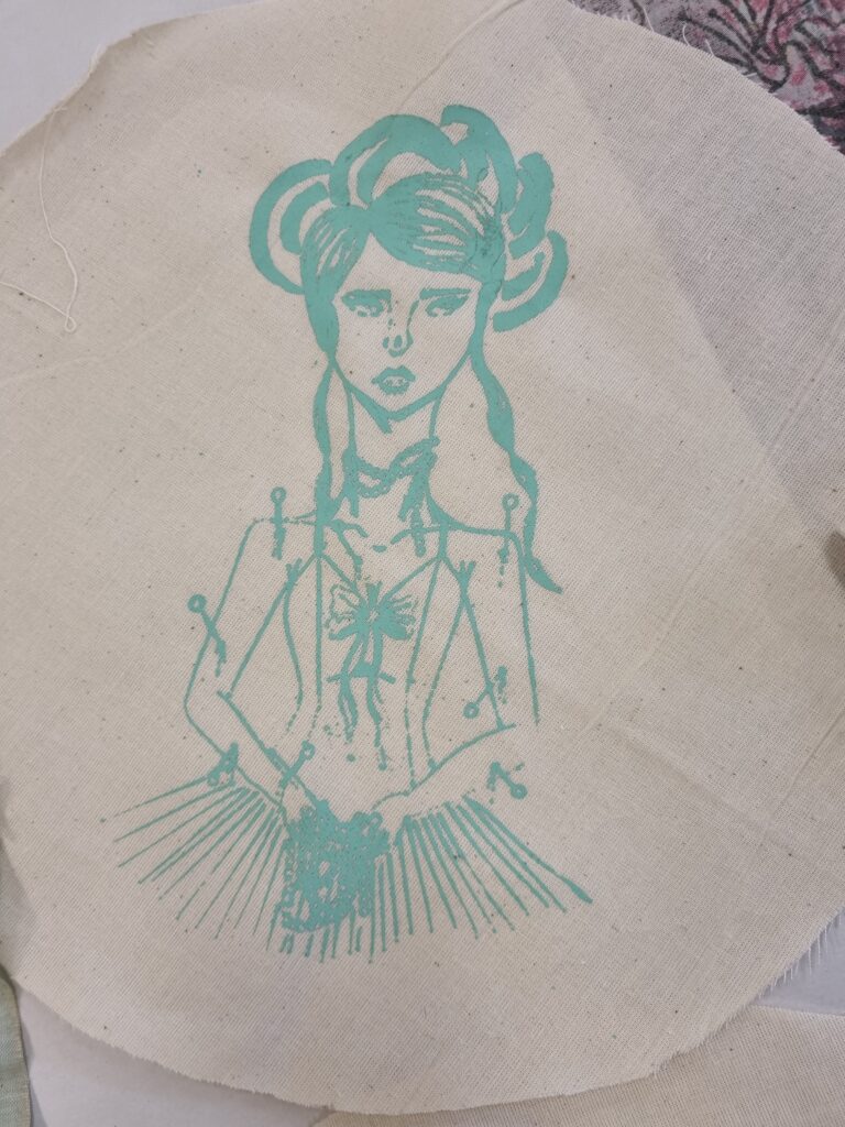
For the other design, I decided I wanted to use a patterned fabric and decided to use a red on it. I like how it came out however due to the design not coming up on the ink in some parts, there were some parts of the arm missing so there isn’t much paint on it.
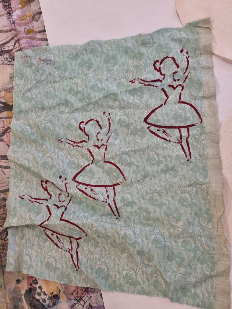
Here is the screen print I was using. In the end, I enjoyed this process however I don’t think I’ll be using it for my final piece.
Feedback
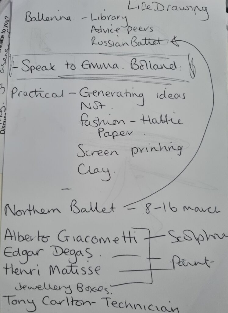
I talked to my tutor about my ideas for what I need to research and what I can do to generate ideas for my final piece. She gave me artists to research and discussed with me what I have already done so far in my sketchbook.
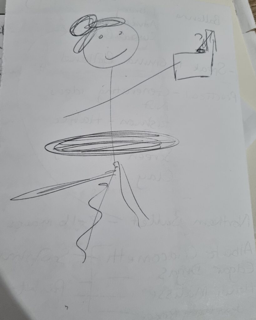
We discussed my final piece and how I said I wanted to make a sculpture of a ballerina having pins stick out of her and how I would love to have her spin around and play music like a real ballerina but the idea is too far fetched as it would be difficult to execute the plan. My tutor helped and said why not have a ballerina box in her hand instead so she’s holding her own music box and has come to life from it? I decided to take this idea on board and decided I’ll further create sketches about my final piece so I could start on it early as it was a big sculpture and needed a lot of time to finish.
Week 5 Overview
I got a lot of information about our client, Accu, and have also done different types of workshops like screen printing, Mobius trip and primary research. Hopefully next week I visit the gallery and the Accu site to gain more research and to see where I would put my artwork for the lounge area in Accu.
Week 6: Visits
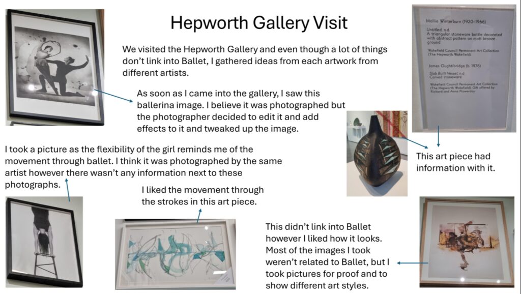
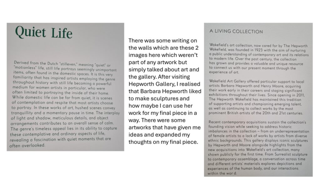
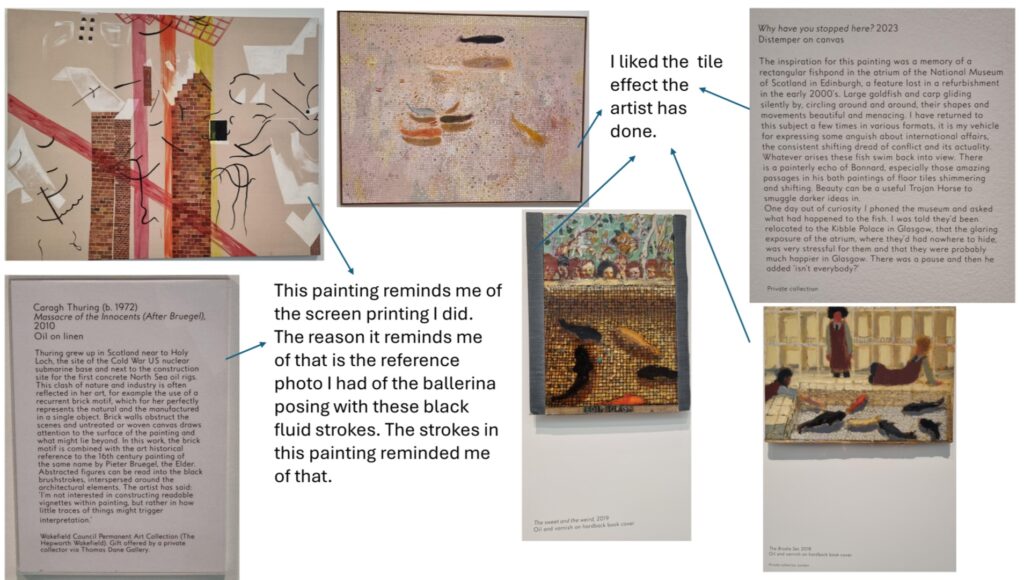
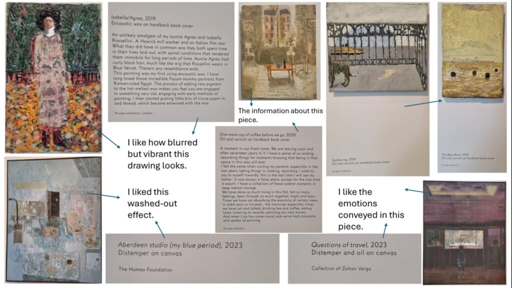
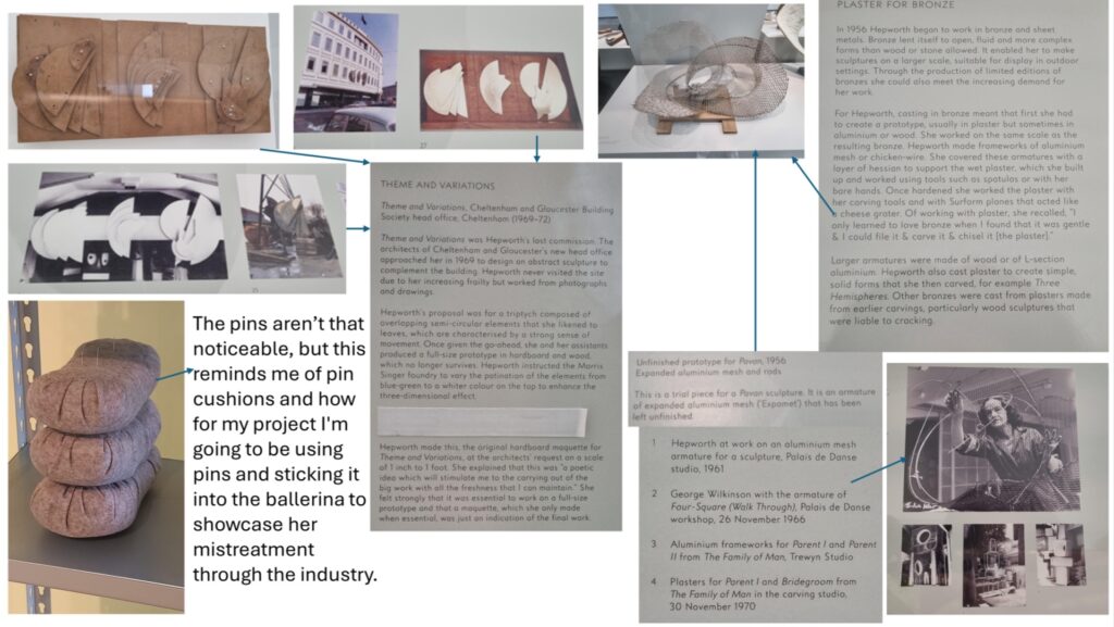
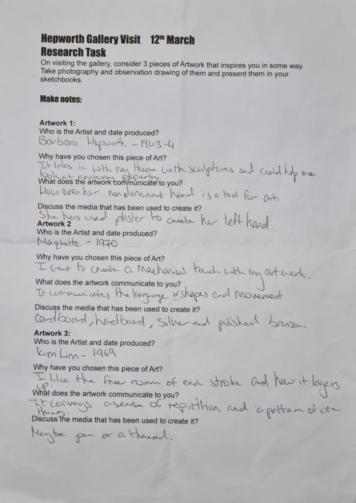
Hepworth Gallery Visit
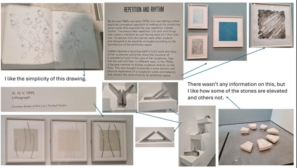
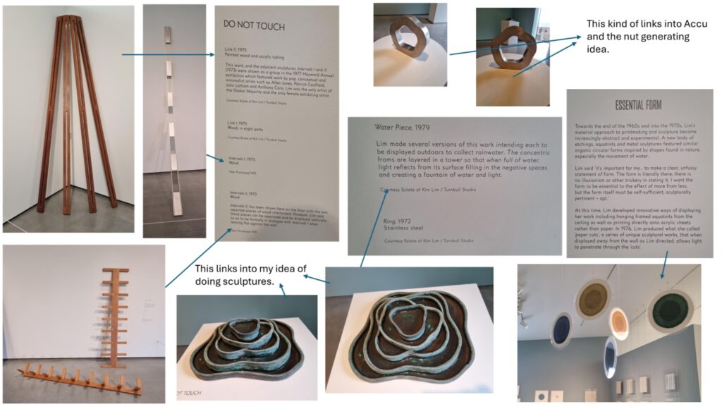
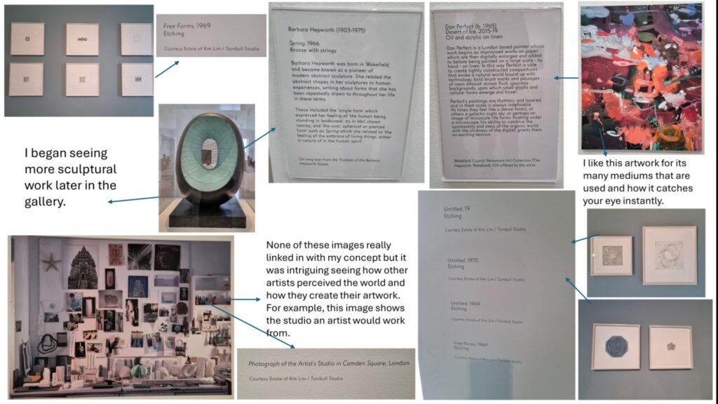
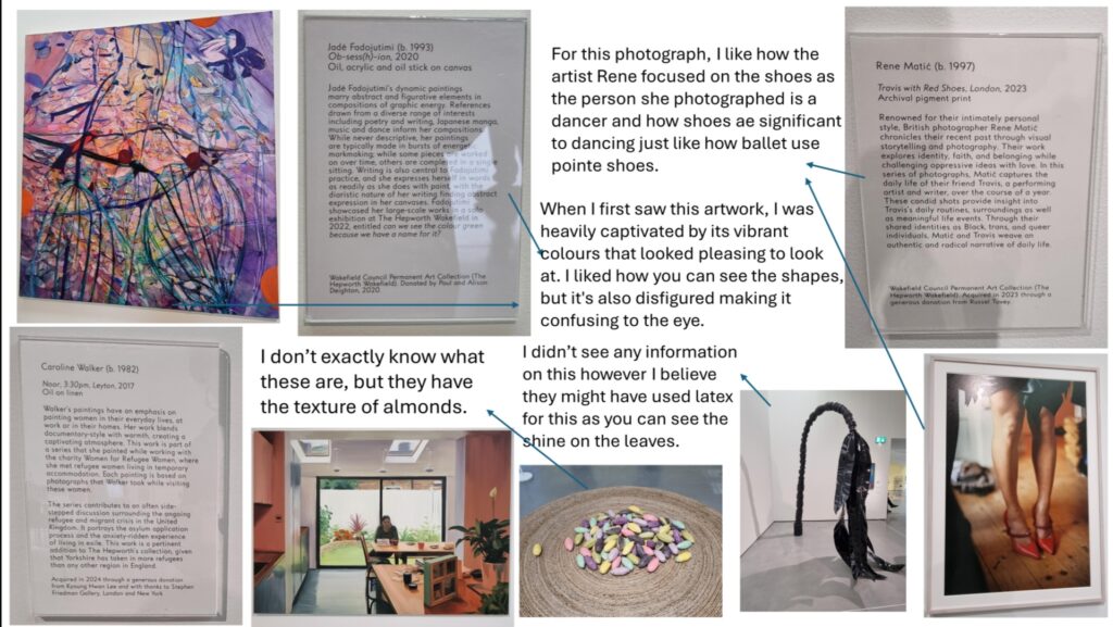
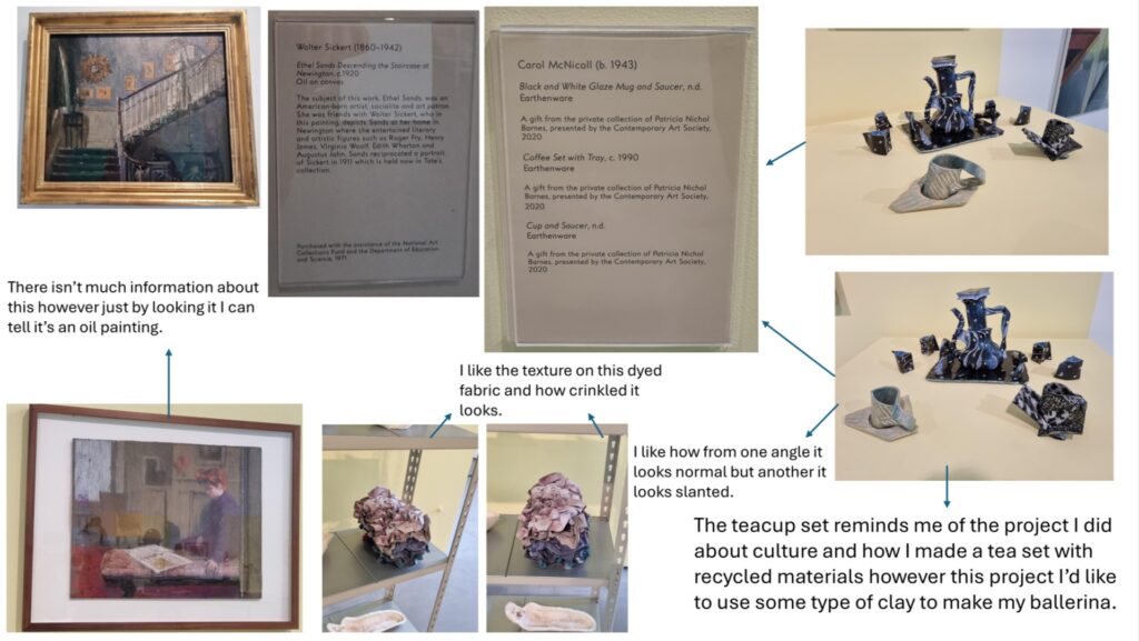
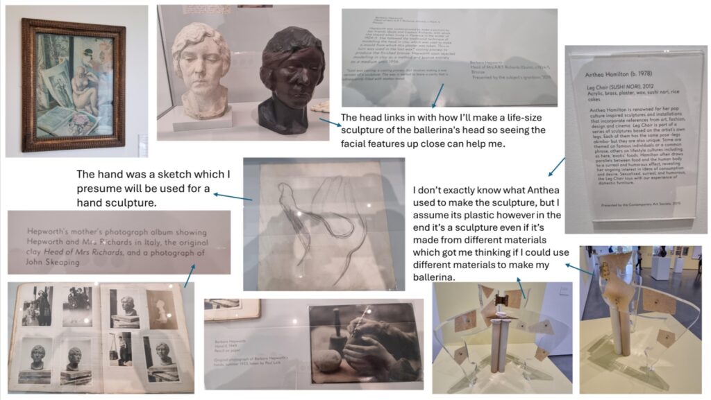
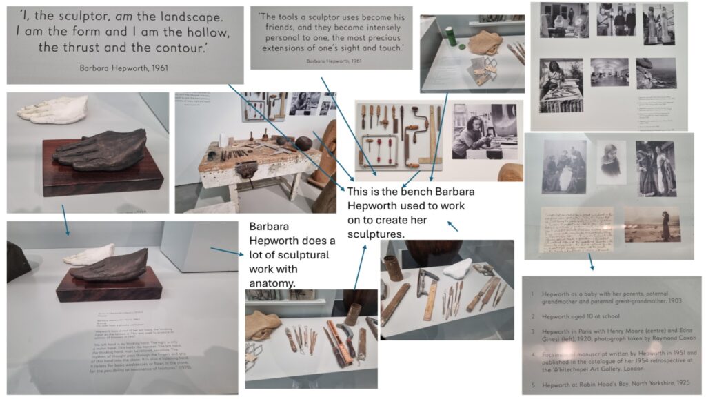
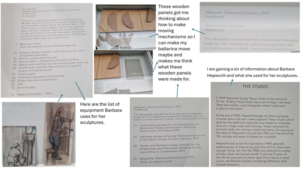
Accu Visit
We went to visit the new Accu site to see what it looks like and where we could put our final pieces when it comes to it.
When we came to Accu they briefed us on who they are as a company, what they strive to do for customers and showed us how they’re changing and rebranding themselves. The PowerPoint is what they showed us to talk about themselves which is the link below.
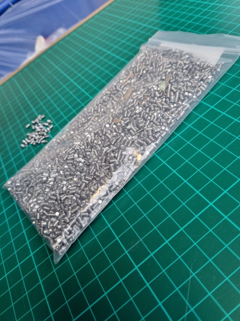
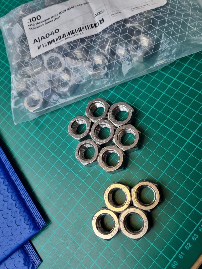
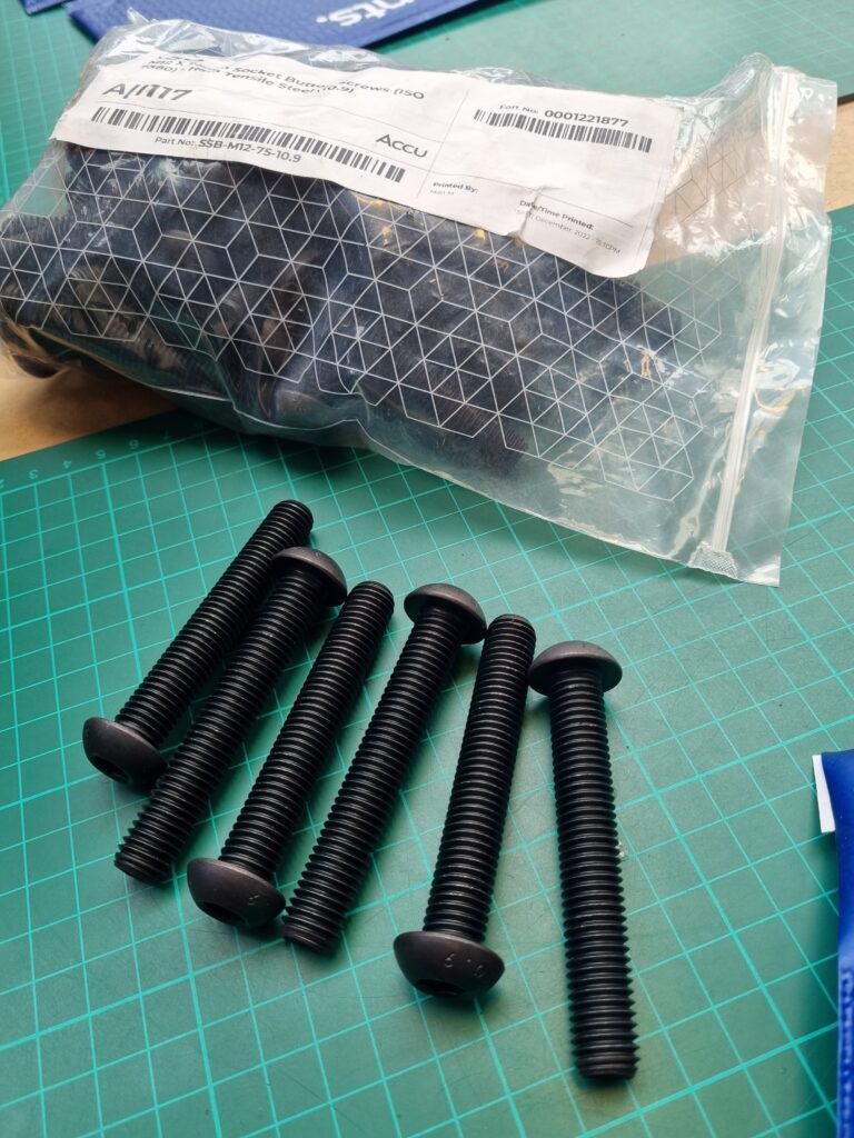
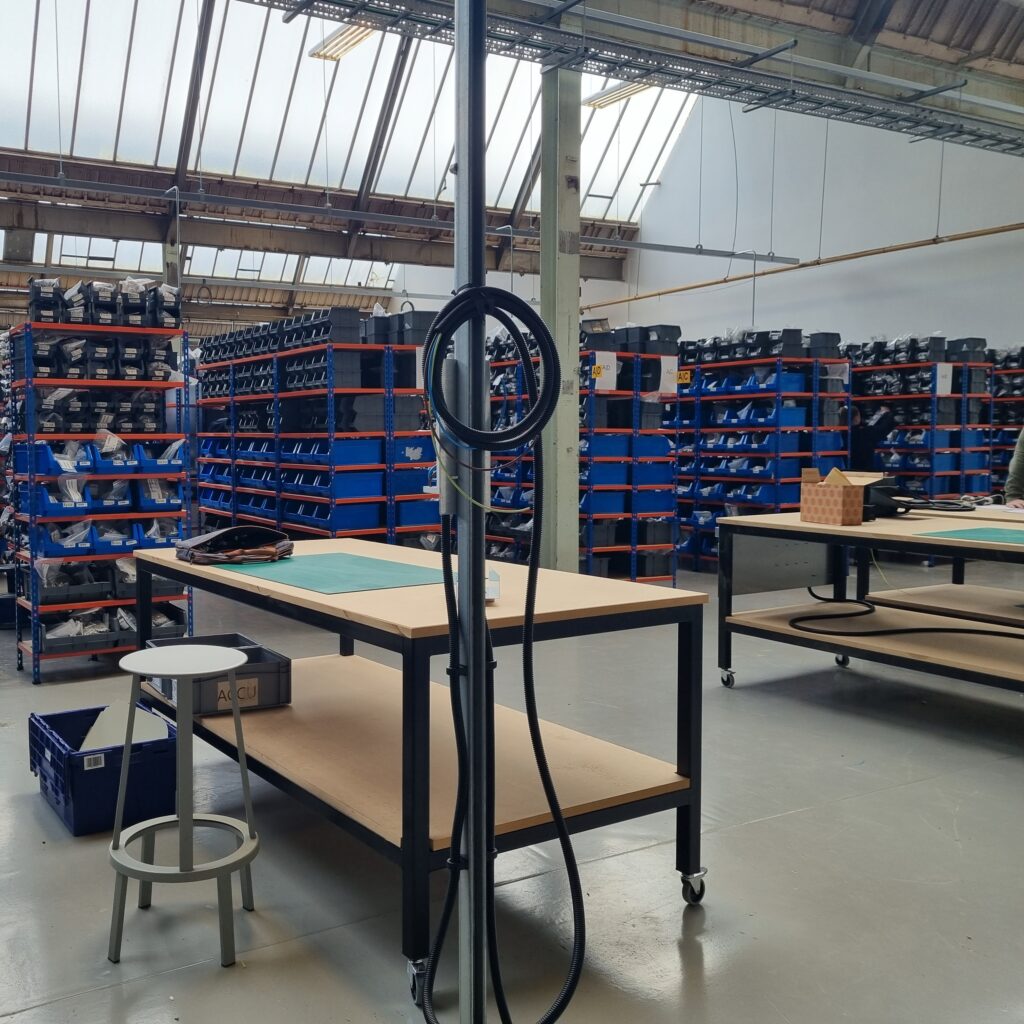
Here are some of the components we got to take a close look at and to see how they package their orders.
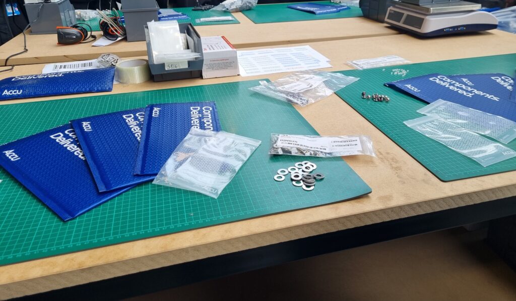
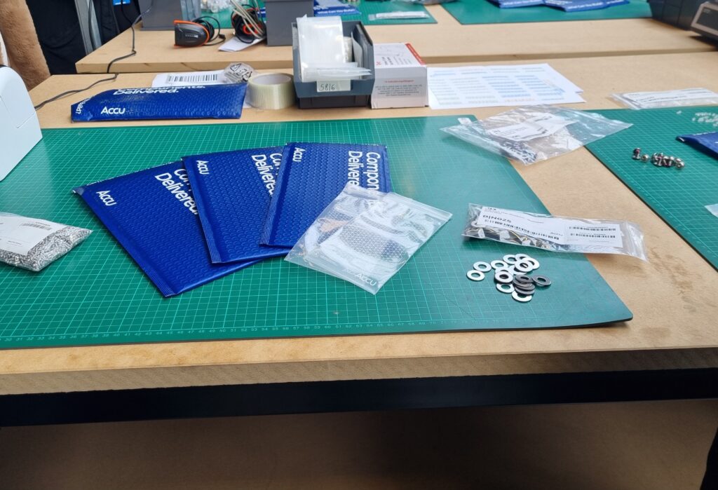
These were the smaller components they sold. I could see that they all have some type of sort code and numbers above which could link to how they keep the components organised and not confuse them and are able to find them easily.
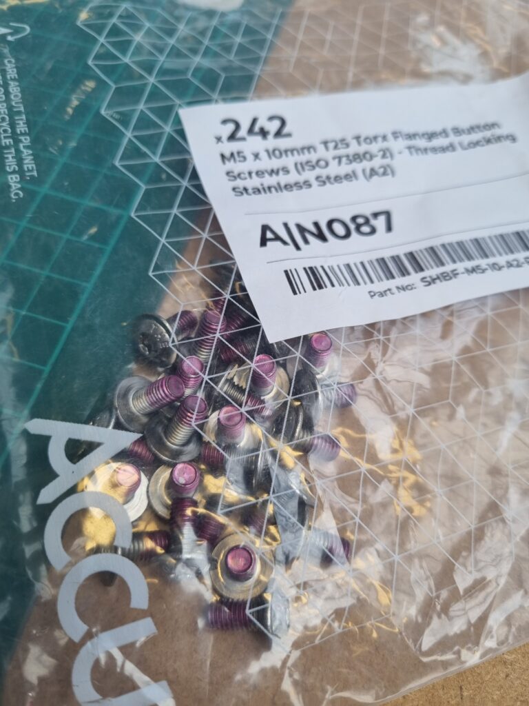
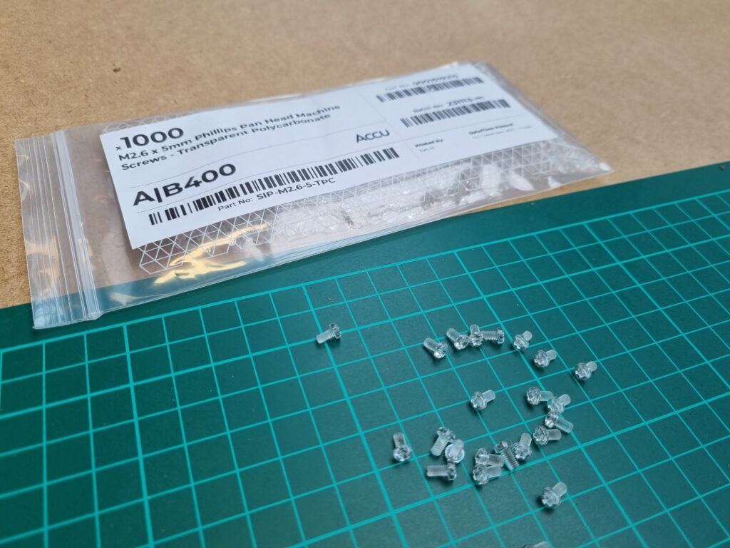
These are the bigger components they sell. You can tell that they have a variety of components from big to small to help with whatever they need to fix or put together which gives customers a load of choices. However, it might be confusing if the components look similar to each other.
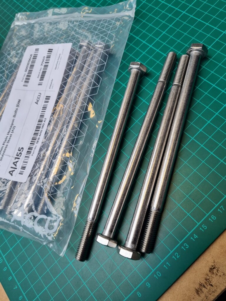
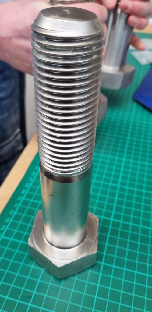
This was the biggest component they showed us. It was quite heavy and I have no idea what they would use this for but it must be for bigger pictures.
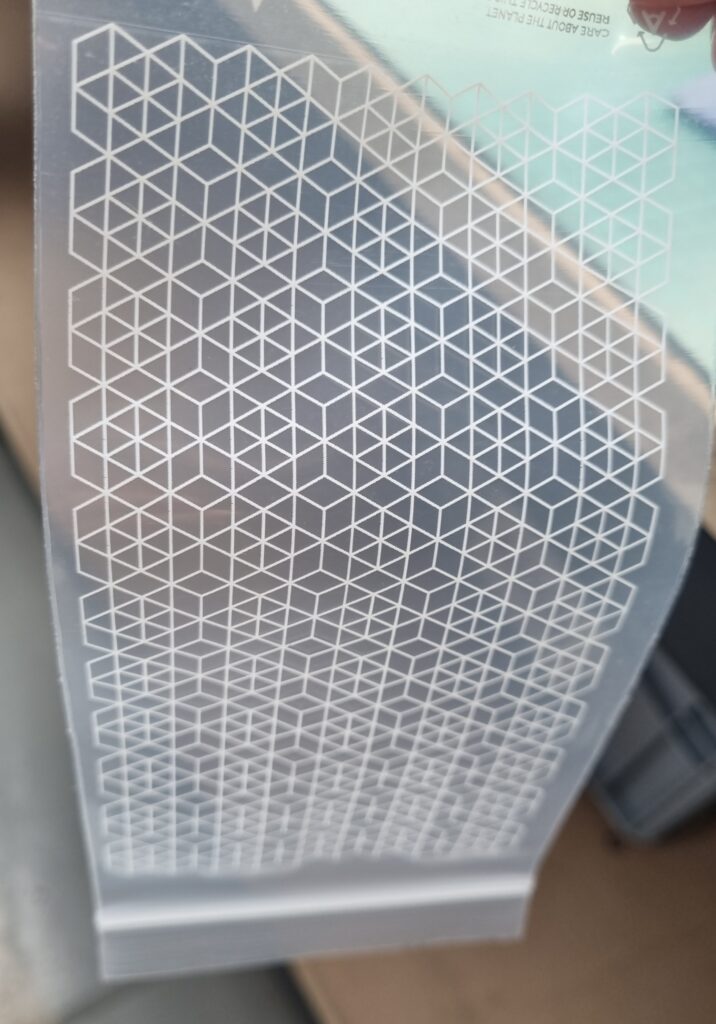
I took some tiny components home just in case I wanted to embed them into my project however, I noticed the pattern on the little ziplock bag. I remembered the presentation we had earlier before entering the site and how they have completely rebranded their company and how these little squares link into that. I like the design as its geometric shapes link in with the shapes of components making it clever, simple, and easy on the eye.
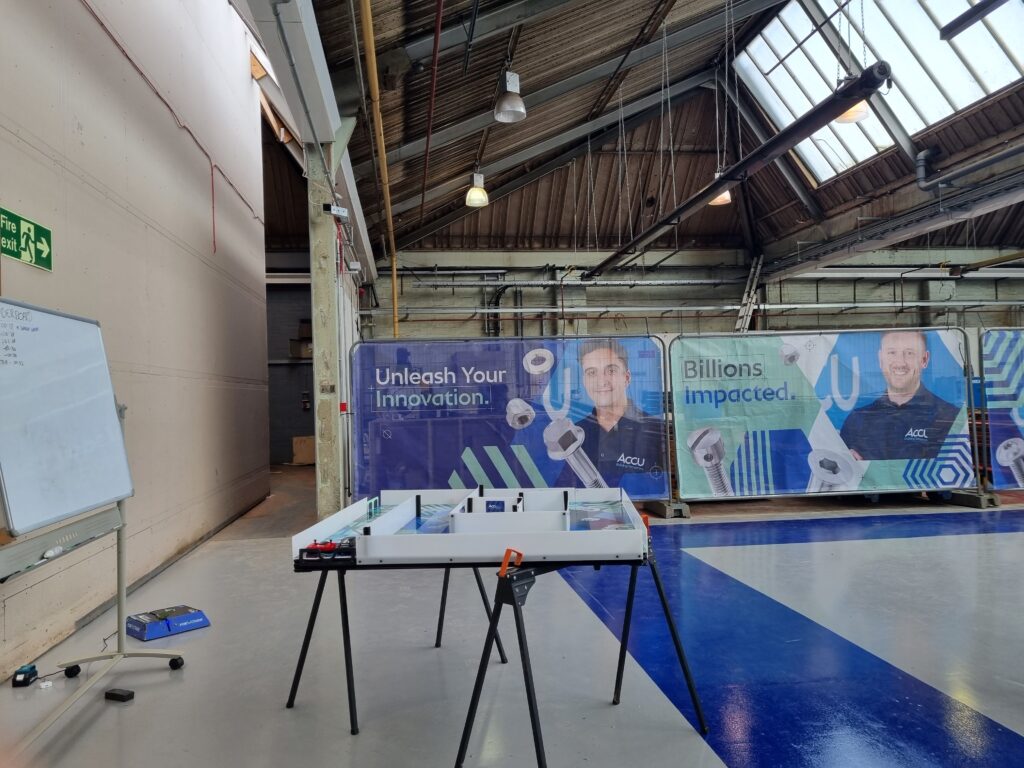
This is the main area that they do their work and sort out each component for customers. The left-hand image is just one of their workspaces and the right-hand image is where they have some games they could play like a car game where they have to get it through the maze to the other side or they do challenges. It’s their temporary chill-out area. Behind the big fences with their marketing on, there are big pillars and other stuff as the building is still being built. They said they might have more space there for the components.
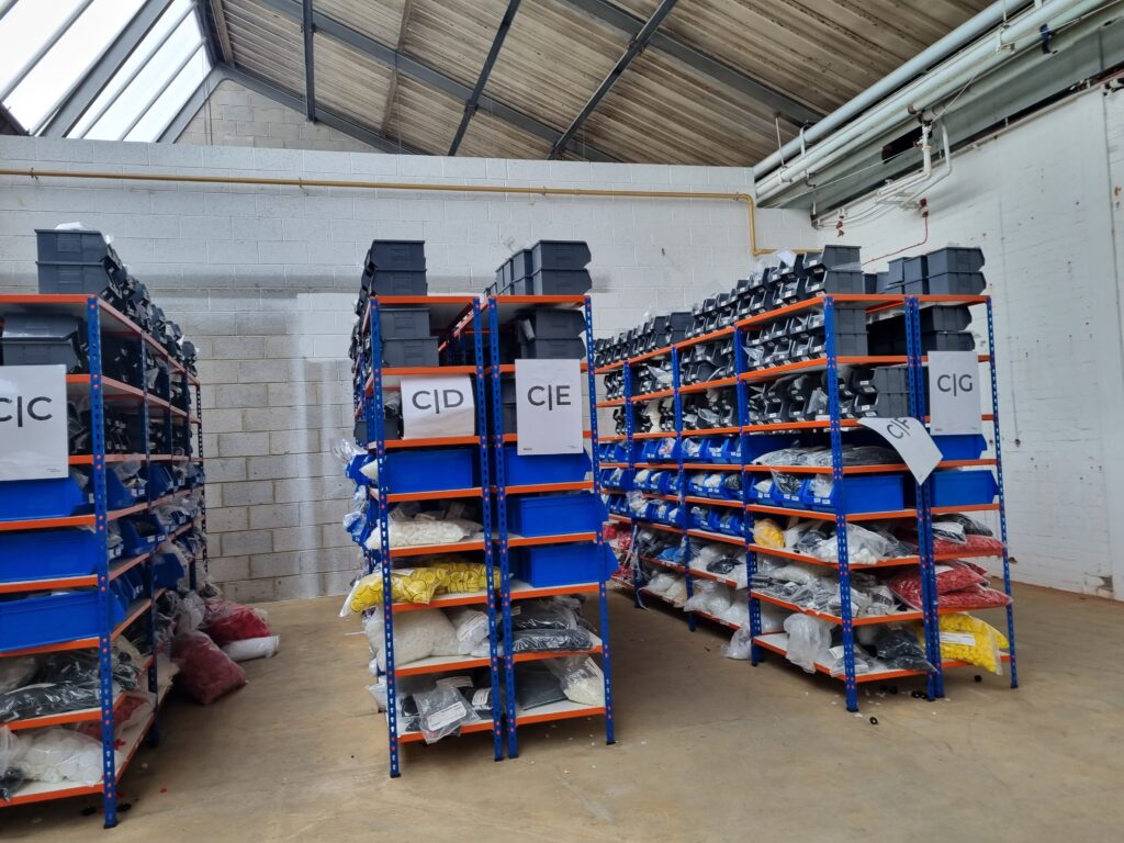
Here is the little room they put other components in as they need to rearrange stuff but they said this would be a games area for the workers. Maybe my artwork could be displayed here however it depends on the finished product of their lounge area.
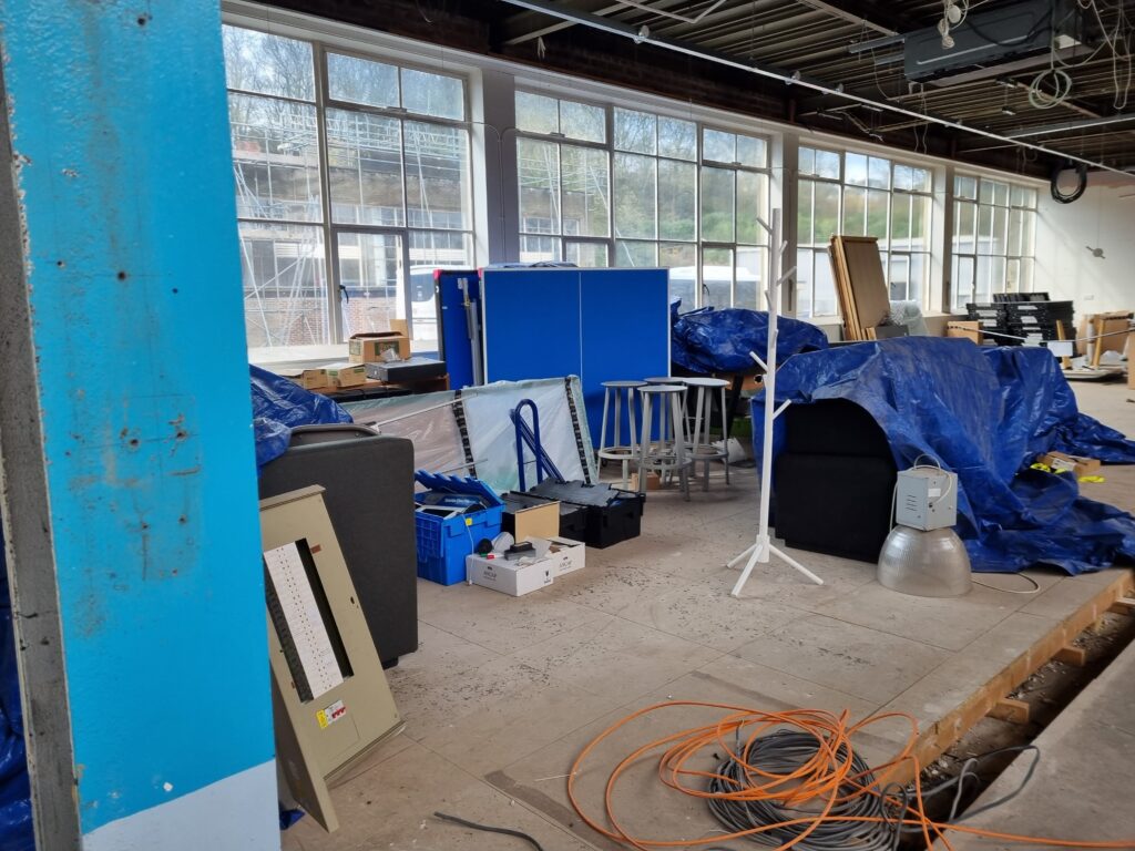
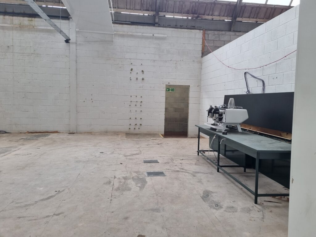
The bottom 2 images are the lounge area where they will knock down the wall to the gaming area. They plan to add a second floor on top as well. It was quite small and due to the lounge area not even being made yet, it was hard to decide where my final piece would look good in the area. I took images just in case to show where the lounge area would be. I’m glad we came to the Accu site as it gave me more of an insight on our client and what they do. It also helps me visualise where I could put my final piece as they showed us a week ago a plan on how they wanted the area to look. I don’t think a big and heavy clay sculpture would be ok for a work environment as it’s too tall so I will make it smaller and try to make it not as heavy.
Midpoint check-in
Week 6 Overview
Although I didn’t do a lot of work due to visiting the Hepworth Gallery and the Accu site, I have gotten a lot more primary research by actually going to the places and taking images which inevitably helps my concept out. I learned that Barbara Hepworth loves to make sculptures so it was a great opportunity to go and how visiting the Accu site gave me more of an insight into our clients and their work environment. The midpoint check-in also really helped me see what I have done so far and what I need to do further along. Next week I’ll sketch out my final piece design and then begin planning on what materials to use making sure to do a lot of testing to see what will work out and what won’t.
Week 7: Finalising ideas
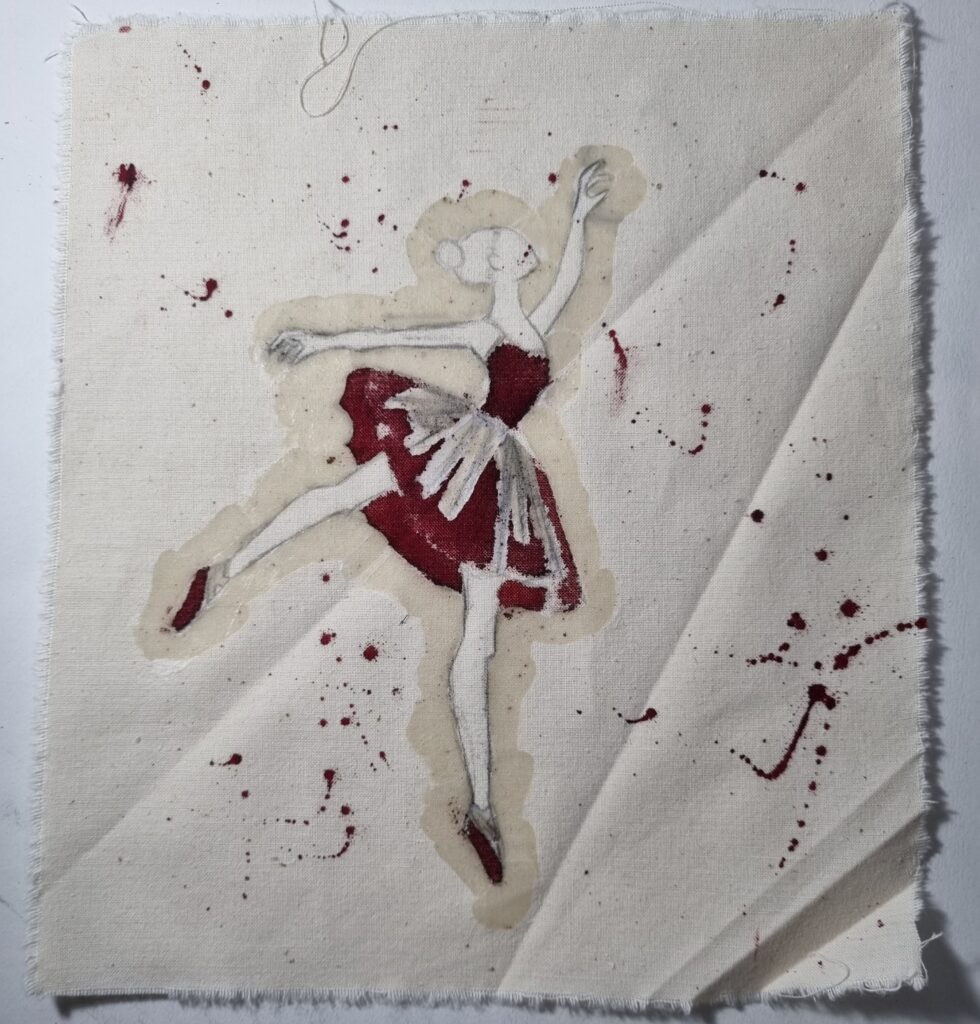
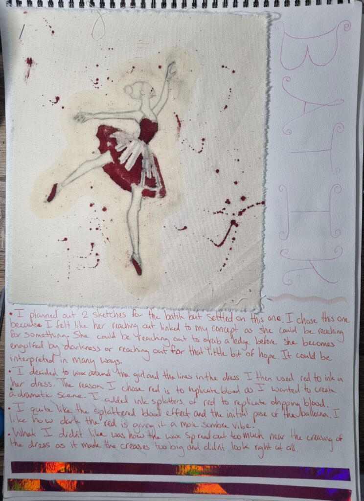
The image on the right is the pose reference I used and the left image is the batik piece before I ironed the wax off by having newspapers underneath and above to take it out of the fabric.


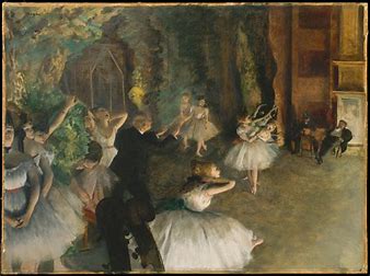
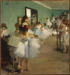
Artist Research- Edgar Degas
Edgar Degas was a French painter, sculptor, and printmaker who did a lot of impressionist art. His subjects mostly were females who had different jobs like laundresses, singers, prostitutes, etc. He was the only impressionist who truly bridged the gap between traditional art and radical movements in the early 20th century. He experimented with a lot of art mediums such as oil, pastel, gouache, etching, lithography, monotype, wax modeling and photography. His art became simplified later on and he would use vivid colours, expressive forms and lots of different compositions. Degas’s father helped him develop an interest in painting where Degas began exploring self-portraits. In 1856, Degas abandoned his studies in Paris and went on 3 long year trip to study in Italy where he immersed himself in painting and sculpture. He first stayed in Naples but later went to Rome and Florence where his notebook was always filled with sketches of faces, historic buildings, landscapes and hundreds of sketches of oil paintings he admired.
Degas seemed to be attracted to the vibrant colours and historical tensions that were being debated a lot in his times. After returning to Paris, he tried immersing himself in the arts and even began painting portraits for families. He then developed a bad habit of self-criticism and always reworked on his artwork trying to get his art to look perfect. The early 1870s were the critical years for Degas as he painted a performance scene from a Ballet class giving Degas new context to paint by becoming an organiser of the first impressionist exhibition as he was recognised for his ballet oil paintings.
Link of information: Encyclopedia Britannica. (n.d.). Edgar Degas – Final years. [online] Available at: https://www.britannica.com/biography/Edgar-Degas/Final-years.
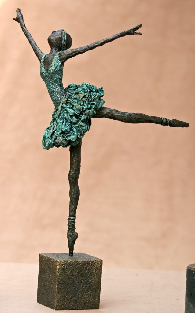
I like his artwork however I won’t be using oil paintings for my artwork but I’ll be using him as my main artist to learn more about ballerinas’ physical appearance.
Final drawing
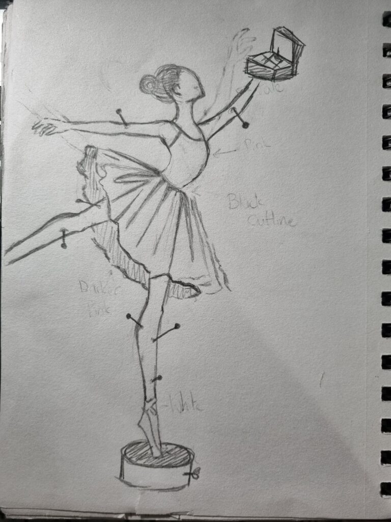
This is the final drawing I am going for. I decided to use the batik drawing I had done as the sketch and added the other bits myself. I want to have it holding the music box like I discussed with my tutor and have pins coming out of it. Next week I’m going to begin experimenting with clay and I’ll further develop what design I want to do for the tutu.

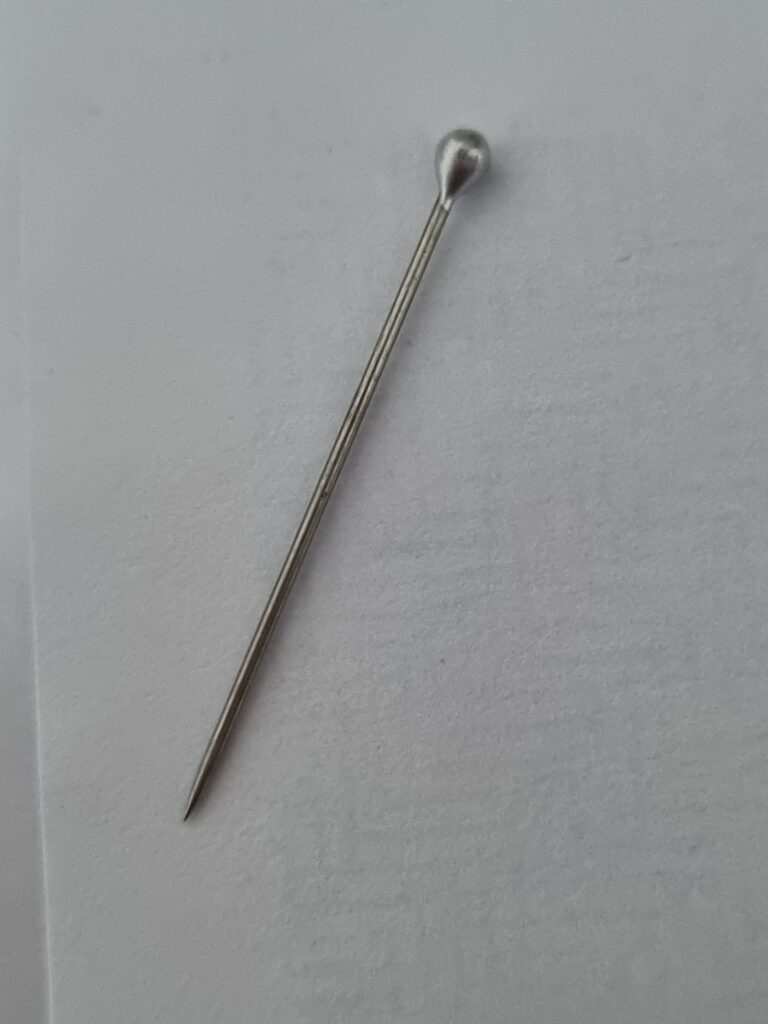
I also found a pin and used that for reference.
Week 7 Overview
I did some artist research and now I’m ready to begin next with the clay work. I’ll further develop my final drawing as I still need to decide how I’m going to make the dress and what colour scheme to go for however hopefully when I begin doing my clay test there won’t be any issues that arise.