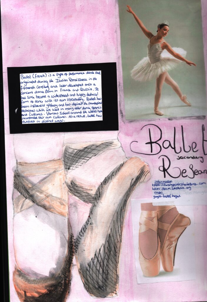
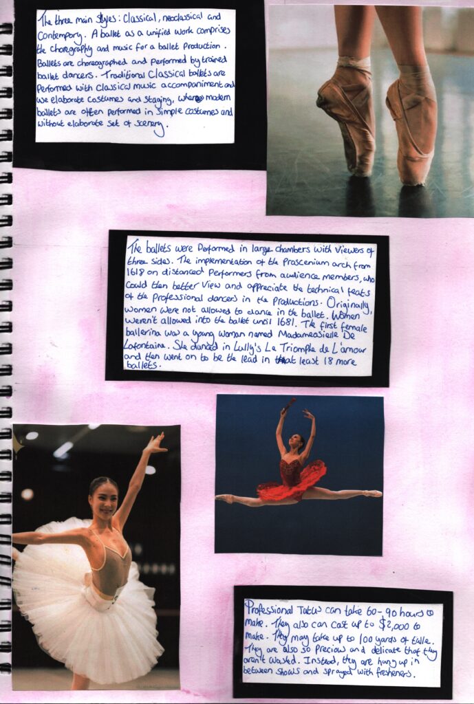
https://en.m.wikipedia.org/wiki/Ballet
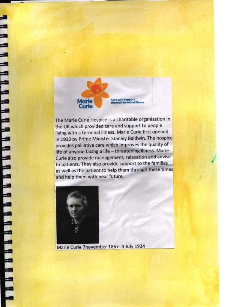
https://en.wikipedia.org/wiki/Marie_Curie
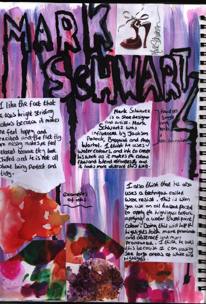
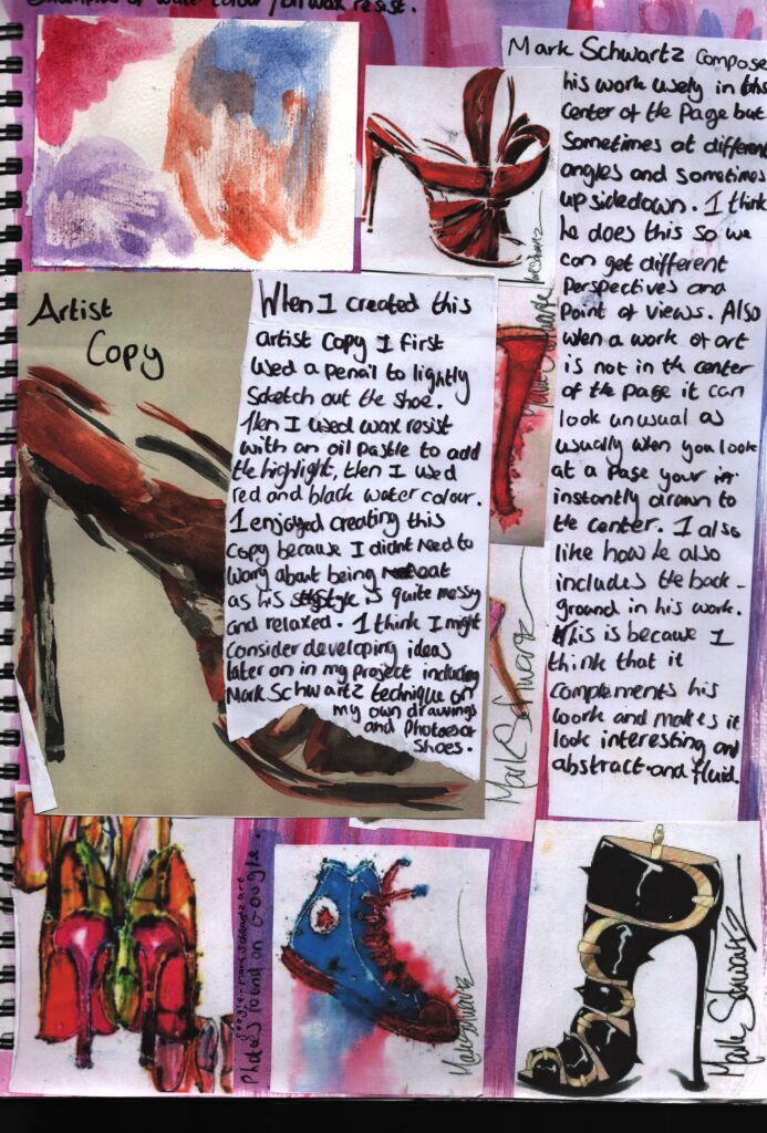
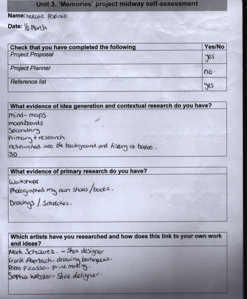
https://en.wikipedia.org/wiki/Mark_Schwartz
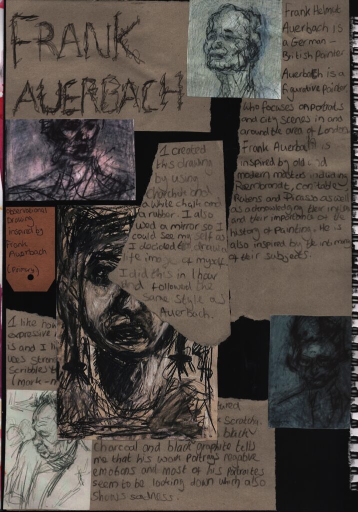
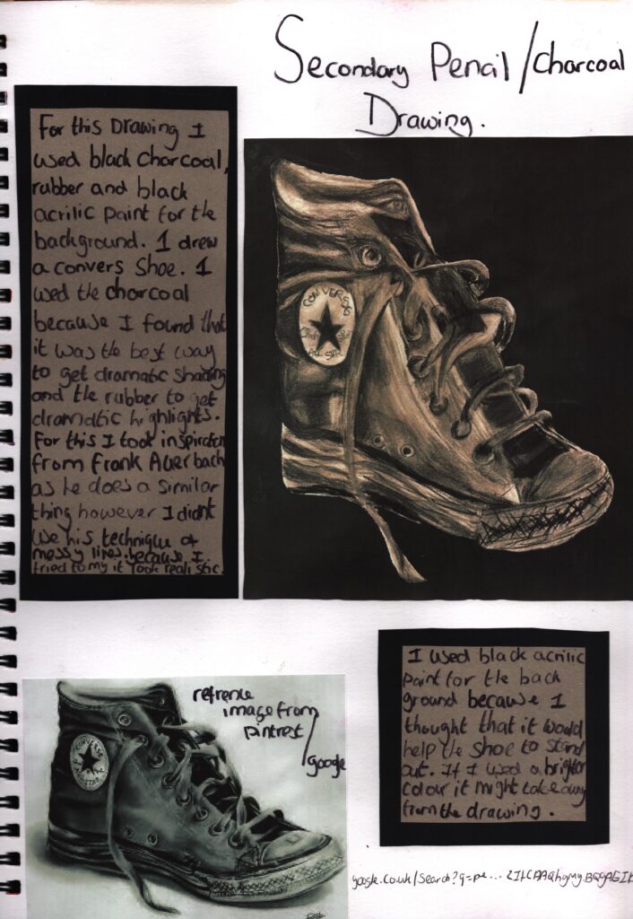
https://en.wikipedia.org/wiki/Frank_Auerbach
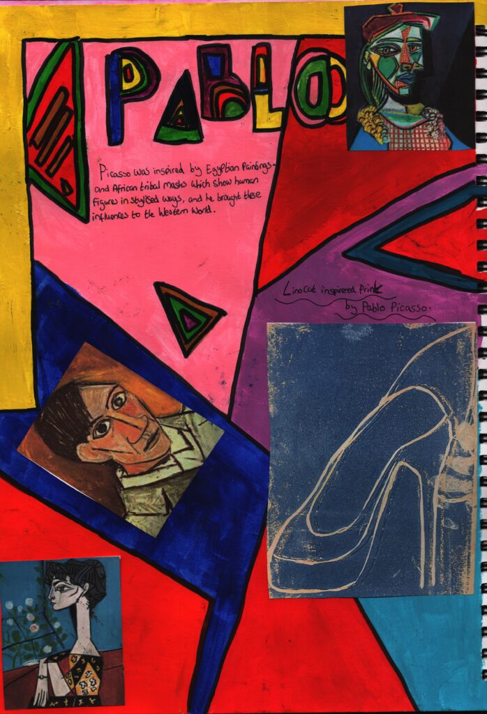
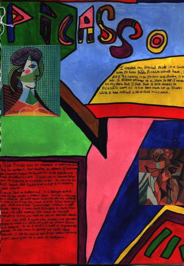
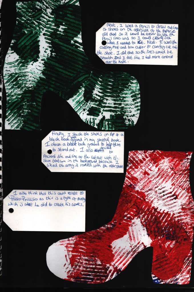
https://simple.wikipedia.org/wiki/Pablo_Picasso
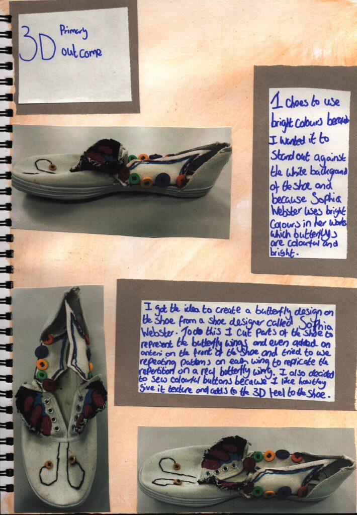
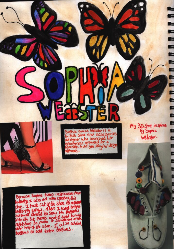
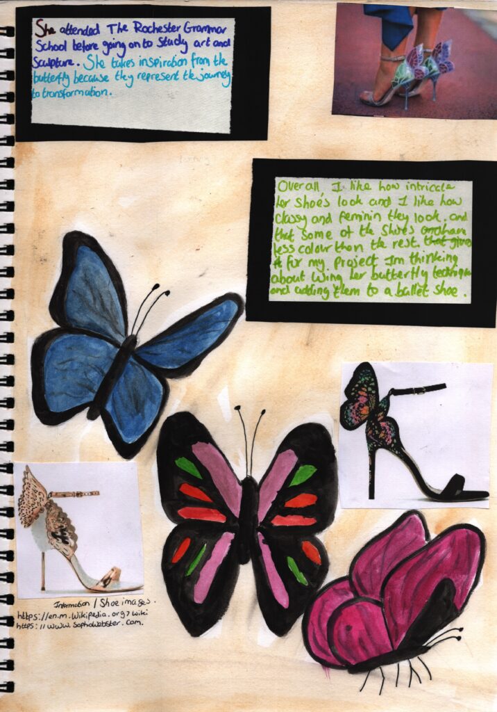
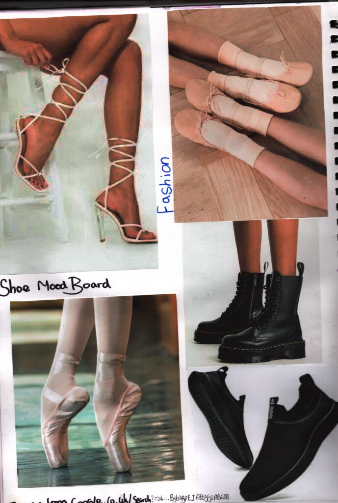
https://en.wikipedia.org/wiki/Sophia_Webster
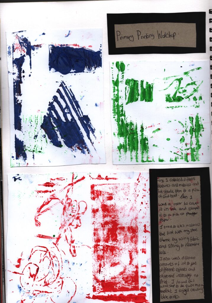
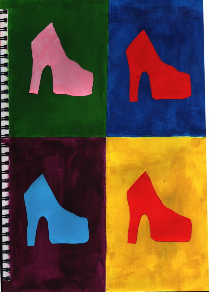
First I split the page in to 4 using a grid and painted each section a different colour of acrylic paint. Then I drew and cut out the outline of a shoe and painted them different colours and glued them a section. I chose to use bright colours and complementary colours to make the shoe and background stand out and pop. I think that this also links to Andy Warhol’s style as he uses grids and the same colour scheme . However, it looks flat and it doesn’t how very much tone or definition in the shoe but it does remind me of being in P primary school and the colour wheel .
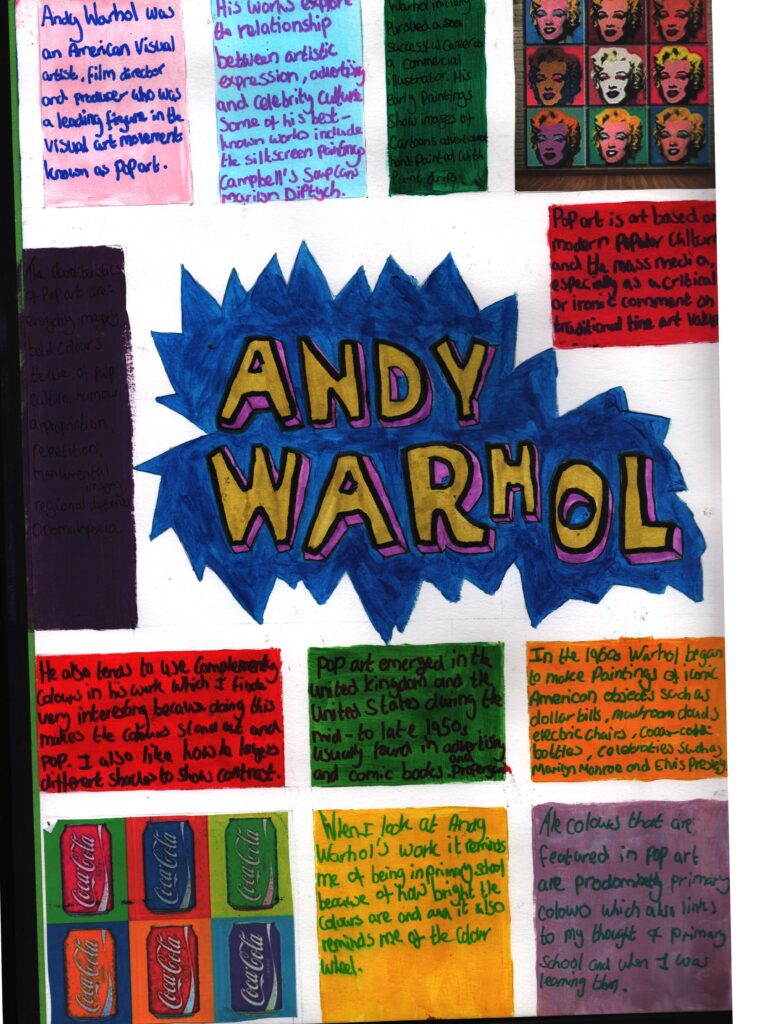
https://en.m.wikipedia.org/wiki/Andy_Warhol
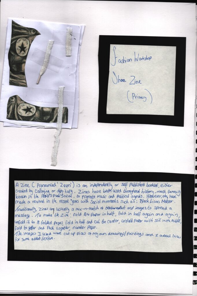
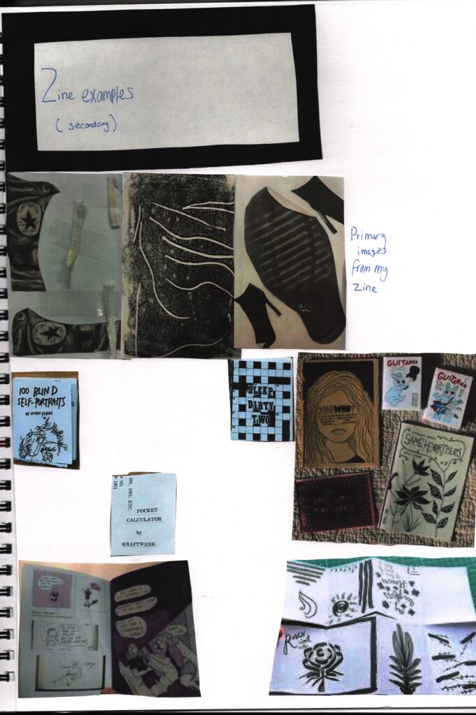
https://en.wikipedia.org/wiki/Zine
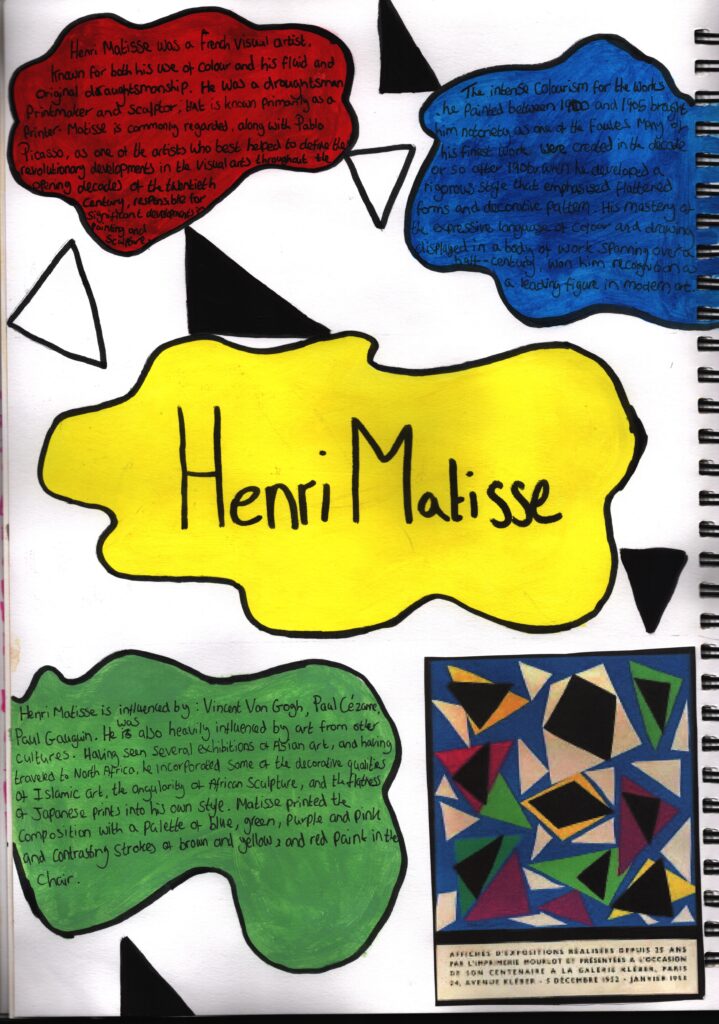
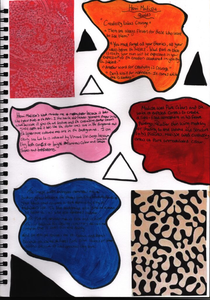
https://en.wikipedia.org/wiki/Henri_Matisse
https://www.brainyquote.com/authors/henri-matisse-quotes
https://en.wikipedia.org/wiki/Grayson_
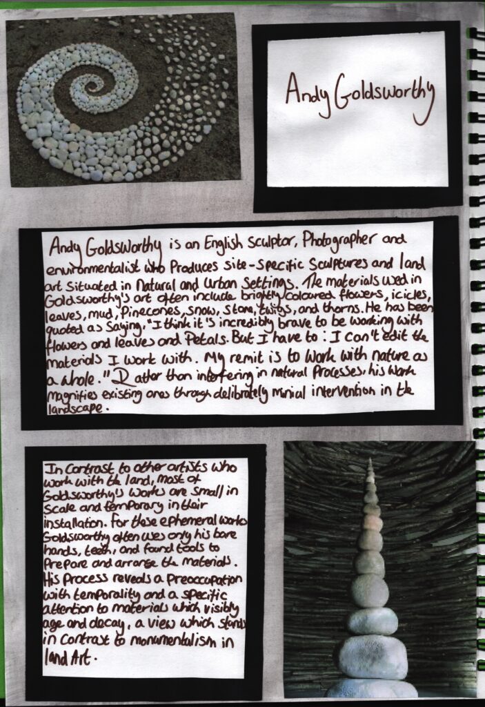
https://en.wikipedia.org/wiki/Andy_Goldsworthy
final piece mind map
Final piece experimental ideas
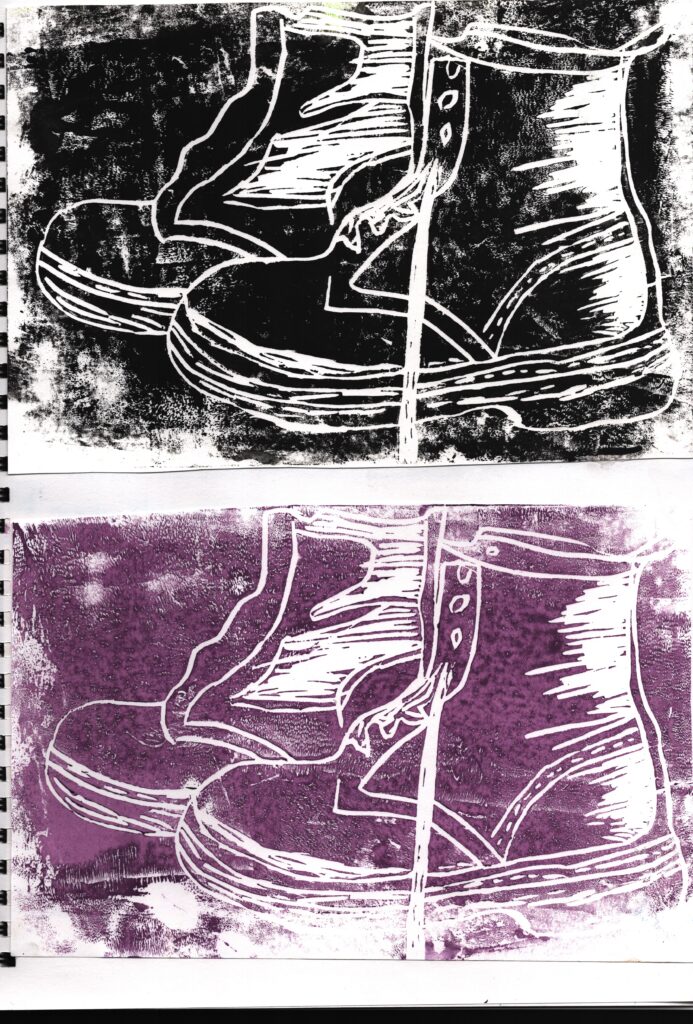
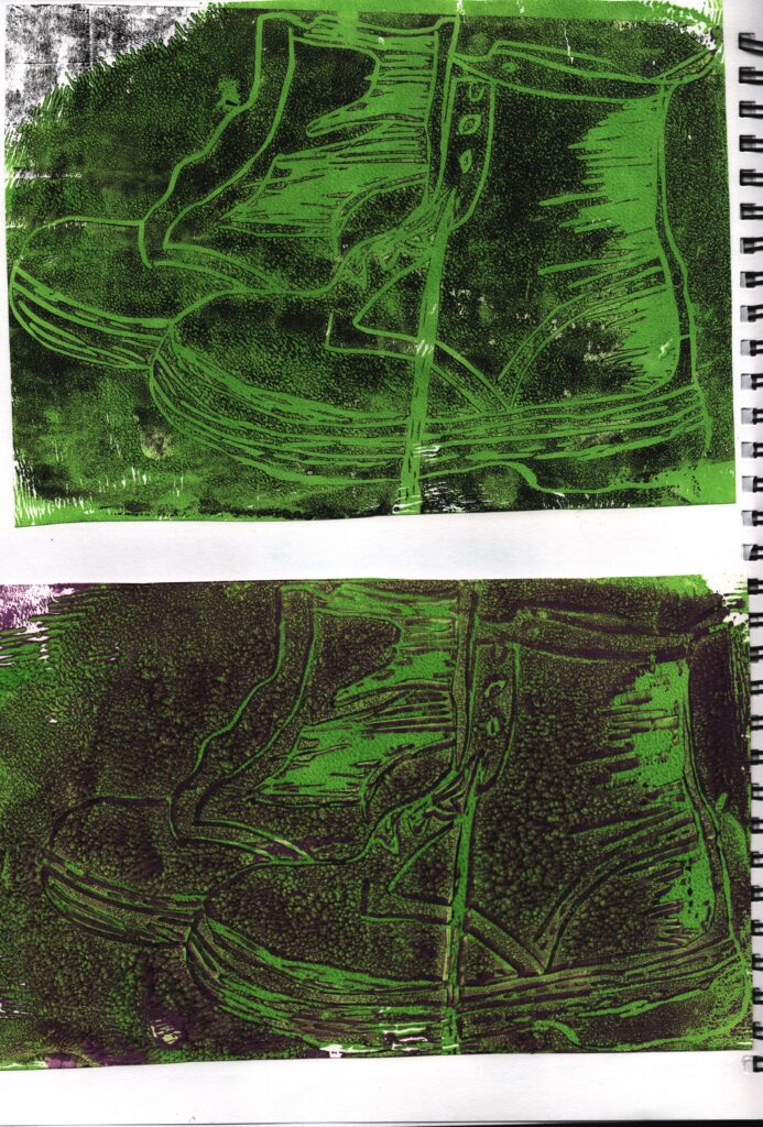
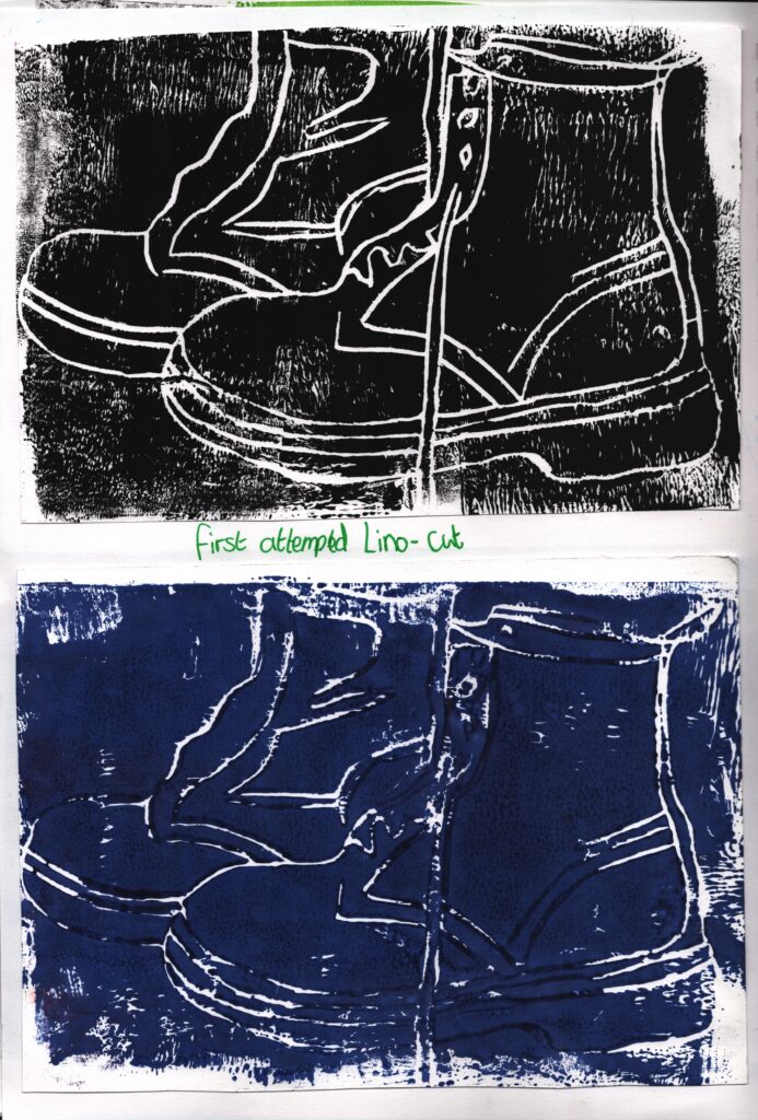
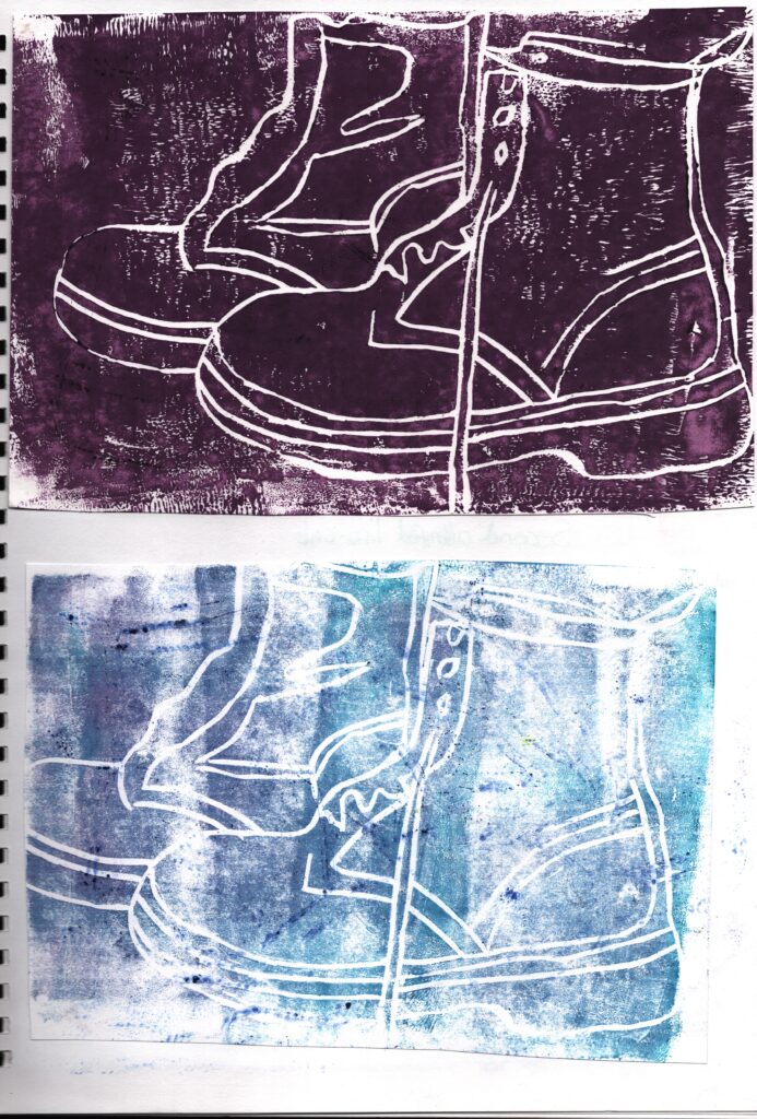
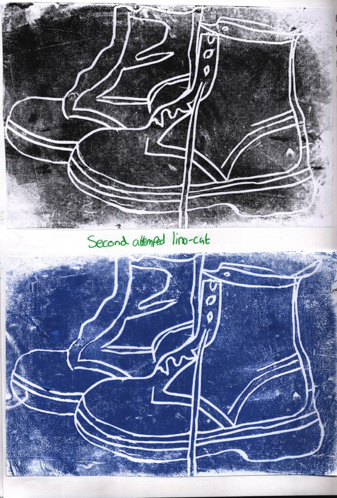
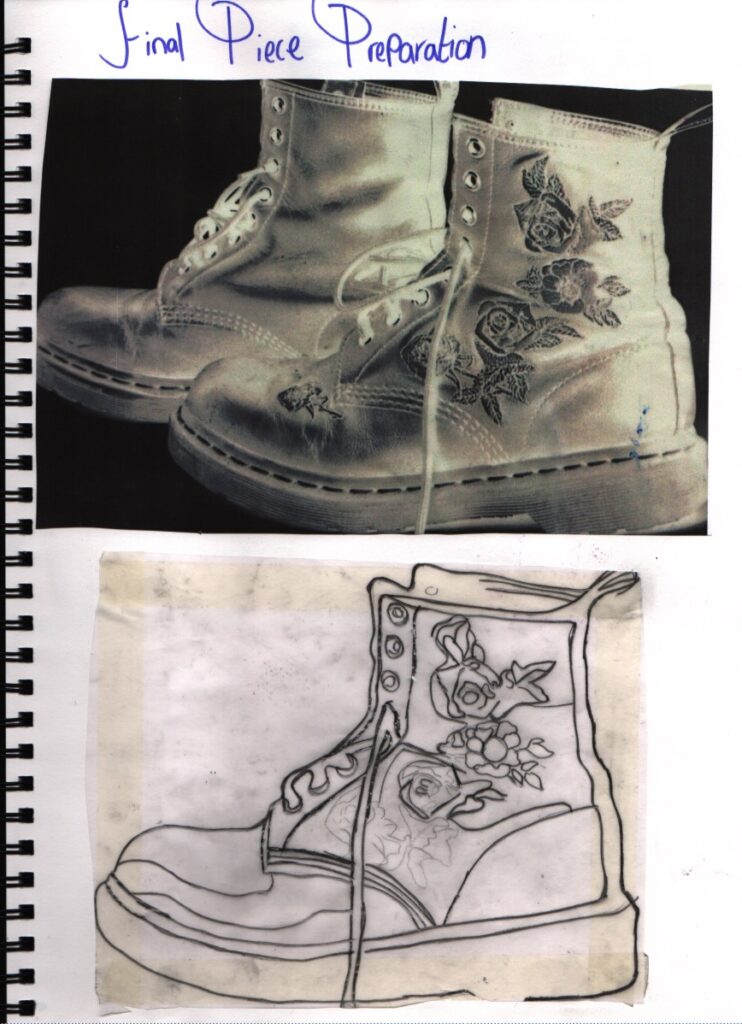
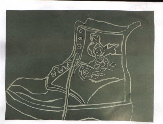
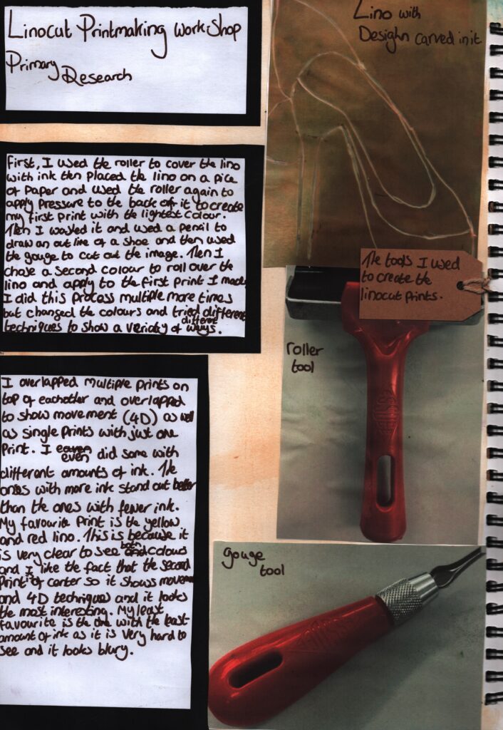
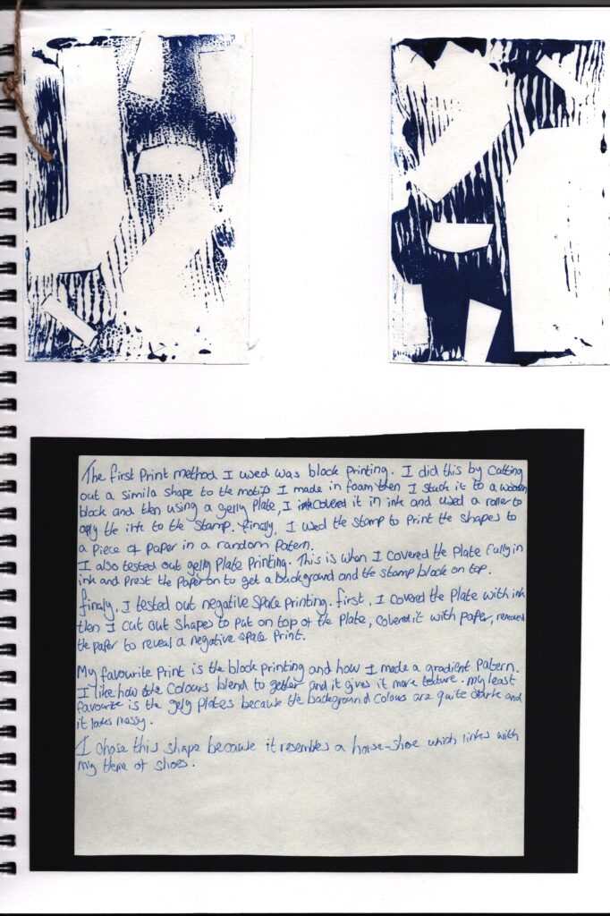
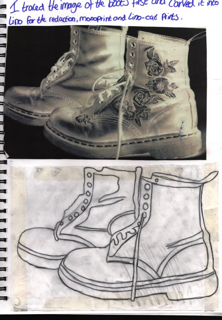
First I printed out the same image of the boots that I used for the experimental pieces . Then I traced one of the boots . I did this because the other boot wasn’t as detailed as the other one . Then I traced that onto a piece of lino . Then I carved the pattern into the lino.
Final piece tests
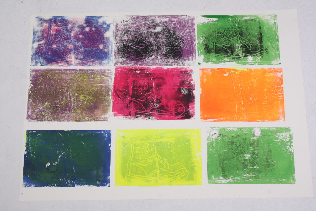
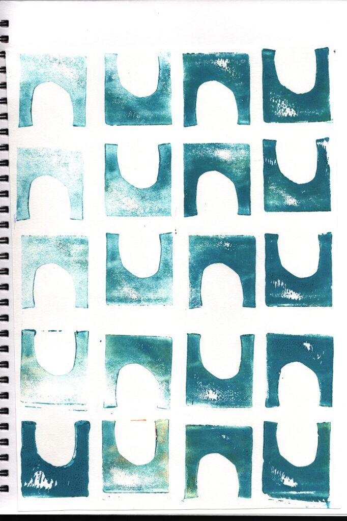
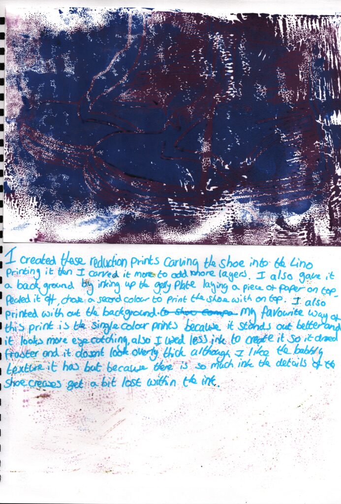
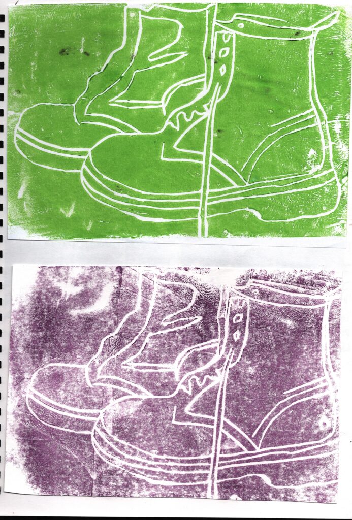
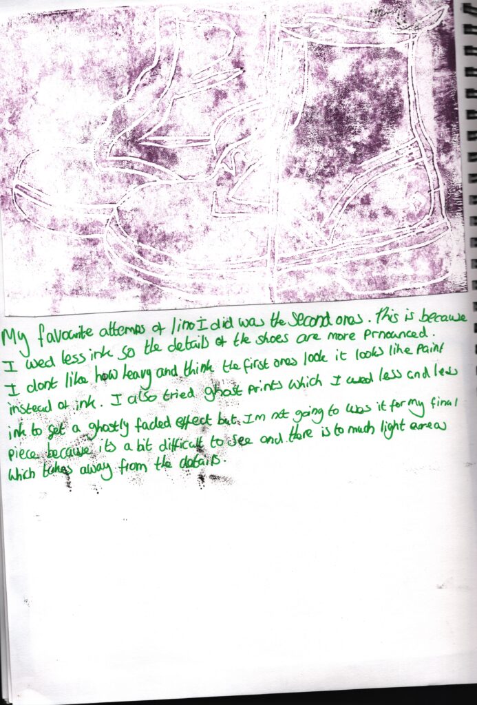
This is my first attempts at my final piece . I did a two tests so I could clearly see how my final piece would look like. I didn’t like how this one turned out because I didn’t like how I presented the colours I thought some of them looked a bit muddy and they don’t show the main focus very well which is the boot print.
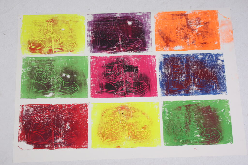
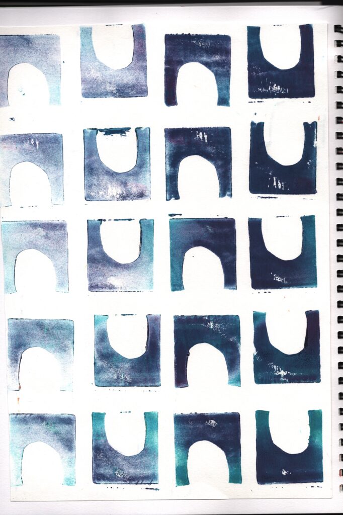
This is my second test for my final piece. I like the colours I used I think that they really complement each other and they make the piece look happy and inviting. However I didn’t choose this to be my final out come because I didn’t like how I smudged the ink on the orange square . This is because I think it makes the piece look messy and rushed .
Final piece
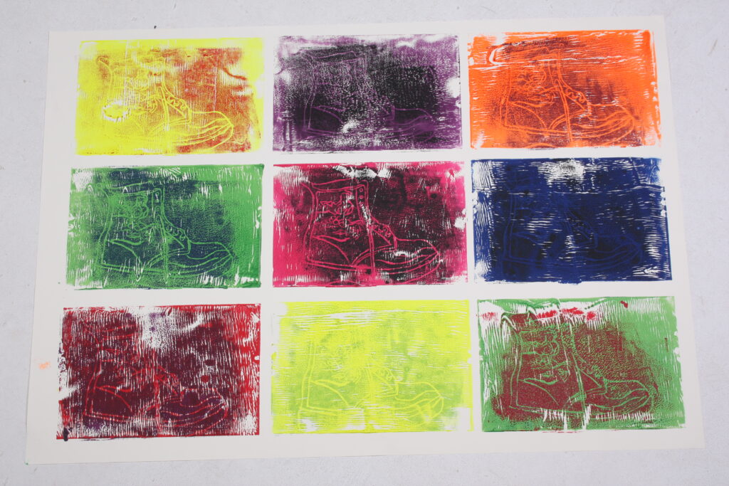
For my final piece, I decided tho use the same colour scheme as the second one but I changed up some of the colours for the show print as I thought that these colours suited them better. For my final piece I also considered an artist that I found very inspirational (Andy Warhol.) I used the same style to his works which is pop art and I also portrayed my work in a gird in the same way that he dose in a continuous pattern. This also reminds me of a War Propaganda poster because they also include pop art . This is because pop art is bright and colourful and attention grabbing and that is wanted my piece to be . It was a bit time consuming to create because after each print I had to wash the ink of the jelly plate , roller and lino so the colours wouldn’t mix and become muddy.