For the first part of this project I choose jazz and I have done work around that
FMP proposal
https://www.citethisforme.com/bibliographies/c5011c1c-e58d-4fcc-af1e-ec0b1e77f375
l.
How have you generated/developed ideas? I used primary research by drawing posters and musicians in my sketchbook I have and also I have done a mind map to help me generate ideas as-well. Which artists have you researched and how have they influenced? I found a artist called Gibbson Mc Carty i really like the work ‘Grant GreenPrint Poster Jazz Guitar Master’ and it has inspired me to make work similar to him What has inspired your ideas? I think that since I’m am doing a jazz memory for this memory project I decided to do a jazz posters as my theme. What other research have you done? I have done a mood board mind map and done some photography for my theme done a mood board about jazz for this project. What materials, techniques and processes. I’m unsure what materials and techniques I should use but I like to using photoshop so that might be my final piece. What materials, techniques and processes do you intend using? I think I might use markers and water colour paint in my work and possibly in my final piece as-well. How do you intend to test and experiment with your ideas? I am going to use different techniques to see which one is good to use for my final piece
Use the following bullet points to help you structure your proposal:Explain your theme/concept/idea for the project?
I am going to be focusing on jazz posters for this project I drawn many of my ideas down and I decided to make my own typeface to go with the poster drawings.
How have you generated/developed ideas?
I used primary research by drawing posters and musicians in my sketchbook I have and also I have done a mind map to help me generate ideas as-well.
Which artists have you researched and how have they influenced?
I found a artist called Gibbson Mc Carty i really like the work ‘Grant GreenPrint Poster Jazz Guitar Master’ and it has inspired me to make work similar to him
What has inspired your ideas? I think that since I’m am doing a jazz memory for this memory project I decided to do a jazz posters as my theme.
What other research have you done? I have done a mood board mind map and done some photography for my theme done a mood board about jazz for this project.
What materials, techniques and processes.
I’m unsure what materials and techniques I should use but I like to using photoshop so that might be my final piece.
What materials, techniques and processes do you intend using?
I think I might use markers and water colour paint in my work and possibly in my final piece as-well.
How do you intend to test and experiment with your ideas?
I am going to use different techniques to see which one is good to use for my final piece
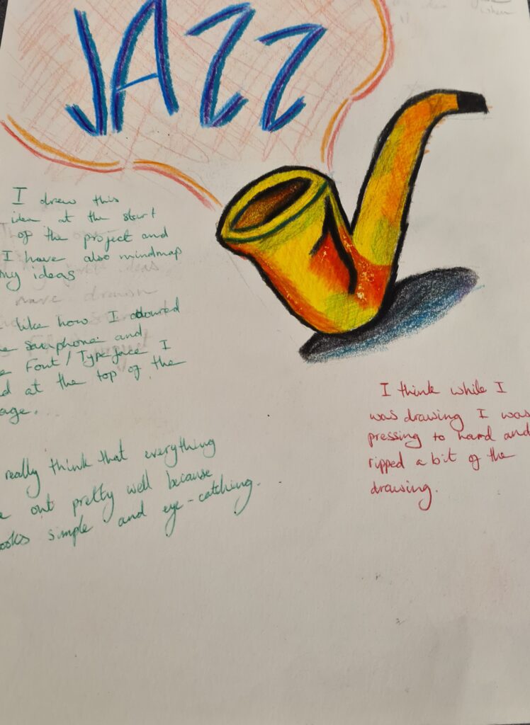
This was one the first poster ideas that I drew and I like it because it was a simple drawing. I think I shouldn’t have done the shadow and I don’t really like how the paper started to rip because I was pressing to hard.
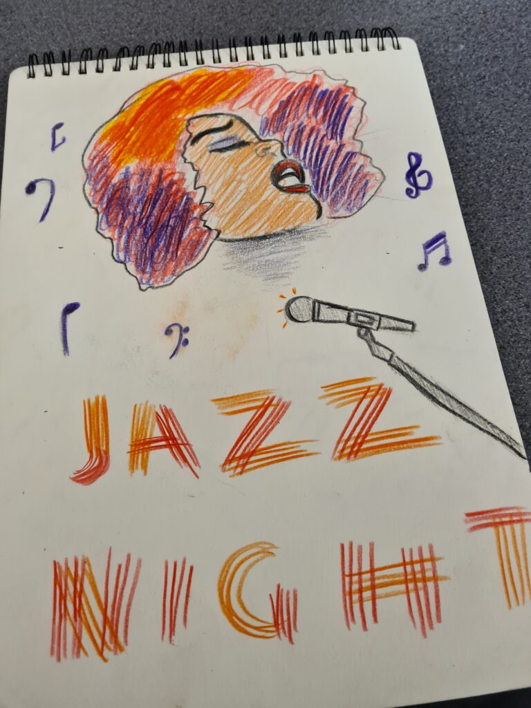
this was one of my favorite ideas that I have drawn so far because it looks so much like an actual poster and i like how my character was drawn to how the microphone looks.
the only thing I’m not really a fan of the the title because the was a made up type face I think it doesn’t have
Artist research
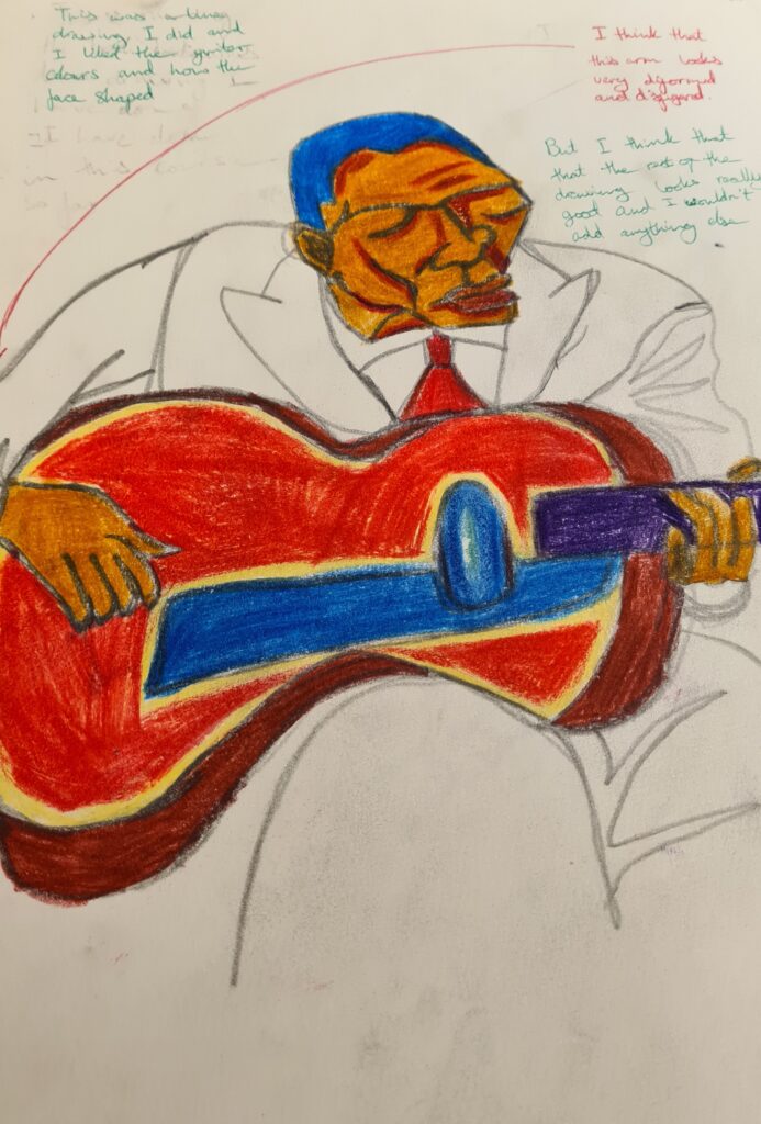
Artist research-Keith Mallet and Ben Heine
This was the only continuous line drawing that I did that I like and I like how the guitar is weirdly shaped.
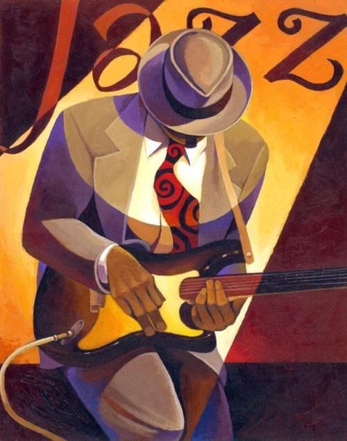
This is one of my favourite pieces of work the Keith Mallet has done.I like how he uses alot of warm colours and he show the person in his work is in the spotlight.
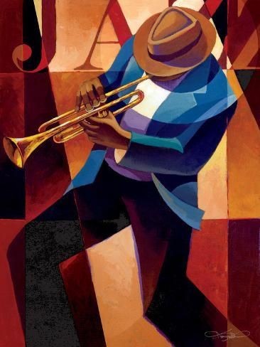
This is another piece of work the I like that he has done Keith Mallet makes his character look like he is preforming while. It also looks like that you can tell that his character may be enjoying his preformence and grooving
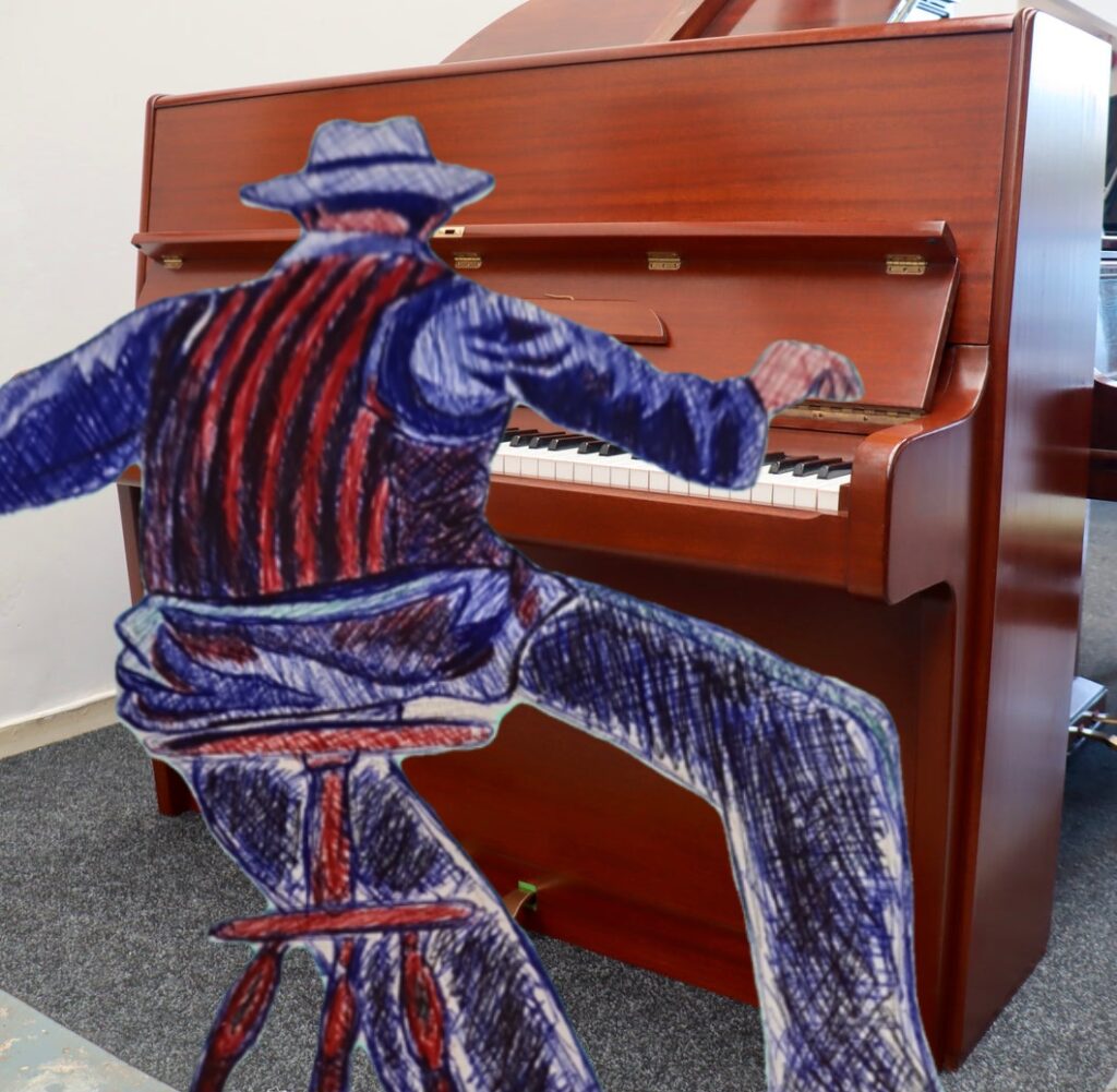
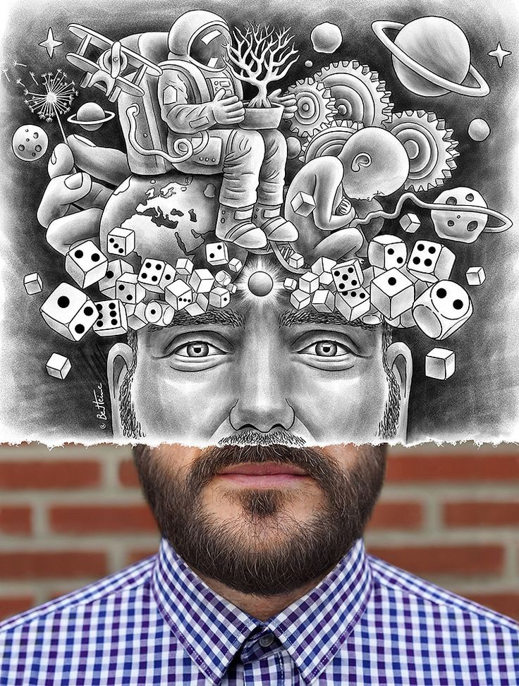
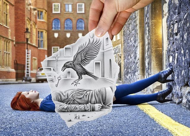
This also reminds me of one of Ben heine’s work because they photograph their work the draw a picture of an area or person than overlaps the drawing over the photo.
I like this idea because this art style looks like it brings more life into the world and makes
I decided to add one the Keith Mallet drawing I did then overlap it on a piano image to make it look like the character is playing some music on the piano
This was a random idea that came into my head and I genuinely think that this was a good idea
The way how I made this image
- I used a photo editing software to remove the background and turned the image transparent
- Then overlaping the transparent image of a piano that I found on chrome
(Note:I’m going to change the piano and add the after photo)
(Ideas)
- A title with a font/typeface because my theme is related with jazz posteers
- could edit over this image in photoshop using the polygonal tool and gradient tool
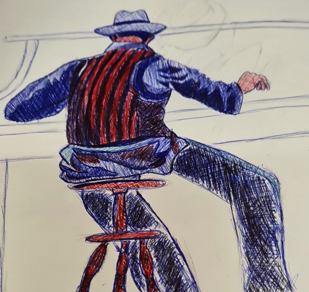
This is the original drawing I did using a biro pen with green, blue, red and black
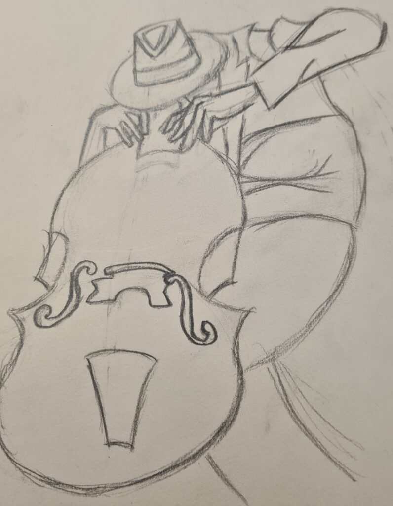
I like my art piece because it looks like their is a person that is playing the chello
But personally think that I should made have this piece more accurate to the image and the beck of the chello is being eaten by my character .
Secondly compared to the actual image I think that the Chello looks deformed and smaller that the chello that was in Keith Mallet’s work
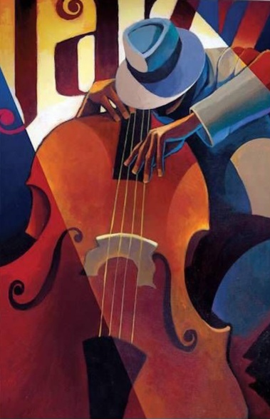
This is the original image and I like how the person I possibly dancing while playing the chello
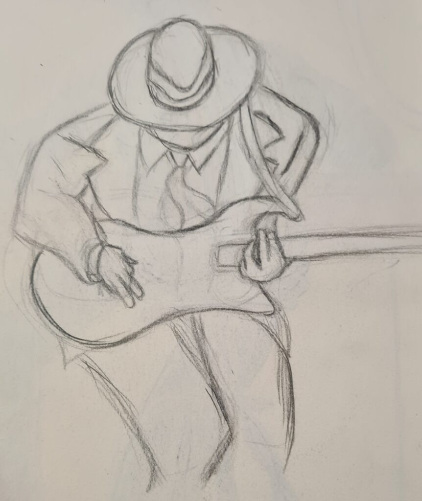
I like this piece of work but I think there is more room of improvement.
I don’t really like how the guitar looks And the legs looks the are struggling to stand
Architectural word hunt workshop
i decided to go around collegeand photograph diferent partsof colllege and turn it intowords, I decided to look forwords that i could possibly usein my final piece I decided to spell “jazz poster”as chosen for this workshop
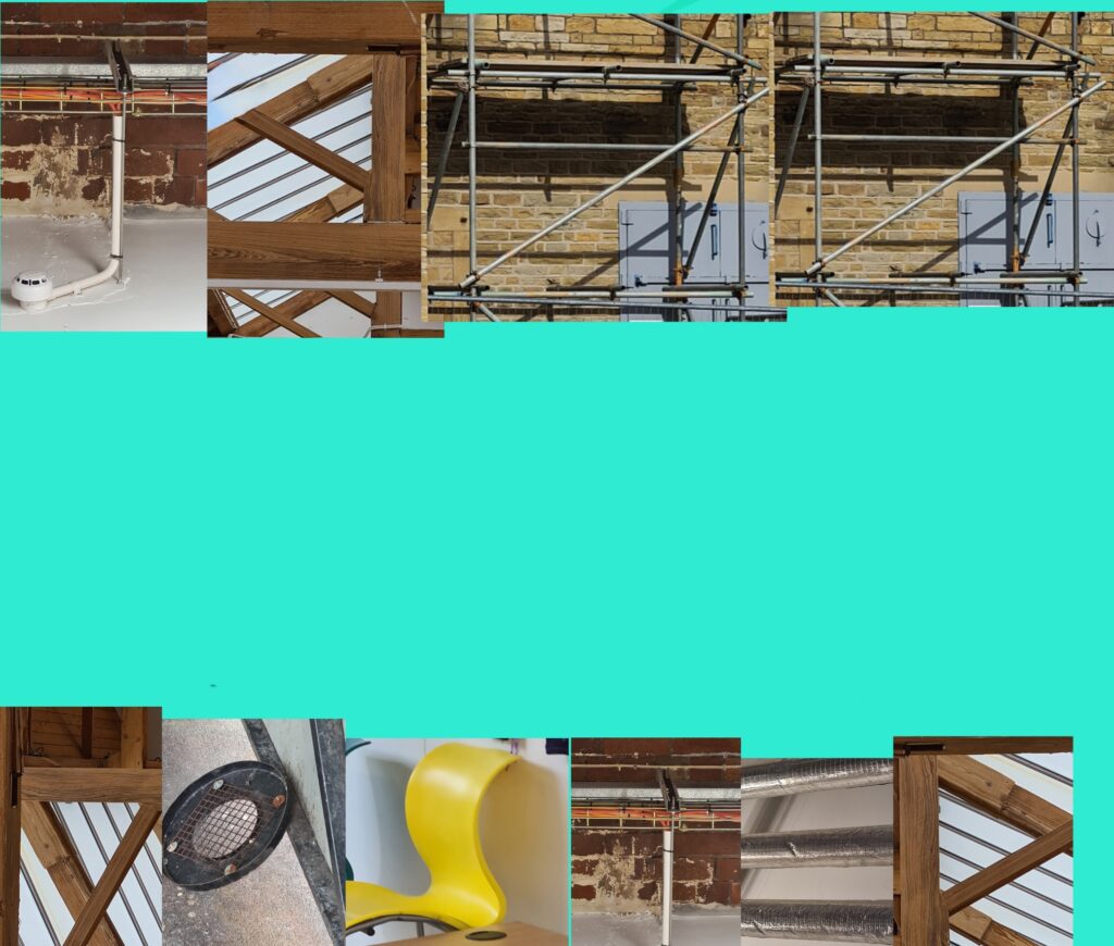
his task was really difficult because I couldn’t really find good letters like e.g. T,E and A I had to crop the T and edit the A but the chair in the café doesn’t look like a proper S. And the E in a17 doesn’t look as close to a E I think I might replace the E.
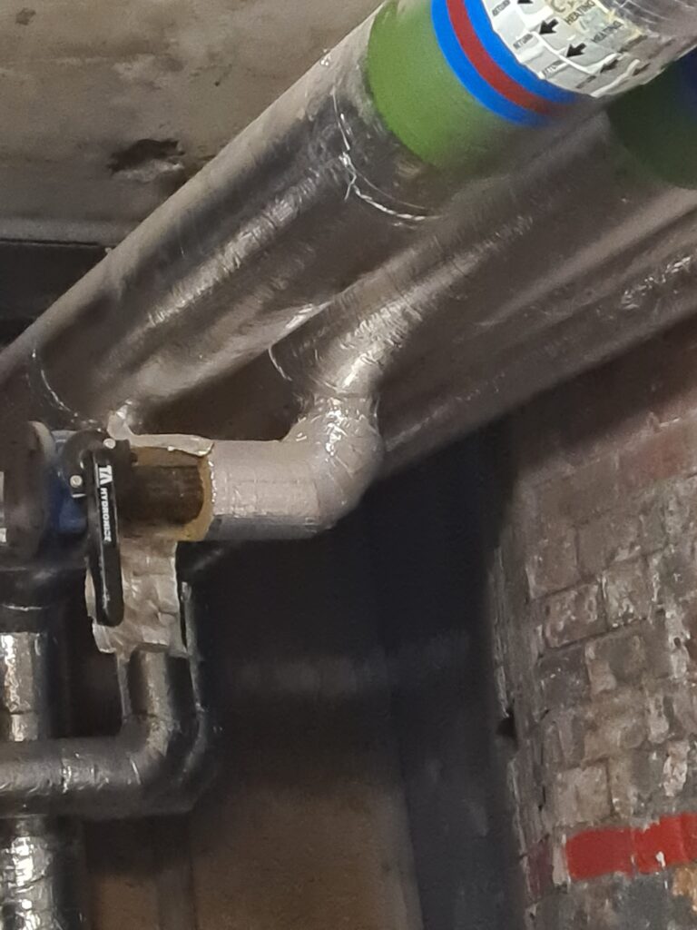
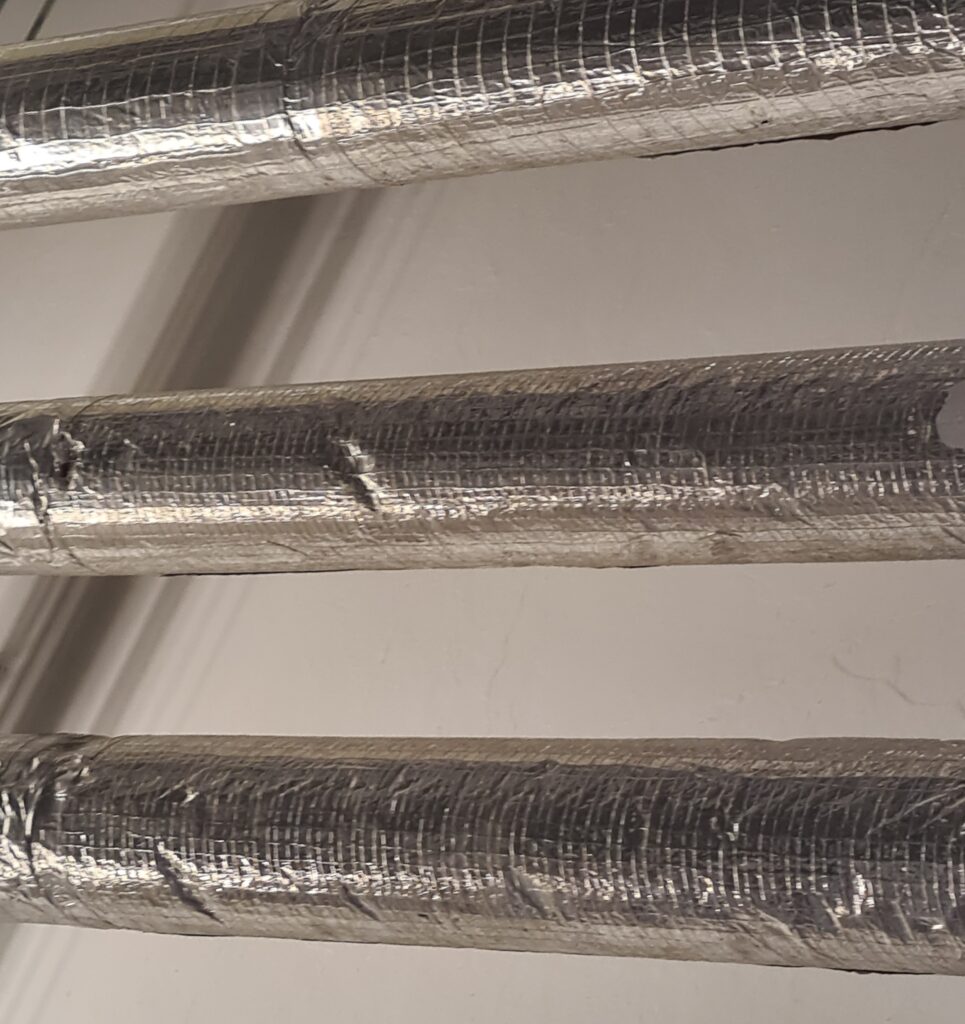
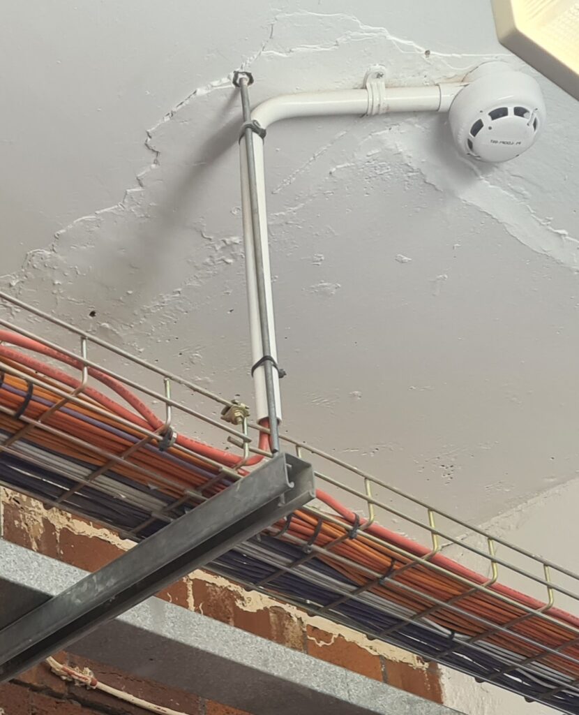
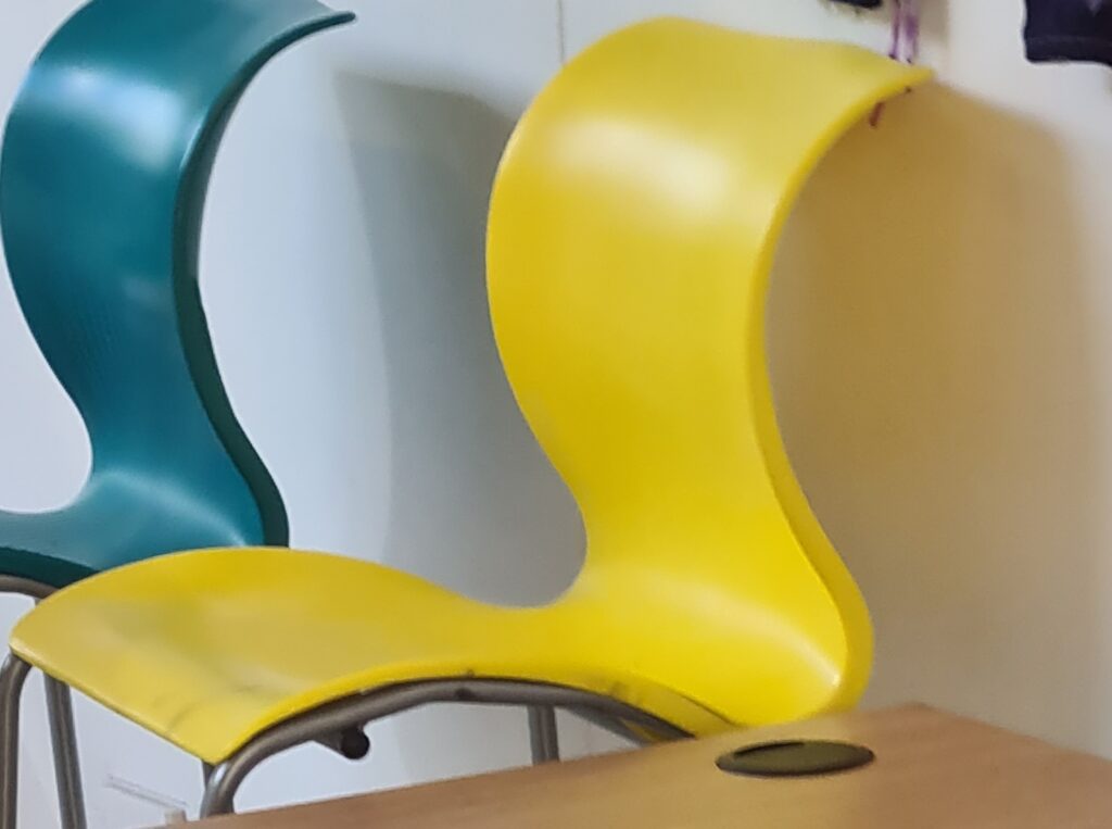
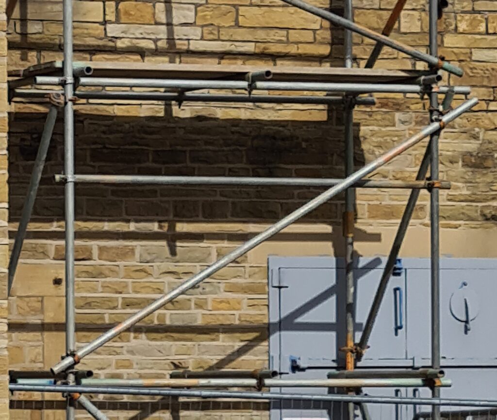
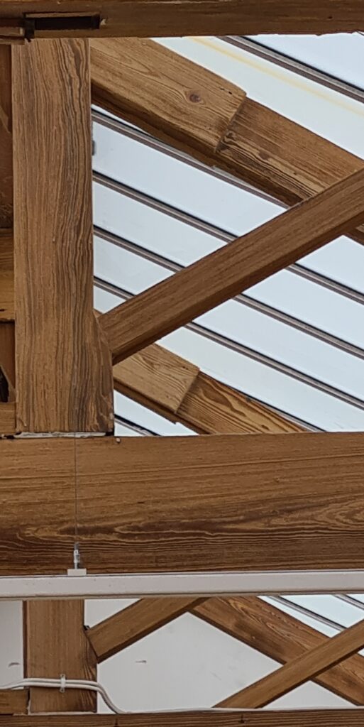
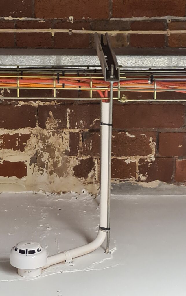
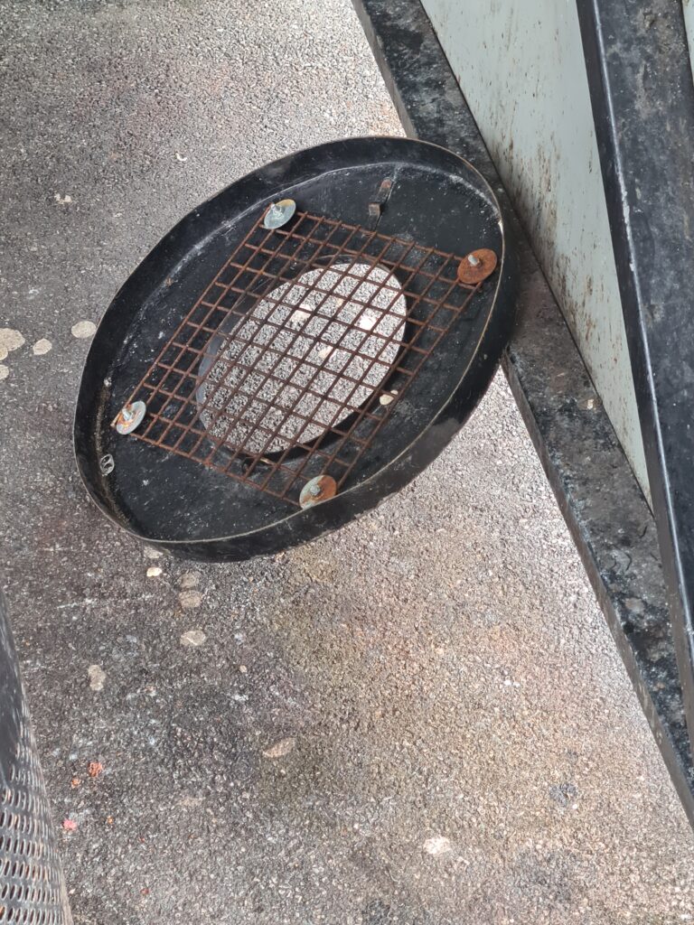
this were all the photos I have from this
College Workshops
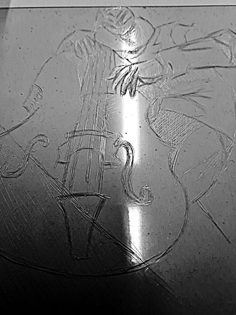
This a process i call etching this i used a etching needle to draw scrape my image out and with this process i can use ink with this
I like this workshop besides the irritating scraping noise from using the etching needle although you can get good results
I haven’t added ink yet so when I do the after image will be below this text
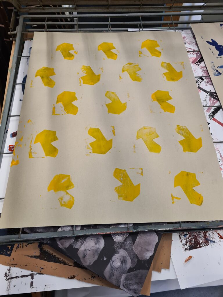
photo-shop ideas
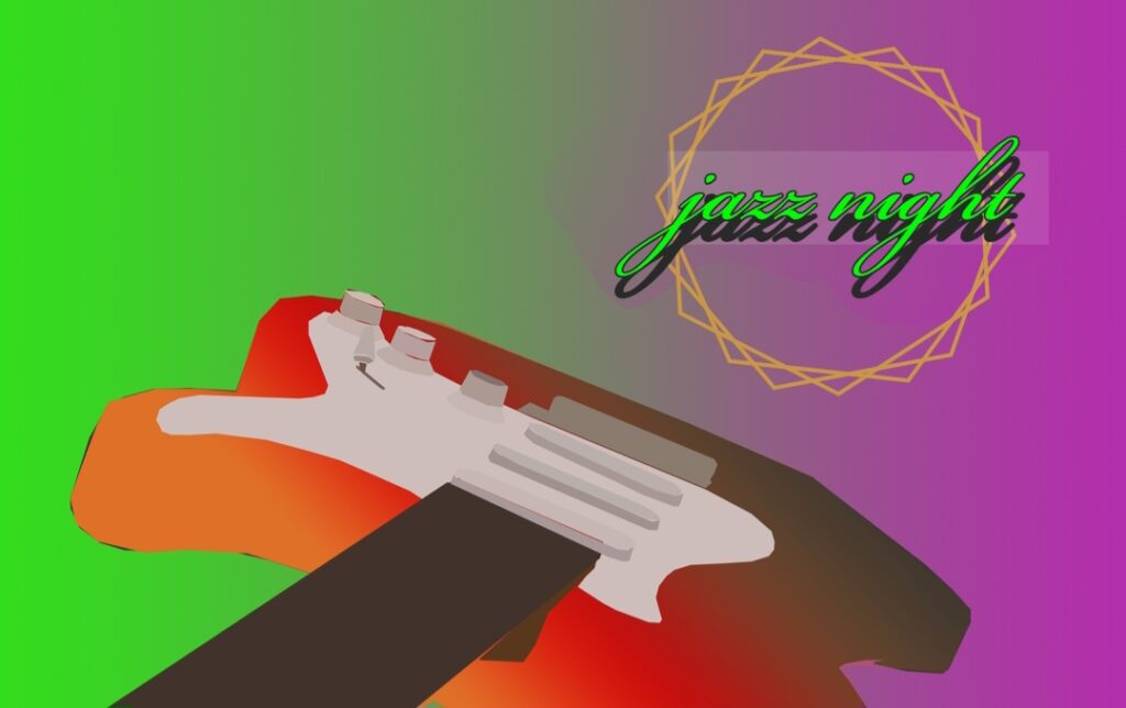
This one is the same as the piece of work as before and this is the first version I did on photoshop
I like colour of the background and I like how a added a bit of detail to my work
And I liked how I used the gradient tool in photoshop and made the guitar look better to the eyes
I think that I should have added more to this piece
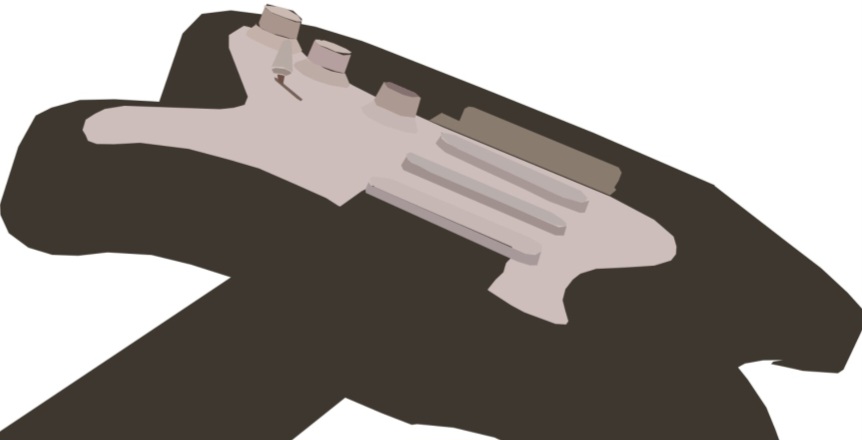
This one is the first version and I was mainly focusing on the minor details in this piece of work and the next photo is the updated version where I changed the dark part of the guitar and add colour
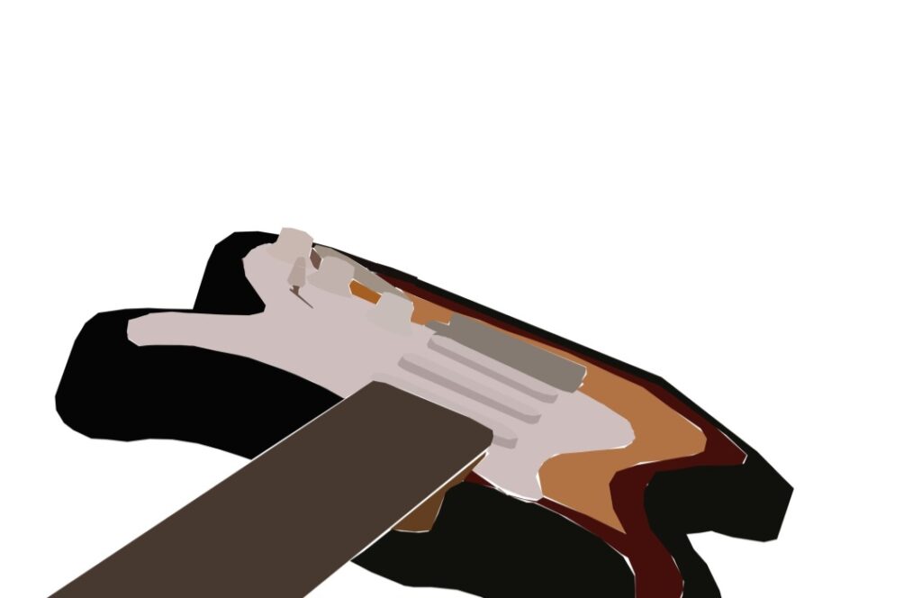
photoshop and I like how I made this version of my electric guitar look like the real thing
I didn’t have much time to add anything to the background but I might add more things to it in the next workshop
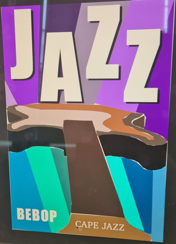
i lost the original version for this one so i took a picture in case something like this were to happen
I really like how I did the background of this piece of work with different shades of blue and purple look like it would come from a comic book. Secondly I like the layout of the guitar to the font used in the title and how the title has a little shade
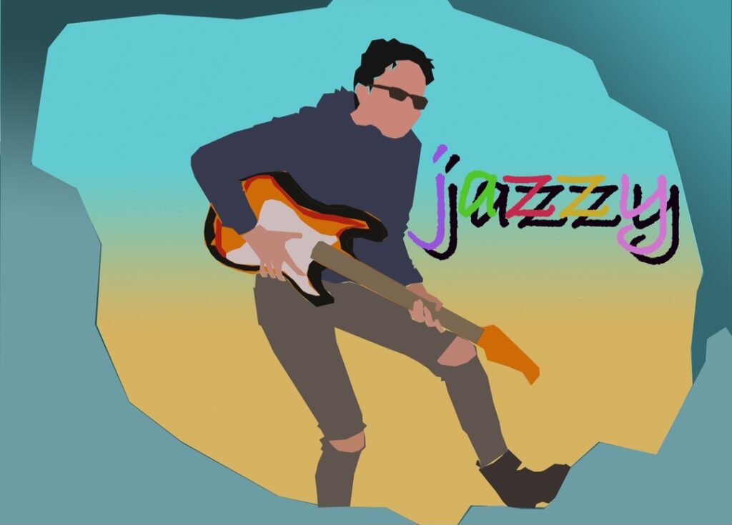
This is a updated version of one of my old workshops I like how I used the gradient tool and make the background look like a Sunrise. I like the colours I did for the font.
might add types of jazz music like e.g.
RagtimeSwing
Bebop
final piece development stages
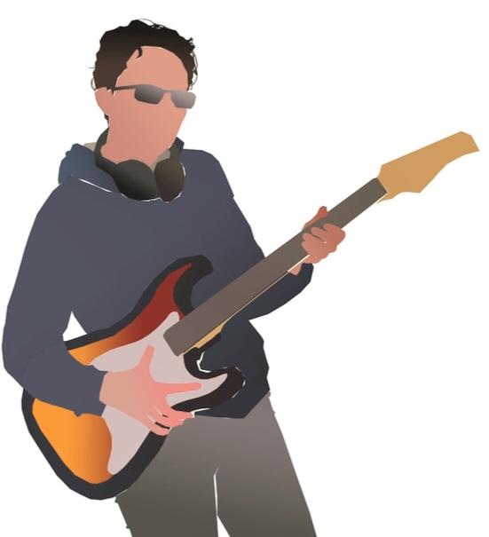
this is a template of my final piece and i like how the basic look and how is used the gradient tool for the guitar
but i think that the headphones don’t really look like headphones but i also like how is used the gradient0 tool for the for the hair as-well.
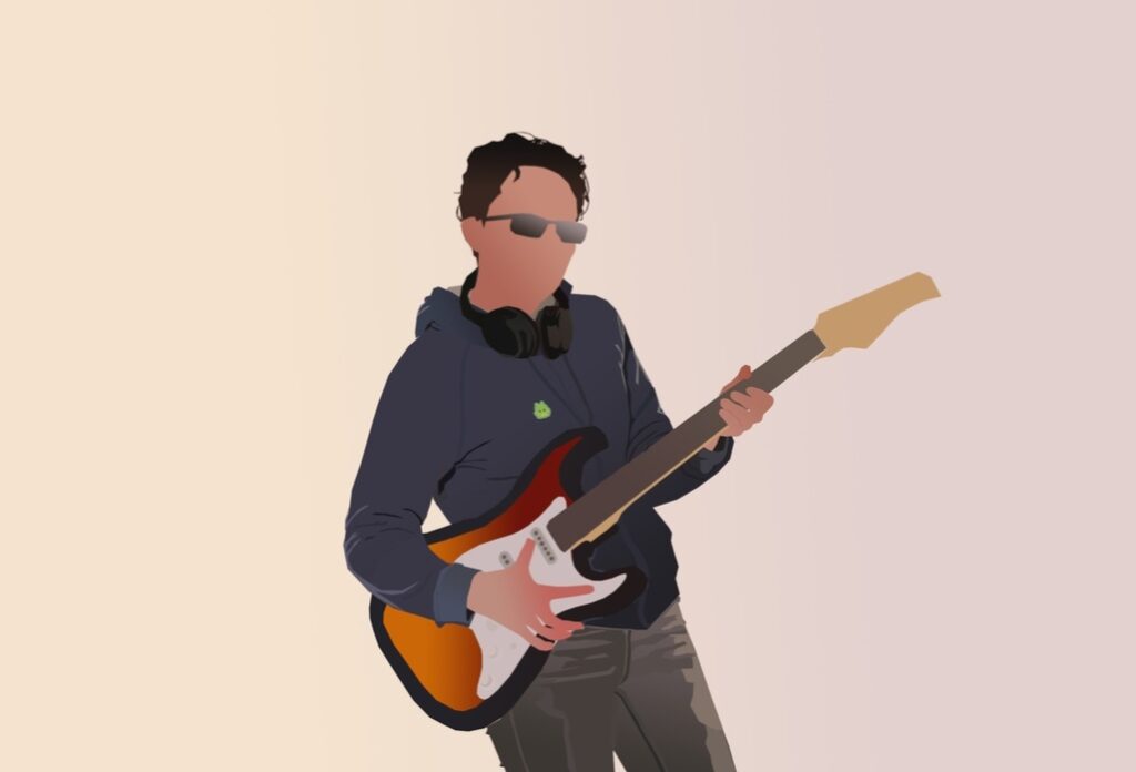
in this one i like how i added detail to the shirt, pants, headphones and guitar although i think that they’re should be more detail in the guitar. and i used the gradient tool in the background so it wouldn’t be plain white
I think that there is a alot of negative space around my character i should add some things to things like a title and information to fill the empty space
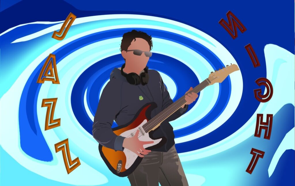
for this one i added added an background to my work that i made and used a filter called twirl and i twirled my background and made it looks like it look like a portal
Secondly i added a two titles of my on each side of my character and i bended them so it could fit with the back ground
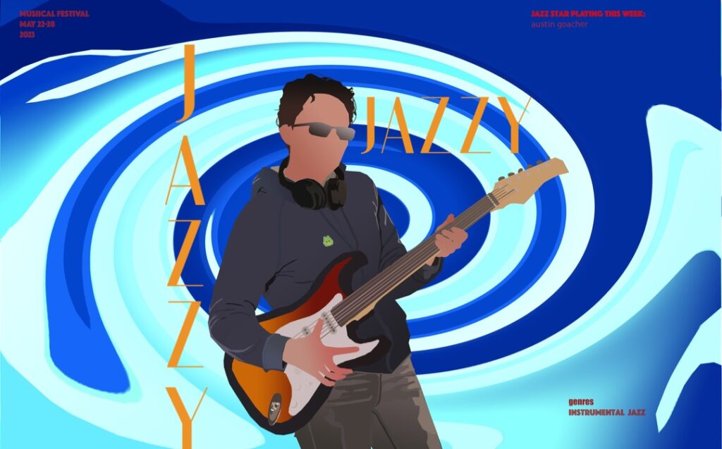
With this one i decided to test get rid of the previous title and used a new font an also i added a date, genre of jazz and jazz star player.
I like how the font looks but i don’t think should have added “jazzy” twice but i think that i should have made the corner text bigger because it can barley be seen.
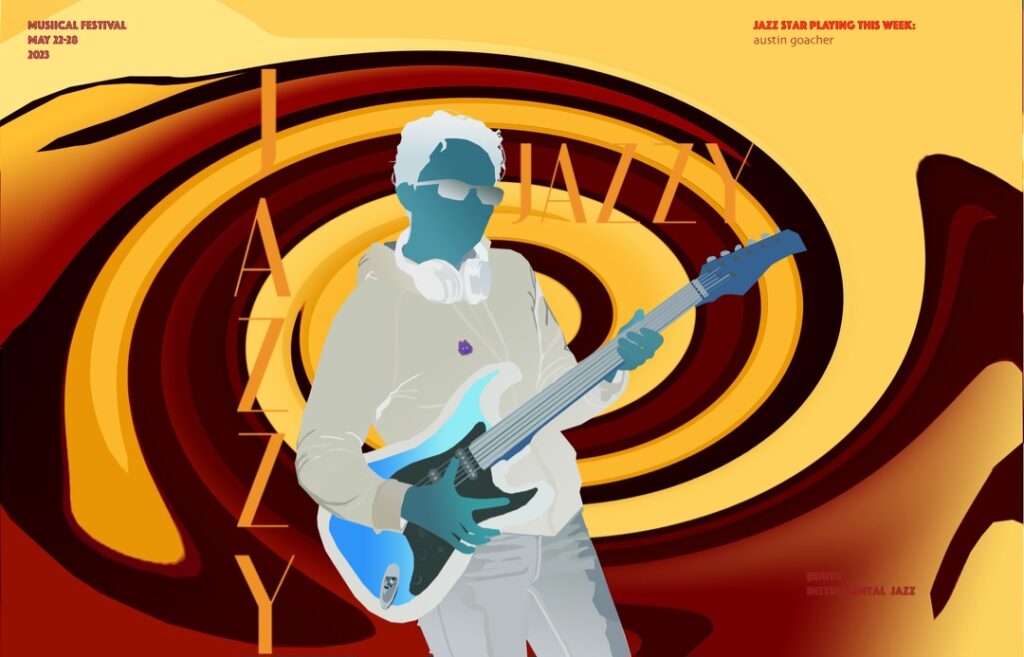
this is an inverted version of the previous work but i like the background colour because of how warm it looks and how the the dark red and the yellow mix and blend together in a twirl
i think i should overlap the non inverted character over the inverted version and change how it looks
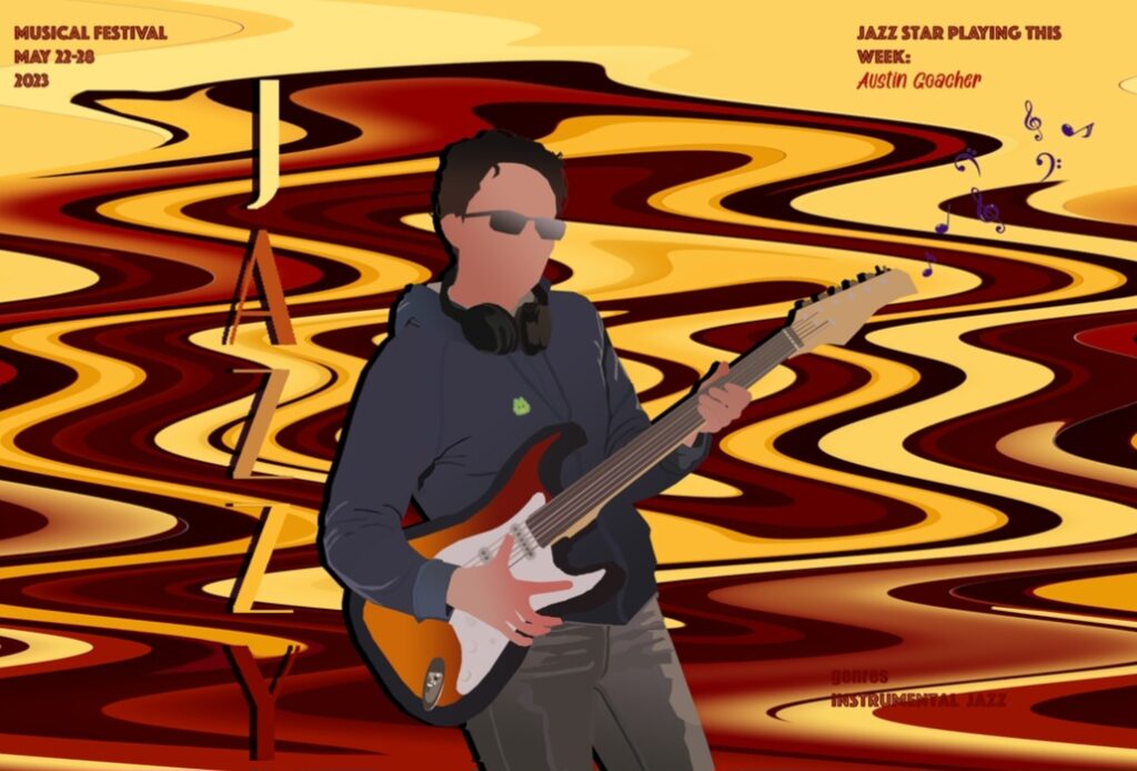
I overlapped my jazz star character over the inverted version and made the title look like it was popping of the page.
I wanted my work to look more like a poster so I added a date and who would be preforming
But I like who the title blends in with the back ground but the character doesn’t really stand out much .
final piece
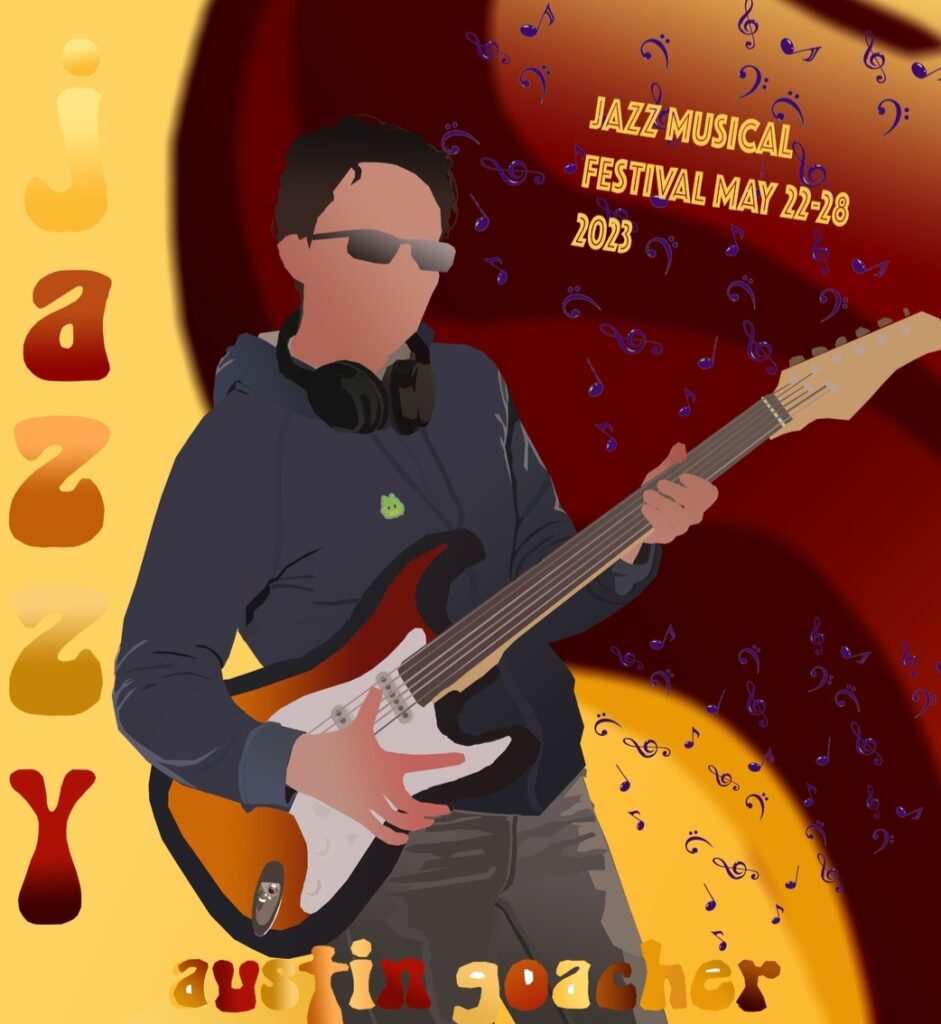
I decided to keep the background but use the normal inverted version because it looked better in my opinion
And I like how my jazz player character takes over most of the page and stands out with the title
If I had to improve anything i would have to improve the look of the guitar and make it look more realistic
But it think that this poster looks appealing to the eyes because the type face/font and how the character stands out.
The way how this relates to this memories project is that someone could of found this poster and like how it looked and remembered when they when to the event. And probably kept this poster as a memory.
i’m glad i added the music notes on my final piece because it makes it look alot better
