These are my own designs for an album cover, as for the name snake eyes , i’m not sure why as a group we called it that, but thats what we’ve done.
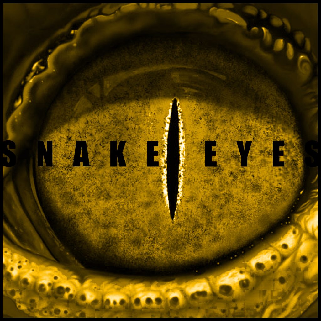
For my first design I wanted to do a simple one, I didn’t really mess with fonts and my first go, the saturation and hue was the only main thing I really played with, the font didn’t pop, and the first and last letters blended into the photo.
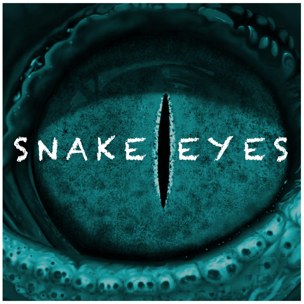
upon revision, I’ve change the font and made it white, its much more visible and the font matches the blotchiness texture of the eye. the letters are no longer blended in, and are closer together. The design is still simple, but i’ts a bit more effective.
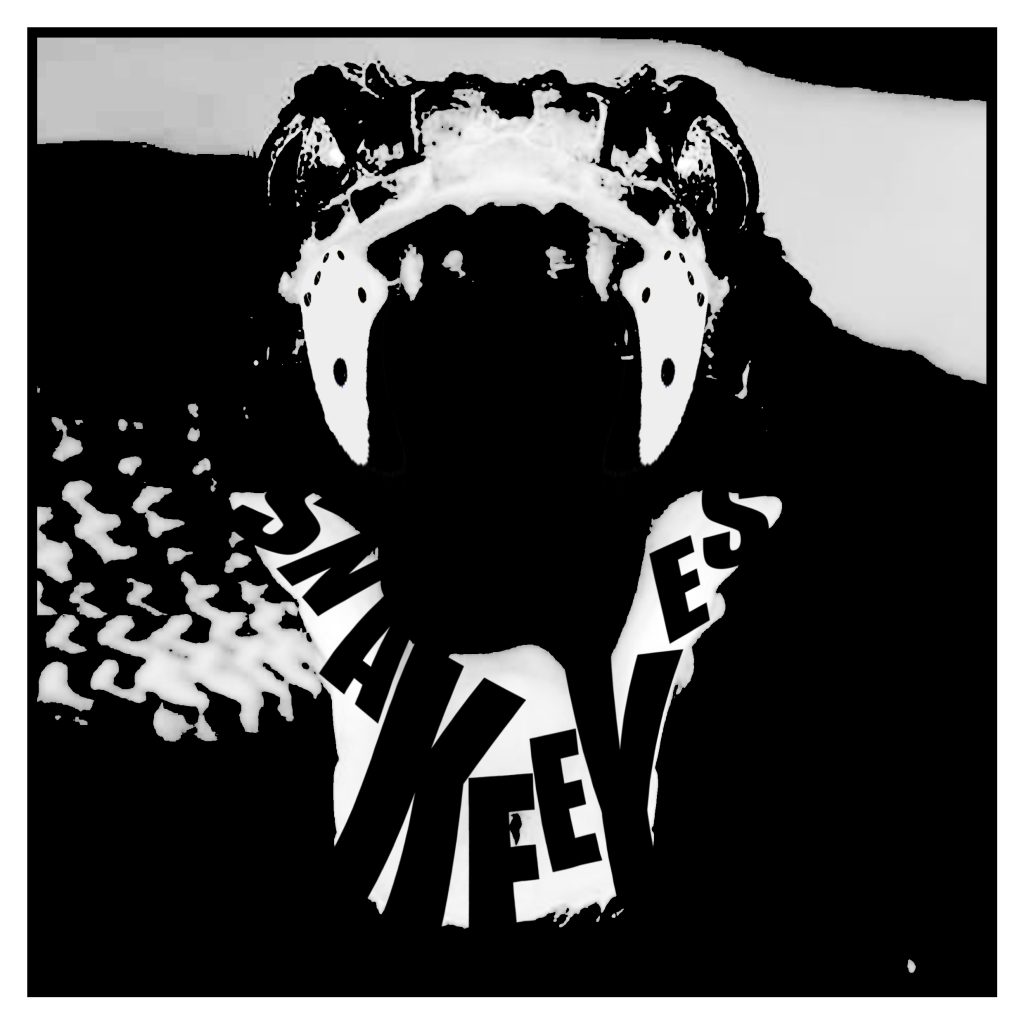
For my second design, I wanted to make something a little more complex. I kept a simple black and white colour scheme, but with the font this time I’ve positioned it and fit the text into the the mouth of the snake, another subtle design feature was I’ve put dice where the snakes teeth would be, to emphasise the title snake eyes.
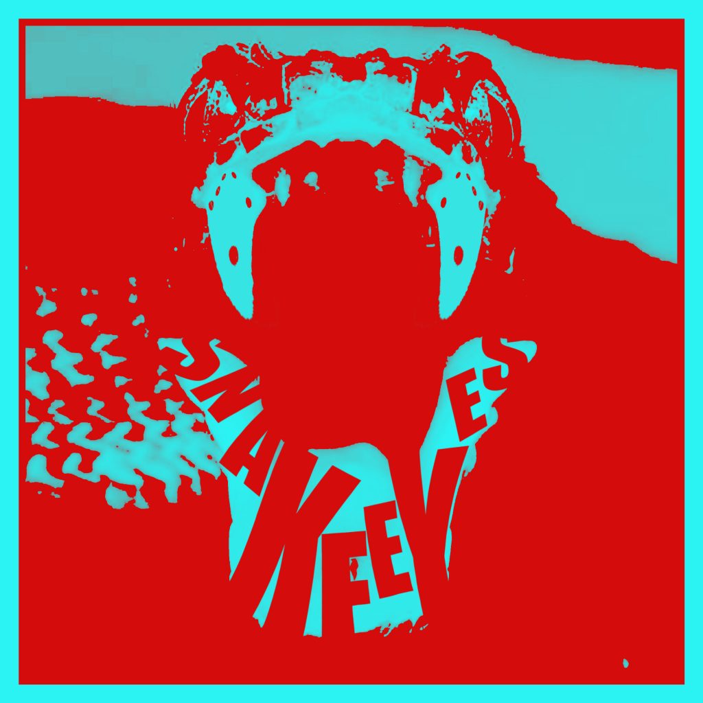
For my second revision of this design, I’ve decided to add colour, I added a red overlay, and the white has being replaced with blue. Overall the image pops more with colour and is a little more eye capturing.