Visual research/concepts:


Game cover research
What are game covers?
Game covers are covers that are made for releasing game. Game covers are usually made in development during a game. At this stage artist get draw down different concepts of for a game covers and come up with final design. To make a game cover it is usually done by drawing it then digitalizing it by the artist, this could be done by using photoshop. The two things to consider when making a game cover art is that you need to think about how you game cover is going to stand out and how you are going to convey this to the audience you are trying to target. Furthermore, the way you can target your audience is that you can make the cover more vibrant and colourful to make it more appealing to the audience. (Polygon 2021)
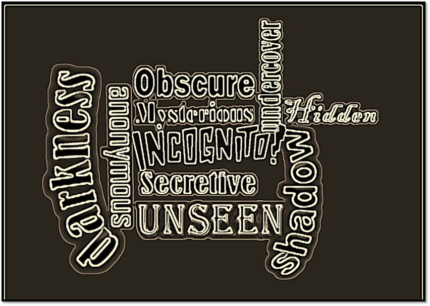
What is incognito?
Incognito is a theme that is surrounded by darkness. This could be interpreted in many ways in all forms of media like games, films, cartoons and tv shows etc. The way incognito is used in films are through specific genre like thriller, mystery, spy movies and for games it could be by the horror and thriller.
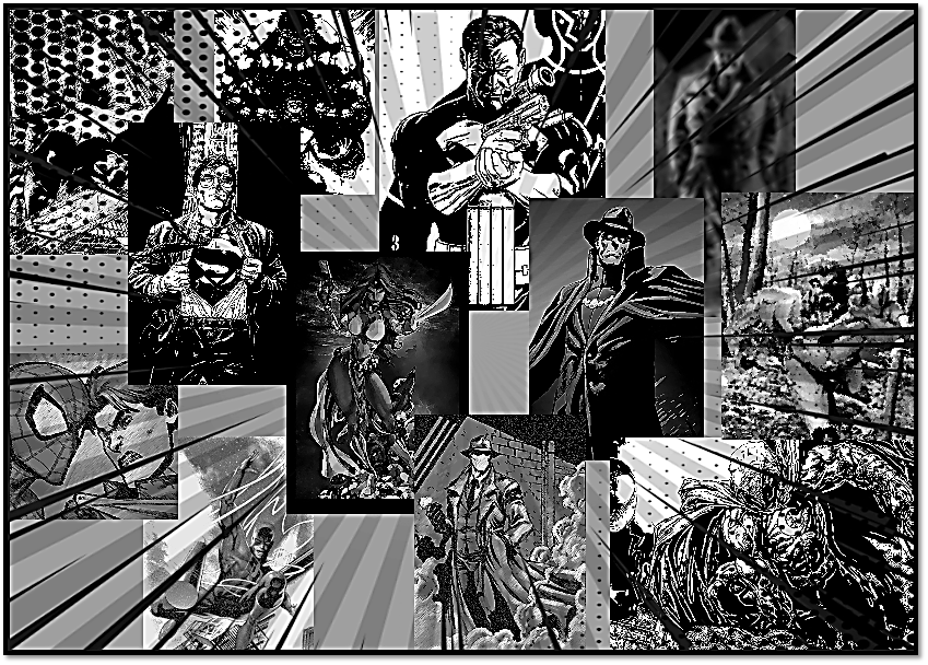
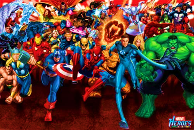
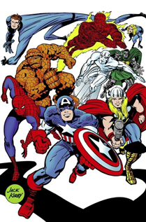
Superhero game covers:
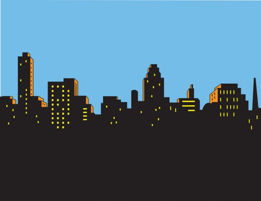
There are different types of games out there including superhero games that are closely based of the comic book source material. There are many superhero games out there and there are even some that tie into to the theme of incognito like Spiderman and batman.
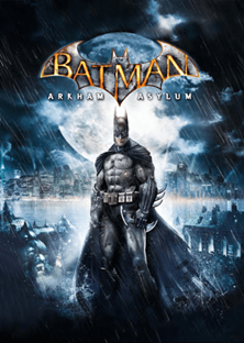
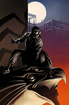
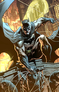
Batman cover: The Batman Arkham asylum conveys a darker atmosphere and a darker tone. The colours that have been used are black, grey and blue. This is effective because batman as a character is darker and grittier who is also a vigilante. This also ties into the theme of incognito because is a character that’s likes to hide in the shadows and is always surrounded by darkness and is always around at night. Furthermore, this also ties into the theme of incognito because in comic book/superhero lore identity is important when it comes to the protagonist especially when it comes to batman because behind the mask and suit, he is Bruce Wayne which no knows that he is batman. The colours in this cover are very dark and at the same time vibrant. It’s vibrant because the colour blue gives of glow effect which stands out. The dominant colour in the cover is black because it gives a shadowy effect which stands out a lot because it works with the character of batman and it also works even more because it looks more appealing to the public and recognisable to its target audience because the character of batman is really popular with audiences and the general public as a whole. Another thing that ties in with the idea with incognito is the way that the architecture has been used in background as you can see that a wide view of Gotham city and the asylum pretty much distant to it. This conveys the idea of incognito is to show that there secret and hidden places in Gotham and it also juxtaposes this in a way that the city filled bright and flashy colours of light as oppose that asylum being all fill with darkness and mystery.
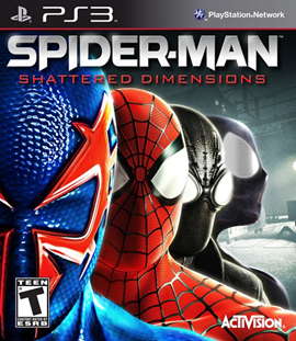
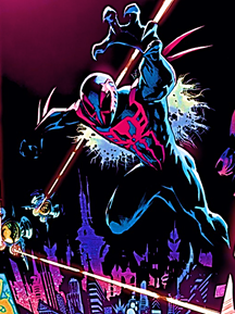
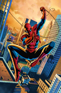
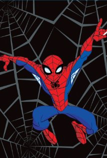
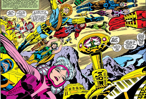
Spiderman cover: The Spiderman game cover is about different versions of Spiderman through different universes. This links in with the idea of incognito because there are multiple version Spiderman through out different universes. The colour that have been used are red, blue, black and purple. The colours in this cover are very effective because each colour represents a certain Spiderman. The colours that are more dominant are red and blue because it’s more recognisable to the audience and to the general public as a whole because Spiderman is pretty popular character. Like batman Spiderman also ties into the idea of incognito because much like batman in superhero/comic book lore Spiderman deals with the idea if identity because behind the masks is peter parker and it’s very secretive because no knows that’s him behind the mask. Here it is more expanded because there are more than on Spiderman with different identities. The background of the game cover gives a foggy cold atmosphere which fit perfect because each Spiderman has its own specialised for example Spiderman 2099 is set in the future and Spiderman noir is set in the past. This not only shows two different version of Spiderman in two different time period which also juxtapose each other because on is set in the past and one in the future. As for the original Spiderman and symbiote Spiderman are set in modern and present day. This ties into incognito because the modern version good side and the symbiote version shows darker version and it is usually hidden and this juxtaposes that because one is more vibrant and lighter while the other is a darker and aggressive version of Spiderman.
How to make a custom game cover: To make a custom game cover you need to use photoshop. You can either do it in two ways by drawing it or by using different images from different sources. To make it look a bit more professional is that they take the actual size of the game cover template and then they add the different console banner. Another key component is also getting the rating logo on the cover. A rating logo is important because it’s to show a specific type of audience demographic you’re trying to target. When it comes to rating there several game rating when it comes to the gaming industry as each game rating targets a specific type of demographic (internet matters 2021). Furthermore to make you’re custom game cover is that you can copy and past images and also add your own font to make it look more realistic and adding different effects like a drop shadow and bevel emboss others like a outline or a glow etc (Nick Wilt 2021).
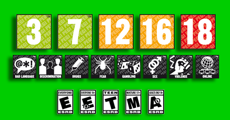
Pegi ratings:
PEGI 3 – suitable for all ages
PEGI 7 – suitable for young ages
PEGI 12 – suitable for children 12 and over
PEGI 16 – suitable for children 16 and over
PEGI 18 – only suitable for adults
ESRB rating:
RP – rating pending
EC – early childhood
E – everyone
E 10+ – everyone 10+
T – teen
M – mature
A – adult
Comic book/Cartoon art research
What are Comic books: Comic books are is a large, serialized narrative/story that is told via illustration. There are many Comic book companies out there but the two most notable companies are Marvel and Dc that started publishing Comic book in the late 1930s and continued publishing in the golden and silver age. When it comes Comic book There two versions of this media Comic books and graphic novels. The way Graphic novels differ from a regular Comic book is that it tells the full story via illustration and containing key components of story telling beginning, middle and end and it also has a longer narrative is well according to (Master Class 2021).
History of Marvel and DC Comic books: When it comes to superheroes there are two major Comic book companies Marvel and Dc. Dc comics started publishing their comics in the late 1930s starting to publish Comic books about superman with action comics title in 1938 who was created jerry Siegel and joe Shuster as the years go on another character was created in 1940 called batman starring in detective comics issue 1 as for other characters wonder women, aqua man shazam, spectre and even others like the flash (jay Garrick) and green lantern (Alan Scott) and even the sandman, dr fate, hour man and Martian man hunter. As through the silver age and bronze age Dc Comics stories were all over the place as time went on in the 1950-80s as they introduced new versions of original characters from the golden age ( late 1930s-40s) like the flash (Barry Allen), green lantern (Hal Jordan) but at the same time introducing new characters like green arrow, phantom stranger, black canary and zatanna as well as introducing other edition and teams like lobo, star girl, as well the teen titans and the justice league of America. Dc story telling was all over the place that in 1985-86 Dc had huge event story called crisis on infinite earths which was a 12-issue series that was written by Marv wolfman and drawn/illustrated by George Perez. The idea behind this was to reset the entire Dc universe and to keep things that did work and to get rid of things that didn’t to fix continuity errors. At Dc this would become a tradition when it came to it’s comics, they would have a crisis event and start from scratch according to the source (Britannica 2021).
Much like Dc Marvel was also started publishing comics in the late 1930s and the company was founded by publisher Martin Goodman, at the time Marvel was known as Timely comics and published very first issue of Marvel which a starred a superhero called the human torch (Jim Hammond) and Namor the submariner who made their debut in comics in 1939. Around the golden age (1940s) Timely comics at the time also published Captain America in 1941 and was created by Joe Simon and jack kirby. In the 1950s Timely had rebranded and changed the name from Timely to Atlas comics, however this didn’t last very long as they were publishing comics horror, romance and exploring different genres. In the 1960s Atlas comics was rebranded to Marvel comics and at the head of the company was Martin Goodman, Stan lee and Jack. In the silver age of comics Marvel had created huge number of characters and teams that were very successful like Spiderman, Ironman, Hulk, Thor, Antman and others like Dr strange, the silver surfer and black panther and such teams as the fantastic four, the X-men and the Avengers as well bringing back golden age heroes like Captain America and creating new versions of characters like the human torch who would be known Johnny storm as one of the members of the fantastic four. In the bronze age of comics (1990s) Marvel would go bankrupt and had to sell some of its properties to different studios in order to keep in business according to the source (Britannica 2021).
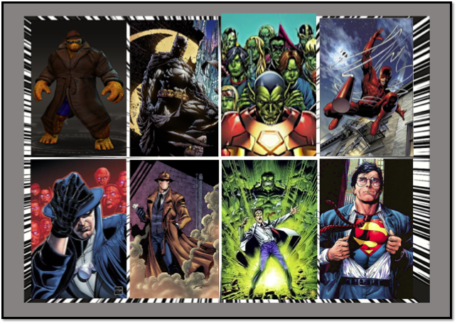
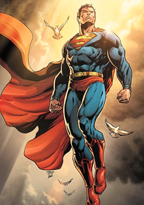
How Comic book characters tie into incognito: There are many characters that tie into the theme of incognito like batman, Spiderman and superman etc. Batman fits into the idea of incognito because he is character that lurks in the shadows at night and blends in with the environment and also has a secret identity. Similar to batman Spiderman is another comic book character with the idea of incognito because he also has a secret identity but differs from batman as he doesn’t spawn at night like batman. Superman is another popular comic book character that links in with the idea of incognito because much like batman and Spiderman superman also has a secret identity which no knows who is superman. These comic book characters are very incognito all of them a very secretive and mysterious.
Thomas Perkins: Thomas Perkins was born as Thomas N Perkins iv. Thomas Perkins is an artist that works on several animated shows. His work is best known for character drawing and doing concept for Ben 10 (2005) TMNT (2007). He has not only worked Ben 10 and TMNT he has also worked several other animated shows like Spectacular Spider man, Avenger’s earth mightiest heroes, Batman, looney tunes and more according to the source (IMDb 2021)
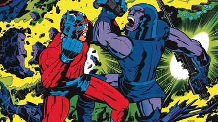
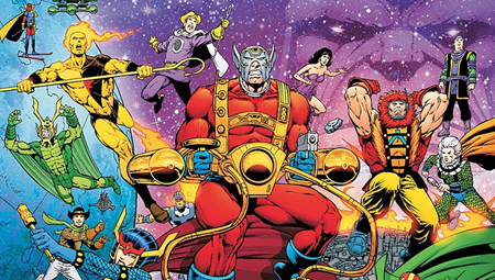
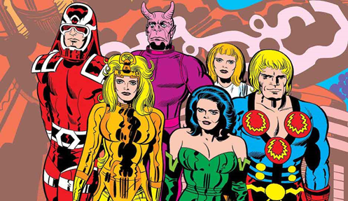
Jack Kirby: Jack Kirby is a famous Comic book artist that started his work during the golden age of Comic Books. Jack Kirby first created Captain America in 1941 for marvel comics which at the time was known as Timely comics. In the 1960s Jack Kirby worked Marvel comics and created a huge number of characters which were all successful. He did this while working with his co worker stan lee who was the writer of marvel comics at the time. Jack Kirby created characters like the and teams like the fantastic four, the x men, hulk, ironman, ant man, thor, dare devil, the silver surfer and the avengers. In the early 1970s Jack Kirby left marvel and went to work at another comic book company Dc. While he was at Dc he created characters known as the new gods. While there he created such characters like Darkseid, highfather, orion, mister miracle and big barda as well creating the fourth wall concepts. After a short period of time jack left Dc In the 1975 and went back to Marvel and created other characters like the eternals and continued his work there according to (Illustration 2021).
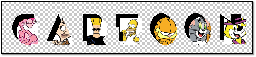
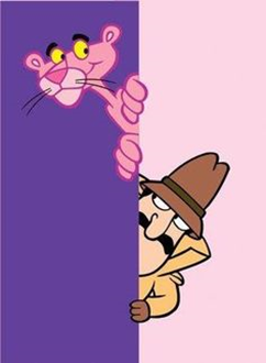
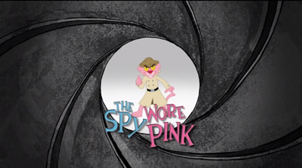
Cartoons/ incognito tie in: There are several animated cartoons that tie into the idea of incognito. The most notable example of this would be pink panther. Pink panther is a animated cartoon that has several episodes, but one the main episodes and the whole idea of pink panther is inspired by detective stuff which links to the idea of incognito according to (Official Pink Panther 2021).
Architecture concept Art
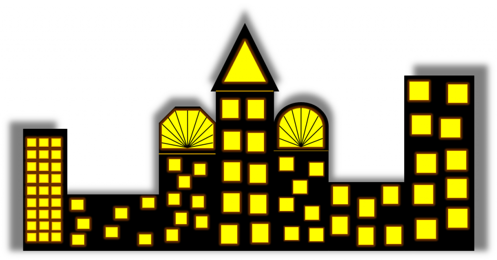
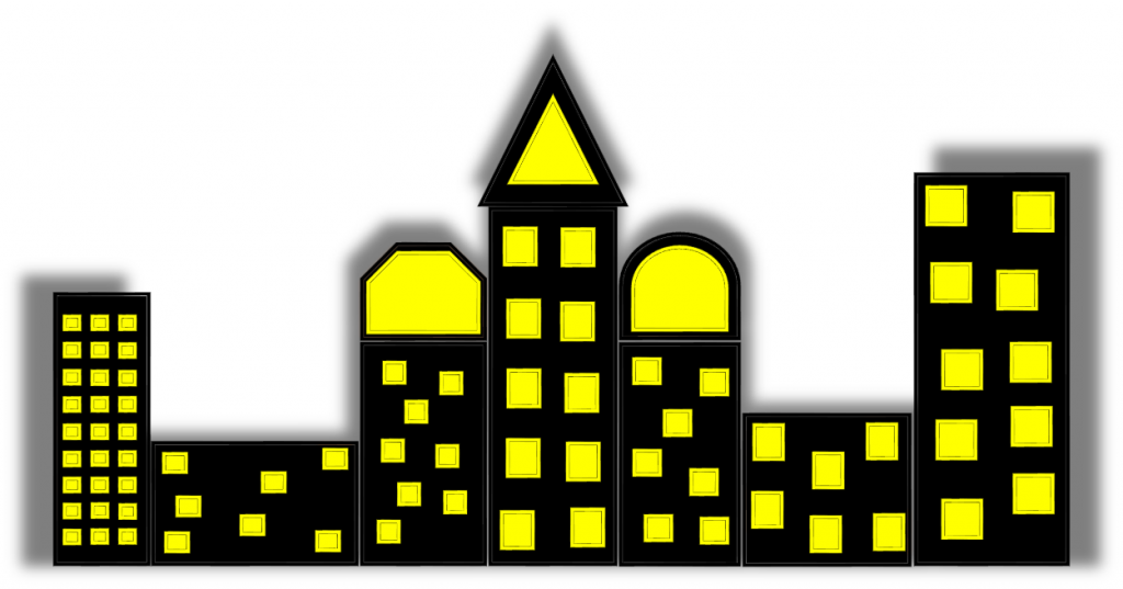
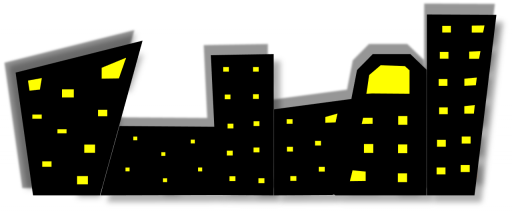
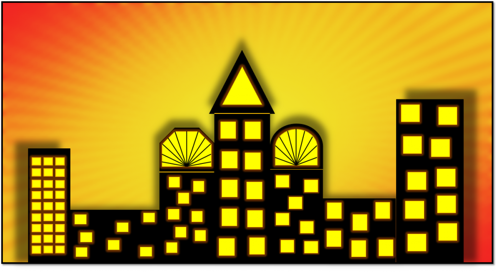
Here I have designed concept art of the type of architecture I am going to use in my game cover design. To make this concept the software I used was power point presentation. I used this because it is more familiar to me and more easier to use. To make the architecture design I used the shape tool to make the shapes. I used this tool because I could use any shapes I want to use and I could use different variety of shapes and mould them in different ways. I used the rectangle shape and changed the sizes, so this way it looks like a building. For colour wise I used the colour black by going on shape format and using the shape fill bucket tool. After doing this I used the same shape to create the windows and I resized it to make it smaller. I did this because it look it would fit well and stand out more. Instead using the same colour black I changed the colour to yellow by using the shape fill bucket tool. I also added a orange outline by using the outline tool and I also added a red glow around the windows to by using the effect tool. I did this because it looks more effective and eye catching. I also copied and paste the windows that made so that it will be easier and less time consuming. I different shapes and lines to add more variety to the cityscape and buildings. After completing the design I grouped the buildings together by highlighting them all and grouping the as one. I did this because it will look more better and effective. After doing so I added drop shadow by going on shape format and using the shadow tool. I used this because it will standout more and look more cartoony which was my intention.
Alternate versions/designs
Architecture concept art 2
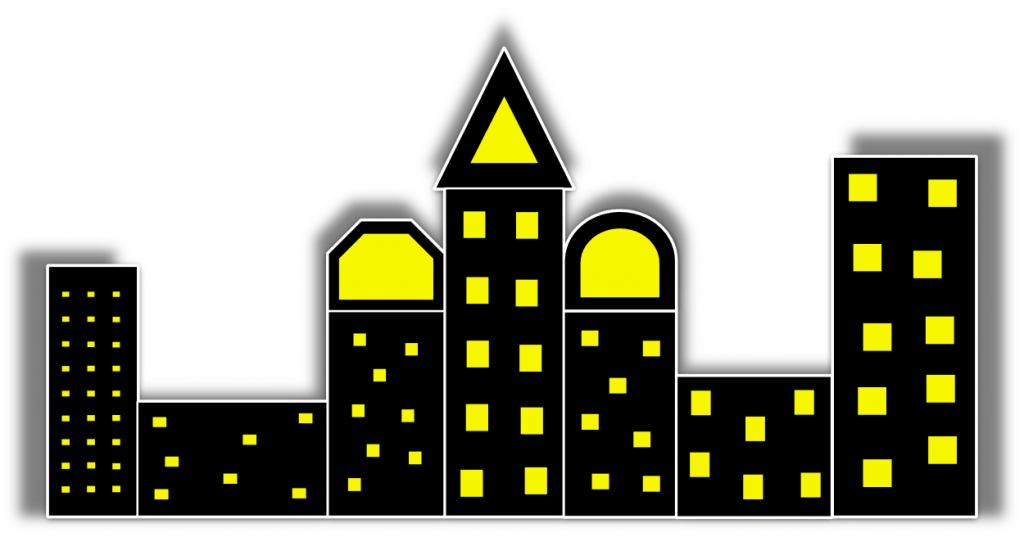
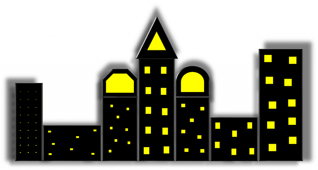
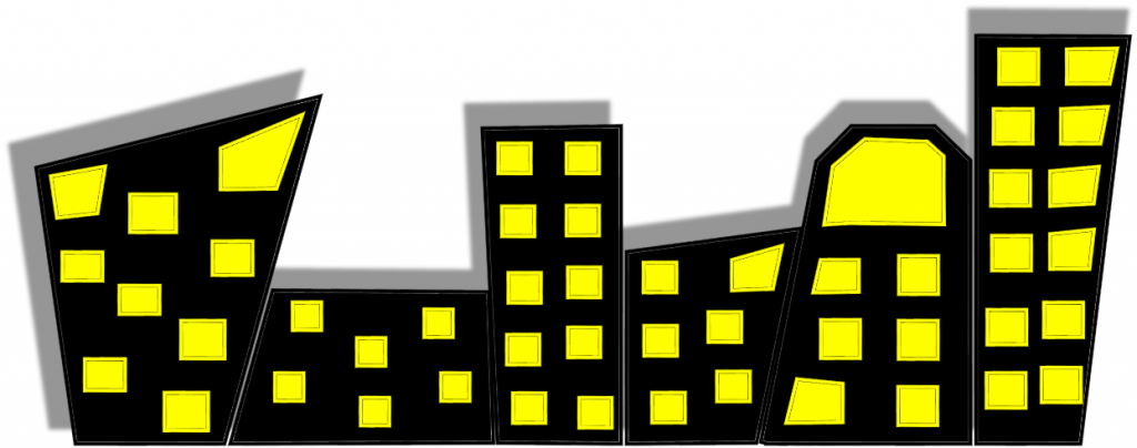
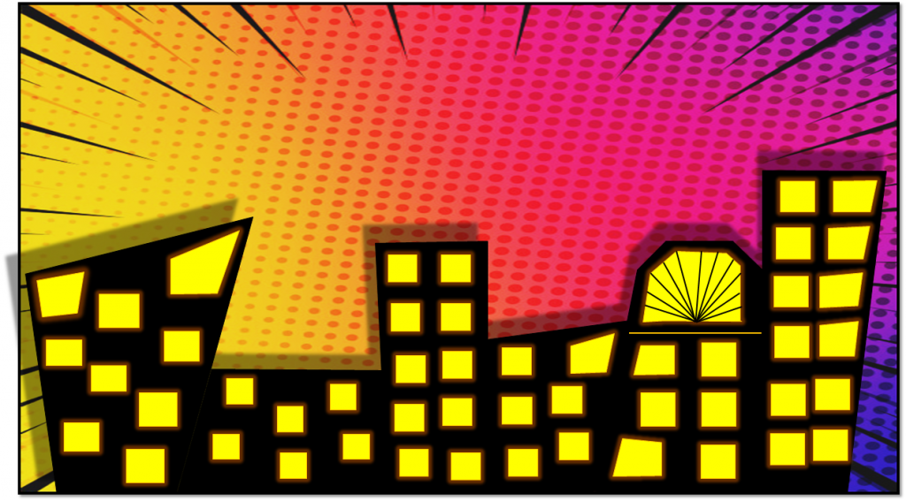
Here I have made another architecture design similar to the first concept I did. Much like the first design I used the same colours by using the shape fill bucket tool and and same shapes by using the shape tool. To make it look different from the first concept design is that I used the same shape tool and I made it a bit more sharp by right clicking and editing the points of the shape by extending the corners. I did this because I wanted this design to look more edgier and sharper compared to the other one. after doing that I grouped all the shapes that I moulded together so it looks like cityscape background. Much like the first design I also added a drop shadow by going on shape format and using the shadow tool. I did this because it looks more effective and it stands out more.
Alternate versions/designs
Architecture concept art 3
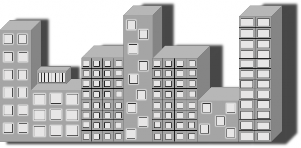
Here is my third architecture concept design. To make this I used a 3D shape cube shape from the shape tool. and extended it to make it look like buildings. I did this because I wanted to take a different approach with my design ideas make one concept 3D appose to a 2D because this it looks more eye catching an effective. I used the colour grey for the Architecture/3D shape by going on shape format and using the shape fill bucket tool. I did this because it looks more better and it works a lot more in daylight and it stands out more. I also used normal rectangular 2D shapes for the windows. I used the same colour grey but used a lighter tone. I did this because so you can see the windows better and it looks more better. I also added a black outline by using the outline tool and I also added white glow around the windows by using the glow tool. I did this because it would standout more and look more effective and eye catching at the same time. I also used black lines by using the shape tool. I did this because the buildings will look more better and standout more on it’s own. After I finished making the third design I grouped all the shapes together to make the architecture as one cityscape background. Much like my previous designs I added a drop shadow by going on shape format and using the effects/shadow tool. I did this because it will look more effective and better.
Alternate versions/designs
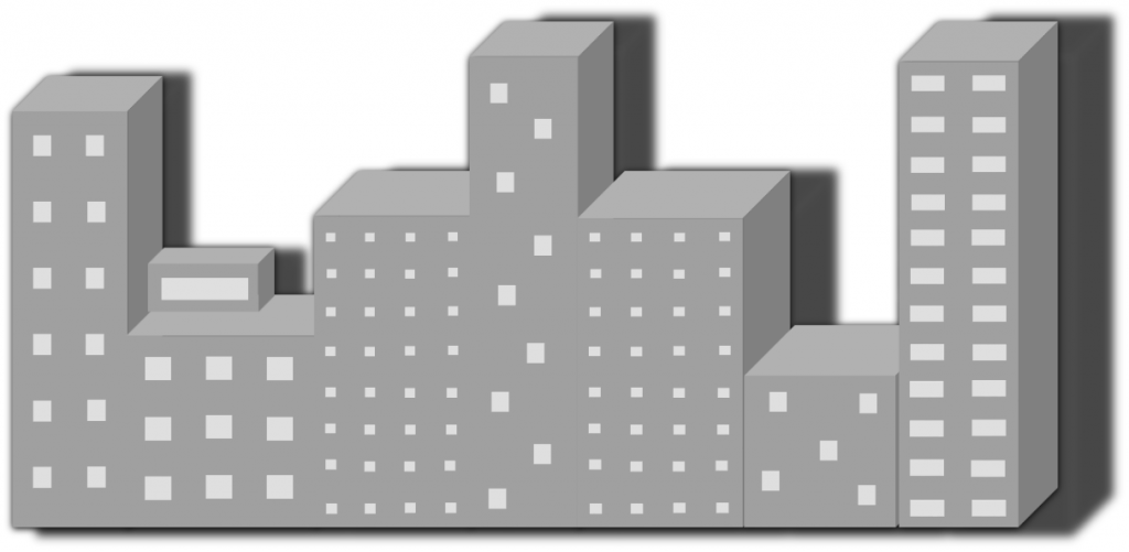
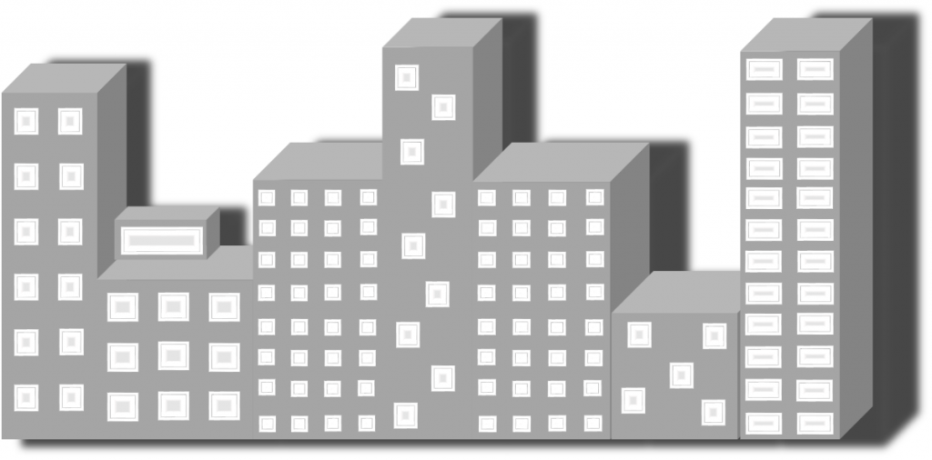
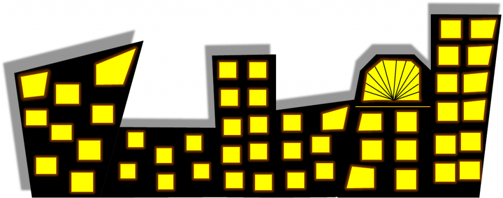
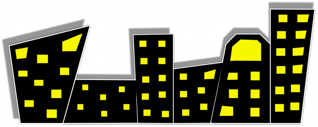
Final concept Designs (Architecture concept art)
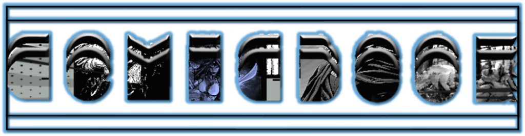
Character design/Concepts:
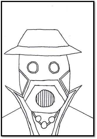
Character design 1: For my first character design I decided to do a portrait. I decided to do this because it would be less time consuming and it wouldn’t take that long. To make this I drew the portrait with a pencil and sketching it out the character design out first. I did this because so I could sketch the drawing out and to see where I can add more detail and erase some bits out. I did this so I could see what would fit well. After I finished sketching the base of the drawing I went over it with black feltip. I did this because it would look more better and you could see the portrait more clearly.
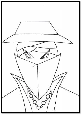
Character Design 2:Much like my first character design I decided to do a portrait. I decided to go with the same template because it would be a lot easier to draw it and it would be less time consuming. As like the first concept I went with a similar approach by adding a hat and face mask. I did this because it I wanted to take the same ideas but change a little. Much like the first design I drew the portrait/base with a pencil, after doing so I went over the portrait with a black feltip pen. I did this because it look more professional and standout more.
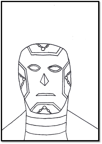
Character Design 3: Here I have taken a different design compared to the previous. I did this because I wanted this one to have a different feel to it. However I have used the same template because it’s a lot easier to do and less time consuming. To draw this I use a pencil for the base to draw the full portrait. After I drew the base I went over it again with a black feltip. I did this because it will look more better from a design and drawing and stand point.
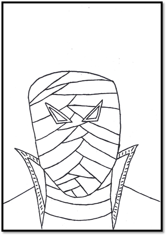
Character Design 4: For my fourth character design I some ideas from my second concept adding the bandages. Here I have drew the portrait as ding so I added more lines for the bandages. I did this because I wanted this design to be more mysterious and intriguing. After I finished drawing the portrait went over with a black feltip pen as I did with my previous drawing/ concepts. I did this because it will look more professional and standout more.
Character Designs in colour
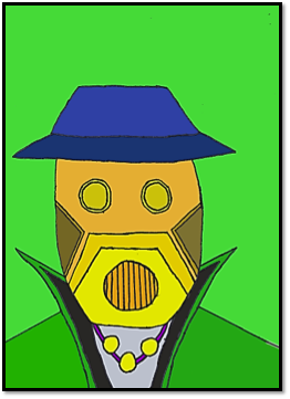
Character Design 1 in color: Here I have coloured in my first character design. To color this in the software I used was photoshop. I used this because I wanted to color character designs digitally so I decided to use photoshop as it is more accessible (in college). The colors I used for my first design was blue, orange, yellow, black, green and brown. I used the color blue for the hat. For the hat I used different tones as I have used darker tone bottom section of the hat and used the same color but a lighter tone. For the face I decided to add a bit of orange, yellow and brown for the eye piece and mouth piece I used the same color with a different tone to make it more unique and colorful at the same time. As for the the color I used was green, for the collar I used a lighter green as for the shoulder I used a darker tone. I also used black for the inner piece of the collar to make it look more better. I used this by using the fill bucket tool. I used these colors because I wanted a mix of light and dark. I used the darker tones of the same color to make a contrast between light and dark and also to make it look incognito and mysterious. I also used lighter tones because I wanted the design to be more vibrant and colorful, this way it looks more effective and it stands out more as a whole portrait
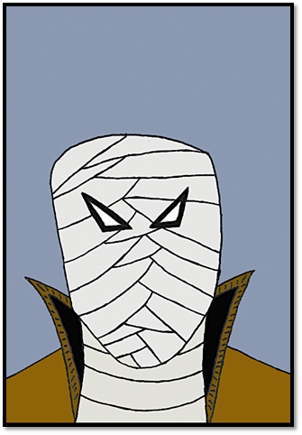
Character Design 2 in colour: much like the first character portrait design I coloured by using photoshop. The colours I used for my second design is different compared to the first portrait. The colours I used for this design was grey, black, blue, yellow. When colouring the portrait, I went with a similar approach with the first design which I used different tones of the same colour for example I used the brown for the hat and used same colour for the mask. I also used different tones for different colours to make it look more professional. Unlike my character portrait design, I used darker colours. I did this because I wanted this piece to feel different than the first one, I wanted this design to feel less vibrant and to feel more incognito which is the theme for this project.
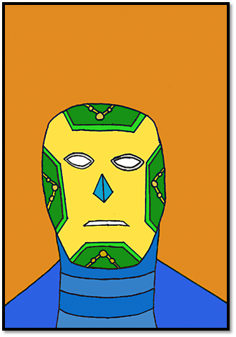
Character Design 3 in colour: For my third character design I used the same tactics with my first portrait as for this one I decided to use the same vibrant colours. I did this because I wanted 2 out of the 4 portrait/character designs to be colourful but at the same time keeping it incognito. Much like the first two portrait I used different tones for different colours. I added these colours by using the fill bucket tool in photoshop. I decided to make the background orange. I decided to make it orange because it would fit in well the character design, and it would fit well with the colours I’ve used because the colours I have I used are very vibrant and colourful. This works from a design standpoint because it’s effective and looks professional.
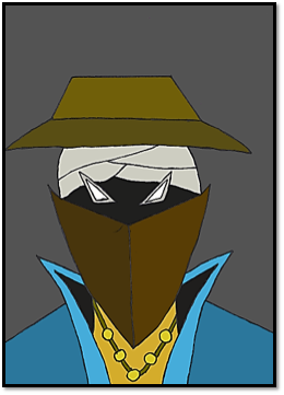
Character Design 4 in colour: For my fourth final concept I coloured it in by using the same software as I did for my previous portrait which was photoshop. As I did for the other portraits, I used the fill bucket tool to add the colours in. Like my second design I added darker colours. I did this because I wanted to make it feel different in tone and to also make it feel incognito meaning to make it feel more mysterious and unknown. As for the colours I used for this design are darker and used different tones for each colour for example I used a darker tone for brown on the collar whereas on the shoulder I decided to have lighter tone of the same. I did this same for face I used a grey colour for the bandages as for eyes I used a lighter tone. For the background I used a greyish blue under toned colour. I did this because it would fit well portrait and it would create a totally different atmosphere compared to the other designs which makes it look more effective in style.
Final Game cover Design
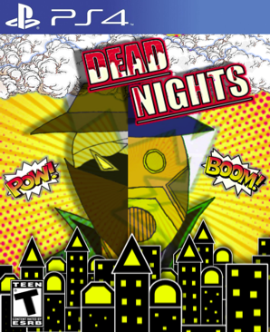
Game cover Design 1
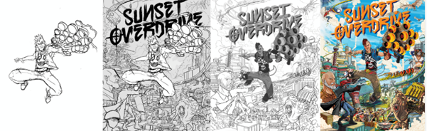
For my first game cover design, the software that I used was photo pea. I used this software to design my game cover because I am more used to it and I know how to use it and it works well. To design this cover The template I used for this cover was A4 print size. I used this template because it would be more accurate when I have finalized the game cover. For the logo design I came up with the name dead nights so it sounds more incognito and mysterious. I designed the logo by using power point. I used this software because it’s a lot easier to use as I am more familiar with it. When designing the logo I increased it size more to make look more clearer, so this it’s easier to read the logo/title. I also added a underline and made it bold. I also changed the font by using the font tool and also added red glow by using the glow tool, to make it look more effective and I also added a shadow by using the effects tool to make it stand out more. After I finished designing the logo I took the logo into photo pea. However to finalize the logo in photo pea I got cartoon blood splatter image and added lighter colour tone by using the colour correction tool on picture format in power point. I then took the image in photo pea and tried to embedded it into the logo. To do this I put the image behind the logo to a certain angle. I then used the wand tool to highlight the interior part of the logo/font and went on the edit/layer tool copy and past the new logo. I did this because this way the logo looks more appealing and looks more professional. after finishing the logo I then got a orange comic book background from google. I also added effects to the image by adding in a lighter tone by using the colour correction tool in power point. I did this because I wanted it to have more appeal and making it more bright and vibrant. I then took in photo pea for my background. After doing so I added some architectures concepts/designs I made previously and took them in photo pea. I used one of the alternate architecture designs for my cover so it could stand out more. When I took into photo pea one wasn’t enough to fill in the space and gaps. To fix this I copied and paste as much as I could and after doing so I grouped them together and centred it in the middle. I did this because it look more realistic because it looks more like cityscape that fits in well with the background I have used. After I finished working on the architectures I added other additional images the cover like the clouds and a lightning bolt. Much like the architectures I added copied and paste the clouds to make feel and look more real. I also added different effects by making a bit darker in tone and also added a blue glow around the clouds to make it look more effective. As for the lightning bolt I added a blue glow to make it look more better and placed it underneath the clouds and and behind the cityscape so this way it doesn’t come in the way and stands out more. I then started add my character design in to the cover. I picked two out of four because I wanted to character on the cover. To do this got the two character designs and cropped half of the portraits and grouped the portraits as one image. I did this because this it looks more professional and effective. After grouping them together I decided to get rid of the background by using the background tool in power point. After doing that I took it into photo pea and added a drop shadow and placed it in the centre because this it works more as game cover and looks more professional. I also added a transparent multiply effect to the the portrait design by using the effect tool in photo pea. I did this because it looks more incognito and it blends in with background and lightning bolt, so this way it looks more effective and more appealing. After doing that I added other images like the small onomatopia speech bubbles to make it look and feel more like a comic book and I made tone lighter and added a blue around it to make it look more effective. I also added a PS4 banner and ESRB teen rating logo. I did this because it the audience I am trying to target is teens and I did this because I wanted it to make it look more professional and real as possible. After I added those images I grouped all the layers together to make it look as one images. I took a screen shot of it and put it into power point and cropped the cover a little by using the crop. I did this because I wanted to make the size right and make it look real and professional as possible.
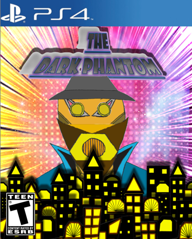
Final Game cover Design 2
For this game cover I used photo pea. Much like my first game cover design I used the same template A4 print. I used this because I wanted to make this real and professional as possible. I designed the logo by using power point. Much like the first one I increased the size of the logo to make it look more clearer, I also added a underline and made it bold and I also added a new font to make it standout more. I even added a purple glow and a drop shadow to make it look more effective and I also added a transform effect to it to make look more different compared to the first one logo design. After I finished the logo I took into photo pea. However to finish the logo of properly I wanted to take a similar approach with what I did with first logo design for the first game cover. However to make it look and feel different to the first one, I got a smoke/mist image from google. I then took the image in photo pea and tried embedded with the the text. To the this I placed the image behind the logo. I then used the wand tool to select/highlight the text and then I went on the edit/layer tab and copied and paste the image to get the new font. I did this because it will look more mysterious which fit in with the idea of incognito which looks more effective and professional. After I finished the logo I started to work on the background. For the background I wanted to have a similar background like the first game cover. I got two different comic book backgrounds one of which was lighter tone and one was from a darker tone. I chose two comic book backgrounds in particular because I wanted to have to have a contrast between the two, so I added a screen effect by using the effects tool in photo pea. I did this because the two backgrounds blends in very well with each. I also got an additional cosmic background to add in with the comic book ones by adding a different effect. I did this because it will look more vibrant with the comic book backgrounds and it will look more effective and colourful. After I finished the background for the cover I added architectures concepts that I designed and put into photo pea. Unlike the first game cover I added more variety of architectures and I grouped them together by making them as one cityscape. I did this because this way it looks more effective and it stands out more. After I finished the architectures I started working on the character design. For this cover I wanted to make a an amalgamation of two character. To do this I used the same character designs and put the them into power point and cropped the features I wanted to keep and I also got rid of the backgrounds of the portraits. After I did this grouped the features together and made sure they were in right place and made a whole new character out of it. I did this because it look more mysterious and abstract when it comes to the theme and idea of incognito which makes it more effective and eye catching. After doing I took the portrait in photo pea and placed it in the centre. After I finished doing the character design I added the PS4 banner and a ESRB teen rating logo. after doing so I grouped all the layers together to make it fit as on image, I then took a screen of it and placed it on to power point and cropped it a bit the cover by using the crop tool. This is it look more real and effective. I did this because I wanted to make this game cover as real as possible and also making it look more professional.