FMP Mood boards
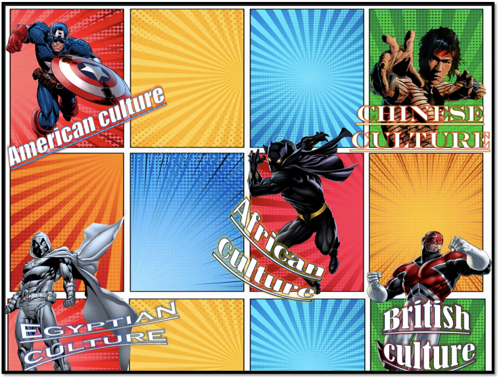
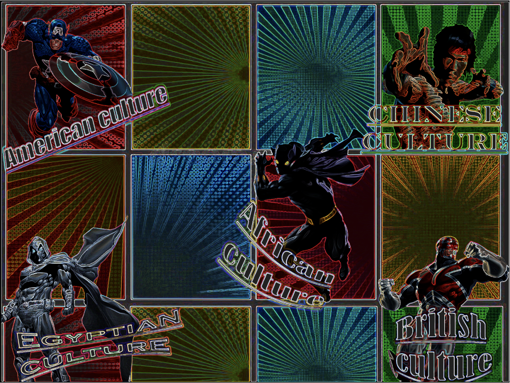
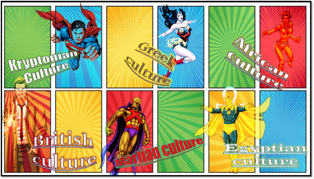
This is a visual research of Pocket Planet but researching what I am passionate about. This is a Marvel mood board of different comic book characters that show different cultures which relates to the theme of Pocket Planet. To create this mood board I used photoshop and got a comic book image from google for the background. After this I researched other comic book character that had different cultures like Chinese, Egyptian and African. By doing this I masked out the characters using the wand tool to get rid of the background and I placed each character in certain areas in the background. I also used Power Point for the typography. I added different fonts to make it look unique, I even added different effects like glow to make it effective and the transform tool to warp the text. I did this because it will look more presentable and standout out more. After completing this mood board I grouped all the layers in photoshop to make it as one image.
Alternat designs
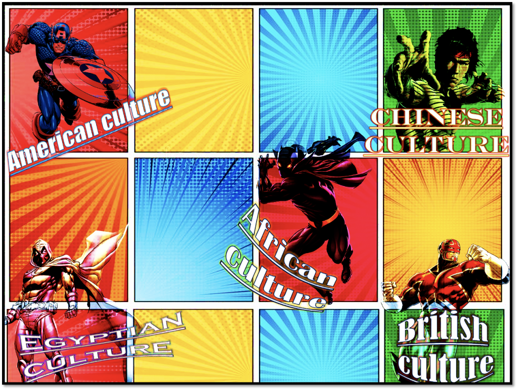
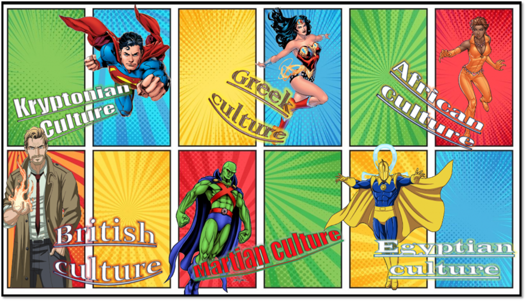
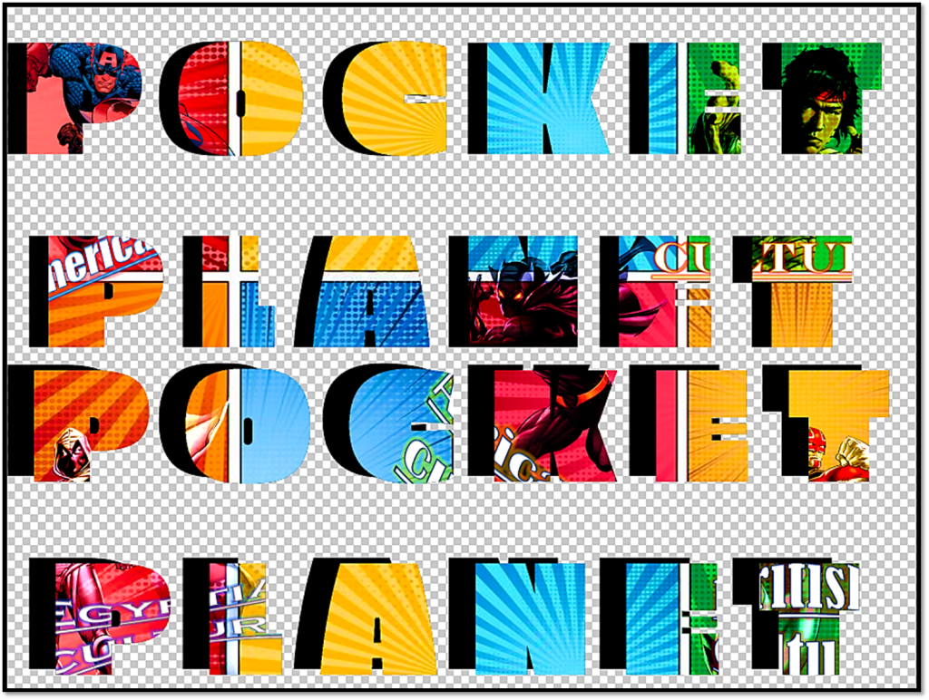
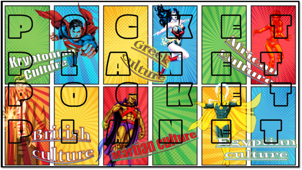
This is a visual research of Pocket Planet but researching what I am passionate about. Much like the Marvel mood board here I decided to something similar. Like the Marvel mood board, for this one I researched different DC characters that have different cultures. The mood board I designed for this one is a bit different than the Marvel mood board as some of the character I researched like Superman and Martian manhunter have fictional background/culture like Kryptonian and Martian. However other characters that I researched like Wonder Woman, Vixen, Constantine and Dr fate have real cultural background like British, Greek, African etc. To make this mood board I used Photoshop and I used the wand tool to mask out the character to get rid of the background and I placed the images in certain areas of the background. I used Power Point for the typography and I used different fonts to make each of the text standout and look unique. To make the text more effective and eye catching I used the glow for each text and I used the transform tool to warp the text. After finishing I copied and pasted each of these text in to Photoshop and placed them with characters images. After I did this I merged all the layers together to make the image as one mood board.
Alternate designs
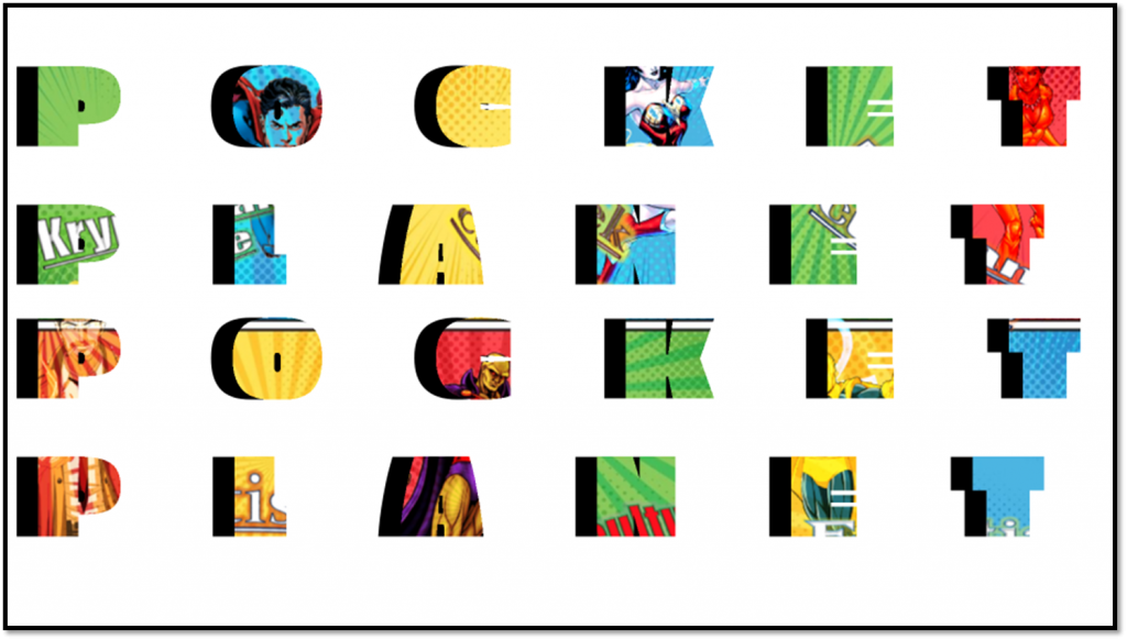
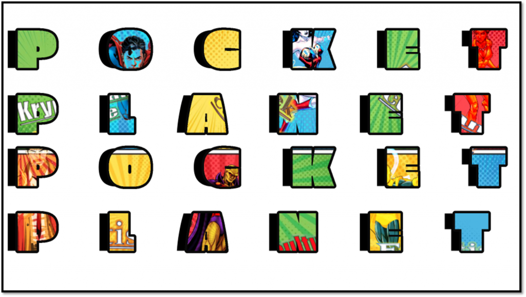
FMP Pocket Planet typography
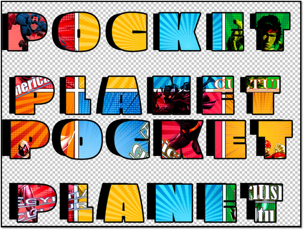
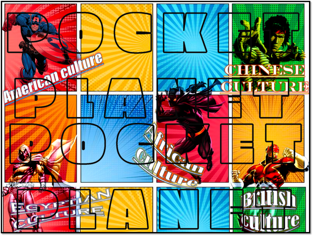
This is Pocket planet typography. To make this I used Adobe Photoshop and used My mood boards that I created for the typography. I used the text tool to write out the text. To adjust and edit Text I increased the size of the text and I also spaced each letter out. I did this so the entire text captures key parts of the mood board image. After doing so I duplicated the text layer so I could have another text layers. I did this because it will fill in the entire image. I then used the wand tool to select the text and I then copied and pasted the mood board image in to the the text. to make it standout more I used the wand tool to select the text and added a thick out black outline to the text. After doing this I took screen different shots of the typography to have a different version of it. I did this because I wanted to add more variety to my typography and have different styles to it.
This is Pocket planet typography. To make this I used Adobe Photoshop and used My mood boards that I created for the typography. I used the text tool to write out the text. To adjust and edit Text I increased the size of the text and I also spaced each letter out. I did this so the entire text captures key parts of the mood board image. After doing so I duplicated the text layer so I could have another text layers. I did this because it will fill in the entire image. I then used the wand tool to select the text and I then copied and pasted the mood board image in to the the text. to make it standout more I used the wand tool to select the text and added a thick out black outline to the text. After doing this I took screen different shots of the typography to have a different version of it. I did this because I wanted to add more variety to my typography and have different styles to it.
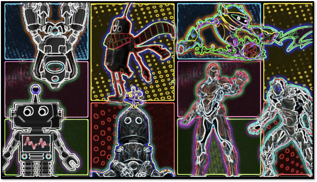
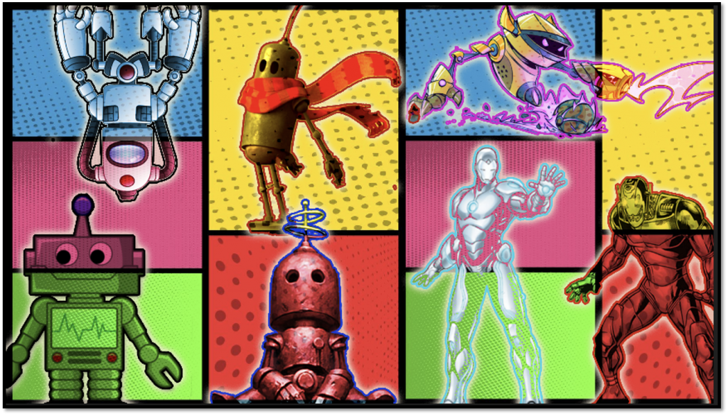
Bot mood board
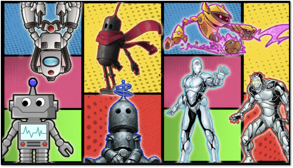
This is a visual research of Pocket Planet but researching about different bot designs. Much like the previous mood boards for this one I decided to do it with different bot designs as it is part of my FMP project. To make this mood board I used a similar software to Photoshop which is called Photopea. I used a comic book image for the background to have that superhero look to it. I then used my research about bot designs into my FMP mood board. I used the wand tool to mask out the images and placed them in certain areas of the background. The bot designs I used were mixed between digital, hand drawn and concept art. I did this because it would expand my research and also looking in to different techniques. To make each bot image standout and look effective I added different glows to the images by using the glow tool and I also added a thick black outline by using the stroke tool. After completing the mood board I decided to take screen shots and put them in to power point and add different effects. I did this because I wanted to have each mood board designs to look unique and have some variety. After doing so I merged all the layers together to make it as one mood board image.
Bot typography
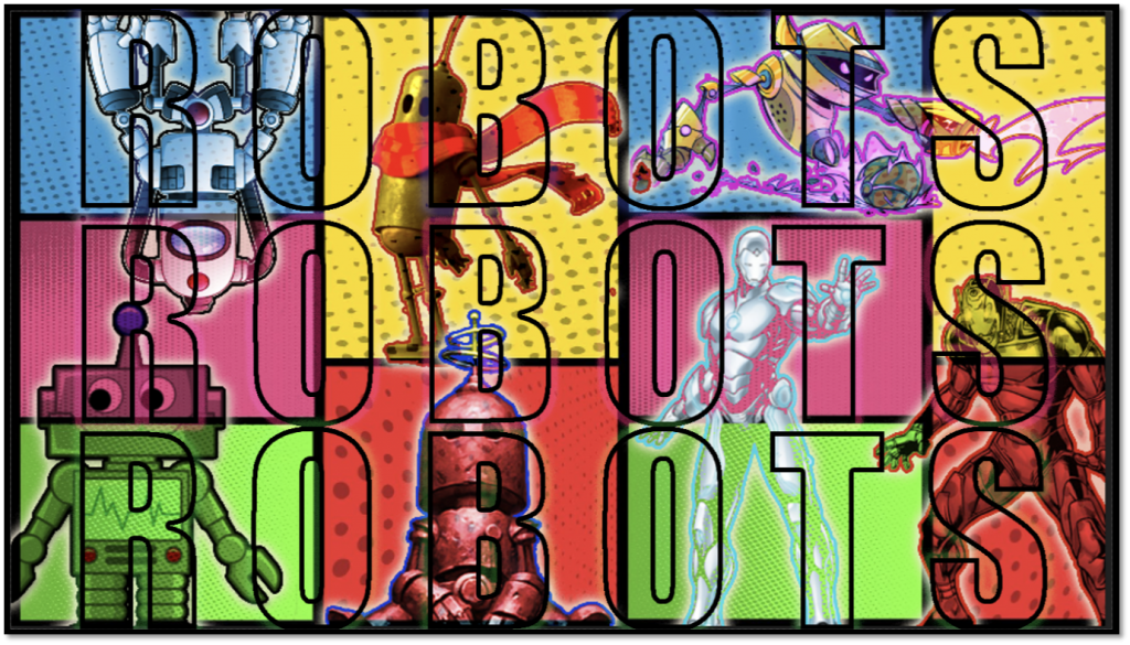
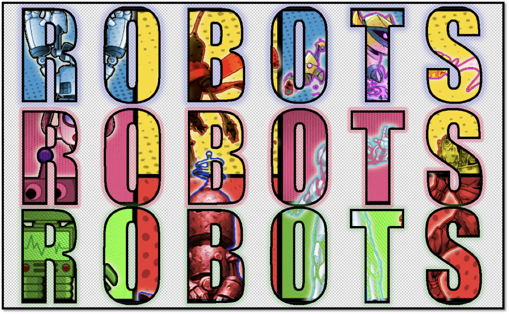
This is a visual typography of robots. I decided to do a similar thing with Pocket Planet but with robots. To make this typography work I used photopea. I used the text tool to type out robot. To edit and adjust the text I increased the size of the text and spaced the letters out and then I also duplicated the layer to because I wanted to have another layer of text. I did this because it will fit within the image and to make the text clear to see. since I used my robot mood board image I selected the text layer by using the wand tool and I copied and pasted the mood board image in to the text. However to make the typography look more effective and creative I selected the text again by using the wand tool and adding a thick black outline by using the stroke tool. I also used the glow tool to add a glow to each text layer to make it look more effective. By finishing off I decided to select all the layers and merge them as one image. while making this typography I did take screen shots to have two very distinct versions. I did this because it will expand my creativity and it will standout more and look unique.
Bot designs
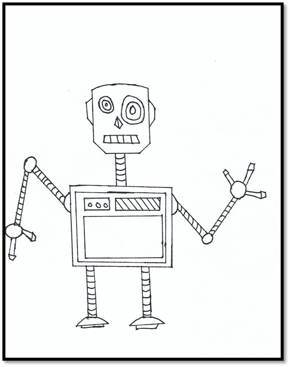
For my graphic novel the character designs that I decided to go for is robots. I chose this design because it’s a lot easier and it’s doable. For my first bot design I drew it out with a pencil and while drawing it I decided to go with a more rectangular look to make it look more robotic as I also used the same shape for the arms and legs but a bit more thin.
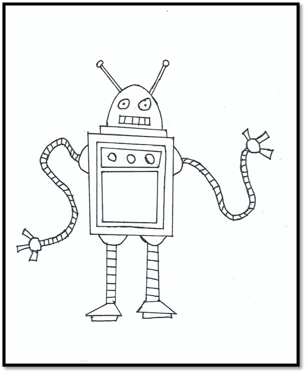
For my second bot design I to use the same ship also using an oval shape for the head to make it look a bit different and circular I have use the same rectangular to rest of design with the centre piece and legs as well as the arms. With I decided to give it a swirly look as though it’s in motion. I did this because it’s more creative and different compared to the first bot design and it is vey imaginative.
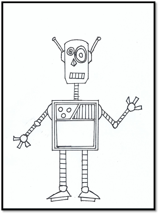
I designed a final design and this bot is going to be main character of my graphic novel. For my final bot design I decided to make smaller in comparison to my robots. For the final one I decided to draw and design by taking certain elements from the previous one. For the I borrowed the antennas from the second design I also used the thicker legs from the second I used majority of the design from the first with shapes that I used.
Bot designs in colour
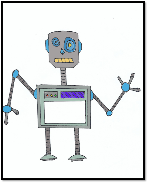
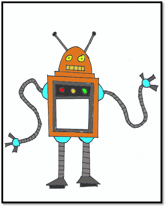
Here I have developed my bot design even further by adding colour it. To do this the software I used was Photopea. I opened the PDF file of my first bot design into Photopea. To add colour I used the wand tool to select certain areas of my drawing and used the fill bucket tool to add any colour of my choosing. The colour that I chose for my first bot design were grey and blue. I used darker tones because it would fit the design I am going for. I used a darker tone of grey for the arms and legs as for the centre piece and head I used a lighter tone of grey to make it standout more. I also used different shades of blue for the eyes and ears as well for the circles on the arms. I did this because I wanted this design to be a bit standard when it comes to colouring. I also did use some bright colour like peach for the mouth and other colours like purple, red, green and yellow. I did this because I wanted this design to be simple but also to make it pop more.
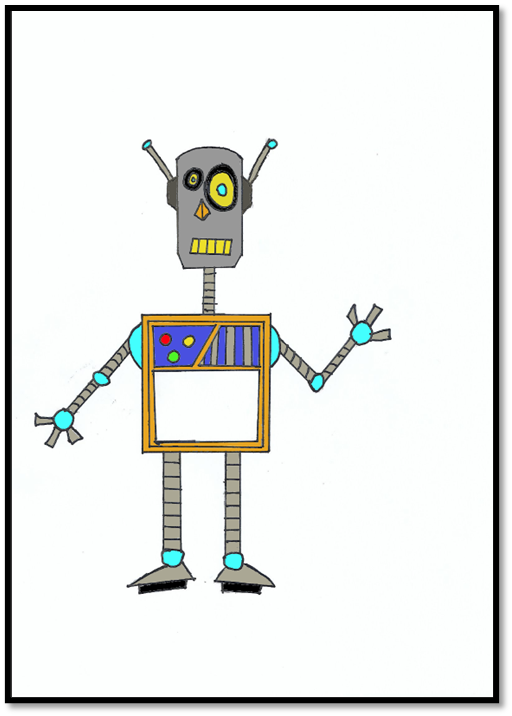
For my second bot design I did the same by using Photopea to add colour to it. However for my second design I decided to use different colours but also using some of the same colour as I did for my first design. I did this because I wanted to have a similar concept but also changing up the colour use. The colours that I did use for my second design is orange, yellow, red, green and blue. I used orange as a base colour of what my second bot is going to look like and I used yellow for the eyes of the robot and lighter tone of blue for the circle pieces in the legs and arms. I decided to do this because I wanted to have this bot design have more of a vibrant look than a dull look. However to have a similar concept I used a darker tone of grey for the arms and legs and antennas. I decided to do this because I wanted this to have some darker tone of colouring in it to make look more effective.
For my final bot design I decided to use my previous designs as a reference to colour in my final design. To colour in my final design I used the same software Photopea. The colour that used in this design are a mix of bright and dark colours. The bright colours I did use was orange, blue, yellow, red and green. I used orange for the centre piece of drawing and for the nose. I used yellow for the eyes and mouth and blue for the circular pieces in the arms and legs. I used these colours because it would look more vibrant. However I also used darker colours like grey and black and other darker tone of colours like blue. I used a darker tone of blue for the square pieces in the centre to make it look unique. I used grey for the neck, arms, legs and feet and antennas. I also used a black colour for the shapes under the feet and for the eyes. I decided to use these colours for these areas of the drawing because it will have the simple look to it but also being eye catching with the use of the lighter tones of colours.
Graphic novel development
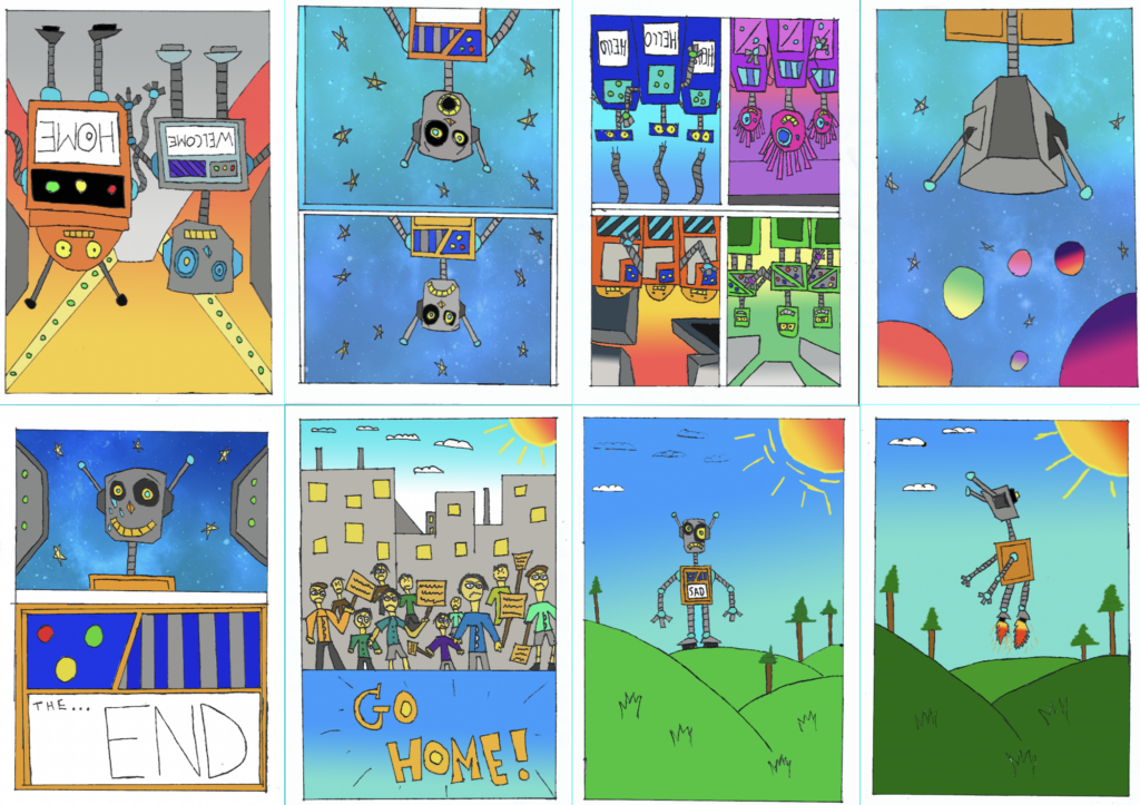
Page 1
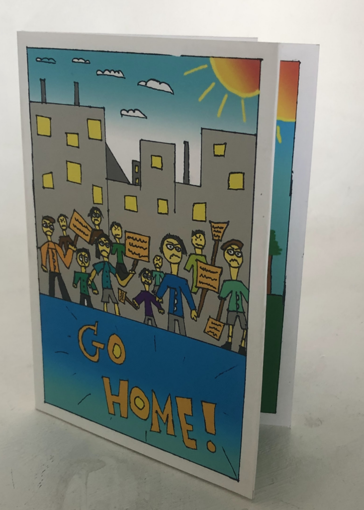
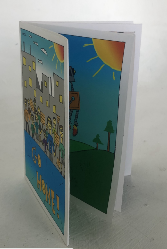
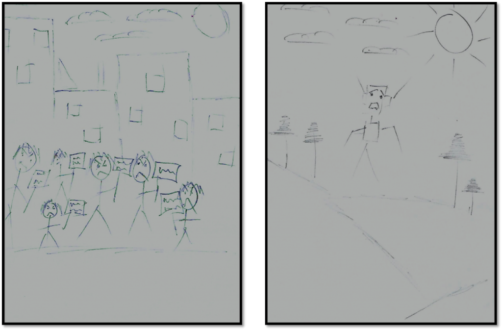
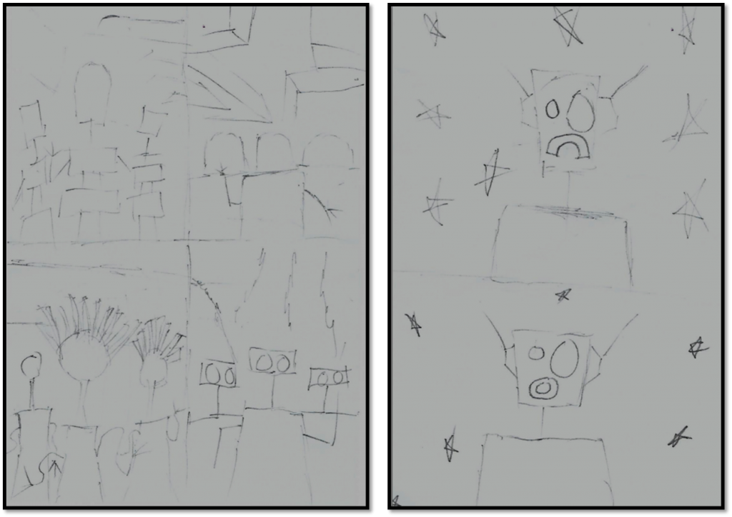
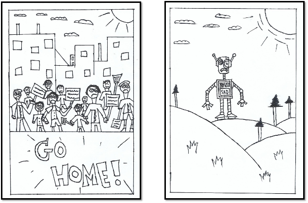
In Page I the story starts out by people protesting and holding out signs saying go home. The expressions these people are showing are very angry and rage-full as they are demanding a robot to go home. The setting I chose for this to be in a cityscape as it would add more drama to the narrative in a way that the world is against this robot.
Page 2
In page 2 I decided to have my main character be lonely and upset as the expression in his face show is sadness. The setting I chose for this page is in a field with nothing but trees. I decided draw this setting because it’s to show how lonely and alone the robot is and how everyone is against him.
Page 3
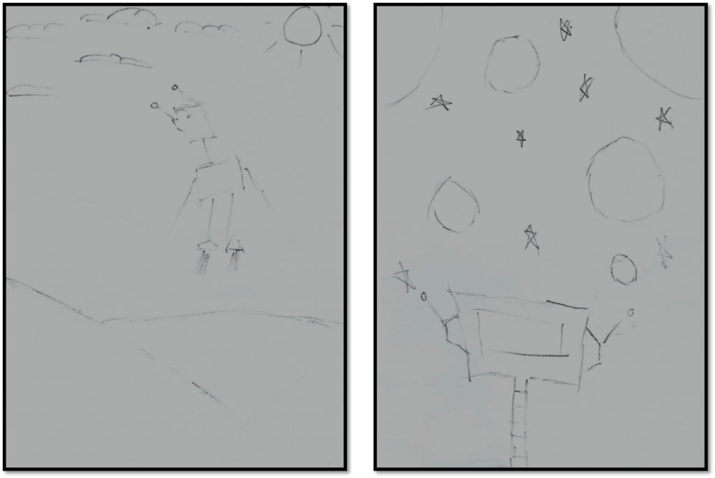
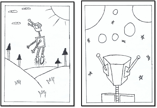
For page 3 I wanted the robot to be in the same setting but being in a different scenario. In this page the scenario I wanted the bot to be in was to fly off in to space. I decided to do this because I wanted to see what I could do with the character and I wanted the character to go into space.
Page 4
In Page 4 the bot is in space and he sees these other planets. The way I drew this page was the perceptive of the reader so I decided to show the back of the head to the bot. I did this because it will allow reader to see what he sees.
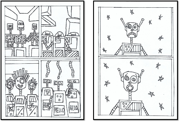
Page 5
In page 5 I decided to have 4 panels as the main character has seen different robot cultures on different planets. I decide to have 4 panels in one page because I wanted the narrative of my story to be simple but also look unique as this page heavily relates to the theme of this year FMP theme which is Pocket Planet.
Page 6
In page 6 I decided to have two panels conveying the main character feeling and emotions. In this page the robot has been to different planets but still can’t find his home and is left alone space, but is then shocked as to what happen in the next page.
Page 7
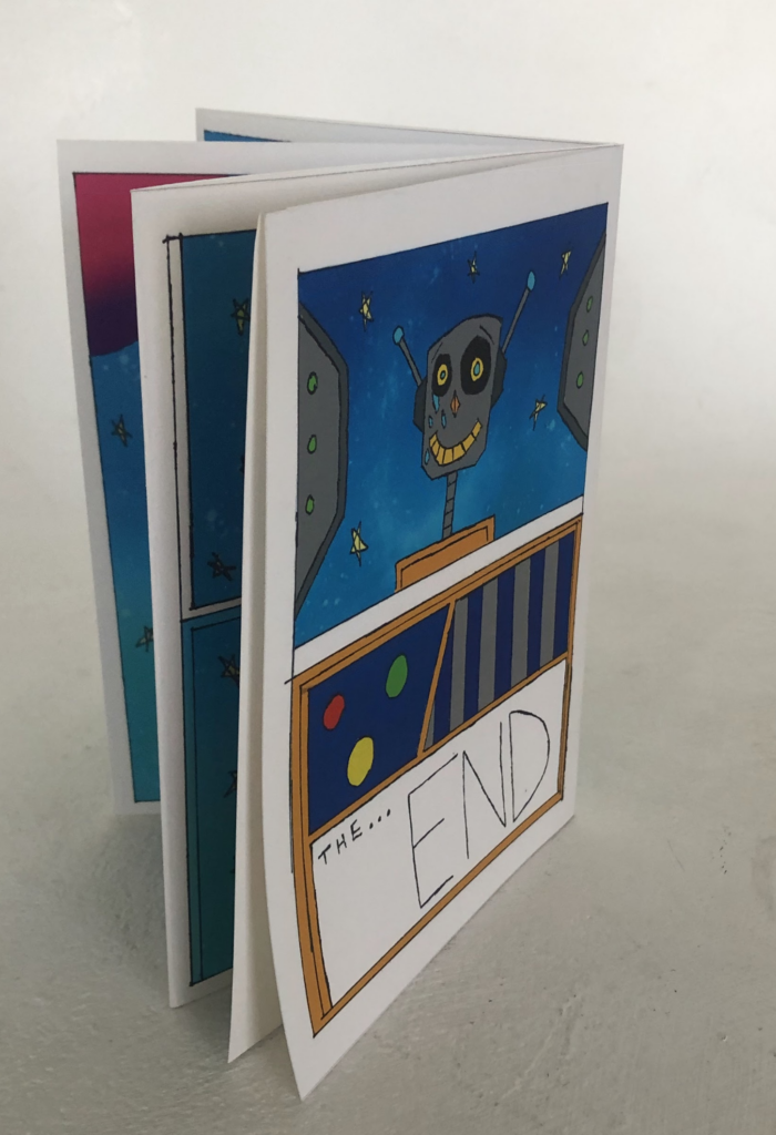
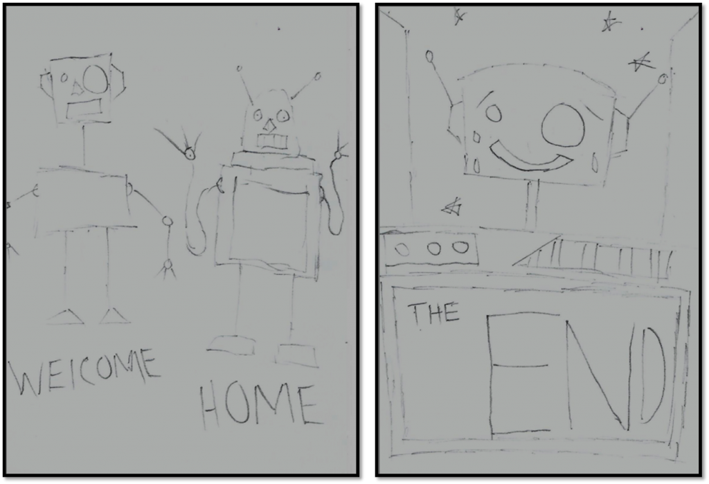
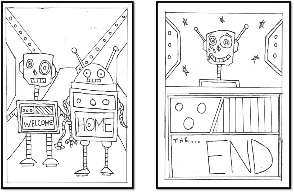
In page 7 his own bot parents finds him and brings him to their home planet with a message saying welcome home. I decided to do this because I wanted this story to convey emotions and have some drama to it. However I haven’t drawn the setting but it is going to be on the inside of a space ship.
Page 8
In the last page of my zine I decided to add two panel in one page. In the first panel the robot is shown in space and happy and emotional as tears start coming out of his eye. I decided to do this because it’s to show that the robot has a home and is not alone and is being accepted. In the second panel I wanted to end this story with a typical message saying the end, however I decided write this out in the centre piece of the main characters design.
This is a draft/story board of what my graphic novel/zine is going to look like and what is going to happen in the finalised version. The narrative for this story telling is going to be visual, so no speech bubble and or text are going to be involved. I decided to visual story telling because it will be easier to grasp and allow people to understand clearly.
Graphic novel development
Page 1 and 2
For my graphic novel I started developing my pages by redrawing it by using my story draft as a reference. As I started drawing out the first two pages I kept the concept and idea the same for example for page 1 I wanted the narrative to start out with people protesting. I added more detail to this by adding in the expression they are feeling and I also drew the city background and added some detail to it. After I finished the main drawing underneath I added a little phrase saying go home. I did this because it would further emphasis what the people are saying especially as I added attention to detail with them holding up signs.
For page 2 I kept the same concept and idea with the robot being alone in a field. As I drew this page I decided to use my final bot design as the main character and staying true to the story draft I decided to draw the expressions on him feeling sad and lost. I did this because it would convey emotion and to see how the robot is feeling. I also added the word sad in the centre piece of the robot drawing as it would show what he is feeling. I did this because it would work effectively and it would add a nice touch to the drawing.
Page 3 and 4
Through developing my graphic novel I re drew my story draft and added more detail. For page 3 I added more detail as the main character is bout to take off. by doing so I decided to draw some flames under the foot with some lines added to it. I did this because it would show what scenario the bot is in and it also gives you more of an idea where it could lead to when the story goes on. Much like the previous page I decided to keep the setting the same as he is in the field. I decided to do this because it would be easy to do and follow instead of drawing an entire new setting.
In page 4 I drew the robot in space but adding more detail to the page by adding the planets and stars. I did this because I wanted the next page to take place in space. When drawing the robot I used my story draft as a reference to see what I could do. I decided to draw the back of the head of the robot. I decided to do this because it would easy and it further allows the reader to see what the main character sees from the point of view of the main character.
Page 5 and 6
In page 5 I used my story draft and re draw the page. When drawing this I made sure to add as much detail as I could to each set of robots as the scenario in this page has 4 panels showing 4 robot culture as the main character in this page has visited these version and variants of robots with different culture. I kept the rough design element of these bots in the draft the same but with more detail. I did this because as it would expand my creativity. I also decided to do a 4 panel page because I wanted to do something different with some of my pages and I wanted to add panels as it would add more of a comic look to it.
For page 6 I decided to do a 2 panel page because I wanted to stay consistent and stay true to the story draft. In first panel I decided to draw the character in space as well for the second panel. In this page I wanted the main character to show emotion as he his still sad and lonely but changed up his feeling by drawing his mouth in a circular shape showing he is shocked and amazed. I did this because I wanted to show more emotion and it would further emphasise why he is feeling the way he is when it come to next page.
Page 7 and 8
For the last two pages I did the same by following my story board draft. In page 6 I drew in detail two bots. to make it easier I used my previous bot design for this page. I decided t do this because it would be more easier to do as they are part of the essential story narrative. The setting I decide to draw for this page was the inside of a space ship as I drew the the ramp and I drew other shape in background to make it look alien. I also decide to add a phrase saying welcome home in the centre piece of the robot drawing. I decided to do this because it would be nice and heart warming.
In page 8 I re drew the same scenario from my story draft as the main character is in space. I added more attention to detail by adding tears coming out of his eyes. I did this because I wanted the character to convey emotions and happiness as he is realised that he has found his home. in the second panel of this page I drew the centre piece accurately by adding detail to it and adding the last message saying the end. I did this because it would add a nice touch and it works effectively with the story narrative.
while I did this I had drawn all the pages with a pencil and then went over it with a black fine line pen to make it look professional.
Graphic novel development final color
After I drew all the pages I took them into photoshop and added colour to it to make it vibrant.
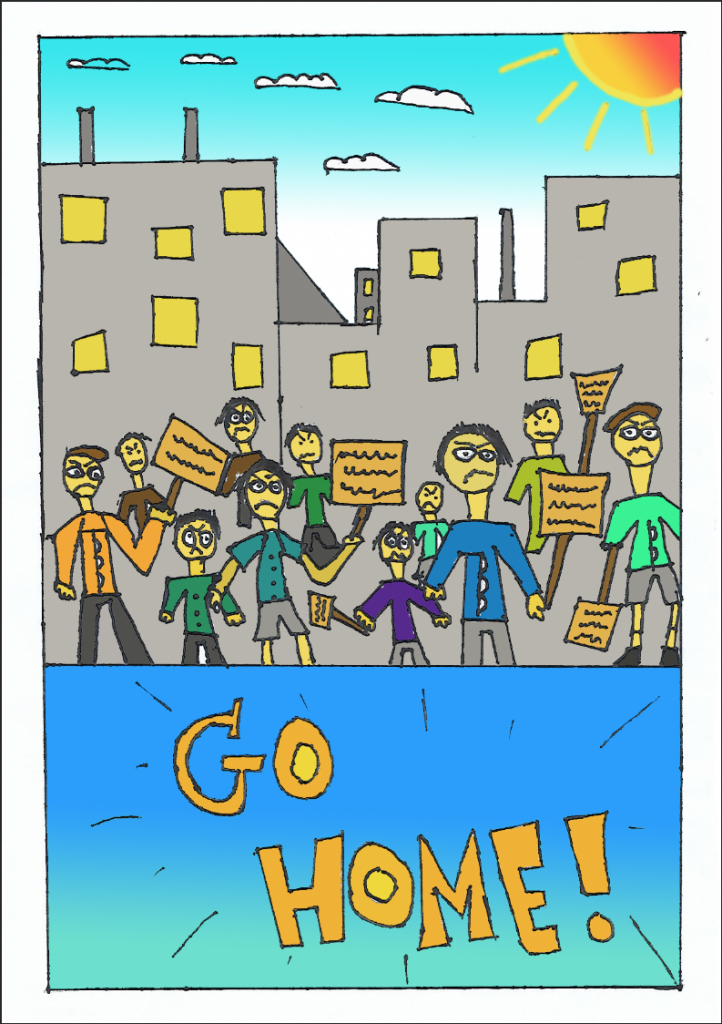
For page 1 the colours I used were bright colours like blue, orange, yellow and white. I used yellow for the people and the windows in the background of the cityscape. I used the colour orange for the signs and the text at the bottom. for the city scape background I used a light grey colour for the architecture. I used the gradient tool for the background by adding a blue gradient as well as adding an orange gradient for the sun. I also used the brush tool to fill in the outline of the sun. I used a gradient tool because it would it look more vibrant and colourful and it will make it look more effective in the end.
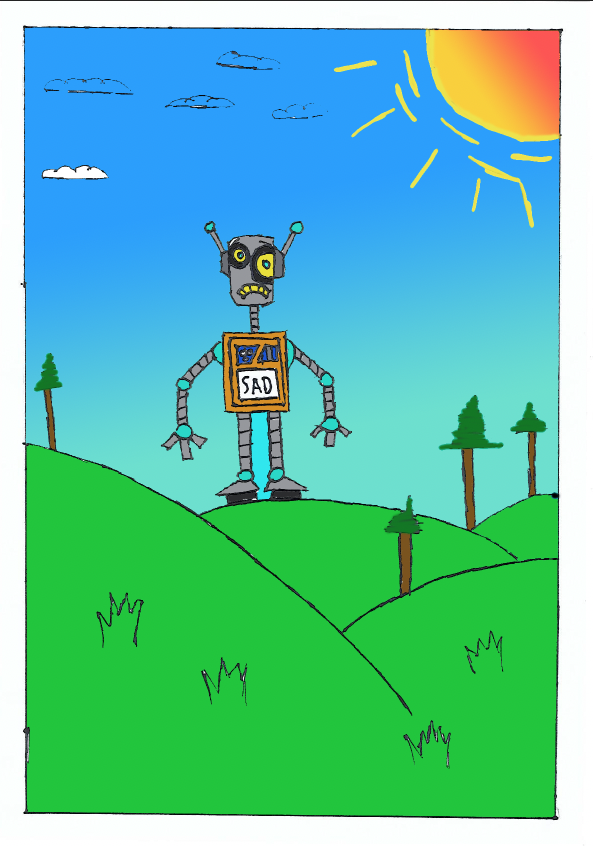
The colours for the second page were also bright colours. the colours that I did use was blue green brown and orange. I used a light tone of green for the grass and I used a darker tone green for the trees as well as using a brown colour for the wood. I did this because I wanted a mix between two distinct tones of green that match and standout. To colour in the trees I used the brush tool. I did this because it would be easier to do than selecting it with a wand tool. I used the same colours as I did for bot design to make it look consistent as well as adding a gradient blue for the sky and adding a orange gradient colour for the sun. I even used the brush tool to fill in the outlines of the sun. I did this because it would make the background pop even more and it looks effective giving it a cartoon look to it.
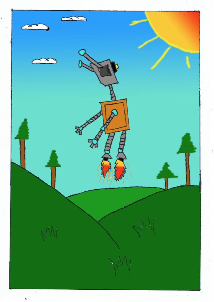
For page 3 I used the same colour as in this page the bot is still in the same setting. With this one page I decided to use darker tone for the grass but keeping the same gradient look to the sun and sky background. I did this by using the fill bucket tool and using the brush tool for certain areas to the page. I added a orange gradient to the flames and I used the brush tool to fill in the little lines and sparks that are part of the flame effect. I did this because it will look more effective and eye catching.
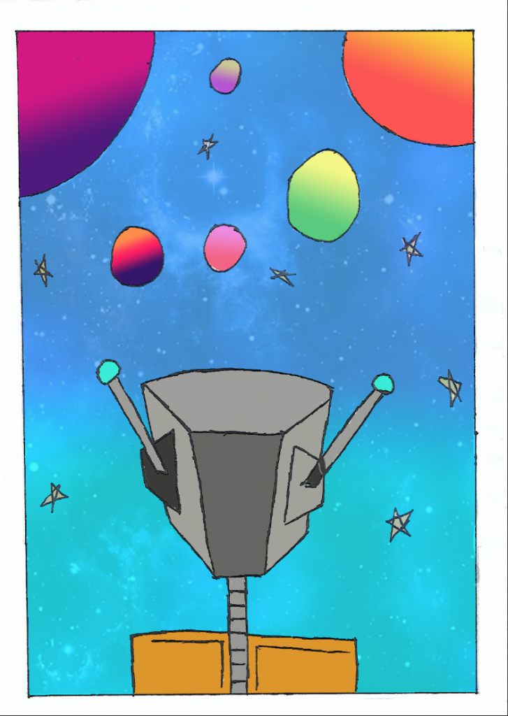
For page 4 I used vibrant colours again. I did this because I wanted to keep each page consistent but also keeping certain element different. For example I added the same blue gradient to the background but got a reference image of cosmic background and add into this page. To do this I duplicated the layer and I used the erase tool and I started to get rid of the background drawing (planets and stars) I used the reference image to put in the background and I decreased the opacity so you could see the blue gradient colour and cosmic background. I did this because this page takes place in space and it I wanted to have this page to have cosmic feel to it which would make it look unique. After doing so I added different colour gradients to the planets to make it look more effective.
For page 5 I used more bright colours like blue, orange, green and purple. I added these sets of colours to the different bot design that I drew. I decide to do this because I wanted each bot race to look unique and different from one another. I also used the gradient tool to add different background colour to each panel. I did this because it will look more vibrant and eye catching. while using these colours I also used different tones to Make it look more effective.
In this I decided to use the same cosmic background image as I did for page 4. I did this because I wanted to keep it consistent and this page is set in space. I also kept the same colours for the bot design and as well using the same gradient colour for the background. To make the background I duplicated the layer and I used the erase tool to get rid of certain areas of the drawing I decreased the opacity of the image and I added the gradient colour to it to make it look more effective and unique.
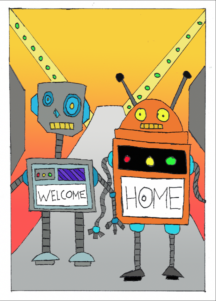
For page 7 I used the same bright colours orange, blue, yellow and green. I also used the same colours from my previous bot designs (bot design 1 and 2). since the setting for this page is inside of space ship I used a light grey gradient for the ramp and for other shapes in this page. I used green by using fill bucket tool for circular shape in the background. For the background I decided to use a orange gradient background to make it standout more.
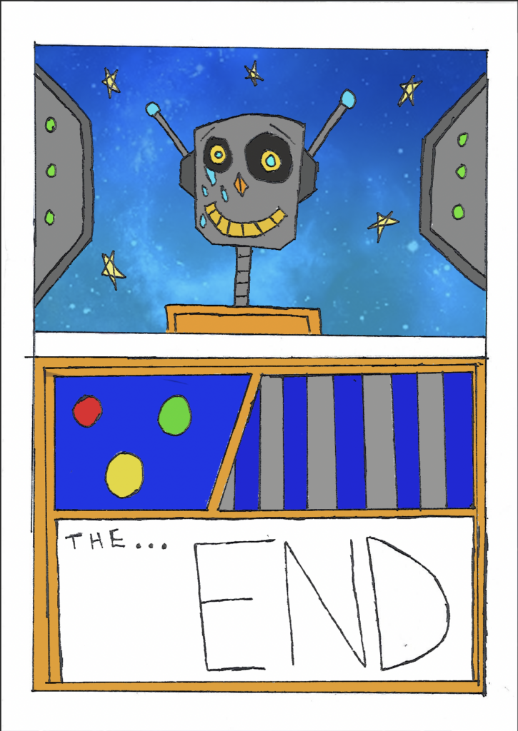
For the last page I decide to use the same image for the background for the top panel. I also added a gradient blue look to it to make it look more cosmic. I also used other colours like grey, green and yellow and blue. I used a grey colour for the shape and a green colour for the circles that I added in the drawing. I also added yellow for the stars so they look bright. I even use a light blue colour for the tears to show emotion. I kept the same colours for the bot design in both panels like orange blue and grey. I decided to do this because I wanted my zine/novel to have a consistent colour palette and to be vibrant throughout the whole narrative.
Mini Graphic novel development
After finishing colouring each page in photoshop I then decided to put them together in one image. To do this I used photoshop and the template I used to create my zine was A2. I used a ruler to set mid points and after I had done that I then I decided to put my pages in. The pages I put in fit in perfectly and then I had to print it out. To make it into a zine I manually used a ruler and a scalpel to smoothen out the paper and folded it in. After I did this I cut though the centre line and folded it into a zine.
Mini Graphic novel finalised