Extended diploma’ Project 4 – Task 2 Research

These screen shots are of my primary research. This will help me because I am able to get an idea of what people would like to see from my project. A positive of this is that I am able to get feedback from people who are in part of my target audience to find out what they are interested in and what they would like to see in the project. However, a negative of this is that I was only able to get 14 people to answer the questionaire. Another negative of this, is that some of the people who answered the questionaire are from or around Badford this could be an issue because I would like to have seen more people answer it who are not from Bradford or Leeds.

Practioners:

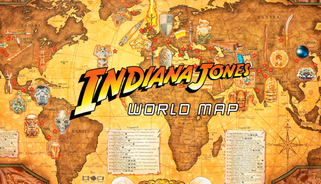
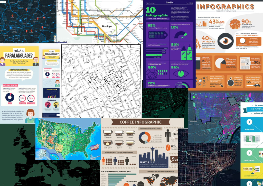
Matt Busch is an American illustrator who helped create the map design for Indiana jones the reason why he is one of my creative practitioner is because of the artistic styling of the map illustration. This can be seen in Indiana Jones not only this but it fits with the theme of my project as it is about history as well as the way certain locations are highlighted on the map i.e. Cities.

This example of Matt Busch map is a favorite of mine this is because of the overall theme of the map and how all the images that are seen on the map placed in the origin of the country they are from. I can implement a similar presentation in my map with the locations i have chosen. In addition to this, I like the theme of the map as well as the colour scheme of the map as it shows that its an old map and the typography is also suitable for the theme of it as well.

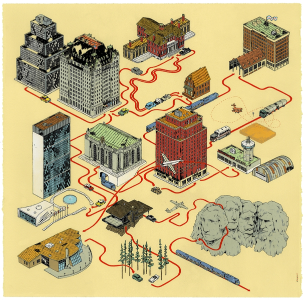
Andrew Degraff is another creative practitioner who has inspired me to create a map for my final major project this is because of the textures used on the maps he has created. This is because the textures that Andrew Degraff uses on his map designs are not cliche and fit the theme of the map perfectly. Not only this, but the simplicity of the maps as well makes them easily recognisable this can be seen in his map for Ghostbusters.

The reason why I like this example of Andrew Degraffs work is because of the simplicity of the map with everything spaced out and not cluttered. I can use this idea in my project to ensure that the locations that I will be choosing are not tightly spcaed together. In addition to this, another reason why I like the map is because of the artistic styling of the map with the buildings as they look like they are in 3D and coming off of the page. I will be taking into consideration how my map will look as well as the locations I have chosen for my project.

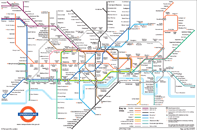
Harry Beck is another creative practitioner who has inspired me this is because he created the London underground map the layout of the map has inspired me to make something similar to Harry Becks design. In addition to this, the use of typography that he has used on the map also has inspired me on what theme I want my map to be based on this is because the type face he has chosen is clear to read and suits the time period therefore I want a similar type face for my project.

This is Harry Becks work as a creative practitioner. The reason why I like this is because of the layout of the railway lines. This is because the lines are all at 45 degree angles and are all well presented on the map. I can incorporate this into my map design with how the lines on my map can be presented but with a different colour scheme to thhe one that is shown in Harry Becks work.
This is a mood board of different styles of maps as well as infographics that presented information. The reason why I did a mood board which had maps as well as infographics is because the infographics gave me the idea on how to present the locations on the maps and the maps on the mood board are to help me on an artistic style of my map. Another reason why I have done this is to put some designs that I like onto the mood board.
This is another mood board that I have created that had more maps on them the reason why I did another mood map for my project is to inspire me on choosing a suitable artistic design for the map its self. The creative industry would create similar mood baords because it would help them settle on an indea as well as finding some artistic styles being similar in design to the the other.
This screen shot is of me messaging the collaborator who has given me permission to use the images he has posted into the group.
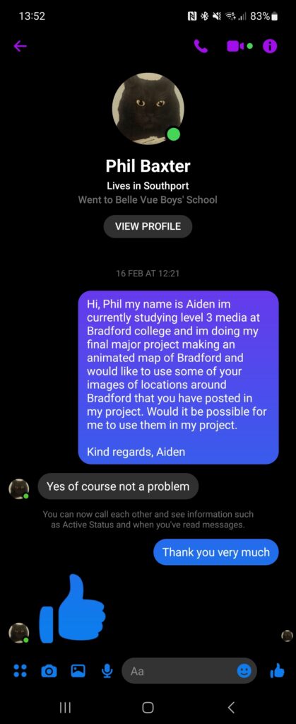
For my project I am being tasked will collaborate and produce a project that links to the community. The reason why I have decided to collaborate with Phil is because he is part of an online group that is about the history of Bradford where he posts. This links to my project as he edits old photos of Bradford re-colourising them to post into the group the positive of having him collaborate with me is the fact, he posts photo’s every few days that are around Bradford with the name of the locations as well. Another positive of collaborating with him is because the photos are posted in the groups there is people in that group that may be able to give insight into the location in the image.    
This mood-board was created to help me decide on a background to use on my map. The reason why I have gone for an old paper texture is because it relates to the theme of history of Bradford and will make my project more visually appealing to the person viewing it.
The reason why I have created a mood-board for typography is because it will help me in deciding a visually appealing type face that is also easy to read. Not only this but this would be done in the creative media industry because it will help decide what type face would be a suitable fit for the project and not just randomly choosing a type face for the project.