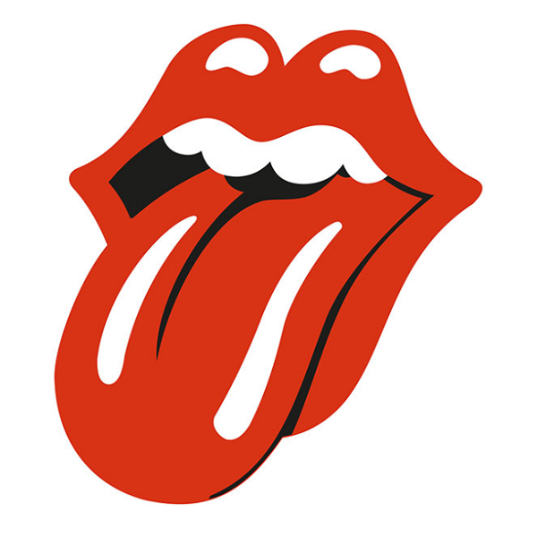
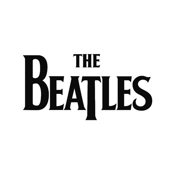
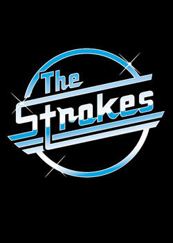
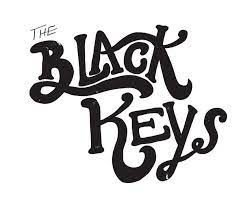
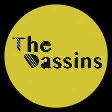
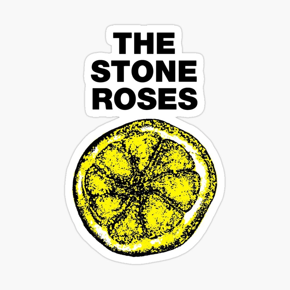
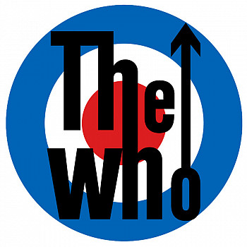
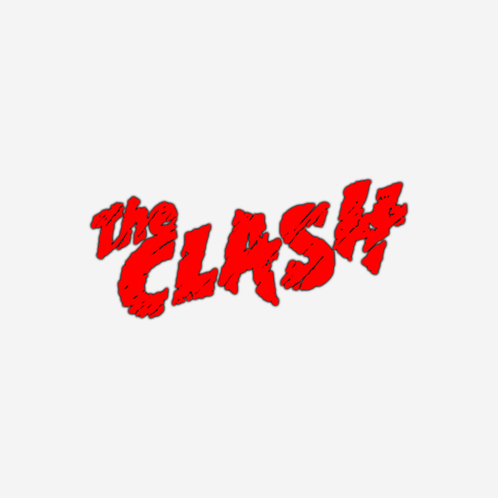
Simple but effective and never goes out of date.This is my band logo the reason we created this logo was due the simplicity of the colours and with the text at the bottom is gives it a striking name easily attracting attention.Very simple again but very unusual band name and you have to wonder what was going through their heads.The t is very enlarged it gives a centre of attention affect.Here we have the strokes with their 80s affect with modern combined really makes their logo unique.The swirl of the lettering seems to catch your eye giving you a sense that the letters are like keys on a piano.The Dassins are a local band around leeds area i chose them as the colour shift from black to yellow catches my eye ad only draws me in.This logo is very unusual due to the lemon I m still trying to work is out to this day. on what is the meaning but the odd art design for sure makes it it a one of a kind.This logo identifies england with the colours and the 60s movement of the british bands taking over. The Who played a huge part in that.The lettering and colouring in this logo is simple with littler detailed designs such as the slashes in the writing gives it a punky affect.