The artwork for your EP is important, very important, as it’s some of the only information you can display before they listen to the music. It is also the main visual accompaniment to the music, and this is why I want to have an artwork I like.
The main idea I’ve had since the start was the theme of the artwork being a spiral. I like that idea and I want to
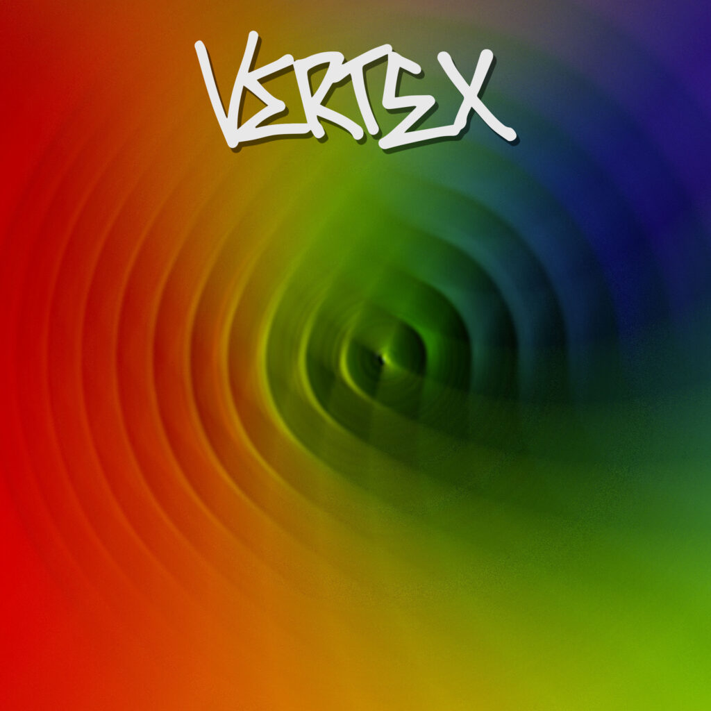
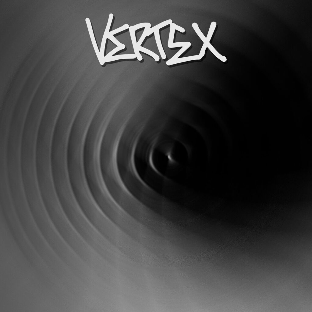
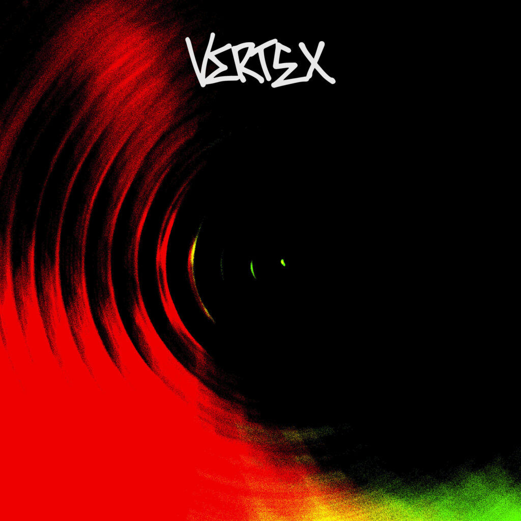
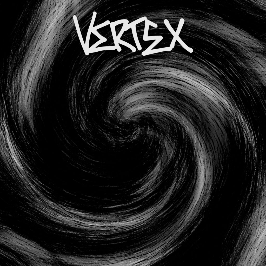
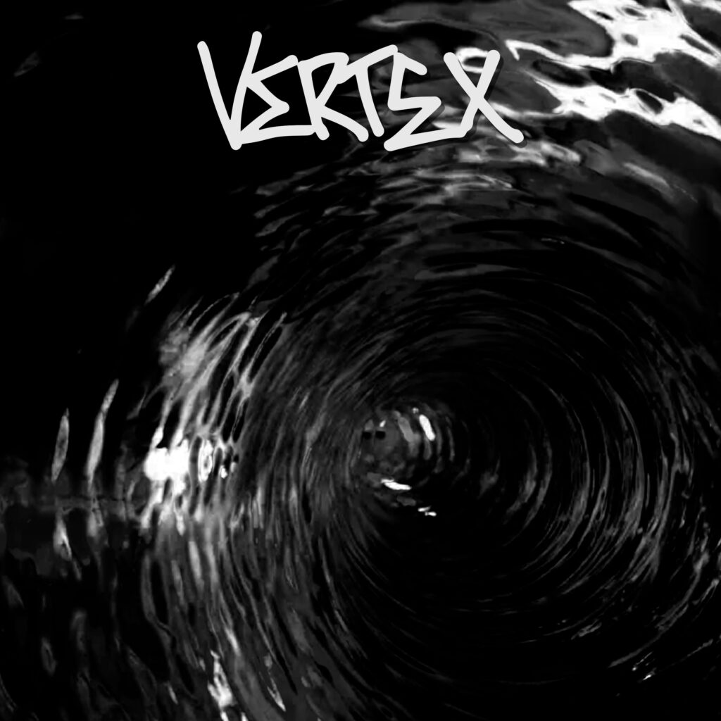
This is the first ep design that me and Paul drafted, you can see the idea of the spiral immediately being the main focus of the artwork, however I didn’t like the colour scheme and colours in general for the artwork Already looks so much better in black and white, however I am not too much of a fan of this spiral hereThis is another variation of the first idea, it looks quite cool however I’m still not a fan of it due to the colours mainly – I want the ep to be monochromeHere we go this is a spiral I really like, the balance of light and dark tones in the monochrome is perfect in my eyes and I like this rougher scratchy spiral, I really like this idea for the artwork.I really like the balance on shades again in this spiral however I’m not the biggest fan of the spiral’s design itself
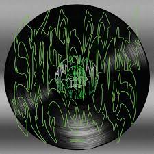
My next step for the artwork is going to be taking the spiral I like the most and placing the artwork on top of a record shape, similar to this artwork here from a visages song.
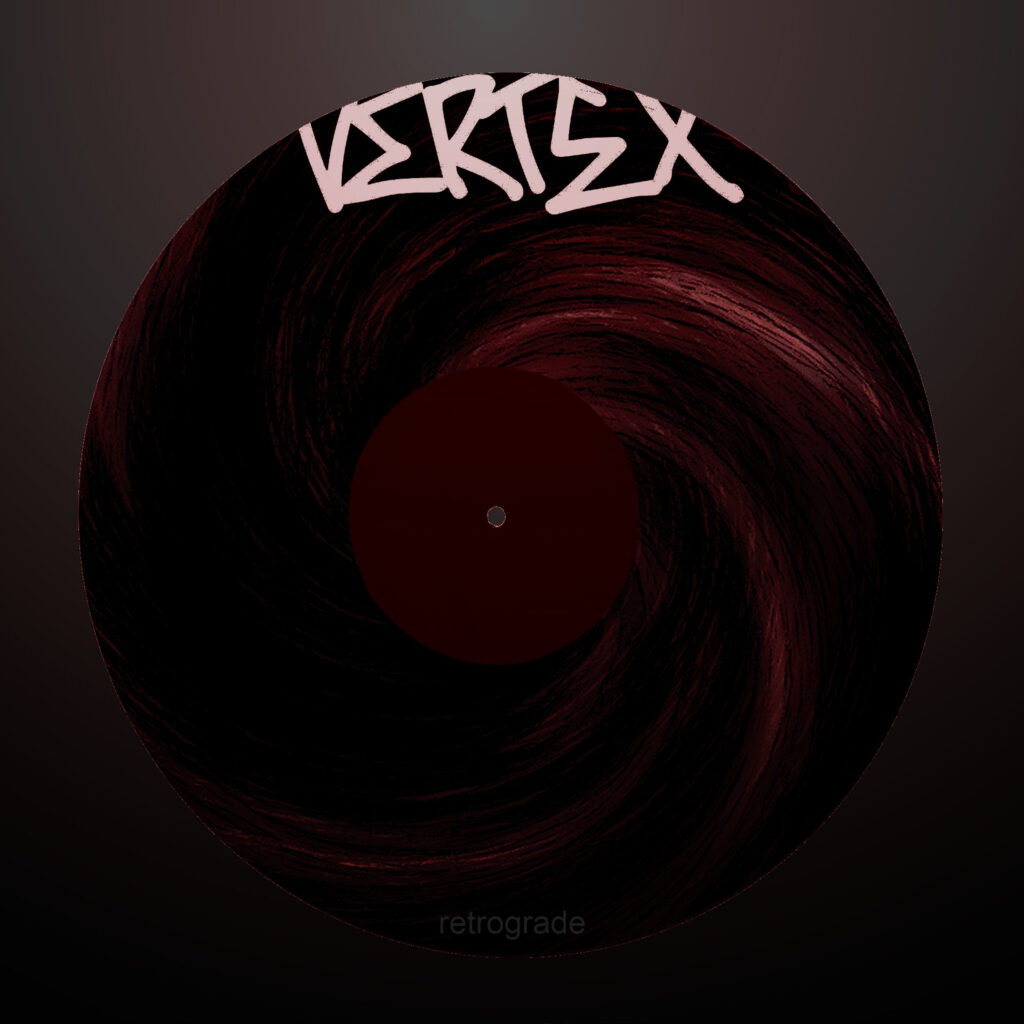
This is the final artwork that I’ve decided to go with. I added some red in the end as I felt that it looked better with the deep red rather than just black and white. I am happy with how my artwork looks and it feels fitting for the music I’ve made.