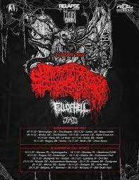
This first poster is a poster from when a band called sanguisugabogg came to Europe for a tour, which I saw them on. I really like the colour scheme of this poster with the red, black, and white making it look quite evil and it stands out. I also like the way it is structured, with the band logos progressively getting smaller as they go down from the headline to the supports.
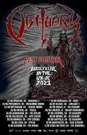
This poster is from the most recent obituary tour, which I saw them on. Once again it has this red, white, and black colour scheme and the band logos getting progressively smaller which personally I really like. I also like the background art this poster has, fitting to the whole vibe and aesthetic of the poster.
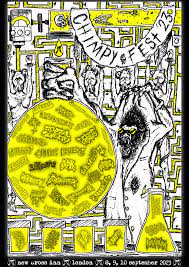
This is the poster from a music festival in London called Chimpyfest, once again something I attended. This poster has a bit of a different vibe to the first too, made in a very ‘DIY’ way as was the whole festival’s vibe. I really like the colour scheme of white, black, and yellow and it really stands out with how bright it is.
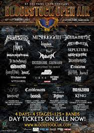
This is the poster for Bloodstock, a large music festival held near Derby. My favourite aspect of this poster is the text down the bottom announcing that tickets are on sale and the amount of bands, days etc. This really would grab peoples attention and subconsciously convince them to get tickets. I also like the colour scheme to the poster with very metallic colours and the texture of the background that they used.
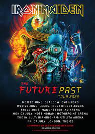
This is a poster off of Iron Maidens most recent tour in the UK. The best aspect of this poster is the eye catching graphic in the centre, with the tour dates directly below it has been designed very well to catch the eye and it also fits that future-past vibe that they seem to be going for.
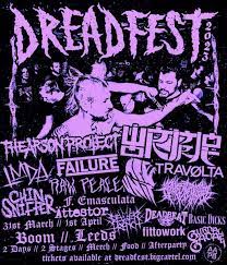
This is the poster to a festival called Dreadfest, a DIY extreme music festival held at boom in Leeds. My favourite aspect of the poster is the way they have put a photo of the crowd on there, all in the purple and black colour scheme with the bands’ logos beneath and the festival logo above.
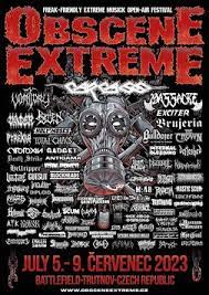
This is for a festival in the Czech Republic called Obscene Extreme, the name describes what the festival is like very well – Obscene and Extreme. I really like this poster, this might be my favourite of them all. The colour scheme of red, white, black, and silver really fits the vibe of the whole festival and I love how all of the band logos are on the poster with them getting larger as you get higher up the running order.