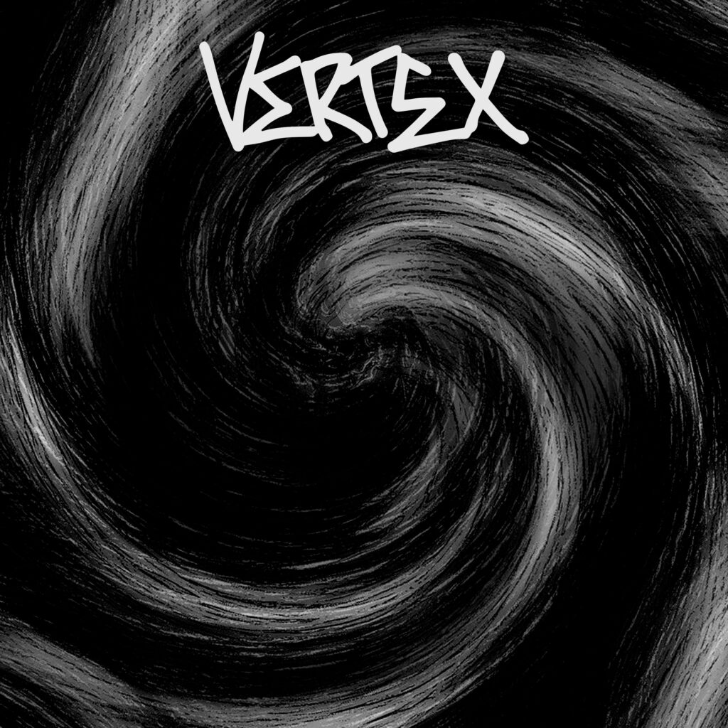
The logo has been a relatively simple design process so far. The main influence I had for the artwork was a graffiti tag – just something basic and easy to read. The first step of designing it was doing some rough sketches onto paper, I did 12 rough sketches and the design changed a fair amount in between each sketch. Me and Paul then scanned the sheet of paper and took the best logo and put it into photoshop, the logo was quite rough so we arranged the letters correctly.
Once we had the basic design into photoshop, the rest of the process was pretty simple. We first made the whole logo 1 individual colour, this makes the logo much sharper and sits on top of whatever you put it on very easily. Then after we made the logo one solid colour, we added a black drop-shadow behind the logo to help make it stand out against the logo much more effectively. Then we had a logo that we could put on anything