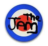
The context of The Jam’s iconic spray-painted logo is that it was designed by Bill Smith, a former Art Director, in the late 1970s as part of the band’s visual identity and was used on many of their album and single covers. The logo’s spray-paint style reflected the band’s raw, rebellious energy and connected to the punk and mod movements they were associated with.


The iconic Oasis band logo, designed in 1993 by Brain Cannon was inspired by the Decca Records logo found on The Rolling Stones’ second album. The initial Union Jack Swirl Logo was created by Tony French, symbolising the band’s “Mind Bending” music. The final lasting version was designed by Cannon to be heavy, monochrome, and versatile for use in various media, including black and white press ads.

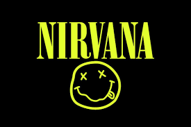
Nirvana is a logo that is still sold massively today even tho the band ended in the 90s due to its unique look and simplicity it easily sells even to people who don’t know the band for some reason people just really like this logo.The Nirvana logo is a smiley face with an X for an eye and a D for a tongue, created by Kurt Cobain and Robert Fisher for the Nevermind album launch party flyer in 1991. While the exact inspiration is debated, theories include a logo from the Seattle strip club, The Lusty Lady, or the band’s own sense of dark humour and sarcasm. The logo is now a copyright-protected symbol used to identify the band and their merchandise.

Led Zeppelin logos consist of the band’s iconic black-and-white word mark, the symbols from Led Zeppelin IV, and the Swan Song Records logo. The Zoso symbol on the fourth album was created by Jimmy Page and has mysterious meanings, while the other symbols were chosen by the band members, often from existing sources like books or mythology. The Swan Song logo is based on a William Rimmer painting, with some sources identifying the figure as Icarus and others as Apollo.
The four symbols that appear on the sleeve of Led Zeppelin’s fourth album represent each of the band members, not a single band logo. The symbols became iconic partly due to the band’s decision to leave the album untitled in 1971 as a statement against the music press.

The Hard-Fi logo is a prominent, yellow and black CCTV camera icon, famously featured on the cover of their debut album, Stars of CCTV (which has some amazing tracks by the way.) The design was created by Aaron Hinchion, who was the creative director, designer, and photographer for the project. The logo was key to the band’s identity, helping them stand out from other indie bands and becoming a symbol of the noughties era.

The famous Beatles Drop-T logo was created in 1963 by Ivor Arbiter, owner of Drum City, for Ringo Starr’s new Ludwig drum kit after he emphasised the B and extended the tail of the T to make the band’s name stand out. This simple, accidental design wasn’t used on their original album covers, but was later adopted and refined to become the band’s official and iconic symbol, which is now associated with their legacy, notes aboutthebeatles.com and Creative Bloq. The logo also has an earlier history with the band’s original drummer, Terry Tex O’Hara.