My 3 main ideas are sunset photography, portrait photography and nature photography. These are the main things I take photos of and I’m best at nature photography, I want to do that because it opens so much gates of what you can do with it, there’s just so much options. There’s also a lot of options with the portrait photography because you can add different lights in the studio and make the model do different things.
Sunset photography:
Sunset photography is when you take photos of the sky with a bit of clouds and there’s colours, usually you see yellow, orange maybe red but other times you see purple, pink or even a mix of all of them in one. It’s a beautiful experience. Some people also call it the golden hour, usually sunsets happen after storms or rainfall but the sky can’t be fully clear or there won’t be a sunset.
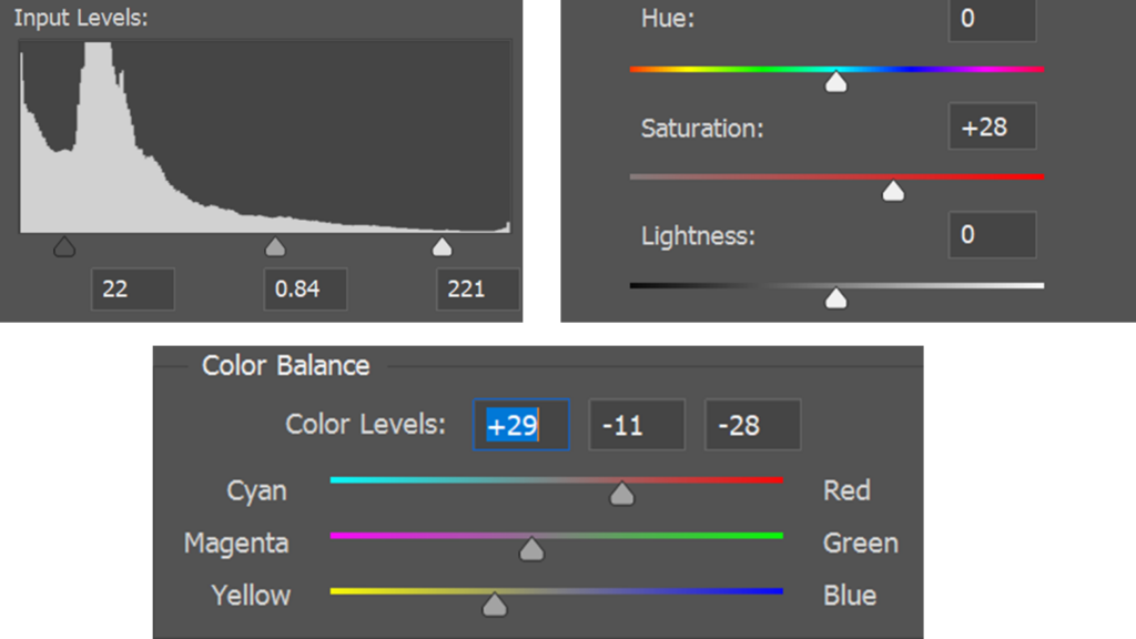
I love sunset photos, the colours are vibrant in person so when I take the photos on my phone I usually take it on the darkest setting to make the colours more vibrant and noticeable. However, in photoshop you can edit the sunset photos so that the sunset has more vibrant colours by using, levels, saturation or even colour balance. This could even add more colours if you have a purple sky you can add more pink to it or even make it orange.
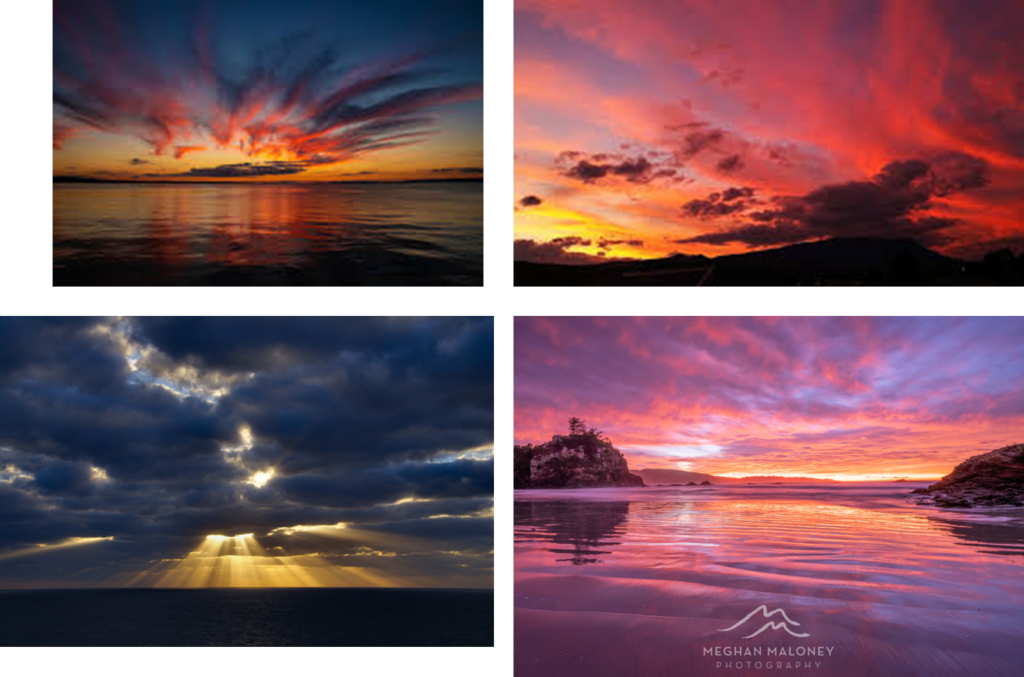
Photo 1:
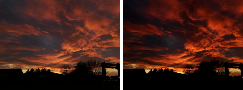
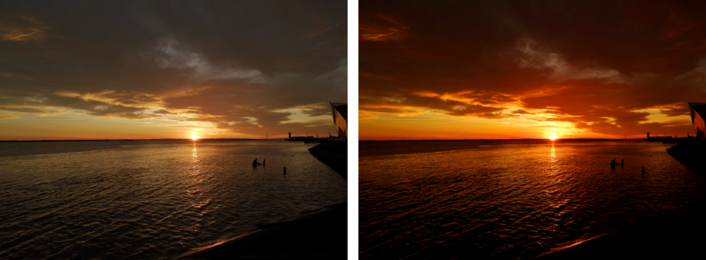
I took this photo in hull on my phone, I loved the sky’s colour, the red, blue, orange, even a bit of pink in the original photo. I love how all of the colours blend together to create a fire effect, it looks so unique and I’m so happy I caught the sky look this amazing. For this photo that I took with my phone I put it onto the darkest setting to get as much of the colour as possible and I also like the fact that everything else like the trees and bridge are black it adds more to the photo.
How I did it ad why:
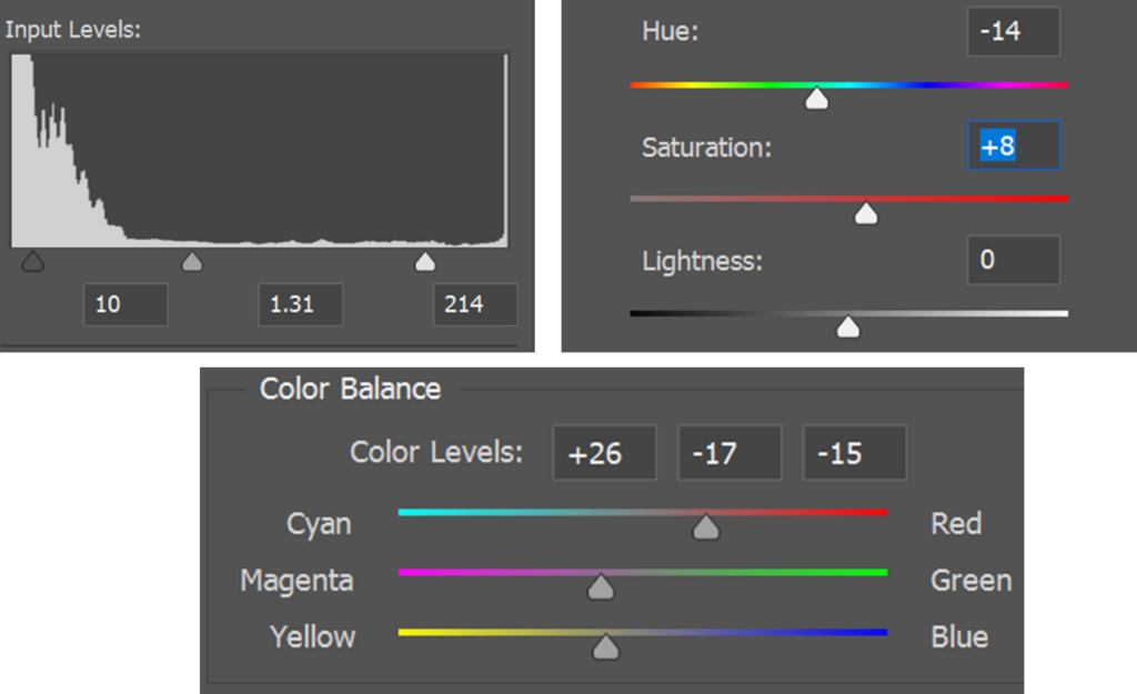
The original photo had quite a bit of colour but just not as vibrant so I went into colour balance, I added more red to the photo and a bit of purple and yellow because red and yellow make orange, I decided to do this so that the sky looks more like fire and so that the colours are more vibrant. On the other hand, I added more saturation too so that the colours are more vibrant so that the sky looks like an actual fire, I really wanted this effect because it looks unique and I wanted to try something new. However, I also made the photo darker in levels so that the colours look more vibrant and so that the rest of the photo like the trees, bridge etc, look dark too because it just adds to the photo. I love this photo, I think personally this is one of the best sunset photo I have.
Photo 2:
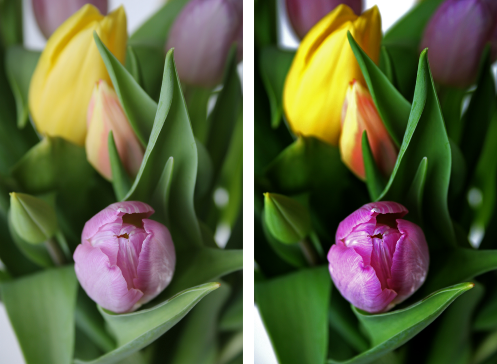
I also took this photo in Hull, I like this photo I just don’t like the fact that the photo is colourless and isn’t vibrant, I prefer more colour to my photos. I prefer more colour because it makes the sunset look more colourful, makes the photo look more outstanding and also makes the photo more vibrant. I also like how there’s a line going through the sea right from the sun, that adds direction, leading lines, the line makes you look straight at the sun.
How I did it and why:
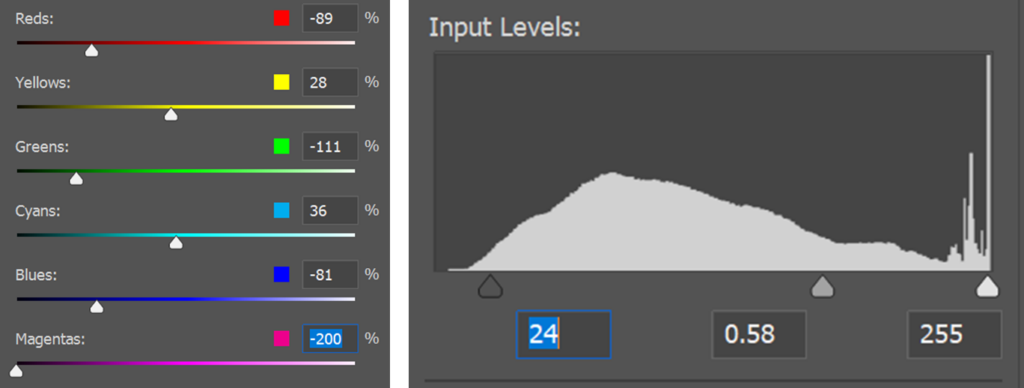
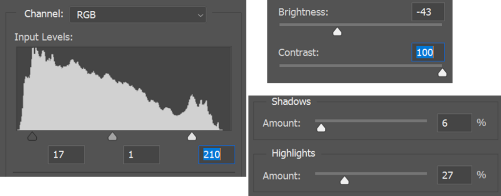
I achieved this photo by adding more saturation to the photo so that there’s more colour and I also adjusted the levels so that the photo is more vibrant, and even the colours on clouds look brighter and have more colours. I added more red, a but of magenta and yellow because those are the usual colours of a sunset. Furthermore, when you combine red and yellow it turns into orange, you usually see the colour orange in sunsets so that is how I made the photo have red, orange and yellow.
My favourite photo:
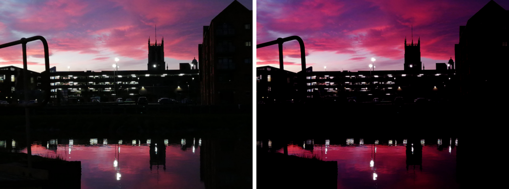
I was in Hull for a trip with my family, there was a gorgeous sunset, there was all type of colours but this was my favourite photo especially because of the reflection, the reflection on the water adds to the photo, this specific photo I did take with my phone but personally I still think it looks amazing. I made the photo quite dark so that you could see the purple and pink more, in a more vibrant way.
How I did it and why:
In photoshop I made the photo more vibrant, so that you can see more of the purple and pink. For that I went into colour balance to make purple you need blue so I added more blue to it and red to it so there’s more colours. I also went into levels to make the photo darker because by making the photo darker, you will be able to see more of the colours that is why when I do take photos of sunsets especially on my phone I usually put it to the darkest option because then the colours look more vibrant. I took this in Hull because I love sunsets and I loved how the reflection worked out on the water too, the building also looks unique with the sunset and the reflection.
Portrait photography:
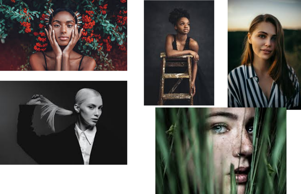
Portrait photography is a type of photography aimed toward capturing the personality of a person or group of people by using effective lighting, backdrops, and poses. Portrait photography doesn’t have to technically be in a studio, personally I prefer to take photos outside, nature with portraits can be really nice and adds more of a vibe. I want to try in this project to link both together.
My work:
Nature photography:
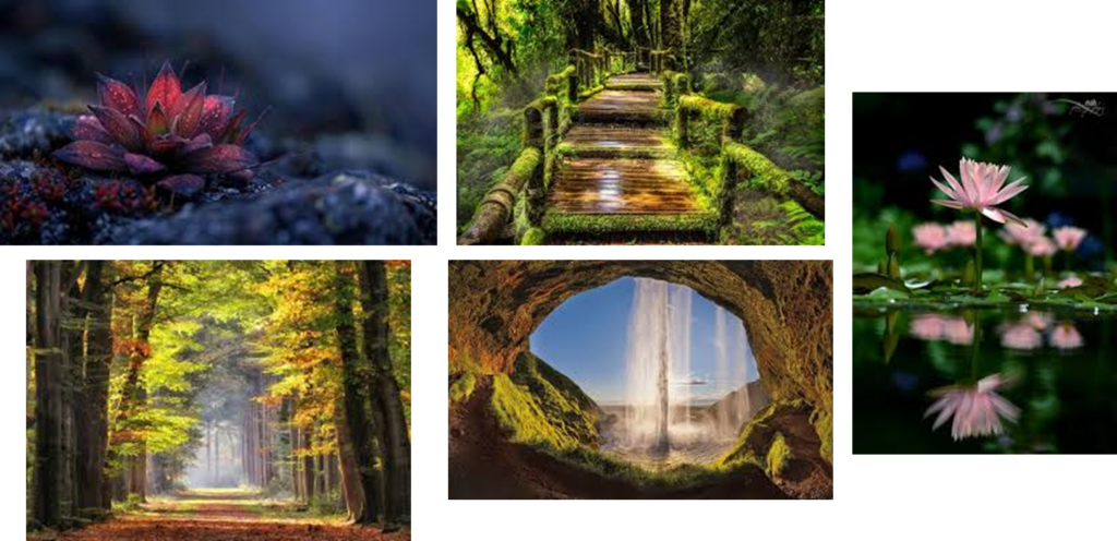
Nature photography is a wide range of photographs outside, such as wildlife, landscapes, plants/ flowers, etc. Close ups to nature such as trees to get their texture is also part of nature photography, you can also overlay the bark of a tree on a different nature photo such as a pathway through the woods to make it look like a paper that has been crumbled up. You can nature photography in any way possible, there’s just so much options and opportunities.
My work:
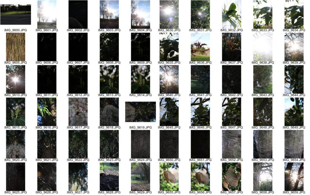
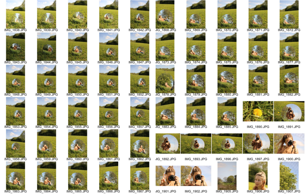
Contact sheet:
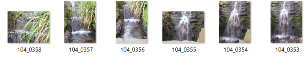
I went to lister park, I took photos of a waterfall because I thought it looked majestic, I loved how the rocks were shaped so uniquely. The rocks make the water flow in different directions making the waterfall look aggressive and unique.
Photo 1:
I took this photo a year or 2 ago, this is part of nature, the waterfall and rocks look magical, nature is magnificent. I love this photo, however it was overexposed so I made the photo darker but also still kept it vibrant. I wanted to keep the colours but also make it darker so that it’s more vivid.
How I did it:
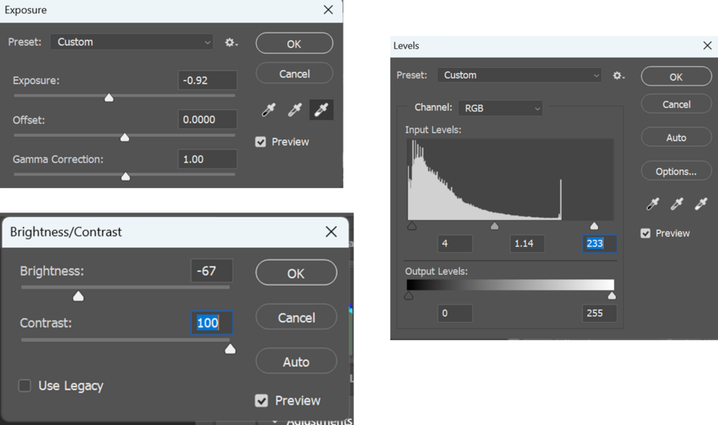
I edit this photo by adjusting the levels so that the background is darker but the water is still bright. I also adjusted the contrast to make the details more visible especially with the water. I added exposure to make the water more visible but also to make the background have more vibrance but also still have the background dark.
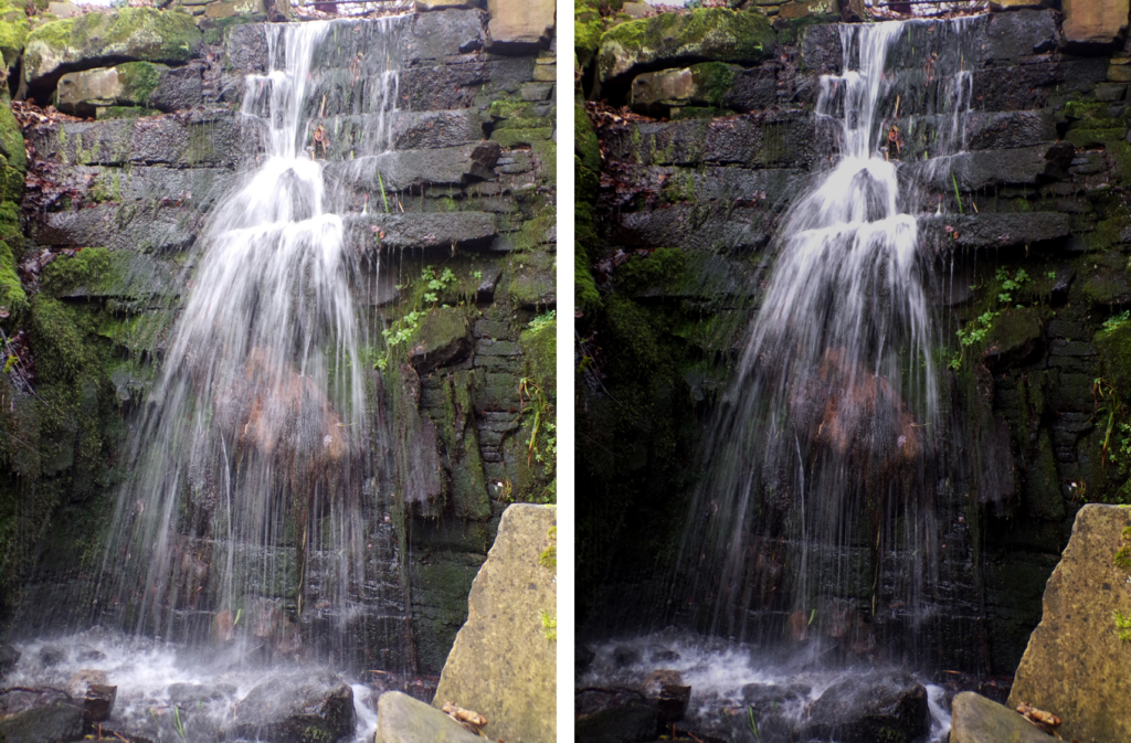
Photo 2:
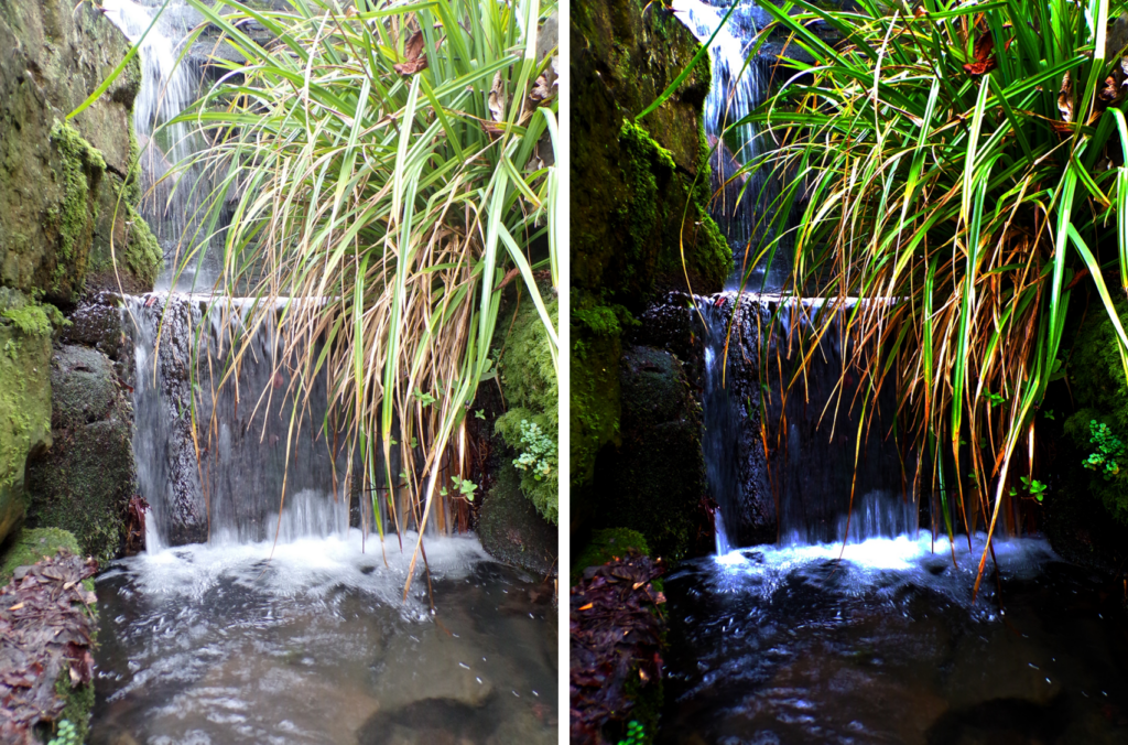
I took this photo in lister park of a waterfall with long grass I thought it would look beautiful and I wasn’t wrong. I think like the edited photo more because I like how it’s not dull or pale, it’s more vibrant. I like the colourfulness in the photo, it’s full of different colours. This photo looks as if it came out of a fairy tale, the vibrance looks like it came out of a book where elf’s or something mystical lives.
How I did it:
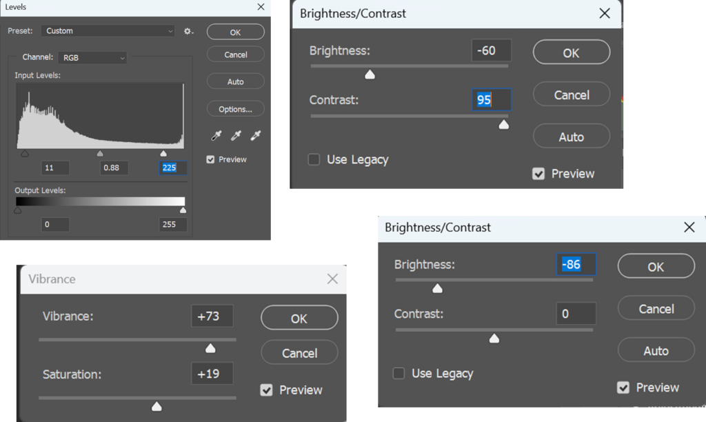
I edited this photo by adjusting the levels to make the photo darker but also brighter on the water and the long grass. I made the photo more colourful by adjusting the vibrance, vibrance helps muted or pale colours become more pronounced. As well as I adjusted the brightness and contrast to make the colours more visible.
Mind map:
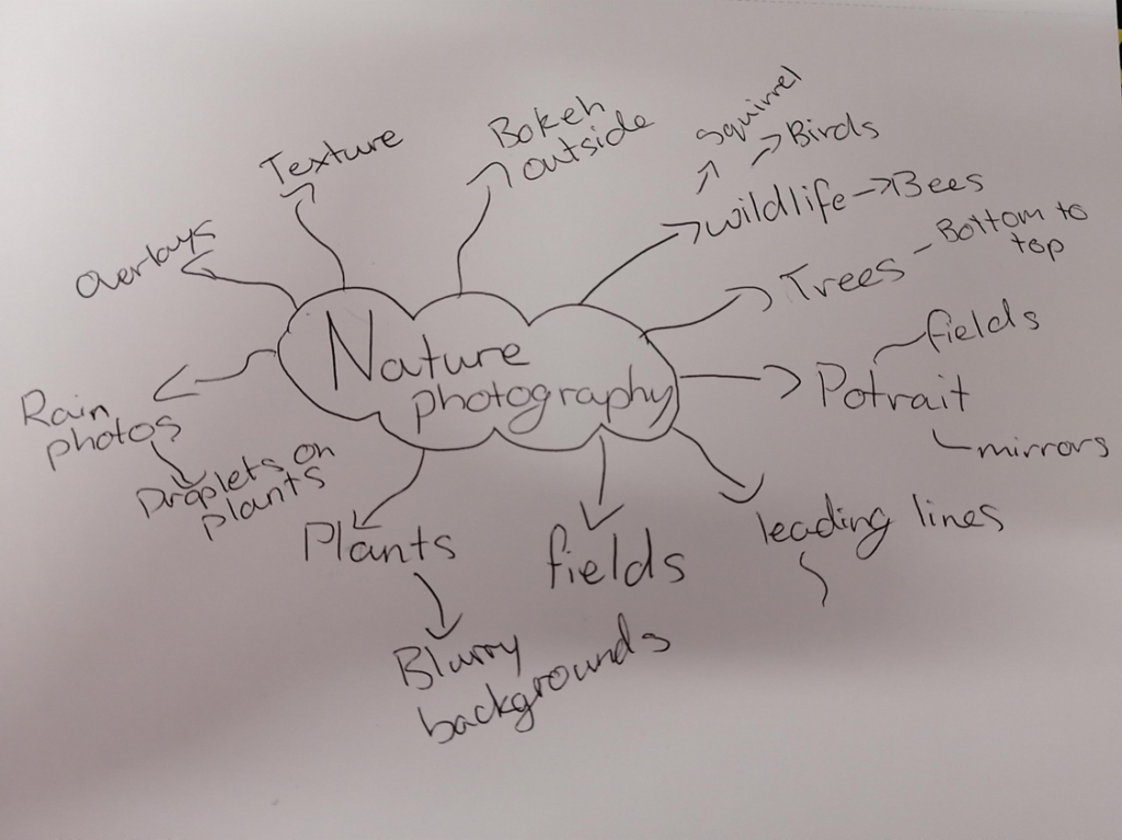
My final major project idea is nature photography, this is because there’s a wide range of photos you can take and you can nature however you like. I’ve always had an interest in nature photography, I started with just taking photos of flowers, then in secondary school I was taught leading lines, this made my photos look better and I started taking photos of pathways in parks and just on pavements. After, I learnt that you can go at a lower angle or even a really random angle, that is when i started to go lower onto the ground while doing leading lines because they look so much better, the lines also make you trace the full photo, your eyes follow the leading lines. However, now I’m so much better at photography, I can now do studio work and nature photography, now when I take photos of flowers/ plants it usually have a blurry background because that makes a bigger effect on the photo. I’ve got lots of ideas, I want to try most of my ideas at least once in a shoot because I want to try lots of different things in this project and experiment with all different types of nature photography because I enjoy learning and experimenting.
Photo essay:
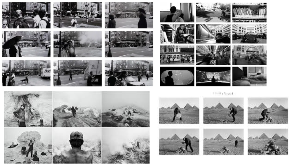
Photo essay are photos made to tell a visual story, they approximately have 10 photos, they describe a story or there’s a meaning behind it. For example, you can take 10 photos while you’re walking home because that’s a story of how you got home, it’s a journey.
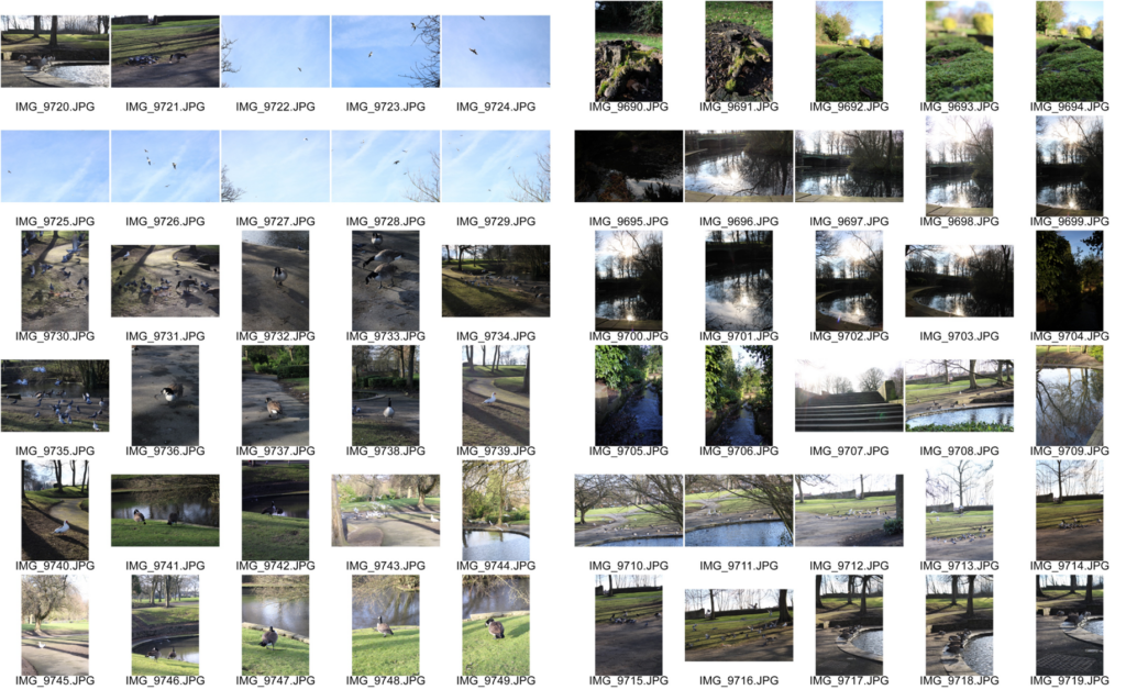
Contact sheets:
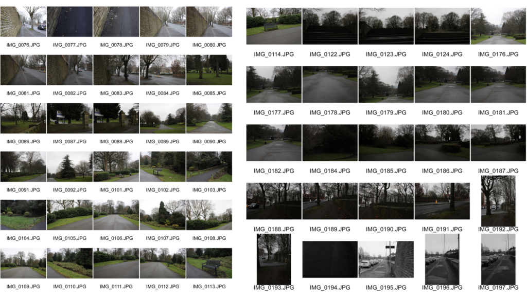
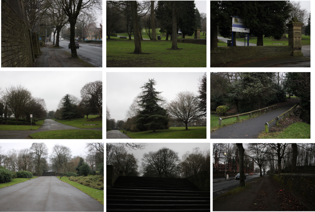
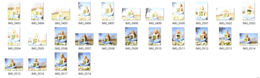
I took these photos while on a walk, I took multiple to choose from, to show a journey because a nature walk links in with nature photography. I took these photos in front of me or on the sides to show the story from different perspectives to show what I saw on the walk. I took 9 photos from my photoshoot to show where I have been so it’s like a story, I walked on a pavement to a park and took photos of whatever I could see.
Black and white photos:
Black and white photos usually show more emotion than colour, you can edit the photos in photoshop to make them black and white or you can set your camera settings to black and white so that your photos are already black and white. Black and white photos are usually more dramatic with emotions specifically in portraits, especially if you need the person looking upset or serious.
Simon Wiffen:
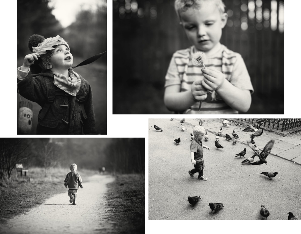
Simon Wiffen does family photography, he has a passion to take beautiful natural photos that tell a story, he loves to document his children. He picked up a camera at a young age and immediately fell in love with the magic of being able to capture a moment forever. I like his work because he captures true and beautiful moments, it reminds me of when my mum used to take photos of me as a child playing or holding flowers. I want to recreate this because I also wanted to link portrait photography with my main idea which is nature photography.
Where I got my information:
Where I got the photos and information from:
Contact sheets:
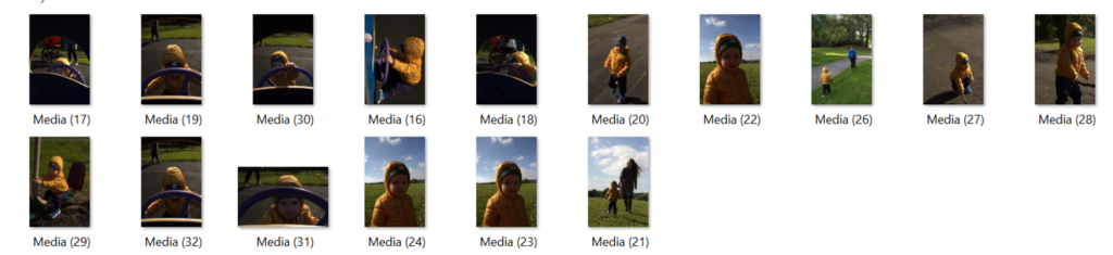
I took these photos of my baby cousin, it wasn’t my best shoot but I have some cute photos of him, even smiling. I was trying to take photos when he’s laughing or smiling to get his natural reaction, it was difficult but I got some. This links to Simon Wiffen because he took photos of his children doing their own thing as well as we were at the park with grass which links to nature. Some photos are too dark or bright but that is a fix in photoshop. Furthermore, I will make the photos black and white to see which one I like more as well as which adds more to the atmosphere.
Photo 1:
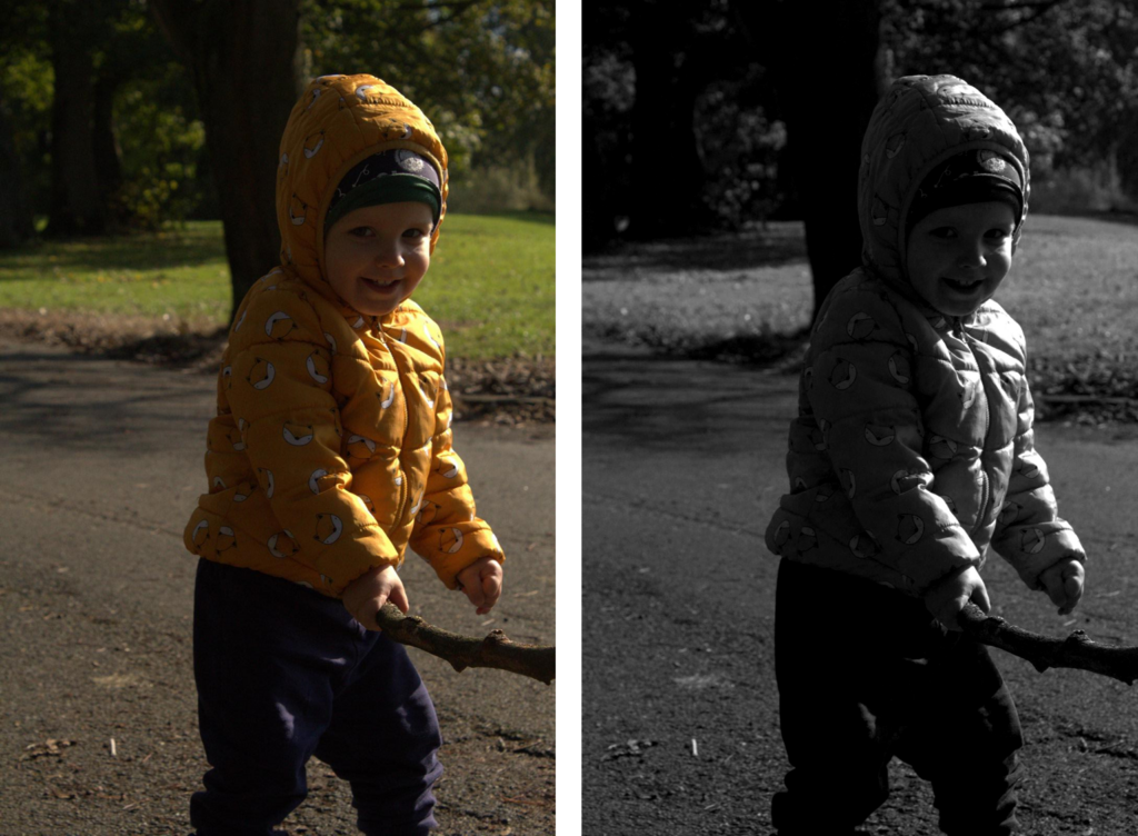
I prefer the coloured version because it suits the atmosphere more, he’s a happy toddler. He’s smiling, his yellow jacket improves the coloured photo because it highlights happiness. The coat combines with the background really well, the colours all combine together beautifully. Black and white photos are more for photos with emotions such as a serious face.
How I did it:
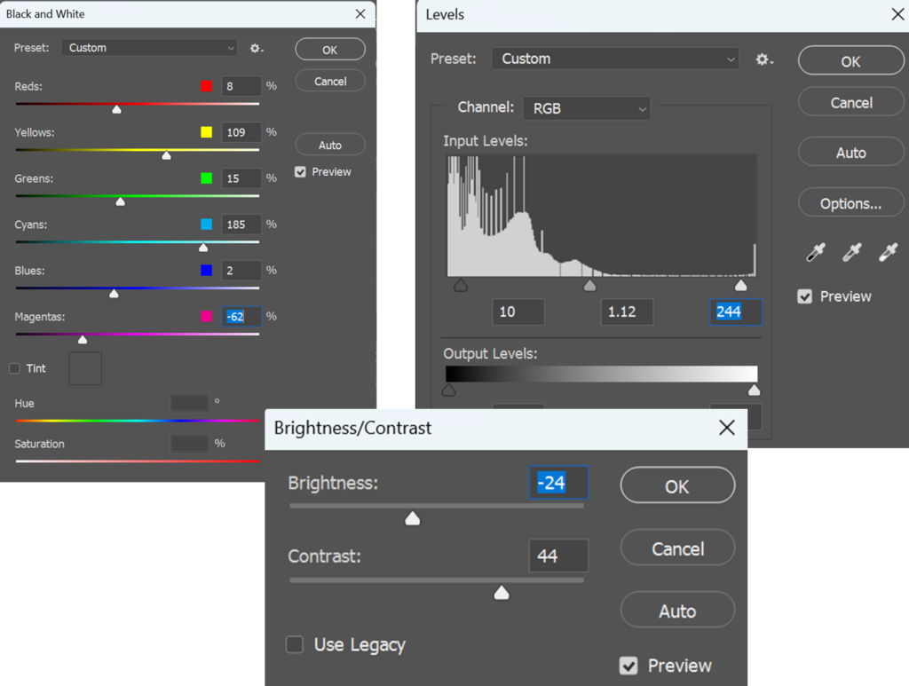
I edited the photo by firstly, turning the photo black and white as well as adjusting the colours so that it’s slightly darker. I also made the photo darker by turning the brightness down as well as I added more contrast to improve the little details especially in the background. Furthermore, I adjusted the levels to make the photo darker so that it looks more like black and white.
Photo 1 (Coloured version):
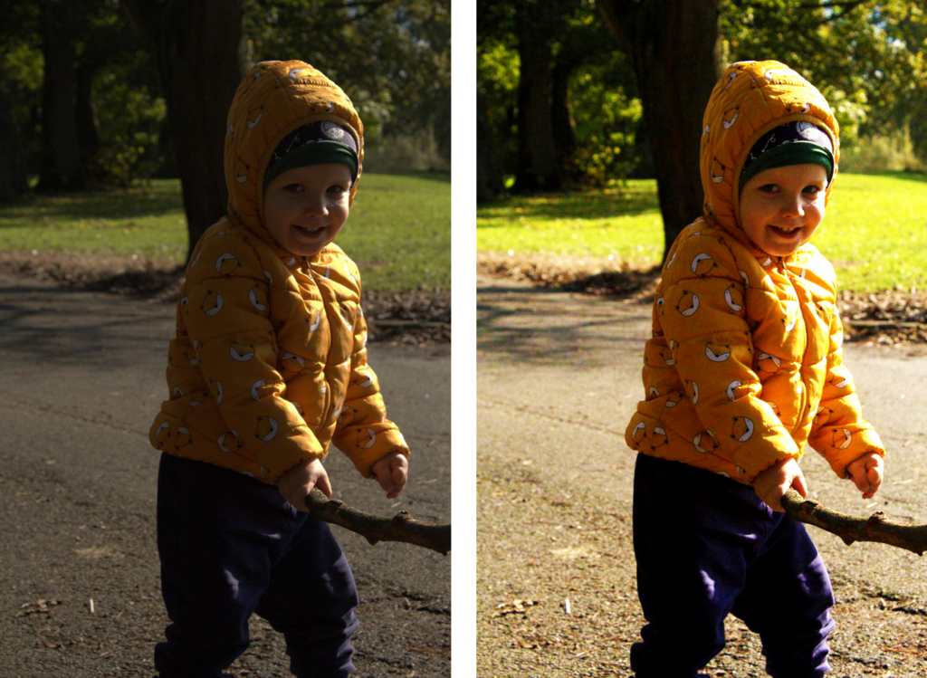
This photo is the exact same one as the other one, however, this one is the coloured version. The edited photo makes the photo feel full of joy, curiosity and just pure genuine happiness. I made the photo more vibrant as well as this shows the joy of his childhood, the curiosity, spontaneous and just full of life.
How I did it:
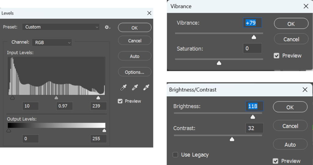
Photo 2:
Paul Coghlin:
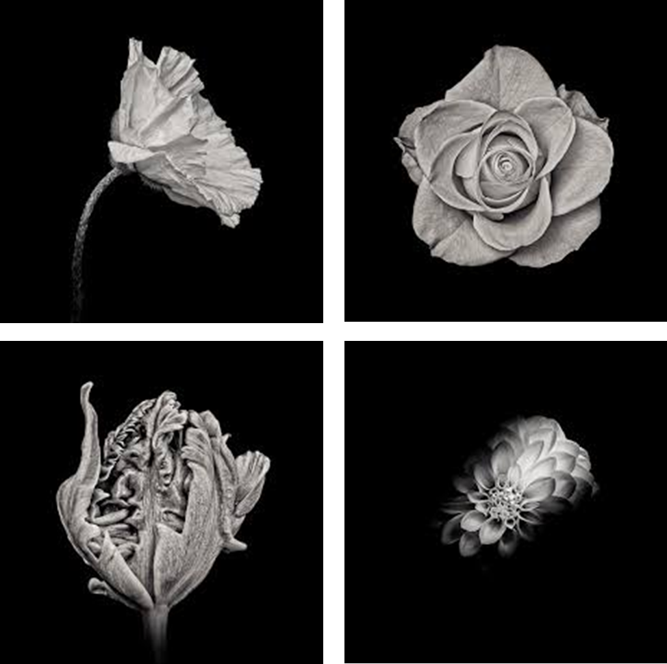
Paul Coghlin does botanical and wildlife photography, he grew up in Southern England near a forest and a coast, he developed a creative interest of photography at a young age. He often took his camera out to capture natural surroundings. At the beginning of 2013, Paul released his largest body of work to date: “Petalum”, a series of thirty stunning black and white botanical studies, featuring the fine-art photographer’s distinctive style and attention to subtle detail. I like his photography work because the black and white feature adds to the plant, it makes the plant look more dramatic the photo has a bigger effect.
Where i found photos and information from:
Contact sheets:
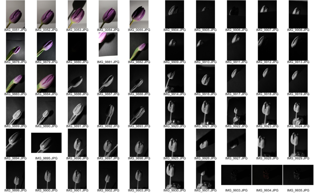
I took these black and white photos by making myself a little studio under my desk so that it’s dark and I put black card paper onto my floor and wall so that the background is black. After, I put a tulip into a glass, I used a tripod to make the photos less blurry and so that it’s easier to actually put paper over the flower too. I also used a book and my phone holder to hold my phone as a flash so that the camera could focus on the flower. Then I took some photos with colour and some are black and white, I want to see which method is easier and looks better.
How i did it:
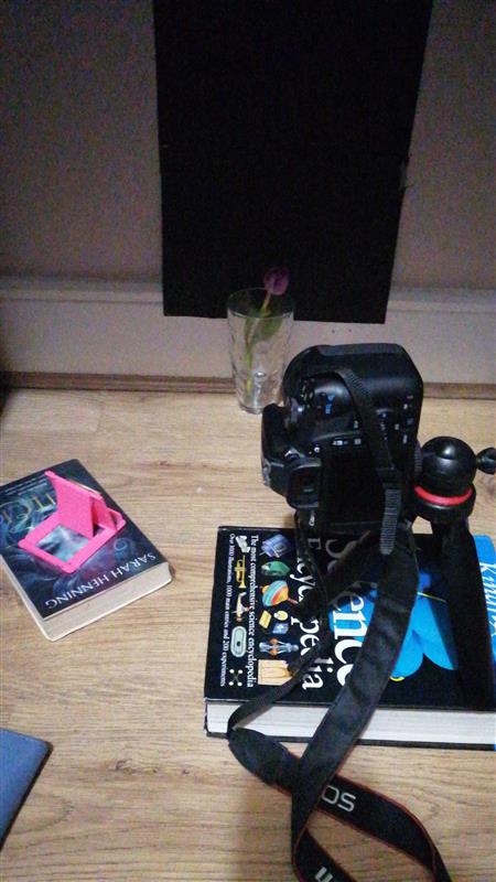
I made a set up under my table so that it’s dark, I put a book down and placed my phone holder on top so that it can hold my phone as a flash so that then there’s light on the flower. I used a tripod so that the camera is more steady, I also used black card to show some parts of the flower.
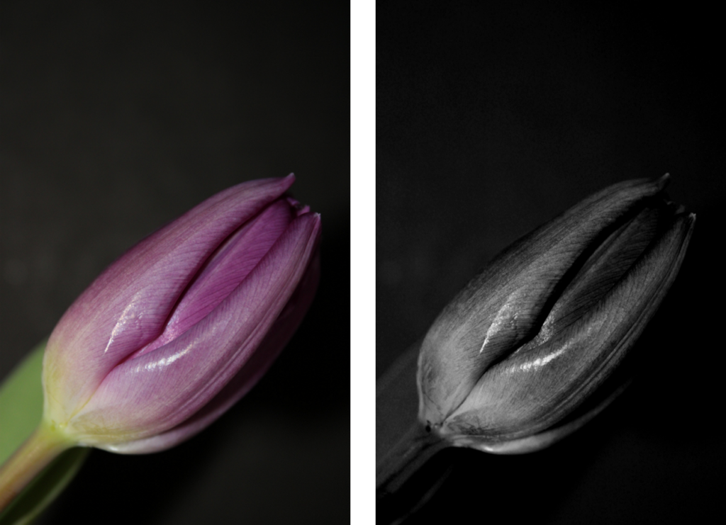
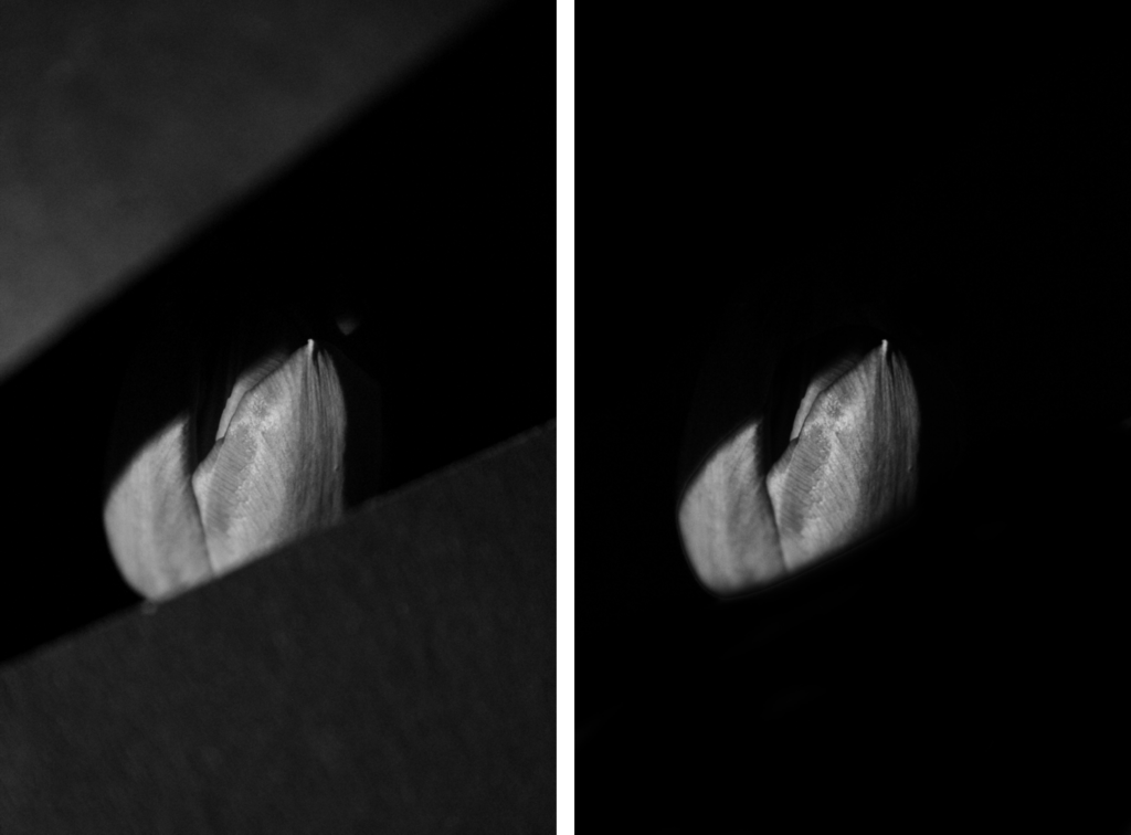
Photo 1:
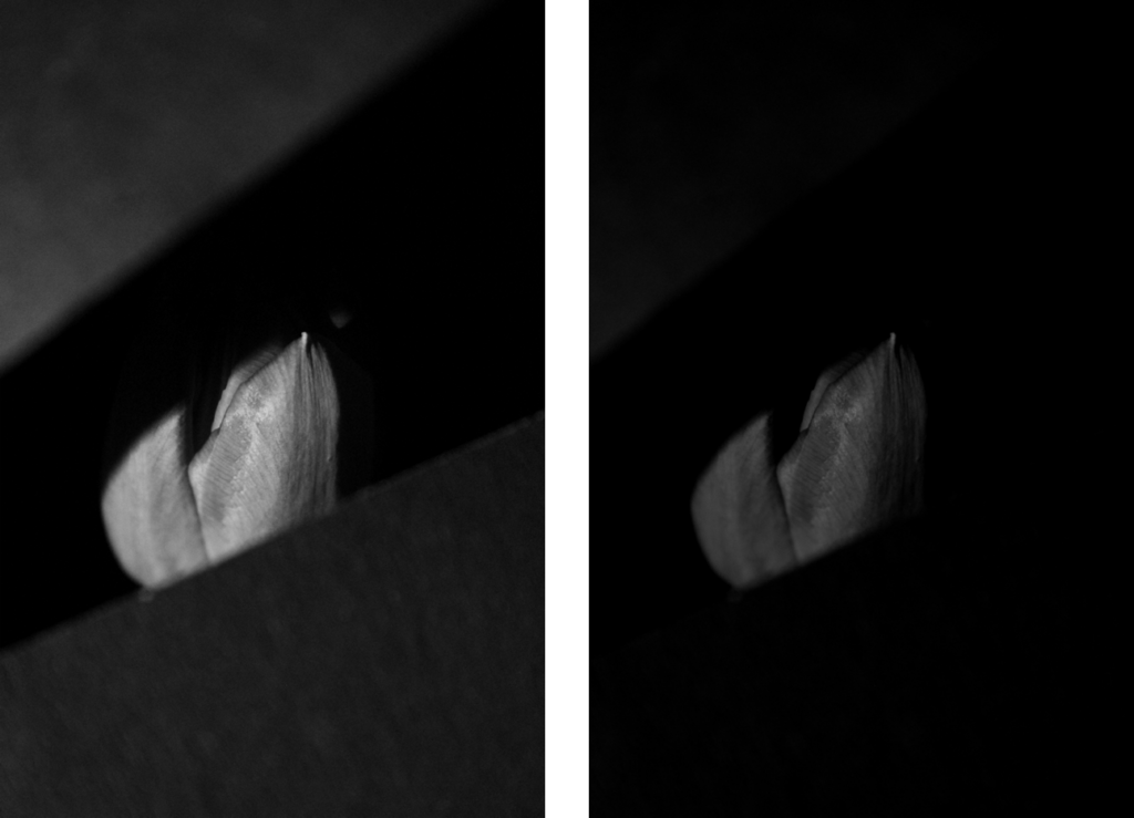
Paul Coghlin takes photos of flowers in black and white, I did this too. I put my camera into black and white by locating the cameras colour mode setting, and change the output to monochrome. I like the original photo because it has more contrast and it adds more of a dramatic look to the photo. However, I like the edited one more because the black card that I placed to cover bits of the tulip looks more natural. However, I dislike how the tulip also got darker and looks more grey than white. Next time I will edit the tulip so that it’s brighter and looks white so that there’s more contrast. But I also think that the grey tulip and the black card makes the photo more dramatic.
How I did it:
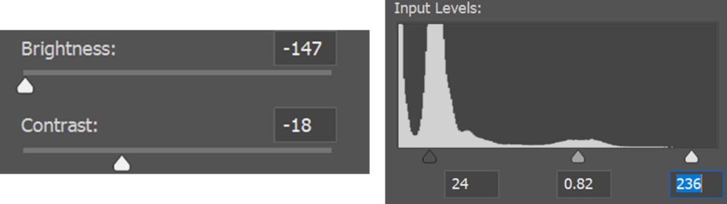
I edited the photo by trying different things with levels to make the photo darker so that the black card matches with the black in the background so that it looks more natural. It gives the impression that there’s a fresh cut in between the tulip and the background. I also made the photo darker by making the brightness at its lowest and also added less contrast to make the photo look darker.
Photo 2:
I took this photo in colour then changed it to black and white in photoshop. I prefer the black and white version because you can see more of the contrast on the tulips petals. I also like how much you can see the texture of the tulip on it’s petals, it adds a bigger affect on the photo. As well as I like the greys in the photo, the background is black and then the tulip is mostly grey and white and that adds a bigger affect of the photo being in black and white.
How I did it:
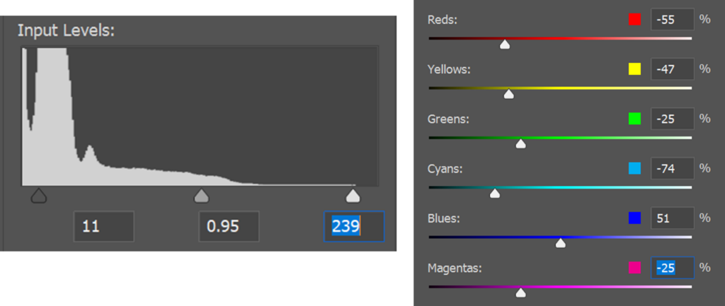
I edited this photo by changing the photo from colour to black and white in photoshop, I made the photo darker by messing around with the levels but I also didn’t want to make it too dark because then it wouldn’t have had contrast or anything interesting. I added more colours to the black and white such as magenta, cyan etc to make the photo have more shades, contrast and for it to look more unique.
Photo 3:
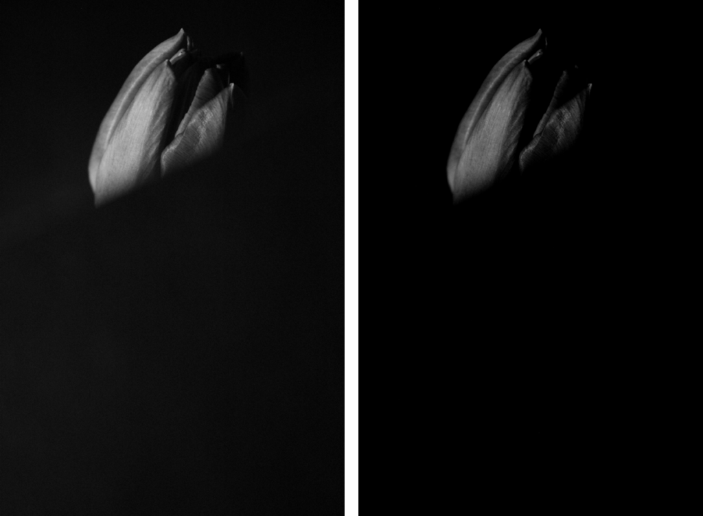
I don’t hate this photo but I also don’t love it, I like the original photo because I like the white on the tulip because it gives more of a black and white effect. However, I also like the edited because the tulip now has more contrast and the black card I put over the tulip so that you can only see half of the tulip. The black card looks way more smooth which looks more natural.
How I did it:
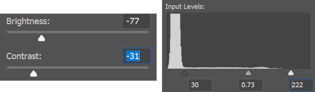
I edited this photo by adjusting the brightness to make the photo darker so that the black card looks more smooth as well as you can see more contrast on the tulip. I also added more contrast so that you can see the tulips lines on the tulip, as well as I adjusted the levels to make the photo darker so that you can see all the detail of the tulip. Next time, I will make the tulip white so that it has a bigger effect on the photo.
Photo 4:
I’m not sure if I like this photo or not, however, I like the fact that I made the black card darker to match the background so it looks more natural and has a bigger effect on the photo. I made the black card look more smooth, I also made the tulip have more contrast but also still make sure that it’s bright and the centre of the photo.
How I did it:
I edited the photo by using the brush tool in photoshop to make the black card match the black card in the background which also made the card look more smooth. After, I selected the tulip by using the selection tool and made the tulip darker but added more contrast so that you can see more of the details on the tulips petals.
Black and white part 2:
Contact sheets:
I took these photos in the small studio and directed the light onto the flower so the spot light is on the flower/ glass with the flower so that there’s a shadow. I set my camera to monochrome to make the photos black and white. I took shots at different angles to see which ones are best as well as I did some close ups so that the photos have a more of an effect. I also took a few shots in colour to see which ones I like better. Some are overexposed because I was trying to set the camera settings so that the photo isn’t too bright and isn’t too dark.
Photo 1:
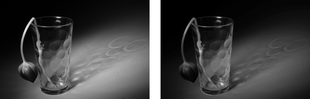
I like how this photo turned out, even the original photo looks good because there is a dramatic lighting setup that emphasizes shadows and highlights the glass’s unique texture. The shadows and reflections add depth and visual interest to the seemingly simple still life scene. This tulip looks dead it makes it an interesting and unique photo as well as it adds a depressing impact on the person looking at it.
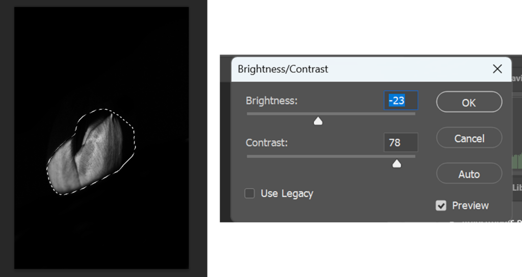
I edited this photos in multiple steps to adjust the photo so that it’s better quality as well as to add more contrast. I adjusted the curves and levels to make the photo darker so that you can see the shadow of the glass more as well as to include more contrast to the actual glass and shadow. I adjusted the brightness and contrast to make the full photo darker because it makes the photo have a bigger impact on the person, the photo looks more dramatic and mysterious. However, I also placed some exposure in the photo so that you can see the shadow more vivid.
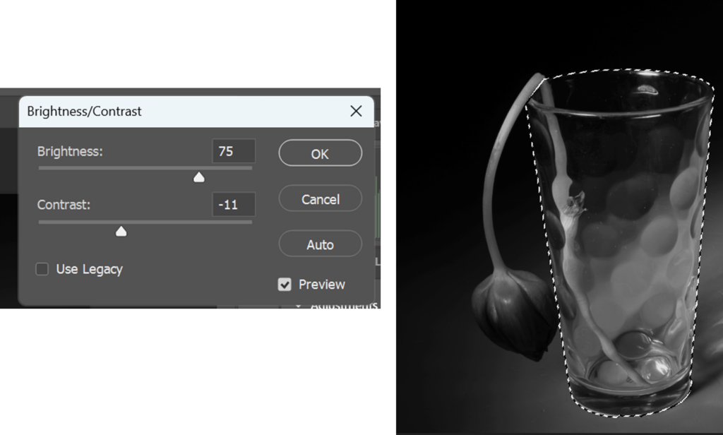
After, I selected the glass to make the glass brighter as well as it makes the glass look more sharp. I like how the glass changes shades from black, to grey to white near the bottom.
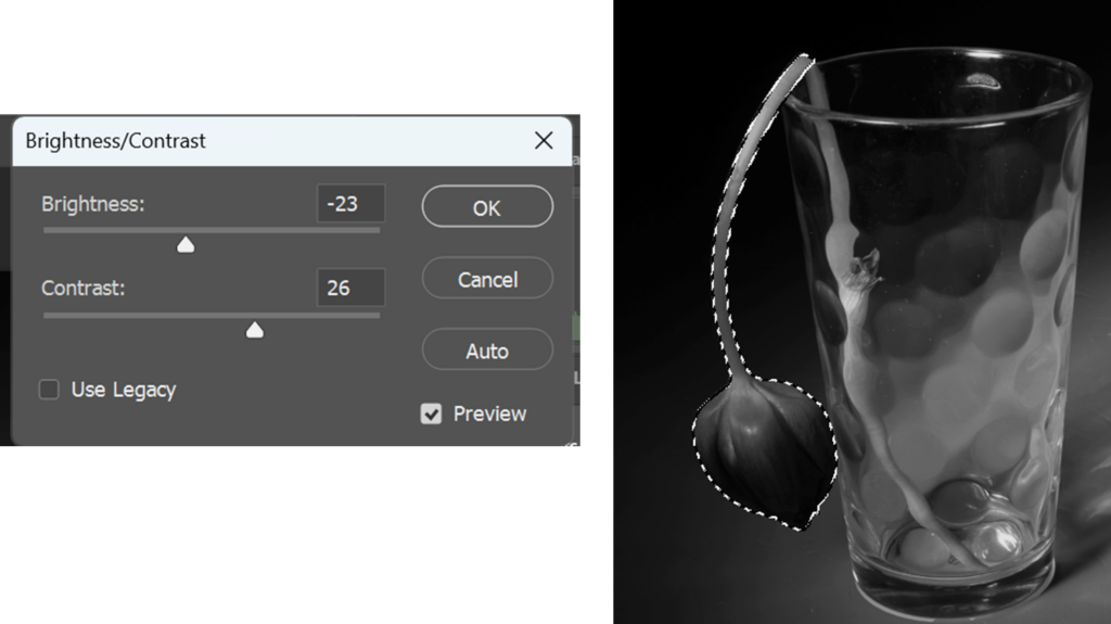
Furthermore, I selected the tulip to make it more sharp as well as to make it darker so that there’s other shades on the tulip and it looks more unique. It also adds more to the depressing atmosphere because the tulip is darker.
Fay Godwin:
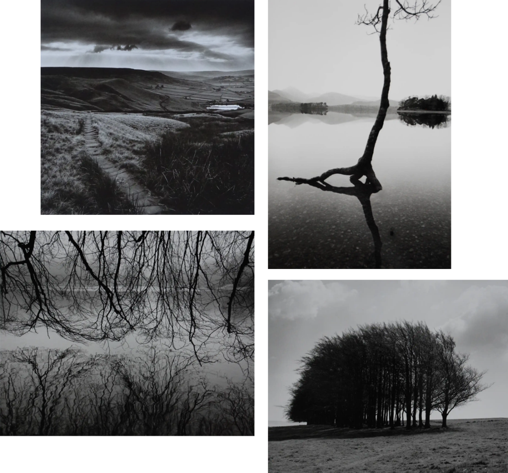
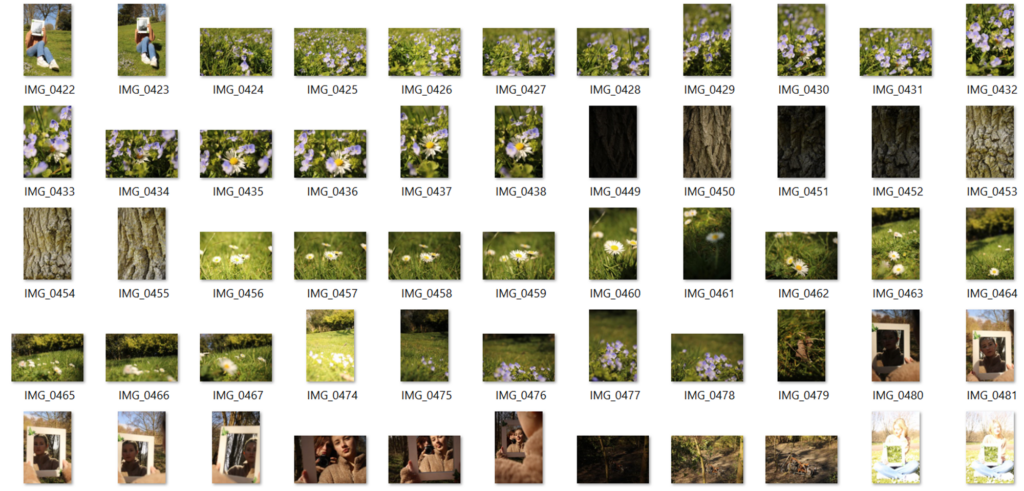
Fay Godwin was a British photographer, she started her work in 1960s and passed away in 2005. She’s well known for her black and white landscapes of British countryside and coast. She went into photography by looking through her family’s snaps, she went through portrait, reportage, and finally, through her love of walking, landscape photography. I like her work because I also love walking and I love landscape photography and nature photography, her work makes it look like so much emotion. I also love her work because it links into my black and white task, it makes her work look more dramatic. I’m going to take photos of trees or branches like she did and make them black and white.
Where I got my information from:
Where I got the photos from:
Wildlife, aquarium:
Contact sheets:
Proposal:
Section 1: Rationale(approx. 150 words)
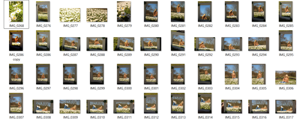
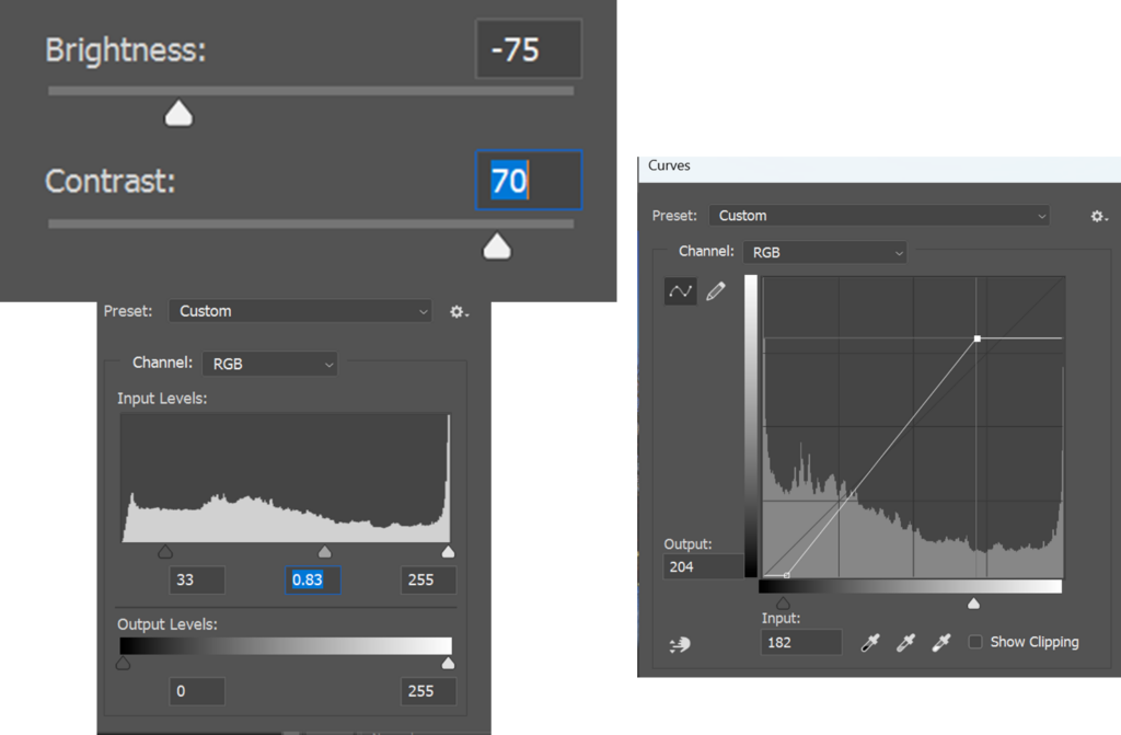
In the first year, I wasn’t comfortable even using the studio because I feared failing, I didn’t know anything about photoshop. I started using more photoshop, I know how to way more now such as, now I know how to overlay photos, I know how to select specific parts of the photos to edit just that bit and not the rest of the photo. I feel more comfortable using the studio now as well as I know you can do a lot of different things in the studio, I also found out you don’t need to use people, you can use anything. Such as flowers which I am doing right now, also I know how to change the colour background with colour gel paper. Right now, I’ve been working in the studio and outside, I know how to use lights and how to analyse my photos better now.
Section 2: Project concept(approx. 250 words)
My main idea is nature, specifically flowers and plants to link portraits with nature. My initial idea is to explore nature photography widely by trying different techniques such as texture over photos, droplets on photos and portrait photography. I hope to achieve better results of photos and to achieve better photos in studio, as well as outside. Last year, I took a photo of a fence specifically for the texture of the metal to place it onto a different photo to develop a piece which could represent an old painting. Therefore, I want to do something similar for this project as I liked the technique of texture over photos. Some photos that I took looked like old paintings which I want to recreate again. For my final piece, I want to link in portrait photography and nature photography together, I will need a mirror, good weather and a model, I have planned to do this photo shoot over the weekend 29th or 30th of March, my friend volunteered to be my model. We are going to go to the park with a mirror and she will lay on the field facing the mirror, she will also wear a pretty dress which will represent summer/ spring atmosphere. I will be taking a photo of the reflection while she’s laying in the field holding flowers. I want to take this photo as my final piece because it links to my specialist practice which is taking portrait photos that I can also merge with nature photography.
Section 3: Evaluation (approx. 100 words)

Photo studio:
Flowers in studio:
Contact sheets:
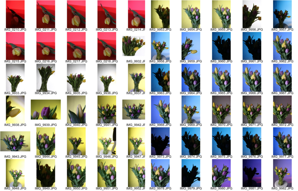
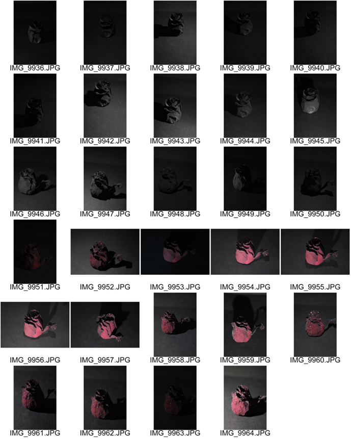
I bought tulips, I tried to buy colours that match together so that the photos look better and so that the background also makes sense with the colours of the flowers. The biggest problem I’ve faced is that the lights in the studio didn’t always flash while taking photos that is why some photos are so dark or a black screen. However, my solution was to turn off the reactor and the lights, then after a minute turn them back on, it was annoying but I got there in the end. I did a lot of different shots, I took some of the full vase of flowers with different coloured backgrounds such as blue, pink, orange etc. To change the colour background I used gel paper because it’s coloured and light can go through it, it makes the photo more interesting and aesthetic. I also took a different lens so that I can zoom in more on the flowers so I did close ups. I also brought in a spray bottle, then I put some water in it and I sprayed the flowers so that I could take some close ups of the droplets on the flowers. Not all of the close ups look because it’s difficult to keep one flower in focus especially if the camera is focusing on something completely different. I also tried lots of different angles to see which ones are the best, I did some from an upper angle and some from the sides and even some from the bottom.
Photo 1:
I took this photo by going from a higher perspective and mixing the orange and pink gel paper to make the background more interesting and it also matches the flowers quite well. I dislike the edited photo because I made it too vibrant, it’s too bright and I feel like if the flowers were darker it would look better and it would suit the background better too. the flowers are also not in the middle which doesn’t look as good.
How i did it:
I edited the photo by messing around with different colours, brightness etc. I selected the flowers first because I wanted to edit just that because I liked the background, the orange and pink has a bigger affect on the photo. I added more brightness and contrast to the flowers so that it looks better, vibrance and saturation added more colour. However, I added too much saturation and brightness, next time I will add less.
Photo 2:
I took a close up photo of the purple tulip and made the background a little out of focus so that the photo looks of higher quality. I like this photo because the main focus is on the purple photo. However, I didn’t like how dull the photo was so I made it brighter in photoshop. I like the scene of the photo because it looks as if I took it outside and not in the studio.
How I did it:
I made the photo more vibrant, more colourful in photoshop. Personally, I think the photo looks greater than the original photo because the original photo looks dull with not much colours. I made the photo slightly darker with levels so that you can see more of the contrast on the flowers. I also made the photo brighter and added more contrast to make the photo more aesthetic as well as having a bigger affect on the photo. In addition, I added highlights to make the yellow tulip look more visible but it also looks as if it’s painted and I like that affect.
Photo 3:
Photo studio with background part 2:
Contact sheets:
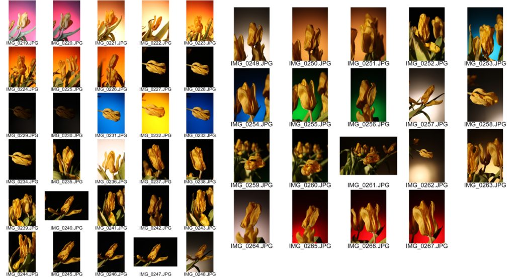
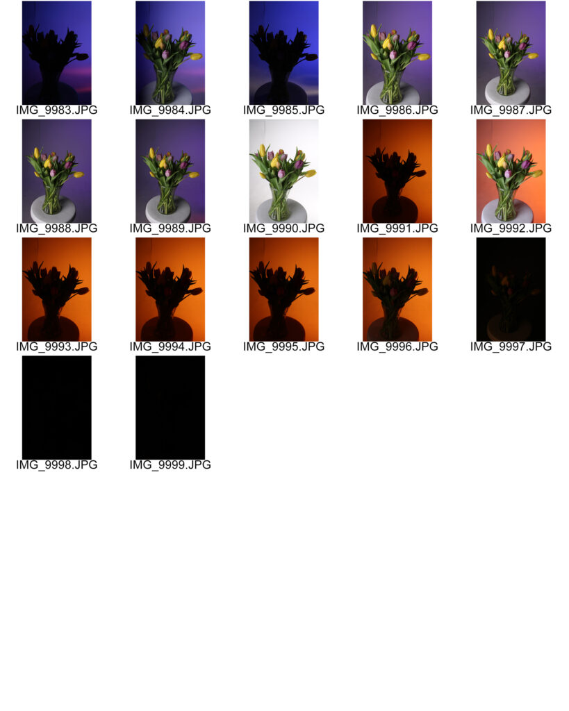
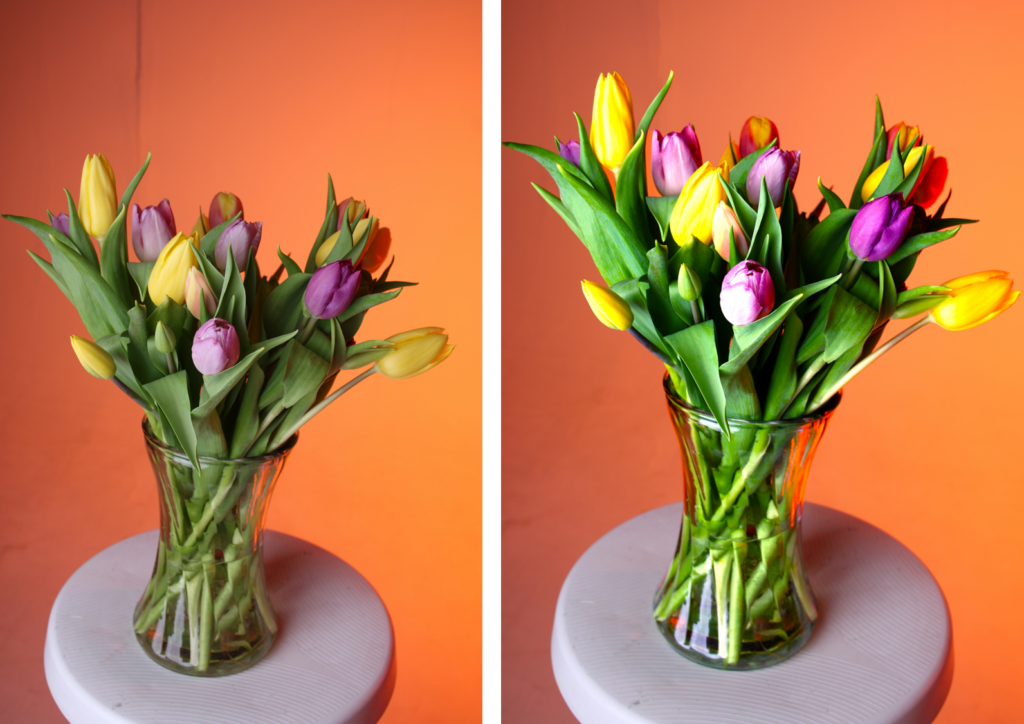
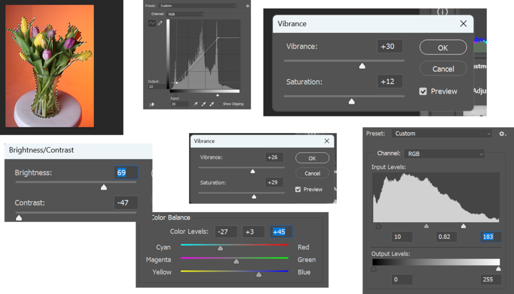
I took these photos in the studio with dead tulips, some of the photos have a really dramatic effect especially with the black background and red. I think the other colours are just too bright and don’t fit in as well in the atmosphere with the dead tulips, the red and black background add to the atmosphere of evil and death. However, I also like the orange background because it gives off sunset atmosphere which makes sense with the dead tulips because it feels as if the tulips are in a field with a sunset behind them. I tried lots different colours to see which ones fit the best and personally I like the dark colours the most because it adds to the atmosphere.
Paul Moon:
Paul Moon lives and works in the East Riding of Yorkshire and he has been photographing Yorkshire Wolds for years. Paul enjoys his countryside photography and takes photos of fields, trees, plants etc. I like his work because I like the effect he does on the flowers so that the front has the bokeh effect. This gives the illusion that the camera lens has droplets on it when it doesn’t. I also like how he focuses on one specific photo and then the background and other flowers are blurry. I want to recreate these photos in my own way but use his techniques and take similar ones.
Where I got my information from:
About
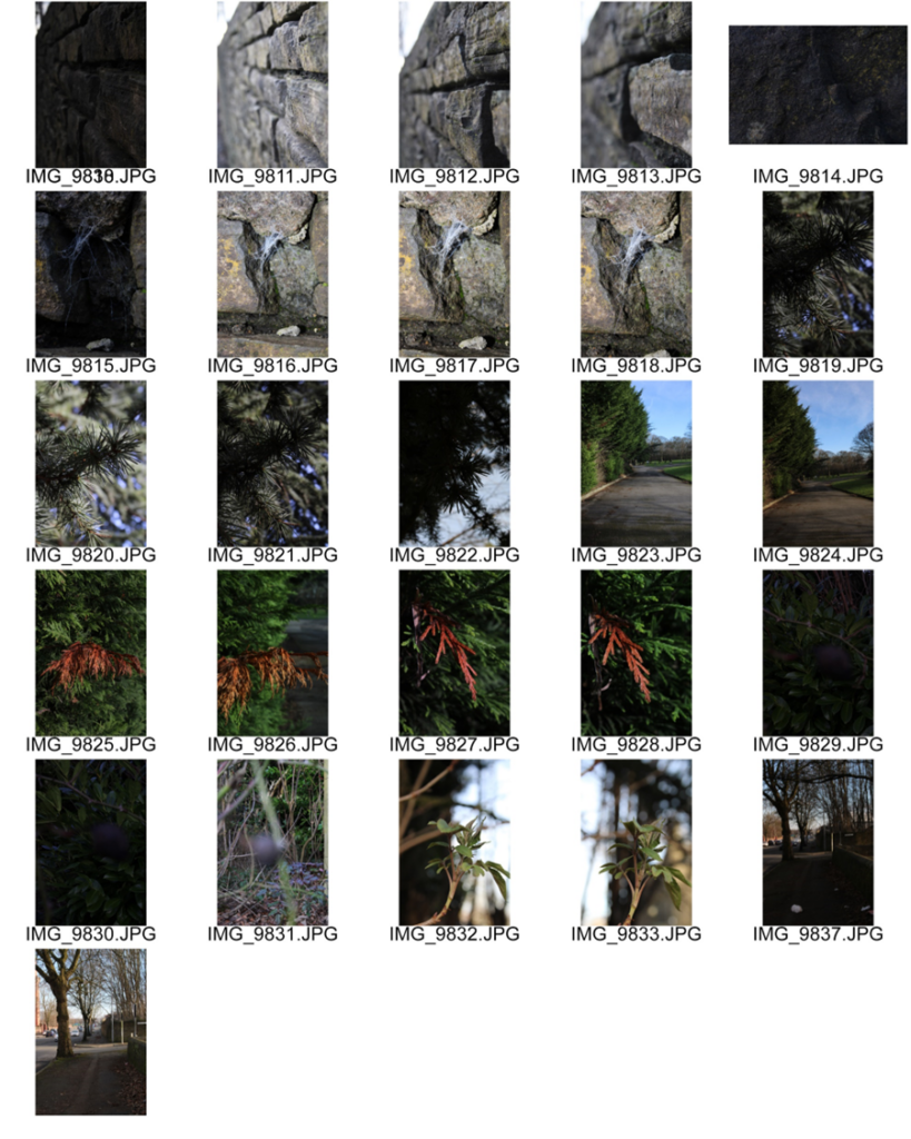
Forest shoot:
My final piece experiments:
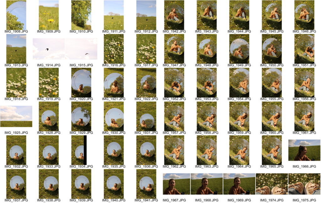
Contact sheets:
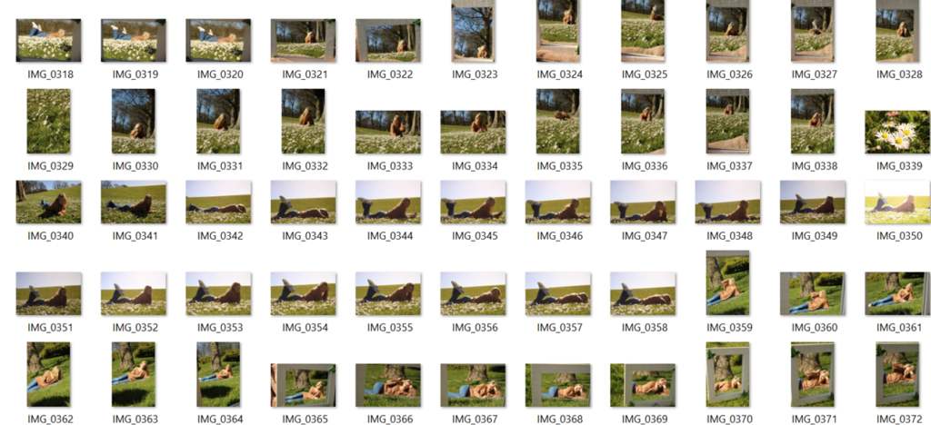
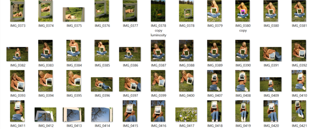
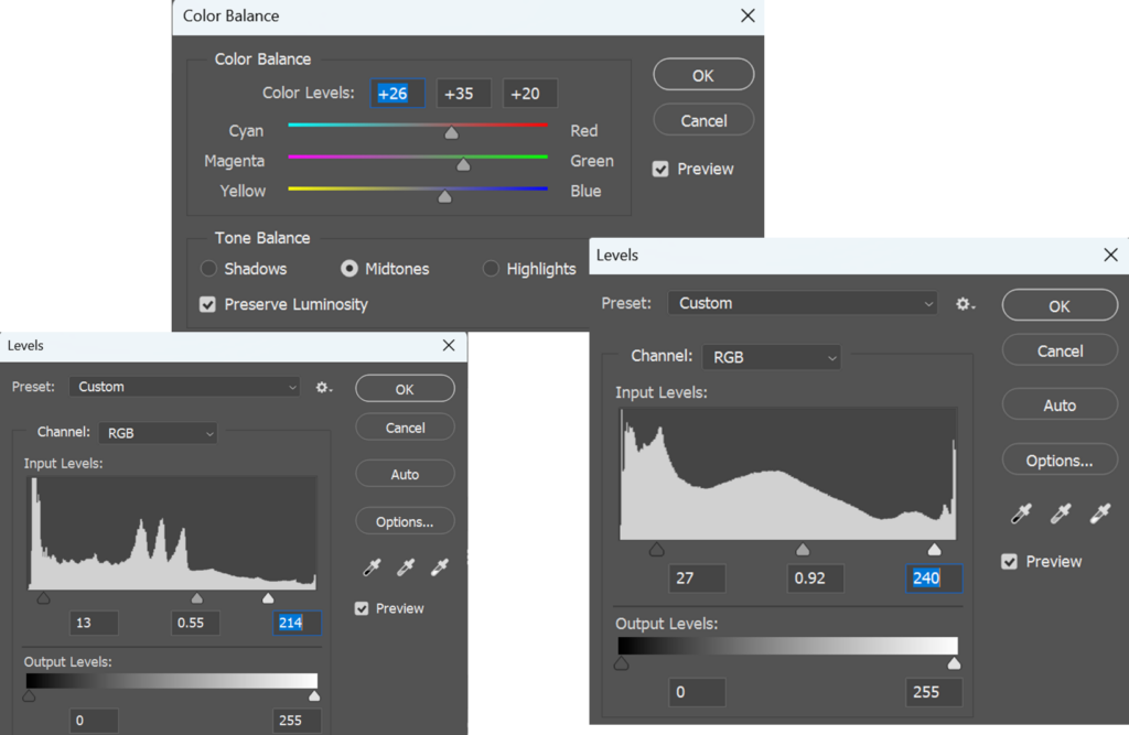
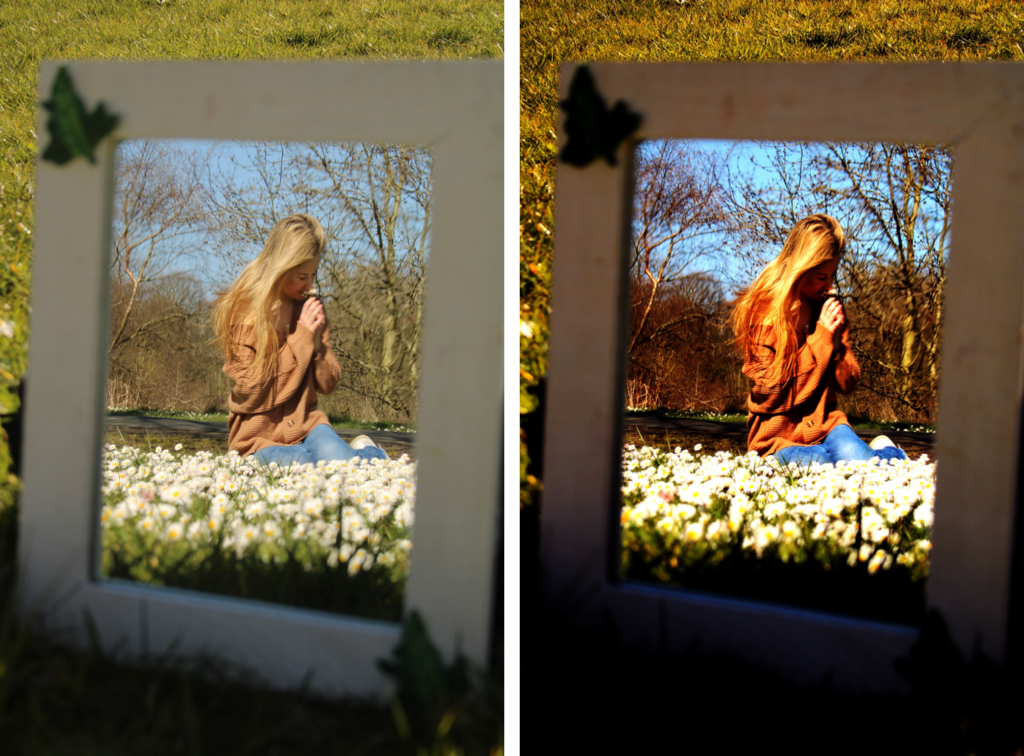
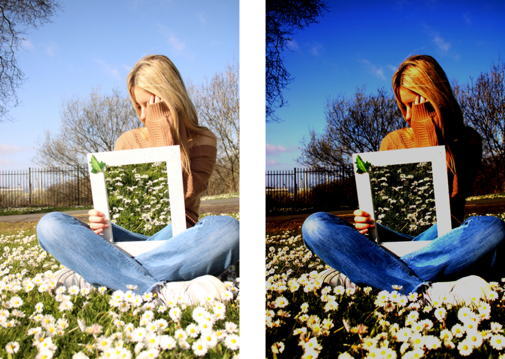
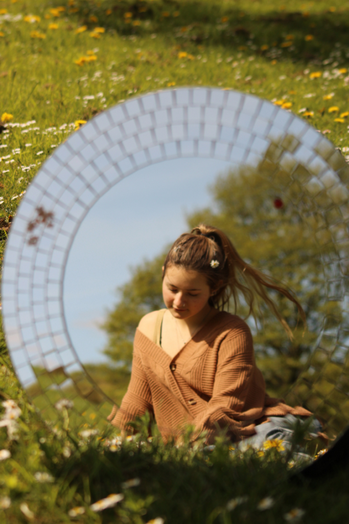
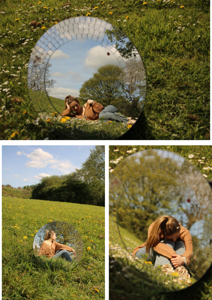
My final piece idea is doing nature photography mixed with portrait photography. My friend volunteered to be my model, I used a rectangular mirror to take a photo of her reflection in a field. I did this by placing my bag behind the mirror so that I can angle the mirror however I like to fit the photo better. However, it was quite sunny outside and I didn’t realise that there’s a few photos very overexposed so I’m going to make them darker in photoshop to see if we can save them. The weather was also quite windy, however that made the photos better because her hair flew back naturally without her having to do much. However, I’m going to re take this photo shoot and do it with a round mirror instead because that will fit better as well as a round mirror is bigger than the rectangular one. As well as, I’m also going to take the photo a bit further away so that you can actually tell that it’s a mirror in a field.
Photo 1:
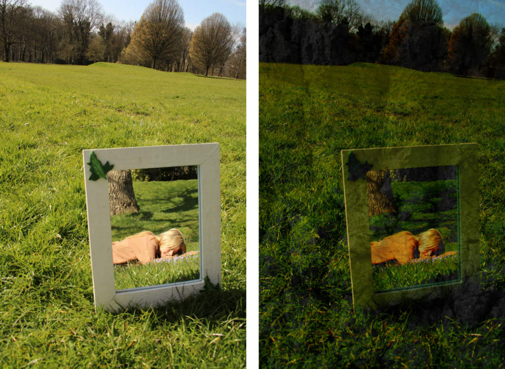
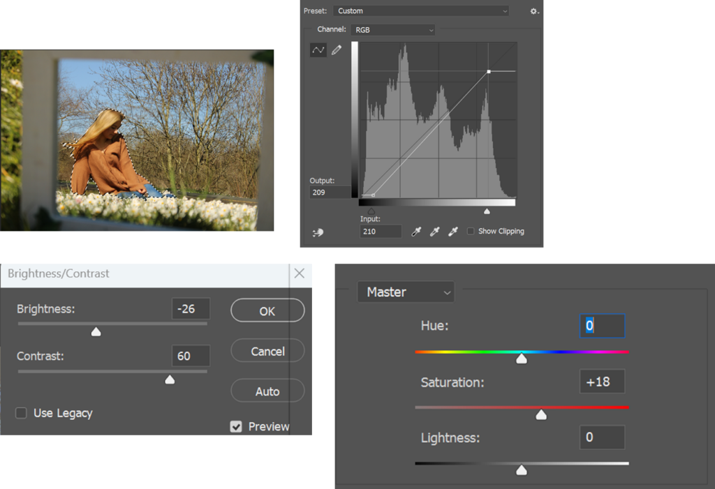
I took this photo in the park on the field, I really like this photo, it’s one of the best photos I’ve ever edited. The original photo is more pale, however I prefer the edited because it has more vibrance. As well as I overlayed a texture of the tree onto the photo which made the photo look more like a vibrant painting. I like the fact you can tell that it’s a mirror in a field I like the fact you can see grass and trees behind the mirror.
How I did it:
I edited this photo by experimenting with different tools in photoshop such as levels, curves etc. I wanted to make the photo more vibrant so it has more colour to it as well as I wanted to make the photo darker too. I made the photo darker by using the brightness however, I also used contrast to make the grass more green as well as to make the photo have more colour. I also added more colour, red, green and yellow to make the photo stand out more.
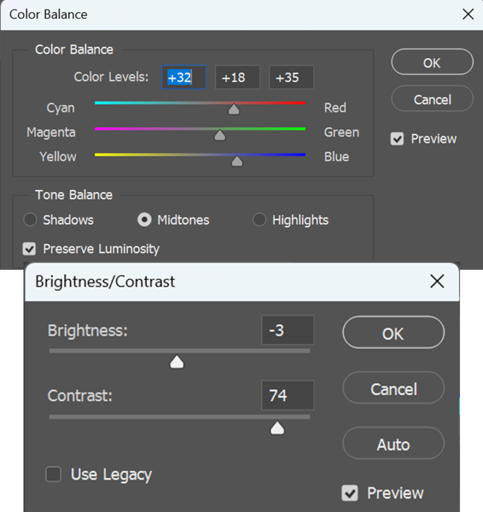
Photo 2:
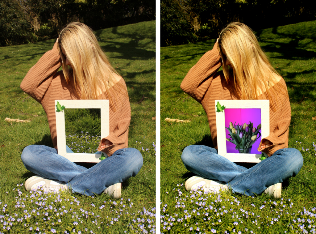
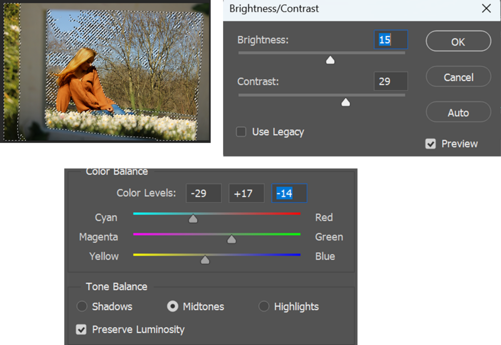
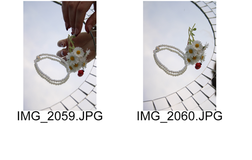
I took this photo at the park, my friend angled the mirror so that you can see the little blue flowers in the reflection of the mirror. The photo looks good, I feel like the grass is quite pale as well as the flowers aren’t that visible with the colour too. I tried something different with this photo, I overlayed another photo onto the mirror to make it seem as if she’s holding a painting of flowers. The tulips are from an earlier photo shoot, I made the background pink, I think the bright background and bright flowers stand out a lot in the photo. It’s not my favourite photo, however, I wanted to try something different so I did.
How I did it:
I edited this photo easily, I just adjusted the levels and curves to make the photo more bright to make it seem as if the day was more sunny as well as to add more vibrance to the grass and flowers. In addition, I adjusted the colour scheme, red, green and blue to make the photo more lively and vibrant. I did this to make the surroundings of the model stand out more. I placed the tulip photo by copying it and cropping it so that it was the size of the mirror as well as I erased some bits so that the photo isn’t on the actual model or out of the frame.
Photo 3:
This photo was taken in a park in a field, the mirror doesn’t belong there and I took a photo of my model while she was sniffing some flowers, acting natural. I edited the photo to make it more vibrant. My problem was that the mirror was small and I was too close and you couldn’t see much of the background. However, I did another shoot with a round mirror and it looks so much better.
How I did it:
I edited the photo by just experimenting with the colours so that the photo has more vibrance and colour to it. I added some more red so the trees are standing out more as well as her cardigan, I also added more green to make the grass more vibrant. I experimented with the brightness and contrast to make the photo more colourful.
Photo 4:
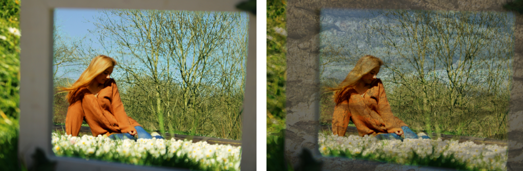
My main problems with these photos were that I had to be quite close to the mirror and I had to angle the camera so that you could see the model and at least a bit of the field in the background. This photo looks like a painting because I overlayed the texture of a tree.
How I did it:
I selected the model to adjust the colours of her clothes and her hair, I made her brighter and added more saturation to make the photo more vibrant. I also selected her to make her stand out more because she’s the main focus of the photo.
Furthermore, I selected the background to experiment with the colours to add more cyan, green, yellow, to make it more vibrant so that the grass looks vibrant. After, I placed the texture of a tree and rotated it to make it landscape so that the photo looks like a painting of her.
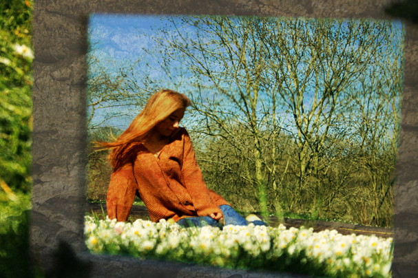
This is the final outcome, the composition of this photo is particularly interesting because the subject is framed within the mirror, creating a “picture within a picture” effect. The photo has an artistic, thoughtful quality to it, it’s almost like a painting or a scene from a fairy tale. The frame of this photo draws the person looking towards the model and then the surroundings.
Photo 5:
I like this photo because I made it more saturated, I made the sky look brighter and not so pale. The original photo is quite pale, however I made it brighter, as well as you can see the daises way more, as well as they are still bright. The photo looks like from a fairy tale, if she was wearing a dress she would look like a princess.
How I did it:
Final piece ideas:
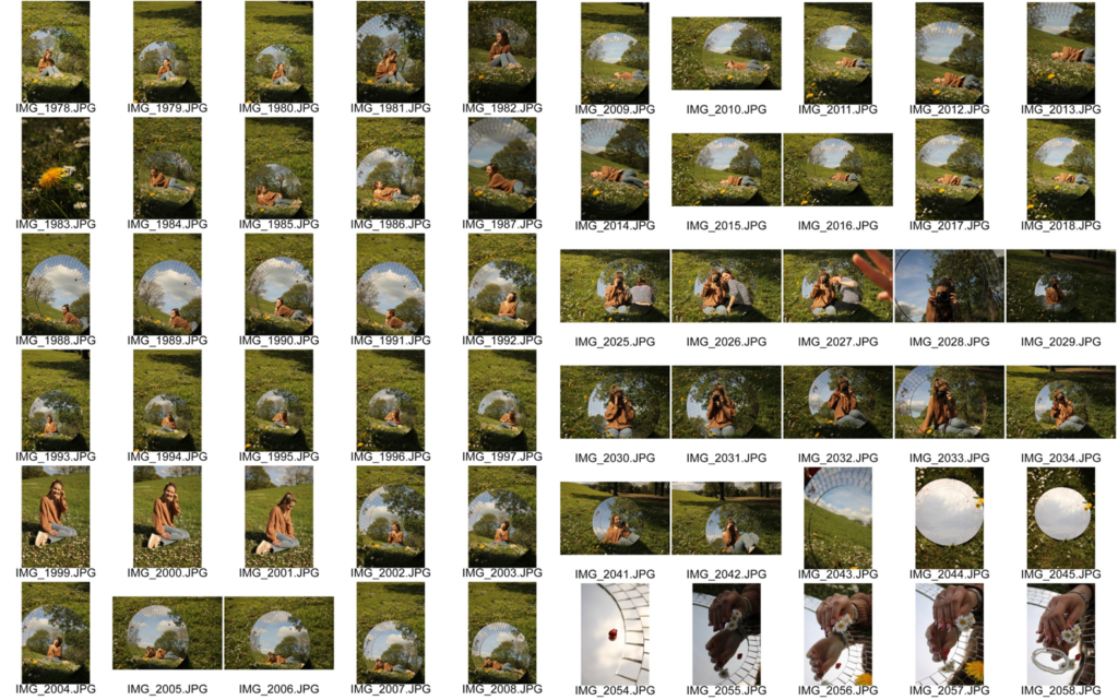
I rephotographed the mirror photos with a round, bigger mirror, in the same park on a field. I placed the mirror as straight as possible against my bag to keep it steady. I angled myself so that you can see my models body in the reflection of the mirror, because the mirror was bigger it was easier for me to fit her full body in as well as catching the background behind the mirror, such as the rest of the field/ trees etc.
Photo 1:
Final pieces:
I chose these 3 photos for my final pieces, the mirror photo idea I thought of is my own idea, after I went onto Pinterest to see how to make my idea come to life.