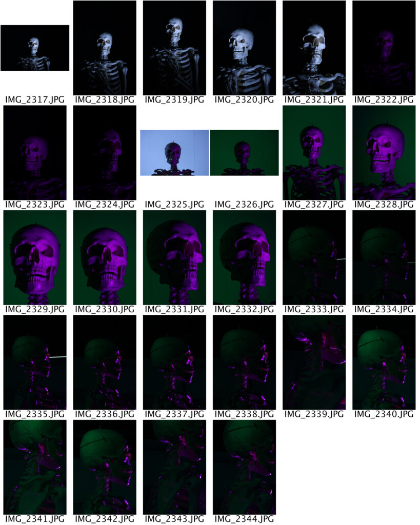
As an experimental shoot, I took photos of a skeleton in the studio and tested out some different lighting techniques. I tried out angling light sources to come from a number of different directions, such as the front, sides and almost behind the skeleton. I used green and purple coloured lights in these photos, as I think these are two colours that contrast well.
I have noticed that in many older horror movie posters involving skeletons, the colours are all quite vibrant along with a lot of hard shadows, which highlight the contours of the skeletons face. Because of this, I chose to edit one of these photos by increasing the brightness and contrast all the way, along with increasing the vibrance and saturation. I also added a gradient layer in two directions; One coming from the bottom and the other coming from behind the skeletons head. This was to slightly hide the wall behind the skull because of the angle I took the photo from. It also made the skeleton look like it was almost emerging out of the darkness even more- like some sort of monster.
This first shoot, makes me want to maybe experiment with typography at some point during this project. I feel like adding words to my images would help tell stories to the viewer and communicate the meaning of my photos on a deeper level.
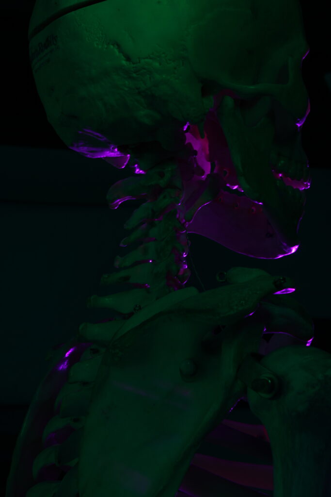
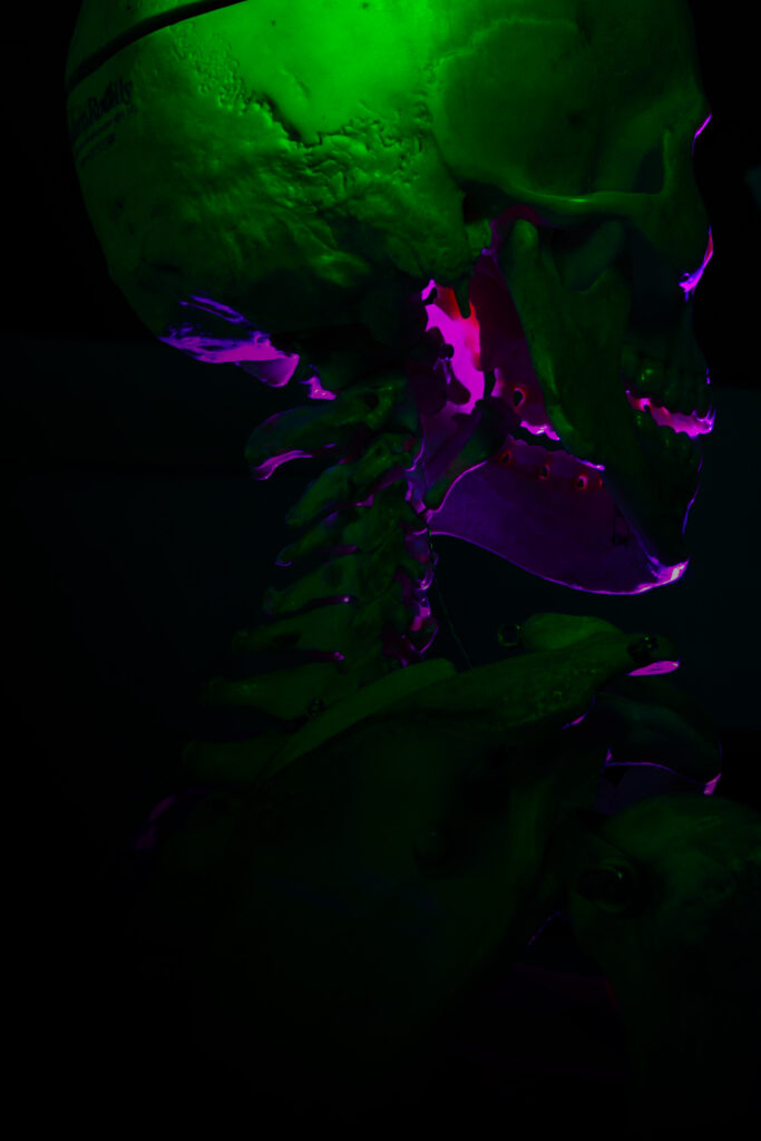
A thing I want to develop from this shoot in another future piece of work is the technique of backlighting. I like how this sort of lighting can bring attention to things that the viewers eyes otherwise would not be drawn to; Such as the inside of the skeletons head, not just the outside.