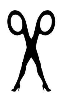
Scissor Sisters – No words, just an image of two legs (feminine) crossed over and becoming the body of scissors. Always black and white.
Coldplay – Bold, thick, black letters, stating the name of the band. There aren’t any holes/spaces in the letters themselves.

The Hives – Big, bold letters, but has an interesting use of a peace sign to replace the ‘V’

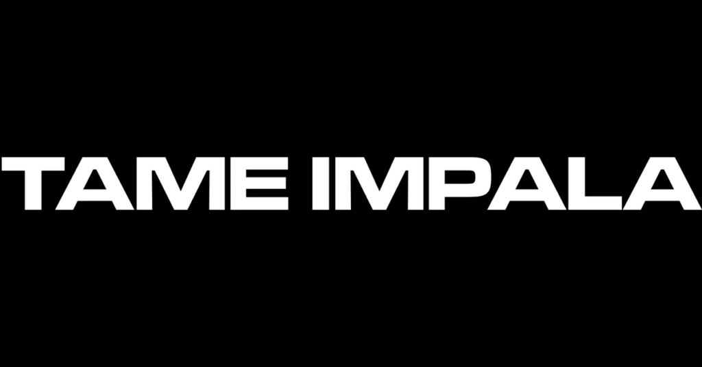
Tame Impala – Bland and straight forward font, no icons with another black and white scheme.
MIKA – 3D, still black and white but sometimes appearing on a coloured background. The letters seem cut up, making small sections between them.

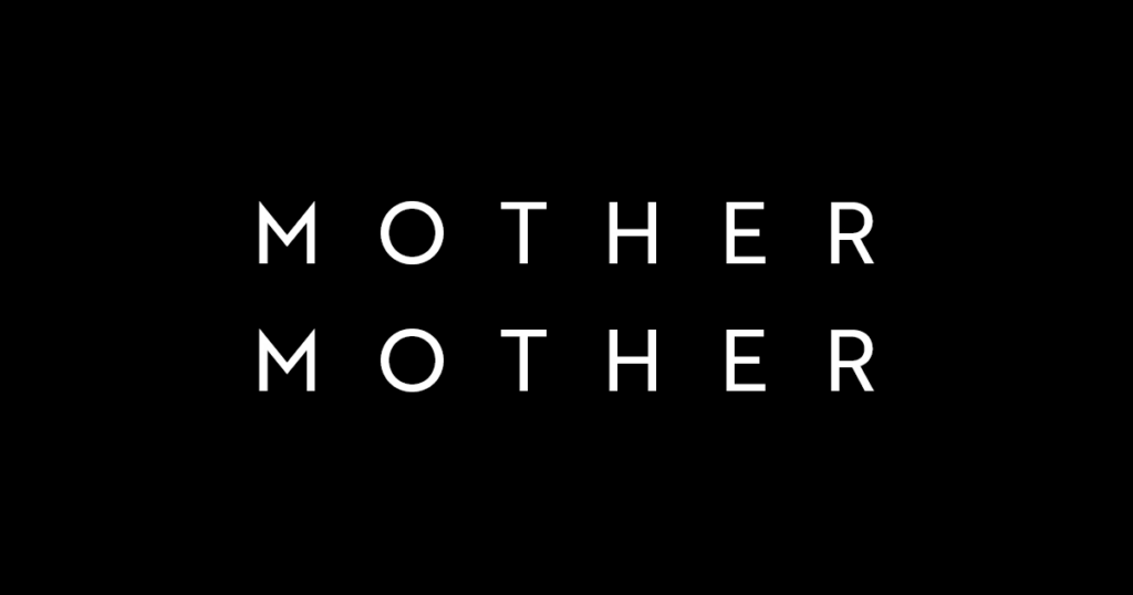
Mother Mother – Plentiful spacing between the letters, a basic font with no gimmick. I prefer the way the logo looks on albums, which is a bit more unique font.
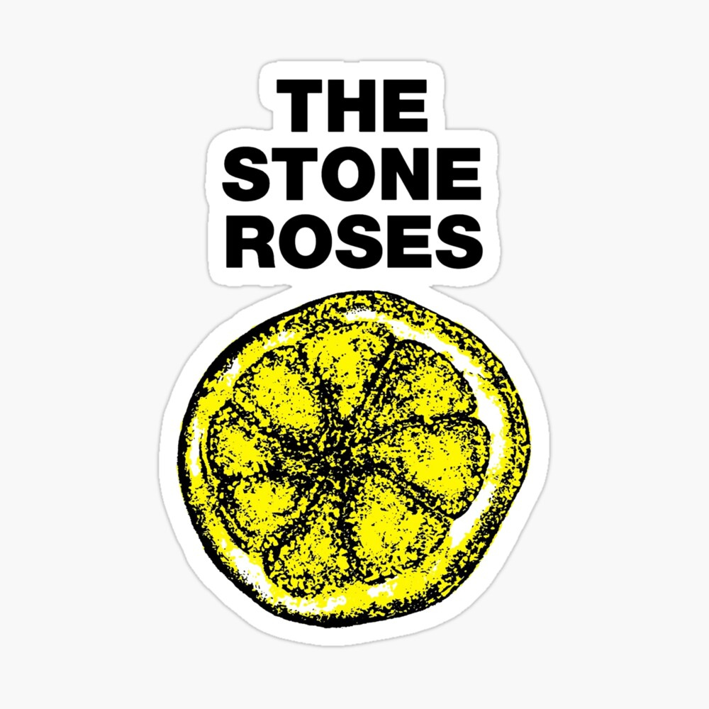
The Stone Roses – I really like this logo despite the simple font. The lemon has basically nothing to do with the bands name, but the yellow and vibrancy it gives off is charming.
Kaiser Chiefs – While the letters are in a standard font with a black and white scheme, the letters are crooked and misplaced with some cracking texture in them, or at least the edges roughed up, making it look very disorganised.

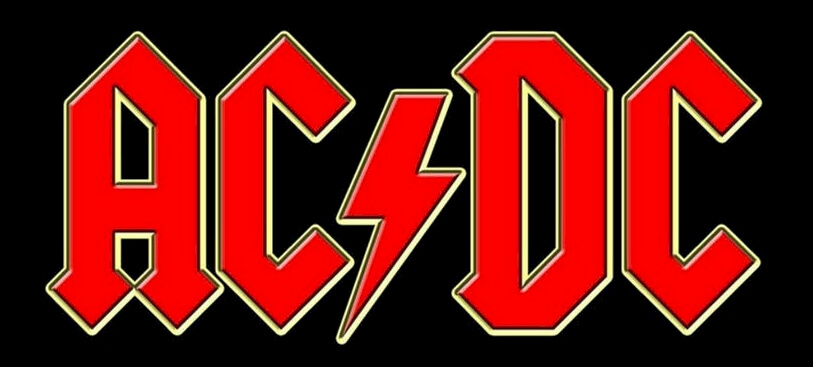
AC/DC – Very edgy font, the icon of the thunderbolt is splitting up the letters instead of a slash like the name is typed out or written. The logo is typically red which is a nice pop of colour.
Suede – Suede’s logo is boring and reminds me of Oasis’. It is black and white, all lowercase, a simple font and is boring to look at.

Some of the better logos have icons of some sort in them with a unique font. Simplification has made the quality of some logos tank overtime, but some started very simple. While it was unique to have a logo like Oasis’ at the time, it is now one amongst many.