For the idea of Double Tap Root Beer, I will be taking inspiration from the work of Motion Craft Media, a media company that creates video content for people such as advertisements and event videography. In particular, I will be using a setup similar to the one seen in their Jack Daniel’s Tennessee Fire Ad.
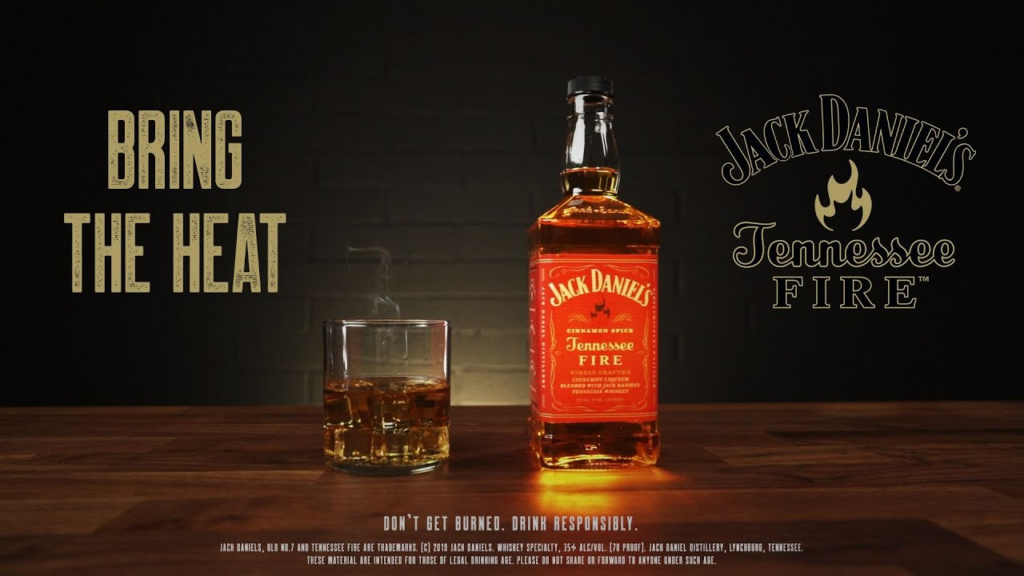
The parts in particular that I am also going to be using are the wooden table for the drink to sit on, the front facing shot of the bottle and the plain background with text on it. I will however be changing a lot of elements, such as changing the colours used, altering the text and shooting in portrait as opposed to landscape. I will also be using different props to further fit the cowboy theme, such as a cowboy hat and a handmade noose or a lasso. I am considering whether or not to put the cowboy hat on a hat rack in the background to make the image seem less crowded or to put it next to the drink along with the noose. This would mean that I can put the drink slightly offset to the centre to fit better with the composition of the image, utilising the rule of thirds. I will be experimenting with which one would work better.
Creating the Noose
This is my process of creating the noose for the photoshoot.
Lighting and settings –
- same lighting as practice with anna
- 1/125 f18 200
- 7K white balance
Editing Practice
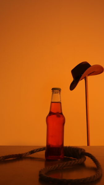
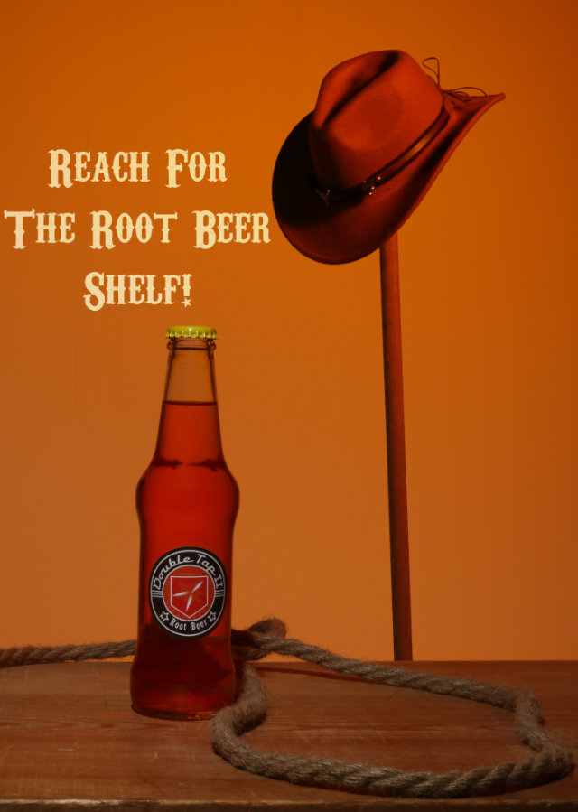
I used the image below to practice the editing I would be doing on the final image.
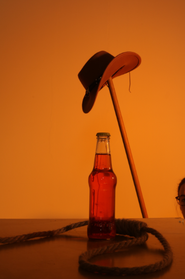
To start, I had to crop out the person on the right that was holding up the hat rack.
I then used Spot Healing to remove the reflections and contortions from the bottle, such as the stick and the assistants face.
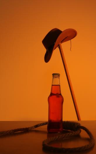
I then removed the string from the hat in the background because it looked out of place.

I then cropped the image. This was cropped into a 16:9 ratio.
I then straightened the image in relation to the table as it is the straightest thing we can verifiably see.
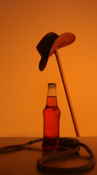
I then took the hat, duplicated it and put it in the position I wanted it in.
After removing the original from the background, I cleaned up the details.
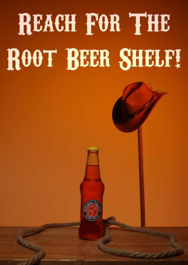
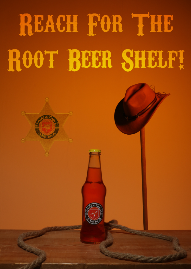
I then decided to crop it to A4 paper size, 210X297 to make it look more like a poster. This also minimised open space above the image.
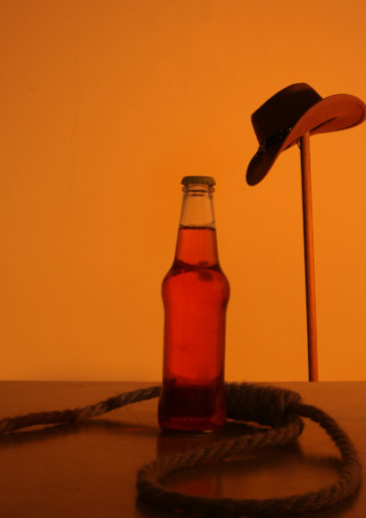
I searched for a cowboy/saloon style font and found Carnivalee Freakshow.

I then added in a quote for the song that is both relevant to the product and a call to action.
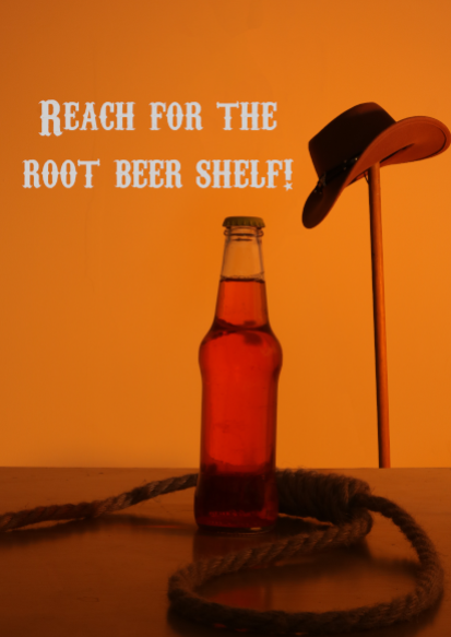
I then changed the text to be based on linear light, matching the slight background
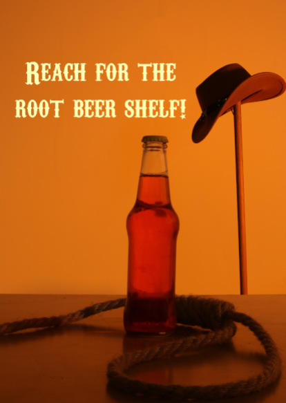
I then changed the text to be on “Linear Light” to mimic the slight vignette of the background.
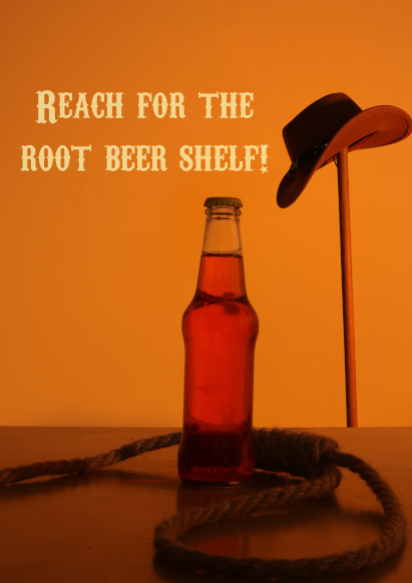
I then lowered the opacity to let some of the background seep in, creating the final shot.
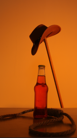
Conclusion
I think that this style will be good for my final shoot. However, I will be using a wooden slab on the table to mimic a western style bar. I will also be focusing some of the light onto the bottle so the logo is more visible.
Final Shoot
Ethics
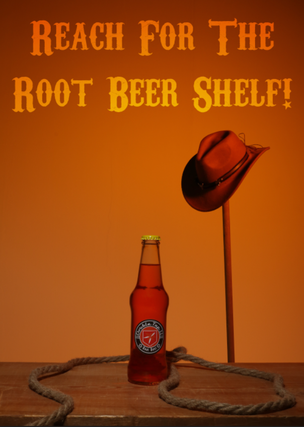
After some consideration, I decided to switch out the noose in my image for a lasso by changing the amount of rungs on the rope. This is because while a noose has wild west imagery, it also has very negative connotations linked to lynching, racial violence and suicide, so I decided to switch it to a lasso which is more typically seen in media as just an ensnaring tool for catching people. Although the noose was only a detail and not the main part of the image, I think it is important to not have anything with negative connotations as heavy as the noose.
Contacts
Edits
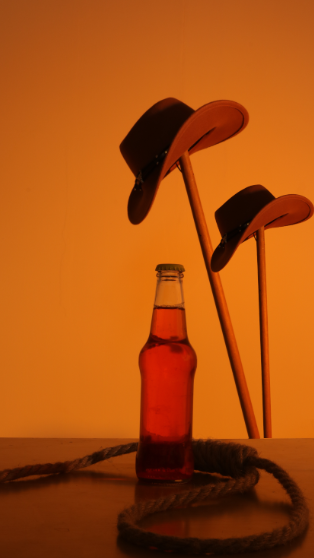
I first grabbed my two original images.
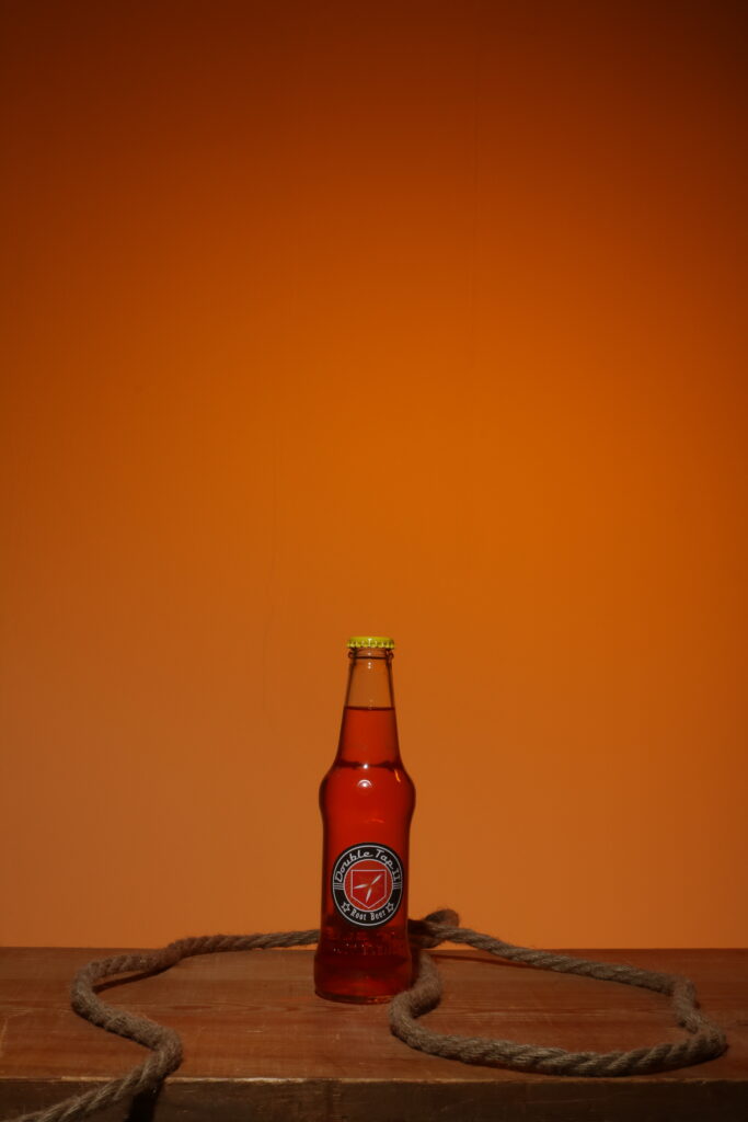
The above image is used as the base. I will be putting everything on this and altering all of the things in this image if I need.
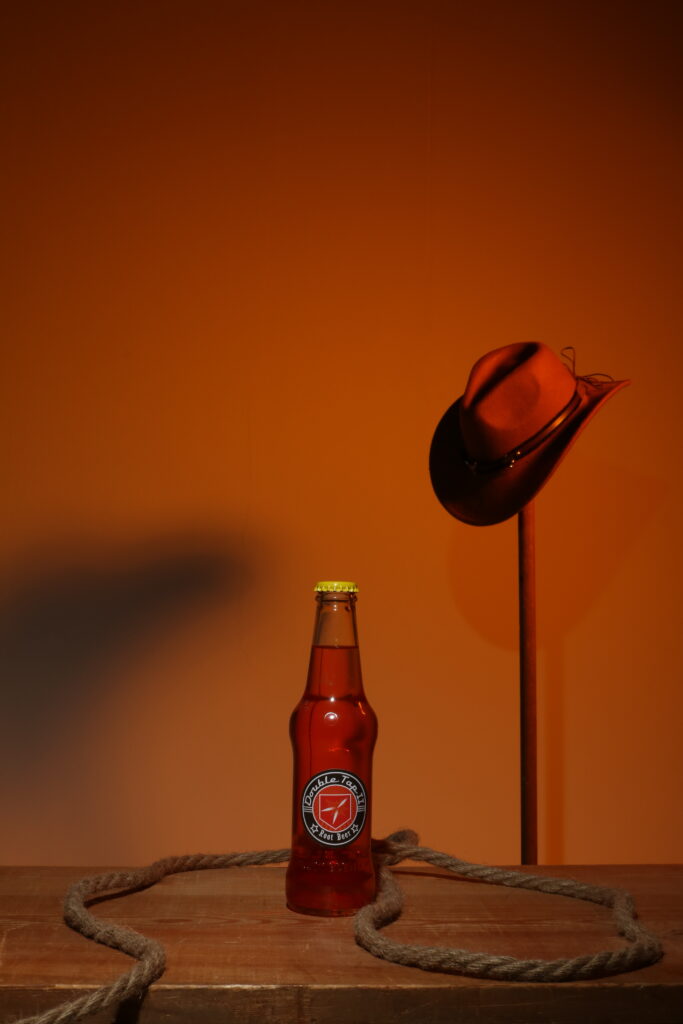
This above image I will be taking the hat in the background from. I will be making sure the aspect ration is the same and everything is squared up so I can take the prop and make it look natural.
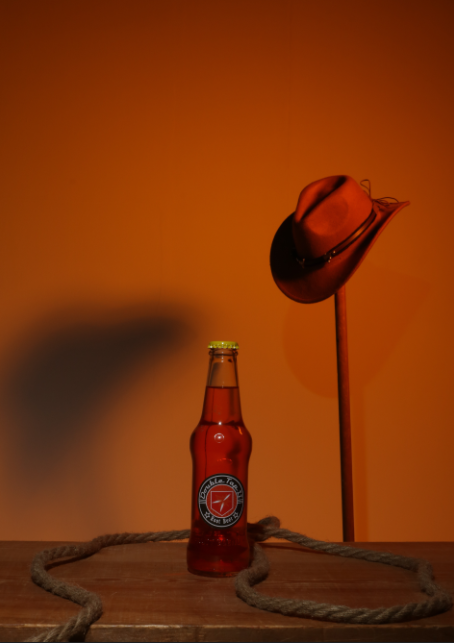
To begin, I altered the crop to be a 5:7 ratio which is an A4 size.
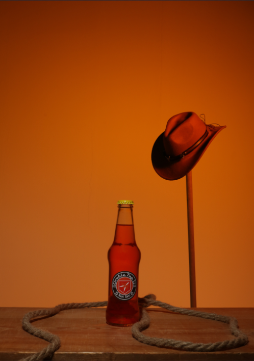
I then transferred the cowboy hat to the main image so there wasn’t a big shadow in the image.
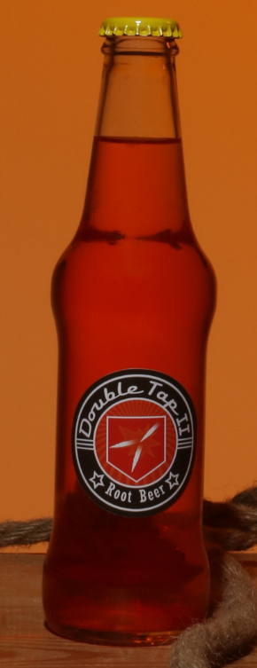
I removed the imperfections from the bottle, such as the shine and the “FRUIT BLEND” engraved into the bottle.

I experimented with further cropping the image to fit with the rule of thirds, but it didn’t quite work how I expected it to so I changed it back.
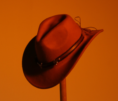
I slightly dodged the shadows on the hat because the contrast was very big so I wanted to make it slightly tighter.
I then did the same thing on the hat rack.

After this, I added the same quote from the song in the same font shown in the practice image.
I made the text based on linear dodge so the text matched the slight vignette in the background.
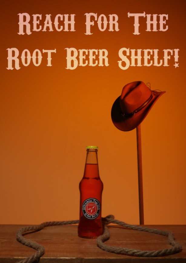
I then lowered the opacity so the background slightly bled colour into the text.
I tried to use the smaller crop from earlier to see how it would look with the text, but it felt too cramped so I switched it back.
I changed the crop back to original and used colour dodge because it blended better while still drawing the eye.
I then slightly changed the colour to be more close to white which made the contrast bigger while still keeping the same colour scheme because of the colour dodge. I wanted to find something to fill the space, so I decided to use a sheriff badge.
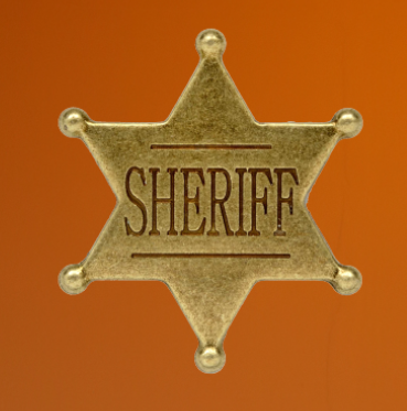
I first found a sheriff badge that I could use.
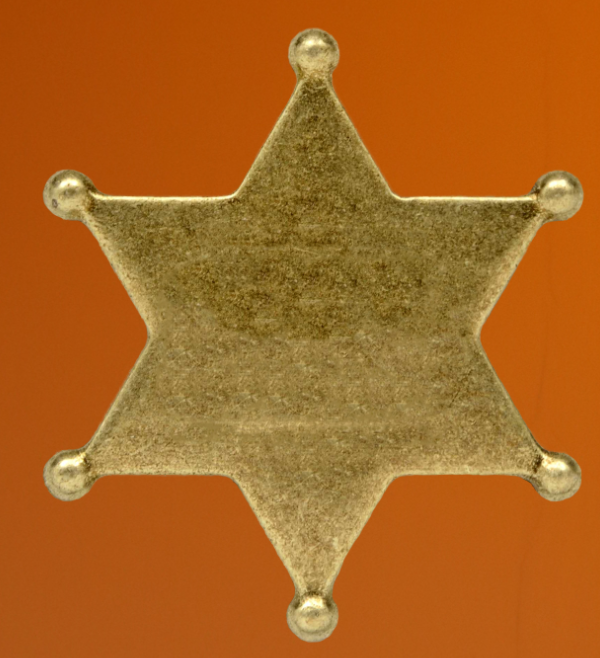
I then erased the word “SHERIFF” from the front and cleaned up the edge with the “Select and Mark” tool.
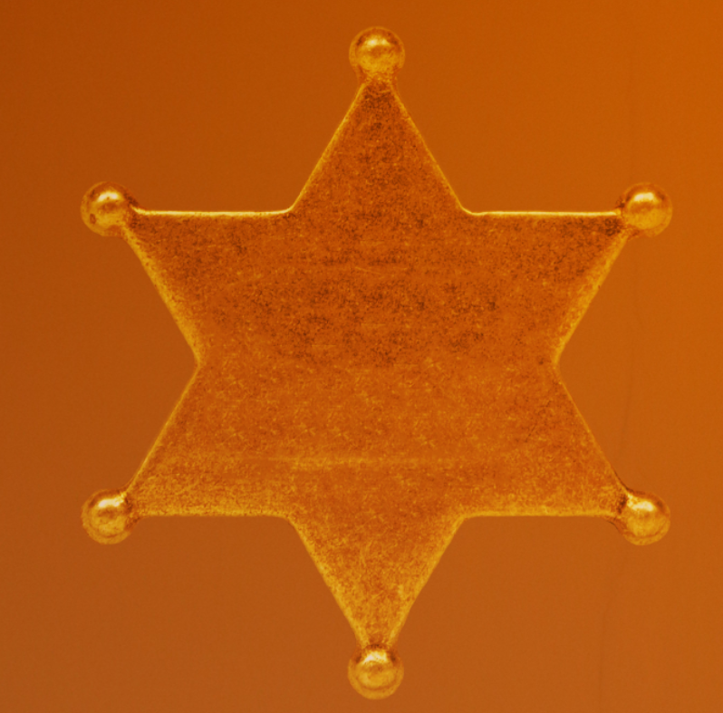
I then used the “Hard Light” setting and adjusted the opacity to make it golden.
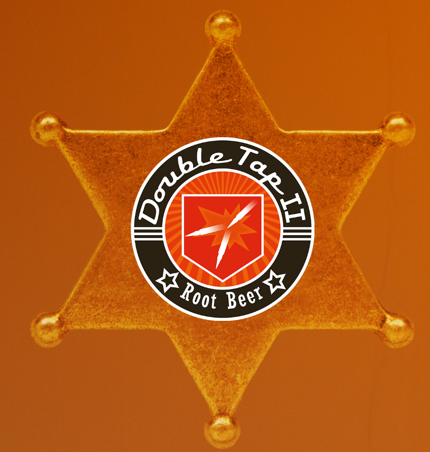
I added the “Double Tap” logo on top of the badge.
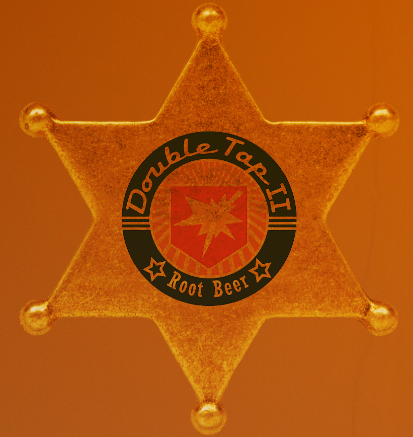
To make it look engraved, I first used “Darken” on the logo.
I then duplicated the star, highlighted the logo and inversed it to delete the excess on the duplicate to add the texture to the logo.
I then used hue and saturation to adjust it until it looked a realistic golden.
I removed some small imperfections from the background that I missed. This created the image with the sheriffs badge below.

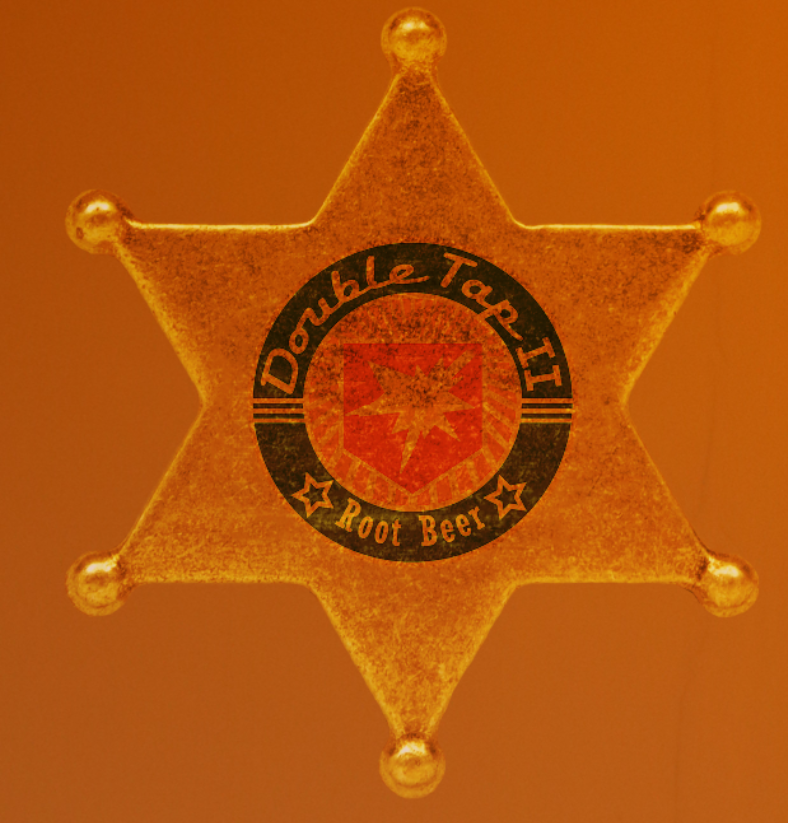
However, I did not like how the badge looked, so I decided to remove it. This created the final image below.