
In this section of the project, I am going to be analysing various advertising photographers to look into techniques that they use to develop their pieces. This will be techniques that are used in camera, in the studio and on the products themselves. To keep consistency, I will be looking into drinks advertising, which can provide a lot of variety while still keeping a similar base product.
In Camera
To define the idea of an in camera technique, the criteria would simply be any setting or change you can make directly within the camera. For this, I would like to analyse this image created by Martin Wonnacott.
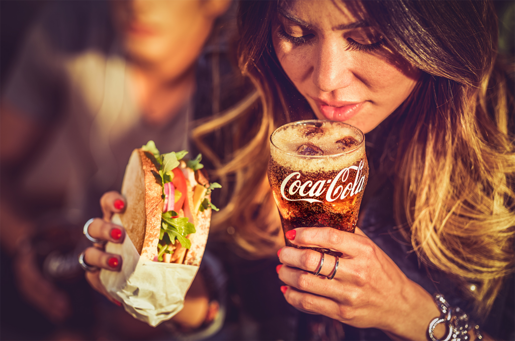
This image features a woman with a sandwich in her hand drinking a glass of Coca Cola. The woman appears to be at some sort of gathering with friends, with her friend behind her while she sips her drink. The logo is clearly in view to provide recognition to the brand, looking ice cold with 3 ice cubes and some head on top of the drink. The woman appears to be in her 30’s or 40’s. However, the think I would mainly like to highlight in this image is the focus. The focal length used results in a shallow depth of field, which further separates the background from the foreground. This creates a very crisp focus and a clean differential between the background and the main focus of the image. The depth of field can also be adjusted with the aperture which could have been used to make it even more narrow. This is only really useful for images that need a distinct difference to separate the background and foreground, but it is a very good technique to have for less studio based shoots instead of shoots where the backgrounds are more artificially created, such as just using a blank background for text.
In Studio
To define the idea of an in studio technique, I would classify it as controlling something exterior to the camera or the subject, such as the background, items around the subject or the lighting. For this, I will be looking at an image by Mark Mawson.
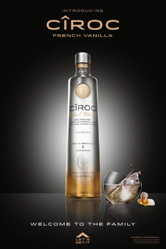
This image is a bottle of French Vanilla Cîroc, a vodka brand. It is placed on a reflective surface with a glass alongside it with the text “Welcome to the family” placed underneath, implying a sense of warmth and agreement around people choosing to drink this. However, the main technique I am interested in here is the use of lighting. This is known as spot lighting and is used in this image to create a vignette around the image without the use of Photoshop. This highlights the bottle by leading your eyes more toward the centre while also leaving room for the creamy coloured text to match the bottle without completely whitewashing it and making it unreadable. This is very suitable for adverts of this style because it looks very sophisticated and high quality, which is also mirrored by the tagline. This lighting could be very nice to try for one of the products I am considering doing.
On the Product
To define the idea of an on product technique, I would say that it is a change made that directly affects the product to make it look better for camera. For this, I will be looking at an image from Johnathan Knowles
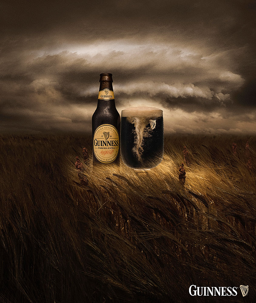
This image is of a bottle of Guinness with a cup next to it filled with Guinness. It is a very drab picture and takes place in a field of barley. The lighting is showing through an opening in the sky and is shining down from the top onto the product. The main part of the image I would like to focus on is how they have instituted a tornado look into the drink in the glass. This directly affects the product, but it makes it blend into the background in an interesting way that makes sense for the brand, as beer and lager is known for having head on top. My guess is that he simply stirred up the drink to create the tornado effect and used a high shutter speed to freeze the moment, but the information on how he did it is not publicly available.