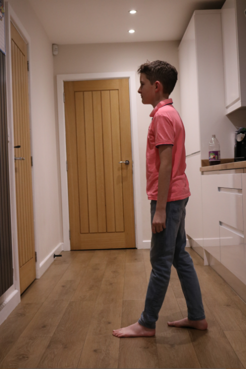
Childhood
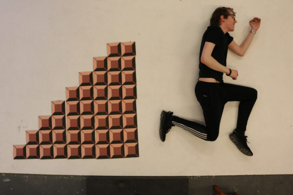
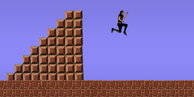
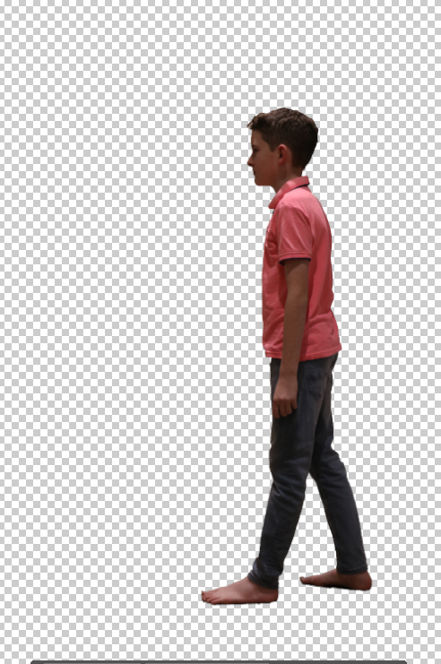
To begin, I cut out the stairs and the model and applied them to a 1:2 canvas. I did this because it allows me both a lot of space to move the pieces of the image around but also because it allows the whole space to be used for the image, whereas the original game was confined to a 1:1 screen.
I then added in the flooring pattern. I stacked it 4 times to cover the whole bottom of the image and adjusted it to find the balance between is looking accurate to the game, but still looking like a practical element as opposed to being fully edited.

From here, I added the background. I used the eyedropper tool to grab the background of the game and made it a solid colour for the minute.
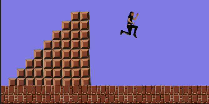
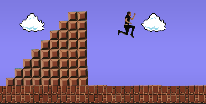
I then added a slight gradient so it gets lighter the lower you get. This added a bit of change to the background like it is in the game.
From here I added the clouds. I used the cloud design from the game, but remade it in a pixel art creator so I could get it in a better quality.
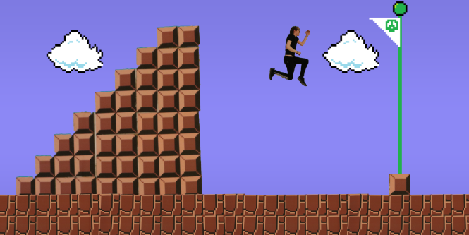
After this, I grabbed the brick texture from the stairs and used it for the base of the flag. I remade the flag design with the eyedropper and using the reference from the game and the pixel art creator. I then layered it below the base and centred it to the brick.
To finish, I added the text at the top. I used the official speed run record for this image to show that Mario was a big influence in my childhood, showing that I was able to complete it with a high level of proficiency through repetitive playing. I slightly tweaked the models of the clouds, flag and character and I created this image.
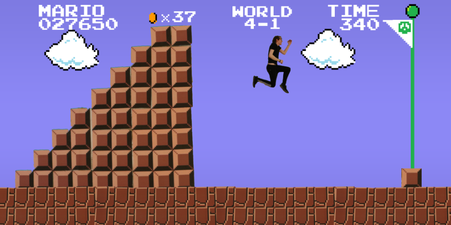
I was going to leave it there, but I thought that the floor and stairs looked too dulled down. I did not want to replace them completely, so I instead decided to use the levels to make them more saturated and blend into the video game theme more. This created the image below, which is the final product for “Childhood”.

Adulthood
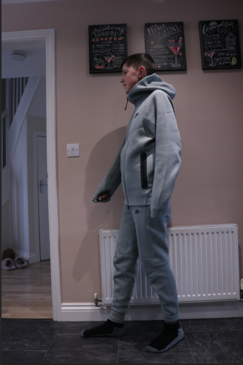
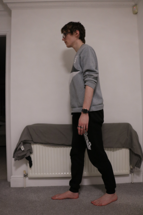
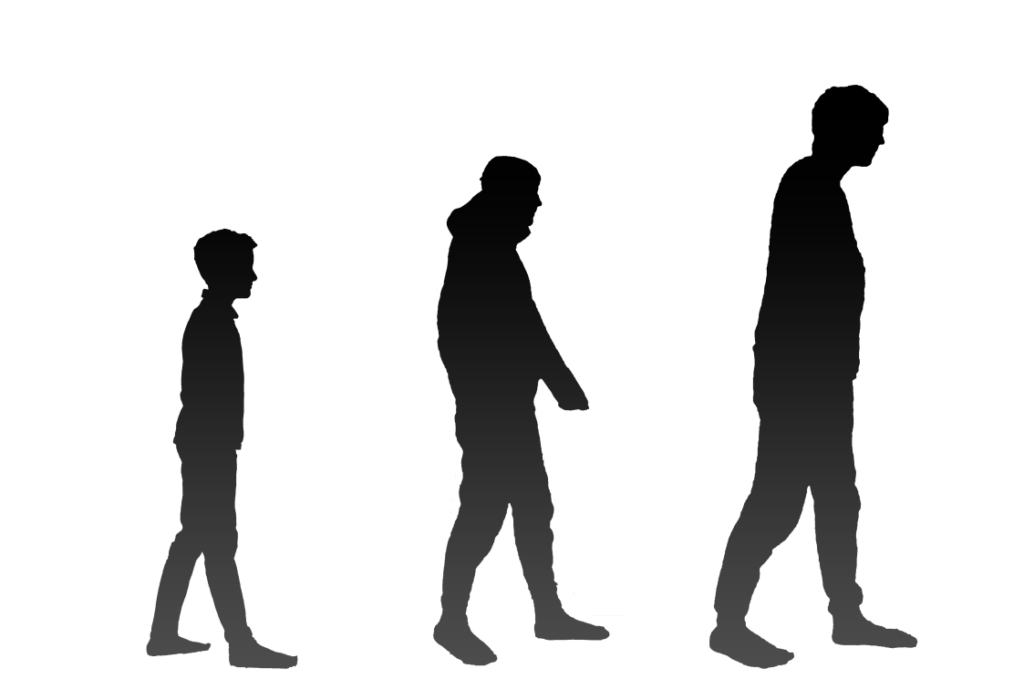
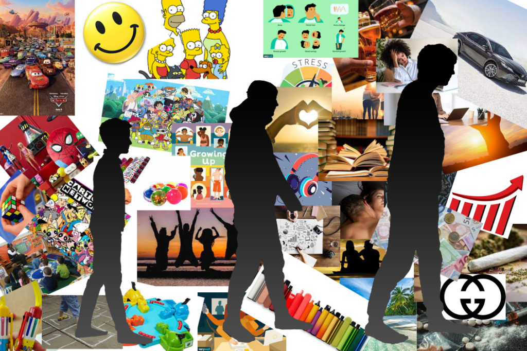
The first thing I did was cut out all of the 3 models from their pictures. To cut them out, I simply highlighter the model, inversed the selection to highlight the background and deleted it. The shape only had to roughly resemble a human because it was going to be made into a silhouette anyway.
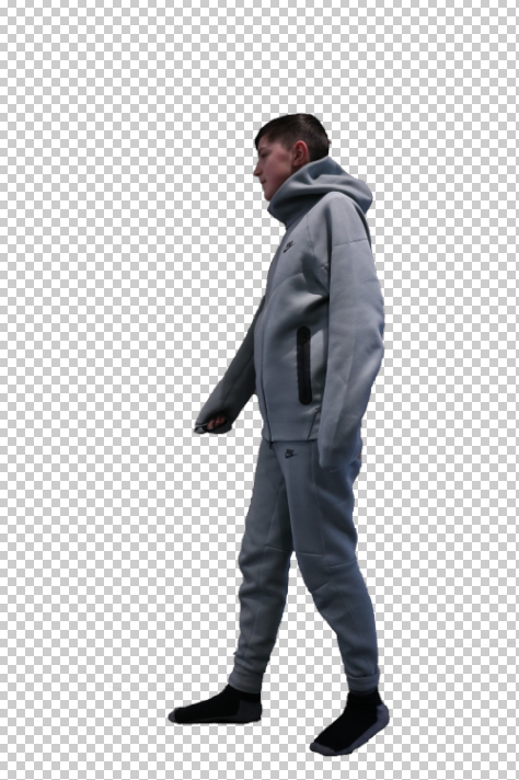
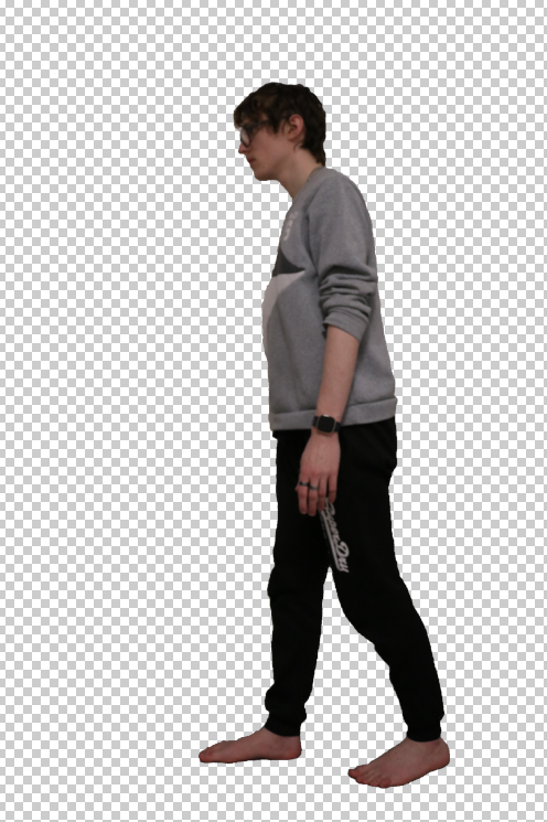
I then placed all pictures onto a canvas that was in a 2:3 ratio. I also altered the sizes so the ages were more apparent and the space from the camera was mostly irrelevant. However, the direction the people were in reverse.

To fix this, I flipped the canvas horizontally so it had them faced the correct way. I also levelled them out the best I could.
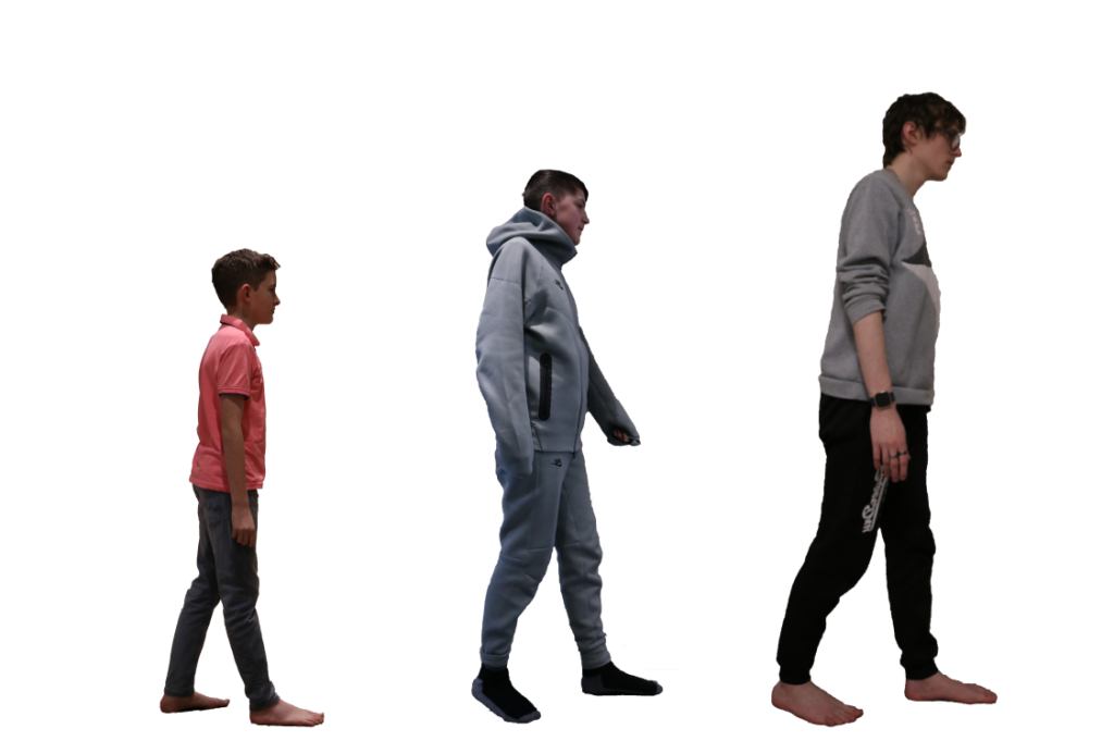
To start, I placed a solid colour on all of the models and created a clipping mask to attach it to just the models. However, I didn’t like the harsh colour contrast very much.
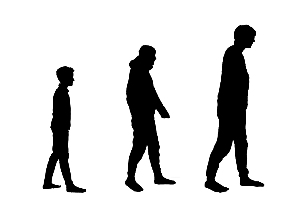
I decided to switch to using a gradient that goes from black to a dark grey instead.
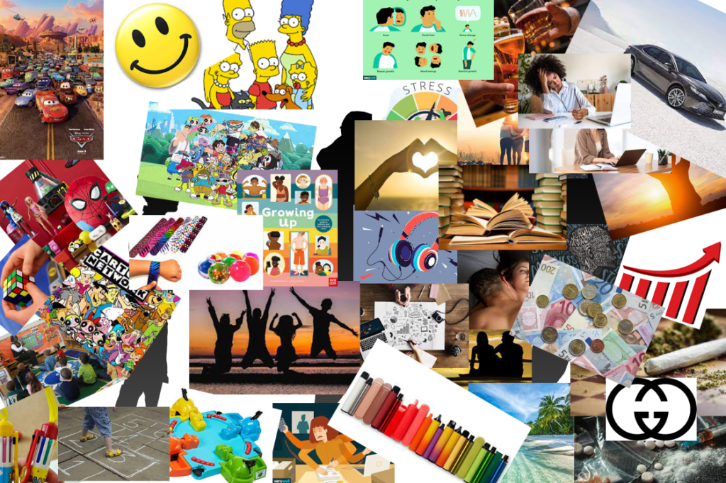
To fill the background, I used approximately 40 pictures to create a collage. Behind each of the characters is something that is appropriate for what would be happening around their age and their general interests. This went from the Cars film, toys and hopscotch for the younger child to puberty, stress and friendships for the teenager and progressing to sex, relationships, money, stress, drugs and freedom for the adult.
I then layered the characters on top of the images below. This is the final product for “Adulthood”
Mid-Life Crisis
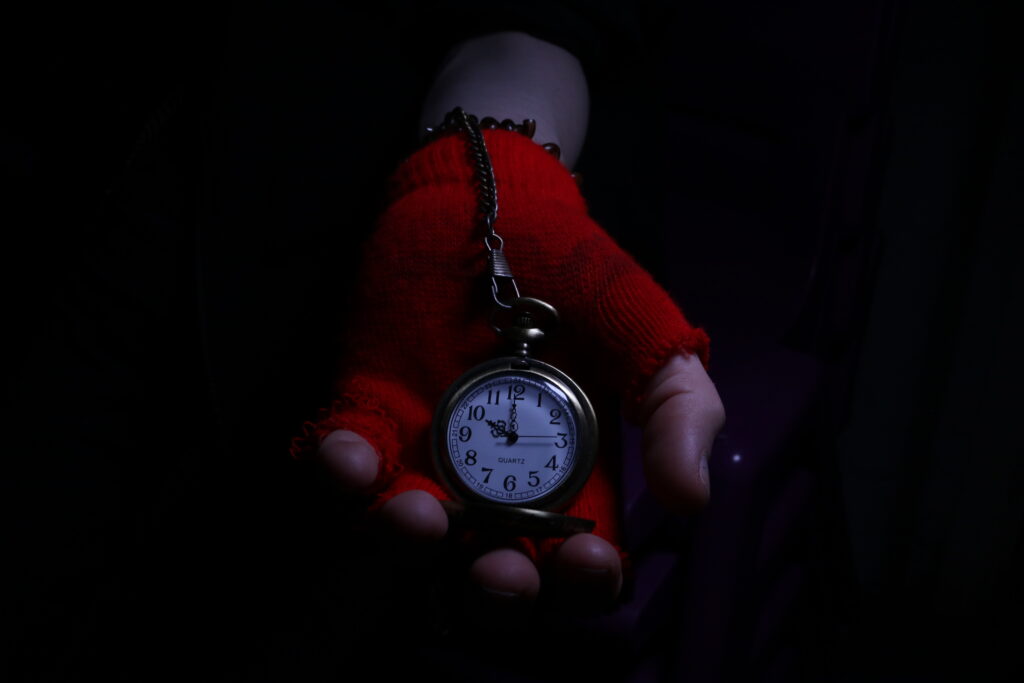
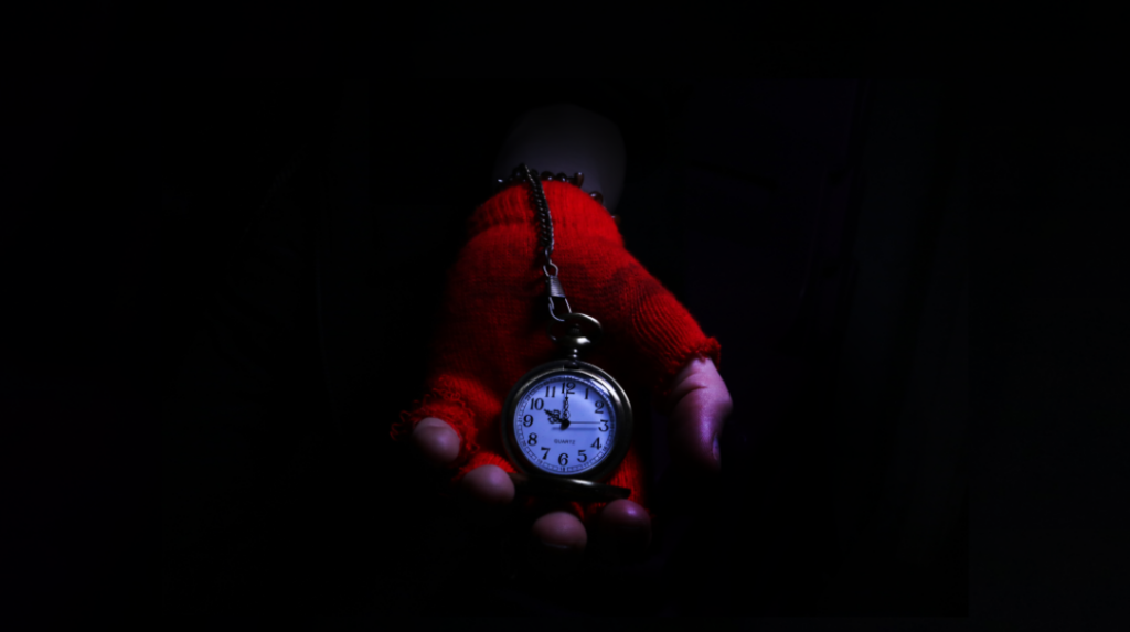
To start, I decided to highlight the hand and the colours of the watch and glove more. Because there is a degradation of colour throughout the images, the colour of this picture is limited, with only the subject being in colour. However, this contrasts the darkness, still emphasising the subject. I did this by burning the shadows very slightly and dodging the midtones. I did not dodge the highlights on the watch specifically because I did not want the shine to be too distracting.
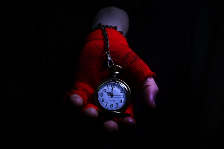
However, the hand felt too cramped, so I decided to change it from the 2:3 aspect ratio to the golden ratio of 16:9. This created more headroom for the top of the image and expanded it more to the sides, making the empty space more apparent to show that anything could be hiding behind the watch. To do this, I first altered the canvas size.
After changing the canvas size, I took the black space from the side of the image and stretched it out to fit the canvas, then put it behind the layer of the hand so it would fill the background.
After this, the main hand was complete. I experimented with different ways to make the hand not look cut off. My model was wearing a black jumper, so it blends in with the background, but this acted as a double edged sword, both blending the model into the background so they are less visible, but also harshly cutting the arm of the model off. To fix this, I attempted to burn the arm to blend it in, but it had little to no effect.
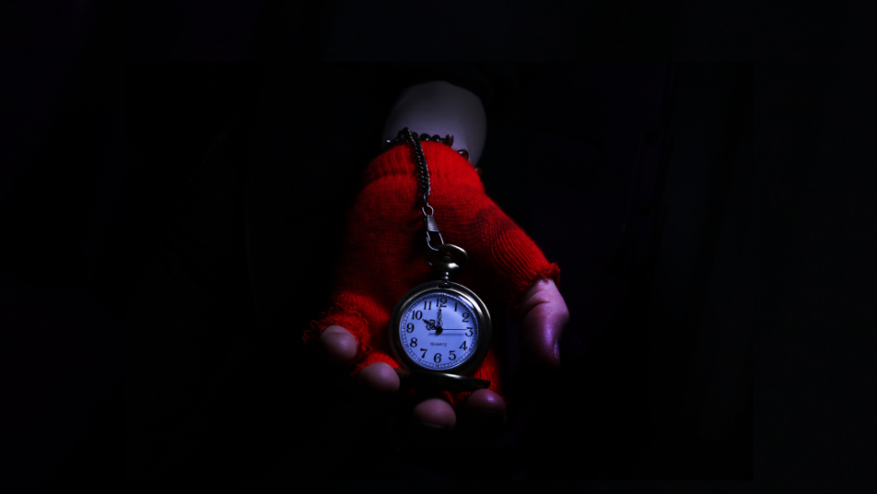
I then tried to add a gradient fading from black to transparent so the bottom of the hand would still be visible while making the hand look like it was coming from complete darkness. I altered the gradient scale until it looked natural. This worked, however it dampened the lighting on the hand much more than I wanted it to.
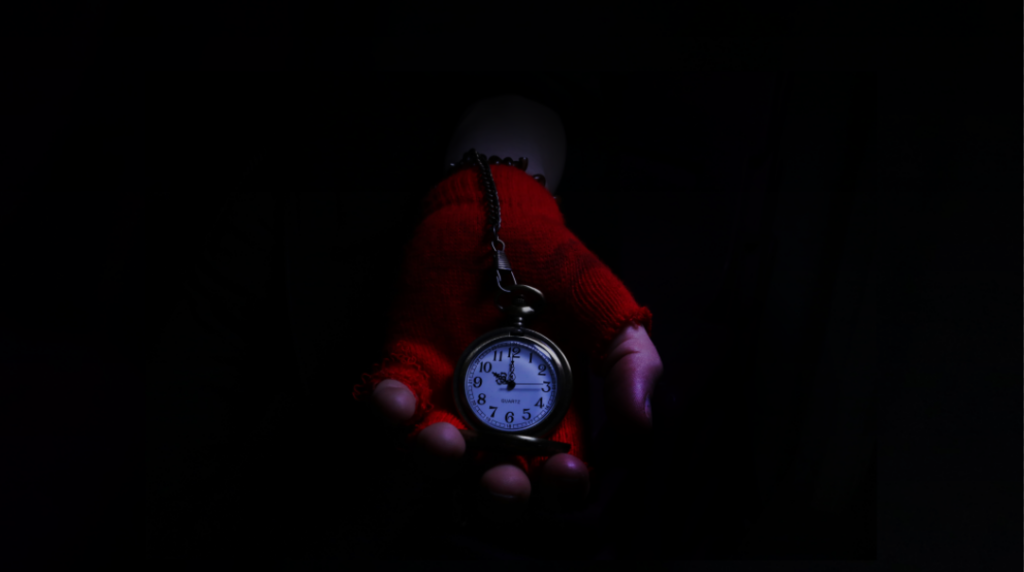
To counteract this, I simply cut out the hand on its own and layered it on top of the original image. I then put this layer above the layer of the gradient, applying the gradient effect to just the arm while leaving the hand and watch in the previous state. This is the final product for “Mid-Life Crisis”
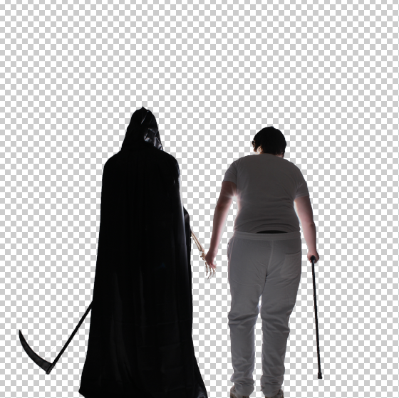
Death
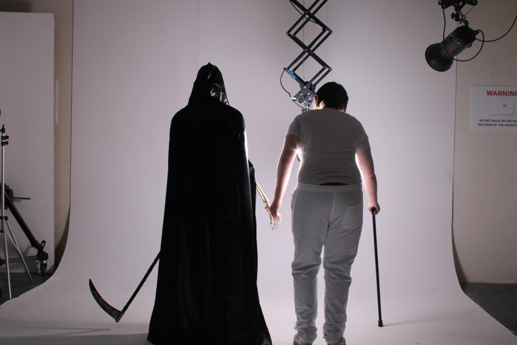
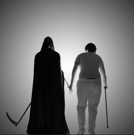
At the start, I decided to make the image into a 1:1 aspect ratio to switch up the presentation while also keeping it a fairly standard resolution. This also means that when I later add the light digitally, it will be evenly spread across the image in a sort of vignette.
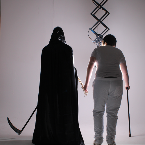
I then cut out the two people and gave them some more headroom and room on the side by expanding the canvas so I didn’t lose the detail of the models by making the image itself smaller. This also meant that the image could line up with the rule of thirds easier, whereas on the original image it was hard to do because the scythe would have been cut off. I also used the durn tool to make the highlights slightly darker so the reflections on the old man’s arms weren’t as shiny and distracting.
After this, I added in the light. To do this, I use the gradient tool and made it so that it went from a bright white to a black. I then made the gradient into an angular gradient instead of linear and fit it to the image. After playing around with the scale, I landed on this and believe that this scale works best.
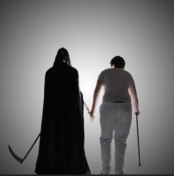
To finish the picture, I added a black and white colour to complete the series, going from a complete and fully coloured image to a void and absent of colour image. This is the final product for “Death”.