
I decided to further explore the cyberpunk theme by practicing with some editing. I first decided to look into using neon pink and blue colours to reflect this. One way I mainly found that it was used was in the lights, with bring neon pinks and neon blues dominating with darker subjects. I did a small photoshoot with the model I was going to use for the main shoot to see how this light would look and how it would affect the model.
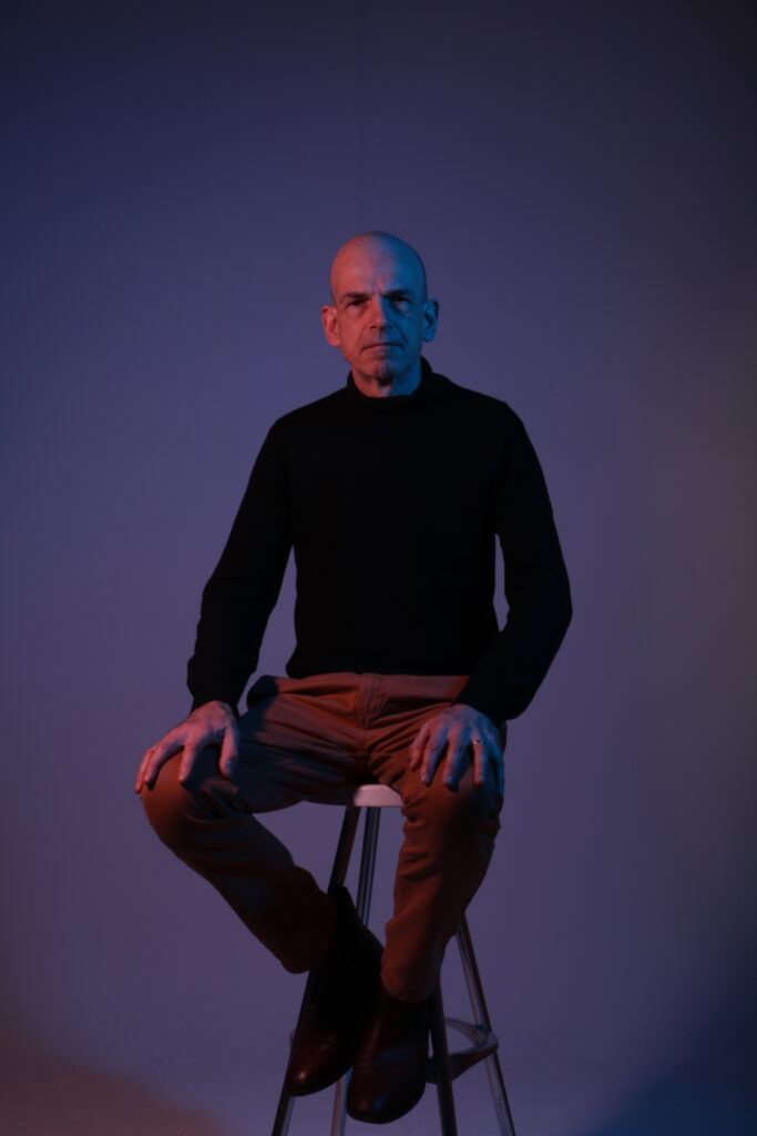
This was the first attempt at using a model to showcase the lighting on what they would look like sitting down. This lighting fit quite well, however I wanted the colours to be a little more neon as opposed to being more white. I have ordered a magenta colour gel to go over the light, but in the meantime I decided to alter the colour, hue and saturation of the reds to see what effect I could achieve with just a bit of editing.

As shown here, the colour looks a lot more like a neon pink by simply darkening, saturating and altering the hue to make it appear more neon. I also made the blue side slightly different with the same technique, but I like the natural blue more. However, I wanted to do this more practically, so I bought a pink colour that would pop more and be more neon. I also swapped out the blue for a clean sheet that was more vibrant and neon.
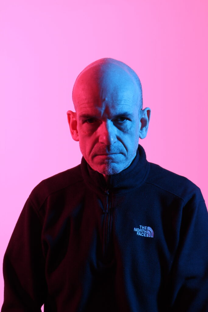
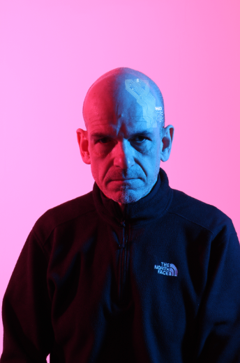
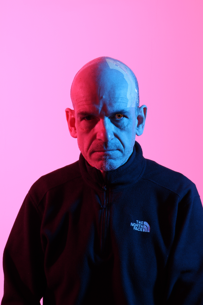
This is taken with the new blue and pink combination. As shown, the colour is much more vibrant and neon and it lights up the background more. However, I need to find a good flash combinations to blend the colours in the background to create more of a dark and purple colour to better suit the theme of the shoot. This is also the shot that I will be using to experiment with the editing of the image.
Image Editing: Layering and Blending
The main focus of this editing was not to change anything about the lighting or the model directly, but rather to create small additions. These additions were wiring on the head and a robotic looking eye. I decided to focus on the wiring on the head first, then the robotic eye.
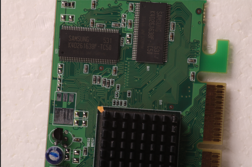
I first took a macro photograph of a motherboard. This allowed me to get a clean picture with crisp focus to take some of the wiring off to use for the picture.
This is the section of wiring I decided to take off. It uses a number with a fuse and has a lot of wires on it.
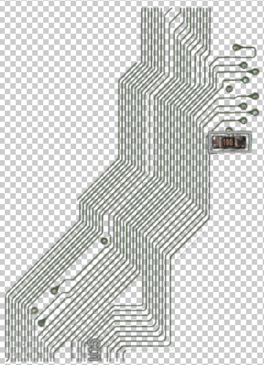
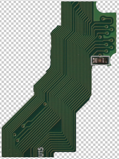
I used the colour select to select the darker parts of the green so it would be easier to blend.

I then added this to my main image.
After sizing it and placing it, I used the “Screen” blend to blend it in and make it fit.
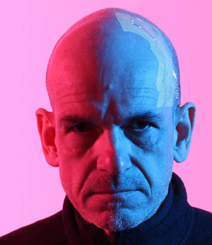
I then bent the wiring around his head with the warp transform to make it look better from the perspective.
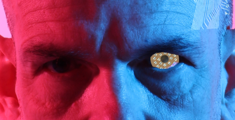
For the eye, I edited the part of the motherboard I scanned into the model’s eye and used the “Quick Select” tool to select his eye, then inversed it to get rid of the parts outside.

I then used the curves and used the “Auto” command tool, filled in the brightest and darkest colours on the blue side of the face to blend the eye in better.
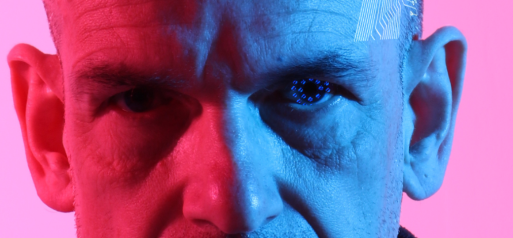
I then used “Lighten” to create a better texture and blend it into the natural eye better.
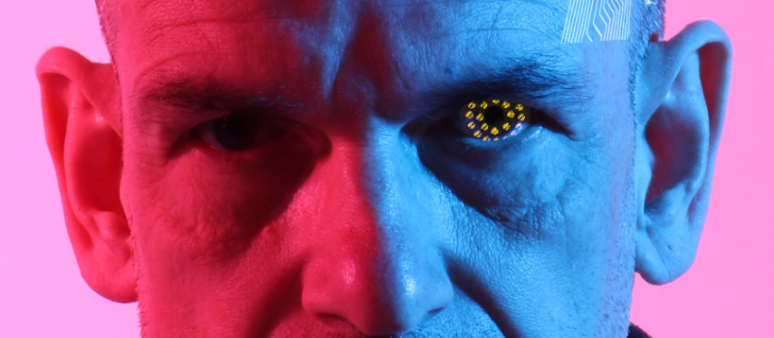
I used the Adobe Colour Wheel to find a complementary colour for the pink and blue in the picture. I then changed the eye to that colour by slightly saturating and hue shifting it. However, I felt like it didn’t fit very well and that is was too light. Because of this, I changed the colour
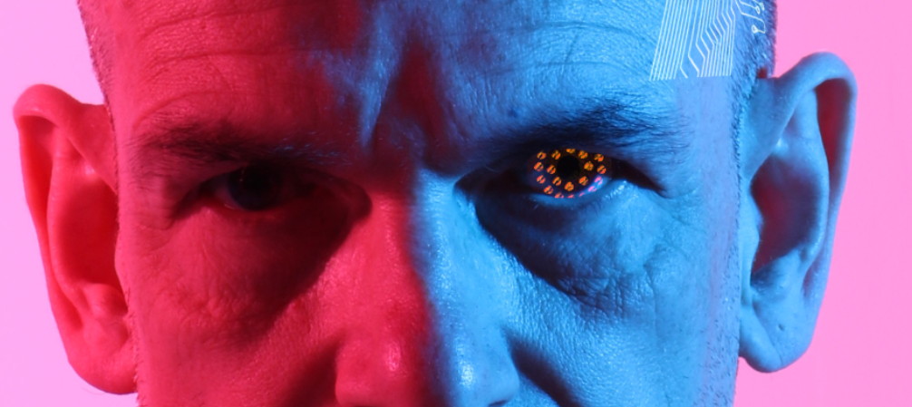
This is the colour I settled on. The orange doesn’t distract massively, but still stands out and goes with the other colours. This created the final image shown below.
Test shoot: How Clothes Affect Light
I decided to do a test shoot to figure out what clothes I wanted my models to be wearing. This could make or break the shoot because the light could affect the clothing differently, so I decided to do a shoot with a few different models wearing different clothes to decide what I wanted them to wear.
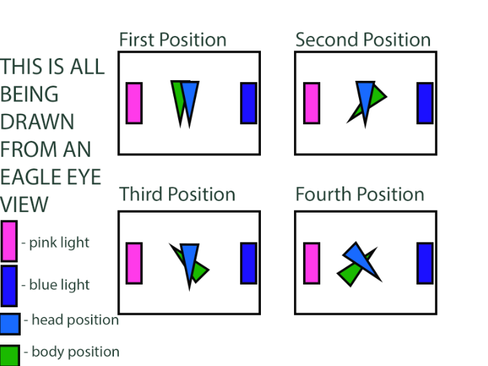
These are the positions that I used to get a feeling for how the different colours would look while keeping a constant so that I see how all the clothes are affected by light. I used hard split lighting with the right light being a blue gel and the left light being a magenta gel.
First, I started off with the black clothing. For this I used Emily, who was wearing a simple black polyester tank top. The light seemed to be absorbed by the top quite well while also bouncing off of it a bit, creating a nice blend. This preserved the dark tones of the image while also being able to add the colour from the lights into the clothing. However, it looks a bit flat and doesn’t create a whole lot of depth because of the flatness of the clothing.
For this next part I used Alice. She is wearing a dark grey polyester/cotton hoodie. The light bounced quite well again, but the dark patches were more prominent as they bent around the creases around the hoodie. This created a very cool effect where the dark spaces are maintained throughout the image and it looks amazing. However, the darkness that the black has is not as prevalent and is only formed by the folds in the hoodie. Because I will be using more fitted clothing for the shoot for the theme, the darkness created by the creases will not come into play.
Finally, I took pictures of Jess, who I decided I am going to use for my final shoot. The light grey clothing reflects a lot more of the light, creating minimal dark spaces. This made it so that the shadows weren’t nearly as prevalent. However, throughout this shoot I discovered that I wanted to use her as my main model alongside Mike because of the way she seemed naturally good for the role judging by her poses and the way the light bounced off her hair. Both of these observations made me want her for the final piece.
Overall, This helped me decide that using black clothing would be ideal for the shoot. It maintains a good amount of darkness while still showing off the light.