
Aqueous: Finding a Theme
To begin, I wanted to find a theme to focus on. Because my Specialist Industry Practice is in Advertising and Product photography, I decided to use the technique of a Lotus Blossom mind map to decide on a good topic to do. I used this to create 8 different topics and think of different things that I could do to expand on those ideas.
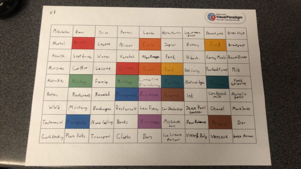
The 3 that I would like to mainly focus on are drinks, food and aqueous. I will be conducting a test shoot for each of these ideas over the first week to decide which one I like the style of more and which one I would like to continue doing. Alongside this, I will be doing research into the different areas to increase my knowledge in the specialisation for future use. With all of these topics, I will be improving my technique in physical prop making and altering, studio technique and camera control to ensure a good quality outcome.
Food
For this section, I will be focusing food photography. This will be mainly focusing on advertising photography.
Stuart West
Stuart West is a London based studio photographer specialising in food and drinks photography. He has worked with such people as Sainsburys, Ocado and Magnum Chocolate. His work is usually studio based with use of colourful backgrounds to match his subject.

This image features a single chip stabbed with a fork with some ketchup on it. It has a simplistic background, a yellow to match the chip while being different enough to create a contrast. The fork used here is interesting. Instead of going for the typical four pronged fork, he used a short three pronged fork reminiscent of the wooden forks commonly found is fish and chip shops across the UK, a staple of British culture. There is also some ketchup on the chip, a common dip to go with chips. This classic pairing appears reminiscent for the viewer, going well together like red wine and steak. It is shot from a front on perspective and is lit from the top left, shining down on the chip like the sun, another common theme of eating fish and chips on the seaside.

This image is of some peas that are arranged where the pods are slightly transparent. This is a very interesting way to show the peas, resembling an image in a microscope of tiny organisms. There is a natural reverse vignette stemming from the light being in the centre and coming behind the peas, moving outwards to a yellow-green hue to match the subject. The colour green promotes the idea of health and nature, with the latter linking back to the idea of organisms under a microscope. These peas also appear to be thinly sliced horizontally, mimicking a small sample of something, again linking back to the microscope idea.
Drink
For this section, I will be focusing on drink photography. This will mainly have a focus on advertising.
Martin Wonnacott
Martin Wonnacott is a London/NYC based advertising and product photographer originally from the UK. He had worked with some of the biggest brands in the world such as Coca Cola, Lipton and SmartWater. His work is a mix of studio based visuals and on location advertising shoots with interesting uses of lighting, framing and ideas.

This shot is of two Jack Daniel’s Coca Cola mixer cans colliding. The collision is in a typical “Cheers!” fashion, a familiar movement and action for most to understand. This is used to create the movement of the water, showing the condensation of the cans off, promoting the idea that the cans are chilled, cold and refreshing. There is also two different types of cans being shown, one regular and one with zero sugar Coca Cola, showing off variety. This shows that there is something for everyone. There is a vignette created with the red central lighting in the background fading out into black, putting the focus towards the centre of the image. The use of red is also very common around food and drink products, promoting the idea of hunger.
Mark Mawson
Mark Mawson is a London based studio photographer specialising in advertising and aqueous photography. He is known for his incredibly varied portfolio and interesting imagery, advertising for different companies such as Gap, Nespresso and Sherwin Williams.

This is an advertisement for Zero Sugar Coca-Cola. It features a Coke can covered in condensation. The condensation is used in conjunction with the text to write the slogan for the product “Incredible taste. Zero sugar.” The “Zero” is highlighted by being written from the condensation, adding to the idea of the drink being fresh and refreshing while also putting emphasis on the zero sugar as a selling point. There is also focus with the lighting on the O in particular, which also matches really well. The red colour palette is very recognisable as Coca Cola while also having connotations of hunger. There is also a tagline in the bottom right that doesn’t distract from the image while reinforcing that idea. This is also seen in the bottom right, where the brand logo is shown to reinforce the brand’s identity.
Aqueous
For this section, I will be focusing on aqueous photography.
Kim Keever
Kim Keever is a Florida based artist that uses his knowledge of science and engineering to create masterpieces. He was an ex-NASA employee with an extensive background in engineering who quit his job to pursue a passion in photography.

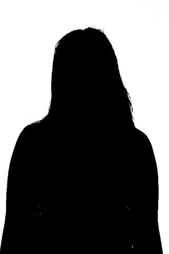
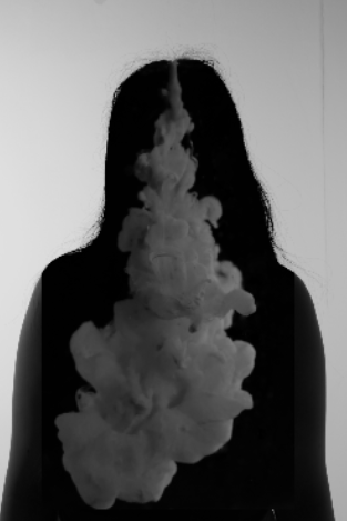
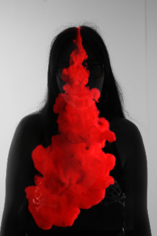
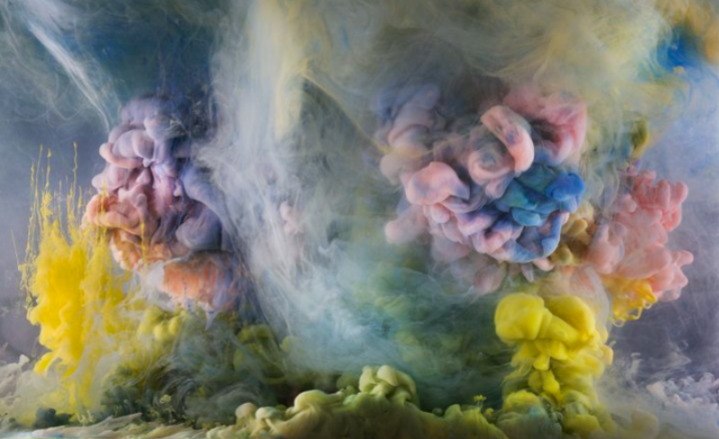
This piece shows a pale blue cloud. It is reminiscent of a more sab but solemn piece due to its colour. I personally see the idea of a ghostly woman emerging from the cloud itself, perhaps to look back on her life or to look down upon someone she left behind while moving into the afterlife. This is caused by the little details of the clouds, moving uniform but disjointed like curly or frizzy hair. I also like the use of framing, filling almost the entire frame with this cloud but having it slightly off for a bit of imperfection.
Mark Mawson
Mark Mawson is a London based studio photographer specialising in advertising and aqueous photography. He is known for his incredibly varied portfolio and interesting imagery, advertising for different companies such as Gap, Nespresso and Sherwin Williams.

This image is one of the collaboration pieces Mawson did with Sherwin Williams. It is composed of a silky cloud behind some text and an image of the paint can being advertised. The main focus of the image is the text, a white on a bold background created by the cloud. This cloud also matches the colour of the paint being sold, showing off the product in an interesting and creative way. The text is placed on top of the cloud, drawing your attention to both the text and the cloud at once without taking away from the overall image. There is also a link to the website below the can to make to easier for consumers to know where to purchase the product, giving access to people who may not have previously known of the brand. The use of the clean font is very fitting, being simple but effective. This all creates a very interesting image that is composed beautifully with the brand and consumer in mind.
Conclusion
Overall, all of these ideas would be interesting to follow, but I am leaning more towards combining two of the ideas. I am thinking about using a Mark Mawson style for the aqueous photography advertisement, but blending it with Martin Wonnacott’s style of drink photography. This could create some interesting visuals that I may explore in a future photoshoot to test out.
Aqueous: Photo Essay
For my photo essay, I decided to search up how people do photo essays in product photography. I found that a common method is to tell a story or explain the process of using a product through a series of pictures. This is a technique commonly found on pages like Amazon, where products can have a showcase. I will link a product that uses this technique.
I will be attempting to replicate this technique in a similar way by using some shots of a phone. I will be using my phone for it and will be learning how to create the various shots used in commercials for use in photography and various photoshop techniques that do not alter the appearance a lot but are still able to make the product look nice.
I will be using my phone for the shots because I have easy access to it. Although it is not brand new, because this is just a test shoot I an fine with using it to create a concept for what the full shoot could be like.
Creating a Shot List
The amount of pictures that are required is 8 for this photo essay. Because of this, I will be coming up with a simple shot list of ideas for the shoot. These ideas will be listed with a reference image that I will be using.
- The phone floating while spinning on its corner similar to the shot found in Kyle Nutt’s CASETiFY ad.
- The front of the phone and back of the phone overlapping like the first shot in this product showcase
- A side on view shot with just the front of the phone similar to the first shot in this article
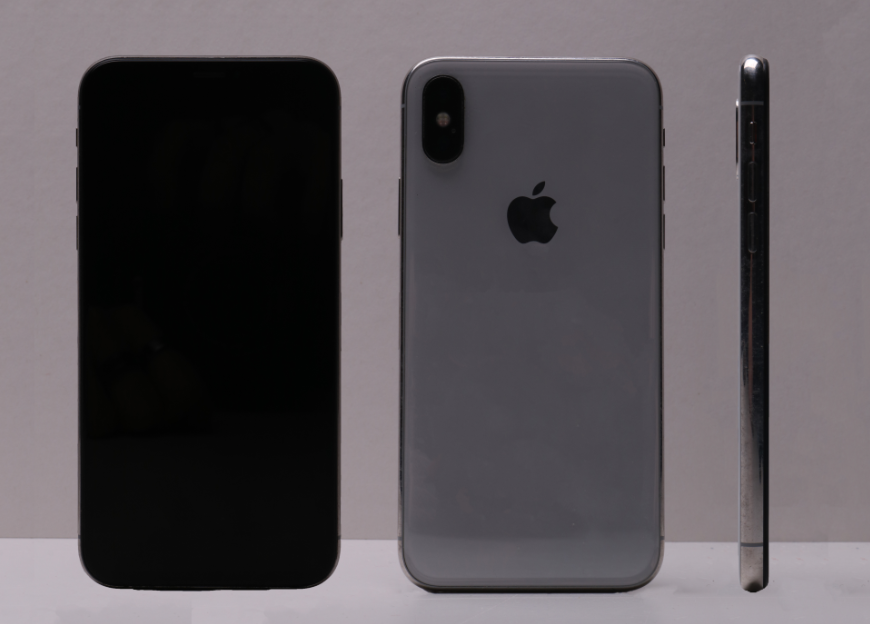
- The back of the phone, replicating this product shot
- A front, back and side view, replicating the iPhone 6 picture from this article
- A shot from behind a model of them using their phone, similar to the opening image of this article but from further back
- A simple front on view shot of someone holding the phone like the shot at the start of the advertisement on the Apple Website
- Showing someone paying with Apple Pay like the image from this article
I will be using these images to create a full show of the iPhone. Because of the style of video essays, I will be doing minimal editing.
Contacts
Finals
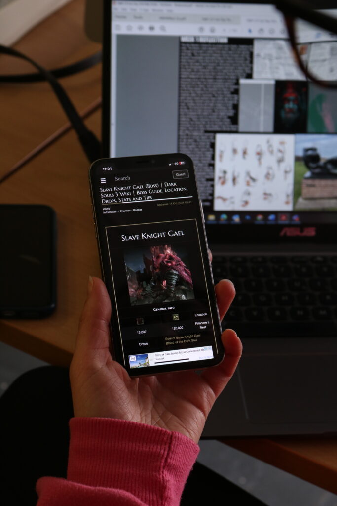
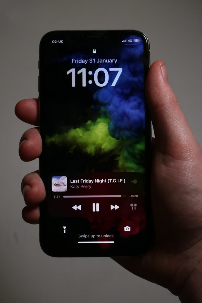
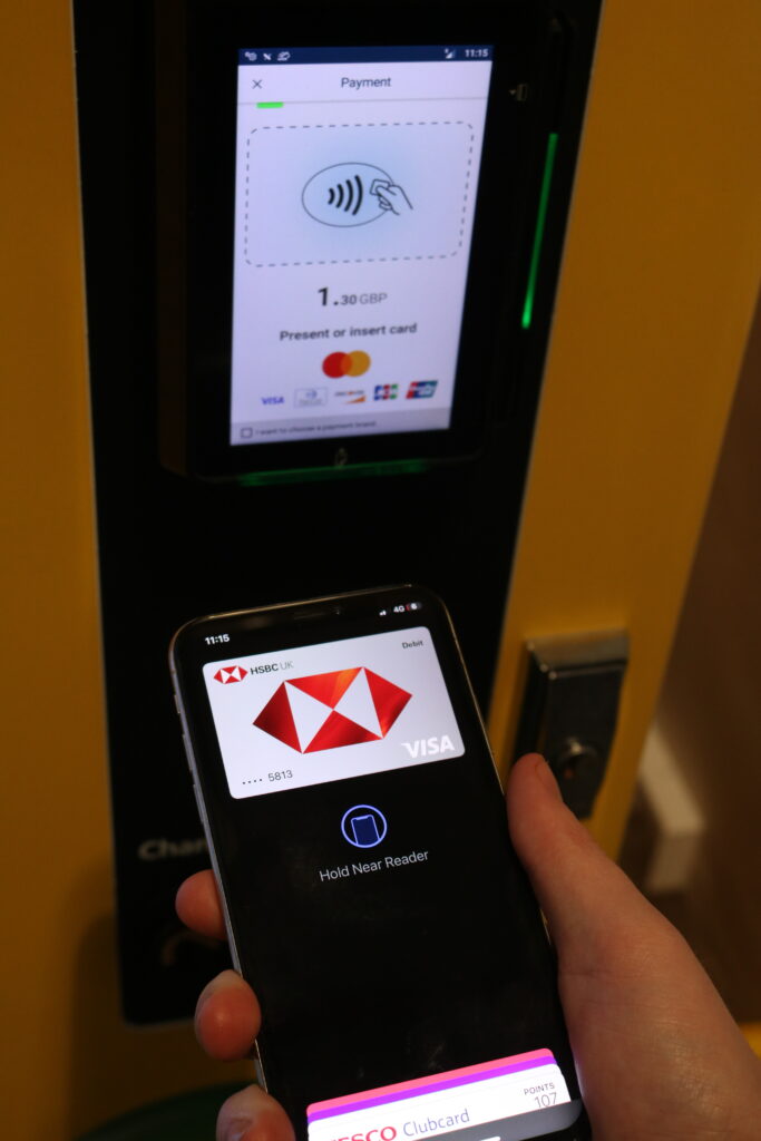
These are my finished shots. They leave a lot to be desired, but the only editing I did on them was changing some of the positions to create the shots. If I were to do a proper shoot, there would be much more thought, preparation and editing put in to make sure the outcome was good. However, I think that this is still able to show off the phone and explain some of the main features in the style of a story as a photo essay requires.
Conclusion
Due to the length of the project, a photo essay could be a good way to go about doing an advertisement. This could show off a product in a lot of different ways. However, I feel like this is more suited for things that have multiple purposes. With my plan to either focus on food, aqueous or drink photography, I do not know if this will be the best way to go about it. However, I will keep the idea in mind for the future.
Aqueous: Project Proposal
Aqueous: Pinhole Photography
For part of my experimentation, I will be doing pinhole photography. I will be doing this to try and discover ways I can create outcomes using out of camera techniques.
What is Pinhole Photography?
Pinhole photography is a style that uses a pinhole camera, categorised by its simple design of essentially being a lightproof box with a small hole to function as the aperture. This allows you to use multiple different forms of recording, such as using 35mm film or a form of darkroom paper to create your image. The pinhole camera itself can also be created using a multitude of methods, the most simple being to lightproof a coffee tin or some other tin with black paint, poke a small hole in the side and placing a piece of light-sensitive paper inside. This will allow you to expose the paper to a form of light that can then create an image.
How does it work?
The basis of a pinhole camera comes from the concept of camera obscura. This is a natural phenomenon in which the rays of light passing through a small hole (aperture) into a dark space form an image where they strike a surface, resulting in an inverted (upside down) and reversed (left to right) projection of the view outside (Wikipedia Contributors, 2019). This is also used in digital cameras and film characters, but the pinhole camera uses the bare principle of camera obscura.
What do they look like?
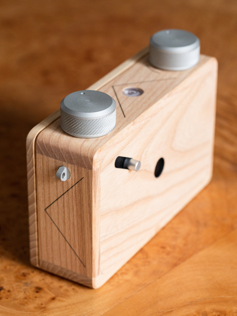
This is an image of a well made pinhole camera. It was designed by Ondu Pinhole, a camera design company that specialises in pinhole. This is the Ondu 6×6 Mark 3 Pinhole Camera that uses 120 format film to expose the image. As you can see, the designer has used a box of similar size to a small camera body to keep the weight down for the camera, weighing just 350g.
Why Pinhole Photography?
I decided to use pinhole photography because it creates some really interesting looking landscapes that can be used for things such as fashion advertising or backgrounds on bottles. It also can link into using cyanotypes by inverting the image back and cyanotype it onto something like a tshirt to advertise.
My Attempt
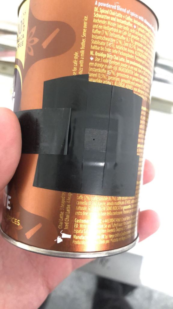
To start, I needed to create the pinhole camera. I first removed the coffee and painted the inside black. This made it so that the reflective colour on the inside would not disturb the image.
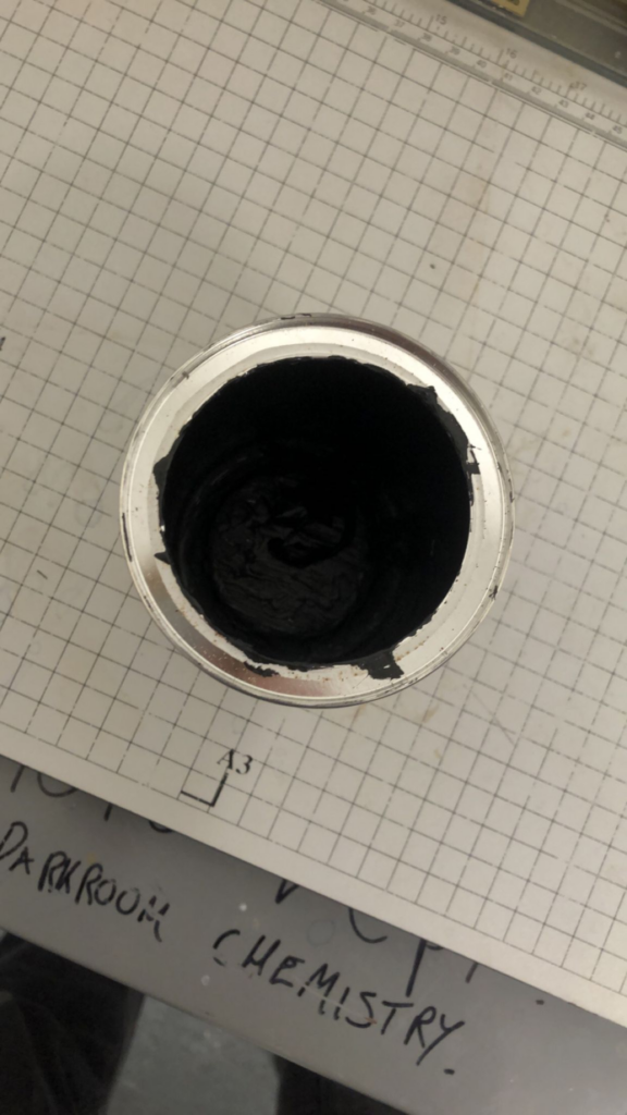
To make sure no light could come through the top, I taped the lid of the container with electrical tape.
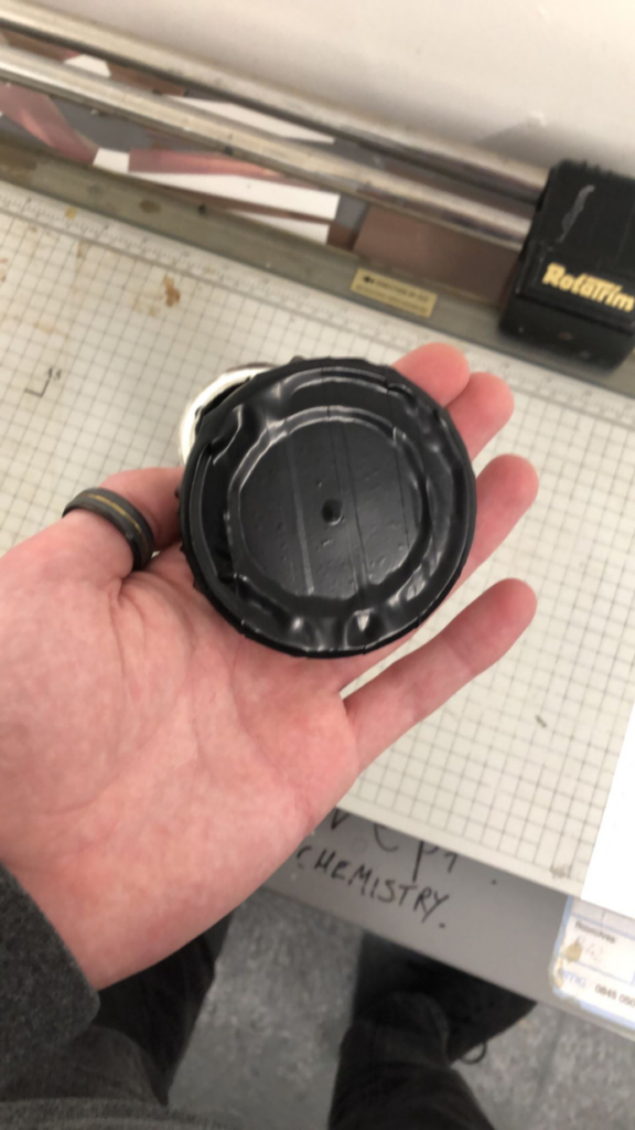
Now to create the pinhole, I bored through the container on the side with a hand drill. After carefully removing the sharp metal, I placed a small piece of card that I would use for the hole. I taped it to the container and poked a small hole using a pin, hence the name “pinhole”. After this, I added a piece of tape I could use to cover and uncover the hole to mimic a shutter.
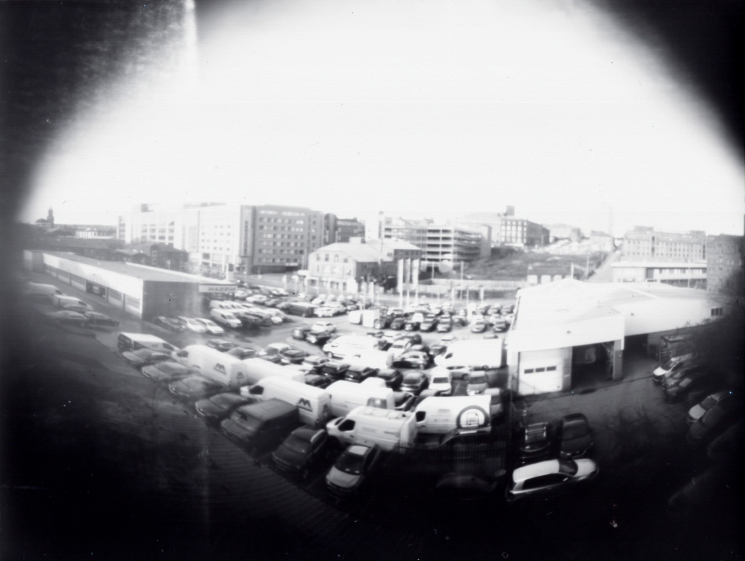
Now, it was time to shoot. I decided to test, I would use a space just outside of college that had a wall with a view of the city. I did this because there was a lot of variety. There were signs, cars and buildings with intricate details which allowed me to see how much detail the pinhole camera could capture. I decided that timing the shots was best, so I used a 15 second, 20 second, 30 second and 40 second shutter time.
After I took these pictures, I developed them in the darkroom. The process for developing is fairly simple. You first use the developing fluid for about 30 seconds to a minute. This reacts with the paper to turn exposed parts of the image black.
Next is the stop bath. This is used to prevent the image from further developing by halting the process. The image is usually left in here for about 2 minutes.
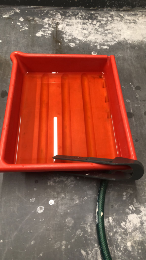
The final liquid is the fixer. This prevents further exposure and protects the paper, making it permanent. You would try and leave this in for a while, so I left it in for about 15 minutes.
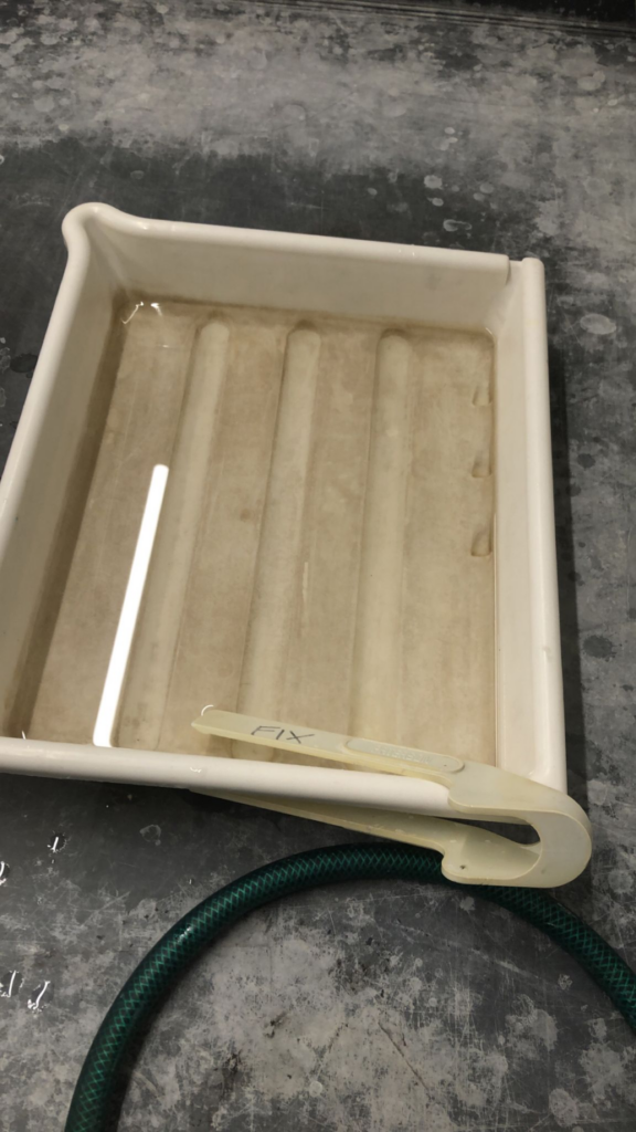
After this was done, I put them in a water bath and left them for about an hour. I then put them on the drying rack and left the finals to dry overnight and collected them the next day. These are the images from top left to bottom right.
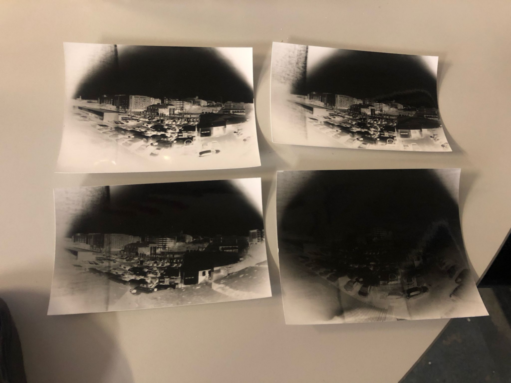
Because of the sunny conditions, I did not have to activate the shutter for long. The 40 second one was way overexposed, the 30 second one was still quite overexposed and the 20 second one had bad framing due to the placement being slightly off. This left the 15 second one, which had the best exposure of the bunch. It managed to capture a surprising amount of detail, down to the windows, the logo on a van and signs. To further develop this idea, I scanned the best one and put it into Photoshop to invert it.
This created an effect similar to old film cameras and reminds me of a style you would see in a locket your grandma owns.
Conclusion
Overall, this was an interesting experiment to do, but I do not think it has much application in the style of photography that I want to do. To link to advertising, it could be interesting to advertise a shirt with these style of pictures pressed onto them, but I am not focusing on fashion style advertising, so I will not explore this further. However, this could be interesting to explore if I was going into fashion.
Aqueous: Work for the Holidays
To begin, I will be doing some simple aqueous shots to get myself back into doing this style of photography. I start by using the setup described in my test shoot page.
Test shoot 1
Setup
I decided to use green for this first test shoot on a white background. I had no reason to do this because I was just getting used to doing it again and green is my favourite colour. I used 1/200 shutter speed to freeze the pictures aswell as using a simple f5.0 and 800 ISO. This created images that looked like this.
first shoot green shotsDownload
Thoughts
These shots were ok, but I had numerous issues with them that I wanted to fix. The first issue was the background. I much prefer using a black background for a few reasons including that it makes the colour pop more, the depth is much better and that a dark background complements the feel of the clouds not being made with water. I also made the consistency a bit too thin, so near the top of the clouds you can see some fraying. I think that my use of space could’ve been better by putting the camera closer. By putting it too far away, I was making the usable area smaller so my picture would have less quality. I also had to place the container far away because I was using a 55-250mm lens, which would only focus at large distances. This meant that although I was using the small box, I still had to use the self timer mode which meant I could only get 10 shots each time.
Plans for the next shoot
Overall, it was a good shoot to get back into things, analyse and move forward with these plans in mind. I will be using a different colour, changing the background to black and switching my lens to try and improve the images.
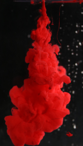
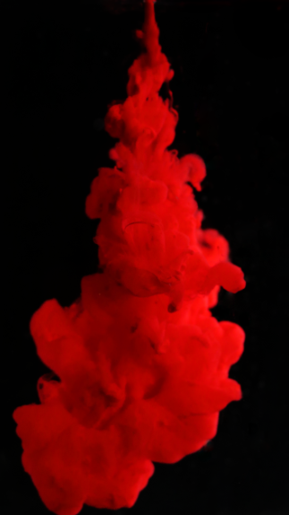
Test Shoot 2
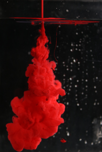
Setup
To follow this shoot, I decided to take the advice and things I had learned previously and apply them. I switched up the background which complemented the colour better, I used an 18-55mm lens so I was able to place the camera closer meaning that I was able to use regular continuous shooting and I framed the pictures better so I was able to get a higher quality image. I switched to using red this time because I find that the a deep red can produce some very nice silky looking clouds that would be quite good in advertisements, such as the Loreal advert produced by Mark Mawson. This produced the following images.
second shoot red shotsDownload
Thoughts
This shoot went much better than the shoot before it. Using the black background with the red made a much better contrast and the red looks nice. The focus leaves a bit to be desired, but it isn’t awful. The reason that the focus can be off is because you have to use a separate item to focus on in the water before you fire off your paint. This is because autofocus does not like to work well when doing this style, so focusing before is your best bet. However, the focus can be fixed by simply doing more shots. I also would like to fix the bubbles that were appearing on the tank. This is caused by the process of emptying and refilling the tank. If the tank is wet before you fill it, air pockets can be created which can show up on the front and back. This can be fixed by using a dish sponge and gliding it across the walls of the inside of the tank to clean them off. In my next shoot, I will be experimenting with using multiple colours in the same syringe and seeing what effect that can create.
Plans for the next shoot
In my next shoot, I will be experimenting with using multiple colours in the same syringe and seeing what effect that can create. I will be using colours that are follow by colour theory to make them look as appealing as possible.
Test Shoot 3
Setup
For this shoot, I will be using multiple colours in the same syringe. I decided to use red yellow and blue, the primary colours for this because those are the acrylic colours I had available. Unfortunately, my focus was not very good during this because I misplaced the thing I normally use for focus so I had to eyeball it. This produced these shots.
third shoot primary shotsDownload
Thoughts
As you can see, the colours did not blend very well together. This is because the blue was much darker and more dominant, so it was the main colour that was showing. It did not create a progressive ombre, instead mushing together in a very unappealing way. Because of this, I will instead be keeping colours separate. This allows me to keep them clean looking. However, I will be experimenting with using multiple colours in separate syringes in future test shoots.
Plans for the next shoot
For my next shoot, I will be attempting to use a different technique for capturing the clouds. My camera has a video function and I will be using that to capture the clouds. This is because my camera is able to take about 5 pictures a second whereas it shoots video at about 25fps. This means that I will be able to get many more frames for use because I will be able to use the stills from the videos I get for the final product. I will also attempt to slow these down in an editing software to get a better look at the individual frames.
Test Shoot 4
Setup
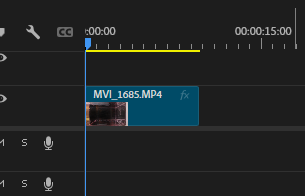
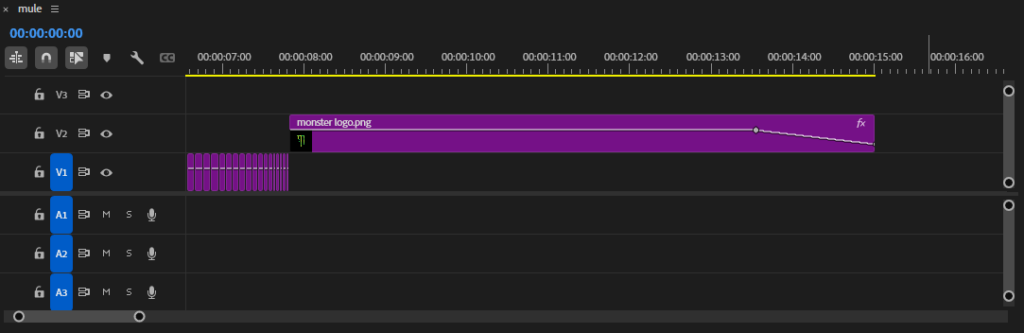
For this shoot, I decided to use the video camera function. I did this in portrait mode because of the shape of my tank and changed the orientation in editing later. I used a black background with red paint for this shoot because I know it works well. After shooting the video, I put it into Adobe Premiere Pro where I would be editing it to alter the orientation and slow it down.
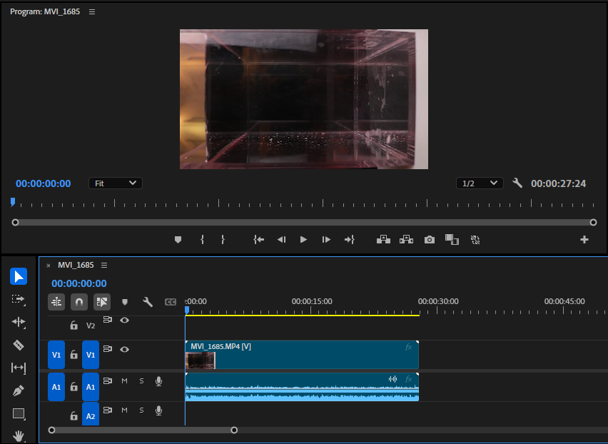
I started by highlighting just the audio track with Alt-Click.
I then removed the audio. This is because I will be experimenting with creating my own audio at a later date.
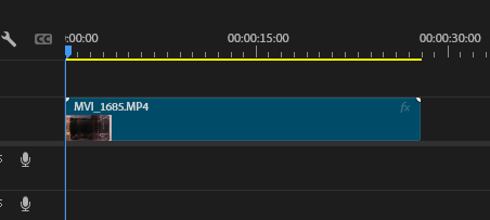
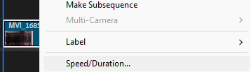
I then used the Cut tool to cut my video to the desired length and removed the excess.
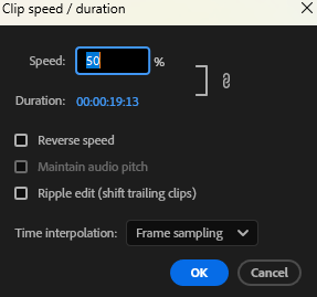
After this, I went into my Speed/Duration settings to alter the video speed.
I then changed it to 50% so the video would move at half speed.
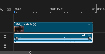
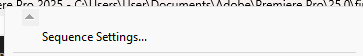
To rotate the image, I needed to do some calculations to make it fit. To begin, I went to the Sequence settings to find the current aspect ratio and pixel count.
After this, I used a ratio counter to find how to alter the dimensions of the video in relation to the golden ratio.
I then used this information to create the bigger video area for my cloud.
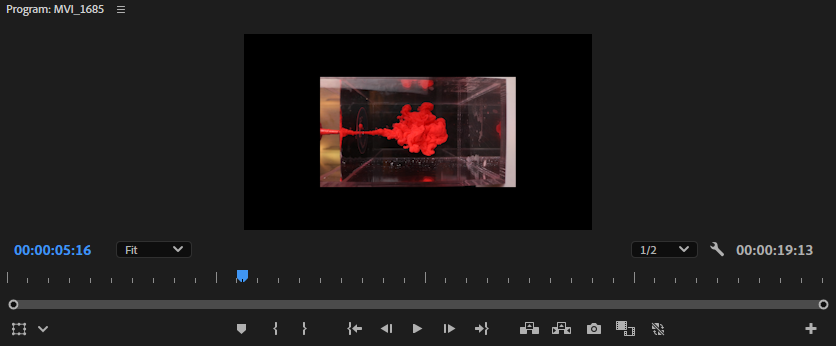
After this, I used the Rotation alteration in my Effects panel to turn the image.
This made the video look like this.

After all of this, I exported the video. This is how it turned out.
This shoot went quite well overall. I was able to get a lot more range of the clouds because of the higher fps. This meant that there were more overall shots
Test Shoot 5
Setup
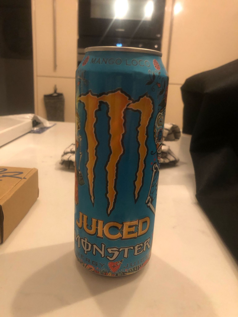
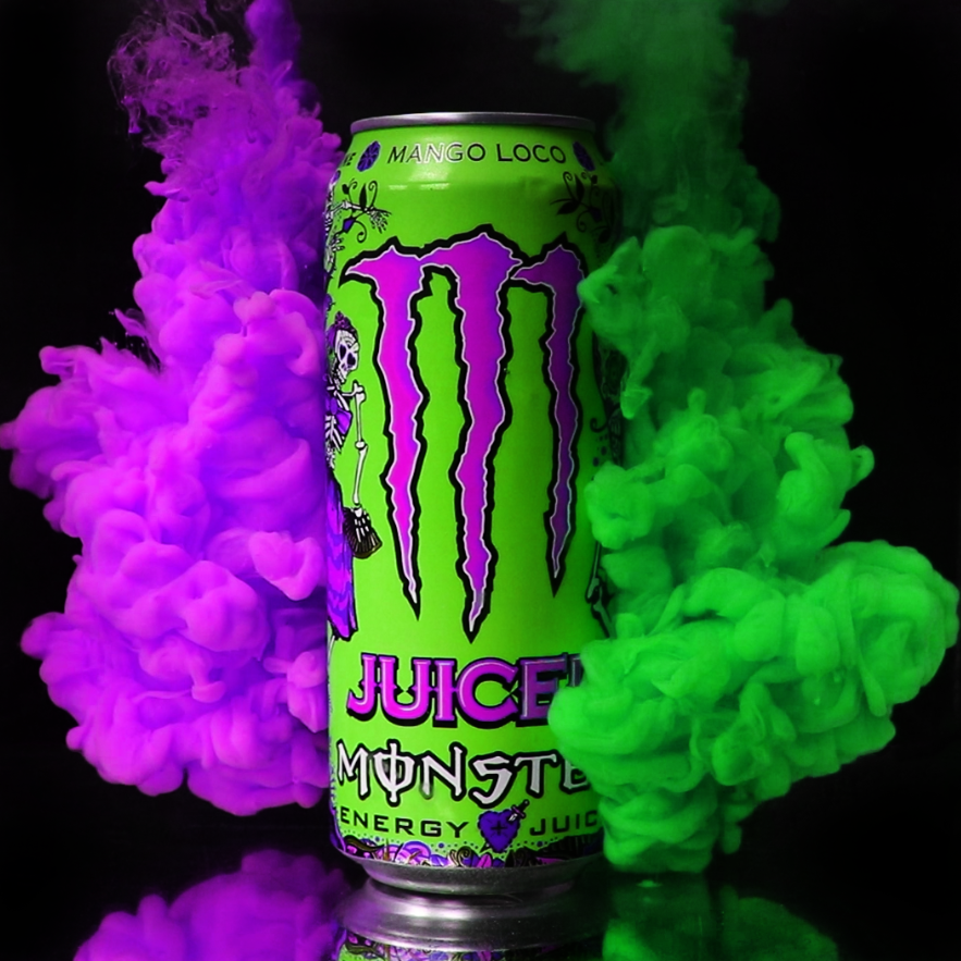
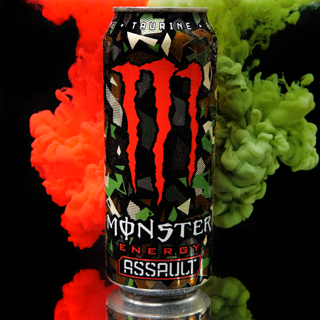
For this shoot, I changed the setup by using a bigger tank shown in Aqueous: Test Shooting. I stuck with using the video format because that allowed me to take advantage of a higher FPS, albeit with diminished quality because of the limits of video with my camera. However, I plan to get a higher quality camera that will be talked about in Aqueous: Main Idea. For now, I used a Monster can I had on hand and some acrylic paint I had to create this shot. I slowed it down to 50% to see every frame, but when I shoot on a higher FPS camera this will not be an issue.
This shot came out very well. I was able to use the stills I got from it to complete some edits shown in Aqueous: Test Shooting. I will be continuing to use this technique for my shoots going forward.
Aqueous: Test Shooting
To do a test shoot for my aqueous photography, there is a few things that I normally use. I will be guiding you through this process of how I will be shooting for the remainder of the project.
Equipment
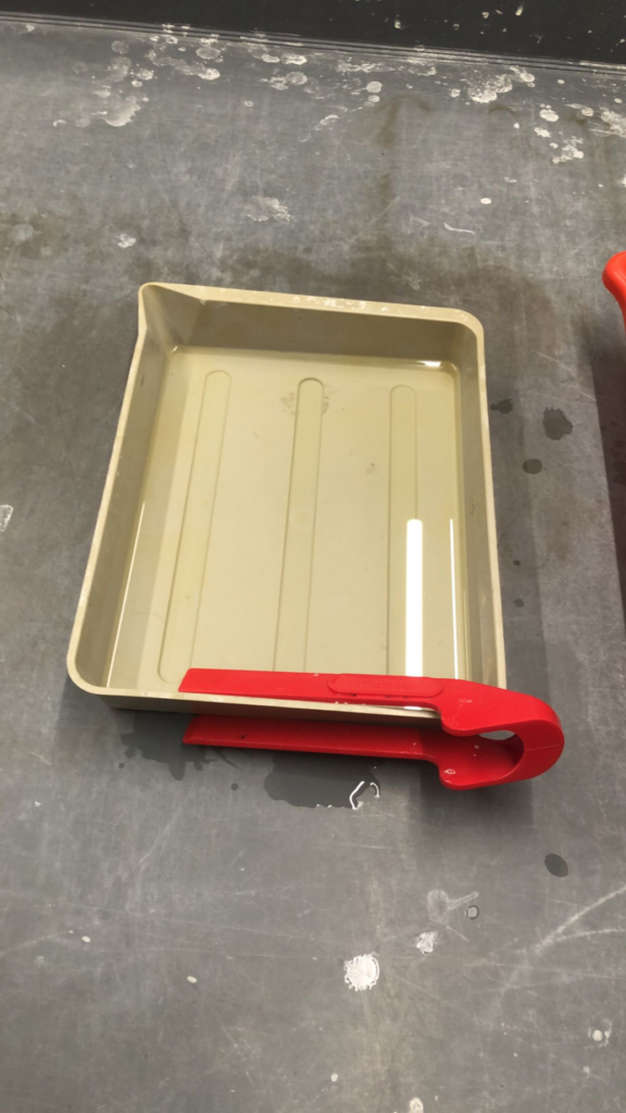
To begin, the equipment I use is very important for what I do. I typically prefer to use softbox lighting for the shoots because I think that it looks a lot cleaner. This is because softbox lighting provides a more smooth and even light to the entire image. I have experimented with using dishes in the past and it doesn’t work as well in my opinion. I will typically only use one of these lights because you don’t normally need more than one. I also like to stay away from using flashes for this because the flash can normally not keep up with the continuous shooting used in aqueous photography.
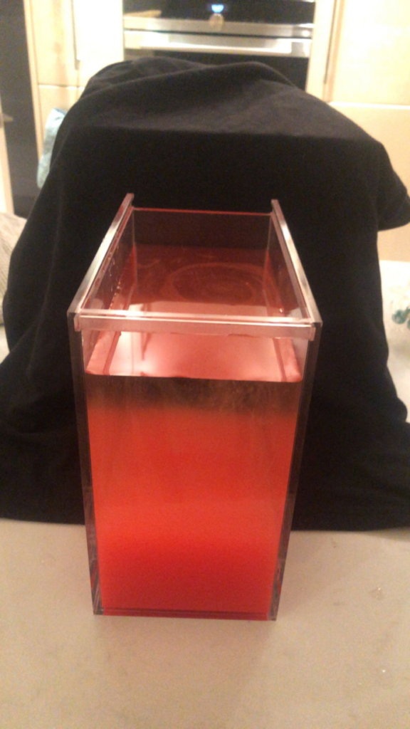
For a choice of tank, I found that using a small acrylic box was a good idea for it. I use this because it is big enough that I am able to capture the full cloud while being small enough that its not a massive pain to empty, clean out, dry and refill during the process. However, I will sometimes use a bigger cubed foot acrylic box
Paint
For the paint, I have found that acrylic tends to do the best. I have attempted to use other substances such as condensed milk and ink, but mixing acrylic paint with water is able to create a nicer effect without whitewashing the colour. With condensed milk, the colour is usually not vibrant enough when using things such as food colouring and ink is not thick enough as well as being more expensive to get.
I will mix the acrylic beforehand with water and work to create the desired colour and viscosity. If you mix it with too much water, it will be very thin and the clouds will appear almost transparent in some cases. It also does not create the rolling cloud look we are looking for. If you mix it with too much paint, it will be too thick and will come out in more of a line and will not split apart and dissipate into the clouds we are trying for. It is also very important to mix it just before you take it out into your syringe, because if you do not it your cloud with have little bits of solid paint coming off of the main cloud, which makes it look like it is breaking apart.
Method of Delivery
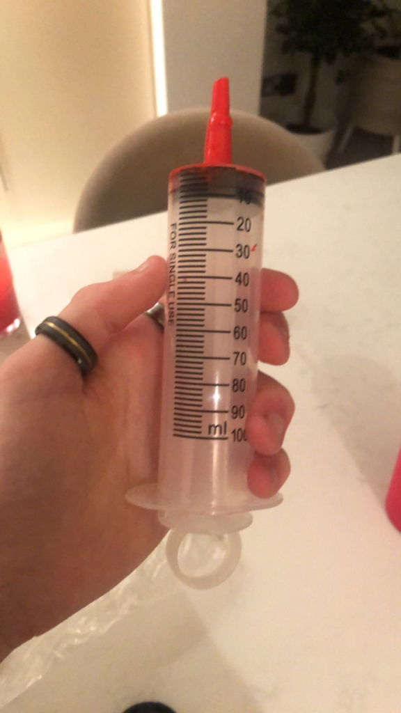
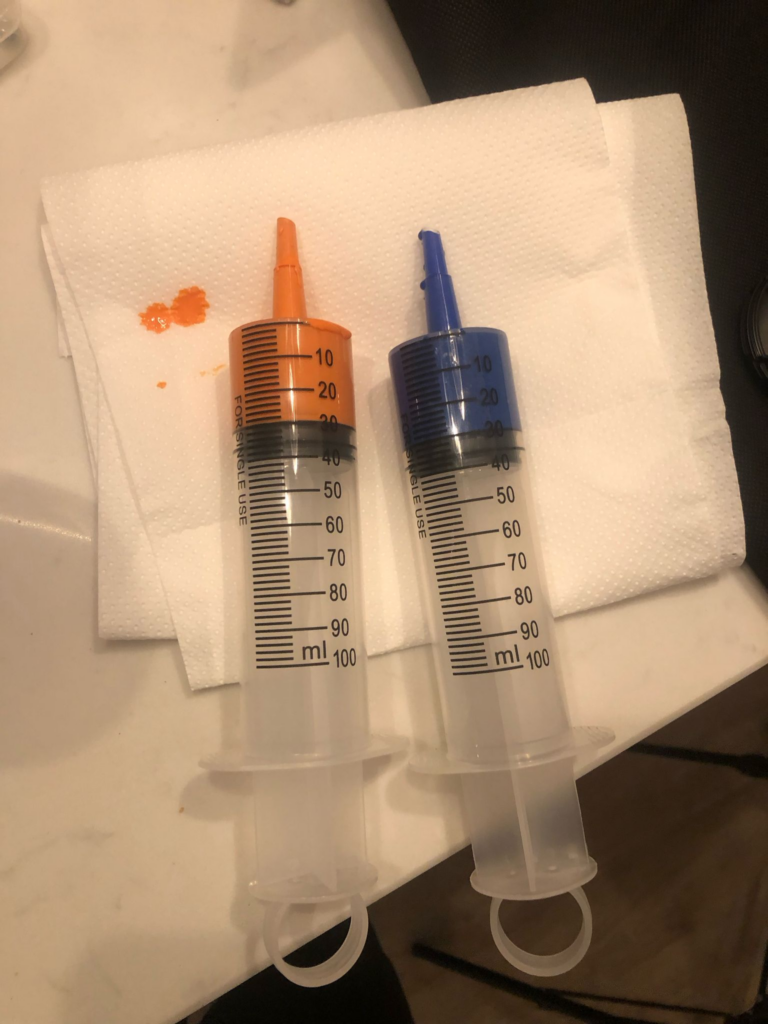
To deliver the paint into the water, I typically use a big syringe. I used to use a smaller version, but because the nozzle is bigger it creates a more continuous spread. However, I still use the smaller syringe when using the smaller tank because I do not need as powerful as a stream. When using the smaller syringe, I will use about 5ml of liquid for the stream and when using the bigger syringe, I will use about 30ml of liquid. I have found that these typically create a good balance of being enough to make nice clouds and not overdoing it to the point of where it becomes too big and too much to clean up.
Camera Settings
I will use most of the same camera settings when I do this style of photography. Because the idea behind this style is freezing the image, you want to focus on using a high shutter speed. I like to hover around the 1/160-250 mark when doing this style depending on the light level. I also use a fairly small aperture so the entire image is able to be in focus. This is very good to have when doing this style of photography because of how much depth there is to it, so it is important to make sure everything is focused. I use around 800 ISO for this because I do not use flash, so quick bursts of light are not available to me for easy bright lighting. However, I do use a bright box light so my ISO can comfortably sit around 800, preventing any grain on the images.
The Setup
The setup for the shoots are very similar. However, the difference comes in the uses for the different boxes. When I use the smaller box, I am normally trying to isolate just the cloud on its own. When I use the bigger box, I am usually promoting a product, normally some kind of or bottled product.
Small Box
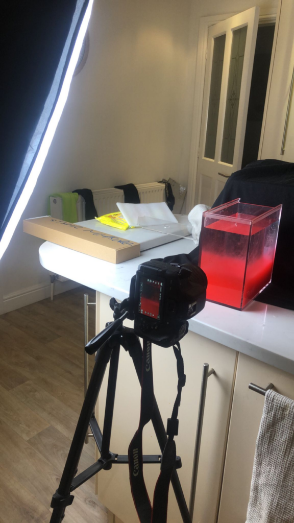
To begin with, I will set up the area of the shoot. I like to do this near a sink so I have easy access to water both to fill and drain the tank. For this example, I will be using a black backdrop. I place something behind the tank to drape the backdrop on and I place the box in front of it to create my shot.
I will then setup my camera in position to check that everything will look fine and is composed correctly. I don’t worry too much about anything around the edges because I know that those can be simply cropped in Photoshop. I shoot in portrait with the smaller box because I am focusing on just one stream of paint and it means that I will get a higher quality than if I was to shoot landscape and crop the edges out.
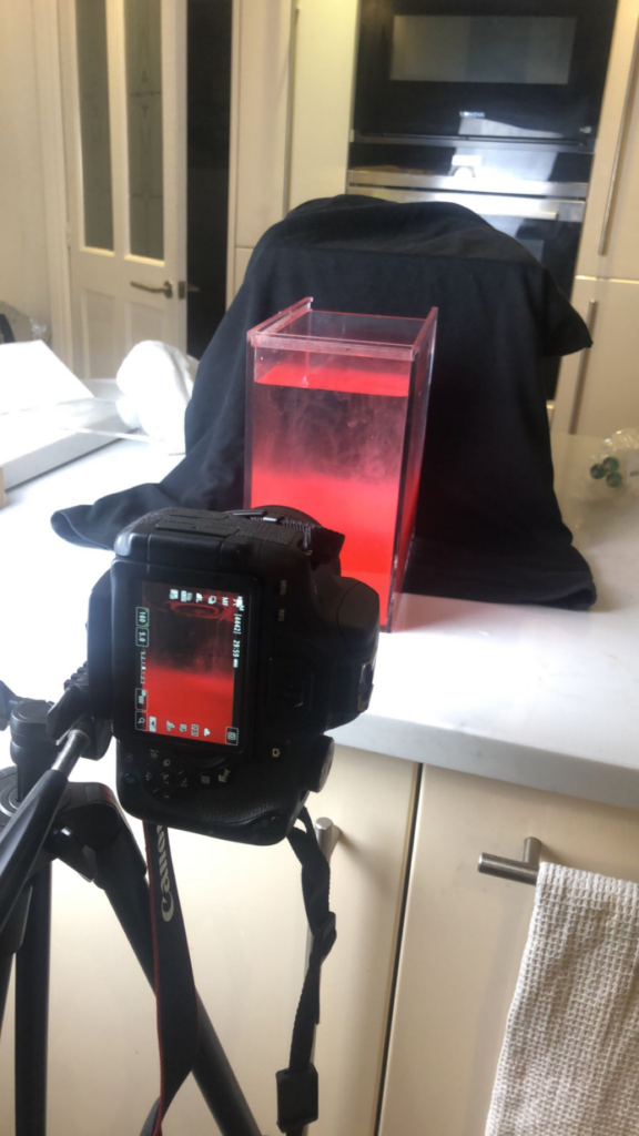
After this, I will set up my lighting. For this shoot, I was placing the box light looking straight down on to the box at an angle. This made it so the subject was lit, but so the reflection of the light wasn’t shown in the box.
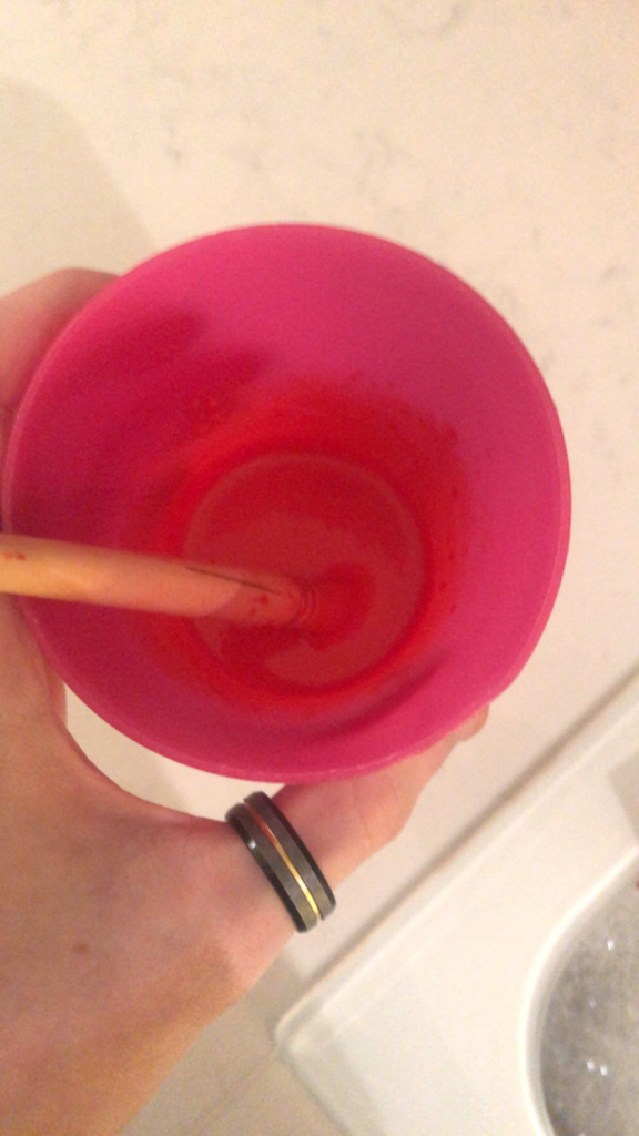
After this, I will make my mixture. I use a plastic cup that is easy to clean to create the mixture and add equal parts water and paint. I will then adjust from there stirring with a paintbrush until I have a completed consistency
I will then load it up in my syringe. For this shoot, I was experimenting with using my bigger syringe on the smaller container.
After this, I will fire the paint into the container while holding the shutter button on continuous fire. If I am using multiple colours with multiple syringes, I will use the self timer to give myself time to get ready and let it fire off 10 shots. However, I only use that method on the smaller tank because the 10 shots are too little of an amount for use in the bigger tank. With continuous shooting, I will usually get a roll of raw pictures that look like this.
After I get my shots, I will drain out the tank, clean it so there is no residue of any paint with a sponge, dry it so no air bubbles are created and then fill it back up and repeat.
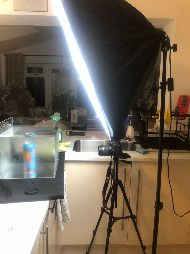
Big Box
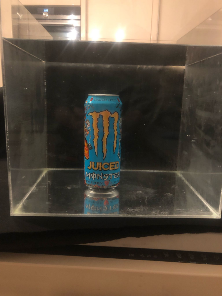
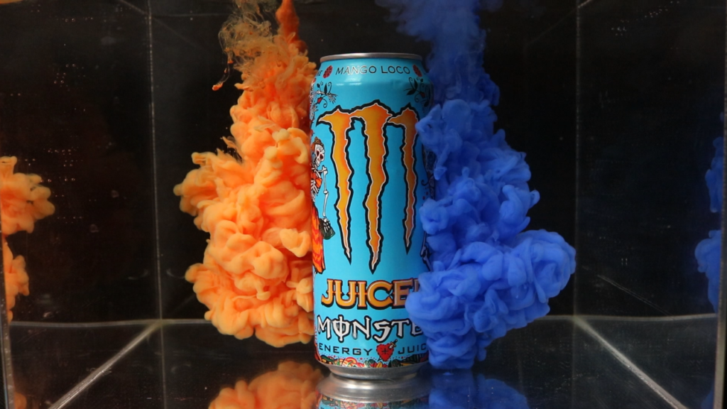
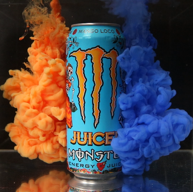
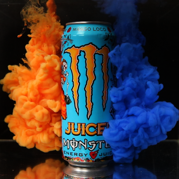
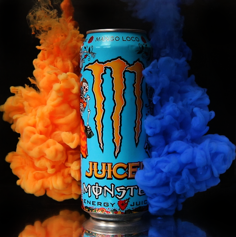
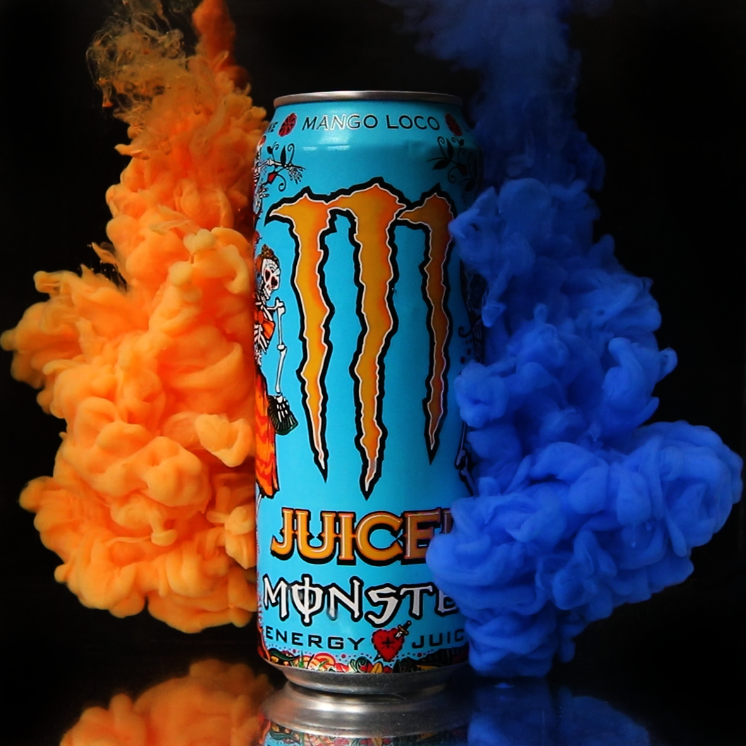
For the big box, a slightly different approach is taken. For this example, the product I will be using for the advertisement is the Mango Loco Monster Energy Drink.
I will still start by preparing the background and placing the box on the background to setup my shot.
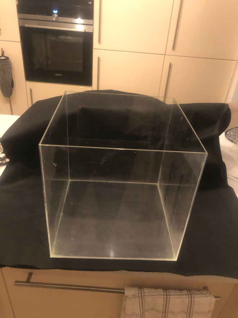
I will place the camera in front of the box, but I will be doing it in landscape this time. This is because the box is much larger so I will be focusing on making the shot more wide to use more of the space that I have. I am also going to have 3 components to this shot; the can, the left orange cloud and the right blue cloud. I also decided to use a polarising lens on this shoot because there was a slight reflection in the box that I didn’t want to interfere with the shot.
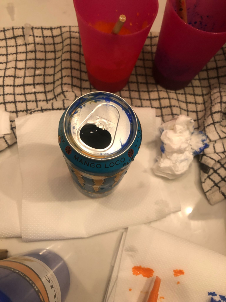
To prepare the can, I had to think of a way to keep it in the water. To start, I opened it and drank all the liquid inside.

I was looking around for something that I could find that was solid. I did not want to waste anything liquid and I had nothing in a high quantity that was dense enough to make the can stay down while submerged in the water, I also figured that if the thing I placed in the can was liquid, it could spread into the water and ruin the shot. To combat this, I found some old metal nuts that I used in a previous shoot.
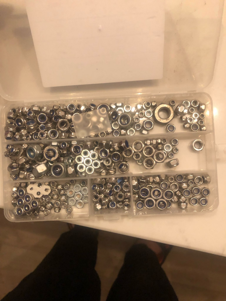
The nuts were way more dense than the water and were able to fit into the top of the can just fine. They were also cleaned so there were no bits of dust or anything that could seep out into the water, so I transferred all of them into the can. After this was done, I set up my lighting in the same way as before to avoid reflections and filled up the tank with cold water. To test the can would sink, I placed it inside the tank and it stayed at the bottom.
I then prepared my colours in the same way as before, using my plastic cups and paintbrushes.
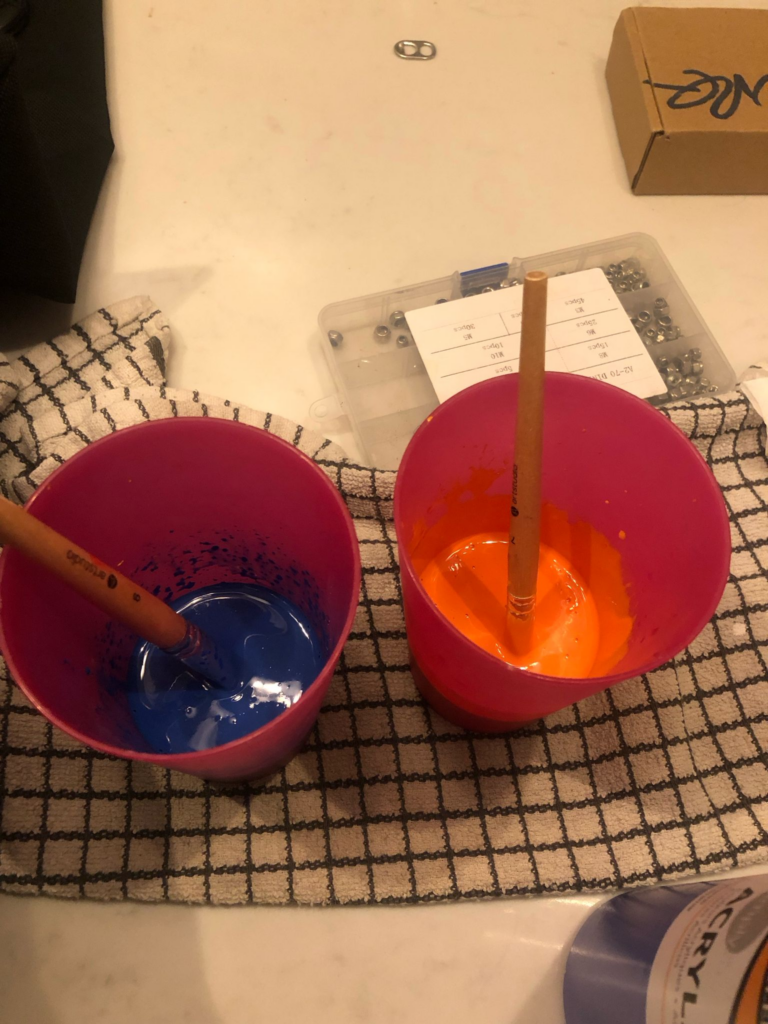
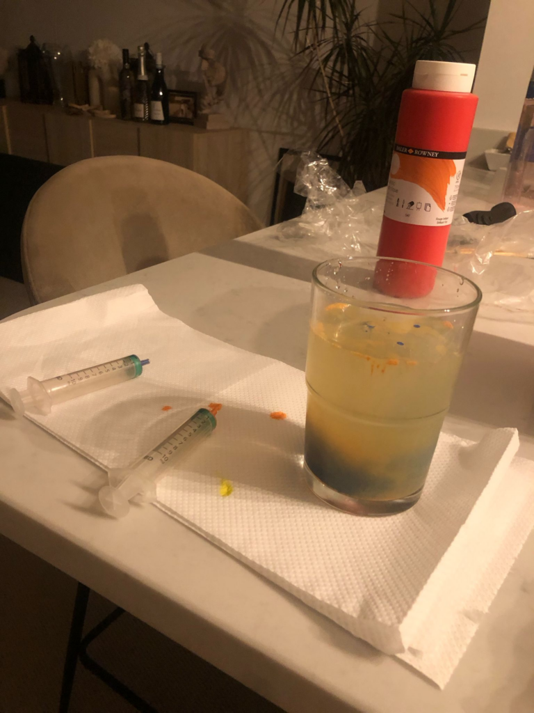
To test the consistency, I used a glass cup with some water in and two small syringes. This allowed me to see how the paint would move in water without having to clean out a whole tank.
After making sure the consistency is good, I prepare the big syringes. In my first shoot, I was getting a lot of stringy bits coming off of the paint clouds. I discovered that this is because in-between the time that I mixed the paint and me preparing everything else, the paint has sunk to the bottom so the consistency had changed, causing the mixture to become thinner. To fix this, I stir it for a few seconds just before I put it into the syringe. This makes the consistency perfect again and ready to be used.
When it came to shooting, I noticed that the shot had become very cloudy. I noticed that it wasn’t the water being cloudy, but the tank itself.

A short term fix for this was to use some window and glass cleaner on the tank. Combined with a microfibre cloth, this made the outside look normal again.
However, the issue persisted when I did more shoots. This was only affecting the big tank and not the small tank, so I was very confused. I eventually figured out that because I was using cold water, it was turning the tank very cold. Because the acrylic isn’t very thick on the big tank, it was very easily getting cold, causing the warmer air outside of the tank to condensate, creating a fog on the outside of the tank. This wasn’t present on the smaller tank because the acrylic was much more sturdy and thick. Combined with the smaller quantity of water and much quicker filling time, the issue was not in any way present. This was a simple fix, I just had to fill the tank with lukewarm water so condensation didn’t take place.
After this, the cleaning process is similar. I use Q tips and paper towels to clean the top of the monster can and drain it of water to make sure that no excess paint from it goes into the next batch of water.
I then empty out the water by using the smaller tank as it is much easier to carry. I clean out the paint in the same way as the smaller tank, using paper towels. After this, I refill the tank and set up for the next shot.
For my test shots, I decided to use a different strategy. Because both of my hands were used for the syringes, I was not able to hold the button for continuous shoot. However, I was also not able to use the self timer continuous because it only provided 10 shots. I would need much more if I wanted to get a good turnout. Because of this, I decided to experiment with using video on my camera. I was not sure of my camera’s video quality, so I used this shoot as a test for it. My idea was to take stills from the video and use those for edits. To slow down the video, I simply took it into Adobe Premiere Pro and altered the speed to 50%. The framerate looks very slow because I discovered that my camera shoots video in 30 frames per second, but that wont be an issue for this style. Below is the slowed down video.
Editing Practice
To practice the style of editing I will be using for the main picture, I will be using one of the stills from the video I took above.
To begin, I cropped the image into a square. I also straightened it in relation to the tank to make sure it was even.
I then burned the shadows. This creates further depth and contrast for the clouds while also making the colours pop without further brightening the image.
I then removed imperfections from the image such as small specks of dirt, differences in the background and the edges of the tank.
I looked at the reflection in the bottom and did not want to remove it, but wanted it darker, so I burned the reflection slightly to make it blend better. This created the final image shown below.
Hue Experimentation
I decided to experiment with different colour combinations following this style. I did this on this image because the colours blue and orange go very well together, using a common form of colour theory known as complementary colours. By altering the hue, I am able to discover other shades that go well together with this complementary style.
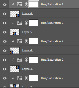
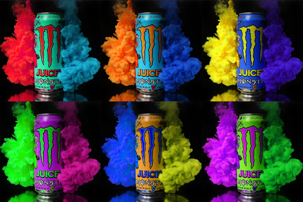
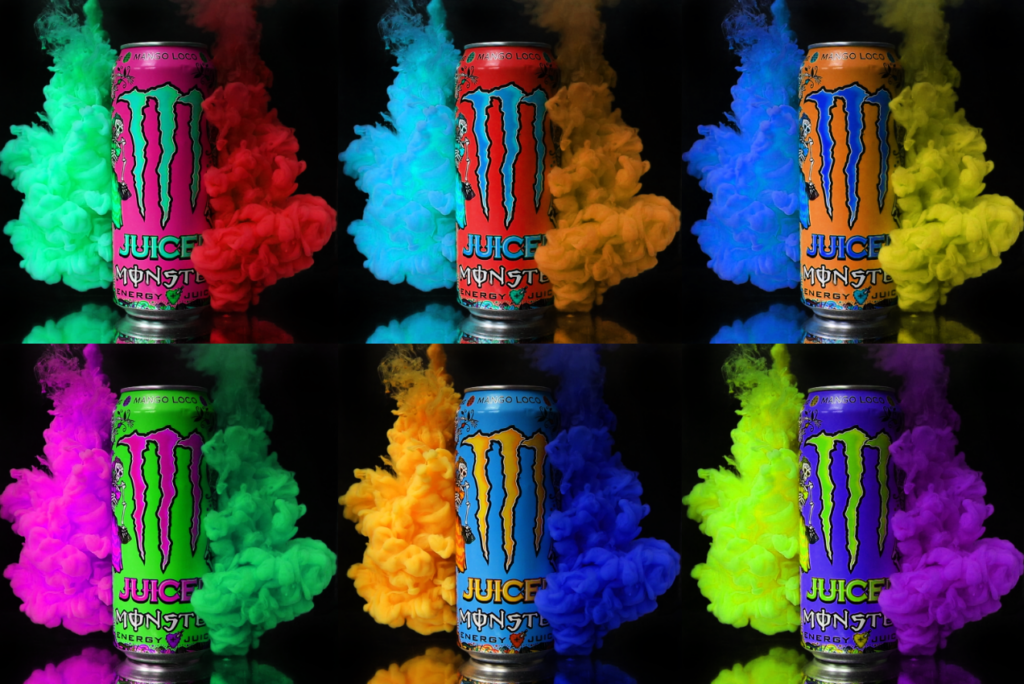
I liked this style quite a lot. It gives some new ideas of different colour combinations to use and also reminds me of the famous Andy Warhol piece of Marilyn Monroe, so I experimented with using multiple of this style on one canvas with different colours. I did this by putting 6 images on one canvas (one for each primary and secondary colour) and added a hue/saturation layer with a clipping mask to make sure it only affected that layer.
I first edited them with the cloud on the left being the primary and secondary colours in order from the top left to the bottom right going across the row.
I then repeated this, instead having the cloud on the right being the primary and secondary colours in order.
I decided to also do this for the can, so I did one where the main part of the can had the primary and secondary colours in order.
To finish, I made it so the logo had primary and secondary colours in order.
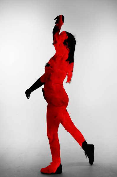
Experimenting with Layering
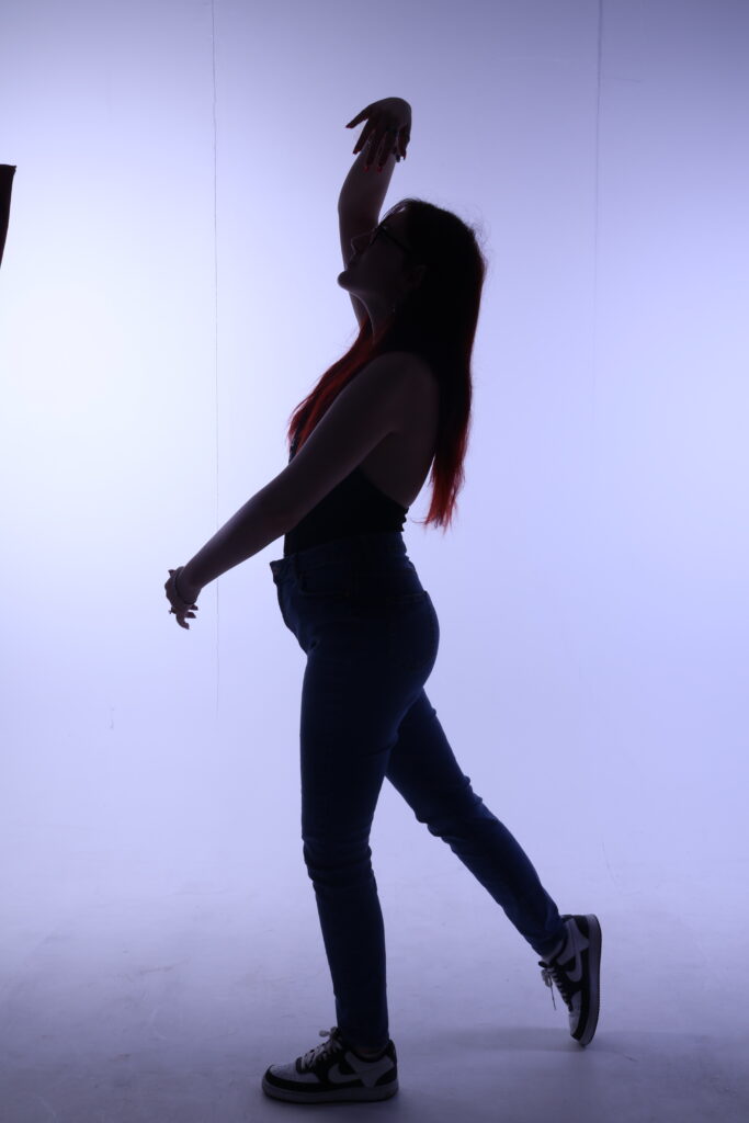
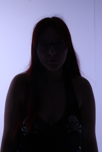
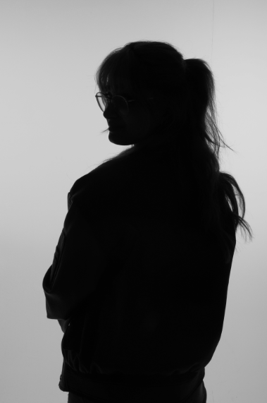
To experiment with layering, I had to get some pictures of some models. I directed these models into various poses and chose the ones that I thought were best. I used these poses because they provide an interesting element to the piece in more of an art-esque style. This is how that shoot went.
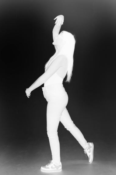
I experimented with 3 different models. I first grabbed a male model after getting my lighting right with a skeleton. I quickly found out that the male model would not be suited for this shoot and I would need more of a slender figure, so I switched to using a woman for the shoot. The reason for the more slender figure is because of the shape of the water. If I used a larger model, I would not be able to fill out the model with the cloud I was using. However, this would be a possibility if I decide to return to this in the future. After finding my second model, I did some shots of her with a bottle. However, I shot most of these pictures in landscape which was a mistake. Because of this, I went back and shot them with a slimmer model in landscape with more varied poses. After some review, I will be using these pictures for the editing:

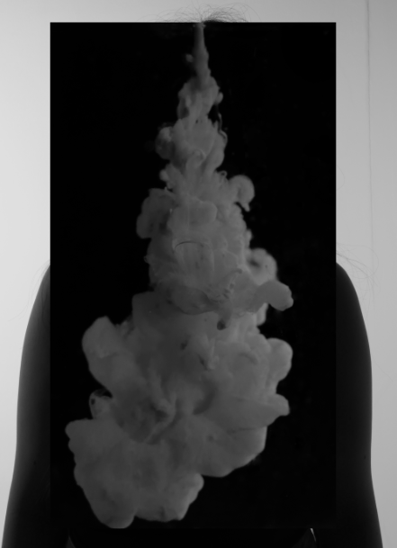
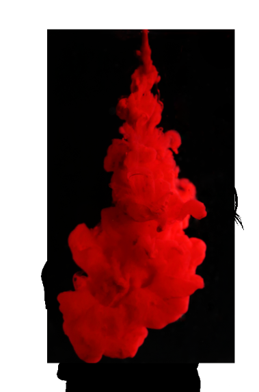
To start this, I decided to grab an image of the cloud to edit first so I had it ready to put on the model.
I cropped and straightened the image so it would fit.
To add more depth, colour and help remove the background, I burned the shadows of the image.

I then removed all of the imperfections. This included the many water droplets, loose stringy bits of the cloud and other varied imperfections.
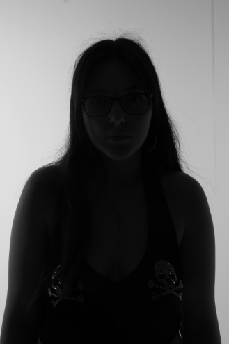
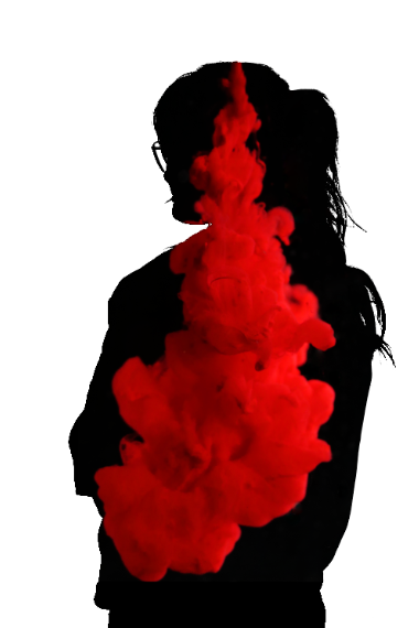
Now that the image was done, I started working on the image of my model.
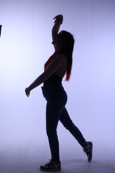
I removed the lines that were on the infinity curve in the background as well as the corner of the light on the left.
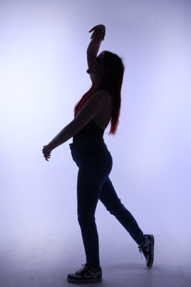
After this, I inverted the image. I duplicated the uninverted version just before this step for later
To make the layers easily distinguishable, I stacked contrast layers in a group until the image was either black or white.
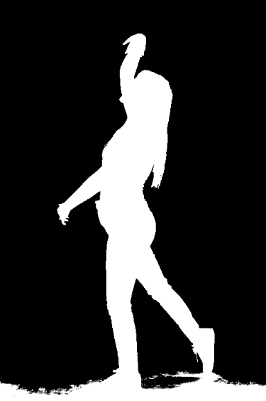
I then cleaned up the feet and ground.

After this, I added the cloud to the image.
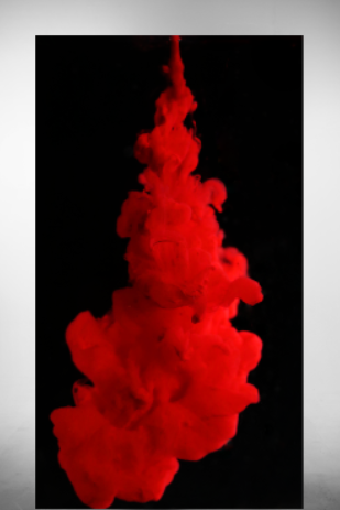
To blend, I used the Colour Range tool. This allowed me to just select the model so I could easily cut out the cloud.
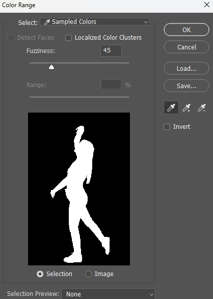
To switch the selection to the cloud, I just selected the layer that the cloud was on and then inverted the selection to delete everything outside of the model.

I then removed the selection to create the final image.
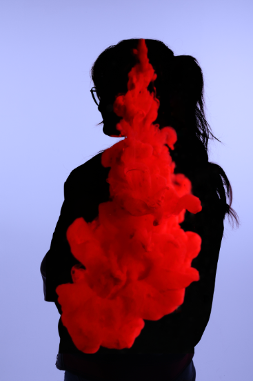
I then tried to blend the cloud using a similar method, but with some use of linear dodge, This is the image I used for the second attempt.
I first made the image black and white with a Black & White layer.
I then threw the image of the cloud in for later.
I hid the image of the cloud and did the same trick with contrast layers, this time not needing to invert the image as I realised that I could just colour range the black instead.
I then selected all of the black with use of colour range and cleaned up the selection with quick select.

I removed the contrast layers, inverted the selection and deleted the outside of the cloud layer.
To blend, I added linear dodge and placed the black and white layer below the cloud so it isn’t affected This created the final image below.
I then decided to give it a try with an even smaller model. I brought one in and decided to use a few different but simple poses.
original
original
Black and white

contrast
add paint cloud in

colour range select and inverse
delete the excess from the cloud

remove black and white layer and contrast layers
removed imperfections in background

added linear dodge to the cloud
This experimentation was interesting to do and created some decent outcomes. However I do not know if it has its place in the advertising style I would like to do. It can be quite particular to get a good shot for it, but, although I don’t think I will continue with it, it has some interesting applications.
Conclusion
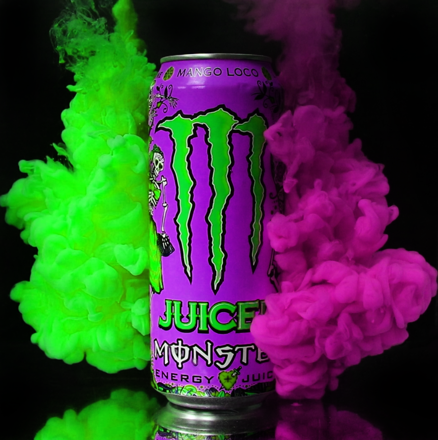
Through this experimentation, I found that using models for these style of shoot can provide some interesting results. I like the style, but I don’t think there is many ways that I can apply it in an advertising setting in a way I would be as confident with as I was with the Monster shoot. I like the bottom two the most with the Monster shoot.. This is because it focuses more on the main subject of the picture: the can. This establishes brand identity while still giving a very cool visual to keep the viewer entertained and more likely to share. I want to do something like this as a way to show off multiple products from the same company. It is at this point where I stumbled across this picture that was taken of Heinz products. Because the products are all unified by that keystone, I was wondering if there is a company that I can use to create a collection of pictures showing off the multiple products under one logo that joins them all together. This is where I decided to use the company Monster for my idea.
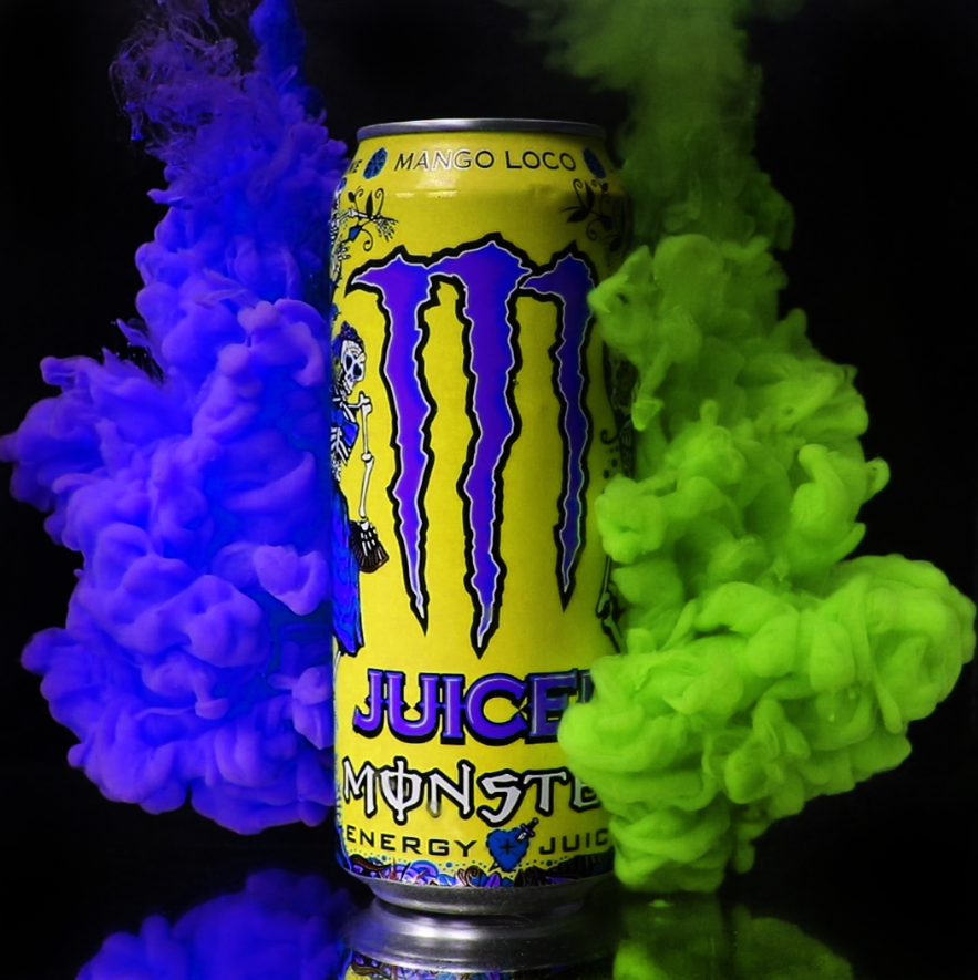
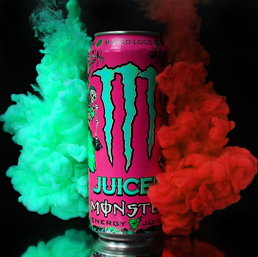
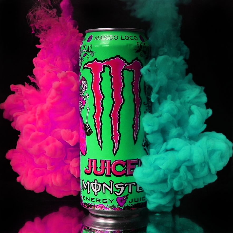
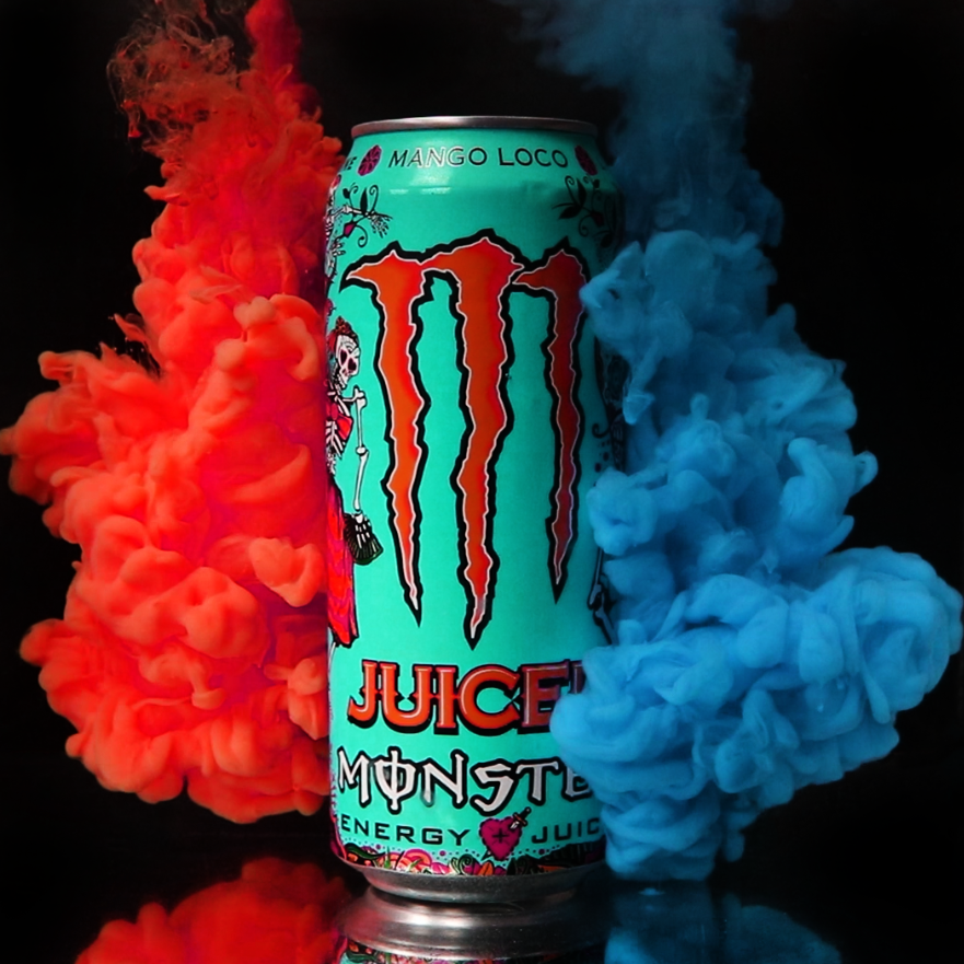
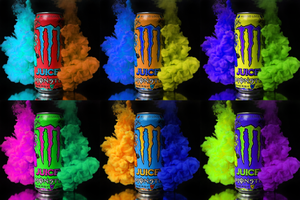
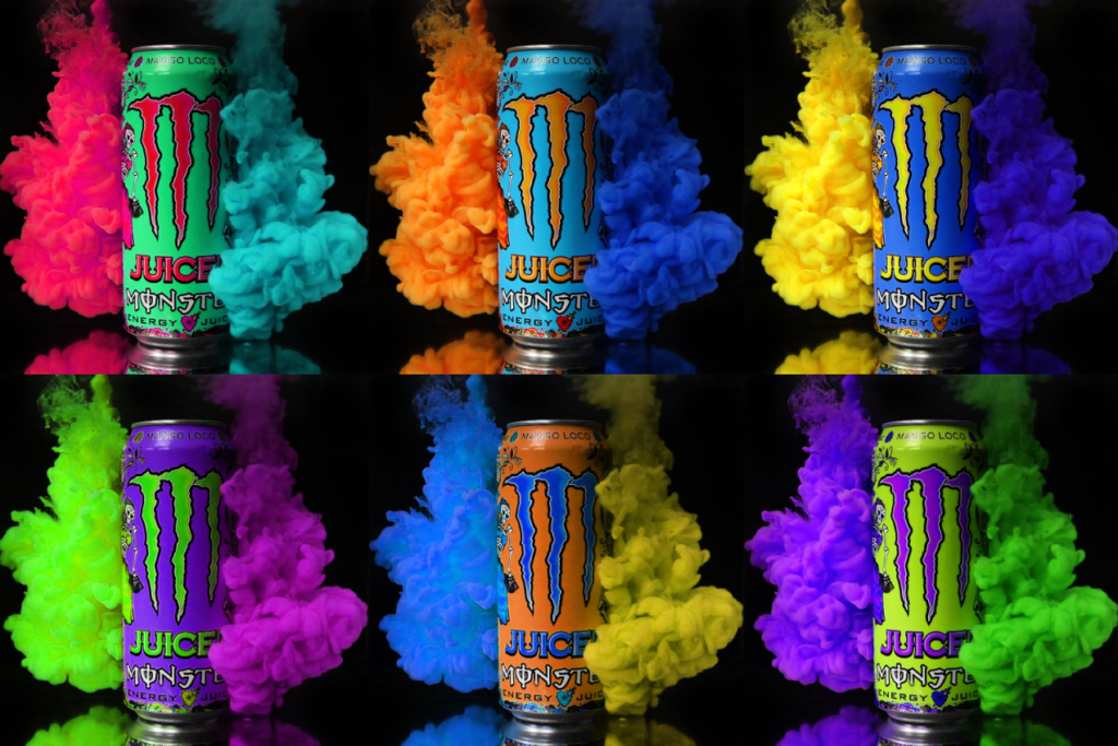
Aqueous: Main Idea
For my main idea, I will be taking inspiration from collections of images such as Andy Warhol and the Heinz Advert and combining them with the aqueous style commonly used by artists such as Mark Mawson. I will be doing this across multiple different flavours and showcasing them with different colours of paint. To keep brand recognition, They will all be unified by the logo on the front, so it will be a simple straight forward shot. I will be doing a test to see if I am able to combine 4 images of different cans and if I can, I will try and do as many as I can. This is known as a jitter lapse and is shown in this video.
For my idea, I will be using a collection of various flavours of Monster cans. I am using this for 2 reasons; there are a wide variety of flavours and colours I can use to show the flexibility of the brand and the idea that there is something for everyone, and because I am able to use a recyclable product to promote sustainability. I also have a lot of Monster cans available to me because my friends enjoy to drink them a lot, so I am able to use the cans that they have.
Research into Artists
Mark Mawson
Mark Mawson is a London based studio photographer specialising in advertising and aqueous photography. He is widely known for his “Aqueous” series which depicts various paint clouds with different colours, shapes and lighting. He takes his aqueous photography to a different level by meshing it with his advertising, creating interesting visuals for different products such as Gap, Nespresso and Sherwin Williams.
Analysis

This image is one of the collaboration pieces Mawson did with Sherwin Williams. It is composed of a silky cloud behind some text and an image of the paint can being advertised. The main focus of the image is the text, a white on a bold background created by the cloud. This cloud also matches the colour of the paint being sold, showing off the product in an interesting and creative way. There is also some text to the right of the can, a short sales pitch for the product. This does not detract from the poster itself and serves as an explanation of the product, where to find it and how many colours there is. There is also a link to the website to make to easier for consumers to know where to purchase the product, giving access to people who may not have previously known of the brand. The use of the clean font is very fitting, being simple but still fancy with the use of a serif font. This all creates a very interesting image that is composed beautifully with the brand and consumer in mind.

This advert is for the brand Nespresso. It is an advertisement for their coffee. The coffee pod is placed in the centre of the image and is surrounded by a thick cloud of brown smoke. The smoke is coloured the same as coffee, matching the pod while creating an interesting visual in the background. The clouds also act as a vignette for the image, drawing your eye to the centre with the edges of the cloud being more dark and the tips being lighter. The text reads “Release the alchemy of coffee and milk.” This is a reference to Mawson’s discovery of aqueous photography, where he watched milk being poured into his morning coffee (Mawson, 2025). It also makes something as simple as coffee seem much more exciting and promotes the concept of creating the coffee as a very interesting procedure with the words “Release the alchemy”.
Emailing Mr Mawson
To discover more about the techniques that Mawson uses, I decided to email him to see what he does. I asked him about the resources he uses in his photography.

This is the response I recieved.

This unfortunately was not what I was looking for. However, I believe that the next photographer will have more answers about what I could use.
Kim Keever
Another artist that really stood out to me for his work in aqueous photography was Kim Keever. Based in Miami, this Florida artist uses his knowledge of science and engineering to create masterpieces. He was an ex-NASA employee with an extensive background in engineering who quit his job to pursue a passion in photography. Using fluid-flow dynamics, he creates visual masterpieces by creating landscapes with use of plaster objects, merging his knowledge of engineering with his eye for art (Kim Keever, 2025).
His work is very detailed. He has extremely high quality cameras that capture the movement of the clouds and freeze it, creating incredible works that he sells prints of. He uses a variety of colours of paint in combination with a huge tank to create these visuals. I hope to emulate these clouds by using his techniques in my photography.
Kim Keever uses paint and ink in his photography. Because of this, I chose to continue using acrylic paint. This is because you can easily make it thinner with water without sacrificing any of the colour. I did this because of an issue caused by other liquids, such as milk. When I used food dye to colour the milk, it was not as vibrant as I wanted because the white of the milk was making the colour much lighter. Contrastingly, with acrylic paint I just add water and it does not alter the colour at all. This is the technique I will be using for my final piece.
Planning The Final Shoots
To do these shoots successfully, I am going to need to effectively use my time, space and budget. To start with, I bought some red, blue and yellow paint so I can mix together a wide variety of colours. I then decided to get some white and black paint to expand that library of colour. To finish I decided to grab a lime green because I found that colour incredibly hard to create.
For the setup, I will be using the same style that I used in Creative: Test Shooting. This will allow me to efficiently, safely and cleanly create all of these images. I will be using further precautions to protect the area I am working with, such as using tarps on the worktops and surrounding flooring to protect them.
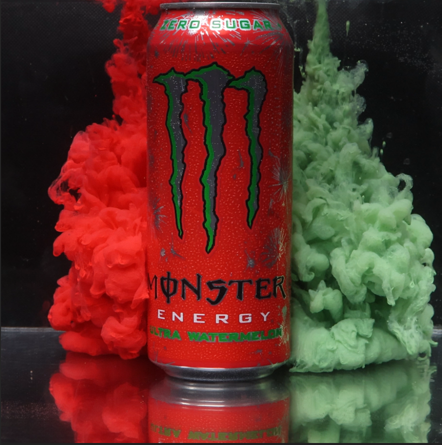
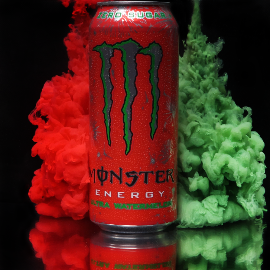
The first shot I did was this shot of Ultra Watermelon. I will be showing my editing process here and this same process will be used for all other pictures.
This is the original.
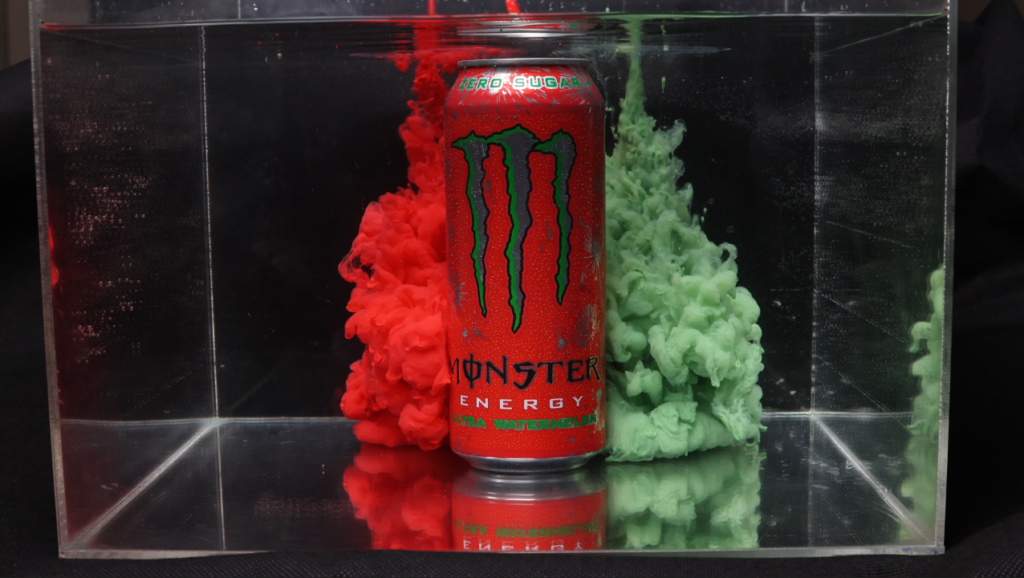
I first crop and straighten out the image.
After this, I burn the background and spot heal the box along with any blemishes created by extraneous variables,
To make the colours look equal, I saturated the green cloud, creating the final.
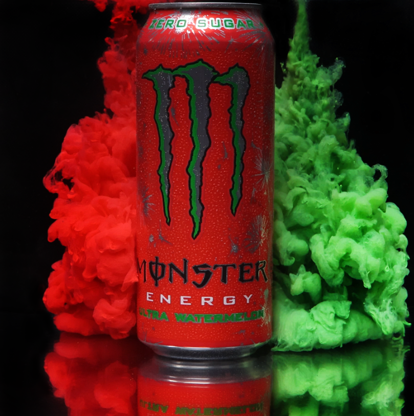
This created a good final image. There were small issues with it, but most of those could easily be fixed in the final images. I also decided to default to using a 2064×2064 resolution for all of the images because the 4K video quality allows for me to shoot that high. Because I now had my final shoot concept, methods and editing ready, I just needed to grab the subjects.
Acquiring a High Quality Video Camera
To capture the images faster and make my life easier, I decided to use a higher quality camera. To do this, I went to the Central Media department in college and asked what kind of video cameras they had. This is where I found the Panasonic S5. This camera has full frame 4K recording capabilities at 60fps, exactly what I am looking for. I asked if I could borrow it and set up to do my shoots across 1 week, returning the camera after it was over. The email chain is below.
Acquiring the Cans: Sustainability
Because the Monster can is easily recyclable, my project is very sustainable. I used cans that I took from friends when they were done with them. After they were used for the shoots, I took them and recycled them in the appropriate way to make sure they would be taken care of properly. After I had acquired the cans, I had everything I needed to take the images.
The Shoot Week
The shoot week went very well. Because I practiced everything, it flowed very well and I was able to get pictures of all 25 different cans. I kept everything clean by using tarpaulin everywhere in the area and I made sure everything stayed washed before every use to prevent colours from seeping into other images. Washing the tank after every use was also essential to avoid unwanted spots from popping up.
Editing the Shoot
To edit the shoot, I first had to grab the screenshots from the videos. I did this by searching through the video for the correct frame and using the “Export Frame” tool.
This allowed me to export any frame directly from the video at the same quality as the video. I then would export the pictures into a separate folder and edit them from there.
While editing, I came across an issue with how to line up the images. However, I solved this by using reference points for the crop. As shown in the image below, I used the grid lines to line up the image at the three points highlighted on all the cans, which made them easy to create a more fluid video out of. Going from top right through to the bottom middle, the first point was making sure the left vertical line was slightly over to the left of the left most part of the logo. The second point was making sure the top horizontal line was in this little divot between two little mounds. The final point was making sure the bottom horizontal line was just below the bottom most part of the logo. This worked really well and created good consistency.

This left me with these final images.
To create my primary piece, I put all of my images into Premiere Pro and ordered them while slowly making the clips faster, putting more of the ones I was happy with at the front because they would get more screentime.


I then added a monster logo at the end to cut out into. I also added an opacity keyframe so it would stay for a while then fade out to black.
After this, I added the tagline of Monster “Unleash the beast!” in a Monster font I found called “Green Energy.”

I also set this to fade, but I made it fade in first after the cut to the Monster logo then made it fade out at the same speed as the logo.

To help with sound design, I enlisted one of the music people to help me out. I explained what I wanted and even added a vocal sample and after a bit of back and forth, I had an audio sample.


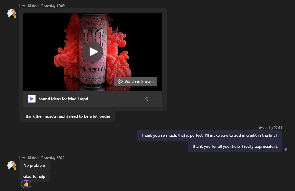
After adding this into my video, my final piece was finished. To upload it, I originally tried uploading it to Youtube as I normally do, but it was uploading in 4K resolution and was not progressing. To fix this, I put the file on Dropbox so it can be accessed there.
To create my secondary piece, I created a 5X larger canvas and placed all of the images on there in a 5X5 grid pattern.

For printing, I will be doing this on A0. Because of this, I changed my DPI to 300 to match the printer and changed my image dimensions to fit the paper size.
Evaluation
Aqueous: References
Amazon.co.uk. (2025). Apple iPhone 13 (128GB) – Midnight : Amazon.co.uk: Electronics & Photo. [Online] Available at: https://www.amazon.co.uk/Apple-iPhone-13-128GB-Midnight/dp/B09G95MCDT/ [Accessed 31 Jan. 2025].
Apple. (2004) iPhone 16 Plus Clear Case with MagSafe. [Online] Available from: https://www.apple.com/uk/shop/product/MA7D4ZM/A/iphone-16-plus-clear-case-with-magsafe. [Accessed 31 Jan. 2025].
Apple (2023). iPhone. [Online] Apple (United Kingdom). Available at: https://www.apple.com/uk/iphone/. [Accessed 31 Jan. 2025].
Apple. (2024) Apple debuts iPhone 16 Pro and iPhone 16 Pro Max. [Online] Available from: https://www.apple.com/newsroom/2024/09/apple-debuts-iphone-16-pro-and-iphone-16-pro-max/. [Accessed 31 Jan. 2025].
BBC Bitesize. (n.d.). Complementary colours – Colour – National 5 Art and Design Revision. [online] Available at: https://www.bbc.co.uk/bitesize/guides/z3bqycw/revision/7. [Accessed 23 Feb. 2025].
Britannica. (2008) iPhone. [Online] Available from: https://www.britannica.com/technology/iPhone/additional-info#history. [Accessed 31 Jan. 2025].
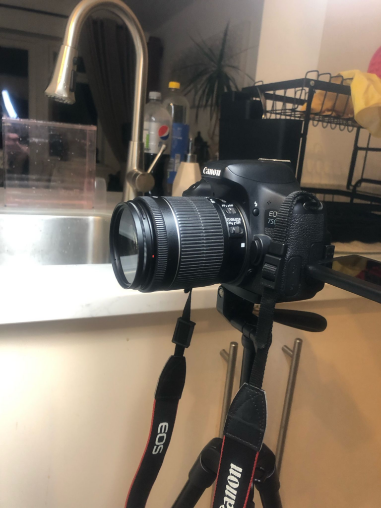
Canon UK. (n.d.). Canon EOS 750D – EOS Digital SLR and Compact System Cameras. [online] Canon UK. Available at: https://www.canon.co.uk/for_home/product_finder/cameras/digital_slr/eos_750d/. [Accessed 24 Feb. 2025]
Hooker, H. (2014). Helen Hooker Photography. [online] Helen Hooker Photography. Available at: https://www.helenhookerphotography.co.uk/pinhole.[Accessed 31 Jan. 2025].
Keever, K. (2017). Kim Keever. [online] Kim Keever. Available at: https://www.kimkeever.com/abstract [Accessed 28 Feb. 2025].
Keever, K. (2025). Kim Keever. [online] Kim Keever. Available at: https://www.kimkeever.com/bio [Accessed 4 Mar. 2025].
Masterworksfineart.com. (2018). Andy Warhol Marilyn Monroe. [online] Available at: https://www.masterworksfineart.com/artists/andy-warhol/marilyn-monroe?srsltid=AfmBOop4_UMqWN9e2LN2oS3sC32ZchXxoLox43aK7PlQF-p7J0GstCyJ [Accessed 23 Feb. 2025].
Mawson, M. (2025). Mark Mawson Photography. [online] Mark Mawson Photography. Available at: https://www.markmawson.com/portfolios/fragrances-cosmetics?itemId=rze66ywxyn706lw4imtxi7aabo24r1 [Accessed 23 Feb. 2025].
Mawson, M. (2025). Mark Mawson Photography. [online] Mark Mawson Photography. Available at: https://www.markmawson.com/portfolios/aqueous [Accessed 24 Feb. 2025].
Mawson, M. (2025). Mark Mawson Photography. [online] Mark Mawson Photography. Available at: https://www.markmawson.com/portfolios/work?itemId=kg8m56to00sortg0kg0ebglb4z1s6u [Accessed 14 May 2025].
Mawson, M. (2025). Mark Mawson Photography. [online] Mark Mawson Photography. Available at: https://www.markmawson.com/portfolios/liquids-splashes-powder?itemId=6u0zxw54sgrum91mjk4l363epikh5r [Accessed 2 May 2025].
Mawson, M. (2025). Mark Mawson Photography. [online] Mark Mawson Photography. Available at: https://www.markmawson.com/portfolios/work?itemId=gt63jkvmqfa095gfc3yhe0e1jd1ck5 [Accessed 2 May 2025].
Mawson, M. (2025). Mark Mawson Photography. [online] Mark Mawson Photography. Available at: https://www.markmawson.com/portfolios/work?itemId=bhw33luybeqkhc1oiphj1w517bih8d [Accessed 2 May 2025].
Mawson, M. (2025). Mark Mawson Photography. [online] Mark Mawson Photography. Available at: https://www.markmawson.com/portfolios/work?itemId=bhw33luybeqkhc1oiphj1w517bih8d.
Nutt, K. (2022) I made a phone case commercial for CASETiFY!. [Online video] Available from: https://www.youtube.com/watch?v=iMF-yUQ48rg. [Accessed 31 Jan. 2025].
ONDU Pinhole (2017). 6X6 POCKET. [online] ONDU Pinhole. Available at: https://ondupinhole.com/collections/get-your-ondu/products/6×6-pocket. [Accessed 3 Feb. 2025].
Panasonic.com. (2016). LUMIX S5 Full Frame Mirrorless Camera – Panasonic UK & Ireland. [online] Available at: https://www.panasonic.com/uk/consumer/cameras-camcorders/lumix-mirrorless-cameras/lumix-s-full-frame-cameras/dc-s5k.html [Accessed 23 Apr. 2025].
Patel, N. (2021). 10 Effective LinkedIn Advertising Ideas. [Online] Neil Patel. Available at: https://neilpatel.com/blog/linkedin-ad-ideas/ [Accessed 31 Jan. 2025].
Stuart West Photography. (2024). About Stuart West — Stuart West Photography. [online] Available at: https://stuartwest.co.uk/about-stuart-west/ [Accessed 7 May 2025].
Stuart West Photography. (2025). Stuart West Photography — Food & Drink Photographer London. [online] Available at: https://stuartwest.co.uk/#group-19 [Accessed 7 May 2025].
Stuart West Photography. (2025). Stuart West Photography — Food & Drink Photographer London. [online] Available at: https://stuartwest.co.uk/#group-47 [Accessed 14 May 2025].
SumUp – a better way to get paid. (n.d.). Learn what is Apple Pay and how to use Apple Pay. [Online] Available at: https://www.sumup.com/en-gb/business-guide/how-to-use-apple-pay-with-sum-up/. [Accessed 31 Jan. 2025].
UnderConsideration (2020). Beheinz Every Great Ketchup is a Great Tomato. [online] Eurom.pt. Available at: https://honeycomb.eurom.pt/pt/a/7bc2f2d3b1672cdbf7e1e29b53cc4e545c3e9f7b/cache [Accessed 23 Feb. 2025].
Wikipedia Contributors (2019). Pinhole camera. [online] Wikipedia. Available at: https://en.wikipedia.org/wiki/Pinhole_camera. [Accessed 3 Feb. 2025].
Wikipedia Contributors (2019). Camera obscura. [online] Wikipedia. Available at: https://en.wikipedia.org/wiki/Camera_obscura. [Accessed 3 Feb. 2025].
Wonnacott, M. (2025). drinks | wonnacott. [online] Available at: https://wonnacott.com/images/drinks/2/ [Accessed 14 May 2025].
www.youtube.com. (n.d.). I tried to make a jitter-lapse…again…. [online] Available at: https://www.youtube.com/shorts/vE5bm3KCbfo [Accessed 03 Mar. 2024].