
To practice what the shot was going to look like, I first decided to get a cup that I could use. I found a Greggs cup that would work as a substitute to get the lighting right and then I used some gels to create the lighting I was looking for. This setup looked like this:
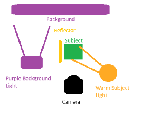
As you can see, this lighting setup separates the lighting for the background and the lighting for the foreground. By using a snoot for both, I am able to create a good strong lighting effect on the subject and I am also able to create a vignette for the background. I am also able to use the reflector just of to the side to keep the lighting fairly consistent on the subject while still having an obvious direction that the light is coming from.
Materials for the Table
I did some experimentation with the colours I could use for the table with different fabrics and cloths to see what could happen.
This silvery cloth had some nice shine, but it wouldn’t fit with the theme we are going for with this project.
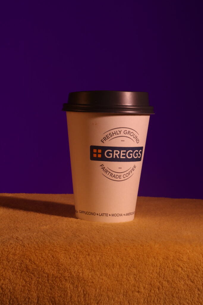
The yellow could work if it was darker, but it would have to be a different material because the furry cloth does not suit the theme.
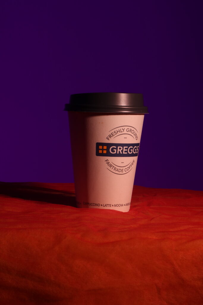
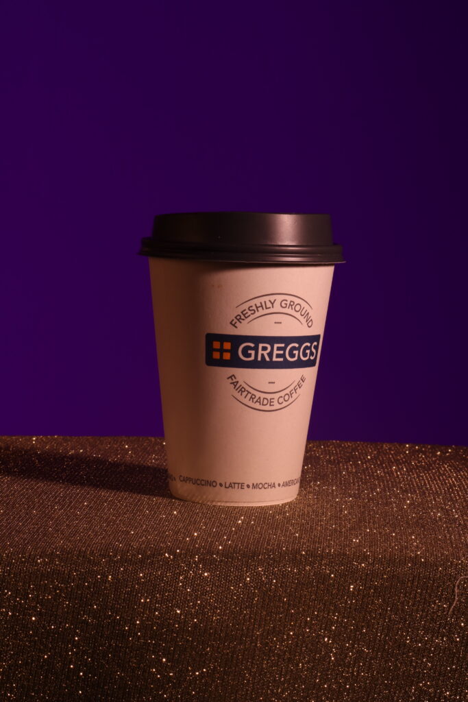
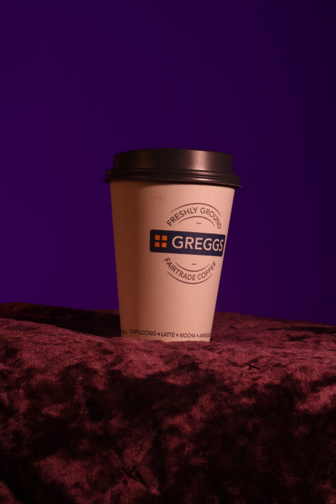
This orange works fairly well to contrast the background, but it is too thick and creates bumps in front of the cup.
The purple has a similar issue to the orange of creating bumps in front of the cup. It also looks wrong to have two vastly different purples with different textures.
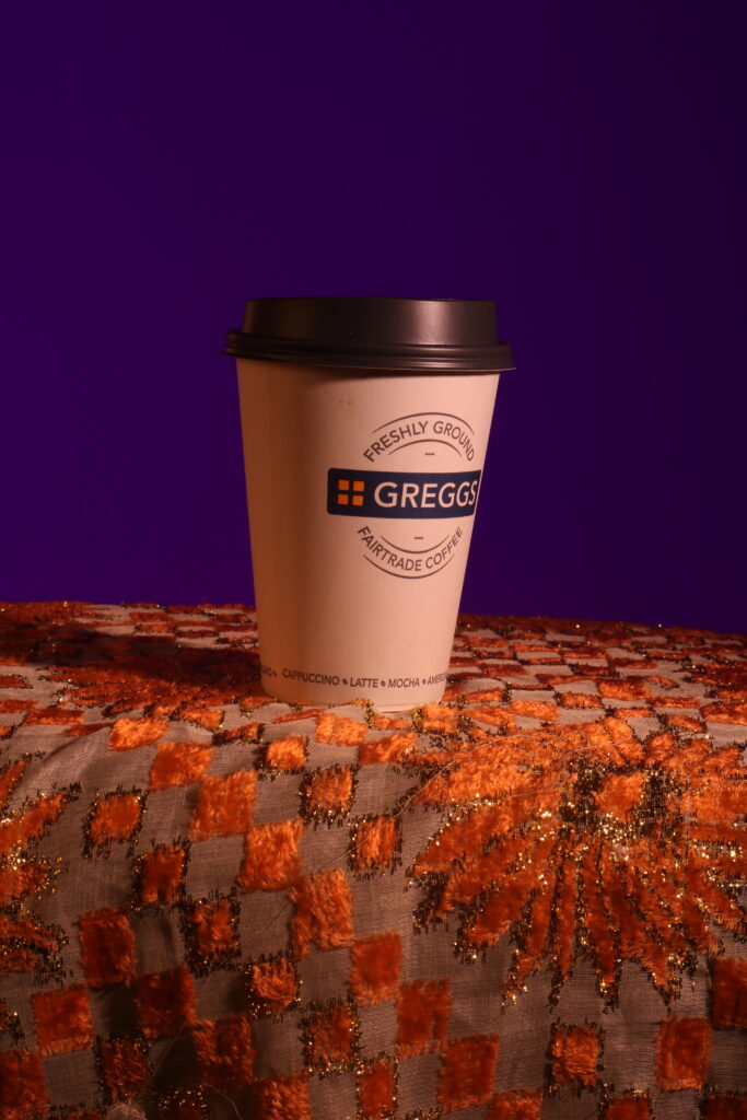
If the flower pattern was not there and it was just a checkered pattern with orange and purple, this could’ve been used for the table. However, that wasn’t available so I wont use this.
Conclusion
After experimenting, I think that using the black cloth for the table will be best. The other colours and materials present various issues and the black will also allow for the image to have some blank space to better fit the image.