
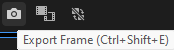
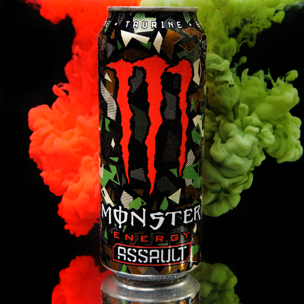
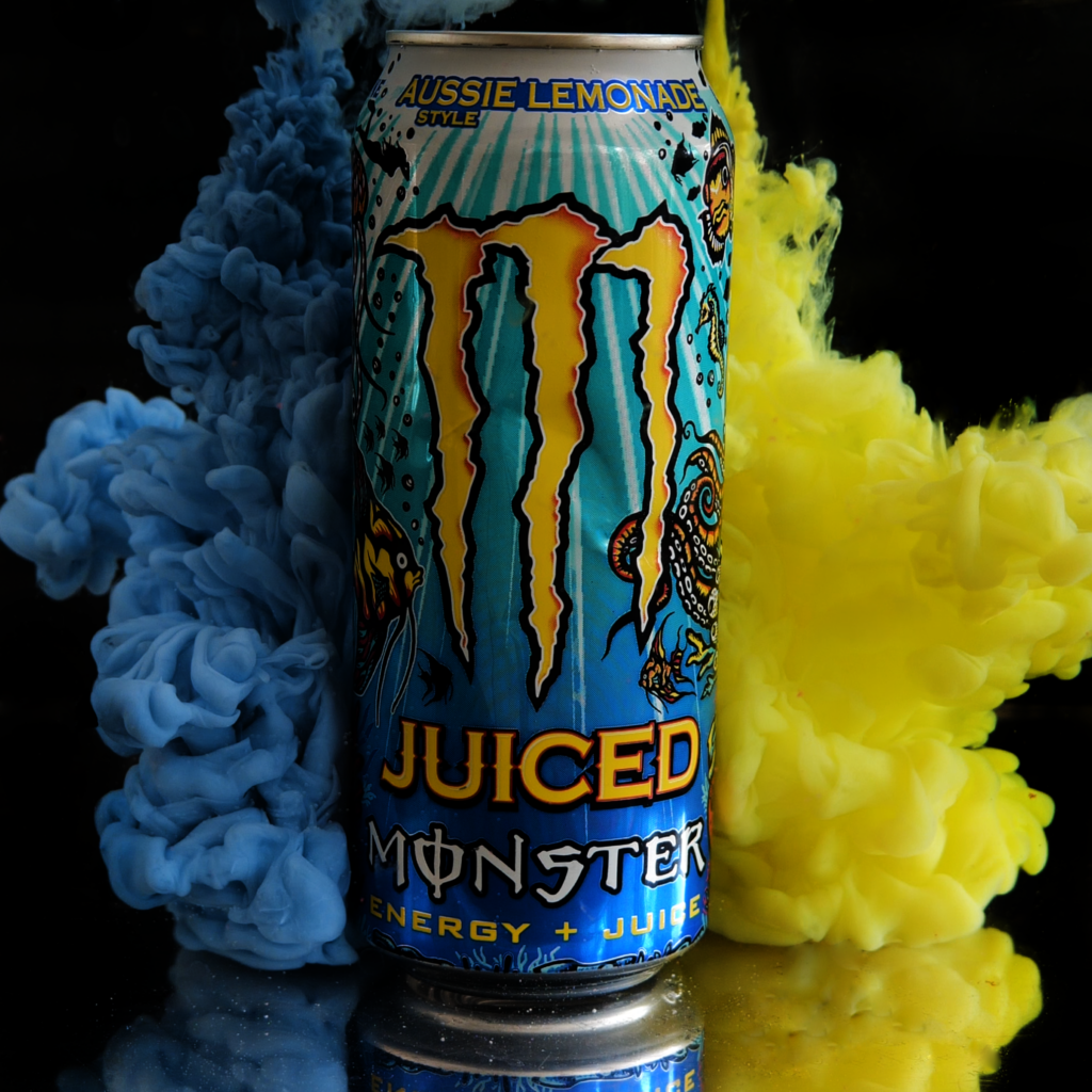
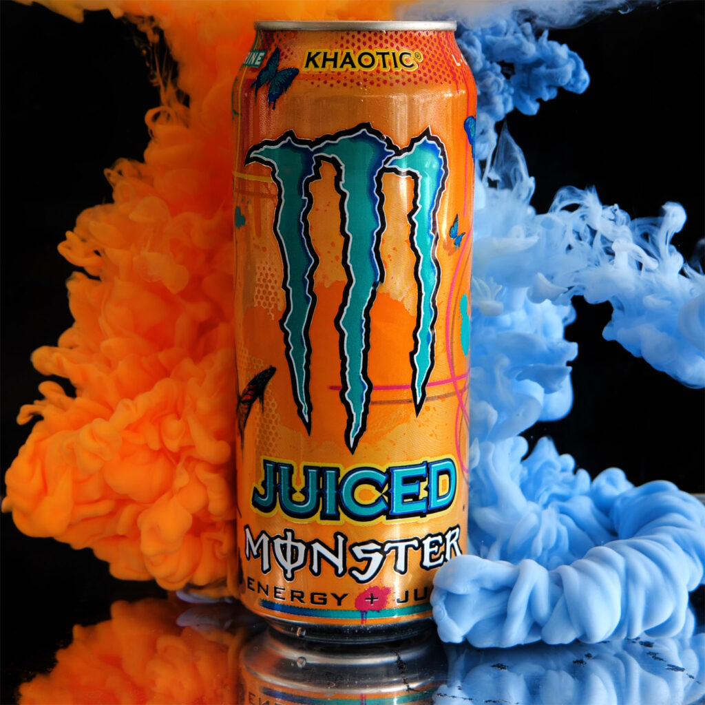
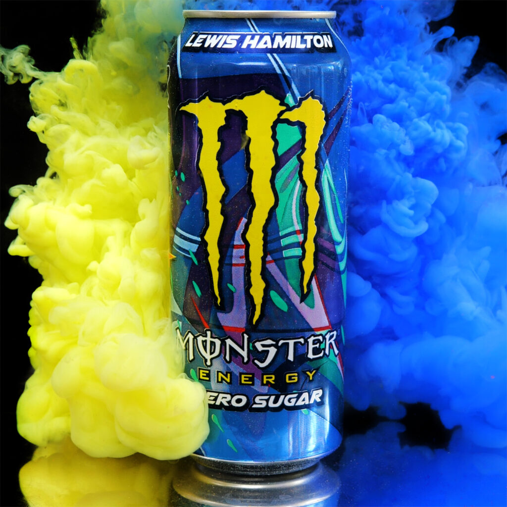
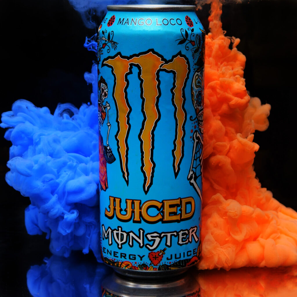
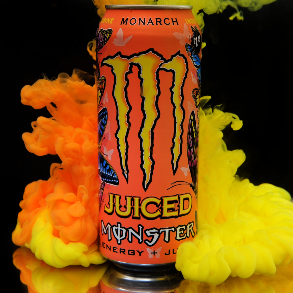
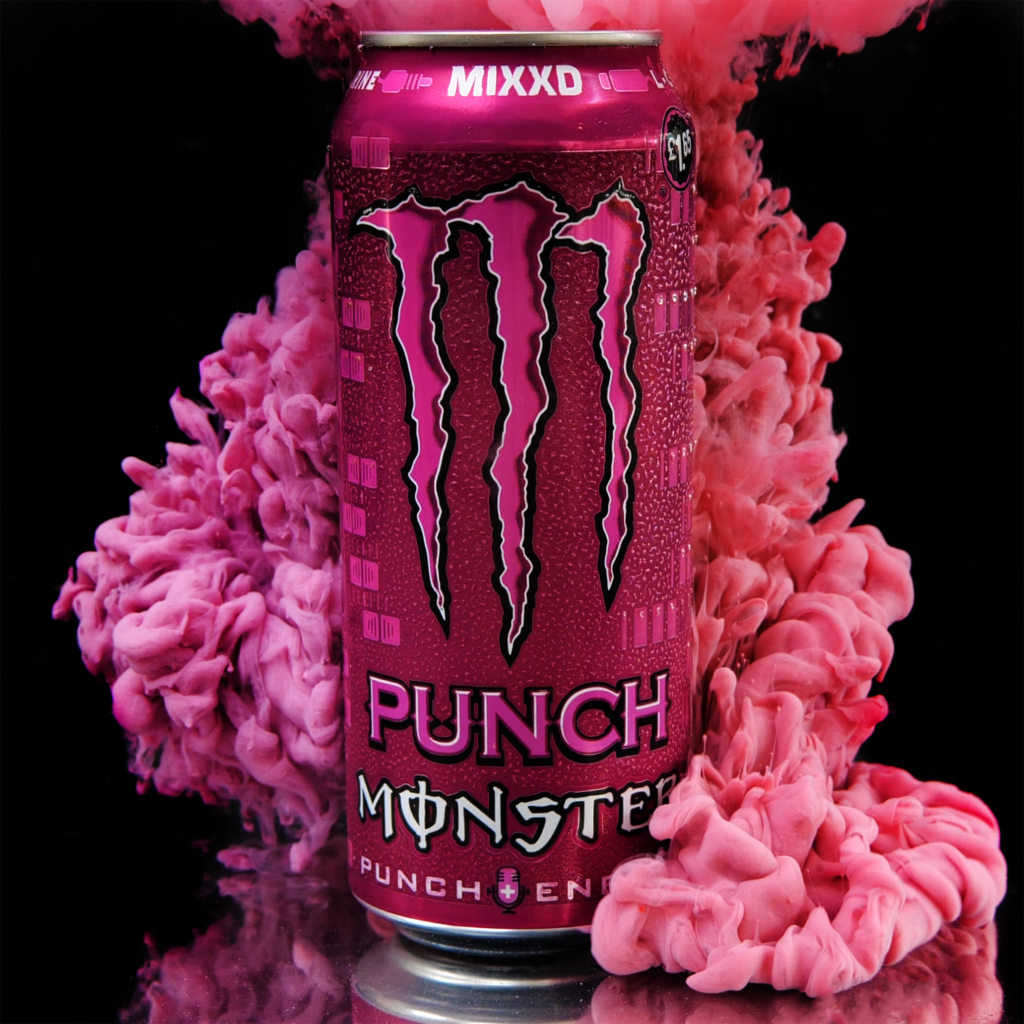
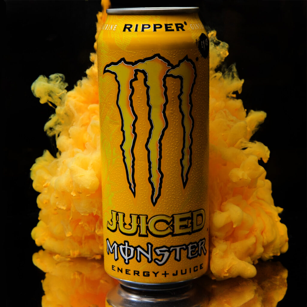
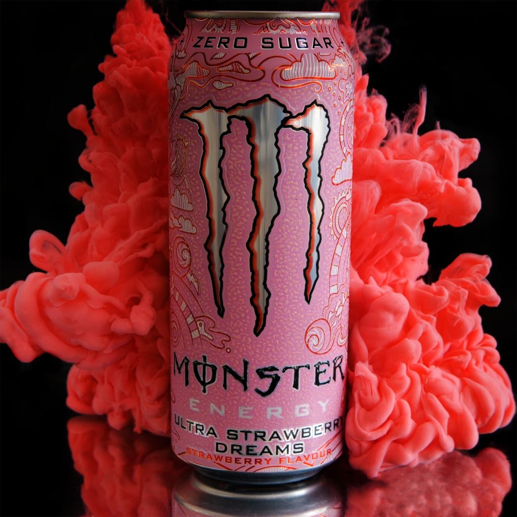
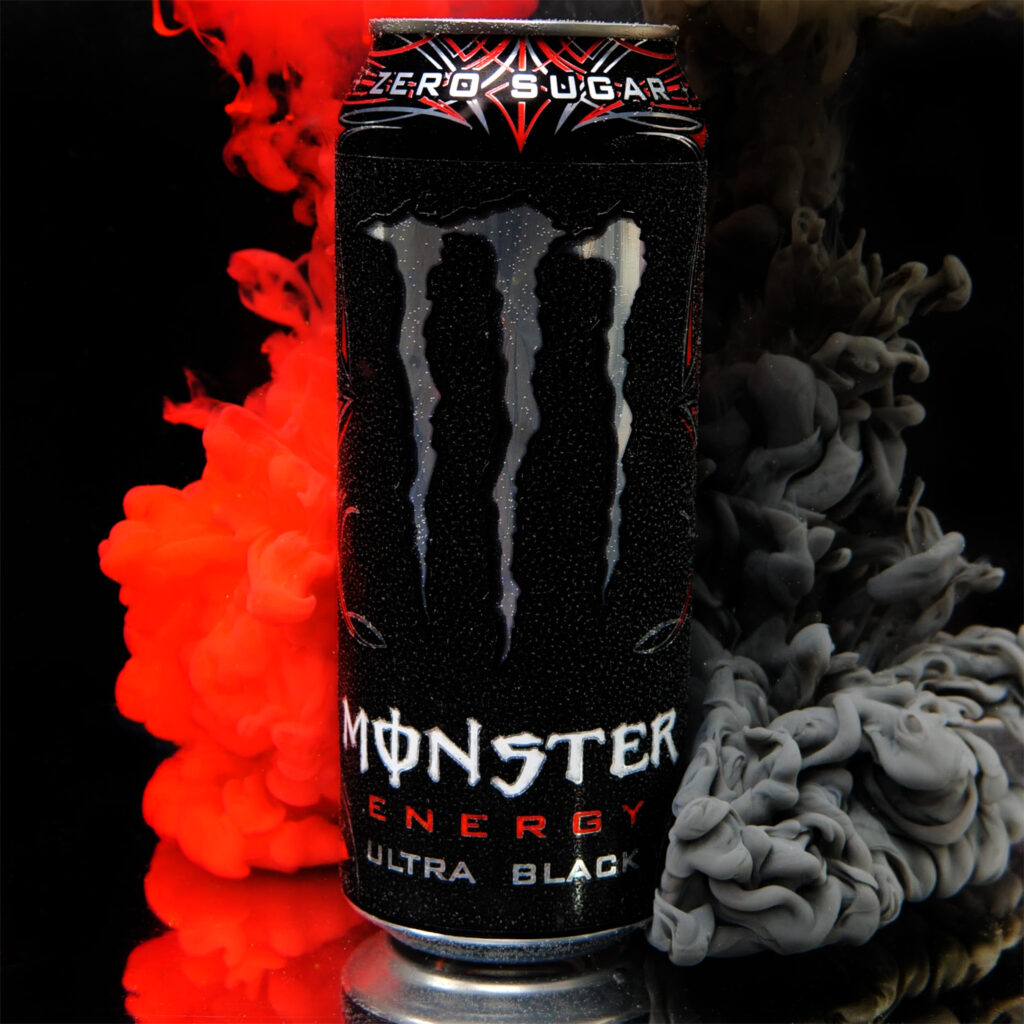
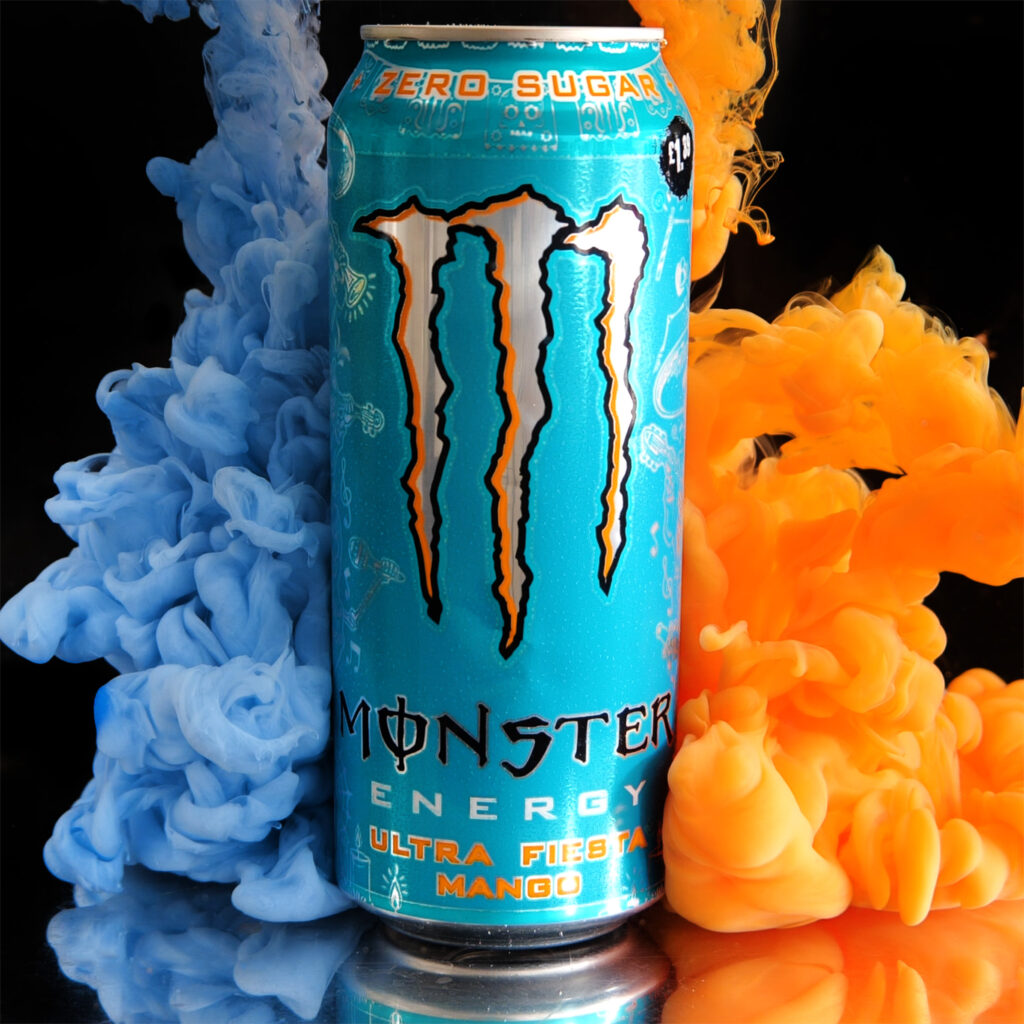
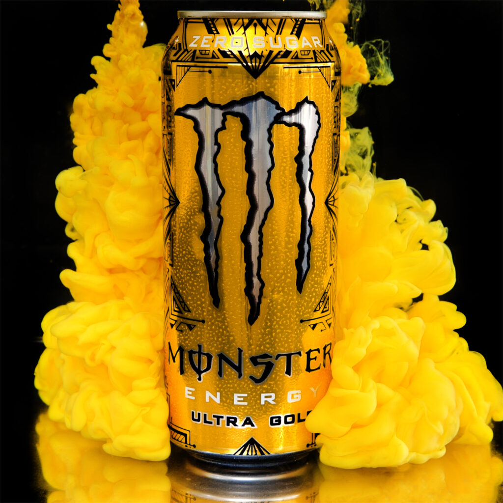
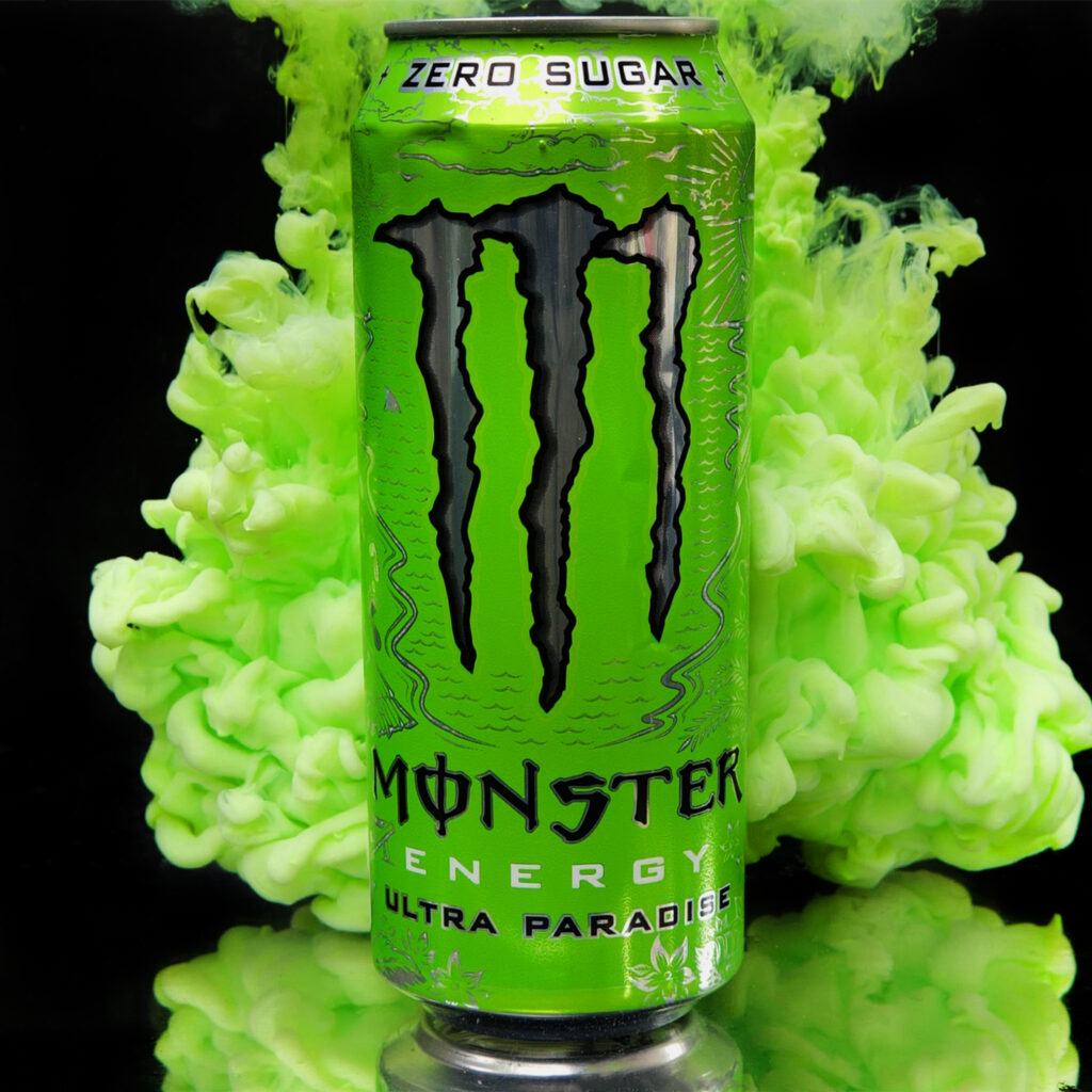
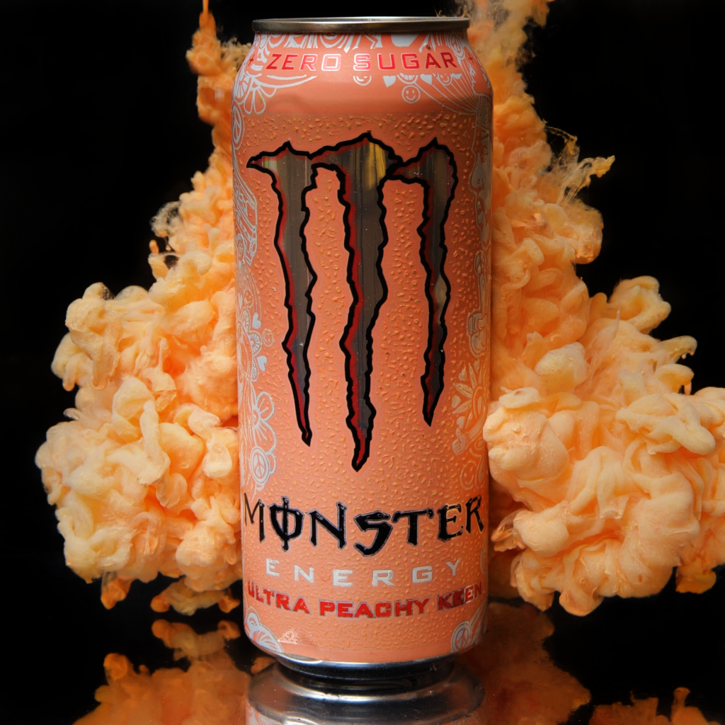
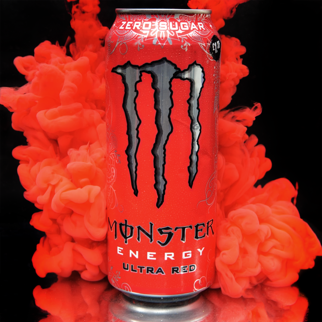
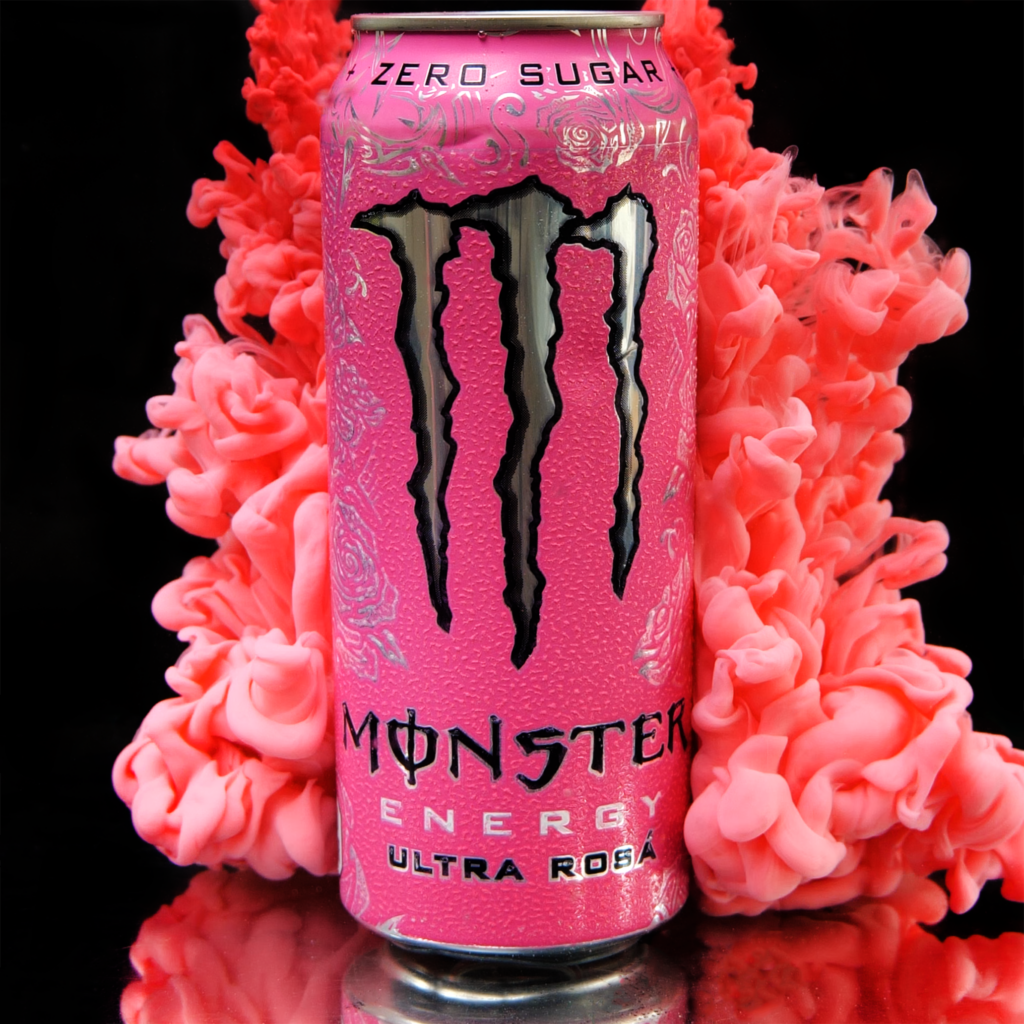
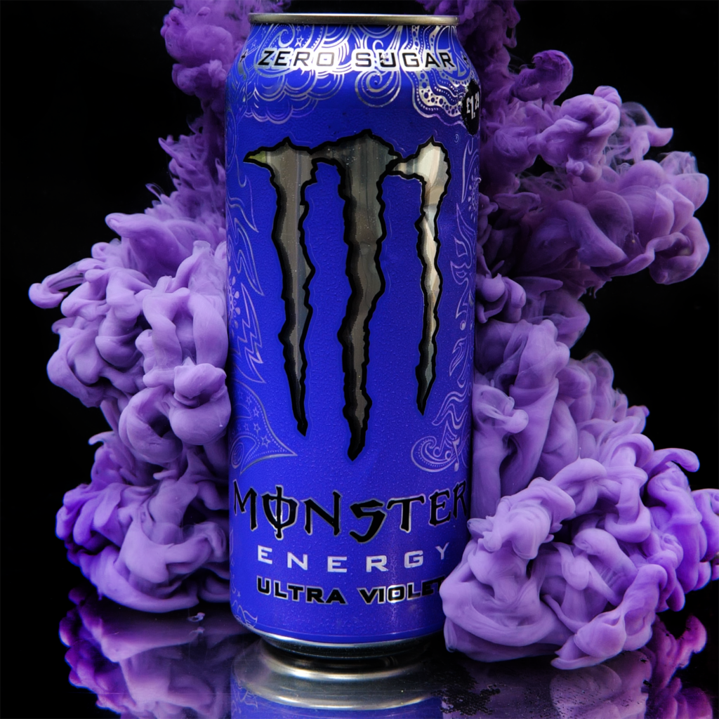
For my main idea, I will be taking inspiration from collections of images such as Andy Warhol and the Heinz Advert and combining them with the aqueous style commonly used by artists such as Mark Mawson. I will be doing this across multiple different flavours and showcasing them with different colours of paint. To keep brand recognition, They will all be unified by the logo on the front, so it will be a simple straight forward shot. I will be doing a test to see if I am able to combine 4 images of different cans and if I can, I will try and do as many as I can. This is known as a jitter lapse and is shown in this video.
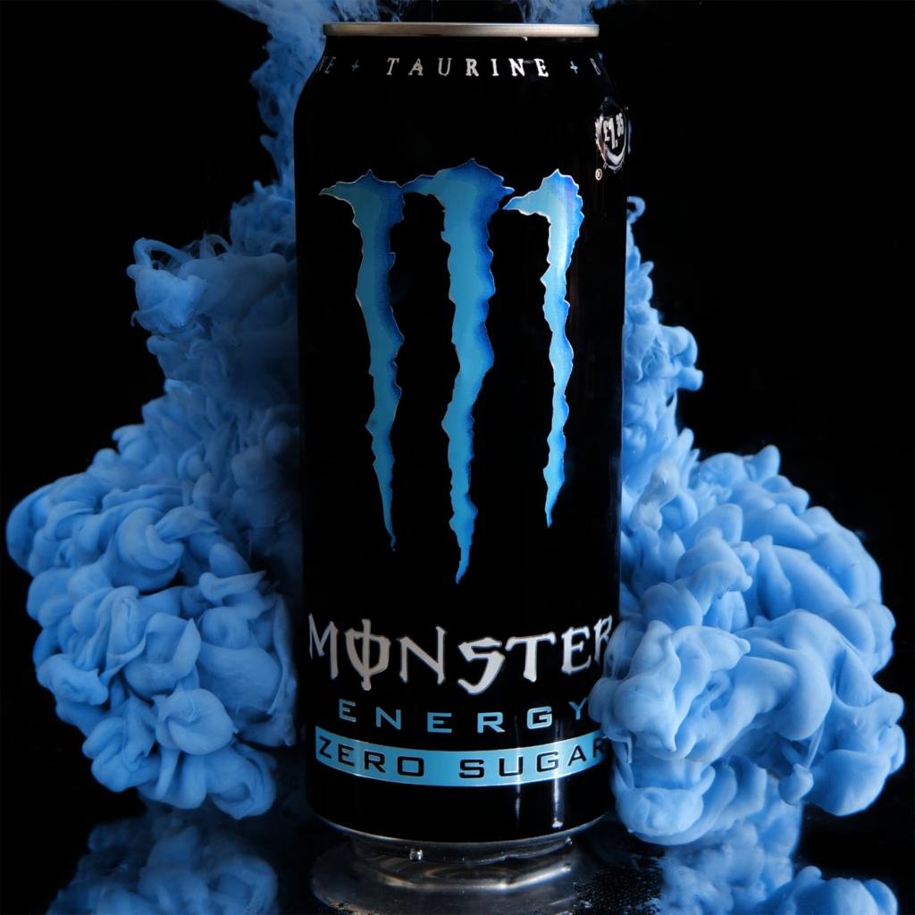
For my idea, I will be using a collection of various flavours of Monster cans. I am using this for 2 reasons; there are a wide variety of flavours and colours I can use to show the flexibility of the brand and the idea that there is something for everyone, and because I am able to use a recyclable product to promote sustainability. I also have a lot of Monster cans available to me because my friends enjoy to drink them a lot, so I am able to use the cans that they have.
Research into Artists
Mark Mawson
Mark Mawson is a London based studio photographer specialising in advertising and aqueous photography. He is widely known for his “Aqueous” series which depicts various paint clouds with different colours, shapes and lighting. He takes his aqueous photography to a different level by meshing it with his advertising, creating interesting visuals for different products such as Gap, Nespresso and Sherwin Williams.
Analysis

This image is one of the collaboration pieces Mawson did with Sherwin Williams. It is composed of a silky cloud behind some text and an image of the paint can being advertised. The main focus of the image is the text, a white on a bold background created by the cloud. This cloud also matches the colour of the paint being sold, showing off the product in an interesting and creative way. There is also some text to the right of the can, a short sales pitch for the product. This does not detract from the poster itself and serves as an explanation of the product, where to find it and how many colours there is. There is also a link to the website to make to easier for consumers to know where to purchase the product, giving access to people who may not have previously known of the brand. The use of the clean font is very fitting, being simple but still fancy with the use of a serif font. This all creates a very interesting image that is composed beautifully with the brand and consumer in mind.

This advert is for the brand Nespresso. It is an advertisement for their coffee. The coffee pod is placed in the centre of the image and is surrounded by a thick cloud of brown smoke. The smoke is coloured the same as coffee, matching the pod while creating an interesting visual in the background. The clouds also act as a vignette for the image, drawing your eye to the centre with the edges of the cloud being more dark and the tips being lighter. The text reads “Release the alchemy of coffee and milk.” This is a reference to Mawson’s discovery of aqueous photography, where he watched milk being poured into his morning coffee (Mawson, 2025). It also makes something as simple as coffee seem much more exciting and promotes the concept of creating the coffee as a very interesting procedure with the words “Release the alchemy”.
Emailing Mr Mawson
To discover more about the techniques that Mawson uses, I decided to email him to see what he does. I asked him about the resources he uses in his photography.

This is the response I recieved.

This unfortunately was not what I was looking for. However, I believe that the next photographer will have more answers about what I could use.
Kim Keever
Another artist that really stood out to me for his work in aqueous photography was Kim Keever. Based in Miami, this Florida artist uses his knowledge of science and engineering to create masterpieces. He was an ex-NASA employee with an extensive background in engineering who quit his job to pursue a passion in photography. Using fluid-flow dynamics, he creates visual masterpieces by creating landscapes with use of plaster objects, merging his knowledge of engineering with his eye for art (Kim Keever, 2025).
His work is very detailed. He has extremely high quality cameras that capture the movement of the clouds and freeze it, creating incredible works that he sells prints of. He uses a variety of colours of paint in combination with a huge tank to create these visuals. I hope to emulate these clouds by using his techniques in my photography.
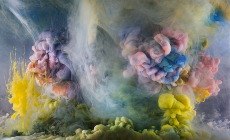


Kim Keever uses paint and ink in his photography. Because of this, I chose to continue using acrylic paint. This is because you can easily make it thinner with water without sacrificing any of the colour. I did this because of an issue caused by other liquids, such as milk. When I used food dye to colour the milk, it was not as vibrant as I wanted because the white of the milk was making the colour much lighter. Contrastingly, with acrylic paint I just add water and it does not alter the colour at all. This is the technique I will be using for my final piece.
Planning The Final Shoots
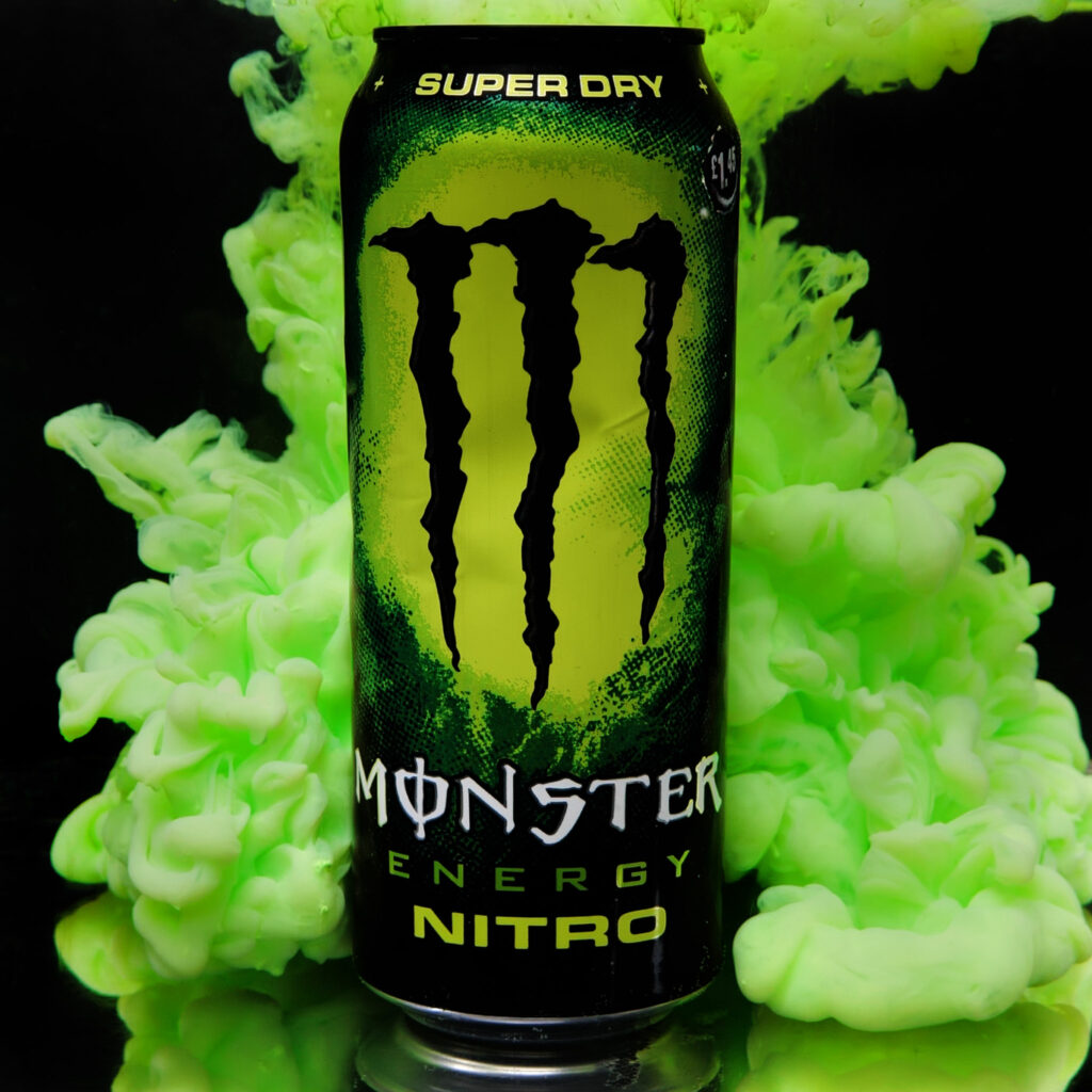
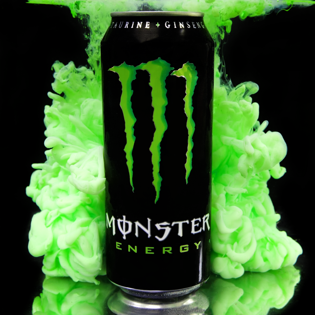
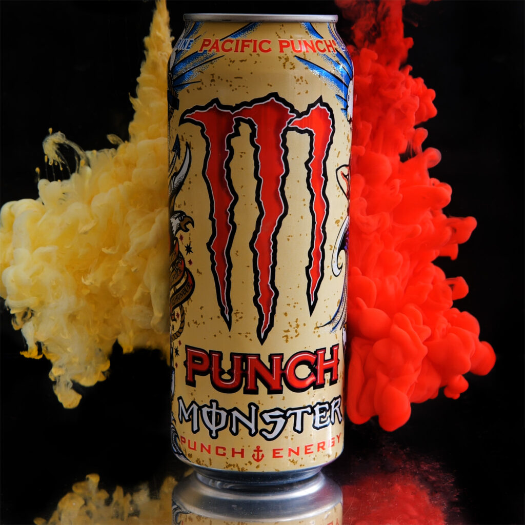
To do these shoots successfully, I am going to need to effectively use my time, space and budget. To start with, I bought some red, blue and yellow paint so I can mix together a wide variety of colours. I then decided to get some white and black paint to expand that library of colour. To finish I decided to grab a lime green because I found that colour incredibly hard to create.
For the setup, I will be using the same style that I used in Creative: Test Shooting. This will allow me to efficiently, safely and cleanly create all of these images. I will be using further precautions to protect the area I am working with, such as using tarps on the worktops and surrounding flooring to protect them.
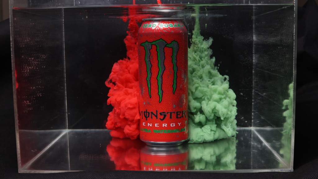
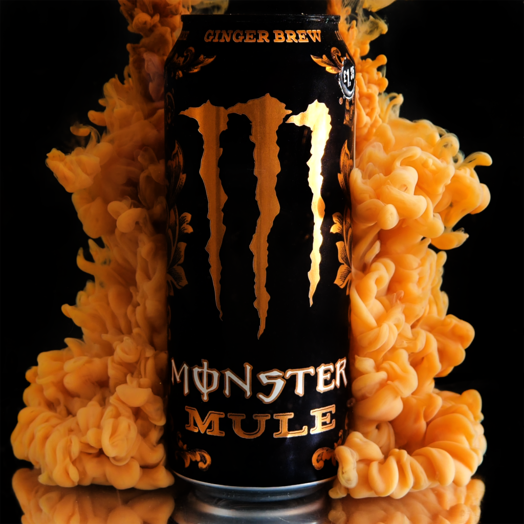
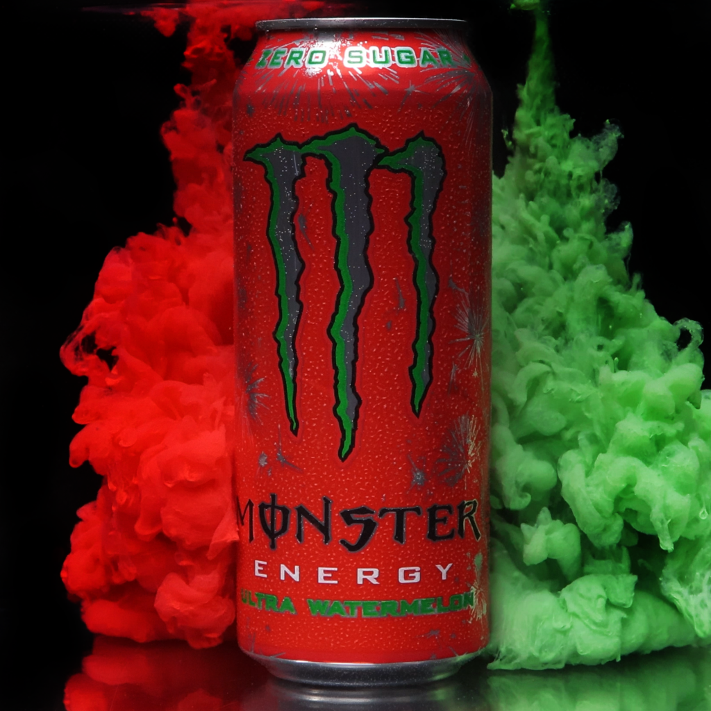
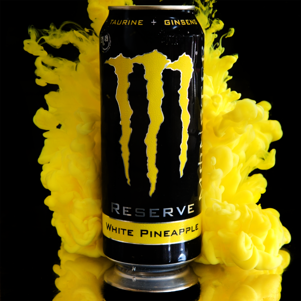
The first shot I did was this shot of Ultra Watermelon. I will be showing my editing process here and this same process will be used for all other pictures.
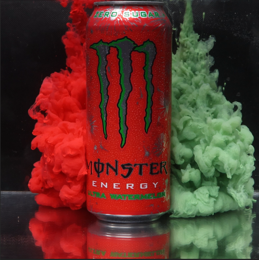
This is the original.
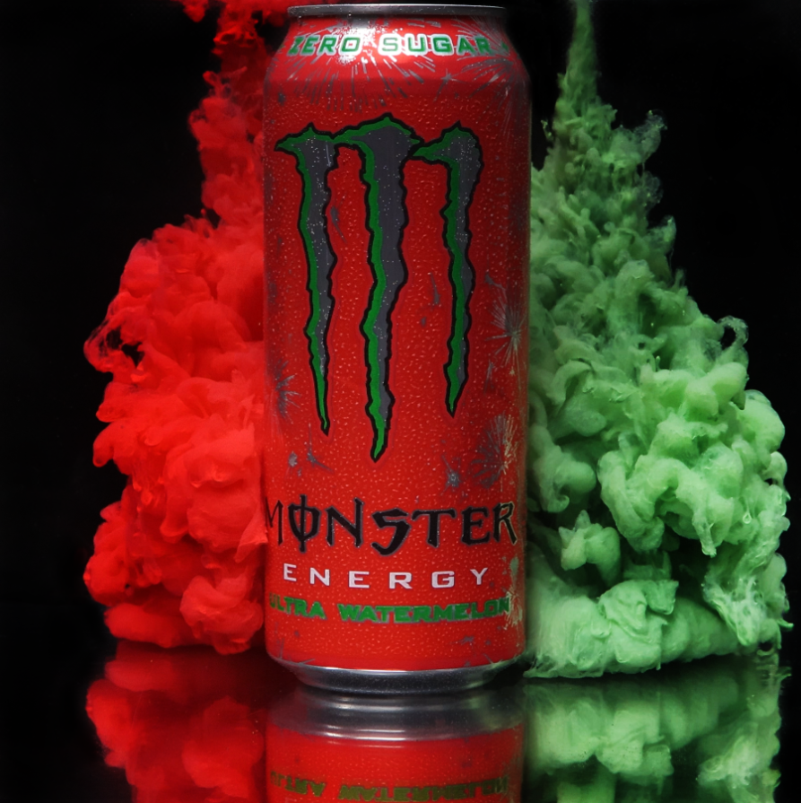
I first crop and straighten out the image.
After this, I burn the background and spot heal the box along with any blemishes created by extraneous variables,
To make the colours look equal, I saturated the green cloud, creating the final.
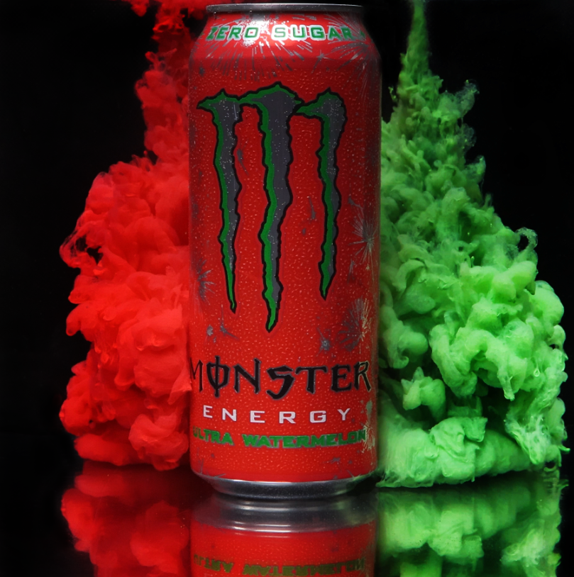
This created a good final image. There were small issues with it, but most of those could easily be fixed in the final images. I also decided to default to using a 2064×2064 resolution for all of the images because the 4K video quality allows for me to shoot that high. Because I now had my final shoot concept, methods and editing ready, I just needed to grab the subjects.
Acquiring a High Quality Video Camera
To capture the images faster and make my life easier, I decided to use a higher quality camera. To do this, I went to the Central Media department in college and asked what kind of video cameras they had. This is where I found the Panasonic S5. This camera has full frame 4K recording capabilities at 60fps, exactly what I am looking for. I asked if I could borrow it and set up to do my shoots across 1 week, returning the camera after it was over. The email chain is below.
Acquiring the Cans: Sustainability
Because the Monster can is easily recyclable, my project is very sustainable. I used cans that I took from friends when they were done with them. After they were used for the shoots, I took them and recycled them in the appropriate way to make sure they would be taken care of properly. After I had acquired the cans, I had everything I needed to take the images.
The Shoot Week
The shoot week went very well. Because I practiced everything, it flowed very well and I was able to get pictures of all 25 different cans. I kept everything clean by using tarpaulin everywhere in the area and I made sure everything stayed washed before every use to prevent colours from seeping into other images. Washing the tank after every use was also essential to avoid unwanted spots from popping up.
Editing the Shoot
To edit the shoot, I first had to grab the screenshots from the videos. I did this by searching through the video for the correct frame and using the “Export Frame” tool.
This allowed me to export any frame directly from the video at the same quality as the video. I then would export the pictures into a separate folder and edit them from there.
While editing, I came across an issue with how to line up the images. However, I solved this by using reference points for the crop. As shown in the image below, I used the grid lines to line up the image at the three points highlighted on all the cans, which made them easy to create a more fluid video out of. Going from top right through to the bottom middle, the first point was making sure the left vertical line was slightly over to the left of the left most part of the logo. The second point was making sure the top horizontal line was in this little divot between two little mounds. The final point was making sure the bottom horizontal line was just below the bottom most part of the logo. This worked really well and created good consistency.

This left me with these final images.
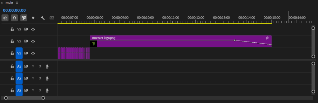
To create my primary piece, I put all of my images into Premiere Pro and ordered them while slowly making the clips faster, putting more of the ones I was happy with at the front because they would get more screentime.


I then added a monster logo at the end to cut out into. I also added an opacity keyframe so it would stay for a while then fade out to black.
After this, I added the tagline of Monster “Unleash the beast!” in a Monster font I found called “Green Energy.”

I also set this to fade, but I made it fade in first after the cut to the Monster logo then made it fade out at the same speed as the logo.

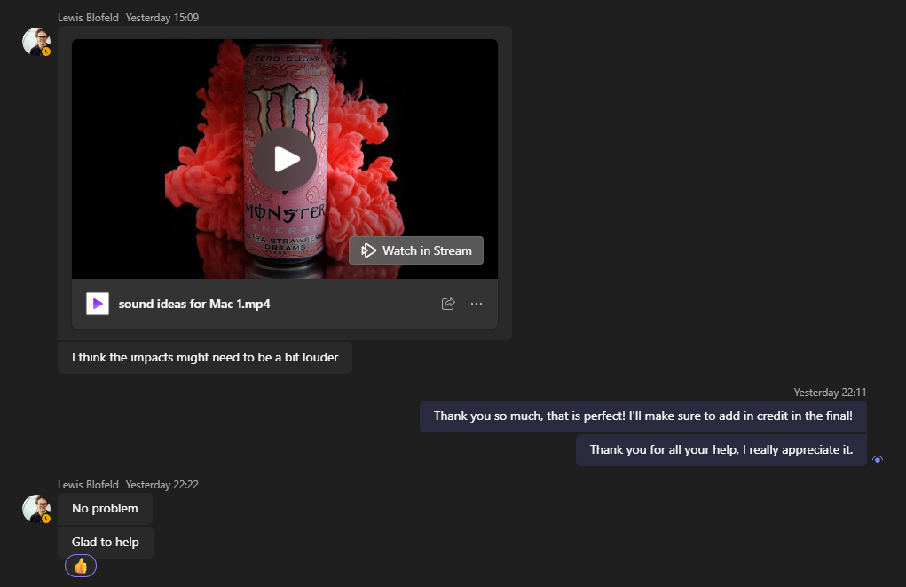
To help with sound design, I enlisted one of the music people to help me out. I explained what I wanted and even added a vocal sample and after a bit of back and forth, I had an audio sample.


After adding this into my video, my final piece was finished. To upload it, I originally tried uploading it to Youtube as I normally do, but it was uploading in 4K resolution and was not progressing. To fix this, I put the file on Dropbox so it can be accessed there.
To create my secondary piece, I created a 5X larger canvas and placed all of the images on there in a 5X5 grid pattern.

For printing, I will be doing this on A0. Because of this, I changed my DPI to 300 to match the printer and changed my image dimensions to fit the paper size.