
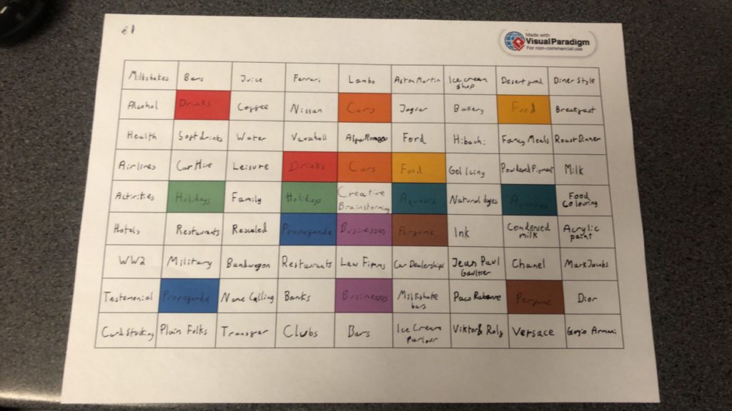
To begin, I wanted to find a theme to focus on. Because my Specialist Industry Practice is in Advertising and Product photography, I decided to use the technique of a Lotus Blossom mind map to decide on a good topic to do. I used this to create 8 different topics and think of different things that I could do to expand on those ideas.
The 3 that I would like to mainly focus on are drinks, food and aqueous. I will be conducting a test shoot for each of these ideas over the first week to decide which one I like the style of more and which one I would like to continue doing. Alongside this, I will be doing research into the different areas to increase my knowledge in the specialisation for future use. With all of these topics, I will be improving my technique in physical prop making and altering, studio technique and camera control to ensure a good quality outcome.
Food
For this section, I will be focusing food photography. This will be mainly focusing on advertising photography.
Stuart West
Stuart West is a London based studio photographer specialising in food and drinks photography. He has worked with such people as Sainsburys, Ocado and Magnum Chocolate. His work is usually studio based with use of colourful backgrounds to match his subject.

This image features a single chip stabbed with a fork with some ketchup on it. It has a simplistic background, a yellow to match the chip while being different enough to create a contrast. The fork used here is interesting. Instead of going for the typical four pronged fork, he used a short three pronged fork reminiscent of the wooden forks commonly found is fish and chip shops across the UK, a staple of British culture. There is also some ketchup on the chip, a common dip to go with chips. This classic pairing appears reminiscent for the viewer, going well together like red wine and steak. It is shot from a front on perspective and is lit from the top left, shining down on the chip like the sun, another common theme of eating fish and chips on the seaside.

This image is of some peas that are arranged where the pods are slightly transparent. This is a very interesting way to show the peas, resembling an image in a microscope of tiny organisms. There is a natural reverse vignette stemming from the light being in the centre and coming behind the peas, moving outwards to a yellow-green hue to match the subject. The colour green promotes the idea of health and nature, with the latter linking back to the idea of organisms under a microscope. These peas also appear to be thinly sliced horizontally, mimicking a small sample of something, again linking back to the microscope idea.
Drink
For this section, I will be focusing on drink photography. This will mainly have a focus on advertising.
Martin Wonnacott
Martin Wonnacott is a London/NYC based advertising and product photographer originally from the UK. He had worked with some of the biggest brands in the world such as Coca Cola, Lipton and SmartWater. His work is a mix of studio based visuals and on location advertising shoots with interesting uses of lighting, framing and ideas.

This shot is of two Jack Daniel’s Coca Cola mixer cans colliding. The collision is in a typical “Cheers!” fashion, a familiar movement and action for most to understand. This is used to create the movement of the water, showing the condensation of the cans off, promoting the idea that the cans are chilled, cold and refreshing. There is also two different types of cans being shown, one regular and one with zero sugar Coca Cola, showing off variety. This shows that there is something for everyone. There is a vignette created with the red central lighting in the background fading out into black, putting the focus towards the centre of the image. The use of red is also very common around food and drink products, promoting the idea of hunger.
Mark Mawson
Mark Mawson is a London based studio photographer specialising in advertising and aqueous photography. He is known for his incredibly varied portfolio and interesting imagery, advertising for different companies such as Gap, Nespresso and Sherwin Williams.

This is an advertisement for Zero Sugar Coca-Cola. It features a Coke can covered in condensation. The condensation is used in conjunction with the text to write the slogan for the product “Incredible taste. Zero sugar.” The “Zero” is highlighted by being written from the condensation, adding to the idea of the drink being fresh and refreshing while also putting emphasis on the zero sugar as a selling point. There is also focus with the lighting on the O in particular, which also matches really well. The red colour palette is very recognisable as Coca Cola while also having connotations of hunger. There is also a tagline in the bottom right that doesn’t distract from the image while reinforcing that idea. This is also seen in the bottom right, where the brand logo is shown to reinforce the brand’s identity.
Aqueous
For this section, I will be focusing on aqueous photography.
Kim Keever
Kim Keever is a Florida based artist that uses his knowledge of science and engineering to create masterpieces. He was an ex-NASA employee with an extensive background in engineering who quit his job to pursue a passion in photography.

This piece shows a pale blue cloud. It is reminiscent of a more sab but solemn piece due to its colour. I personally see the idea of a ghostly woman emerging from the cloud itself, perhaps to look back on her life or to look down upon someone she left behind while moving into the afterlife. This is caused by the little details of the clouds, moving uniform but disjointed like curly or frizzy hair. I also like the use of framing, filling almost the entire frame with this cloud but having it slightly off for a bit of imperfection.
Mark Mawson
Mark Mawson is a London based studio photographer specialising in advertising and aqueous photography. He is known for his incredibly varied portfolio and interesting imagery, advertising for different companies such as Gap, Nespresso and Sherwin Williams.

This image is one of the collaboration pieces Mawson did with Sherwin Williams. It is composed of a silky cloud behind some text and an image of the paint can being advertised. The main focus of the image is the text, a white on a bold background created by the cloud. This cloud also matches the colour of the paint being sold, showing off the product in an interesting and creative way. The text is placed on top of the cloud, drawing your attention to both the text and the cloud at once without taking away from the overall image. There is also a link to the website below the can to make to easier for consumers to know where to purchase the product, giving access to people who may not have previously known of the brand. The use of the clean font is very fitting, being simple but effective. This all creates a very interesting image that is composed beautifully with the brand and consumer in mind.
Conclusion
Overall, all of these ideas would be interesting to follow, but I am leaning more towards combining two of the ideas. I am thinking about using a Mark Mawson style for the aqueous photography advertisement, but blending it with Martin Wonnacott’s style of drink photography. This could create some interesting visuals that I may explore in a future photoshoot to test out.