
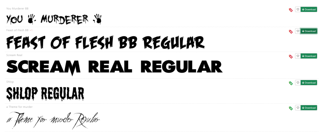
The first thing I did was to go to various websites to look for fonts. I used popular websites like 1001fonts and dafont to search for the correct font.
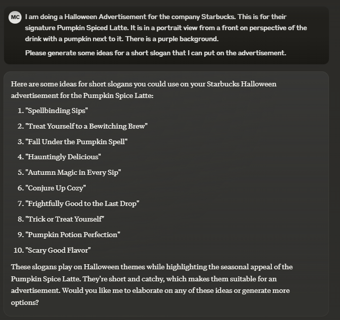
To find a good slogan, I searched a prompt into the Claude AI. This prompt was:
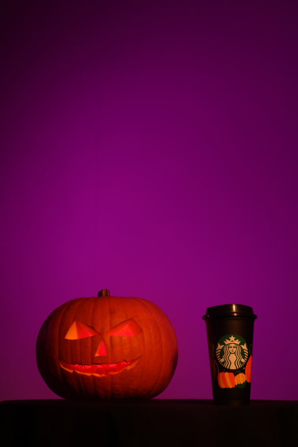
“I am doing a Halloween Advertisement for the company Starbucks. This is for their signature Pumpkin Spiced Latte. It is in a portrait view from a front on perspective of the drink with a pumpkin next to it. There is a purple background. Please generate some ideas for a short slogan that I can put on the advertisement.”
The ideas generated are below.
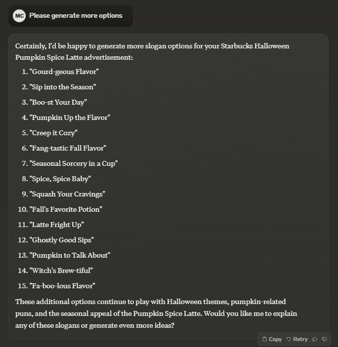
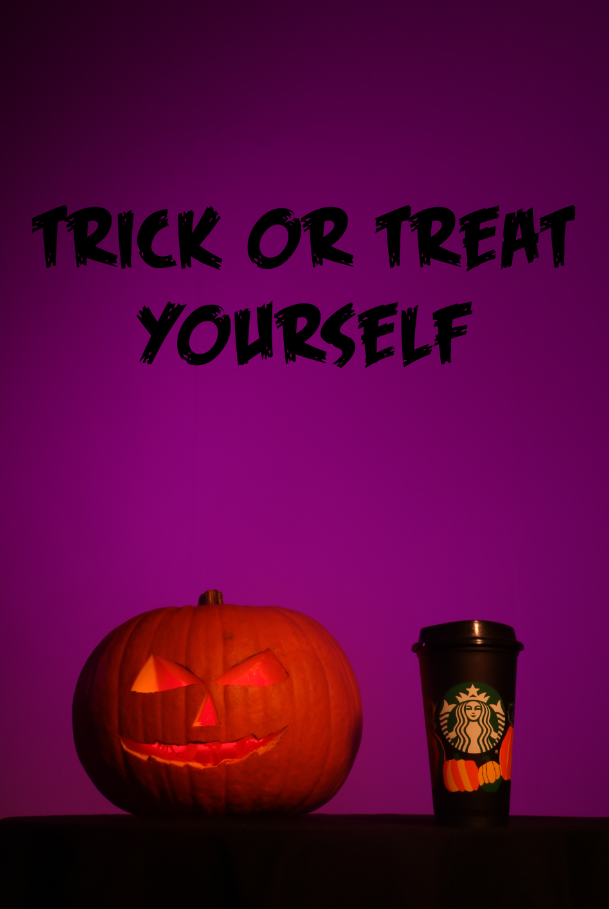
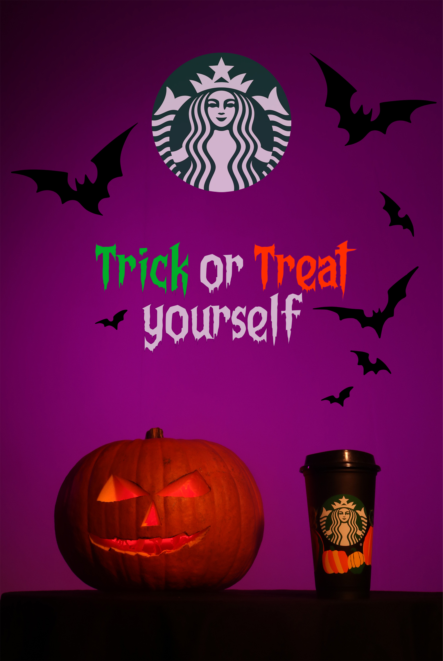
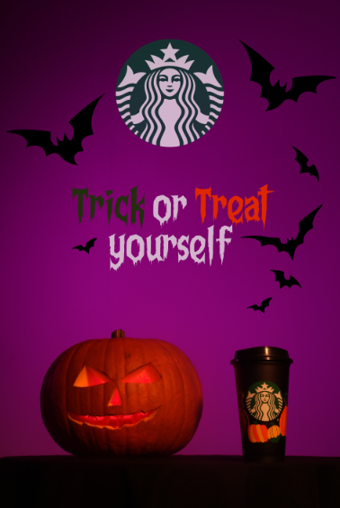
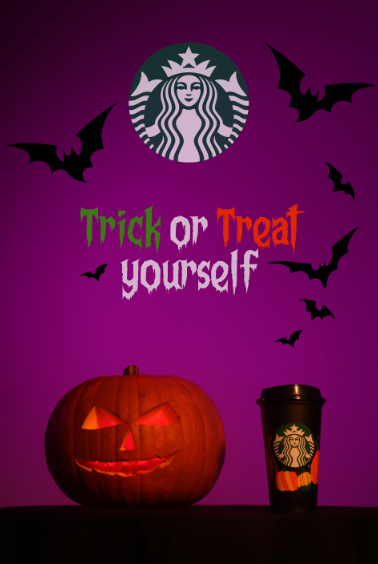
I decided to use the phrase “Trick or Treat yourself” because I could create emphasis with the capitalisation of the letters as well as creating emphasis with a colour change for those words. I used the “Feast of Flesh BB Regular” so I can get my colours and sizing correct.
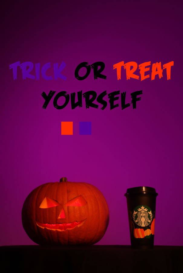
I experimented with using the colours from my Pecha Kucha presentation that were taken from other advertisements. While the orange worked very well, I felt like the purple didn’t blend properly, but I kept it for the moment while I looked for new fonts.
I eventually settled on “Frightmare”, a simplistic font that works well for the advertisement. It has uppercase and lowercase so I can use capitals to emphasize and it is not too big. However, it is a bit thick so I may have to change that soon.
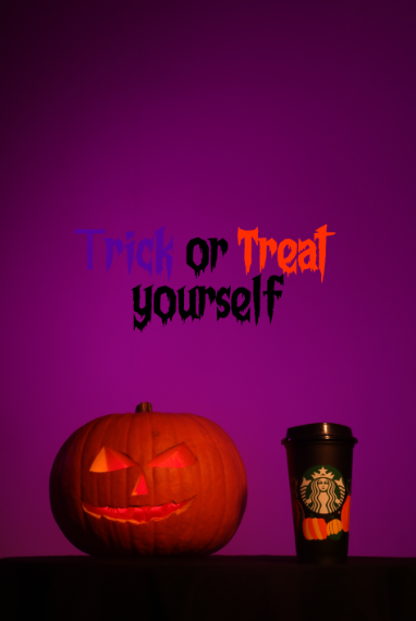
I then changed the colours around to see how it would work. I used a slightly purple white so it wasn’t too blinding while still standing out while using the Starbucks green for the word “Trick” instead of the purple. This worked better, but the colour was just too dark and drab for the advertisement.
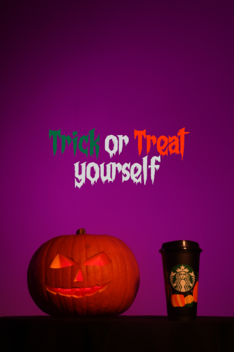
I then changed it to be a very bright green like a witches brew, but it was too neon and contrasting so I decided to try find something more in the middle of the two.
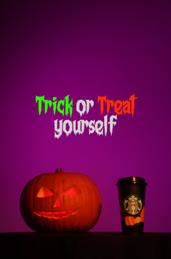
This is when I found this green. It is contrast to the background and the orange without being overpowering and blinding.
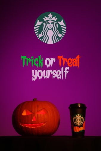
To create more brand recognition, I added the logo and slightly blended it with the opacity tool. This makes the while less overpowering while making it seem like an actual part of the background.
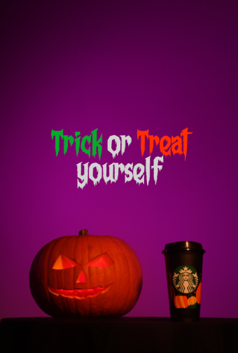
To solve my issue of the letters being too thick, I sampled a purple from the background and created a thin outline around the letters to improve spacing and make them thinner.
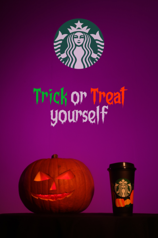
To follow the themes of Halloween, I added some silhouettes of bats and moved them around a bit to create this background.
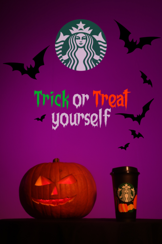
To blend the logo slightly more, I then decided to burn the shadows slightly. This created my final image shown below.
I did one final piece of experimentation by using the orange and green from the Starbucks cup, but it looked awful so I wont be using it.
I then altered the colour and it did look better, however I didn’t like making it look murky because that makes the image look more drab and dirty which is not good when promoting, so I will not use this.
Conclusion
Overall, I believe I have successfully created an image that could be used to advertise effectively. My use of colour theory and being able to dissect other adverts and apply what I learned about them to my own has worked quite well. I planned for the shoot well and everything went as intended. I also got to experiment with making my own props.