
For Juggernog, I wanted to follow down the route of the style I found when looking at the Perk Jingle. This style was very 40’s/50’s style advertising that I would typically associate with Coca Cola. This style is very traditional, with a woman in a polka dot dress, voluptuous curly hair and bright red lipstick. One of my main inspirations is this picture seen below.
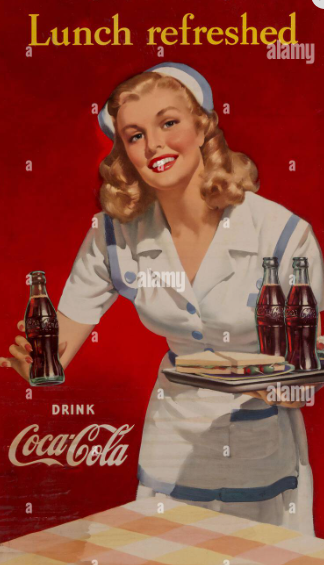
Some elements I would like to use is the female model holding the bottle, the colour matching background and the use of text. However, I would like to change some things, such as using a polka dot dress, changing the text and using a different pose. I have a few poses in mind that I will be testing out to see which one looks the best.
Test Shoots
Test 1
For the first shoot, I used a skeleton mannequin as a substitute for a model. This was simply so I could see how to separate the lighting for the model and the lighting for the background. It was a success overall as I was able to use a softbox to light the model in the front and use a light with gel in the back to light the background. However, the red lighting was not even so I had to figure out a way to make it look better.
Test 2
My second test shoot was used to further test the lighting and test some poses. I used my models for this shoot so they knew what poses to do for the final shoot. I also solved the issue with my lighting. I did this by using a softbox for the red lighting as well. Through some research, I discovered that you can use gels with softboxes, something I did not previously know. I did not have enough gel to put over the light diffuser, but I did have enough to put inside the softbox itself. After this, the red light was able to be evenly distributed on the background, fixing the issue. I also found that the models were able to easily do the poses, so we were able to move to the final shoot. The settings are below
Conditions for the shoot
- Same lighting used in practice – One red softbox for background and one normal softbox to light model
- Shutter Speed 1/125, Aperture f18, ISO 200
- One layer of red gel in softbox
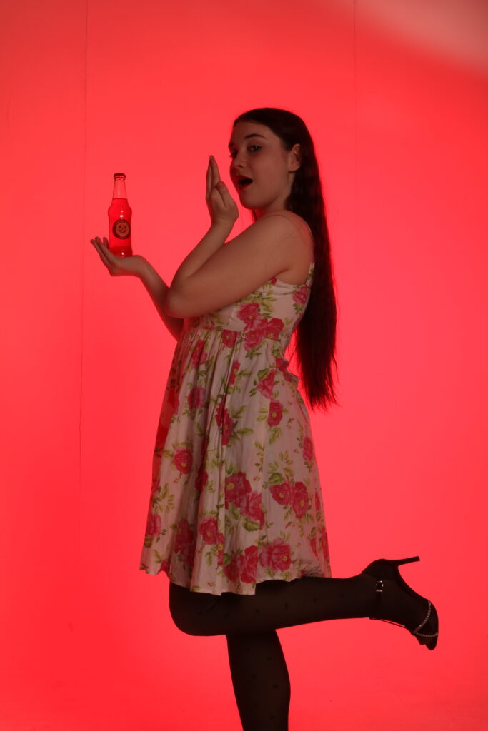
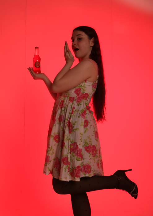
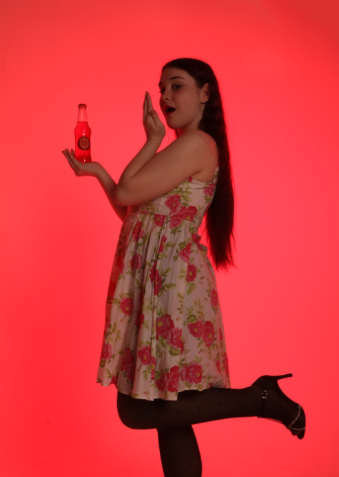
Final Shoot
Contacts
Edits
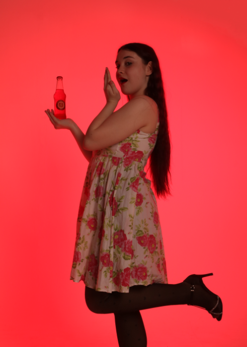
original
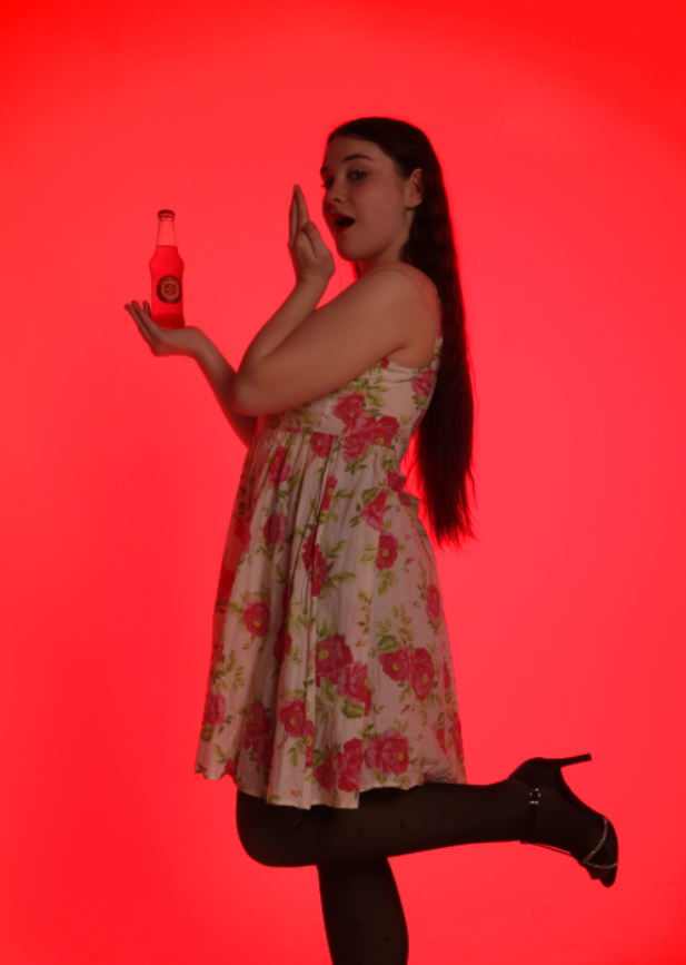
changed to 5:7 ratio
clean up the top right corner lighting and the background lines
removed light from bottle
cut her out and made the background more saturated, emphasizes vignette
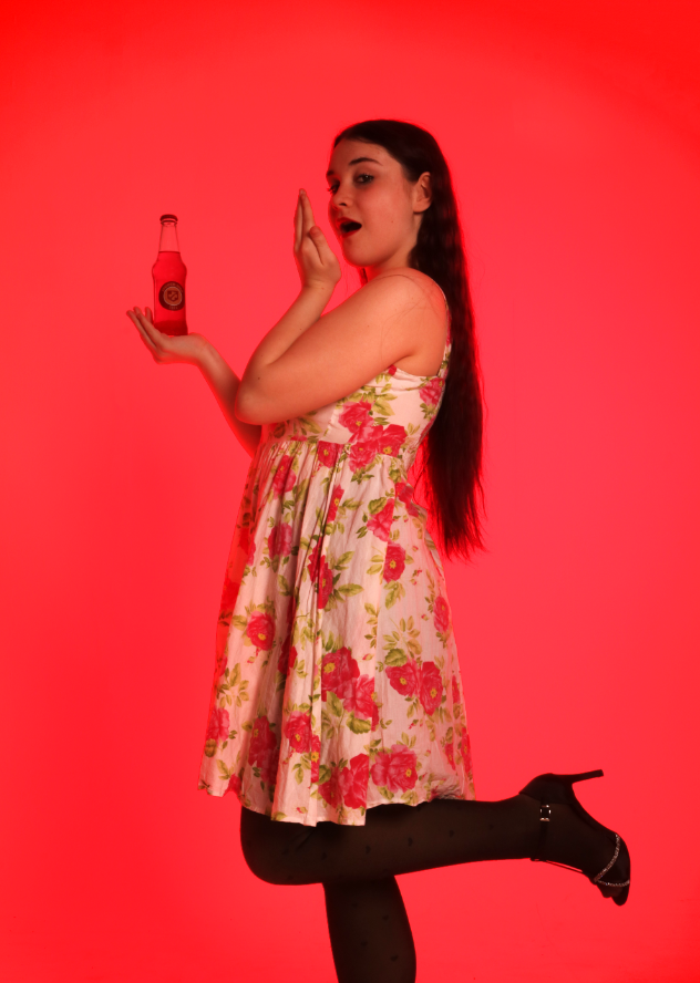
dodged the model to make her seem more prominent

used birds of paradise font because it was an eloquent font similar to coca cola, the main inspiration for the shoot
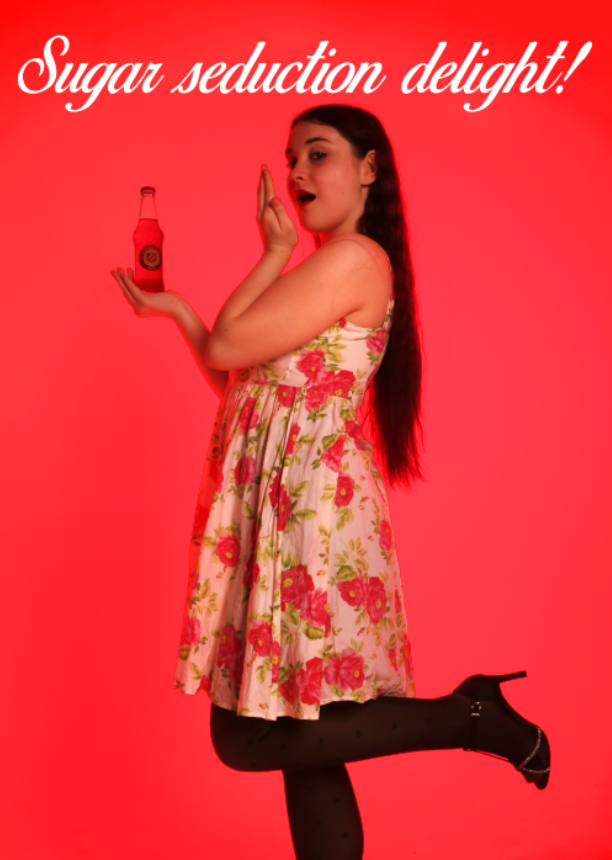
added into the picture and sized to fit. text references the jingle
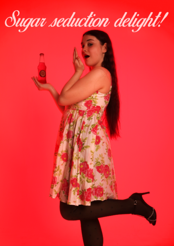
used linear light with a slight opacity change to make the text less contrasting
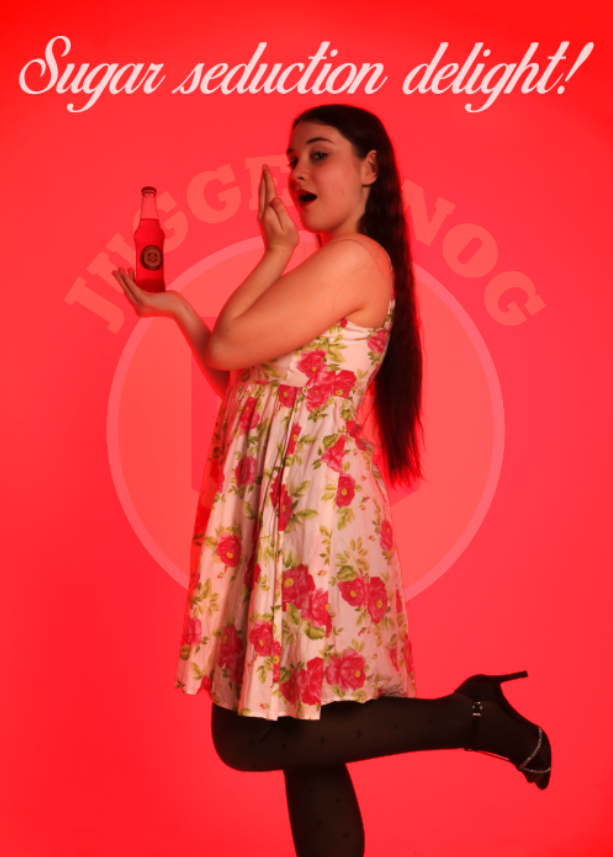
experimented with putting logo behind the model, but didnt look great so went back to previous image. this created the final below