Finding a Novel
To begin my project properly, I first needed to find a novel. Finding a novel that can link to advertising was very difficult considering the limitations that come with finding a recognisable product within a fictional universe that can be advertised. One idea that first came to mind were Nuka Cola from the Fallout universe, but I couldn’t find any links to that in the graphic novel that was released. I was only able to find these links through other pieces of media. Another idea was Willy Wonka’s various consumables, such as the Never-Ending Bubblegum or the Wonka Bar. However, I felt like that wasn’t something that would make for a good advertisement in the style I am looking to practice. However, I will be keeping this idea in case I don’t find success with my other ideas. I wanted something that would be bright and would pop, but that also could have some darker tones to it.
This is when I stumbled upon the Call of Duty: Zombies novel. After looking through the novels, there was one character in particular who stood out: Russman. After further research, I found out that he worked for a group called Broken Arrow: a program created to prevent another undead outbreak after the events of “Five” where the POTUS (John F. Kennedy) the US Secretary of Defense (Robert McNamara) the former Vice President of the United States (Richard Nixon) and the Prime Minister of Cuba (Fidel Castro) were caught in a breach of the undead while discussing the Cold War in the Pentagon. While in employment for Broken Arrow, Russman was in contact with Element 115, an element sent by an alien race known as Apothicons. This element had various uses, such as reanimating dead cells which caused various zombie outbreaks. However, the main application that I would like to look into is the Perk-a-Colas.
Perk-a-Colas are a set of drinks created by Group 935, a group of scientists that mainly worked with Element 115 and collaborated with Broken Arrow. These drinks provided various benefits, such as Juggernog providing extra life, Stamin-Up boosting stamina and Speed Cola increasing action speed. However, the main thing that I enjoy about these colas is that each one has a specific look to them because they all come in a vending machine made specifically for each one. These vending machines also come with “Perk Jingles” which is a song that is written to play on repeat to entice you to buy the cola. I will be using these to base my ideas around what sort of themes can be present in the pictures.
Another idea that I had surrounding the books was the setting that it takes place in. There are many links to themes surrounding the war, such as Germany funding projects done by Group 935 because of their interest in using the weaponry they could create. This is also what leads to the creation of the zombies, as Germany was looking to create an undead army to assist in the war. Because of this, I was thinking of making possible propaganda advertisements in a similar vein of classics such as the classic “Lord Kitchener Wants You“. I will be doing some more investigation into how they created propaganda and the themes they followed to incite the people to do certain things for them and what kind of things I could create following that same path.
Conclusion
In conclusion, I will be doing some further research into the individual perks and jingles to discover some more elements that I can add into the overall design of the shoot. I will be also taking inspiration from other artworks such as drawings or official concept art. I will also be looking into propaganda and how different countries, political parties and companies have used it and how it has affected the people. I will research how it has changed over the years and how I can put it into my project.
Project Proposal
In my previous project, I started to explore my specialist practice through the lens of “Fear”. This led me down the route of Halloween, which linked well to the idea of product shooting and fear quite well. I was able to further advance various techniques, such as lighting, use of colour theory, semiotic analysis and studio etiquette. I will be further focusing on advancing these techniques and integrating these into my work more. I want to focus more on semiotics for this project, so I will be putting more focus into putting the themes into the photos with more effort, making use of props, wordplay and clever editing to do so.
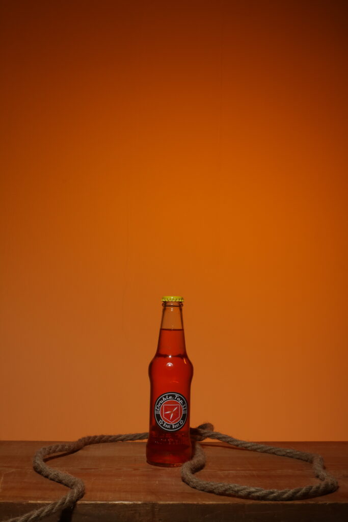
My aim is to create a group of shots based on the Perk-a-Colas that are featured in the world of the graphic novel “Call of Duty: Zombies”. I was looking into the idea of doing a propaganda style shoot to try and rally people together behind one of the organisations in the story, but I realised after doing some research that the group was very secretive and did not want their work exposed, so it would not make much sense for them to put out propaganda to get people to enlist in their group. This led me to looking into the Perk-a-Colas, where I found a brilliant product that I could do work on. There is a lot of them and they all have different themes, so I will be sticking to 2 of them: Juggernog and Double Tap. I will be using models and various props that I will be searching for to be able to create semiotic links to the products and I will be experimenting with lighting techniques to see which works best with the bottles and the props.
During this project, I will make sure to keep linking back to the previous parts of my project to make sure I am keeping on track with my objectives and my artist research. This will allow my work to be more fluid and easier to follow, keeping a good amount of order so the working process goes more smoothly.
Artist Research
In this section of the project, I am going to be analysing various advertising photographers to look into techniques that they use to develop their pieces. This will be techniques that are used in camera, in the studio and on the products themselves. To keep consistency, I will be looking into drinks advertising, which can provide a lot of variety while still keeping a similar base product.
In Camera
To define the idea of an in camera technique, the criteria would simply be any setting or change you can make directly within the camera. For this, I would like to analyse this image created by Martin Wonnacott.
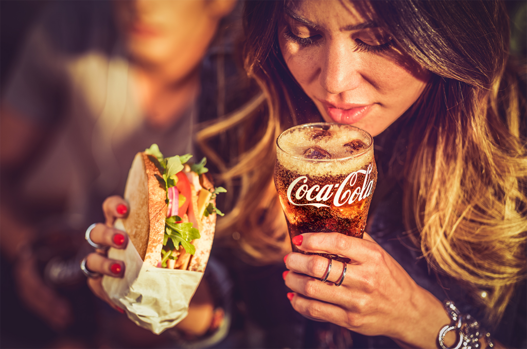
This image features a woman with a sandwich in her hand drinking a glass of Coca Cola. The woman appears to be at some sort of gathering with friends, with her friend behind her while she sips her drink. The logo is clearly in view to provide recognition to the brand, looking ice cold with 3 ice cubes and some head on top of the drink. The woman appears to be in her 30’s or 40’s. However, the think I would mainly like to highlight in this image is the focus. The focal length used results in a shallow depth of field, which further separates the background from the foreground. This creates a very crisp focus and a clean differential between the background and the main focus of the image. The depth of field can also be adjusted with the aperture which could have been used to make it even more narrow. This is only really useful for images that need a distinct difference to separate the background and foreground, but it is a very good technique to have for less studio based shoots instead of shoots where the backgrounds are more artificially created, such as just using a blank background for text.
In Studio
To define the idea of an in studio technique, I would classify it as controlling something exterior to the camera or the subject, such as the background, items around the subject or the lighting. For this, I will be looking at an image by Mark Mawson.
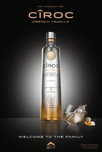
This image is a bottle of French Vanilla Cîroc, a vodka brand. It is placed on a reflective surface with a glass alongside it with the text “Welcome to the family” placed underneath, implying a sense of warmth and agreement around people choosing to drink this. However, the main technique I am interested in here is the use of lighting. This is known as spot lighting and is used in this image to create a vignette around the image without the use of Photoshop. This highlights the bottle by leading your eyes more toward the centre while also leaving room for the creamy coloured text to match the bottle without completely whitewashing it and making it unreadable. This is very suitable for adverts of this style because it looks very sophisticated and high quality, which is also mirrored by the tagline. This lighting could be very nice to try for one of the products I am considering doing.
On the Product
To define the idea of an on product technique, I would say that it is a change made that directly affects the product to make it look better for camera. For this, I will be looking at an image from Johnathan Knowles
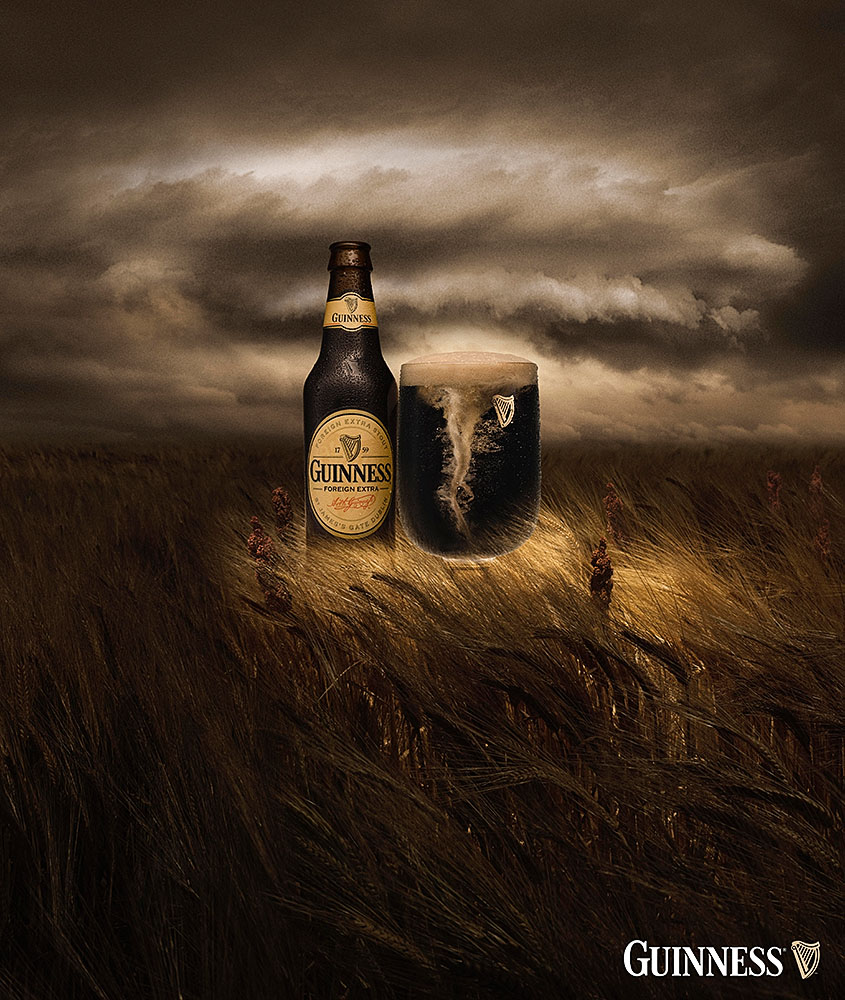
This image is of a bottle of Guinness with a cup next to it filled with Guinness. It is a very drab picture and takes place in a field of barley. The lighting is showing through an opening in the sky and is shining down from the top onto the product. The main part of the image I would like to focus on is how they have instituted a tornado look into the drink in the glass. This directly affects the product, but it makes it blend into the background in an interesting way that makes sense for the brand, as beer and lager is known for having head on top. My guess is that he simply stirred up the drink to create the tornado effect and used a high shutter speed to freeze the moment, but the information on how he did it is not publicly available.
Novel: Propaganda Research
Propaganda, as defined by Oxford Languages, means “information, especially of a biased or misleading nature, used to promote a political cause or point of view.” Starting in the early 20th century, propaganda was usually seen as a very manipulative approach, often using loaded language to provoke irrational responses and selectively presenting information to better promote a certain ideology.
The main examples of propaganda I would like to look at are those based around the First and Second World Wars because that is the time in which events of the stories I am researching take place. Famous pieces of propaganda from around this time include:
I will be looking at all these images and analysing them to see how they were used effectively and ways I can use similar techniques in my own work.
Lord Kitchener Wants You
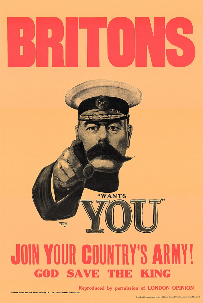
This image was created in 1914 at the beginning of the Great War. It was created as an advertisement by Alfred Leete which was later developed into a recruitment poster. This is one of the most famous uses of propaganda and was the basis for other famous propaganda, such as the Uncle Sam poster created 3 years later. It features Lord Herbert Kitchener, the British Secretary of State for War from 1914 to his death in 1916 from a sunken ship due to a German explosive off the shores of Scotland. This image also has various calls to action, such as “Join your country’s army!” and “Wants You” to create emphasis. The simplistic imagery with the bold word created a very simple yet iconic image that is very widely recognised as one of the most famous uses of propaganda. This simplistic style could be very good for use in my photoshoot for propaganda because it creates a very simple directive for what the viewer should do. It is not overwhelming or overdone, it is a simple call to action while still being very direct and encouraging.
When you ride ALONE you ride with Hitler!
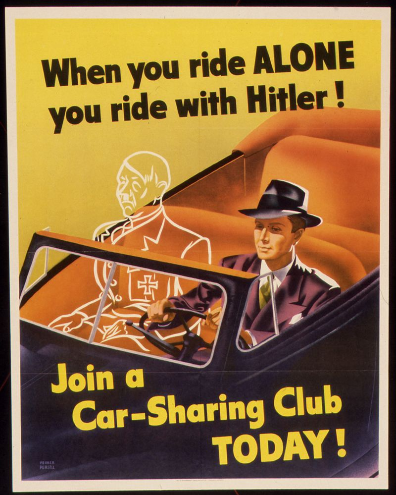
This is a poster designed to assist with the campaign to reserve as many resources as possible. Around World War Two, there were various efforts made by the American federal government to reduce the number of resources being used. It came out in 1943 as the Americans didn’t know how much longer the war would be going on for. This is made to incentivise the American people to carpool to save resources, specifically conserving rubber on the home front after the Japanese military cut off access to rubber plantations in southeast Asia. The reasoning behind the poster plays in to this because the solution the Americans thought of was gasoline rationing because it would inherently lead to less usage of cars so the rubber would last longer. This is trying to say that by riding alone and using your car, you will be wearing it down more which means you are helping Hitler in the war. The text is direct and shocking, leaning heavily into the logical fallacy of reductio ad absurdum, meaning “reduction to absurdity.” This happens when an idea is stretched to its most extreme, which is apparent here by saying that not sharing a car is equivalent to helping Hitler.
Uncle Sam
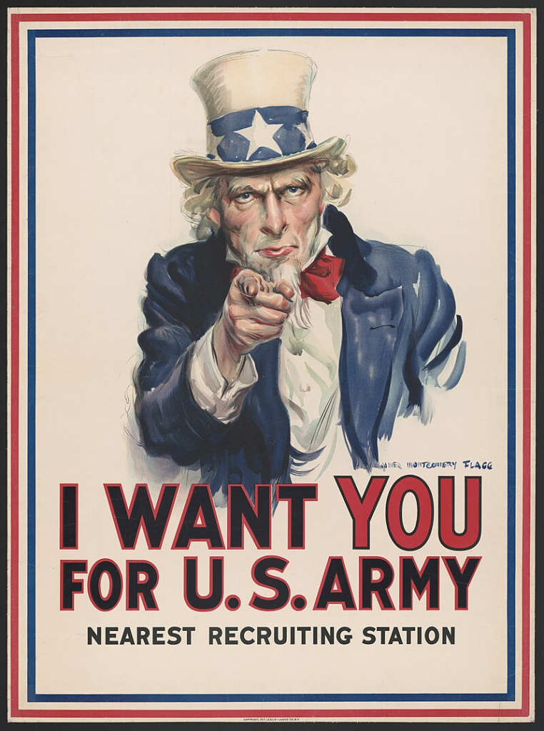
This image shows Uncle Sam, a national personification of the Government of the United States. He is most commonly associated with the idea of freedom and patriotism. The poster shown here was created in 1917 by James Montgomery Flagg, an American artist, comics artist and illustrator. His name is seen signed above the word “YOU” in the quote below. The poster was made with inspiration from the original British Lord Kitchener poster shown in the first example. The image features Uncle Sam pointing directly at the viewer, mirroring the direct and encouraging themes from the previous poster. This is also mirrored to a further extent with the wording, using the phrase “I WANT YOU FOR U.S. ARMY”. The use of the word “I” makes the interaction seem more personal than the previous one, acting as if Uncle Sam is directly addressing the viewer.
Conclusion
Overall, these posters are very interesting and the methods they use to draw people in work very well. I am thinking of doing the drinks idea but somehow combining a method of propaganda into the image, perhaps with a poster in the background. This could create some interesting effects with the final piece.
Novel: Perk Analysis
In this section, I will be looking at the designs of the perks and how I can utilise them to add details to the advertisements. I will also be talking about the effects of the perks and links to things I can involve in the process of creating an effective advertisement.
For my project, I have decided to focus on 2 main perks. These perks are:
- Juggernog – Increases total health
- Double Tap – Increases fire rate and doubles bullet damage
I chose these 2 perks because they were the first perks to be released. They also all have the best perk jingles in my opinion and are the most recognisable perks. Along with the release of the map “Shadows Of Evil”, these 2 perks also had revamped jingles in the style of the map that I will also be looking into to further analyse the perks and consider the creative choices I could make. Choosing 2 perks also allows me to make a nice mini collection that will fit well together without overwhelming myself with work.
Juggernog
Juggernog is a perk that is featured in Call of Duty: Zombies. This perk increases players health allowing them to take more damage from enemies. The effect is hinted at in the name, as it is a portmanteau of the words “juggernaut” and “eggnog”. The soda is also made with the base ingredients of eggnog (milk and eggs), with the ingredients list reading, “Carbonated milk, powdered crocodile eggs, spinach juice, pure gumption, and is fortified with iron.”
After some searching, I found a high quality 3D render of the original machine created by William Leggatt, a talented 3D artist. As shown in the gallery, the machine has the main colour of red, which is widely associated with themes such as hunger, fearlessness and power. These themes link very well to the perk because it looks to provoke hunger so it looks appetising to consume, it promotes fearlessness because of the effect of the perk (increasing health) providing safety to you and it links to power because it makes you feel more powerful being able to withstand more damage. The writing on the machine also links to various things, such as the “MADE WITH REAL EGGS” on the front linking to the ingredient of powdered crocodile eggs and the facts that eggs are used in the making of eggnog.
Juggernog is also typically associated with links to drinks such as Coca Cola, with a similar style of traditionalism with the perk jingle and typical Coca Cola advertising. This means that I will be using Coca Cola advertisements for some ideas on what I can do to bring Juggernog to life.
Double Tap
Double Tap is a perk that is featured in Call of Duty: Zombies. This perk doubles the damage of the bullets and increases the fire rate of the users weapon. This perk is based on the idea of the double tap, a shooting technique that is credited to William Ewart Fairbairn and Eric A. Sykes, British police chiefs working in Shanghai during the 1930s. This techniques was developed to overcome the limitations of full-metal-jacketed ammunition which can sometimes fail to cause sufficient damage. The name of this technique was later popularised in the hit film Zombieland (2009) where the technique of the “Double Tap” was one of the main rules followed by the protagonist of the film. This was cemented further in the titular sequel Zombieland: Double Tap (2019).
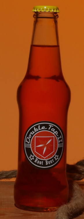
While the original recipe was never shown, there is a canned version that was shown with the release of Call of Duty: Black Ops Cold War that has a recipe list containing “Lemon juice, lime shavings, high octane gasoline, vitamin K, capsaicin, jumping bean extract”.
The main colour used in double tap is orange. This colour is widely associated with optimism, enthusiasm and youthful connections. These fit well with the idea of Double Tap, as the jingle has been shown to be uplifting and happy, enthusiastic and very joyful. Being youthful is also linked to ideas of being faster and more energetic, exactly what the perk promotes with lines such as “Cowboys can’t shoot slow” in the jingle.
Conclusion
I have some ideas from this on various themes I can use throughout the project. I will be using the background of these drinks to create engaging and interesting images with good semiotic themes.
Perk Jingle Analysis
In this section, I will be looking at the different jingles that come with every perk. There are two versions of each of the 4 perks, the original variant and one that is more jazzy and was specialised for a certain location. I will be looking into the lyrics and thinking of visualisations for what I could use for my images.
Juggernog
Lyrics:
When you need some help to get by,
something to make you feel strong.
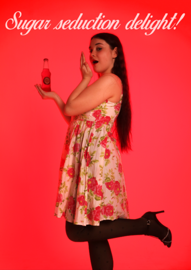
Reach for Juggernog tonight,
sugar seduction delight!
When you need to feel big and strong,
reach for Juggernog tonight!
This jingle has a very nice swing to it. Like many of these jingles, it is influenced by very 1950-1960’s style jazz. This is further pronounced through the use of the trombone, a harpsichord-adjacent keyboard sound and a swinging ride cymbal and snare drum beat. The vocals feel very reminiscent of classics such as Mister Sandman by The Chordettes, with a pleasant harmony of women singing. If I were to think of a visual style for this, it would take a lot of inspiration from 1950’s pinup style Coca-Cola adverts such as Example 1, Example 2 and Example 3.
Lyrics:
When you need some help to get by,
something to make you feel strong.
Reach for Juggernog tonight,
sugar seduction delight!
When you need to feel big and strong,
reach for Juggernog tonight!
This version is more of a jazzy and cluttered feel than the other version, but it feels much more polished. It substitutes the harmony of female voices for just one that cuts through the instrumentation while still remaining soft, reminiscent of a more Madonna esque era. It feels more bouncy and playful than the other version. The brass also feels stronger, mainly due to trumpet filling the higher tones instead of covering the mid range like it was in the previous version. The faster pace also makes it seem more upbeat to give a better dance style as opposed to the more slow swinging pace of the previous version, more akin to the charleston, a dance popularised in the early 1920’s in a song of the same name. If I was to visualise this, it would be closer to a 1920/1930’s style burlesque performance.
Double Tap
Lyrics:
Cowboys can’t shoot slow or they’ll end up below.
When they need some help, they reach for the root beer shelf (Yee-haw!).
Cowboys can’t shoot slow, or they’ll end up below,
when they need some help, they reach for the root beer shelf.
YA THIRSTY PARTNER!?
This jingle is a very stereotypical cowboy style song, sounding like something you would find in a jukebox in a wild west saloon. This uses a typical snare and tom backbeat with a ragtime piano triplet and a simple bassline to create the main beat. This is paired with a gruff male voice and some lighter female backing harmonies. The backing harmonies are also saying the name of the perk, “Double Tap”. The lyrics speak to the effects of the drink and how it makes them shoot faster, also saying that they “reach for the root beer shelf” which is a very stereotypical American style drink associated with cowboys. If I was to visualise this, it would follow some stereotypical cowboy themes such as rodeos, lassos and cowboy hats.
Lyrics:
Cowboys can’t move slow, they’ll end up dead or old,
when they need some help, they reach out for the shelf.
Cowboys can’t shoot slow, they’ll end up dead below,
when they need some help, they reach out for the shelf.
Have no fear, the Double Tap Root Beer,
get all the damage done,
Double Tap Root Beer, will double damage fun.
Oh Yeah, Get Thirsty.
This jingle is more calming and slower than the original version. It uses a guitar for the chords and bass with a brush drum backing. There is also some brass instruments used for harmonies and occasional syncopation. The male leading voice is less gruff and more smooth, reminiscent of Johnny Cash. There are also female voices features like in the previous version that use the same chant of the perk name “Double Tap”, although much slower due to the decreased tempo. As opposed to being more high energy like the previous song, this feels more like an older gentleman reaching for his 6th root beer on a lazy Saturday. Because of this, I would visualise this more calmly than the other, with an old man on a rocking chair as the main theme with some light cowboy imagery.
Conclusion
Overall, I was able to find some themes that I think will be very useful when it comes to creating my final products. For Juggernog, I will be using a very saturated 1950’s style Coca Cola advert feel reminiscent of music from around that time. For Double Tap, I will be using a more modern look with cowboy themes, such as a cowboy hat, a western bar and a noose.
Cyanotype Experimentation
Cyanotypes are a photographic process that produces a blue print by exposing a light-sensitive solution on paper or cloth to ultraviolet light. This can be both an artificial light or a natural light, such as the sun. The process follows a path similar to using a darkroom, but instead of using light-sensitive paper, you create a light-sensitive solution to put onto the paper or cloth. This is applied first to create the canvas and is then exposed to either sunlight or an artificial UV light to expose it. It has the same versatility as the darkroom, most commonly using a form of acetate to produce an image, but you can also use objects to create images, such as the artist I will be researching for this concept.
Joy Gregory
Joy Gregory is a UK based photographer and graduate of both Manchester Polytechnic and the Royal College of Art. She mainly focuses her effort on creating artwork with more political or social messages and meanings “with particular reference to history and cultural differences in contemporary society”.
The collection I would like to focus on that she produced was titled “Girl Thing” and was produced from 2002-2005. This exhibition looked into gender construction through pieces of clothing, jewellery and other objects typically associated with being “feminine”, such as female underwear, bangles, a doll and even a hand fan. This was done to show that people recognised the objects almost instantly as being associated with femininity and questioned why gender expectation had still stayed relatively the same compared to the claims of radical social change that had occurred in the last 40 years. This point is that people had not changed their opinions on social issues at all, it was simply that they thought they did because they thought that the overwhelming population had.
Possible Applications
- Her idea of using these cyanotypes to portray political and social issues interested me because I could possibly use that in a way to present propaganda because it is used to promote a certain political message. This could be done in a very obvious way by using a technique where the cyanotype is the full image.
- I could use the cyanotype for a certain part of an image, such as using it for a background of my propaganda or for one element of the propaganda.
- For my drinks idea, I could use it for the blue variant of the drink as a background and use some physical props instead of editing them in.
- I could experiment with changing the hue of the cyanotype digitally to allow more applications in work, such as changing the colour to match one of the other drinks.
Editing The Image
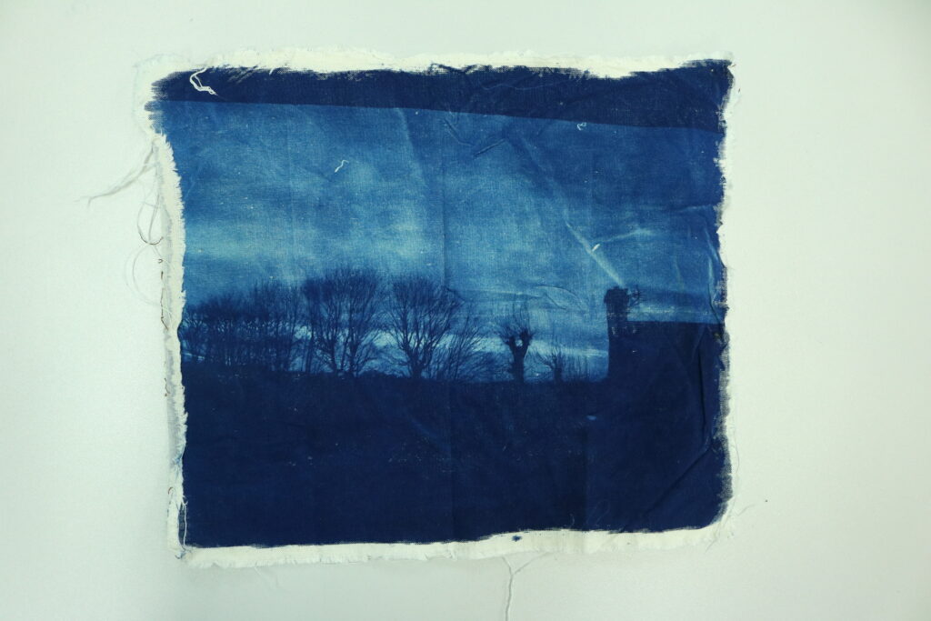
This is the image I chose to use for the cyanotype. I did this because the trees against the background would create some very nice contrast with the blue.
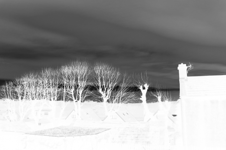
To make sure it would print correctly on acetate, I converted the image to be in black and white and inverted it, making sure that the houses and trees would be more exposed than the sky. I then printed this final part on acetate.
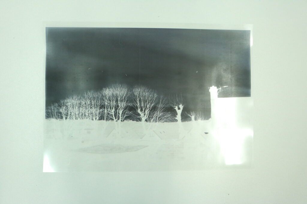
This was then used in the cyanotype process. I painted some fabric with the UV-sensitive solution and exposed it to an exposure unit for about 5 minutes. The fabric was then washed in cold water to remove the excess chemicals and was dried overnight. The process created the image below on the fabric.
Conclusion
I am happy with the image created. The detail in the branches contrasting with the background looks very nice. However, I do not think it would have much application in my project, so I will not be continuing to do cyanotypes. However, this may be useful for a future project so I will be keeping it in mind for the future.
Technical Skills Deep Dive
Step 1: Choosing your Technique
A technique that I will be practicing is using long exposure with a focus on light painting. This is a technique that I have used before, but the application that I will be using is vastly different. Instead of using it to create a prop as I have done in previous shoots, I am using it to enhance an existing prop. I was far from mastering this technique as I still see applications that blow my mind and seem impossible, but I will be attempting to refine it with what I have available to me. I feel that this technique has its place in advertising, making beautiful imagery that captures the eye and can make use of colour theory and composition to improve the overall image.
Test Shoot 1
My first test shoot went quite well. I was in the studio to do this first part so I could experiment with it in a familiar environment first. My camera settings were 4, f20, 200. I used a big light brick to create the light in the background and used gels to adjust the colour of the bulbs. This was done to make the bulbs green to match the drink. After this, I shot some images using different techniques, such as spinning the light around the main bottle and using the individual bulb lines to create an interesting Tron style effect. The green colour was good, but I would like to make it more neon which I will be able to do with a different light brick where I can digitally change the colour on the light instead of having to lay gel sheets on the light to alter it. It had the right effect of highlighting the main subject without taking away from it.
Test Shoot 2
My second shoot was done in various places. I did this in the hallway in my house, a dark room in the college and attempted to do one outside, but it was very rainy so the image did not come out well. I was using similar settings to the last shoot, but I decreased the shutter speed to 15 seconds and decreased the ISO to 100 to compensate for it. I experimented with creating shapes with my light to practice accuracy and control. This also helped me get a grip on how much time it would take for the shutter to go off. I found that doing the Star of David produced the most effective challenge. It helped me create straight lines, while also needing accuracy with combining the two separate shapes. I will continue to use this pattern to experiment with because it combines all elements of good light painting in a fairly standard way.
Test Shoot 3
For this shoot, I decided to stick with using that Star of David. I used some stickers on the door to mark points in which I wanted to form the star at. This helped me create consistency between my stars, which is much more apparent in this shoot compared to the last one. I further changed my settings, using a 20 second shutter with the same f20 and 200ISO from the previous shoot. This allowed me more time to create the shape. I also took off the light diffuser. This allows the bulbs to glow brighter because there is no material in the way. It also means that we can see the individual bulb, so instead of being the thick beam of light, it is instead many individual beams of light. This created some interesting looking images when combined with various different colours. Some examples of the different colours I used were RGB, the primary colours, warm light and cold light and a deep red.
I also experimented with using a lower brightness. These shots in order go from 100%, 50%, 25% then 10% brightness. As you can see, the clarity of the individual bulbs is a lot more prominent in the 50% and 25% compared to the 100%. However, the 10% is less prominent because the base colour of the background is overshadowing the light directly from the bulbs. The surroundings are also less exposed which makes it a lot easier on the eyes to look at. I will try and experiment with this in my final shoot.
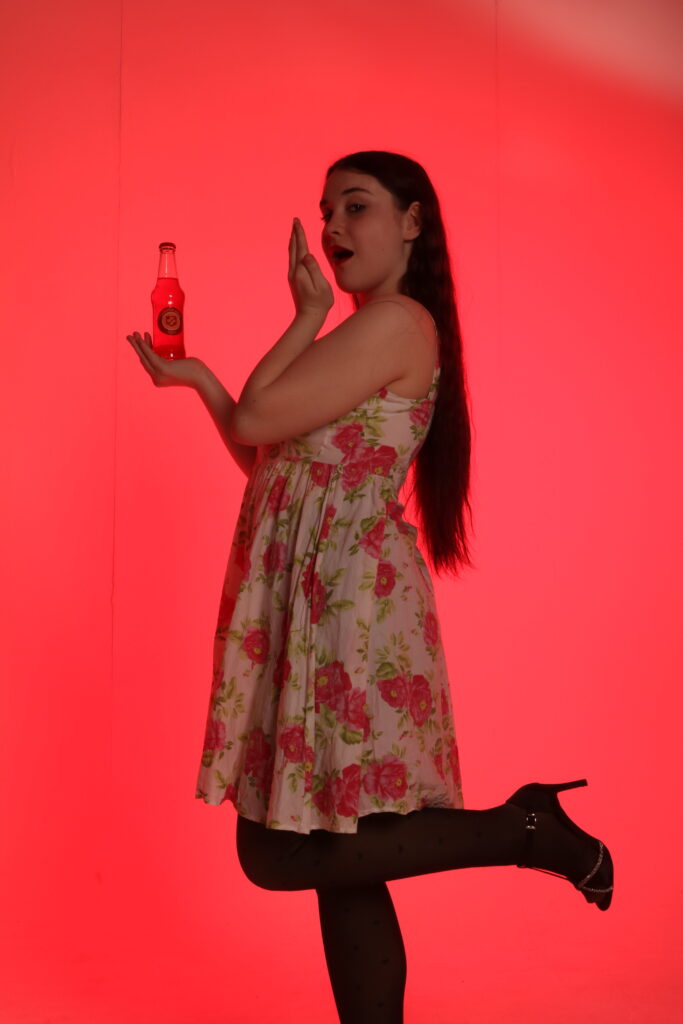
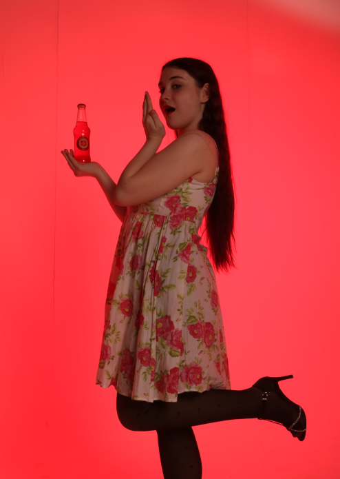
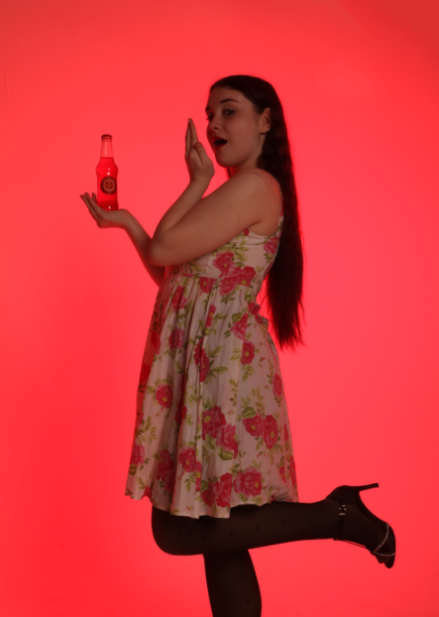
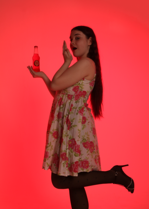
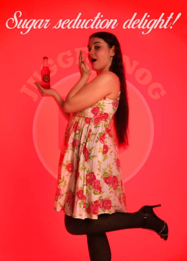
Juggernog Work
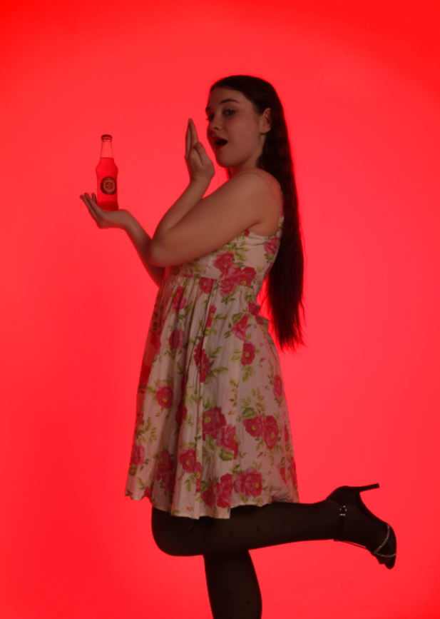
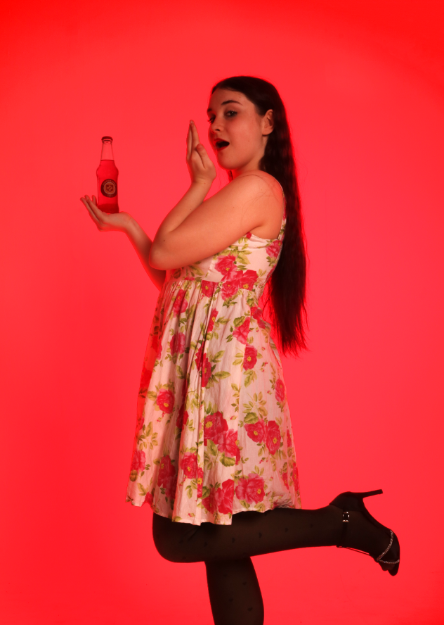
For Juggernog, I wanted to follow down the route of the style I found when looking at the Perk Jingle. This style was very 40’s/50’s style advertising that I would typically associate with Coca Cola. This style is very traditional, with a woman in a polka dot dress, voluptuous curly hair and bright red lipstick. One of my main inspirations is this picture seen below.
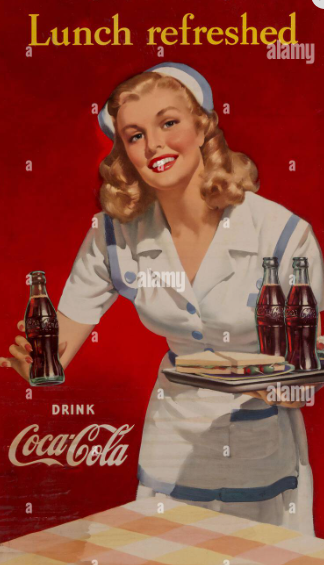
Some elements I would like to use is the female model holding the bottle, the colour matching background and the use of text. However, I would like to change some things, such as using a polka dot dress, changing the text and using a different pose. I have a few poses in mind that I will be testing out to see which one looks the best.
Test Shoots
Test 1
For the first shoot, I used a skeleton mannequin as a substitute for a model. This was simply so I could see how to separate the lighting for the model and the lighting for the background. It was a success overall as I was able to use a softbox to light the model in the front and use a light with gel in the back to light the background. However, the red lighting was not even so I had to figure out a way to make it look better.
Test 2
My second test shoot was used to further test the lighting and test some poses. I used my models for this shoot so they knew what poses to do for the final shoot. I also solved the issue with my lighting. I did this by using a softbox for the red lighting as well. Through some research, I discovered that you can use gels with softboxes, something I did not previously know. I did not have enough gel to put over the light diffuser, but I did have enough to put inside the softbox itself. After this, the red light was able to be evenly distributed on the background, fixing the issue. I also found that the models were able to easily do the poses, so we were able to move to the final shoot. The settings are below
Conditions for the shoot
- Same lighting used in practice – One red softbox for background and one normal softbox to light model
- Shutter Speed 1/125, Aperture f18, ISO 200
- One layer of red gel in softbox
Final Shoot
Contacts
Edits
original
changed to 5:7 ratio
clean up the top right corner lighting and the background lines
removed light from bottle
cut her out and made the background more saturated, emphasizes vignette
dodged the model to make her seem more prominent

used birds of paradise font because it was an eloquent font similar to coca cola, the main inspiration for the shoot
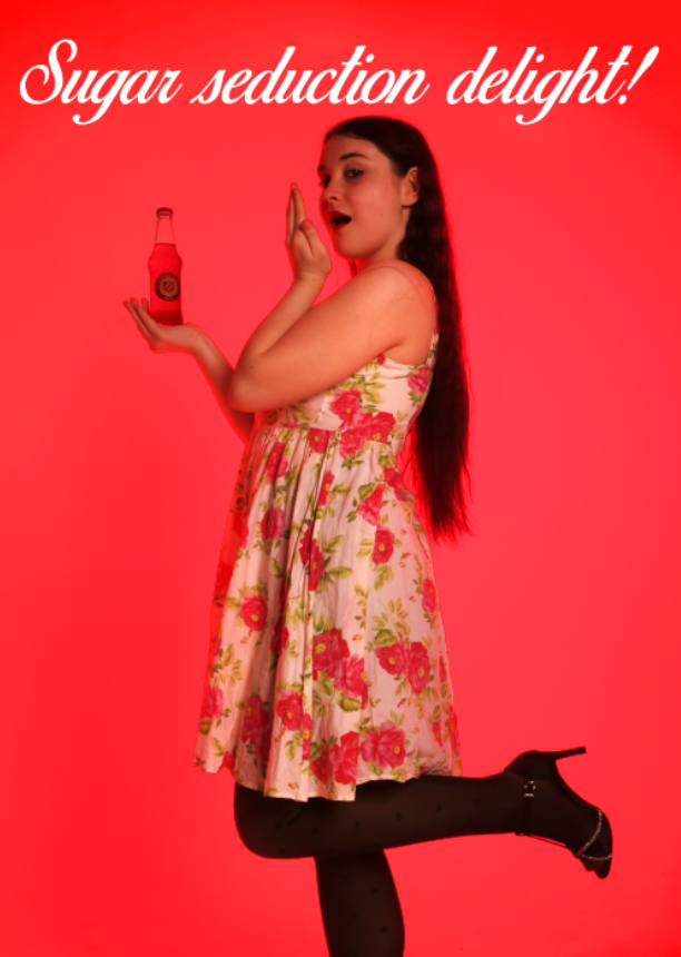
added into the picture and sized to fit. text references the jingle
used linear light with a slight opacity change to make the text less contrasting
experimented with putting logo behind the model, but didnt look great so went back to previous image. this created the final below
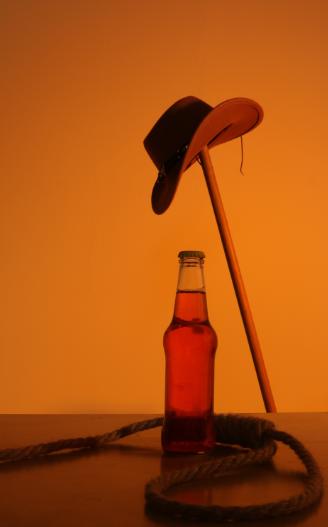
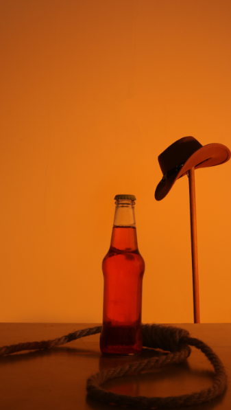
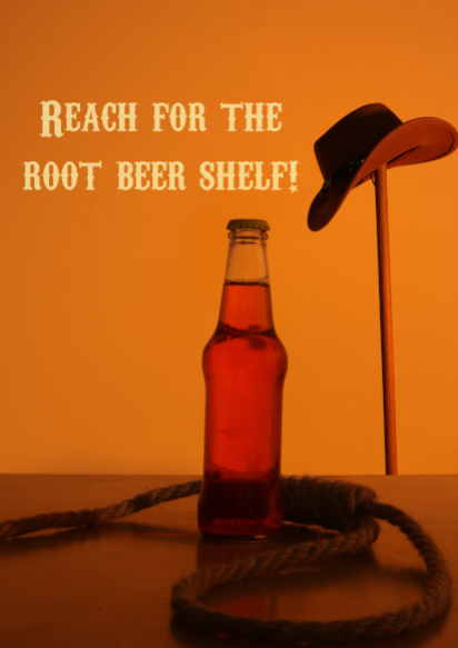
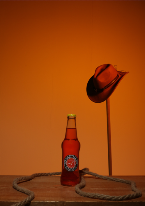
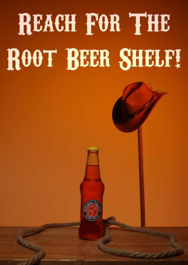
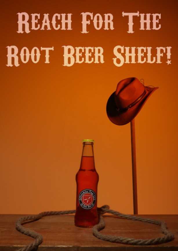
Novel: Double Tap Work
For the idea of Double Tap Root Beer, I will be taking inspiration from the work of Motion Craft Media, a media company that creates video content for people such as advertisements and event videography. In particular, I will be using a setup similar to the one seen in their Jack Daniel’s Tennessee Fire Ad.
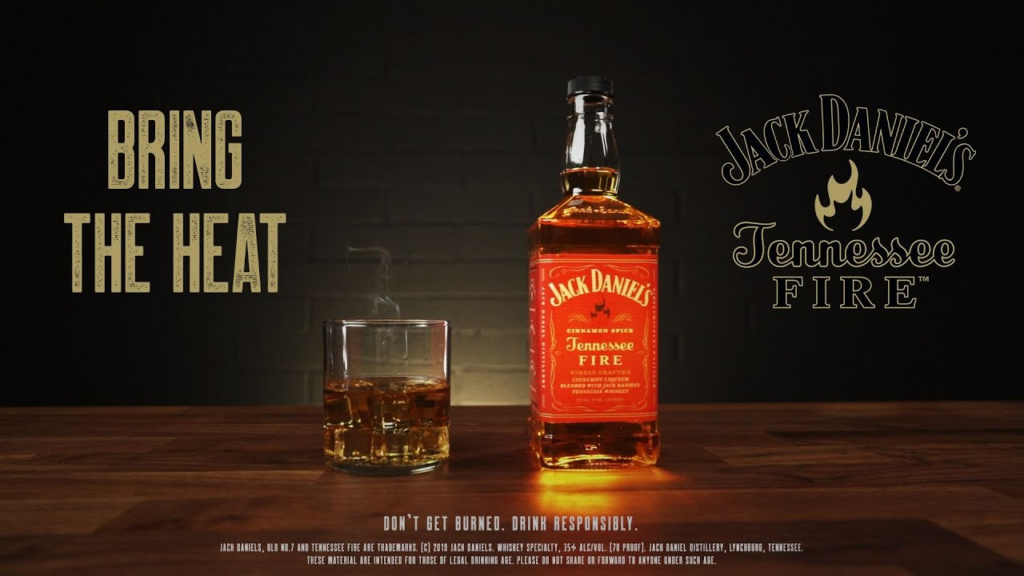
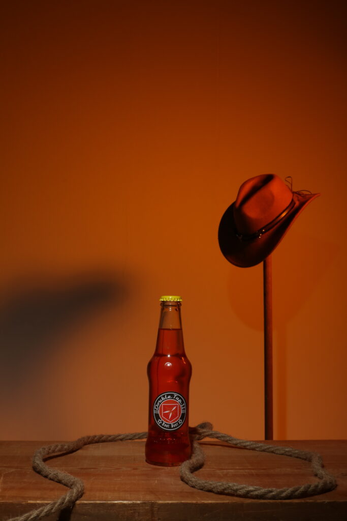
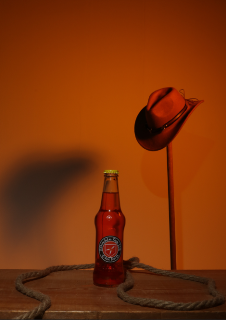
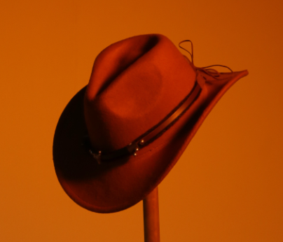
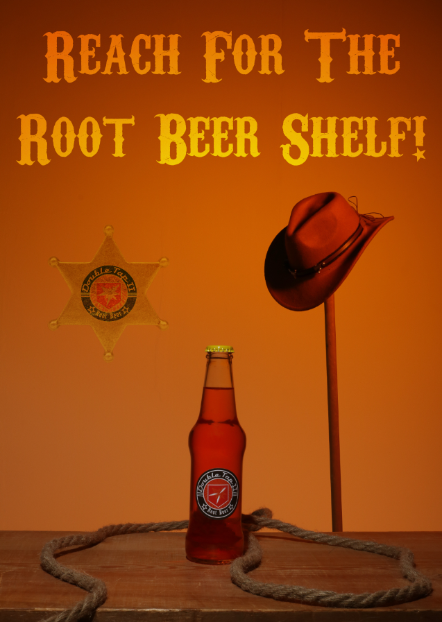
The parts in particular that I am also going to be using are the wooden table for the drink to sit on, the front facing shot of the bottle and the plain background with text on it. I will however be changing a lot of elements, such as changing the colours used, altering the text and shooting in portrait as opposed to landscape. I will also be using different props to further fit the cowboy theme, such as a cowboy hat and a handmade noose or a lasso. I am considering whether or not to put the cowboy hat on a hat rack in the background to make the image seem less crowded or to put it next to the drink along with the noose. This would mean that I can put the drink slightly offset to the centre to fit better with the composition of the image, utilising the rule of thirds. I will be experimenting with which one would work better.
Creating the Noose
This is my process of creating the noose for the photoshoot.
Lighting and settings –
- same lighting as practice with anna
- 1/125 f18 200
- 7K white balance
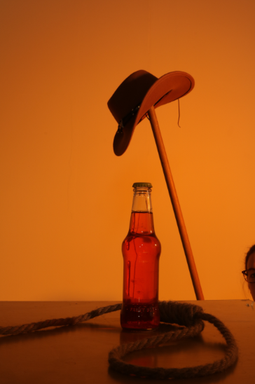
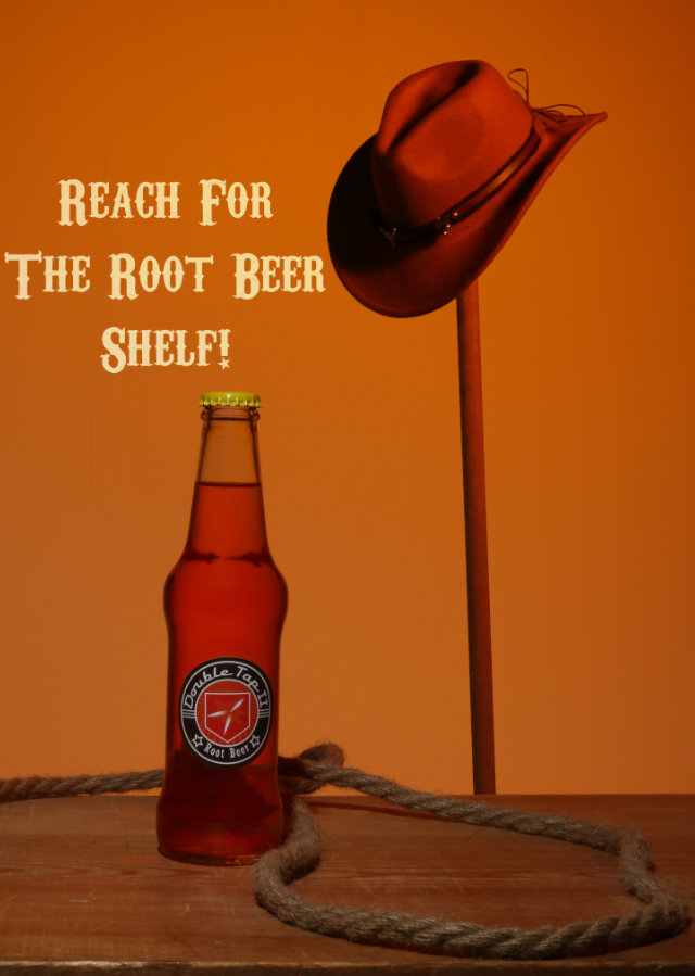
Editing Practice
I used the image below to practice the editing I would be doing on the final image.
To start, I had to crop out the person on the right that was holding up the hat rack.
I then used Spot Healing to remove the reflections and contortions from the bottle, such as the stick and the assistants face.
I then removed the string from the hat in the background because it looked out of place.

I then cropped the image. This was cropped into a 16:9 ratio.
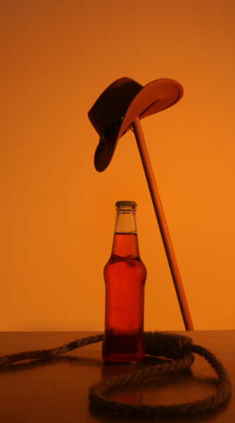
I then straightened the image in relation to the table as it is the straightest thing we can verifiably see.
I then took the hat, duplicated it and put it in the position I wanted it in.
After removing the original from the background, I cleaned up the details.
I then decided to crop it to A4 paper size, 210X297 to make it look more like a poster. This also minimised open space above the image.
I searched for a cowboy/saloon style font and found Carnivalee Freakshow.

I then added in a quote for the song that is both relevant to the product and a call to action.
I then changed the text to be based on linear light, matching the slight background
I then changed the text to be on “Linear Light” to mimic the slight vignette of the background.
I then lowered the opacity to let some of the background seep in, creating the final shot.
Conclusion
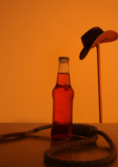
I think that this style will be good for my final shoot. However, I will be using a wooden slab on the table to mimic a western style bar. I will also be focusing some of the light onto the bottle so the logo is more visible.
Final Shoot
Ethics
After some consideration, I decided to switch out the noose in my image for a lasso by changing the amount of rungs on the rope. This is because while a noose has wild west imagery, it also has very negative connotations linked to lynching, racial violence and suicide, so I decided to switch it to a lasso which is more typically seen in media as just an ensnaring tool for catching people. Although the noose was only a detail and not the main part of the image, I think it is important to not have anything with negative connotations as heavy as the noose.
Contacts
Edits
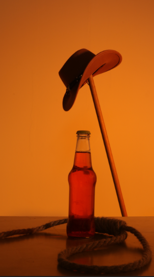
I first grabbed my two original images.
The above image is used as the base. I will be putting everything on this and altering all of the things in this image if I need.
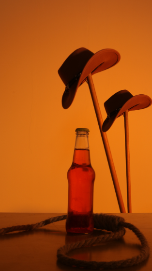
This above image I will be taking the hat in the background from. I will be making sure the aspect ration is the same and everything is squared up so I can take the prop and make it look natural.
To begin, I altered the crop to be a 5:7 ratio which is an A4 size.
I then transferred the cowboy hat to the main image so there wasn’t a big shadow in the image.
I removed the imperfections from the bottle, such as the shine and the “FRUIT BLEND” engraved into the bottle.

I experimented with further cropping the image to fit with the rule of thirds, but it didn’t quite work how I expected it to so I changed it back.
I slightly dodged the shadows on the hat because the contrast was very big so I wanted to make it slightly tighter.
I then did the same thing on the hat rack.

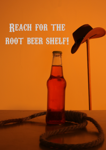
After this, I added the same quote from the song in the same font shown in the practice image.
I made the text based on linear dodge so the text matched the slight vignette in the background.
I then lowered the opacity so the background slightly bled colour into the text.
I tried to use the smaller crop from earlier to see how it would look with the text, but it felt too cramped so I switched it back.
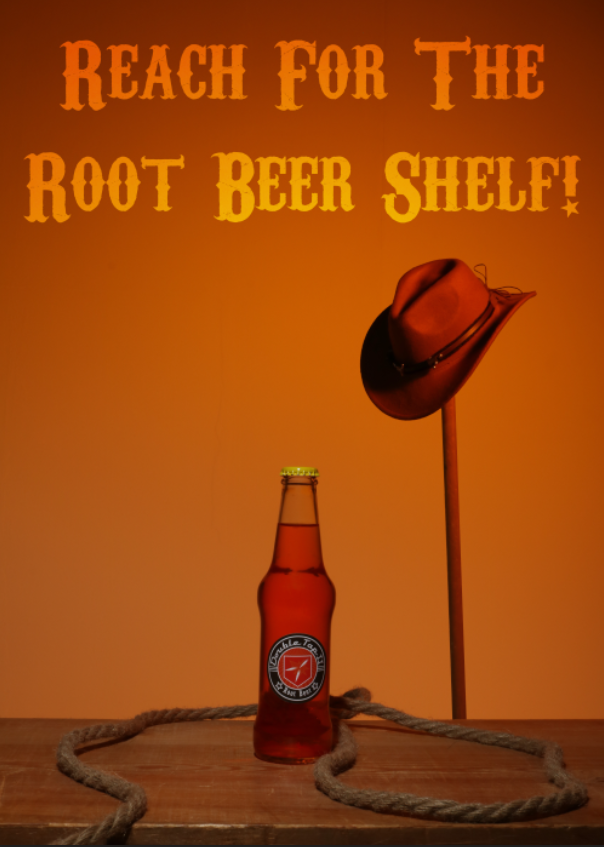
I changed the crop back to original and used colour dodge because it blended better while still drawing the eye.
I then slightly changed the colour to be more close to white which made the contrast bigger while still keeping the same colour scheme because of the colour dodge. I wanted to find something to fill the space, so I decided to use a sheriff badge.
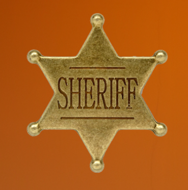
I first found a sheriff badge that I could use.
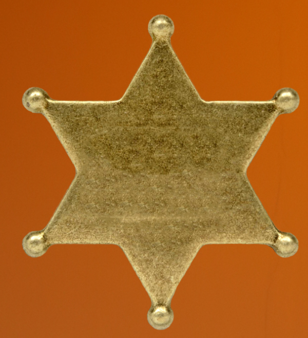
I then erased the word “SHERIFF” from the front and cleaned up the edge with the “Select and Mark” tool.
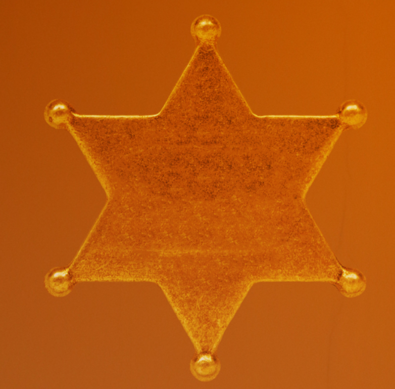
I then used the “Hard Light” setting and adjusted the opacity to make it golden.
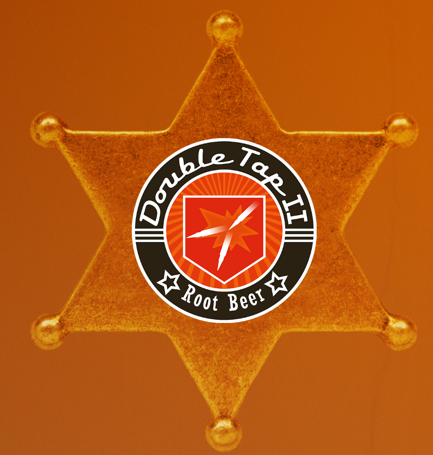
I added the “Double Tap” logo on top of the badge.
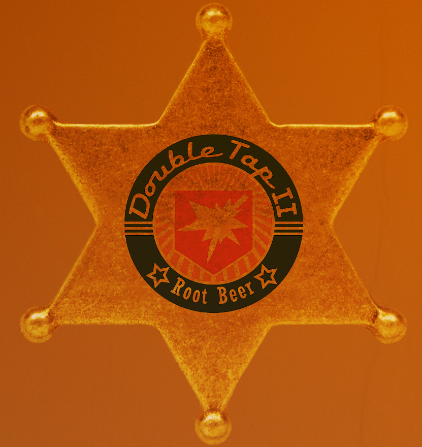
To make it look engraved, I first used “Darken” on the logo.
I then duplicated the star, highlighted the logo and inversed it to delete the excess on the duplicate to add the texture to the logo.
I then used hue and saturation to adjust it until it looked a realistic golden.
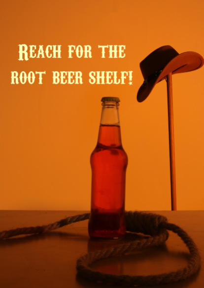
I removed some small imperfections from the background that I missed. This created the image with the sheriffs badge below.

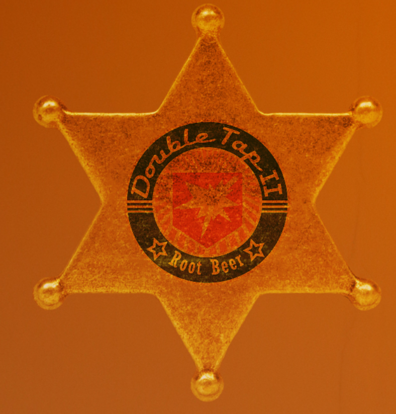
However, I did not like how the badge looked, so I decided to remove it. This created the final image below.
Evaluation
Throughout this project, I have been using some new materials, ideas and techniques to create my final pieces. These have included crafting my own props, using different models and overcoming different challenges.
Going chronologically, I began by finding a novel. Because of the nature of my specialist industry practice, I wanted to find something that I could advertise in a book. I had some ideas off the bat such as “Bertie Botts Every Flavour Beans” from Harry Potter or the “Everlasting Gobstopper” from Charlie and the Chocolate Factory. However, these seemed to employ tactics that I would not be able to apply as much to other projects. However, I was able to find a graphic novel that has links to a line of drinks that are available in the world of the novel. These drinks are perfect for advertising as they all come with a personalised machine they are dispensed from and a jingle to go with them.
I also discovered the idea of creating some propaganda for a form of political advertising, but I decided that it would be ethically questionable to create some, especially based around the World Wars.
I first decided to go for 2 drinks to advertise so I wasn’t too overwhelmed with different ideas and shoots. I then did some more research into both these jingles and the drinks as a whole to try and discover different themes I can use for the advertising. After this, I managed to settle on some themes to use through use of my chosen artist research. I developed these into working ideas through test shooting and further brainstorming, and I eventually landed on my finished idea.
I experimented throughout the time with using different techniques to create or add to the images, such as using cyanotypes and light painting. However, these techniques didn’t have much of a place in my current idea. I will be keeping these ideas in the back of my mind for my future projects.
After going through test shoots and ideas for editing through experimentation, I managed to complete my final shoots. I had to get through a few issues such as the ethics of using a noose in the shoot, organising timings and makeup with models and developing new techniques like using gels inside of box lights. Through all of this, I was able to create 2 final pieces that I feel accurately portray the products in a stylised way. I was able to use influence from my chosen artists to discover ways to create a good looking final product and the influences worked very well.