I was asked to make a ticket announcement post rather late into the project, so it was quite rushed and I didn’t have a lot of time to keep creating different save files.

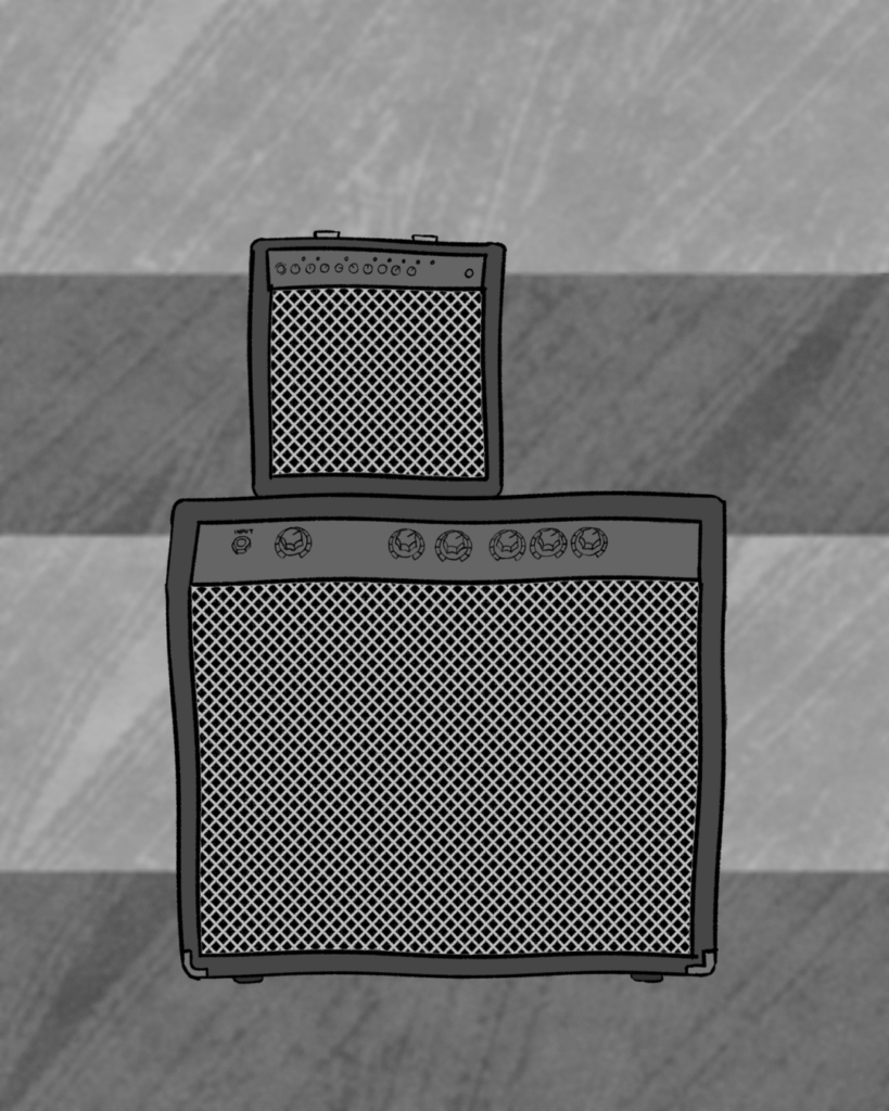
I began with a simple background composed of two shades of grey. These two shades are actually just the same thing inverted and put beside each other. The paint effect was achieved using a different shade of grey and a wide brush effect. The sections aren’t equal but I didn’t think that was crucial since it was only a background and would mostly be covered. I think my background fit the theme so far well, since it followed the colour scheme and continued the pattern of using textured backgrounds.

The second step was to copy and paste the amp art from the poster by itself onto this page and adjust the size and location of it. It looked pretty plain, so I had the idea of sectioning bright contrasting text circles behind the amps in order to draw in attention.

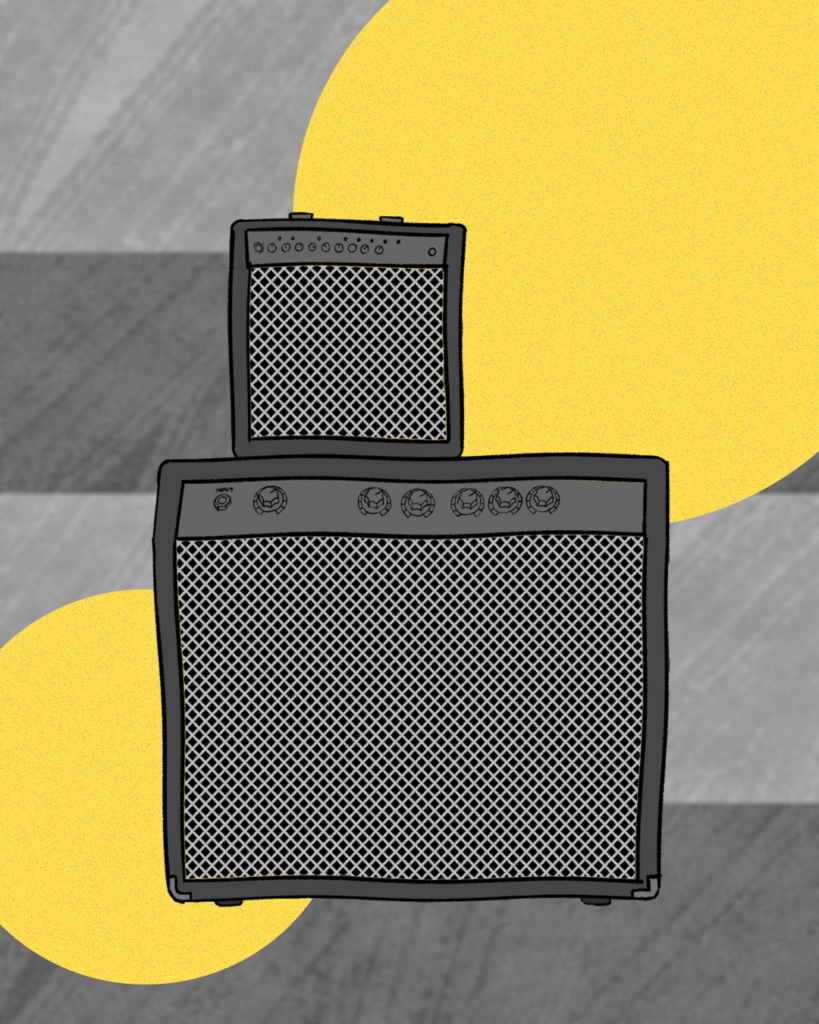
This is how the yellow text boxes turned out. I selected the colour from the original poster so it matched and stayed in line with the promotional content’s colour scheme. The size of the circles and the location were important as I had to fit text into at least one of them, so I made sure the top right circle was large enough and used the bottom left circle as a decorative section. I added a noise effect to both circles to make them look a little more rough.

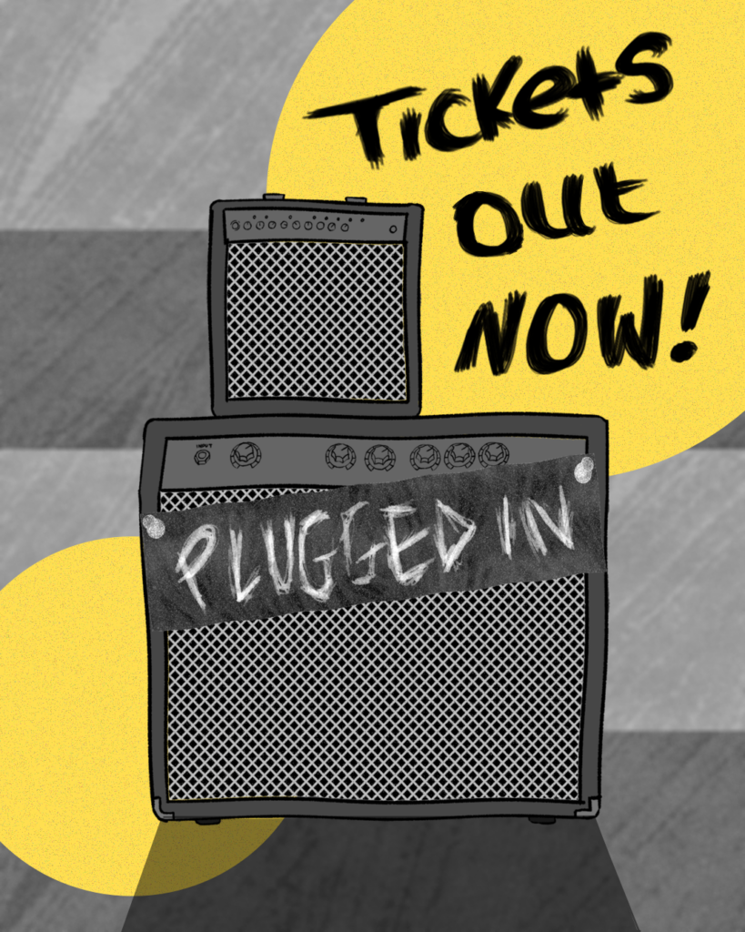
Lastly, I added the important details. I added the poster banner to the front of the large amp to tie it in with the theme and wrote ‘Tickets out NOW!’ by hand, then layered it slightly misaligned multiple times to make it look more bold and noticeable while maintaining a somewhat messy look. The shadow of the amp added contrast, though it doesn’t add much.