While developing ideas and creating art for this event, I have been using an XP-Pen Artist Pro 12 tablet and art software called Krita. I use Krita because I’ve been using it for a few years and that’s what I’m most familiar with, and I find it easier to use a tablet because I prefer to do art by hand.
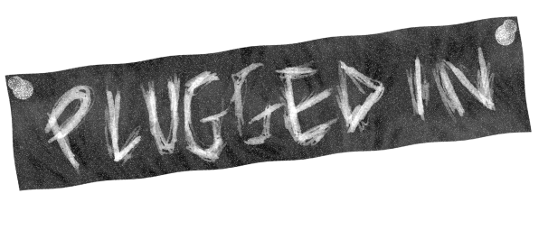
Initially I wrote the text by hand on a white plain background using black, I then worked on the texture of the background by inverting both the text and background, using different brushes, like a bristle paintbrush and mountain stamp brush in dark grey. I added noise afterwards, desaturated all layers to do with the text and background and added a wave effect to the section of the title and background I cropped. I then found a pin png, inverted it, desaturated it and added noise. I copied and pasted it, then rotated it and moved it to the other side to have two pins.
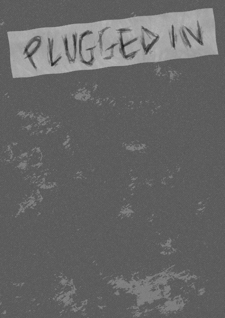
This is what the initial idea with the light grey banner and black writing looked like. I decided this wasn’t going to stand out enough, so I scrapped the background and inverted the banner and text, then used a burn effect on shadows to darken the background further.
After receiving feedback, I decided I needed a bright feature colour to grab people’s attention both online and in person when the posters had been printed.

I decided on this warm yellow as a background to the main art I was going to make and added texture by using a splattered brush and colouring it white on top of the yellow. I also added a paper-like texture to the white background so it’s not so plain in comparison to the texture of the banner and centrepiece background. The space at the bottom was needed for the information about the gig and looked like enough space for everything. I changed the banner here, as described above.
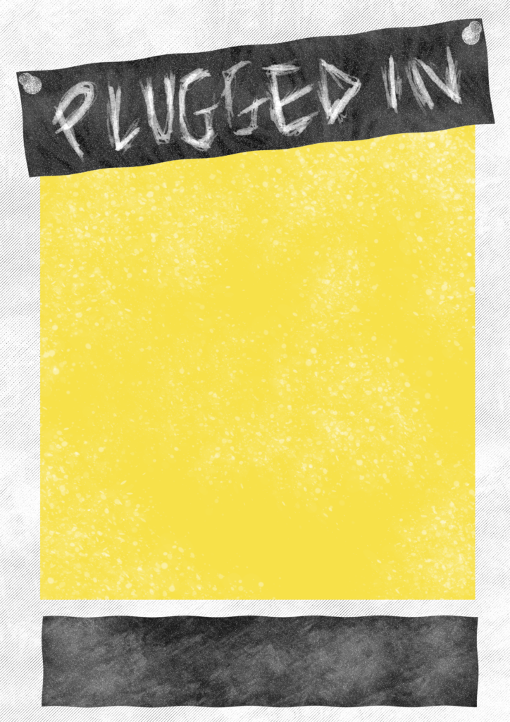
I added a text box since I thought having black handwritten text against a white background didn’t separate it enough. It has almost the same texture as the top banner, but I had already forgotten how I did the banner by the time I did the text box, so I tried my best.
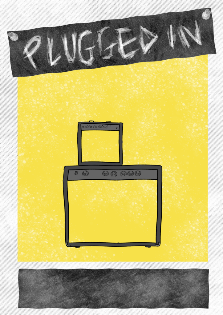
Then I started working on the main art. To fit in easily with the theme, I stuck to the simple plan of having a bass and guitar leant against a set of amps plugged in.
The amp outlines were individually drawn based on a template and I added a wave effect on them so it looked imperfect and natural.
I didn’t add texture to the inside of the amps yet because I had to get what I was thinking onto the page as quick as possible before I forgot what the plan was.
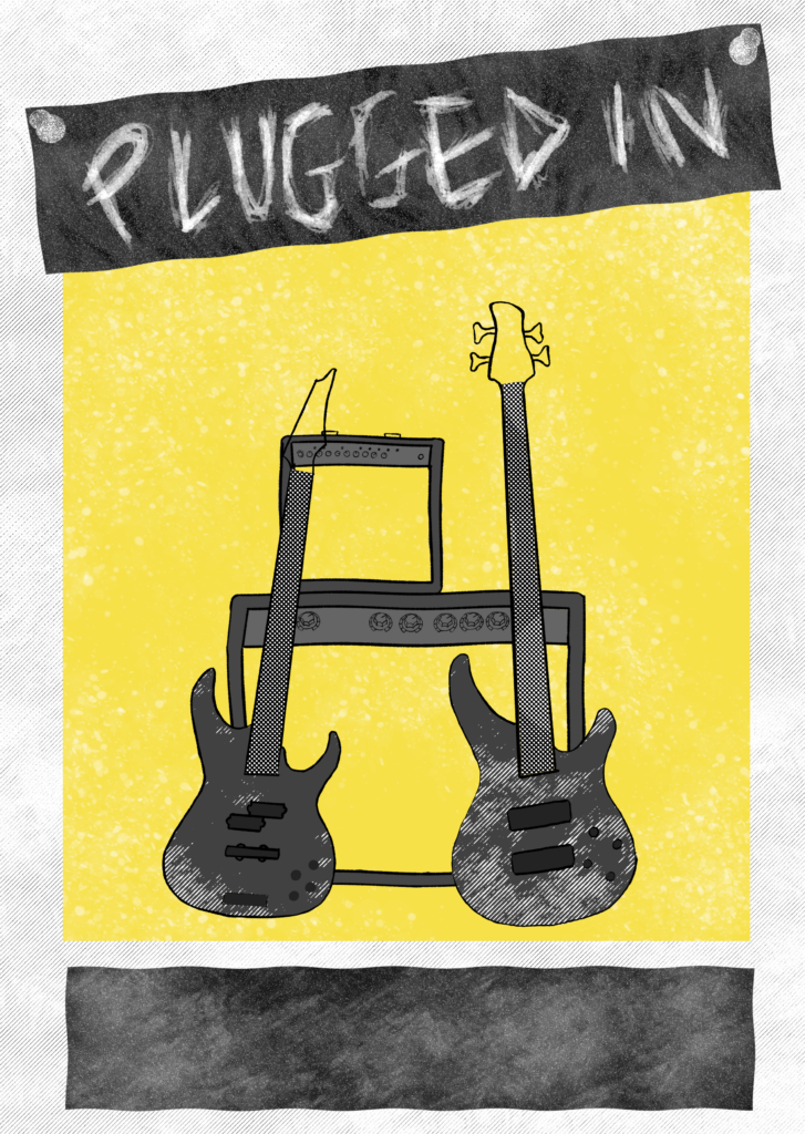
Next was the guitars which I rushed, hence why everything was on one layer and thankfully didn’t mess up. Both of these were drawn using templates but were adjusted afterwards so it looked more natural. The texture on the body of each was made by first covering them in two different greys, then I selected them and used a halftone effect on them. The same happened to the fretboards, but I only added a different shade of grey to the bass fretboard. I struggled to draw tuning pegs on the guitar since I wanted them facing different ways but the guitar was already titled unusually so it was difficult to picture how it should look.
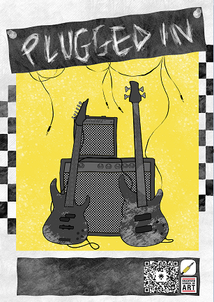
I added an alternating black box pattern on each side because it felt empty, then added the cables so both guitars were plugged into the amps. I added a dot based texture that looks like the darker parts are crosses, similar to an actual amp. The colouring on the guitars was finished and cables from the banner were added to emphasise the theme.
Lastly, I experimented with adding logos and tested out a Linktree QR code, which leads to the bfdpluggedin Linktree site, containing the Instagram, Youtube, ticket page and a Bradford college page including the L2 course information.
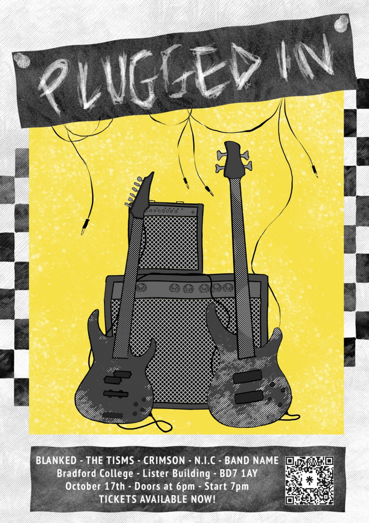
Since I made a mistake with the information that needed to be on the poster by forgetting to put the date on, Paul kindly offered to add the text since it needed printing that day. He forgot the logos, but I think this is okay as it is since on the programme sheet that we’ll hand out at the gig, I can put the logos where the text box would have been instead of the gig information.