How I created the logo was to first look at doing a written logo, based on fonts such as these, but using original designs:
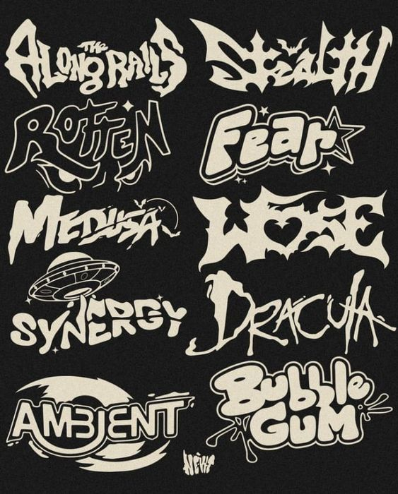
Since at this point I had already made the poster, I was considering using the title part of the poster as the logo but it would be too long and the event needed some variation in designs, otherwise it would be boring and not eye-catching at all. However, I still looked at plenty of this type of art to see if I liked anything in particular and could work in the style I liked. Unfortunately I didn’t find anything, so I went with a different idea.
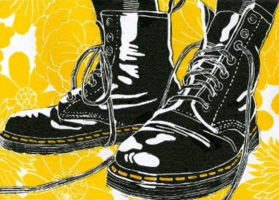
After realising I didn’t want to do a written logo, I asked my graphics tutor, Paul, to give me feedback on my poster idea and asked how I could incorporate the theme of the poster into the logo. Then, I used the inspiration I found for the poster again to ensure I know what I’m aiming for. The inspiration I found were these:
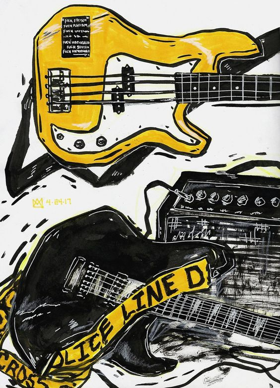
Most of what inspired me about these were the colour scheme and scratchy art style on this top image. I used the second image to picture a different, cleaner style and how I would apply that to my own art.
The Process
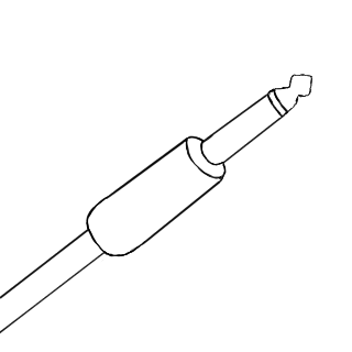
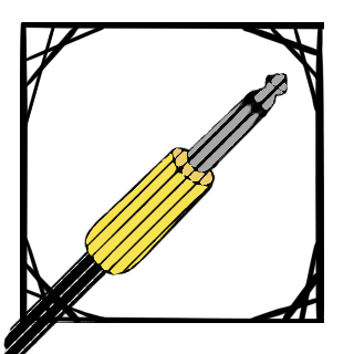
I began with an outline of the main image and added the colours I wanted to use after some shape adjustments. There were only three colours here and a white background, as these were the base colours.
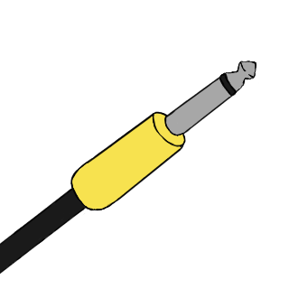
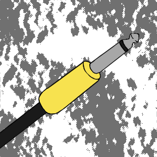
Then I started experimenting with a background using an oil paint effect on some areas where grey and white were placed next to each other. I decided this was way too distracting and didn’t compliment the main point of focus well, so I tried putting a frame on it instead and keeping the background white.
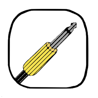
The last development was adding a frame and selecting the image and adding a line halftone effect onto the centre art, as well as adjusting this halftone effect so it looked more natural and different parts looked darker than others intentionally. I decided the first frame was too distracting and it also didn’t fully fit into the average profile picture dimensions (110 x 110 pixels) as it was rounded, so I smoothened out the frame myself, focusing on the inner shape and smoothing out the corners while removing anything outside of that. I made the section outside of the frame transparent for places that allowed backgrounds to be transparent, like the Linktree logos for the Youtube and Instagram page. It isn’t transparent here since digitalspace blackens out the transparent space instead of allowing the image to layer on top of the page’s colour.
