Electric Blue had multiple logo ideas, but we stuck with this one for a few reasons.
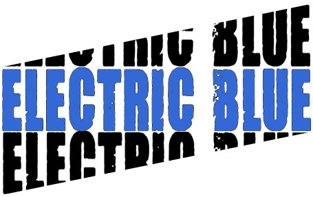
To start with, this one stood out significantly more than any other design and was very easy to read. In comparison to the others, this would be very easy to put over any base colour without clashing colours or missing details. I wanted to stick with the theme of blue but not overly blue, so the black acts as an appropriate contrast. The ascending cut-off text effect is pleasing to the eye as it’s simple yet effective at displaying the name in full. If you glance at the logo without intending to read it in full, it’s likely that you’ll understand what it says regardless.
Other band members suggested very different ideas, both are shown below.
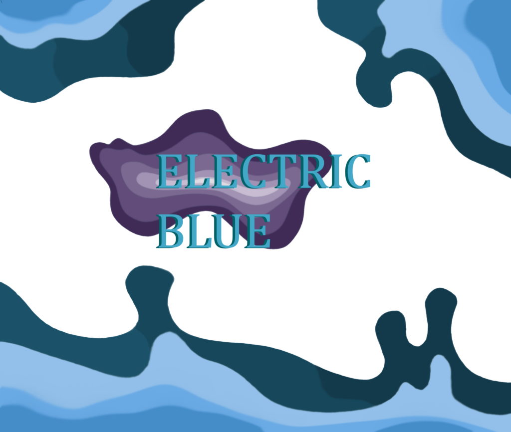
I think this one would be hard to put on a base colour without it looking lost and it doesn’t feel like it shows much of our interests or type of music.
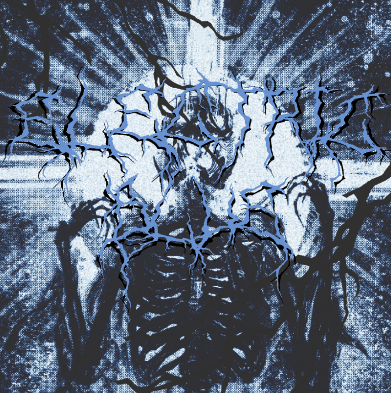
This one is very metal themed, of which we didn’t have in our set. Additionally, the font against a scratchy blue, highly detailed background makes it hard to read.
Some more of my ideas are below:
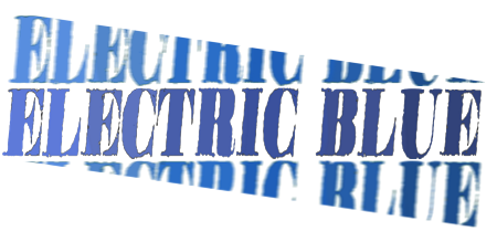
A slope effect was originally tested on this design and included in the final logo, but ascending instead of descending to suggest a positive rise of some kind. The font in this is rougher than the one below but still didn’t feel like it stood out much. I think the colour scheme didn’t have enough contrast. The motion blur on the text above and below the main text felt distracting, too.
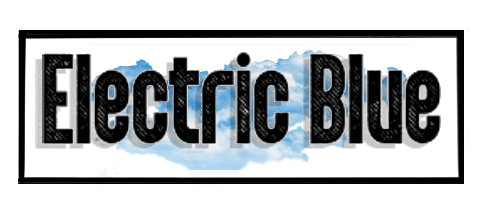
The font and background art felt too soft and simple to be our logo. It wasn’t particularly eye-catching and didn’t say too much about the type of music we play.
I had a few ideas for poster art but didn’t end up liking either of them.
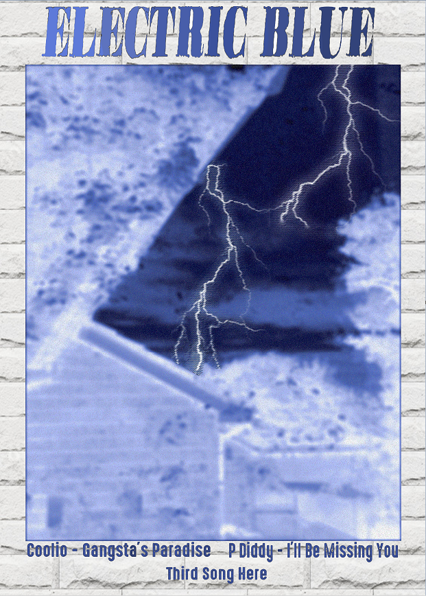
This design would have worked well if I’d have used the same font in the logo, but I decided against it. The design is eye-catching but perhaps too simple. The colour scheme isn’t complex and there isn’t a lot of detail besides the first two songs.
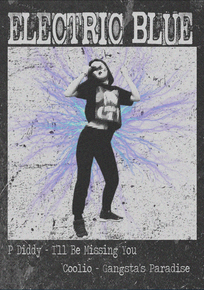
This design was more fitting to the songs by having a somewhat vintage feel to it and a simple but interesting colour scheme. The electric effect behind the feature image contrasts well and stands out while fitting the theme of Electric Blue.