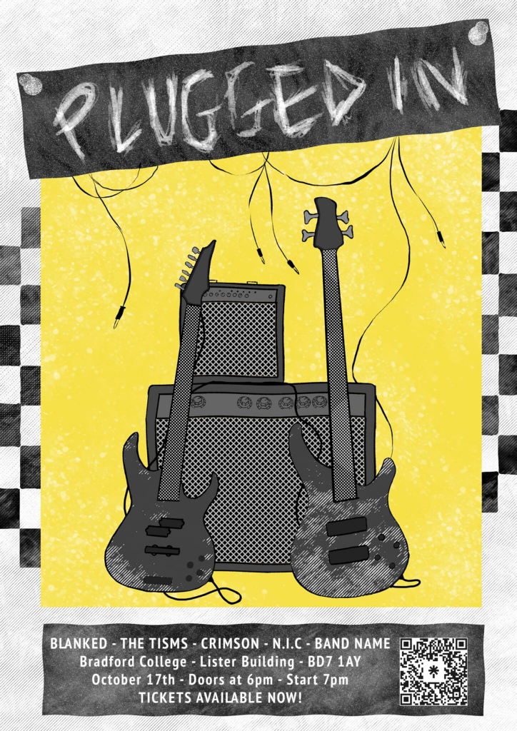
I’m proud of how this turned out aesthetically and how I utilised my skills in order to create certain textures and effects. The paper texture of the background and the chalkboard texture of the banner and text box, as well as the white splatter texture on the yellow background adds character and the impression of it being messy means the sections flow together easier and it looks more relatable and less professional.
In my opinion, the poster is eye-catching and fit for purpose as all of the information is there and the link to the event’s Linktree where tickets are available. The Linktree page got 83 views and 44 clicks, so it had a 53% clickthrough rate. The ticket link got 19 clicks, meaning it’s possible 19 people used the posters to book tickets. The Linktree is also on the Instagram page but it’s the second link down and isn’t visible unless you purposely click to see more.
Since this was the first bit of art I made for this term, the theme rooted from this so matching the theme isn’t a problem.
Some things I could have changed were the texture on the fretboards, as they could have been more accurate and included strings. Additionally, I need to pay more attention to the gig information so I can confidently print posters without mistakes, since I initially forgot to put the date on.
I could have also started with some sketches before going straight into it to provide evidence of development, but the process was smooth and quick and ideas came naturally with some experimentation with the textures.