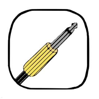
This is the logo that I went for after my poster was voted to be used for the promotion of the event during the L2 and L3 graphics class. I was told that a few members of the L3X didn’t like it as it looked like there wasn’t much effort behind it, despite the imperfections being intentional. Since the logo was due the day after I was told that, there wasn’t much I could do on such short notice considering I had been updating the group on what I had been working on regularly.
Personally, I’m very happy with it and I think it ties in well to the theme of our brand due to the colour scheme, line effect and imperfect shape of the frame. One thing I could have added was shading to the metal part of the lead to show that it’s metallic, but I think this might have looked odd in combination with the black lines which are partially used as shading anyway. I could have also experimented with using the cable as part of the frame or trying to loop it around so it looks less stiff.