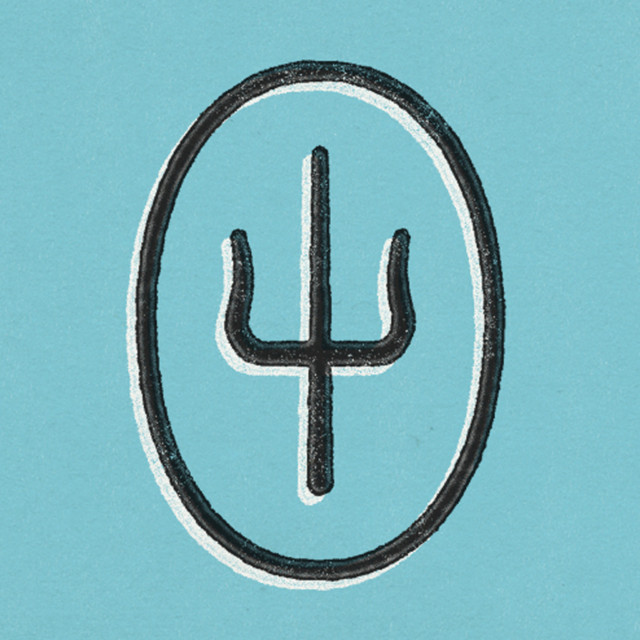
Twentyonepilot’s band logo is fairly simple, featuring the main art in the centre which allows viewers to come up with an idea of what kind of music they may make. The contrast between the light blue and black is effective and makes the darker areas stand out. ψ is the Greek symbol for psychology and is shown on stage in their live shows, where the stage is split between to colours. I’m not sure of what this means exactly, but it intrigues fans.
Twentyonepilots
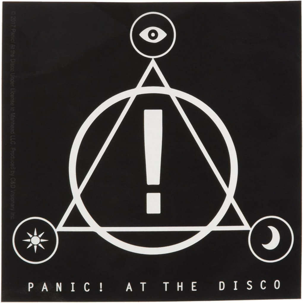
P!ATD’s logo is simplistic in that it has the white logo against a plain black background with the band’s full name underneath. The symbol ! is easily recognisable as a reference to the band within musical context and the name being shown below the logo ensures new listeners can find the artist from the logo.
Panic! At The Disco

Samsa’s logo relates to the title given to them by followers and fans, ‘The Lyrical Genius’, featuring just a head with two eyes and a crown to portray the title. As it’s fairly simplistic and unique, the white and yellow pairing stands out with the bold black outline and is instantly recognisable.
Samsa

There’s not much room to go wrong with a name as a logo. It links directly to the artist and the soft font may hint at the type of music they write. The black on white contrast makes their name stand out and it can easily be displayed on any plain surface.
Dodie

This specific Green Day logo is in direct relation to their Dookie album, matching the style and promoting the album itself. The comic style and dark yellow against a white background design bordered with bold black lines ensures the band name is the part that stands out the most.
Green Day
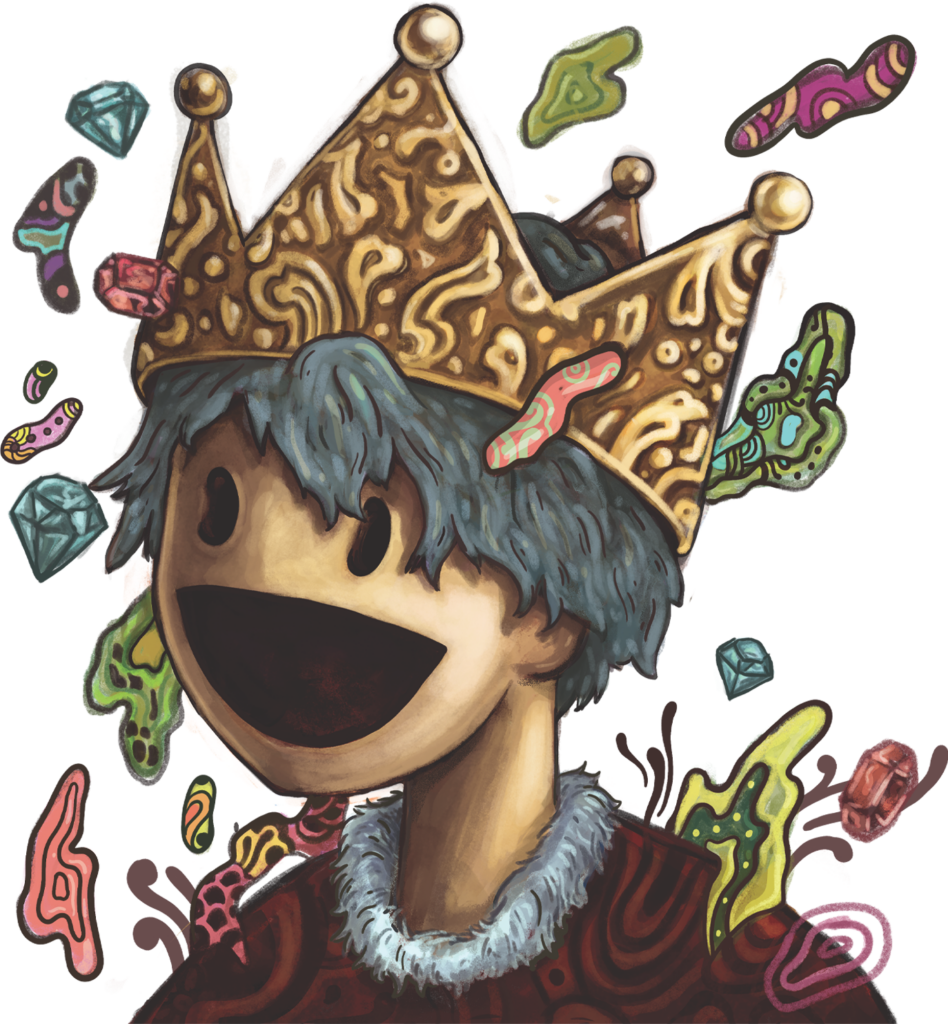
Good Kid’s style is pop punk, which is suggested by the bubbly yet semi realistic character with a cartoon like face coloured with a dark colour scheme. This character is very unique with its interesting art style and design, so it can be used as a mascot.
Good Kid
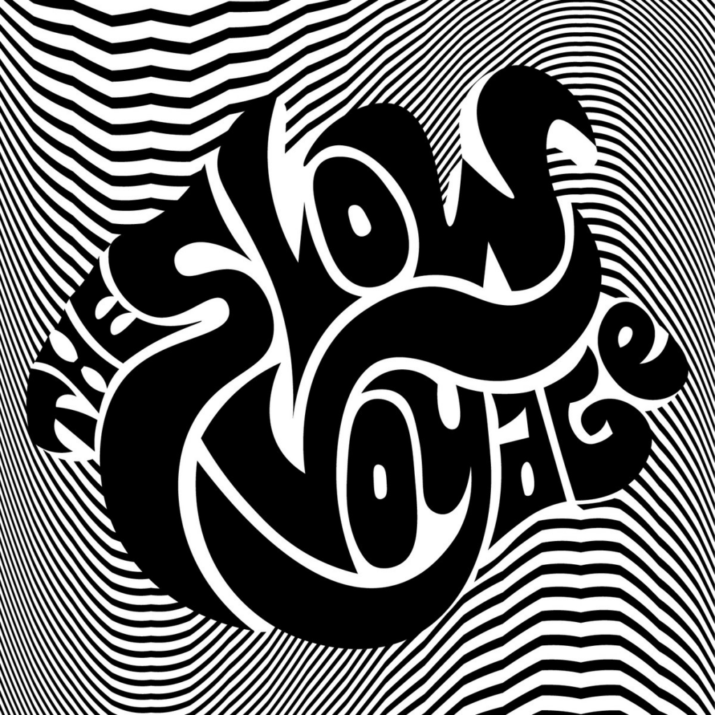
The Slow Voyage uses an optical illusion effect to make the band name, which is plain black, pop out and catch viewer’s attention. The effect of the optical illusion is very eye-catching and displays a somewhat pop or psychedelic rock style. The font used wraps around other words, creating a central bubble around the word ‘Voyage’ and specifically the ‘V’, while the ‘Slow’ appears to be larger than all other words in order to look proportional and to stand out.
The Slow Voyage

Jimi Hendrix’s logo clearly displays his own face, sometimes paired with his name below. Including both of these details will allow fans to recognise this logo immediately. However, it doesn’t particularly present the genre of music he primarily made and isn’t particularly eye-catching for people who are unaware of who the artist is. The black and white theme is simple and can be displayed on any plain colour or simply textured background.
Jimi Hendrix