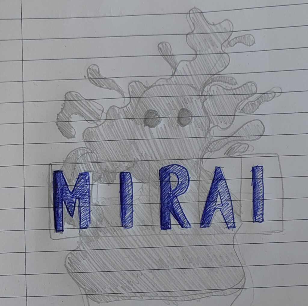
I liked this design for the anonymity, inclusion of a name and simplicity. It would be easily recognisable and not too distracting, either. The font is bold and eye-catching and the fade effect could work well. The body of the blob would likely be blacked out with white eyes and the text would be in lime green with a purple shadow effect.
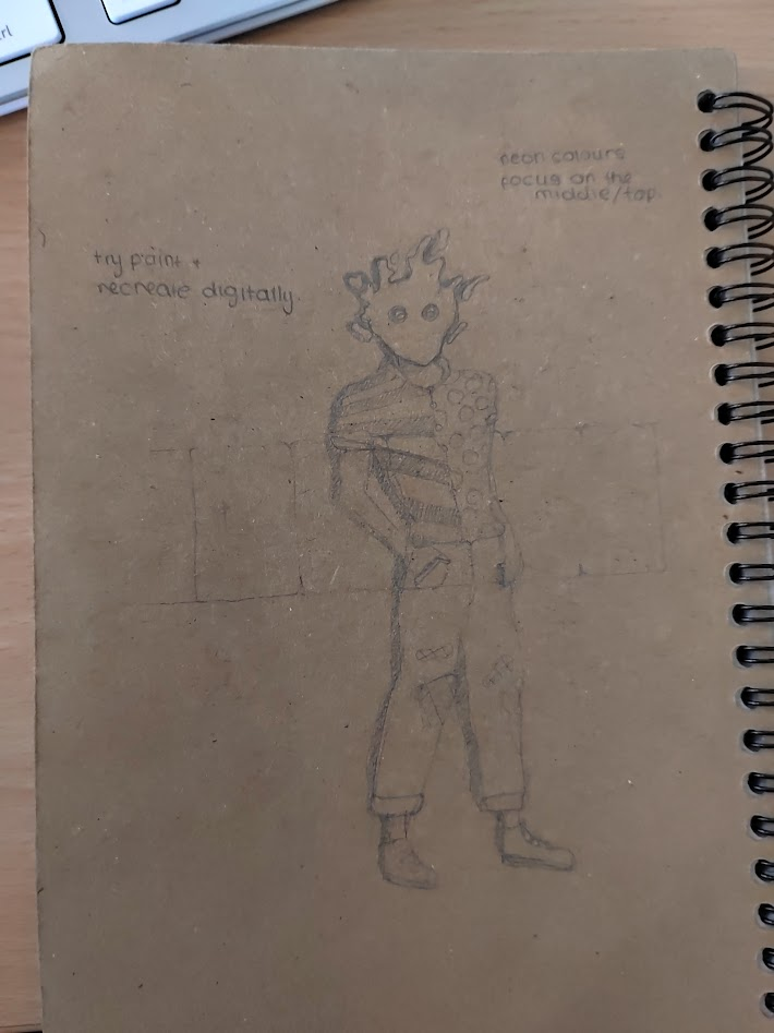
I had a second idea soon after where I planned to put the name there and likely crop out the bottom half of the body.

I thought this one might be too detailed and not all too memorable, so I favoured the first design. Unfortunately I missed a few graphics lessons and I can’t access my digital art tablet at the moment so I’ll have to resume this art next term or work on it over the holidays.