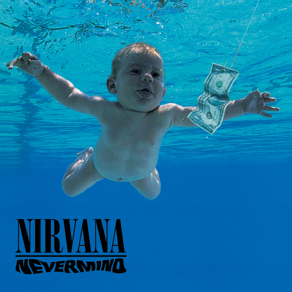
Robert Fisher was the art director for Nirvana and worked with Kurt Cobain for the creation of the art for Nevermind. A censored version of the album art is provided below.

The photograph originated from Kurt’s idea of having a baby underwater. The imagery was rather random as the style of music that Nirvana was making was unique and that almost of a new age.
The final photo was one of about 50, chosen because it allowed the potential to get creative with the image and looked as though the baby was reaching out for something. The hook was Kurt’s idea of how the image could look more menacing and between himself and the Robert Fisher, the idea of money came around to be displayed on the hook. Most will say that this concept was to show societal corruption and how even an infant is hungry for money, but the process of creativity was free so it could have just been a fitting item for the imagery.
There were multiple other photos to choose from and a lot of experimenting took place, but I won’t be able to provide photos because none are censored. The band’s logo was made before the album art, so all that was left was to edit out the pool floor and add an album logo with the existing logo.

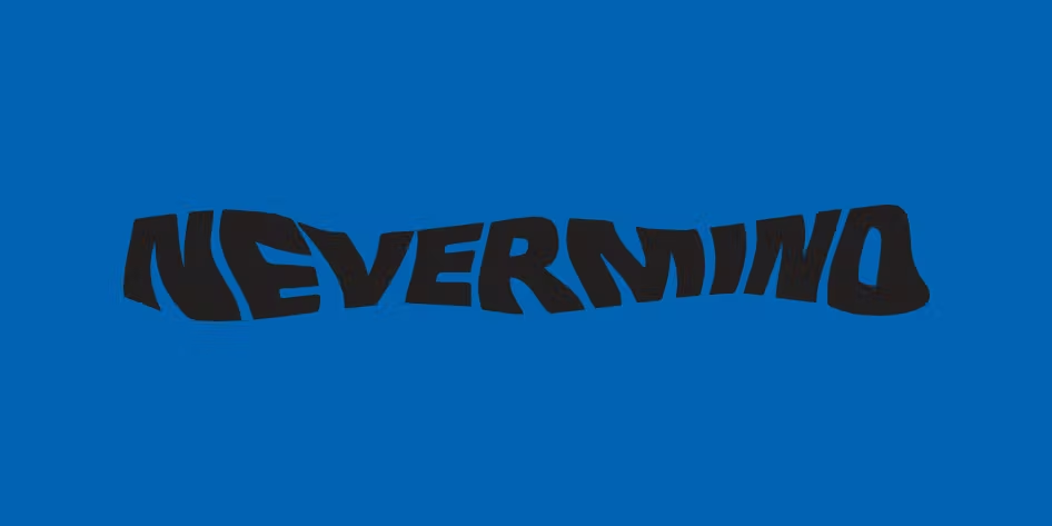
The text had to relate to the underwater theme somehow, and adding a distortion or wave filter on an art app wasn’t possible at the time it was made. Instead, the plain text was printed out and put through a scanner while Fisher wiggled the image through. This logo was then paired with the band’s existing logo, separated with one line and put directly onto the album art.