I analysed a few gig posters from a few bands who composed and performed in various genres and made points of why they were appealing. To begin with, Green Day’s poster advertising a gig in Chicago definitely stood out to me.
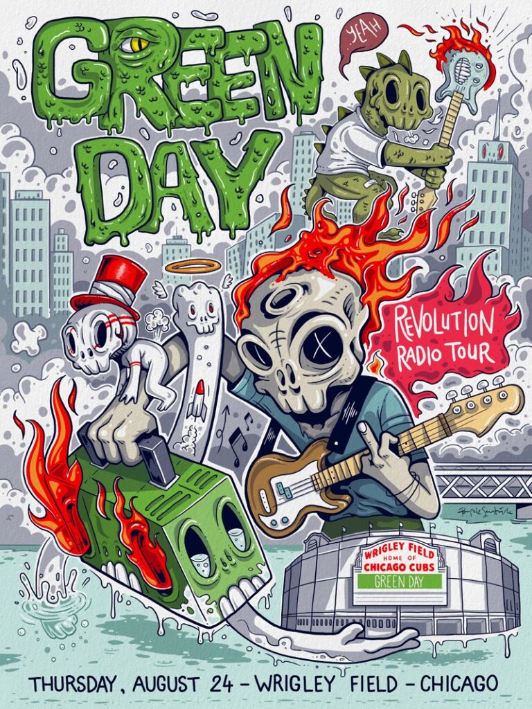
The design of this poster is appealing due to the comic style featuring the most saturated colours, large band name and muted yet intricate background. The items within the poster show exactly what is to be expected (instruments deducing a live show) while also showing the potential style of music displayed in themes such as skeletons and fire. Plain text at the bottom of the image is helpful to identify the most important details quickly once the design gains the viewer’s attention.
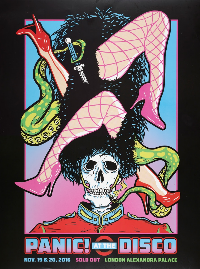
Similarly, this poster fits within the comic art category and stands out because of the block colours of the feature art and the gradient colour of the background, contained by the bold black border. The band name is clear and directly contrasts the dark background, as does the colourful information below. The themes are demonstrated in both the style and content of the feature art. A skeleton and alien-looking creature points towards danger and mystery, as does the dagger. The legs may suggest promiscuity and the bearskin hat and uniform is a symbol of power and pride.
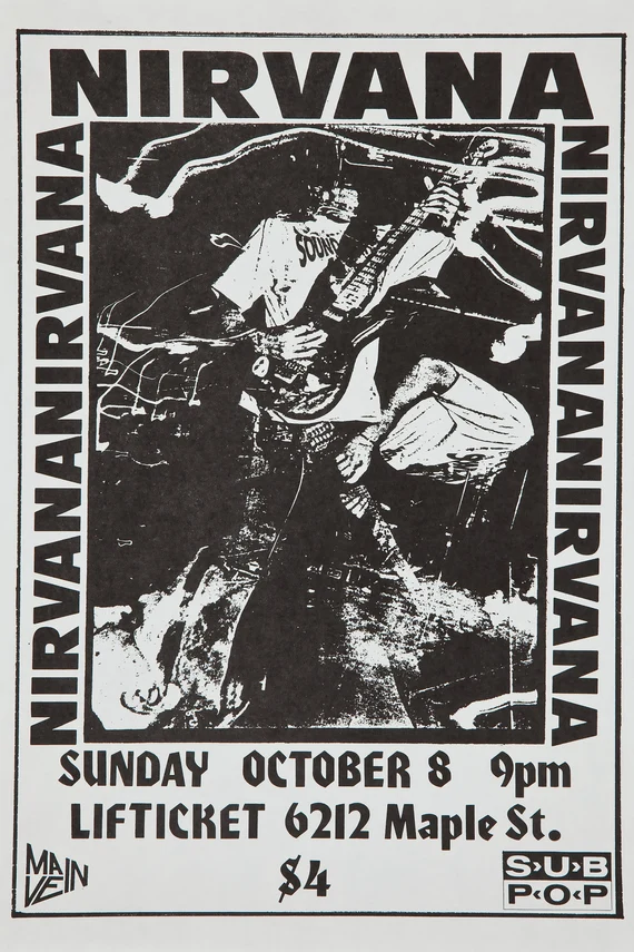
I find this one particularly interesting as the monochrome theme highlights the band name and genre perfectly, as well as the important information below. While not necessarily eye-catching, Nirvana likely used their well known name as a selling point rather than overwhelming colour and complex design. The rock / grunge style is performed with tones that would be described as ‘dark’ and ‘harsh’ which the scratchiness of the art and plain text matches accordingly.
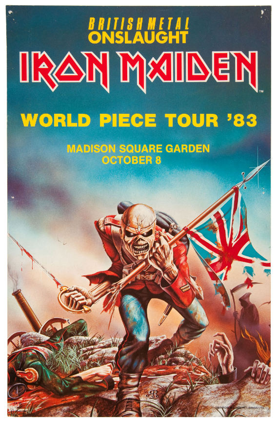
The character being the feature art works well as the design is interesting and accurately represents British history. The idea of matching the concept of war with metal music reflects an aura of power and anger. A gradient blend of colour from red to blue means the band name can stand out among the dark blue background as well as the tour information.
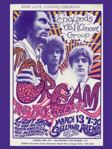
Cream’s poster utilises texture and complementary colours to attract attention, contrasting lines with circles and yellows with purples. I think the use of band member’s faces in purple combined with simplistic white clothing draws attention well to ensure possible recognition happens with fans. I would say the art style aligns with typical experimental 60s art, more so on the psychedelic side, matching with the psychedelic rock music cream usually played.
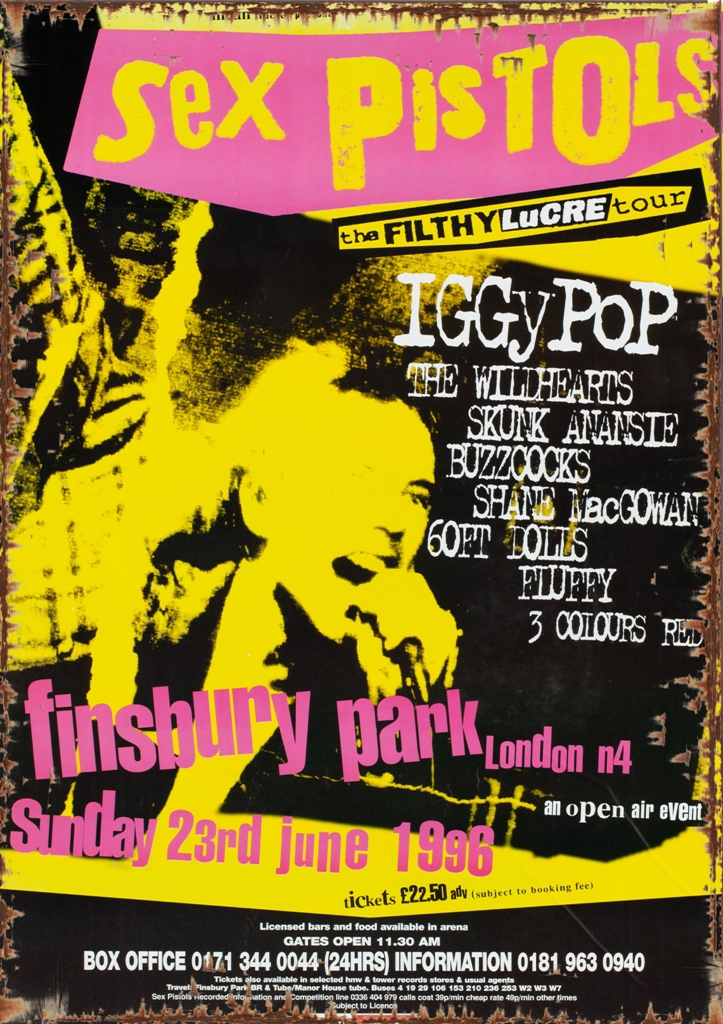
This band’s art has consistently been my personal favourite for a long time and has been particularly useful to reference what punk rock art characteristics I can use in my own band in both music and art. Generally, the scratchy effect and contrast between just three solid colours and information in white creates a nice stage for the band name and information to shine. I think the bold colours and inconsistent font size is eye-catching as inconsistency doesn’t blend in. A clear to read font is perfect to quickly take note of details and the band name is once again a point of focus to draw particular attention.
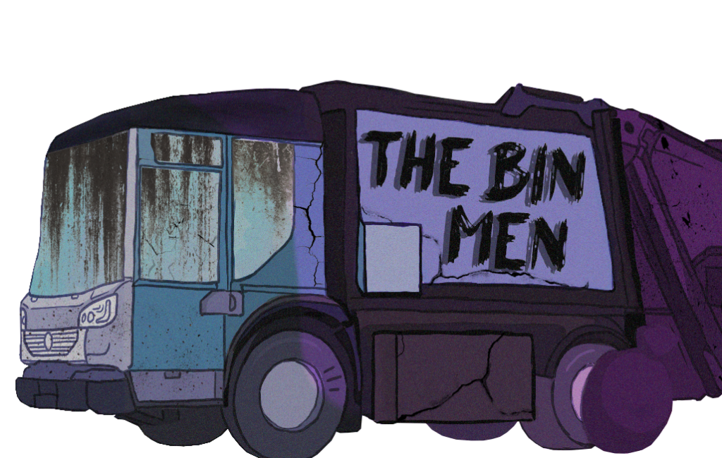
I tried to choose three main colour groups (blue, periwinkle, vibrant purple) similar to the example above, but generally darker. I thought a scratchy and messy font for the band name would fit the theme and the black against the periwinkle would be contrasting enough. Initially, the design was too neat and clean which felt more techno and futuristic opposed to punk, so the addition of dark zones, cracks and dirt made it feel more natural. I did try to use this art as part of a gig poster and found it difficult to make any specific part stand out, but I think using a bland but somewhat complex background design, as shown in the green day poster, and bold coloured outlines around the text, as shown in the example above, would work well.