Besides not being informed about running order changes and additional performances by different students, making the art for this and adding text was fairly easy.

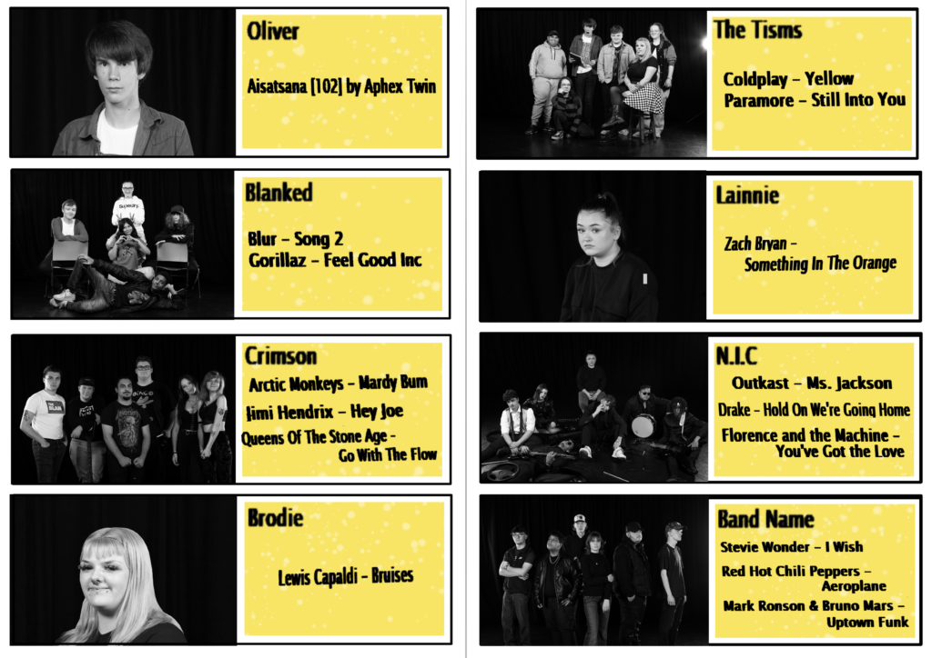
The inside consists of image boxes, a black frame, a yellow text box with the same white splatter effect as the front and the text that explains what each performer / band is playing.
The text was all copied and pasted from a plain white page in Paint since the software I used, Krita, wasn’t very easy to use to apply text and didn’t have many font options.
I decided to desaturate all of the images to make them all match the colour scheme since some photos featured really bright, contrasting colours that didn’t match. I think this ties the whole thing together well.

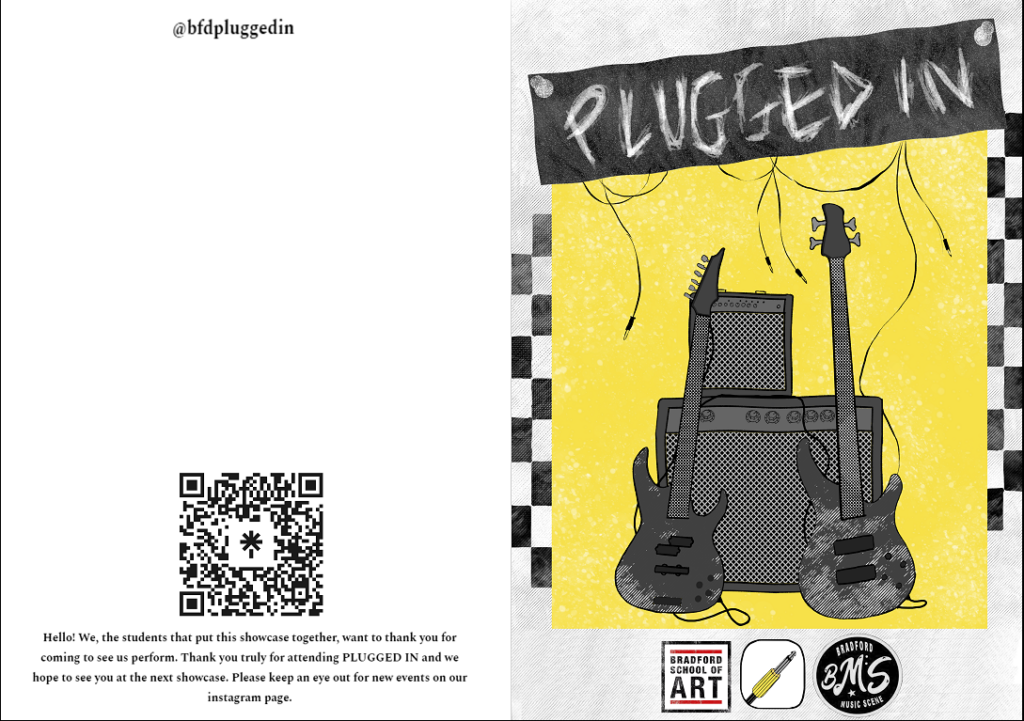
The front consists of the poster art with the subtraction of the bottom text box and addition of the BSOA logo, the event logo and Bradford Music Scene’s logo, our sponsor.
On the back, I added our @ for everything online, as well as the Linktree QR which links to our social media pages. I liked the thought of adding a thank you message at the bottom and informing visitors that we have more than one showcase every academic year, so I added that too.
I think my art and plan for this was very helpful for people to follow the showcase, besides the last minute changes that were made. Additionally, the Instagram page did gain a few more followers on the night of the performance, likely due to the Linktree and @ combined with the message. I’m hoping this means more people will be better informed of the next showcase. My design follows the overall theme of the event since it uses the same colour scheme and effects and it uses the main poster too. It would have been nice if we had the whole course photo ready to use on the back of this, but Anna was unfortunately sick during this time, so we didn’t have access to the photo.