Since there aren’t many well known music event logos that I can find and feel inspired by, this page will be a mix of designs that could be logos or are existing logos for bands and similar things. I’ll be making both the event logo and most likely the band logo too.
Radiohead’s logo was inspiration to me due to the simplicity of it and how well it aligns with their music without it being obvious. Most logos now are black and white, so having a red logo in a bold font stands out a little bit more. The font doesn’t look perfectly written, since parts of letters lean too far one way and aren’t even. There’s a scratchy effect with the white dots that further imperfection. All of this makes the logo seem a little more human, rather than having each letter perfect.
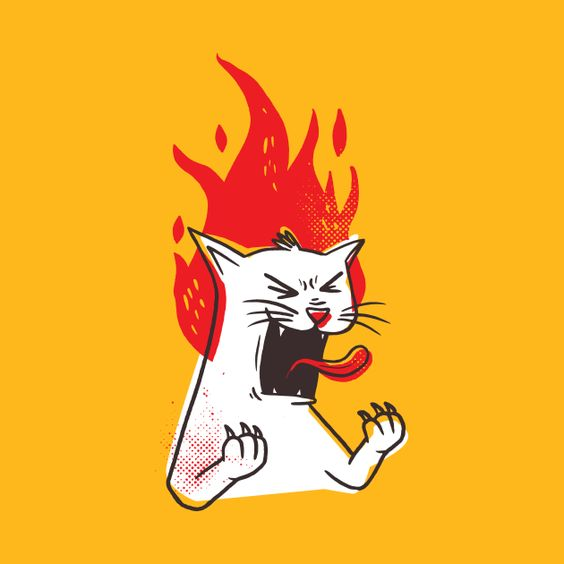
This is an art piece I found on Pinterest that I found interesting due to the use of effects to add texture and imperfection, like the yellow faded dot effect at the top right of the cat’s head and the red dots by its left paw. The contrast between the red, yellow, white and black outline is something I want to utilise. Maybe just with white, yellow and black for simplicity. I like this shade in yellow in particular against black and white, so I may use this or a very similar shade.
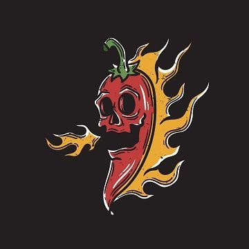
I’m liking the idea of sticking to very little colours and using art instead of words for the logo, as long as it matches the theme, like this art. This isn’t from anything in particular, I found it on Pinterest and the link attached to it is a site that you can buy the image from, since it’s ordinarily watermarked besides on Pinterest. This kind of art seems to be what modern logos are starting to lean towards.
Foster The People’s logos usually look handmade and not completely professional, which gives off the impression that the band is more relatable and the art not being refined means they don’t look like they put themselves on a pedestal that states perfection. A lot of bands do this by adding irregularity and distortion to the fonts in their logos.
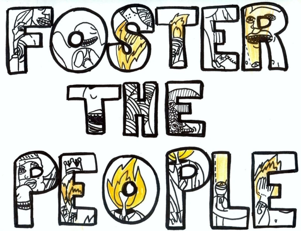
The same applies to this logo, as the art within the letters look like rough sketches from a comic book but is really part of their album art. Using a simple font as a frame for putting art inside the letters looks like a great way to make each letter pop in a different way. The thin line art and consistent use of exclusively black, white and yellow means each letter is tied together nicely.
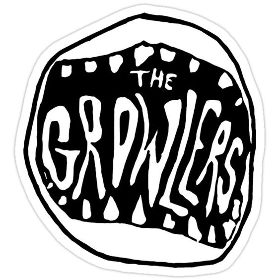
The irregularity effect is again seen in this logo. It’s subtle, but the theme of the growlers combined with the image of teeth and lips add relevancy to the art and give it reason to be there, rather than just have ‘The Growlers’ in the same font but in black against a white background.
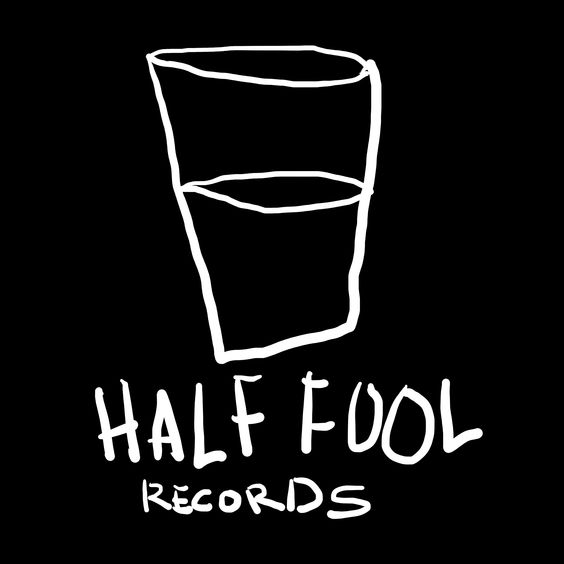
This logo is really simple and looks like its drawn with very little care for quality, but the ‘half fool’ below a half full glass gives the name more meaning. It’s clever, and something that could be applied to PLUGGED IN in a more obvious way.