https://www.behance.net/gallery/89090259/Slipknot-Roadshow
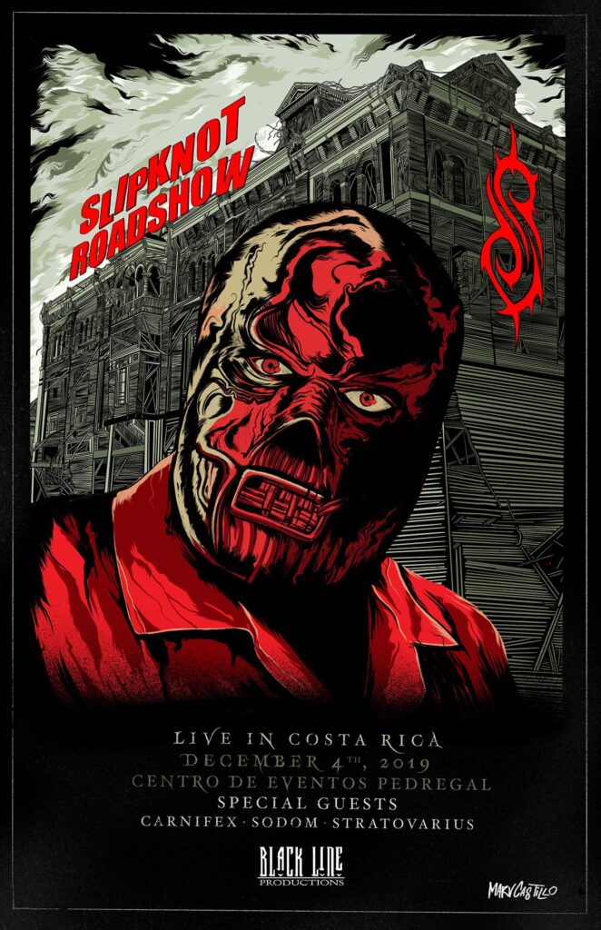
This series of posters were designed privately for each member of the band instead of for the purpose of advertisement. However, I’d like to use this as an example as I can explore some aspects of the image, such as the vignette effect visible at the bottom of the image, the sky background and the font and text angle against the building.
The information at the bottom having a bland background means the focus isn’t stolen and no words clash with any patterns.
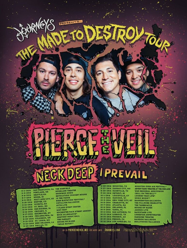
Pierce the Veil’s US tour poster features a US shaped frame for an image of the band and splattered paint background with highly saturated complimentary colours framing the band name and venue and date information.
Some parts I like about this poster are the green, pink and yellow text and frames due to the clear sectioning and the messy black paint drips below the tour information.
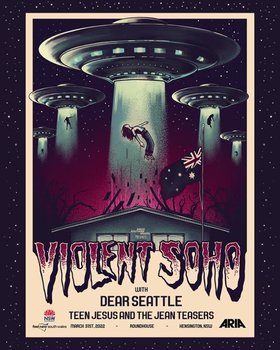
Violent Soho are an Australian alternative rock band. Their tour poster suggests what style of music they perform with the use of dark but highly saturated purples and blues, partnered with the theme of destruction and abduction. The font suggests some aspect of horror.
I like the extension of the background of the main image pushing beyond the boundaries of the creme / white frame, as well was the dotted gradient of colour used in the band name’s font.
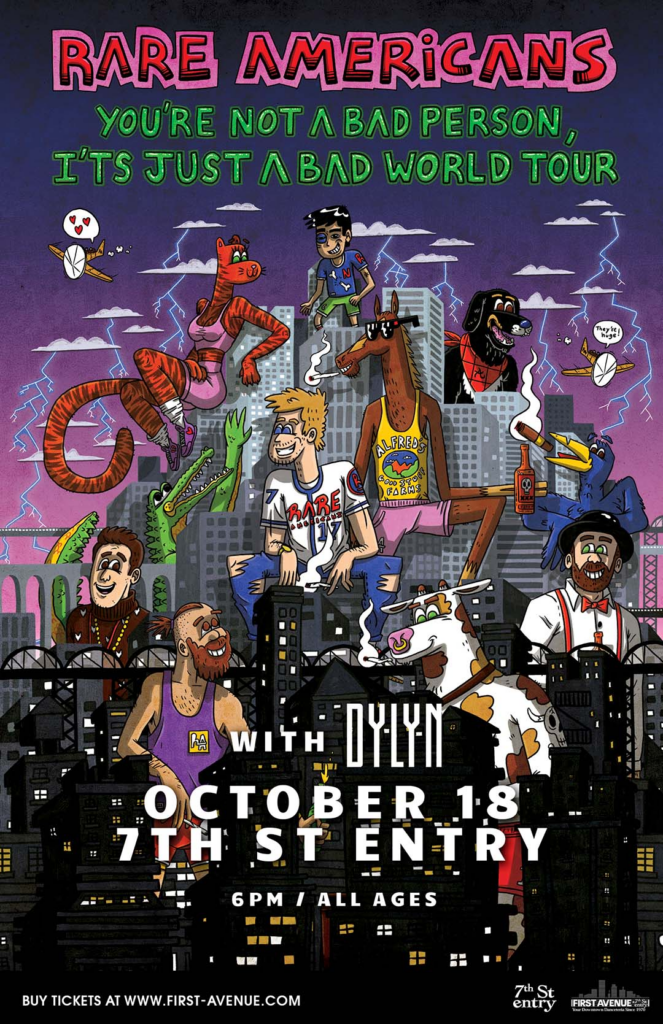
The Rare Americans tour posters are usually eccentric, similar to the stories told in their lyrics in some songs. From experience, the poster feels like it advertises some chaos which aligns with how their gigs feel as there isn’t a calm moment besides one or two songs in the end side of their setlist (usually).
Displaying band members and characters in the art is ideal for fans to recognise which album or what songs they plan to play.
I especially like the font variation and the gradient colouring.
Showcase Inspiration
All of the images I post below are from Pinterest and are saved on my personal account. I want to take aspects of each and apply it to my own art. These images are in an array of different styles as we’re yet to find out what genres the bands are going to play, hence what style our branding should be.
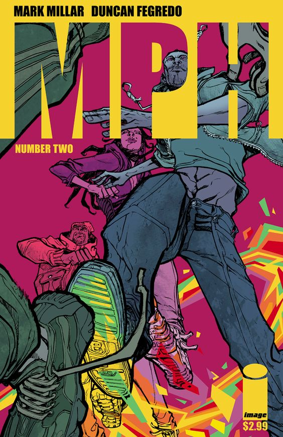
This kind of art style is something I would love to experiment with and would feel comfortable working in it, but I don’t feel as though it would be easy to apply to the showcase if the theme is dark. I could still create some ideas using it and propose it to the group if I have time. The structure of the image is appealing. I like the idea of the title being shaped from a cut-out starting at the top of the page.
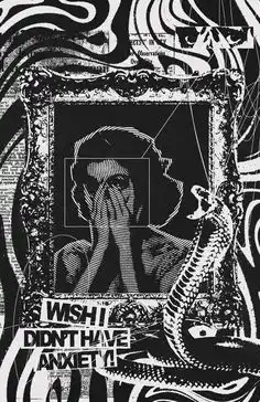
This image is more of what I think the group is suggesting, and I would enjoy working on this kind of project too. The most important thing here is the variety of textured and exclusive black and white theme, with one main point of interest against a black background.
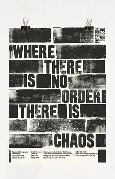
This is an idea I wanted to experiment with joined with the image above. I was thinking about how the showcase name and date would look in white, like how this would look when inverted. The texture on the blacked out rectangles could be interesting to see when inverted and against a black differently textured background.
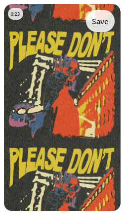
I chose this image because I like the idea of the poster being continuous with no cut off, the effect the image has and the way the text bends around the image. The texture on this image is interesting too, I might want to consider experimenting with this. The colour scheme is pleasing and I would still consider the image as ‘dark’, in line with the group’s ideas, so this one might be the one I base the poster off most closely.